
Melissa C. Walker's Blog, page 12
July 25, 2012
Win-It Wednesday: Beauty Prize Pack
The fabulous Cynthia Leitich Smith is hosting an Unbreak My Heart + beauty giveaway over at Cynsations, so head there to enter to win:

a signed copy of Unbreak My Heart;
a copy of Raising Eyebrows by Cameron Tuttle (a guide to your perfect brow);
Marie Natie natural lip gloss in Red;
Marie Natie natural lip gloss sample in Cotton Candy;
Bumble & Bumble Pin Tin (bobby pins);
Mad Grab Lip Balms;
and nail tattoos!
Yay! US only–sorry! This package gets big/pricey. Back to international soon, I promise!


July 23, 2012
Cover Stories: Masque of the Red Death
 Bethany Griffin is here today to talk about her cover for Masque of the Red Death, which is a twist on Edgar Allen Poe’s gothic short story (cool!). The cover has atmosphere in spades. Here’s Bethany:
“I think that covers are the most exciting thing, seeing a visual interpretation of your work, and every time we’ve sold a foreign right, a part of me is jumping up and down going, Another cover! Another cover! But, I didn’t have an image in mind as I wrote.
“In retrospect, I’m not sure that there was much discussion with my publisher, but one thing we did discuss during revisions was having some symbols for different groups in the story, because through a good part of the story evil is sort of amorphous, and since there are multiple groups vying for the city, it made sense to give the reader some visual clues. I think it was great editorial advice, and added to the story, but…in my mind I was picturing a more gender-neutral cover, perhaps using some of those symbols, so I was surprised when I got the cover, initially.
“I thought it was beautiful, but I wasn’t sure about it. First, it didn’t seem like it would appeal to male readers much, and though even the first draft was wonderfully atmospheric, and there are scenes in the marshes, the book is essentially about saving a city, so the setting of the cover threw me at first. Also, the color and style of the font changed later, into something really beautiful and special, but in the first draft, they weren’t as striking, so I liked it, but I wasn’t in love!
“We made some suggestions, but none of them worked. I suggested that the parasol be more tattered, and we suggested some sort of city outline in the background (and I’m going to agree that might not have looked good, particularly if it was worked in later) but I do like tattered things! But no, they had purchased the beautiful artwork for the cover, and I don’t think it could be manipulated very much.
“In some ways I would say the final cover was unchanged from the first version I saw, but in fact the final hardcover is very different. The font color changed, and the font itself improved dramatically, and is really just beautiful. And the effects that were added, first the glowing depth that the ARC had, and then they left that and put embossed foil on the cover, and added in deckled pages…I am really pleased with everything about the book and the cover!
“I may not have been in love the first time I saw it, but now that the book is on my shelf, I’m definitely in love! I think the cover is very representative of how dark the book is, and that even aspects that I questioned at first, the parasol for instance, helps the reader see immediately that the book has a historical setting, the misty background is mysterious, and the red dress suggest glamour, all of which are a bit part of the book. I think the feel of it is just right, and the color, well, it’s Masque of the Red Death! I know there are other books with red dresses (I own quite a few of them!) but red was the absolute right color for the dress on this cover.
“Oh, and another cool cover related thing that Greenwillow did was that instead of a trailer, they created an interactive book cover for the book. (Be sure to click for lightning and scroll over parts for creepy vines).
Um, that is my favorite thing in the world. An interactive book cover! What do you guys think?
July 20, 2012
Photo Friday: Saltwater Sandals
I got new ones! Purple! (Forgive the in-need-of-pedicure status of my toes.)

Happy weekend!
July 19, 2012
Cover Stories: Torn
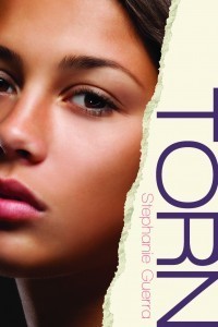
Stephanie Guerra‘s debut novel has a cover that really tells a story, especially when you look at the entire jacket. Here’s Stephanie to talk about the process:
“I love the cover of Torn, because by some amazing coincidence, the model looks like the friend on whom Stella, my narrator, is based (see the picture of ‘Stella’ and me in high school, below right). I also like the model because I can see both Latina and Eastern European characteristics in her face, and Stella is biracial Mexican and Croatian.
 “The art department used stock photos, and I’m grateful for the level of input they allowed. While I wasn’t consulted about the original design, I was given seven possible head shots to choose from, and asked for feedback about framing. The whole process was fun, collaborative, and stress-free.
“As far as the design itself (the close-up of Stella on the front is mirrored by one of Ruby on the back–see full jacket below), I feel it’s perfect. Torn is about what it means for a woman to be a true friend, and what it sometimes requires from us. There’s a lot of YA romance in the marketplace right now, but when I was a teen, my friendships defined my experience more than my romances did. That comes through in Torn; there are men in both girls’ lives, but ultimately their friendship is deeper and more sustaining than their respective romances. I think the dual head-shots keep the spotlight where it belongs: on the girls.

“While I had choices around Stella’s headshot, the art department only offered one option for Ruby. At first I thought she looked scary (those eyes!), but now that I have the actual book in hand, I see that she was a good, dramatic choice. Ruby’s character is fiery, and it makes sense that her image should reflect that intensity. The only quibble I had was that Ruby’s red hair is a dye job, while the model is clearly a natural redhead. Not a big deal in the grand scheme of things! By another stroke of luck, I met a young mother at a playground who resembled the Ruby model. I asked the woman if she’d like to act in my trailer, and she agreed (thank you, Michelle!).
“The cover came together fortuitously in so many ways that I feel a sense of peace that it’s just right. I even love the end papers. Maurice Sendak once compared the end papers of a book to the curtains of a theater, and I think it’s a great analogy. My end papers are a delicious, candy pink—not quite bubblegum, not quite cherry blossom. The pigment is rich enough that the color feels strong, but not shocking. Somehow it reflects both the estrogen and the edge of Torn.
“And now I could go on about why I love the type-face… but I have to stop somewhere. I’ll close by saying that as a lifelong book lover, it’s very satisfying to have my first book feel aesthetically right, and I’m grateful to the designers at Marshall Cavendish (now Amazon Publishing) who made it happen. Thank you!”
Thanks, Stephanie! Below are various headshots for Stella, below. I love the final pick! And check out the Torn trailer too. How cool that Stephanie found a real-life Ruby lookalike to use for the filming!
What do you guys think?


July 16, 2012
Cover Stories: Such a Rush by Jennifer Echols

Jennifer Echols has some great covers. (Remember the makeovers of her illustrated-cover books into photographic covers? Love that!) Her new book, Such a Rush, is no exception. Jennifer’s here to share her latest Cover Story as part of her GCC tour:
“When the publisher asked me for my input on the cover, I told them a big sky would be good, but we would also need to see the characters Leah and Grayson to make it evident to readers that the book is a romance. They came back with two possibilities. One looked like the back cover, showing the small-town airport with an airplane overhead, except that Leah and Grayson were also lying in the grass. The other looked like the front cover.
“At first, I wanted the back cover, because I thought it conveyed the contents of the book better, but it was too sleepy-looking (see below right).
 “I thought the front cover was arresting, but it didn’t make clear to readers what the book was about. But my editor really loved the front, as did the art department. They tinkered with the fonts until I got my beautiful flowy title, and I compromised by flat-ironing Leah’s curly hair in one scene in the book so she would ‘match’ the girl on the cover. I’m really happy with the results, and I’m grateful to my editor for caring so deeply about what I thought.”
Thanks, Jennifer! Here’s what I love: The way her hair sweeps in a way the matches the font of the title. Also: the almost black-and-white coloring with a pop of color for the title. And it’s cool that the back cover got to tell a little bit about the small-town airport aspect of the story. Oh, and yay for writing straight hair into the story–so worth doing that for readers, I think!
What do you guys think?
July 11, 2012
Cover Stories + Win-It: Never Enough
 Denise Jaden was here in 2010 to share the Cover Story for Losing Faith, and she’s back on her GCC tour for Never Enough, which has a cover with amazing light! Here’s Denise:
“I didn’t have much in mind for the cover of this book. I feel like there are lots of things I wanted it to encompass, and because I don’t have much of an artist brain, I didn’t know how to do that.
“With my first novel, I was told I would have time to make some suggestions, but then it never came up again. With this one, the cover was not mentioned until they had a final version to show me.
“I really love my cover, but to be perfectly honest, the girl on the cover doesn’t look like either of the main girls in my novel. I was a little bothered by this initially, but I must say, I think they’ve chosen a picture that covers a lot of the themes and fits the tone of the book. The image is a stock photo, which is fine with me. I hope that one day one of my novels will have a live model, but this photo works so well with the tone that I don’t think one was needed for this. I really think the people in the art department at Simon Pulse are masterful!
“I did mention my concerns over character congruity. We discussed it, and eventually both agreed that capturing the tone of the book is more important.
“The original version said ‘Title Here,’ because my book did not yet have a firm title, but otherwise it is exactly the same, with an added tagline.
“I’m thrilled with the cover overall. I think Simon Pulse does an amazing job with covers, and I really think mine is eye-catching in its final version.”
Thanks, Denise! It bugs me when the cover model doesn’t resemble a character, but I agree with you that the tone is most important. I have to say that I love the light play in this cover. The branches almost obscured by sunspots, the green tones with blue title font–lovely.
What do you guys think?
PS-Denise is holding a contest on her blog for four boxes of great books! If you comment here, you’re automatically eligible to win. HOORAY.
PPS-Check out the trailer!
PPPS-Last week’s Win-It Wednesday winner of Tara Altebrando’s latest is… Brianna! Send me your address, B.
July 9, 2012
Cover Stories: Eve by Anna Carey
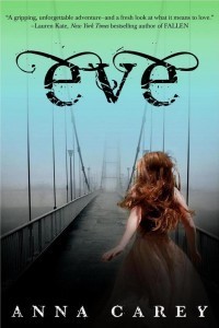 I’m a sucker for bridges. And running. And flowing hair. So the cover of Eve? Kind of up my alley. Here’s Anna Carey to talk about the cover of the first book in the Eve trilogy (the second, Once, is out this month!).
“I had a vague sense of what the book might look like. The name–Eve–conjures so much. We all know Adam and Eve, and there’s so much imagery associated with their story. Originally I saw the cover as having a lot of lush greenery. I sometimes saw a pale girl lost in the forest. It’s funny, the book trailer captures a lot of those original images and ideas that were left behind as the cover evolved.
“The designer asked for a list of images or words that appear in the book. I can’t seem to locate that list, though I’m 99% sure the designer came up with the bridge idea, which I love. It’s hard to go back through your book and decide which imagery is meaningful and/or metaphorical–so much of that is folded into the manuscript unconsciously. I’m pretty certain all my suggestions were fairly basic. Thankfully she didn’t put a wall or a cluster of trees on there. I don’t think it would’ve had the same effect.
 “There were so many amazing covers in this process, I’ve thought of framing them and hanging them on my wall. So much goes into finalizing the cover–publisher’s approvals, comments from sales and marketing teams. The team went through several different options before getting it just right. So when I did see the cover I loved it, but I wasn’t sure if it was FINAL FINAL, so I didn’t want to get too attached. Side story: One of the covers involved an underwater photo of a girl in a white dress. She was kicking her legs, the skirt blooming out around her. It was gorgeous, but thankfully we didn’t use it–it would’ve been too close to The Unbecoming of Mara Dyer or Imaginary Girls. (See those covers at right).
“The actual image didn’t change at all. But when I had the physical book in my hands, it was so much more beautiful than I could have imagined. You can’t tell from the picture, but the sky is actually much darker, and the book jacket has a metallic sheen to it. The hardcover beneath the book jacket is black, with gorgeous, metallic green type embossed on the front and spine.
“The image of the girl was shot by Merisa Okic, a photographer. She does some really interesting, evocative portraits. You can check out her work here. I wonder if you’ll guess which model is the real Eve…
“I love the cover, and owe endless hugs and thanks to Elizabeth Clark, the designer. What first struck me was the sky, how it fades from green to blue to purple. I like that there’s something beyond the bridge, though you can’t quite see what it is. It’s almost as though everything is covered in fog. I hate to admit this, but I didn’t originally connect the bridge on the cover to the very famous bridge featured at the end of the book (I associated it more with the first bridge in the book, which is inside the compound walls). So much of this book, and this series, is about crossing thresholds. It’s about going places you never thought you could go, and becoming a person you never thought you’d become. To me it seems fitting that the girl on the cover is crossing over, headed for the unknown.”
Thanks, Anna! I love the details you’ve mentioned, and I also really like how the font makes the three letters flow together in the title. And, the girl’s stance/movement reminds me of the original cover for Nancy Werlin’s Extraordinary, which I also loved.
What do you guys think of this one?
July 6, 2012
Photo Friday: Babies in Hats
Baby June, in her grandfather’s hat, says, “Have a great weekend!”

July 5, 2012
Win-It We-Thursday: The Best Night of Your (Pathetic) Life
 Tara Altebrando writes great books. This one? So excellent! I found myself folding pages down to remember certain passages (so, um, the copy you win may be a little dog-eared, as I’m giving away the one I read). But don’t let that get you down. The book is so, so much fun. Filled with adventure and action and the kind of self-reflection that hits you smack in the face on those summer-after-senior-year days.
Incidentally, I’m reading with Tara (and David Levithan and Andrea Cremer and Anna Waggener!) on Sunday at McNally Jackson in NYC. So, come! Here’s your invitation.
Now, to win a copy of Tara’s excellent book, which features an all-night scavenger hunt, tell me this: What item from your hometown would you put on a Scavenger Hunt list? For me, I’d include a tablecloth from Allen & Son, my favorite barbecue joint in Chapel Hill–they’re those perfect gingham picnic types (I’d totally return it the next day!).
Happy Thursday!
PS-The trailer:
July 2, 2012
Cover Stories: 52 Reasons to Hate My Father
 Jessica Brody has shared two previous Cover Stories here (for My Life Undecided and The Karma Club). She’s back for a GCC tour, telling the tale behind the cover of 52 Reasons to Hate My Father.
“I’m terrible at envisioning covers. So no, I didn’t really have an idea in mind. But I knew I wanted it to show the contrast of my main character’s two worlds (spoiled heiress and working girl) which I think they ended up doing really well!
“Honestly, I was surprised when I saw the cover. It was SO different from the light, pastel, girly looks of my other YA book and my publisher had told me they were going to keep with the same look. So when I opened this, I almost thought that they sent me the wrong cover! It was all edgy and kind of punk rock-ish. I wasn’t quite sure how I felt about it. It took me a few days to really come around to it. My publisher explained that they’d decided to change directions with this book. And go with an edgier look (because the book is a bit older and edgier than my other titles). But once I got over the shock of how different it was, I could finally see how awesome it was! And I’ve loved it ever since!
“It really didn’t change at all. They added a few more ‘paparazzi flashes’ in the background and the Meg Cabot blurb that we got (SQUEEE!) and that was about it! I guess they felt they got it right the first time!
“Apparently they used a model to shoot a photo for a first version of a cover concept that I never saw. I did get to choose the model, though! My editor sent me photos of about five different girls and asked which one I thought looked the most like Lexi. I was told the original concept was something about a girl in a maid’s uniform, holding a mop, but wearing all sorts of shiny, blingy jewelry.
“But then I guess the marketing and sales department didn’t end up liking the way it came out so they scrapped it and went with this concept instead. Which is really just the reverse of the original concept. In the original, it was Lexi in a work uniform, with heiress accessories. In this version, it’s Lexi in heiress clothes, with work accessories. I can see how this version might play better on the page.
“With the current cover, they didn’t have time to do another photo shoot so they used a stock photo instead. But what’s funny about the whole thing is I actually think this girl (the stock photo) looks more like Lexi than the model I chose! So I guess that worked out!
“When they sent me the cover, I noticed that the girl in the picture was wearing a donut shop hat. I found this odd because in the book, my character never works at a donut shop (she works just about everywhere else though!) But my editor explained that they wanted the heiress to be wearing a hat that distinctly contrasted the ‘heiress’ look and represented her new working status. They felt that the donut shop worked the best. I agreed so I went into the manuscript (which was still being revised), deleted one of the other jobs and replaced it with a donut shop job. It was a job that only had a few sentences of description so it was easy to replace but I actually ended up liking the donut shop job better than the original.”
Thanks, Jessica! I have to admit that I had 100 questions upon first glancing at this cover, so I love hearing the explanations. And I think it’s so great that the book reflects the donut job, because as a reader, I really want to see the cover image reflected inside.
What do you guys think of this one?
PS-Jessica always has amazing trailers. This one? No exception:

