Melissa C. Walker's Blog, page 10
September 24, 2012
Cover Stories: Fingerprints of You
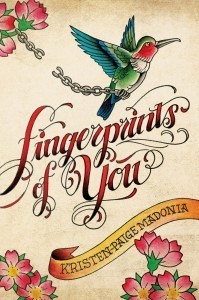 Kristen-Paige Madonia has a cover that stood out for me instantly. In a way it felt both old and new somehow. Anyway, here she is to tell its tale:
“For the cover, I imagined something that had to do with San Francisco, maybe a gritty photo on Haight Street or a shot of a bus moving through the city, but nothing particularly specific. Authors, especially new ones, don’t have much say when it comes to the cover design. There’s a lot of trust involved with selling a book, and you essentially hand over the cover to the art director and hope for the best. My editor asked for my thoughts early on in the process, but the only request I made was not to include a picture of an actual person. It’s a common design approach in YA, but for me I wanted to let the reader imagine what the central character, Lemon, looked like as opposed to including a photo of her on the cover. Other than that, I didn’t make any specific suggestions.
“When I first saw my cover, I thought it was so unlike any cover I had ever seen, and I was thrilled with how distinct it was. The only information they gave me ahead of time was that they were creating ‘something outside of the box,’ so I wasn’t sure what to expect. But it never crossed my mind that they were working on a tattoo-inspired design, we just never discussed it. It’s a funny thing, to have an image that represents a project you’ve worked on for so long, but once Simon & Schuster shared the cover, it was clear that it was perfect for FINGERPRINTS OF YOU.
“They did ask for feedback, but in the end not much changed. We played with the background a little and added more texture. We also tweaked the color, which was originally slightly rose colored. In the end, we thought the cream color was a better fit, it seemed more edgy and more reflective of the mood of the book.
“The final cover art was a custom design and font created by a tattoo artist living in San Diego named Terry Ribera. My brilliant art director at Simon & Schuster, Krista Vossen, created the concept and the original sketch, and then she brought in Terry to draw the final art. Krista did an amazing job before she turned it over to Terry though, and once the book came out and I started receiving so many questions about the cover in interviews, she shared a lot of details about the process and, eventually the original sketch (below). I love the original sketch just as much I love the final cover, and I feel so fortunate that she worked as hard as she did to make sure the artwork represented the novel.
“I’m guessing that it’s getting featured on shelves more frequently because the cover is so unique and colorful. It’s absolutely perfect in terms of the story and represents the idea that Lemon is in the midst of taking flight as she stands on the brink of adulthood. The opening line of the novel reads, ‘My mother got her third tattoo on my seventeenth birthday, a small navy hummingbird she had inked above her left shoulder blade, and though she said she picked it to mark my flight from childhood, it mostly had to do with her wanting to sleep with Johnny Drinko, the tattoo artist who worked in the shop outside town.’ The image on the cover, of course, is the tattoo that Lemon’s mother picks, but it also demonstrates her want for freedom and her search for her own identity.”
Thanks, KPM! I’m super into it, and also: How tight is that first line?! (Um, and the JB blurb on the back–INCREDIBLE.) I’m sold.
What do you guys think?
September 21, 2012
Photo Friday: Vintage Shopping!
This week I did some vintage shopping with Vintage maven Sammy Davis at A Little Wicked (check out their Yelp reviews–an amazing must-hit shop if you’re in NYC).
There was one dress that was super fun but a little too costumey on me (didn’t buy)…
And then there was the black and white dress that is a one-step party-goer (bought):
And the $20 bargain shirt-dress with the great gold-thread detail (bought):
And finally the dress that Sammy scoped for me that was labeled “Miss Fall 2012″ (bought!):
Ahhh, I love vintage shopping! Remember last time I went? It was like two years ago, way pre-baby! So glad to be stocking the closet again. Thanks, Sammy D!
Happy Friday!
September 17, 2012
Cover Stories: Blackwood by Gwenda Bond
 Gwenda Bond’s Blackwood is getting some high praise. For example? Scott Westerfeld says, “With whip-smart, instantly likable characters and a gothic small-town setting, Bond weaves a dark and gorgeous tapestry from America’s oldest mystery.” Hi. Sold.
The cover is all kinds of evocative, and here’s Gwenda to talk about how it came to be:
“I don’t think I ever had an idea what the cover for the novel now known as Blackwood should look like. Maybe I thought there would be trees or a ship, or a map, something suggesting a mysterious island. When I thought about it, I worried a little—how would the cover get across that this is a story that takes place now, even though the historical Lost Colony of Roanoke inspired it? Fret and fret, as we authors do about covers (because, let’s face it—they are so important; a good cover image helps crystallize the feeling of a story, pulls us in before we’ve read the book in a way no synopsis or thousand words can).
“So, yes, nervous, even though I knew Angry Robot, the parent publisher of imprint Strange Chemistry, had built a reputation for gorgeous covers. But I shouldn’t have worried.
“Because the book was with a brand-new imprint, one of its first two books, we were on a tight timetable. We started discussing the cover as soon as the book was bought. My editor Amanda Rutter came to me with a concept involving a snake on Miranda’s face, turning into an actual snake coiling around her. Miranda Blackwood’s father has a snake-shaped birthmark on his face, just another confirmation of the family’s status on the island. I loved it, since it’s very thematically resonant and also an image that would take on more meaning for readers of the book. But, as I’ve said before elsewhere, it still could have skewed Adam & Eve or heavy metal rock cover. I did get to see the official art brief that went to Steven Wood, the excellent UK illustrator/artist who did the cover. Here’s a snippet from it:
“Subject: An older teen girl’s face (seventeen or so) turned to the side so that we half see the profile. On one cheek is a snake birthmark, in a red colour. This snake becomes a real snake and wraps itself around her neck and down her unseen body. The face and the snake are the focus of the cover.
“(Note: The publisher is based in England, hence the ‘colour.’) And that went along with more description of the elements, possible colors, and some reference covers from other books. The artist created the image, and the publisher’s art director added the title and blurb elements of the design—which I think really bring the whole cover together. The first version was mostly the same, but with some key differences. The snake’s tail was on Miranda’s cheek, looking a bit more like a tattoo, and its head was on her other side (in fact if you poke around Wood’s website, you’ll find the earliest version of the cover). I still really liked that first version, but when I saw the revised artwork, with the striking snake on her cheek, I was stunned by how powerful the image became.
 “I honestly couldn’t have asked for a better cover. I was stunned all over again when I saw the first final copy of the book. It’s beautifully matte, with even more depth than you see in the image on-screen. I really couldn’t be happier with how it turned out, and I so enjoyed getting to watch the process from start to finish.”
Thanks, Gwenda! It’s so cool to get a glimpse of the official art brief, and it so perfectly describes the lovely final result. I poked around but couldn’t find the original cover. I did, however, find the image without the text, which is cool to see (right).
What do you guys think of this cover?
September 12, 2012
Win-It Wednesday: The Other Normals
 I know I’ve been bad about Win-it Wednesdays, but I do have great books to offer, so here’s a new one! This week, I’m giving away a copy of Ned Vizzini‘s brand new hardcover The Other Normals, out later this month. You know him from previous amazingness like It’s Kind of a Funny Story, and his latest book sounds awesome. Read Readingjunky’s review.
To enter, jump through one or both of the hoops I’ve set up below! I’ll pick a random winner next week. Happy Wednesday!
September 10, 2012
Cover Stories: Send Me a Sign
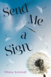 Tiffany Schmidt’s debut novel comes out October 2nd, but I’m featuring it today because she has a very cool pre-order offer going on right now. The author herself will donate $1 to cancer charities for every pre-order of the book between now and its release date.
In Tiffany’s own words, “Send Me A Sign is about a teenager with leukemia. It’s about a lot of other things, too: love, luck, music, friends, alliteration… but leukemia plays a large role. And did you know that leukemia is the most common form of cancer for young people?” Tiffany lost a former student last year, and it inspired her to do more to help find a cure — that’s where you come in. Pre-order the book, spread the word… here are the details.
And now, Tiffany’s debut Cover Story:
“I first saw my cover in my editor’s office back in December. It had already been an overwhelming day: a chaotic morning drive into NYC with my family and agent – during which one of my 13-month-old twins had been carsick twice, a day popping around the city with friends, and an evening that ended with meeting my editor for the first time.
“After a quick tour of the office and meeting a rapid-succession of the fabulous Walker-Bloomsbury staff, I was starry-eyed. The twins were less impressed: one was cranky from lack of napping, the other was irritable with what turned out NOT to be car-sickness after all, but actually the start of a stomach flu.
“In the midst of all this, my editor said casually, ‘I can’t remember, have I shown you your cover yet?’
“She handed me a piece of paper and I froze. It seemed like a moment where someone should cue a soundtrack , or that there should be some fancy close-up camerawork when I flipped over the piece of paper and saw the cover of my debut novel for the first time. I almost didn’t dare look at it. It was too much. And such a public forum for processing it and reacting.
“One of the first things my editor said was, ‘You don’t have to tell me you love it right away, if you need time to think about it.’
“As everyone who has read an ARC has been quick to say, SEND ME A SIGN isn’t a Cancer Book. It’s also not an It Girl story. My main character, Mia, is privileged and does have cancer, but because the story is about so much more than that I’ve always had a clearer picture of what I didn’t want on the cover of SEND ME A SIGN than idea of what I did. I didn’t want a cheerleader. I didn’t want a girl in a hospital bed.
“While certainly those are elements of Mia’s journey, but the book is really about HER. About gaining control and losing it. About relationships and pushing people to their limits versus pushing them away. About being in charge of your own destiny, AND embracing being powerless.
“I wanted a cover that said THAT.
 “In my mind it looked something like this (right).
“A nod to Mia’s overwhelming dependence on luck and superstitions, but also to romance. And the cover would take on a second meaning once the readers had finished the book and learned the importance of clovers and heart necklaces within the story.
“When I finally looked at the piece of paper with a photo of my cover, I saw that design team at Walker-Bloomsbury had gone in a different direction—no cheerleaders, no hospital beds, but no clovers, Magic 8 Balls or other superstitious icons either. What I saw was unexpected (below, left).
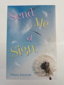 “It wasn’t instant love for me. I worried it was too close to BEFORE I DIE (right) and my very literal mind thought things like ‘Mia wishes on two flowers in the story – neither is a dandelion.’
 “But I immediately adored the swirly-whirly font—which later lost its pink-and-yellowness and I adore the darker color even more. I also recognized the wistfulness of the image. Both of those really suit the tone of the story. The fact that it looks fragile and evokes a sense of wishfulness works so well.
“And when my editor sent me shots of the way the design had been incorporated in the inside of the novel, I was sold. They’re stunning. (See below.)
“While this cover is nothing like I would have envisioned for SEND ME A SIGN, now I can’t picture it looking any different. I am so lucky to have the design team at Walker-Bloomsbury looking after my books!”
Thanks, Tiffany! I adore the interior treatment–I love it when book design carries into the inside pages. Also, did you guys know that Tiffany’s book has a bracelet? It does! Also, that pre-order offer? So very cool. Tell people!
September 7, 2012
Photo Friday: Highlights
A wedding in the Hudson Valley, with white sangria (Congrats, Amanda and Paul!):
The incredible Decatur Book Festival, with hotel pool and Teen Stage action!
Happy Friday!
September 4, 2012
Cover Stories: 34 Pieces of You
 Carmen Rodrigues has a new book out today! It’s billed as “A dark and moving novel—reminiscent of Thirteen Reasons Why—about the mystery surrounding a teenage girl’s fatal overdose.” The Compulsive Reader called it “complicated, emotional and mesmerizing.” Sounds good, right?
And that cover? It has a story too. Here’s Carmen:
“When I consider a YA book cover, mine included, I like to imagine myself as a fifteen-year-old walking through the aisles of my favorite bookstore, scanning the crammed shelves for something that stands out. What I’m looking for is an image that evokes a mood or a strong emotion. The covers that appeal to me vary. For example, I instantly loved the iconic cover of John Green’s LOOKING FOR ALASKA and the human-based cover of Deb Caletti’s QUEEN OF EVERYTHING (below).
“I picked up these books based on their cover appeal, having never heard of the writers who, at the time, were not yet famous. These covers screamed, ‘Read me, love me, spend your hard-earned money on me!’ Of course, I don’t buy books based on covers alone. I also read the back cover copy and then a random page inside to see if the voice grabs me. If it does, I buy it. But, the larger point is, I won’t arrive at step three if I’m not drawn to the cover.
 “When it came to my own cover for 34 PIECES OF YOU, I was nervous. I had been through this before with my first novel, NOT ANYTHING, and found the cover design for that book (right) to be satisfactory but less-than-inspired. In that first experience, I had pitched several eye-catching ideas which were disregarded. (Ironically, I walked past a YA cover at B&N the other day, which featured a version of one of these discarded ideas and thought, See? I knew that would make a good cover.) For 34 PIECES OF YOU, I was also asked if I had any cover ideas, and I only suggested one–a take on the ‘Dear Photograph’ concept, which you can see by visiting dearphotograph.com. (Trust me, go there.)
“My reasons for suggesting an imitation of the ‘Dear Photograph’ style were that 34 PIECES OF YOU is really a series of stories within or interlinked to other stories (there are three, arguably four narrative voices) as well as a story that takes place in both the past and the present. Five years of history is covered in the novel, and I felt that a ‘Dear Photograph’ cover might really explore that interplay between past and present–how the past is as present as the present. Ultimately, though, we went with something that would immediately resonate with viewers. My feeling is that the girl on the cover (our imagined Ellie) provokes a definite emotional response (dark, moody, mysterious, reckless). Conversely, a ‘Dear Photograph’ image, while interesting, would require a second level of thought (What is this about?) or a third (Who is this about?), becoming too-much work for a potential buyer who, as a result, might pass it up.
“One of the interesting parts about our cover process was that Simon Pulse decided to hire a model. Photos were submitted to Jen Klonsky, my editor there, and she went through the stack and narrowed it down to a girl who looked like a young Kate Bosworth. I thought she was very pretty (too pretty, really), but when it turned out that she didn’t live in NYC and we had to replace her with a different model, one who freakishly resembles Evan Rachel Wood, I was thrilled. This model captures Ellie’s grittier beauty, and they did a wonderful job of styling her with all the details that were given in the book: the excessive eye makeup, the hot pink fishnet stockings she’s wearing at the time of her death; and the roughness of her attitude, which is mirrored in her jewelry selection. As a final touch, they decided to use a staff member’s handwriting for the title and all of Ellie’s notes (pieces) on the back. I nearly cried when they emailed me the comp of the full cover! This was my exact reply:
“Screams! Shouts! That light headed feeling you get when you’re about to kiss someone for the first time or you’re cresting the hill of a roller coaster!
“The final test, though, was when my first ARC arrived in the mail. I placed it in a stack of other YA titles released in 2011-2012. My cover immediately popped out. The spine, which also features ‘Ellie,’ stared back at me. Her haunted eyes seemed to dare me to look inside. So I did. My hope is that readers will too.”
Thanks, Carmen! I think my favorite thing about this cover is the font treatment–the torn paper bits completely intrigue me, and I know they carry over to the back.
What do you guys think of this cover?
August 31, 2012
Photo Friday: Elsewhere
August 28, 2012
Win-It Wednesday: Secret Letters
 I love the legend of Sherlock Holmes (I was born in London near his, perhaps fictional, offices. Truly!). Leah Scheier‘s novel, Secret Letters, brings the detective’s world to life as she tries to solve a mystery in Victorian London. I have to say, I’m a sucker for this setting, and–superficially–I love the cover. Ah, London!
There are a few ways to enter to win, below, so get to it.
Happy Wednesday!
August 27, 2012
Cover Stories: Poser by Marley Gibson
I’m always interested in modeling covers since I have the Violet on the Runway series, and Poser by Marley Gibson is way more urban-glam than Violet’s cover looks. Here’s Marley to talk about her cover:
“I wrote this book in 2005 and it was entitled LIFE OF CHAI, as the heroine is named Chai Devareaux. My agent, Deidre Knight, actually signed me on this book. Sadly, the book didn’t sell, but when The Knight Agency began their digital publishing last year, Deidre immediately suggested this book. I changed the name to POSER (since I love double entendre titles) and that’s when we began looking at the cover. I always imaged there would be a model on the cover, but never one as amazing as this one!
“My agent has a form that authors fill out to share their version of the book cover. Then, the information gets sent out to the graphic designers and they run with it. My original idea for the book was for it to be a a teenage girl with no makeup, ponytail, backpack, looking into a full-length mirror and seeing her glamorous, model self in full hair and makeup looking back at her. Again, I knew I wanted a beautiful girl in a fabulous dress.
“When I first saw my cover: Honestly? I gasped. Truly gasped. The colors popped out and I couldn’t believe my name was actually on this fabulous cover!
“What the designer produced was smarter and better than what I’d envisioned. The model really pops, as do the colors. I did a small survey with some teen readers and 100% of my survey loved the cover and can’t wait to read the book.
“I adore this cover! The only real ‘hidden’ thing in the cover is the actual title, POSER. It’s a double meaning that relates to the heroine of the book. It totally represents her life, her challenges, and what’s expected of her from her mother and their relationship.”


