Melissa C. Walker's Blog, page 11
August 24, 2012
Photo Friday: Upstate
A country escape is so very satisfying.

Happy weekend!


August 22, 2012
Cover Stories + Win-It Wednesday: Populazzi + 4 Books
 Elise Allen, who co-wrote Hilary Duff’s books (did you know that?) is here for her GCC tour, and she’s telling tales about her cover, naturally.
“I got very lucky. I loved my cover the first time I saw it.
“While I loved it at first sight, the more I looked at it, the more I had issues. My biggest issue was the model’s lips. In the first draft of the cover, her lips were ginormous. She looked like she had a fish allergy, and had just sucked on a carp. I mentioned that to Harcourt, and they agreed, so the lips were shrunk to normal human size.
“Flush with that tweaking success, I gave the cover to my husband, a trained artist who does graphic design for a living. I asked him to give notes as if it were one of his work projects, and he came up with twenty very specific changes: tweaks in font, in placement of the image… he even comped up a version of what the cover should be, and said he could send the file to Harcourt if that would help. I was elated, and passed all the information to my publisher… who was very kind as they patted me on the head and said (and I’m paraphrasing), ‘Sweetie, we did the lip thing. That’s all you get. Settle down now, okay?’
“The cover was shot with a model, and they actually made the Populazzi necklace for the shoot. I’ve been trying to get my hands on it ever since, but alas, to no avail!”
Thanks, Elise! I actually know how you can DIY a necklace like that. Cool, huh?
Now here comes the Win-It Part: To thank everyone for their support with the paperback launch, Elise is doing a giveaway on her blog where commenters can win a pack of five books — Populazzi plus books from the four authors who blurbed it. Go enter!
PS-Check out the trailer for Populazzi below:
August 20, 2012
Cover Stories: NARC by Crissa-Jean Chappell
 Crissa-Jean Chappell‘s cover for the newly released Narc made me look twice, spin it around and then around again. I don’t do that with many covers. It’s got that extra something. Here she is to talk about it:
“There’s always that moment when you hit ‘save’ and step away from the computer. And then it hits you. This collection of scattered files has grown into a book-length manuscript. Of course, you’re daydreaming about the cover. I tried to picture something that would catch the attention of older teens (and because my protagonist is male, I hoped it would appeal to guys, too). I have to give a shout out to the cover designer, Lisa Novak, for her beautiful work.
“I was thrilled when my editor at Flux asked me for suggestions (in the publishing world, this isn’t always the case). I sent pictures of book covers and movie posters that shared the themes of mystery and ‘going undercover.’
“When the email popped on my cell phone, I was driving to work (I waited until I could pull over to check it out. And that’s a good thing because I was so emotional, I almost bounced off the roof). It’s a big deal, looking at the cover for the first time. That’s when everything starts to feel real.
“My editor, Brian Farrey-Latz, sent two covers—the one we picked and a second, more traditional cover with a boy’s face. Although I loved both, I felt it was important to avoid showing too much of the main character’s appearance. For one thing, readers often prefer to imagine the characters on their own. And the conflict in NARC revolves around dual identities. So the doubling effect on the cover is perfect for Aaron, the boy who believes that everybody at school wears a mask….including himself.
“The lonely swings are so perfect. It’s like he’s waiting for someone to sit next to him. The playground is like a symbol of leaving childhood behind… but you’re not quite ready for the responsibilities of being a grown up. Aaron is forced into taking on a very grown up job (working for the police). At the same time, he is not out of high school yet. He wants to go to parties and meet girls. In other words, he wants be liked. But it isn’t easy when you’re pretending to be something that you’re not.”
Thanks, Crissa! I’ve seen swings (one example with a Cover Story is Jessica Warman’s Between), but this one has the loneliest feel of all, and the double image requires some contemplation, I think–in a very good way.
What do you guys think of this cover?
Check out the trailer here:
August 17, 2012
Photo Friday: Helen Gurley Brown
The Hearst lobby was swathed in pink this week in honor of the dearly departed revolutionary Cosmopolitan editor, Helen Gurley Brown. My friend Amber wrote this essay about her, and I second many of her thoughts.

“Good girls go to heaven; bad girls go everywhere.” RIP, HGB.
August 13, 2012
Cover Stories: The Sisters 8 Finale!
 Lauren Baratz-Logsted has been here many times sharing Cover Stories, and now the final book in her Sisters 8 series (which she writes with her husband and daughter) is out! You can read the Cover Story for the first two books here.
Take it away, Lauren!
“On August 7, the ninth and final volume in The Sisters 8 was published. The Sisters 8 is a series for young readers, that I created with my husband and daughter, about octuplet girls whose parents go missing one New Year’s Eve.
“From the time we sold the first book to Houghton Mifflin Harcourt, I was curious about what the cover would look like. Perhaps more than any area of books I can think of, series for children are defined in the public mind over a long period of time by the packaging. Can you imagine Harry Potter or Junie B. Jones with a different style artwork on the cover? Try switching the two styles in your mind. Does your head hurt yet? So, as perhaps you can imagine, I was nervous.
 “All I can say is, the day HMH decided to go with Lisa K. Weber to do the cover and interior illustrations, it was a great day for me. It’s as though, with each cover (see a few at right), she’s captured everything that I hope is special about the books.
“Take this latest cover, for instance. All eight sisters are depicted but since there are no cats on the cover – the sisters each have a cat and one has always had a cover op in the past – I imagine young readers will wonder about that! Annie, the oldest octuplet, is making a chess move against a boy - a boy? on a TSE cover? – and wherever they are, it’s snowing outside; which is odd since, when last we saw the sisters at the end of Book 8, it was August. Hmm…
“So much gorgeous artwork to look at, so much to think about…
“Not to mention, the amazing job HMH’s own Carol Chu has done throughout the series with the design and lettering. Honestly, I could not be happier. And that’s really saying something because, 25 books into my career, I have by no means loved all my covers. In fact…
“But that’s another cover story for another day.”
Thanks, Lauren! I’ve made no secret of the fact that I think the illustrations in this series are adorable and so cute, with an edge. What do you guys think?
Read more of Lauren’s Cover Stories (for Crazy Beautiful, for The Twin’s Daughter, and for The Education of Bet and Marcia’s Madness (another Sisters 8 book).
August 10, 2012
Phone Photo Friday: Cupcakes and Karaoke
My week in phone photos consisted of some awesome stuff:

Cupcakes for June’s 1st birthday! English muffin pizzas! Karaoke with old friends.
Hope your week was great!
August 8, 2012
Win-It Wednesday: Every Day by David Levithan
 I am reading this book, which is one of the reasons why the rest of my life is getting chaotic. I cannot put it down! Every day, “A” jumps into another person’s life, another person’s body… and has to live in their world. But when he meets Rhiannon, he falls hard, and he has to see her again. And again. But each time as a new person.
It sounds kooky, but it’s so well done and compelling! Yes, totally Quantum Leap-ish, but with more heart.
Also, I’ve been humming Buddy Holly and Fleetwood Mac songs all week. And I thought Unbreak My Heart gave me an earworm!
Enter with a comment, bonus for a tweet. Happy Wednesday!
August 6, 2012
Cover Stories: The Statistical Probability of Love at First Sight
 I know that everyone has read The Statistical Probability of Love at First Sight by Jennifer E. Smith, and I need to GET ON THAT! Because I know I’ll love it — I’ve heard her read from it, I’ve seen the reviews, it’s a sure thing. And the cover? I think it’s pretty timeless.
Here’s Jennifer to talk about how it came about:
“I’ve realized I’m not all that visual a writer, so I’m always more than happy to let the pros handle this aspect of the process. Because it’s a love story, I guess I was just hoping the cover wouldn’t be too cheesy. I think I probably mentioned my aversion to seeing a photograph of the main characters… I tend to prefer graphic covers to photographic ones, and I never like seeing the characters too clearly – I’d rather let the reader come up with their own ideas about what they look like – but beyond that, I hadn’t really given it much thought.
“When I saw the cover, I absolutely loved it! It wasn’t final at that point, but the concept was just brilliant. You could see the characters, but not their faces, and they were far enough away that it wasn’t the main focus. What I loved most was the title treatment, which gave it some quirkiness and really made that the focal point, which I thought was cool. I think we originally saw a second option with a red background (instead of the black), but we all quickly honed in on the black version and moved forward with that one.
“They were really enthusiastic about it, so I think they were happy I felt the same, and all my comments and suggestions were really just tweaks. In the original image, the girl had dark hair and was wearing a long coat, but in the story, Hadley has blond hair and it’s summer. And there were also a few too many frills to the title, so we suggested revising that slightly. But for the most part, I was just really pleased.
 “The early image was used for the galley, actually (see the galley at right), just because of the timing, but they made all revisions I suggested for the final version, and I think it turned out brilliantly. The designer, Liz Casal, is a genius. She’s working on my next one too, and I couldn’t be happier.
“I know it doesn’t always happen this way, and in fact, it hasn’t for many of my books, but in this case, the first concept they showed me was a knockout, so it was a pretty easy process all the way through. I think the original image of the couple was a stock photo, and then they manipulated it to make her blond and change her outfit just slightly. The title treatment is hand lettered, which I love.
“I adore the cover. It’s romantic and cinematic and eye-catching, and I think it really captures the feel of the book, that sense of time slowing down when you’re with someone, and the way the rest of the world becomes a blur all around you. It’s a great cover – I got really lucky!”
Thanks, Jennifer! I love that the detailed tweaks got made, and the final fonts are a total win too. Little changes do a lot.
What do you guys think of this cover?
PS-Here’s a sneak peek at some of the international covers for this book. See the full covers on Jennifer’s website.

August 1, 2012
Win-It Wednesday: My Life Next Door
 I believe I have gushed about Huntley Fitzpatrick’s My Life Next Door in various mediums, but here’s the blog-gush: This book is so good! It’s moving, it’s heartfelt, it’s family-filled, it’s funny, it’s sexy. I mean, it’s sexy. And in a really sweet way that is so hard to do. Great characters, good pacing, believable situations and a cinematic summery layer, too. So well done!
So that’s why you want to win it. It can be yours if you enter below. Yes, I’m using a widget. Cool? I would also love a comment if you have one. I’m still old-school like that.
PS-This contest for my book and a ton of little beauty goodies is still going on… (4 more days!).
PPS-I’ve also learned about this one, which involves a trip to the Austin Teen Book Festival (Dreamy! I love this festival!).
PPPS-I can read all of your answers, but if you want to share your response, comment below! It’s fun to hear what everyone’s reading! Bonus entry for doing that.
July 30, 2012
Cover Stories: The Witch Narratives Reincarnation
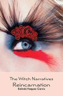 I often talk to authors who have very little say in their covers, but today I’m hosting Belinda Vasquez Garcia, who had total control. The Witch Narratives Reincarnation was featured alongside Unbreak My Heart in Kirkus, and I thought the cover was so incredibly arresting that I had to ask her about it. Here’s Belinda:
“In choosing my cover image for The Witch Narratives Reincarnation, I searched through stock photos. I was looking for a photo I had found on the internet and was using on my website at the time. In keeping with my covens, The Sisterhood of the Black Rose, this photo of a black rose with its leaves flung out like arms was so haunting (right).
 “There are drops of blood on the stem, as though the black rose has been wounded. To me, this bleeding black rose represented Salia, my main character, a 3rd generation witch forced by her mother and grandmother to follow their paths. However, though I found this picture on various photo websites, it was not on any sites of stock photos that could be purchased.
“I was disappointed, but then stumbled upon a picture with an elaborately made up eye. Since Salia longs to be an opera singer, the dramatic effect of the eye was perfect. She is, also, half-Native American so the feathered eyelashes were perfect. And along the eyelid are a cluster of red roses. Salia practices red magic and is not yet a full-fledged member of the Sisterhood of the Black Rose, so the red roses were perfect. I then chose as close to flesh-colored as I could get for the back of the book cover and the bottom quarter.
“Also, the book is the first in a series, and I purchased other similar eyes for the other books to give the series a common look and feel.
“Mm, I have been told that my cover is eye catching!”
Thanks, Belinda! I was completely drawn in by this shot, and I’m glad to hear there are more eyes coming for the rest of the series.
What do you guys think?