Melissa C. Walker's Blog, page 8
December 6, 2012
Photo Friday: Shaving Kits and Baby Cosby Sweaters
Pics from this week include retro shaving kit, coffee, Christmas trees and a baby Cosby sweater, among other things…

Happy weekend!


December 3, 2012
Cover Stories: The Twisted Tragedy of Miss Natalie Stewart
 Leanna Renee Hieber has some amazing titles, like her latest: The Twisted Tragedy of Miss Natalie Stewart, and the covers have to match those intriguing introductions to her stories. Here’s Leanna to talk about her most recent cover concept:
“I didn’t have a cover in mind, because the cover for the first book, Darker Still [read that Cover Story], went through SO many changes that I just figured I’d sit back and see what the marketing team came up with. In my heart I wanted something Gothic and something that portrayed a historical novel, whatever that might be.
“When I saw the cover, I loved it from the first. It’s beautiful, classy and Gothic. It’s my favourite cover I’ve ever had. I suggested the hair be toned down a bit as Natalie is auburn, not red, but I think the red ended up staying as it matched the red in the other parts of the cover.
“There was just a font change, and I couldn’t have known about the beautiful sheen on the cover, or the beautiful wallpaper interior. Those are wonderful touches.
“I really adore this cover. The subtle wall-papering across the whole book is so lovely. Even the spine is gorgeous, all the details on the inside and outside make it really special and I think it truly stands out. It really fits my Gothic voice as an author. (And as someone who owns 10 black corsets. I’m not kidding). Lots of folks have asked if it was me posing on the cover, which made me laugh. While I do have several corsets just like that, it’s not me.  ”
”
Thanks, Leanna! I love the wallpapering and the title treatment on this one the most. They feel like very thoughtful parts of the package.
What do you guys think?
PS-Trailer!
November 29, 2012
Photo Friday: Coffee, Perfume, Cat Tents
A few pics from my week, which included an olive boat, beverages, eyebrow care and babies, among other things…

Hope you had a fun one!
November 26, 2012
Cover Stories: The Almost Truth
 Eileen Cook shared her new paperback cover for Unraveling Isobel last week, and now she’s on tour with the GCC, here to share the cover of her latest novel, The Almost Truth!
“I am so fortunate to work with the team at Simon Pulse. They’ve given me the best covers. For my most recent paperback release, Unraveling Isobel, they’d redesigned the cover to reflect the romance angle of the book (read that Cover Story). I knew with The Almost Truth they would want to have something that has a similar feel.
“When I saw a draft of the cover I was thrilled. I loved the fingers crossed behind her back. I thought that hinted at how Sadie, the main character, has a very ‘flexible’ relationship with the truth. She’s a bit of a con artist and not beneath telling a story to get what she wants. The problem comes when she’s told some many stories she’s not sure how to get back to the truth.
“The models were live (my editor even sent me some behind the scenes photos on my phone), then they were put onto a stock backdrop. It’s a small detail–but I love how her nail polish exactly matches the word ‘almost’ in the title.”
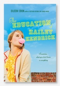
Thanks, Eileen! 1. I love tiny details like the matching polish! 2. I think it’s really cool that Simon Pulse is repackaging the books to give them a new shot at a different audience. 3. They also repackaged two of Eileen’s books, The Education of Hailey Kendrick and Getting Revenge on Lauren Wood, into a single volume called Used to Be, with a cover like these new ones! Here are those to covers, and the new package:


Some readers commented that the new covers are a little less unique, and I agree, but I also think they can reach more people who are looking for the love stories that Eileen writes. Plus, I love a coherent feel for covers — it makes them so great on a shelf.
What do you guys think?
November 19, 2012
Cover Stories: Unraveling Isobel paperback
 Eileen Cook is here because she recently got a cover redesign that I really love! She shared its hardcover Cover Story last year, and she’s (paper)back, haha:
“The paperback version of UNRAVELING ISOBEL came out the end of October and has a shiny new cover. When I was shown the original hardcover design (below right) I was thrilled. Isobel, the main character, is an artist and the artwork on the cover matched how I imagined her style. I liked that the model’s art was slowly encircling her wrists- it hinted at the feelings she has of being trapped. Feedback on the cover from readers was mixed. Some loved it, but others didn’t feel that it matched the book. When we began to discuss the book coming out in paperback my editor and I discussed the idea of having a different cover.
 “The team at Simon Pulse is great at including authors in the design process. We talked about what were some of the strong elements in the book that we could highlight with the new cover. We wanted to make sure readers knew the book was contemporary and had a romance. The art department also wanted to create a consistent look with some of my other covers including USED TO BE and my upcoming book, THE ALMOST TRUTH.
“My input was that I prefer when the models faces aren’t shown as I like readers to have their own idea of what the characters look like and not have it decided for them in the cover art. I was also interested in having something that hinted that the story took place on an island. The setting in this book was important to me. I set it on a remote island off of Seattle. I live in the Pacific Northwest where we have all sorts of small islands and they have a unique feel. There’s something about being on an island that is isolating, but also special. Like a time out from regular life.
“When they sent the proposed cover I fell in love. It highlighted the romance element and also the design elements I wanted to include. It’s hard to decide between the hardcover and paperback covers, I’ll be really interested to hear what readers have to say.”
You heard Eileen! Okay, I like both covers, and I love the artsy indications of the hardcover, but I give the edge to the paperback because it’s more romantic, and because I LOVE her dress on that cover. Too shallow? Oh, whatever, covers are looks-based!
What do you guys think?
November 12, 2012
Cover Stories: All You Never Wanted
 Today, a special treat! Adele Griffin is here to talk about the cover for her new novel, All You Never Wanted, and she’s joined by her cover designer, Sarah Hokanson, in a Q&A. Here we go:
Did you picture your cover while you were writing?
AG: I had a really weird bad idea of two girls sitting in a chair and the girls are almost joined.
SH: After reading the initial first draft of the story I knew the jacket needed to be really dramatic and rich in feeling. I had been told by the editor that she and Adele both felt that the sisters should be featured together on the front cover. I found an image of two girls that seemed perfect at first but, then anyone who saw the image asked if the girls were lovers?! An image of sisters being sisterly in a dramatic way was going to be harder to find then I thought!
Did your publisher ask for your input on the cover design before the art dept started working?
AG: Yes, I think in early days I scrawled my bad joined-girls idea on a napkin and I can only hope my editor just threw it away before showing the designer. Ack, embarrassing.
SH: I do remember the editor showing me Adele’s little napkin drawing! I have to admit I did get a little nervous when I saw it and thought “Oh no this author is going to be hard!” But—to my relief she was a dream author to work with—and ultimately we had the same vision for the cover.
What did you think the first time you saw your cover?
AG: I’ve never seen such a beautiful cover. It was perfect the first time. I don’t think that had ever been my thought since I saw the cover of the hardcover of a book I wrote called Amandine, all the way back in 2000.
SH: Wow! Thanks Adele.
Did the cover change much from the original version you saw?
AG: When we got the beautiful blurb from Sara Zarr, and we figured out a tagline for the back, I saw a few different versions of how Sarah was working with it.
SH: Initially we wanted to put the quote from Sara Zarr and the great tagline “One Sister Has It All, The Other Sister Wants It All” on the front cover. But, I had a really hard time making all that copy work together on the front. In the end I do think we all came up with a great solution by putting the tagline and quote on the back cover. [See the full wrap, below]:

How did you find the cover image?
SH: I was hoping not to have to do a photo shoot so, I kept searching for two girls together until I found this great image of one girl alone that I thought perfectly captured the character Thea. She was pretty but, distraught and kind of insane in a rich girl kind of way. I then started searching for a photo of the other sister, Alex, which I thought would be impossible because her hair is talked about so specifically but, it was a Christmas miracle—I found the perfect photo of Alex! It was at this point I really started to think about the jacket as a whole package. I was lucky enough to find two beautiful photos to capture the essence of the story’s characters so well. I didn’t want to give up either photo. So, why not make two great photos—one great jacket!?
How do you feel about the cover, in the end?
AG: While at first I loved the differences in each image, I think the beauty of these dueling images is that they are both projecting the same themes of rivalry and seduction and power and empowerment, through two very different voices. It’s a really smart, thoughtful cover on so many levels. Oh and I love the chandelier flaps. Such a brilliant touch– especially if you’ve read the book.
SH: All You Never Wanted was definitely one of my favorite books to work on this year. A great story always makes my job a lot easier and definitely more inspiring!
AG: Smiling!
Thanks, Adele and Sarah! Such fun to hear from both sides, and this cover? Chillingly awesome, especially the full wrap.
What do you guys think?
PS-Don’t miss Adele’s Cover Story for The Julian Game.
November 7, 2012
Win-It Wednesday: Your Choice of Tara Altebrando e-Books
The winner of Dear Teen Me is… Macy! She stacked the comments, which was totally legit, and it worked! Yay! Send me your address, M.
Now, the only thing I can say about how inconsistent Win-It Wednesday has been late is: Sorry! I’m working on a ton of stuff (and a new book!) so I’m just… behind.

But here’s a good one: Yesterday I posted about how Tara Altebrando’s first two novels are now e-books with new (amazing) covers, and how proceeds from these e-books through the end of the year are going to Hurricane Sandy relief. Well, I’ll buy a copy of either book (What Happens Here or The Pursuit of Happiness) for one winner this week. Yes, that does mean you have to have an e-reader (or a plan to get one).
To enter to win, just leave a comment telling me which new TV show of the fall is your favorite. (Mine is NASHVILLE–swoonsville all around and baby June loves the country music!) Oh, also tell me which book you’d choose (read about them here).
Good luck! I’ll choose a winner next week, or thereabouts.
November 6, 2012
Cover Stories: Tara Altebrando’s New e-Books
You guys! Tara Altebrando has done something awesome: She’s releasing 2 of her early titles on e-book, indie style, and I could not be more exited, for 2 reasons:
1. I’ve only read Tara’s later books, and they are SO GOOD that I can’t wait to read these.
2. The Pursuit of Happiness is set on the Jersey Shore and Tara herself grew up on Staten Island — both ravaged by Hurricane Sandy — so through the end of the year, all proceeds earned on her books will go to Sandy relief.
How great is that? Tara is here to share the Cover Stories for the new e-books of The Pursuit of Happiness and What Happens Here. (I’m buying my copies TODAY.)
“I think that enough time has passed that I can finally admit that I liked the original covers for these books okay. But really just okay. [See original, left, vs. new covers, right, below.]


“The Pursuit of Happiness was one of the first four young adult novels that MTV Books published back in 2006 and they were all given the same ‘look’ in terms of font treatment and also a summery sort of vibe. I always felt like there was a different/better cover involving the silhouette art that plays such a big role in the story. The main character, Betsy, is having this horrible summer because of a family tragedy but her summer job is at a colonial re-enactment village and she discovers a passion for cutting old-fashioned paper silhouettes.
“A lot of the reviews of Pursuit back in the day talked about how the book was surprisingly moving and powerful and well written…and how you never would have known that from the cover/packaging. That always irritated me! But yes, of course people really do judge books by their covers.
“This ebook repackage was my chance to give Pursuit the cover I think it should have had the first time around. There! I said it! I am officially in love with this cover. I have half a mind to get a hard copy of this version of the book printed up on demand just so I can hold a copy of the book bearing this cover in my hands. (Oh! And I should mention that the covers are embedded in these ebooks; not all ebooks include cover art but these do.)


“As for What Happens Here, I think the original cover was cool and dark and true to the book, but I am not sure it was accessible enough? No matter. I’d originally wanted to call that book Exploding Hearts because which makes sense if you read the book—which is about a devastating event that breaks open the main character’s heart in many ways—but I couldn’t get that title through editorial approval. I didn’t want to change the title in this repackage because I always thinks that’s confusing, but I was excited that my designer friend (Peter Lutjen) and I found a way to bring that exploding heart imagery into the new cover.
“As you can tell, we set out to give the two covers a shared look, which I thought might be tricky since the tone of the books are so different, but Peter nailed it. I love that the two covers are technically quite similar but emotionally very different.
“I’ve joked often that when you see your book cover (handed down from the publisher) for the first time, it’s like seeing a baby you have given birth to for the first time. You’re like, ‘Really? That’s what it looks like?’ So this time around, it was really fun to have these covers designed to my own specifications. I loved these babies the second I laid eyes on them. ”
I love this idea, and I just may do the same with some of my early books, if I’m able. And the new covers are head and shoulders above the original ones, I think — I love simple silhouettes with a pop of color. You guys?
PS-You can read the original Cover Story for What Happens Here here.
November 2, 2012
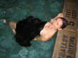
Photo Friday: Stormy Halloween
So much destruction hit near us in this terrible hurricane week, and we’re lucky to be safe and sound, with lights even!
This one image caught me on twitter on Monday night–the historic carousel on the Brooklyn waterfront, meticulously restored just last year:

And then, on Wednesday, I got to have the image of people on my block, standing outside with candy and costumes and a sense of togetherness. New York always rises to the occasion. Baby June the strawberry enjoyed herself quite a bit too:

Happy weekend, guys. Here are some ways to help Sandy victims from anywhere in the world.
October 29, 2012
Cover Stories: Something Wicked
 The cover for the anthology of nightmares, Something Wicked, makes me wish I had a Halloween costume just like this. Kelly Parra has a short story within its pages, and she’s here to talk about the cover:
“When I first saw the cover for Something Wicked I thought, ‘Wow, eye-catching!’And that’s what I really like about covers. I want them to be unique and give you a little punch at first glimpse.
“Buzz Books’s first young adult anthology Prom Dates to Die For was shot with a model (right).  My first story with teen supernatural hunters Jaz and Blake were introduced in my story ‘Darkness Becomes Him.’ They did an entire behind-the-scenes video with a teen model. I really enjoyed that. This time I believe the girl with the painted face may be a stock photo. But I can tell the choice really gave the spooky vibe the publisher was going for.
“I’m very pleased with the Something Wicked cover. The model gives a paranormal creepy feel with the death mask, yet the pink flowers and dress make it just a bit feminine. We do have one male author in the collection, however, you can tell this anthology wants to entice female readers of YA paranormal.”
Thanks, Kelly! I have to say that I think the cover is stunning — I seriously want that look in my closet for Wednesday. It’s very Day of the Dead, right?
What do you guys think?