
Melissa C. Walker's Blog, page 16
April 18, 2012
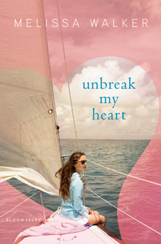
Win-It Wednesday: Unbreak My Heart
[image error]Loved hearing about how you Rocked the Drop last week! The winner of that ARC is… Jasmine Rose! Send me your address, JR.
This week I’m giving away one more ARC of Unbreak My Heart. To enter to win, just tell me about your last library visit. What did you check out? I have to admit that the library closest to me has been under construction for two years so I’ve been buying books instead, but that’s definitely got to slow down, judging by my bank statement. I need my library back! I miss it!
So tell me about yours. One commenter will win the ARC next week!


April 16, 2012
Cover Stories: Take a Bow
[image error]The fantastic Elizabeth Eulberg is here today to share the story of her latest cover. Take a Bow is told in four points of view (so hard!) and I’ve heard only raves about how awesome this book is (MTV’s Crush gave it a standing ovation). YES! Also, the cover is blindingly eye-catching, no? Here’s Elizabeth:
“I usually don’t start thinking about the cover until I’m almost done with the book. I didn’t really have a clear idea of the cover until I had the title (the book was untitled for awhile). Then once we settled on Take a Bow as the title, I automatically envisioned a cover very similar to the final cover. It’s really freaky how in sync the book designer (the fabulous Elizabeth Parisi), my editor (David Levithan), and I are. We’ve been on the same page for all of my books. Just the other day, I told David my thoughts on the cover for my next book and they were already mocking up covers with the exact same concept – scary! The only difference between my idea for Take a Bow and Scholastic’s was that I was picturing four people “taking a bow” to reflect a key scene in the book, but I think the one person is more dramatic and personal.
“I really don’t like having faces on covers of books, it’s just a personal preference I’ve always had. So when David called me to tell me their idea for the cover, my first thought was ‘that’s exactly what I was thinking!’ but I only wanted to see the back of the head. When he said they were going for a side view, but in shadow, I was a little hesitant. But then I got to have an opinion on the model who’d be on the cover, which was a huge treat. And, OF COURSE, David, Elizabeth, and I all picked the same person. There was a photo shoot with the model we selected. She really is perfect and I’ve only seen two photos from that shoot, but can only imagine all the amazing shots they got.
“I LOVED the cover when I saw it. I realize how extremely lucky I am to have loved all my covers. Back when I was in publicity, I got to be part of the jacket committee so I know how many opinions, rightfully so, go into deciding a cover. So I do always hold my breath when I open up a book cover for the first time. I loved this one right away. The first version was a little different than the final version, the character had on a different outfit and the shot was further away. In the end, we decided to go with a different shot of her closer up, so it felt more personal. When I opened up the second cover (which ended up being the final cover), I was really nervous since I liked the first cover so much. But I think the second one is so much better.
[image error]“I should probably mention that my nickname is ‘Two Cover’ Eulberg, because for some reason, I always have two covers for my books, the first cover always ends up changing. And, without fail, I get nervous when the cover changes and then I always like the second one better. I can’t even look at the original cover of The Lonely Hearts Club anymore. That was another instance where I was a nervous wreck about the cover changing, then I suggested using Abbey Road as inspiration (but no faces!) right at the same time Elizabeth Parisi walked into David’s office and recommended the exact same thing.
“David’s great about asking me my opinion on the covers. The only comment I had on the final cover was that I thought my name placement was weird. It really threw me when I first saw it because it wasn’t on the bottom, where it had been for my first two books. I don’t know why this one thing caught my attention, but after sitting with it for awhile, I didn’t mind it at all. And I know having your name above the title is a compliment to the author, but I guess I wasn’t expecting it!
“I have all my covers up on the wall where I write. As soon as I got the final cover, I hung it up on my wall and would look at it often. I’ll even admit to hugging it a few times (because I’m a nerd like that). I really think it perfectly captures the book. Especially the pressure these characters face competing for different performance spots and the feeling that they are always auditioning or performing.”
Thanks, Elizabeth! You know, I wanted a girl’s back for my first Violet on the Runway cover (here’s that Cover Story), but they insisted front-facing was the way to go and I ended up loving it. This side profile, though? Awesome in so many ways. You can see her nerves, but also her poise; her performance hair, but also her personal style. I love it.
What do you guys think?
April 11, 2012
Win-It Wednesday: Rock the Drop and Unbreak My Heart
The link for more information is here, as are the bookplates for the books you plan to drop! In addition to Rock the Drop originators, Readergirlz, Figment is also a big supporter of #rockthedrop (tweet that when you drop and follow it all day for fun drops from amazing authors, like, um, Sarah Dessen–Chapel Hill people, get ready to hunt for her books!).
Actually, here's a bookplate. Snag it:
And now, leave a comment telling me what book you dropped/plan to drop and where. Then you're entered to win an early copy of Unbreak My Heart!
PS-Last week's winner is… Lucia! Send me your address, L. And the rest of you should still be liking Bloomsbury Teens on Facebook (more chances to win, naturally). Plus their theme this month is quite striking, if I do say so myself. Haha.
April 9, 2012
Cover Stories: The Julian Game
[image error]Adele Griffin's The Julian Game was released in 2010 with a raucous cover that I always meant to share here. Much belatedly (my fault!), she's showing some early cover options for that book and a bit about the story. Also, I'm psyched that she's got another book coming out this year (All You Never Wanted, October).
Here's Adele:
"I had no cover ideas at all. For one thing, the original title of the book was MELLEN IN SPRING which gives me such big shivers of Terrible Title-ness. What was I thinking? It sounds like a strange, Little House on the Prairie story. That early draft was so different. Mellen was short for Mary Ellen, who then became Ella. And the story was more like a 'bad influence' type, with Mellen getting Raye to do awful stuff for her. So, no cover had jelled. Maybe: two girls in a red convertible? More shivers!
"My publisher went into the bat cave slash think tank, and came up with a lot of options. I loved so many of them. It was during the summer, and my family was on vacation in Fire Island, so we printed them up and put them on the kitchen table. And people would walk by and say–'I love that one! No, that one!'
"Penguin's art department is, in my mind, very 'mad genius in the lab'– and my last cover with them was for my middle grade 'Vampire Island' series. I'd been over the moon for their choices there. All I'd said on VI was 'What do you think about making the vamps sweet but streetwise?' and they came back with pure gothy delicious. So I was prepared to be bowled over. And I was!
"I got to make suggestions for the cover, which was fun. I didn't bring much– really all I brought were the crayons. I knew the book so well, and I owned that blue wig (Halloween costume!) So I said: how about bright blue hair and bright green the gloves on the black-and-white, dominatrix image– that was the one I thought was the sexiest. And then the bathroom scene was a later draft chapter, so we checkered the floor, a la Fulton's bathroom.
"Then Nancy (my editor) came back and said– but Raye never wears those gloves. So we edited a couple of scenes that motivated her to put them on once. For logic.
"We had one little back-and-forth with a cursor button. Like that arrow that shows you where your mouse is? It was on the edge of the title, as if you could click the title. I wasn't feeling it, and even though it was popular within the departments (editorial, art, marketing), they very graciously took it off. I was so appreciative; because I knew I'd always be staring at that cursor, like a paint scuff or something.
[image error]"The cover was a stock image. I used to collect my jackets because they were almost always original art. Now it's the rare exception. But it's amazing how much emotion can be packed into covers, I love walking along the bookstore table and seeing so many visual stories.
"The book is about cyberbullying, and I've come to see the blue wig as representing a person who is more guarded, defensive and careful about her cyber-presence– while the gloves belong to the aggressor, the manipulator."
Thanks, Adele! I love being able to see and show so many versions of this cover. The final has all the best elements: blue hair, green gloves, black-and-white checkered floor. It makes the image more 3D and has that extra pop. I'm into it. And this cover definitely is a double-taker, as in, "Whoa, what is that book?"
What do you guys think?
April 6, 2012
Photo Friday: Harvard!
I went to visit my friend Ruthie at Harvard this week. It was very exciting. That place is the original College. Two standouts were…
Homemade Pop Tarts in the library cafe:

And Mufasa evil empire reading chairs:

Here's to friends since first grade! Happy Friday!
April 4, 2012
Win-It Wednesday: Unbreak My Heart
Last week's winner of the incredible Boy21 is… Maggie! Send me your address, M.
It's April; it's time. Unbreak My Heart comes out May 22, and it's taking over the Bloomsbury Facebook page this month. Yay!
Over the next few weeks, I'll give away a signed ARC (Advance Reader Copy) each week. This week, your task is to "like" the Bloomsbury Facebook page… and you'll have chances to win copies of the book there, too, as well as copies of lots of other fantastic books, so it's really just a win-win-win-win-win.
After you do that, just leave a comment here telling me you're a fan (I'll trust you). I'll choose one winner among commenters. Oh, and +1 if you also follow @bwkids on twitter (because you'll get news about the book, and other great stuff, there too).
PS-If you want a clue about what next week's task will be, click here.
Good luck, you guys!
April 2, 2012
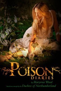
Cover Stories: The Poison Diaries
 The Poison Diaries by Maryrose Wood is based on a concept by The Duchess of Northumberland. See? I'm already enchanted. Here's the effervescent Maryrose to talk about that cover:
"[As I was writing], mostly I was thinking about plants. Plants and more plants! But there are already quite a few book covers out there with plants on them. They seem to skew toward spooky tendrils, like the Beautiful Creatures cover, or close-ups of luscious blossoms, like New Moon. I knew The Poison Diaries needed a cover that would appeal to fans of gothic, supernatural and romantic YA, but would also communicate the uniqueness of the poison plant concept. Thank goodness it was not up to me to come up with a solution.
"While writing The Poison Diaries, I read quite a bit about the English Romantic poets. In fact, they're one reason I chose to set the book in late 18th-century England (that and Wuthering Heights, of course!).
"My boyfriend and I went to see an exhibit of William Blake's illustrations at the Morgan Library & Museum. There were all these amazing, trippy drawings, with terrifying winged angels and so on. The hallucinogenic feel of it was inspiring to me. (You can check out this exhibition online.)
"I remember sending my editor, Donna Bray, some links to those images. I'm not sure they were useful in her thinking about the cover, but I certainly drew upon some of that imagery when I was writing. People think writing is all about the words, but I find visual research very stimulating when I'm working on a book. Thank you, Google Images.
"There was a day-long photo shoot with photographer Gustavo Marx, a model and tons of props, which I think were mostly vegetative in nature. I wasn't at the shoot, but both Alessandra Balzer and Donna Bray of Balzer + Bray were there. Apparently the craft services table was to die for.
"Before the shoot I was asked my opinion about what sort of dress the model might wear. Imagine! Wardrobe advice from me, who wears the same three tank tops in rotation until winter comes, and then adds a sweater! But we talked a bit about clothing styles of the period. There's scene in the book where Jessamine puts on a beautiful dress that had been her mother's. It's described as having kind of a wedding dress feel. They ended up putting the model in a white dress that has lovely, simple, Regency-style silhouette. Perfect!
"The first, early draft of the cover was a full body shot of the model (right), semi-reclined on the ground and surrounded by greenery, as if she were in a garden. It was beautiful, but upon reflection it was decided that it seemed a bit too pastoral and sweet. The book is edgier and more mysterious than that. It's about poison, after all! Not Herbal Essence shampoo. Although I do love my Herbal Essence. It's the smell of my teen years.
"I loved [the final cover] but I was surprised, too, because the first shot I saw had been all about the dress and the props. In the end they used a tight close-up of the (gorgeous) model's face, and you can barely glimpse what she's wearing or holding.
 "But nothing goes to waste. The Poison Diaries was conceived as a trilogy, and different photos from that shoot will be used for the other two covers (see the second cover, for Nightshade, left).
"The penultimate version had a slightly different type placement than the final. I thought was a bit hard to read. I asked them to have another look at it but they were already fixing it. That's the nice thing about working with creative geniuses! They miss nothing.
"I love the final cover. I think it's beautiful and mysterious and the poison-green color of the logotype is perfect: natural but slightly unnatural at the same time.
"I also really love the back cover copy and type treatment. The tag line for the book is, 'In the right dose, everything is a poison. Even love.' The idea of love as the ultimate poison is lifted from the book, but to turn it into a nice punchy tagline was genius!
 "I also was tickled to find the UK cover online one day (right). It's the same photo but with a totally different design treatment. I think this is a neat example of the amazing contribution cover designers make to a book, and how books are packaged differently to appeal to different markets."
Thanks, Maryrose! I love the way nature encroaches on each of these covers, even the very up-close final version. The leaf gives the whole cover a deliciously sinister feel.
What do you guys think?
Check out a past Cover Story from Maryrose Wood, too, because it's full of fairies and magic.
Check out the trailer too:
March 31, 2012
Teen Author Festival: Giant Signing
This happens tomorrow! Be there.

March 29, 2012
Rock the Drop: 4/12/12

Guys, this is happening again and it's THE MOST FUN DAY EVER. Seriously.
Once again, readergirlz and Figment are going to ROCK THE DROP in honor of Support Teen Lit Day, 4/12/12. Here's how you can get involved:
* Snag the above banner, created by the uber-talented David Ostow and add it to your blog and social networks, linking back to this post to share the love. Proclaim that you will ROCK THE DROP!
 * Print a copy of the bookplate, right, and insert it into (or affix it to the front of) a book (or 20!) to drop on April 12th. Leave the book(s) in a public spot (park bench, bus seat, cafeteria table). Lucky finders will see that the book is part of ROCK THE DROP!
*Plan to snap a photo of your dropped book and post it at the readergirlz facebook page. Then tweet the drop at #rockthedrop with all the other lovers of YA books.
I bet we can get #rockthedrop trending. What will you drop?
March 28, 2012
Cover Stories + Win-It Wednesday: Boy21
[image error]This week's W-i-W is a Cover Story too! Matthew Quick is here to talk about the cover of his latest (and incredibly great) novel, and one commenter will win a copy! (US only on this one).
So in honor of a certain basketball tournament (in which my Tarheels are no longer competing, sigh), here's Matthew:
"The idea I pitched for the cover of Boy21 was a shot of Finley and Russ from the neck down. Finley would have been in his team uniform and holding a basketball. Russ would have been in his space costume and holding his makeshift astronaut helmet. I still think that would have been a good cover, but I have to admit that what the designer came up with was much much better. Maybe this is why I am a fiction writer and not a jacket designer!
"When I saw the design, I yelled, 'YES!' Alicia [his wife] came running into my office to see why I was yelling, looked at the image on my computer screen, and said, 'That's so much better than what you pitched them. That cover is amazing! Amazing!' It was a happy day.
"At one point they changed the photo of Russ, who is depicted on the cover. The photo they swapped in featured an older-looking teen who appeared harder and maybe even menacing. It didn't look like Russ at all. I immediately wrote an e-mail explaining why the original photo captured Russ perfectly. The teen on the cover now has an intensity–especially if you look into his eyes–but he also looks a little vulnerable and as if he would be a complex person. Russ is a very complex character, who is troubled, but is also wise and compassionate and intuitive. I believe there was a meeting regarding which photo to use and, happily, everyone at Little, Brown agreed.
[image error][Take a closer look at his face, and those energetic illos, right.]
"I absolutely love this cover. It's perfect for the book. Basketball is mentioned in BOY21–the game provides the framework for the plot–but it's not a basketball book, per say. It's a book about friendship, mental health, and escaping the cycle of poverty; it's about two troubled teens meeting at precisely the right time and benefiting from simple things like conversation and stargazing. The doodles that cover Russ's face seem to represent all of the swirling thoughts that he has in his mind. (Finley has swirling conflicting thoughts too.) Also, both Russ and Finley are hiding behind coping devices–Finley's silence, Russ's obsession with outer space–and the doodles covering Russ's face are symbolic of that. I also appreciate that the cover is mysterious and hard to peg genre-wise. This isn't a book that's easily labeled."
Thanks, Matthew! I also asked Matthew about the fact that his cover features an African-American character from the book, Russ, which interested me especially because of the whitewashing controversies that have happened in the past with book covers. And he pointed me to this interview on Diversity in YA with his editor, Alvina Ling, who says, "…for the upcoming YA novel Boy21 by Matthew Quick, the face of a black teen is featured prominently on the cover. There are two protagonists in the book, one white and one black, and the narrator of the book is white, and yet when two versions of the cover were shown at our jacket meeting, one with a white teen, the other with a black, it was the black teen that was unanimously chosen. I found that heartening."
So, extra cool. What do you guys think of the cover? I loved, loved, loved this book, and you guys will too. I'll choose a winner from the comments at random next week.
PS-The winner of last week's W-i-W, for The Difference Between You and Me by Madeleine George, is… Brianna! Send me your address, B (you magazine addict! I love it.)
PPS-Trailer!


![[image error]](http://www.melissacwalker.com/wp-content/uploads/2012/04/UnbreakMyHeart_revised-242x3481.jpg)
![[image error]](http://www.melissacwalker.com/wp-content/uploads/2012/04/TakeABow.jpg)
![[image error]](http://www.melissacwalker.com/wp-content/uploads/2012/04/rtd-bookplate.jpg)
![[image error]](http://www.melissacwalker.com/wp-content/uploads/2012/04/julian-game.jpg)
![[image error]](http://www.melissacwalker.com/wp-content/uploads/2012/04/julian-selection.jpg)
![[image error]](http://www.melissacwalker.com/wp-content/uploads/2012/04/julian-selection-2.jpg)
![[image error]](http://www.melissacwalker.com/wp-content/uploads/2012/03/boy21.jpg)