
Melissa C. Walker's Blog, page 17
March 26, 2012
Cover Stories: Preloved by Shirley Marr
[image error]Today, Shirley Marr is here to share her cover for Preloved. It's such a sweet title, right? And the concepts are as emotional as the final cover (fully pictured below). Here's Shirley:
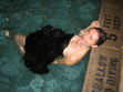
[image error]"I'm a very visual and 'big picture' person, so with every new novel I start, after I come up with the storyline and title (which I make happen at the same time), I look around for an image which I think best sums up what I am trying to write. Preloved is a vintage-flavoured romantic ghost story with themes of second chances and second hand things. I found this particular image (right) and it contained the theme, motifs (whimsical vintage bike!) and 'feel' I was going for.
"So yes, I make myself an 'unofficial' cover. I don't go as far as putting my own name on it, but the image itself is as influential to me as any notes and research I collect, I will often glance at it for inspiration.
"I didn't have any input into the covers that were created. The cover decisions of my Publisher are very sales and marketing driven. The Marketing Team always give input during meetings in terms of a cover's marketability. The Editorial Team and the designer will provide balance by looking at the cover on a deeper level, in terms of it's relevance and relation to the content. I am happy for the initial designs to be done without me. After all, the teams have years of experience in what works well and I trust them to strike the perfect balance. Plus it's also quite exciting seeing someone else's interpretation of my words. It's like waiting to see your baby being born. I like surprises.
[image error]"Honestly, when I first saw my cover, right, I was very surprised! It looked and felt completely different to what I had imagined. I was thinking it would be more 'indie' looking, but it was very 'chick lit.' And very pink!
"My editor Maryann Ballantyne (who is the most patient woman in the world) wanted to hear my honest opinion, so I told her the truth. It didn't help that my last novel cover (for Fury) was very gothic and dark looking so I kinda had very firm ideas about what I was and I wasn't. I told her I wasn't sure 'pink' was very 'me.'
[image error]"The next thing I knew, Maryann had gotten straight onto the designer, Gayna Murphy, to let her know about the cover! And in a matter of hours, Gayna had responded with a new cover treatment. Gayna changed the colour of the cover from pink to orange (left).
"I decided to take a few days to mull things over. When I revisited the original cover, I couldn't help but really see how pretty and delicate the whole thing was. I think my initial reaction was due more to the expectations I had in my head rather than the cover not being suitable. I basically had a completely different image in my head the nine or so months I took writing the novel. Once I got over that, the more I looked at the proposed cover, the more I became used to it and the more I fell in love with it.
"I completely love the cover now. I think the image captures my heroine perfectly, with the ball dress and sneakers. It's reflective of the prettiness and also the edginess and cheekiness, which I think is totally me. It wasn't until I received the actual physical copy in the post that I full understood what Gayna was trying to do. The cover is so unbelievably beautiful in the flesh – printed on matt paper, it is all sepia tones and saturated pinks – like an old tinted vintage print. Which is exactly what the novel is about – ghosts of the past and nostalgia. I love how the necklace that plays a major part in the novel is on the cover in a very subtle way. And I love how the sunspots add that touch of whimsy. Walker Books MD – Sarah Foster – is really big on getting all of the designers to read the entire book they are working on. And it really shows.
"The lesson I have learnt – just because I have a concept I feel is right for the book, doesn't mean someone else can't come up with something as perfect too. I can't thank Gayna enough.
"And you know what, I reckon I can fully 'do' pink!
"Without further ado, I present to you my final cover:
"And here are all of the other proposed covers! The yellow cover with the girl with the paper umbrella was the second choice. Without giving away any spoilers, I can say that Gayna has done her research and I really like all of them. For some reason I really love the one with the cassette tapes! But I think that the right cover was chosen. What do you think?
[image error] [image error] [image error] [image error] [image error]
"Thank you so much Melissa for having me on your blog!"
Thanks, Shirley! I absolutely agree that the final cover is best, though you have SO MANY great concepts here. Still, tulle and Converse? I'm in. Seriously. You had me at tulle.
What do you guys think?


March 24, 2012
NYC Teen Author Festival 2012
[image error]Just a reminder that the NYC Teen Author Festival starts on Monday!
Full info, with schedule and exciting details, on the Facebook page.
There are a bunch of great events with incredible authors. Here are mine!
Monday, March 26 (Mulberry Street Branch of the NYPL, 10 Jersey Street b/w Mulberry and Lafayette, 6-8):
Plotting Dangerously: Doing What it Takes to Find the Story
Coe Booth
Jen Calonita
Paul Griffin
Deborah Heiligman
Melissa Kantor
Morgan Matson
Kieran Scott
Melissa Walker
moderator: David Levithan
And on Thursday morning 3/29, I'm at the Brooklyn Public Library with an incredible lineup:
Brooklyn Public Library, central branch, Grand Army Plaza
Kate Ellison
Gayle Forman
Melissa Kantor
Barry Lyga
Michael Northrop
Matthue Roth
Victoria Schwab
Melissa Walker
Sunday April 1: Our No-Foolin' Mega-Signing at Books of Wonder, 1-4, with 60+ authors! I sign at 3:15pm.
Hope you can come to something!
Go, go, go!
March 23, 2012
March 22, 2012
Win-It Wednesday: The Difference Between You and Me
[image error]The winner of The List by Siobhan Vivian is… Edna! Congrats–send me your address, E. (The book is way good.)
This week, I'm giving away an ARC of The Difference Between You and Me by Madeleine George (one of my favorite YA authors, for real). This is Madeleine's second book (I loved her first, Looks), and it delivers. You will truly care for her characters.
To enter to win, tell me this: Do you read print magazines? Subscribe to any? Which ones? I still love a magazine, but I know it's a dying form. I get a ton delivered, and I always get excited when I stumble upon a pile of magazines (like this one at my accountant's office).
Good luck! I'll pick a random commenter next week.
March 19, 2012
Cover Stories: Buried, a Goth Girl Mystery
 Linda Joy Singleton has been here to share her Cover Story for Dead Girl Walking, and she's back to talk about her latest novel, Buried: A Goth Girl Mystery:
"For this cover, I actually thought they would show more of a Goth girl. I wanted something with a girl in dark flowy clothes, netting, piercings combined with a mysterious setting.
"Flux usually asks me for suggestions and I did a search on Goth girls and sent some of my favorites in as examples. I wanted something beautiful, edgy and mysterious.
"When I first saw the cover, it was a surprise, not what I visualized but dramatic and mysterious. I liked it! I think early on they looked at my suggestions, then did their own thing. I trust them to be the professionals and to know what's best in a cover. I always ask myself is my adult taste the same as a teen? I'm not sure if it is, so I'm glad to have professional making the final decision. I'm pretty sure it was a stock photo with some artistic tweaking to get the full mysterious look.
"The cover shows a goth girl in a frame, which represents my heroine being pushed into a tight corner and trying to break out from how society expects her to behave, yet also caring about her family. The look of shock could represent the moment she finds a dark secret buried in a grave."
Thanks, Linda! I think I've gotten so used to close-up covers that this one takes me a moment to process. It almost has an adult novel feel to it. I do think the mystery comes through, and there's no doubt that it says supernatural. What do you guys think?
March 16, 2012
Photo Friday: Shamrocks!
These are available at my local deli. Kind of magical; kind of a scam, right? It's all in how you look at it (I bought one):

Happy Weekend!
March 15, 2012
Win-It Wednesday: The List by Siobhan Vivian
Oh, Wednesday, I always seem to miss you. Hi, Thursday! Last week's winner of PG Kain's Commercial Breaks is… Alicia Marie! Send me your address, AM.
 This week, I'm giving away an advance copy of Siobhan Vivian's The List. It's out April 1st, and it's already racked up three starred reviews (and counting…). I am reading it right now and I can hardly get to my laptop to do this post. Riveting, people. And smart and interesting and truthful and complicated.
To enter to win, tell me this: Do you re-read books? If so, what's the last book you re-read? I'm just curious.
I'll choose a winner at random next Wednesday. Good luck!
PS-That Cover Girl did a fascinating interview with Siobhan about the cover and it says a lot about what's inside as well.
March 12, 2012
Cover Stories: And Then Things Fall Apart
[image error]Arlaina Tibensky's debut novel sounds like something I need on top of my pile. ("Sylvia Plath and an old typewriter usher an angsty virgin through the worst summer of her freaking life.")
Also, the cover spoke to me. So I spoke to Arlaina about it. Here she is:
"I had this fantasy that the cover of And Then Things Fall Apart was going to be a newer, updated version of a classic The Bell Jar cover, like the one with the creepy letters and the rose, or the Victoria Lucas (Sylvia's pen name) with the dark purple letters, or even the cool one with the spirals. Like one of those, but 'updated, for the youth of today!' (See right.)
[image error][image error]"I mentioned my 'Updated, for the youth of today!' idea to my editor… and we never spoke of it again.
"At first first first, I thought the cover was a little too cute. But too cute or not I fell in love, immediately, with the typewriter. The BLUE TYPEWRITER. And my huge ego loved that my name was right there in the middle. I was also happy there were no bodies on it, no anonymous 'teens' acting 'quirky' in stripped tights and pink hair.
"My editor just emailed it to me and said, 'There it is, isn't it GREAT?!" and I let it sit a little while and then came to agree with her. As I did on most everything she said. It didn't change one iota. They had some placeholder copy at the top that used to say 'Snappy sassy copy here…' That became 'You think you've got it all…'
"It is totally a stock photo! I saw it on an image search on typewriters I was doing for my blog. A friend of mine was reading Good Housekeeping magazine and saw the stock photo in the back for some kind of advice column and assumed it was my book getting reviewed! Until she read the column, of course.
"I adore my cover. I love that it's white, I love that it is a little mysterious. I love that it appeals to a wide variety of readers and also a very specific reader. The book is about so many things; literature, writing, self-examination, virginity, betrayal, love. I think that the image Jessica Handler (the designer!) came up with was really inspired and really represents the book in a way I could never have imagined.
"What's so crazy is that the typewriter on the cover really resonated with me for some reason. I always was very into it and had a real connection with it from the minute I saw it. So… I'm getting ready for the launch party and asked my husband to get some of my vintage typewriters out of storage to bring to Books of Wonder. He brought back two, a brown number and– are you sitting down?– THE VERY SAME TYPEWRITER from the cover. Black and red ink, blue case. Do you have goosebumps? What are the odds?"
Thanks, Arlaina! Love it, love the coincidence (fate?), love the colors on the cover and love the sound of the insides. Always the most important part, of course.
What do you guys think?
March 8, 2012
Win-It Wednesday: Commerical Breaks by P.G. Kain
 The winner of the stuffed Figment tote bag is… Travis! Remind me of your address, T. (Also, I've been meaning to tell you that I sometimes go back and watch your "Blue Eyes" video just to make me smile, and I play that song for Baby June all the time! So I'm telling you publicly.)
This week, P.G. Kain is generously donating a signed copy of his latest, Commercial Breaks. You may have seen the Cover Story on Monday, in all its hilarious glory. So, just leave a comment–there or here–about the cover, and you're entered!
You might talk about illustrated vs. photographic covers, or whether you've ever seen "Bewitched" or "I Dream of Jeannie" (because this cover has a total Samantha/Jeannie vibe), or just where you stand on very pink covers these days. (While remembering that my May cover is pink! Haha.)
So… go! I'll pick a winner next week. Happy We-Thursday.
March 5, 2012
Cover Stories: Commercial Breaks

P.G. Kain is hilarious and very good at Words With Friends, I'll have you know. He also has a great website. His latest middle grade novel is out this week, and he's here to share the story behind that bubbly cover:
"I really wanted the cover to convey the fact that this series is about the world of commercial castings. This is a very specific world. It's not exactly modeling, where you need to be beautiful and it's not exactly acting, where you need to be talented. Someone once told me that to be in commercials all you need is a face. That's true as you see very few amoeba or protozoa selling soft drinks on TV.
"I first imagined a cover that showed a photo of the pristine perfect world of the commercial in the center with a sun-drenched set and a tween model with an even sunnier smile. But then the edges of the cover would be hand drawn in pencil and extend beyond the frame of photo to reveal all of the people, cameras, riggings, etc. that were focused on making the on-set scene look 'natural.'
"[As far as involvement with the design], I was never asked to fill out one of those forms I know other authors get but I sent over many images and talked with my first editor about some ideas. The concept of using a type of collage with Polaroids was developed in house and I sent over images to expand on that idea (below):

"My editor was very generous in showing me drafts. I really scrutinized the cover. It's not about being a diva or making demands it's about being serious about your brand and your business. I ghosted for a best-selling women's fiction author for a very long time and I learned a lot about covers and sales. Often a writer can't recover from a bad cover. Of course, with books for young readers you are always playing a guessing game and working on hunches and experience since no one in the room is really part of the demographic toward which you are marketing. I think that balance of opinion, instinct and experience makes it very difficult to navigate. I don't always do it well. If I did, I would be making a lot more money working at the UN. I always try to watch a clip of Barbra Streisand talking about the making of Yentl and that seems to help as much as I imagine any prescription medication would.
 "When I saw the original cover (right) I thought it was unique. They had gone through many changes and two photo shoots for the cover so I know there was a lot of effort involved. My editor assured me that everyone was in agreement that it was a wonderful cover. As an author, when you see the final image you have to get 100% behind it. Writers have to spend so much of their time marketing and selling their book. It just won't work if you don't have complete confidence in your cover. If you are struggling you can either print out stickers to go over the design and risk the threat of being arrested at a BN or work with a good therapist. I didn't need to do either of these options. I admit I wasn't crazy about the first cover but I was able to get 100% behind it.
"Then I got an email saying they were making some changes and going with an illustrated cover. In tween books we live in a world where the illustrated and photographic compete like Louella Parsons and Hedda Hopper. (Am I dating myself here?) The change to illustrative was a surprise but in many ways it created more possibilities. This happened pretty close to the pub date. I sent over some ideas for illustrators and they chose someone who has a style very similar to some of the artists I suggested. My editor sent me a sketch and I suggested adding a few more 'on set' details and the result was the makeup mirror on the left of the final cover which I think really gives visual context to the iconography.<
"When I saw the new cover (full jacket below) I thought it was cute and that it would totally appeal to my audience. I know this is called Cover Stories but perhaps there should be a spin-off called Spinal Tales; because as much as we talk about covers, spines do a lot of the actual work of getting a reader to pluck you off the shelf. I love the spine of this book. I think it totally catches your eye and looks like the character is peeking around the corner. It reminds me Conrad Hall discussing Rosemary's Baby in Visions of Light where he talks about setting up a shot so that the audience needs to peer into the frame. I think this spine does that and it's a clever, well-executed but very simple design. My three greatest fears are swans, kosher gefilte fish and fonts. The designer did a wonderful job with the fonts mixing two seemingly disparate ones into a composition that is completely cohesive. It's like working with prints. Some people can mix them together beautifully others can't. She can. I can't.
"As much as spines are important so is the idea of scalability. So much of our sales effort happens online where the cover is represented in postage stamp size. I think this cover really works well any size as the two very large white studio lights create an eye-catching element at any size. I have not seen it in the opposite direction but when the cover is blown up on a Times Square billboard I'll be sure to write an addendum.
"I also love the illustration. It's very current but also has a vintage feel. It reminds me of the opening sequences of 'Bewitched' and 'I Dream of Jeannie.' At the end of the day, I love the cover. Early in the morning and in the middle afternoon I love the cover. From about 2:35 pm to 2:37 pm I am in very strong like with the cover but then by 2:38 I am back in love."
Thanks, P.G.! I am fascinated by the stages of this cover–photo shoots to illustrations. I actually think the photo looks a little dated, and I'm glad the final illo has such charm and cheek to it. I have to admit to not always loving illustrated covers, but I think it works really well for middle grade novels, and you're right, this one is totally Bewitched/Jeannie! Also, spine: YES. Her face will totally stand out.
What do you guys think?


![[image error]](http://www.melissacwalker.com/wp-content/uploads/2012/03/preloved-3.jpeg)
![[image error]](http://www.melissacwalker.com/wp-content/uploads/2012/03/preloved-2.png)
![[image error]](http://www.melissacwalker.com/wp-content/uploads/2012/03/preloved-42.png)
![[image error]](http://www.melissacwalker.com/wp-content/uploads/2012/03/preloved-5.png)
![[image error]](http://www.melissacwalker.com/wp-content/uploads/2012/03/preloved-61.png)
![[image error]](http://www.melissacwalker.com/wp-content/uploads/2012/03/preloved-7.png)
![[image error]](http://www.melissacwalker.com/wp-content/uploads/2012/03/loveed-8.png)
![[image error]](http://www.melissacwalker.com/wp-content/uploads/2012/03/teenauthorfest-logo250px.jpg)
![[image error]](http://www.melissacwalker.com/wp-content/uploads/2012/03/book-lover-e1332524129806.jpeg)
![[image error]](http://www.melissacwalker.com/wp-content/uploads/2012/03/diff-between-you-and-me.jpg)
![[image error]](http://www.melissacwalker.com/wp-content/uploads/2012/03/cover.jpeg)
![[image error]](http://www.melissacwalker.com/wp-content/uploads/2012/03/belljarpurple.jpg)
![[image error]](http://www.melissacwalker.com/wp-content/uploads/2012/03/belljardebutante.jpg)