
Patrick O'Shaughnessy's Blog, page 36
June 18, 2014
The Best Performing Sector (Consumer Staples, Part 1)
When Jeremy Siegel and Jeremy Schwartz were doing research for the book The Future for Investors, they wanted to find the best performing stock from the original 1957 version of the S&P 500[i]. What they found wasn’t an exciting technology stock, or a behemoth oil company, but rather a simple consumer stock: cigarette maker Philip Morris (now called Altria Group). What’s more, Siegel and Schwartz found that 11 of the top 20 long-term performers came from the same boring economic sector: consumer staples. The sector is defined by great brands, wide economic “moats,” and above market returns on equity. So how can you use consumer staples stocks in your portfolio? My plan is to answer that question in a multi-part sector series.
For each of the ten economic sectors, I’ll write two parts. Part one will be an overview. I’ll tell a quick history, highlight important companies, and discuss any interesting trends or characteristics. In Part two, I’ll explain how you can find the best investments in each sector, and discuss when the sector does well across market cycles.
At first, I’ll focus on American stocks for a few reasons. First, they are more recognizable and therefore more interesting to U.S. investors. Second, U.S. stock data is clean, broad, easy to work with, and has a deep history. Depending on the popularity of this sector series, I may expand globally as well, perhaps collecting a similar analysis into an e-book (so let me know what parts you enjoy and what you find boring). We’ll start with the consumer staples sector which, as we’ll see, has been the best performing sector in the U.S. market since the early 1960’s.
A Peculiar Sector
The reason consumer staples stocks caught my eye was a bit of research I was doing on returns on equity (ROE). Over the past 50 years, consumer staples stocks have had persistently excellent returns on their equity. They haven’t obeyed the same ROE mean reversion that other economic sectors do. Because outsized profits and rates of return on equity should attract stiff and serious competition into an industry, it’s fascinating that an entire sector could enjoy above market returns on equity for so long.
Such sustained excellence must mean that these companies have had impressive “moats” around their businesses—barriers to entry in the form of brand, economic scale, or other advantages that make it very hard for newcomers to knock off the market leaders. Warren Buffet, Charlie Munger, and other great investors have often said that a good moat is one of the most important attributes for any company. For more information on moats, read this great piece by Michael Mauboussin.
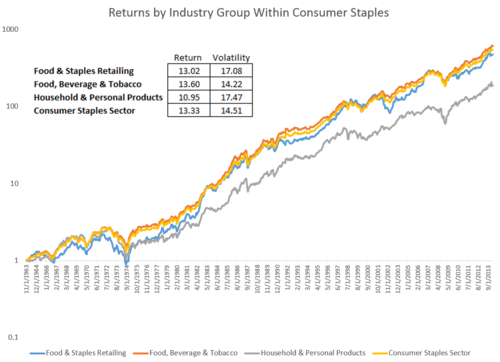
The consumer staples sector is divided into 3-primary groups (known as industry groups) by S&P’s Global Industry Classification Standard (GICS). These are food & staples retailing (think Wal-Mart), food beverage & tobacco (think Coca-Cola), and household & personal products (think Proctor & Gamble). Here are the number of stocks in the sector (and in each industry group) over time.
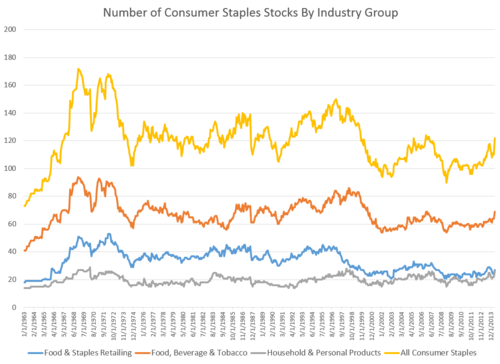
There have never been more than 200 consumer staples stocks in the all stock universe-->[ii]-->—it has always been a fairly concentrated and top-heavy sector. One convenient measure of concentration is to measure how much of any market is controlled by the top companies. One well known measure is the “four firm concentration ratio,” which simply adds up the market share (% of total sales) of the top four firms in each industry group. Here is the historical concentration of each group:
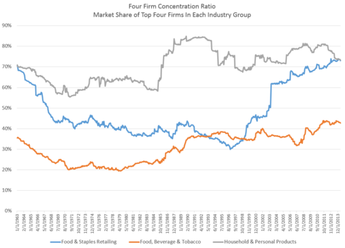
Today, roughly 75% of the sales in both the food & staples retailing and the household & personal products industries come from just the top four companies.
Historical Returns
Though it is populated by companies that seem plain vanilla and don’t excite with new technologies, the consumer staples sector has been the best performing of the 10 economic sectors since 1963. Below are the annualized returns for each of the ten economic sectors-->[iii]-->.
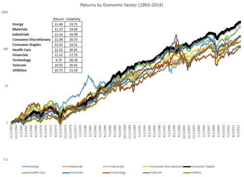
In addition to delivering the highest returns, consumer staples stocks have had the second lowest annualized volatility, trailing only utilities for lowest annual standard deviation of returns.
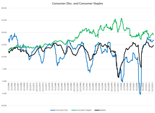
Within the sector, returns for the food, beverage & tobacco industry group are especially impressive, while household & personal products have had returns similar to the rest of the market.
So why do these two industry groups do so well? Part of the answer is extremely effective economic moats, mainly resulting from powerful and iconic brands. Warren Buffett has ridden this trend to success—to this day three of his largest holdings are Coca-Cola, Anheuser-Busch (Beer), and Proctor & Gamble.
Food, Beverage & Tobacco
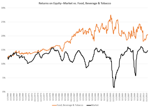
The largest (and best performing) industry group is food, beverage and tobacco. Some of their success comes from the fact that as a group they’ve earned exceptional returns on their equity across history, well above the rest of the market as seen below. Unlike an industry like automobiles—which are the ultimate cyclical stocks—these companies do not show strong mean reversion in their collective return on equity.
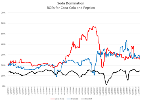
It is amazing, but market trends like these often come down to just a few companies. Coca-Cola and Pepsico, for example, represent about 25% of the food, beverage & tobacco industry group’s common equity. Since both have had high ROEs, they are a major reason for the sustained dominance of the industry.
Outstanding Long-Term Returns
Thinking back to The Future for Investors, I wanted to update the research on long-term returns by looking for the best performing stocks in the U.S. since 1963 (using all stocks as a universe rather than just the S&P 500). My criteria was that the stock was around in 1963 and survived through the present. Sure enough, Philip Morris (now Altria) was the number one performing stock with an annualized return of 20.23% per year since 1963—that is a total return of more than one million percent! Other consumer staples stocks peppered the top thirty stocks: Hormel Foods, Anheuser-Busch, Pepsico, and Coca-Cola (among several others) were all near the top of the list.
Clearly, consumer staples stocks have been great investments over the long-term. Lucky for us modern investors, we can buy staples using a low cost ETFs. Of course, sector ETFs are market-cap weighted so there may be a better way. Improving on a market-cap weighted strategy will be the subject of part two: how to find the most attractive consumer staples stocks in any given market. Stay tuned!
SIDE NOTE: With each of these posts, I am learning. I would love to hear from you with ideas, questions, or disagreements about what matters most in each sector. Email me at patrick.w.oshaughnessy@gmail.com with any thoughts.
[i] Pg 36 of The Future for Investors by Jeremy Siegel
[ii] All stocks = any stock in the U.S. with an inflation adjusted market cap>$200MM
[iii] Each custom sector index (and industry group index) is constructed as follows: first, every stock with an inflation adjusted market cap floor of $200M or higher is included. Stocks must be domiciled in the U.S., so no ADRs. Stocks are then equally weighted in the index and the index is rebalanced using the same criteria once per year in December.


June 13, 2014
Overdiversification
Who doesn’t like to be diversified? It’s one of the easiest words to throw around when pitching an investment product or process because the word has an almost perfectly positive connotation. I am guilty of overusing the term because it’s just so easy to throw around.
But diversification isn’t all peaches and cream. There is such a thing as being overdiversified. Take an index fund. It owns tons of stocks that will stink over the next year. Apple last year is a great example. It was the biggest stock in the S&P 500 (and therefore most impactful on returns), and had a relatively weak year.
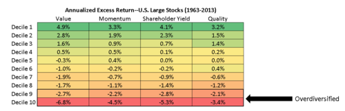
Owning everything means you will always own certain types of stocks that tend to perform poorly. Let’s look at four such types, and then see how an index would perform if it first stripped out the worst stocks by these measures. Because market indexes are weighted by capitalization, I’ll focus on large stocks here.
Value
Expensive stocks—those trading at high multiples of their sales, earnings, and cash flows—have been very poor performers historically. These are usually exciting companies, but the market expects too much of them, and when reality sets in, the stocks underperform. The most expensive stocks in the large stock universe (the worst 10%, rebalanced annually) have underperformed by 6.8% annually since 1963.
Momentum
Same story for the falling knives out there. Stocks whose recent returns have been among the worst in the market tend to continue to lose over the next year. Stocks with the worst momentum have underperformed by 4.5% annually since 1963.
Quality
Stocks with suspicious earnings quality—which tend to have very high accruals and weak cash flows—have also gotten beaten up over the years. Stocks with the worst earnings quality have underperformed by 3.4% annually since 1963.
Shareholder Yield (Dividends + Buybacks)
Stocks with the worst shareholder yield (meaning they are issuing shares and typically not paying a dividend) have also underperformed, by 5.3% annually.
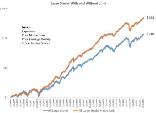
An Index without the Crap
So what would happen if we just refused to invest in expensive stocks, low quality stocks, stocks with poor price momentum, or stocks issuing shares? The results below illuminate what I mean by overdiversification. An equal weighted basket of all large stocks (junk included) has grown at an annual rate of 10.3% with an annual standard deviation of 15.9%, since 1963. If, instead, you stripped out stocks (annually) in the worst 20% of the market by value, momentum and quality, and also stripped out any stocks that were net issuers of shares (issuance – buybacks > 0), then you’d have achieved a much better result. This modified index would have grown at a 13.1% annual rate and done so with less volatility, with a standard deviation of 14.6%. You’d still own several hundred stocks, and be very diversified, but you’d have a smarter portfolio. Here is the historical growth of the two strategies. Diversification is good…to a point. But owning everything—even the junk—can be a drag on returns over the long term.
June 10, 2014
My Five Favorite Investing Books
I recently asked a number of my favorite writers to list their five favorite investing books. You can read the fantastic list that resulted here. For this month’s reading list, here are my five all-time favorites.
1. What Works on Wall Street by James O’Shaughnessy—I am, of course, massively biased in this first selection but hear me out. I never like anything just because it was produced by someone well known or well regarded, my father included. But this book is a classic for two reasons. First, its early chapters give an excellent overview of the modern investor’s options and obstacles. These chapters (1-4) explain investor fallibility and how a model-based approach to investing can help investors overcome their inherent faults. Second, the remainder of the book—the “data” chapters (5-29)—provide extensive evidence in favor of systematic investment strategies that favor value, quality, momentum and yield. My entire personal portfolio is dedicated to these ideas.
2. Inside the Investor’s Brain by Richard Peterson—this is the best book on investor behavior that I’ve ever read. It is like Daniel Kahneman’s Thinking, Fast and Slow¸ but specific to investing. It is comprehensive, entertaining, and chock full of stories and examples that I use on a weekly basis.
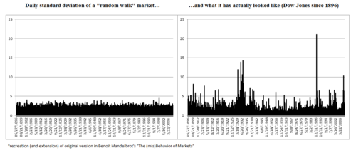
3. The (mis)Behavior of Markets by Benoit Mandelbrot—A unique take on (and dismantling of) the efficient market hypothesis. I adopted and extended my favorite chart ever from his book, shown below.
-->4. -->Contrarian Investment Strategies by David Dreman—this was one of the first books I read on investing when I was 22 and remains one of the best. It reveals “forecasters” as charlatans, highlights the contrary nature of the most successful investing strategies, and proposes concrete strategies for outmaneuvering the market.
-->5. -->Devil Take the Hindmost by Edward Chancellor—No investing education is complete without a healthy dose of history. Chancellor’s book is—BY FAR—the best collection of investing history lessons ever compiled. Learning from your own mistakes is great, but learning from the mistakes of others is even better. This is the most entertaining book on the list.
May 30, 2014
A (Very) Short History of Shareholder YIeld
I'm working on a longer piece on share repurchases (and shareholder yield) and found the two charts below very interesting. Buybacks are an important part of the corporate toolkit here in the U.S.--since the late 1990's, cash spent on gross buybacks has exceeded cash spent on dividend payments. This first chart shows the total dollar value of all gross buybacks, net buybacks (subtracting any stock that was issued), and dividends in $MM over the trailing 12-month period. These values come directly from the statement of cash flows for all U.S. firms.
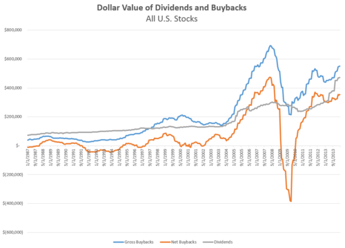
I've seen people argue that the peak of buybacks in 2007 shows how foolish buyback programs are--this is nonsense. The raw dollar is less important that the "yield" that results from dividing buybacks and dividends by total market cap of the market, seen in the second figure below.
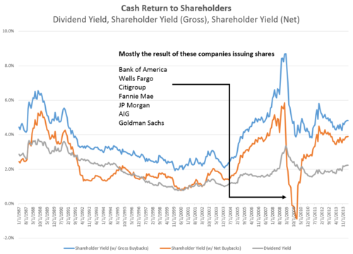
Buyback yield is a great factor for stock selection that I will expand on in a future piece, but what stands out here is the total yield for the market is around 4% today--much higher than the 2% of so dividend yield for the market. The net yield took a huge bath in 2009 mainly because big banks were raising so much capital.
Of course some investors want the actual cash dividend, but for shareholders that intend to keep holding their stocks, buybacks should be considered in the total calculation of yield.
May 29, 2014
The Best Investing Books Ever
I've only been posting here for a few months, but already I've learned that the most valuable part of writing online is meeting smart, interesting people and learning from them. I learn mostly through books, so I've asked a bunch of my favorite writers what their all-time favorite investing books are. I love the list that has resulted from the first group of respondents. Here is a meta-curated list of the best investing books ever, from Meb Faber, Morgan Housel, Josh Brown, Michael Kitces, Michael Batnick, and Ben Carlson (full list below). My own top five will be the feature in June's book list, so sign up over here.
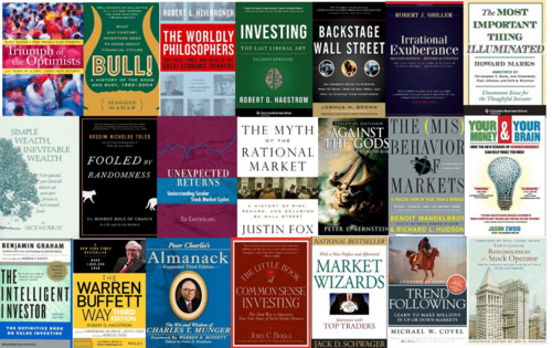
I've read most of these books (but did find some great suggestions that I didn't know of) and can attest that if you read each one, you would have an incredibly thorough and well rounded take on markets. This is like a bachelor's and master's degree combined. Thanks to all the great writers who submitted books--hopefully this will be the first of several similar lists.
THE BOOKS
The Worldly Philosophers by Robert Heilbroner
Investing: The Last Liberal Art by Robert G. Hagstrom
Backstage Wall Street by Joshua M. Brown
Irrational Exuberance (2nd Edition 2009) by Prof Robert J. Shiller
Simple Wealth, Inevitable Wealth (Fifth Edition 2013) by Nick Murray
Fooled by Randomness by Nassim Taleb
Unexpected Returns by Ed Easterling
Myth of the Rational Market by Justin Fox
Misbehavior of Markets by Benoit Mandelbrot
Against the Gods by Peter Bernstein
The Most Important Thing by Howard Marks
Your Money & Your Brain by Jason Zweig
The Warren Buffett Portfolio by Robert G. Hagstrom
The Little Book of Common Sense Investing by Jack Bogle
Poor Charlie's Almanac by Charlie Munger
The Intelligent Investor by Ben Graham
Market Wizards by Jack Schwager
Trend Following by Michael Covel
Bull! by Maggie Mahar
Reminiscences of a Stock Operator by Edwin Lefevre
Triumph of the Optimists by Dimson, Marsh and Staunton
May 28, 2014
Margins Don't Matter When Picking Stocks
With all the talk of high profit margins, it is worth remembering that they are nearly useless as a tool for individual stock selection. If you are an index investor, then margins (and maybe more accurately, ROEs) matter a great deal because when margins/ROEs revert to longer term norms, the market will likely suffer. But if you are instead building your own portfolio (whether it be through a quantitative screen or individual stock selection), then net profit margins haven't mattered nearly as much as other measures like valuations across history.
In the below chart, you can see the historical excess return, by decile, for two factors: net margin (relative to companies in the same industry group) and valuation (relative to the entire market). On the left hand side (decile 1) are companies with the cheapest valuations or highest margins, and on the right side (decile 10) are those with expensive valuations or very low margins.
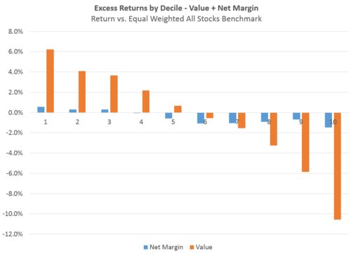
1963-2014
You can see right away that where valuations have been highly predictive of strong future excess return, net margins haven't been over the past 50 years. A high margin does not a great investment make--but a cheap price often does.
Calculation Notes: deciles are run using a rolling annual rebalance. The universe is all stocks with an inflation adjusted market cap > $200MM between 1963-2014. To control for differences in margins across industries, I've calculated margin relative to companies in the same industry group. I've also excluded companies with negative earnings. Value is calculated using a variety of measures like price-to-sales, price-to-earnings, EBITDA/EV. The benchmark (against which I calculate the excess returns) is an equal weighted basket of all stocks with an inflation adjusted market cap > $200MM.
May 27, 2014
The Market's Return on Equity
“Jesse Livermore” has a thorough and convincing new article in which he argues that return on equity (ROE) matters more than profit margins, because it is high ROEs—not high profit margins—that lure new entrants into a market and drive competition. As Livermore says,
Corporations seek to maximize their total profits…The mistake we’re making here is to assume that corporations “compete” for profit margins. They don’t. Profit margins have no value at all. What has value is a return. The decision to expand into the market of a competitor and seek additional return is not a decision driven by the expected profit margin, the expected return relative to the anticipated quantity of sales. Rather, it’s a decision driven instead by the expected ROE, the expected return relative to the amount of capital that will have to be invested, put at risk, in order to earn it.
— "Jesse Livermore"
Indeed, market ROE has exhibited strong mean reversion over the past 50 years. What follows is a breakdown of contribution by sector to the overall market’s ROE. We are above the long term average, but current levels look completely normal relative to past ROE “peaks.”
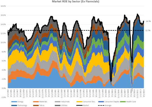
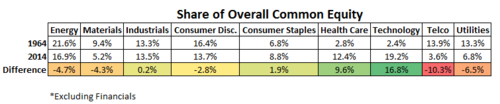
I wrote an article about the changing composition of market profit margins, and the story for ROE is very similar. 50 years ago, technology and health care stocks represented a small percentage of the market’s ROE. In 1964, the two sectors represented just 5% of the markets total common equity (book value). But today, these two sectors combine to represent nearly 32% of the non-financial market’s common equity value.
ROE mean reversion is much more pronounced in some sectors than in others. Here are a few examples.
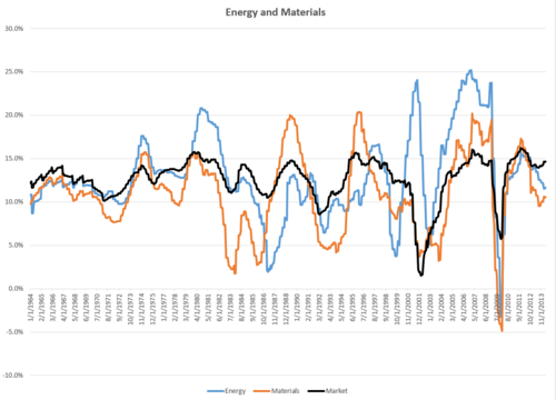

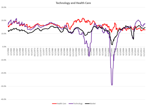
Current ROE levels are high but well within reason based on historical averages and market cycle peaks. This paints a much different valuation picture than the popular profit margin chart (corporate profits/GDP) that bears are fond of citing (seen at left below). ROE reversion will no doubt continue in future market cycles as it has in the past—nothing appears to be that different this time.
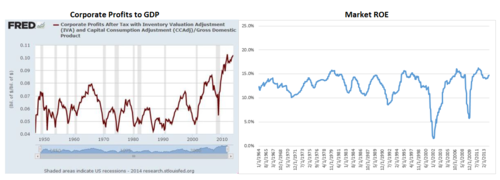
Some calculation notes: ROE by market and sector is a simple comparison of total annual net income to total common equity. The universe is all U.S. domiciled stocks with an inflation adjusted market cap larger than $200MM since 1964. I exclude financials and any securities for which I am missing either net income or common equity data. I also exclude companies with negative common equity.
May 26, 2014
Gold vs. The Stock Market
I've never been able to figure out gold as an investment. It has a rich history as both a precious metal and means of monetary exchange, and more than forty years after the end of the gold standard, gold still gets an inordinate amount of attention. I’ve read lots about gold, but even after countless pages written by very smart people, I am no closer to deciding if it’s worthwhile to own any. The main problem I have with it is that it is unproductive. There are no earnings against which to measure gold's price. But I thought in lieu of earnings it would be fun to compare the value of all the world’s gold to the value of stocks at various points in history.
I remember reading an anecdote in one of Berkshire’s annual shareholder letters about how all the world’s gold could fit into a baseball infield, and that the value of all the world’s gold ($9.6 trillion at the time) could buy all the cropland in America plus sixteen Exxon Mobiles. I thought it would be fun to see how a similar comparison would look over the past 50 years.
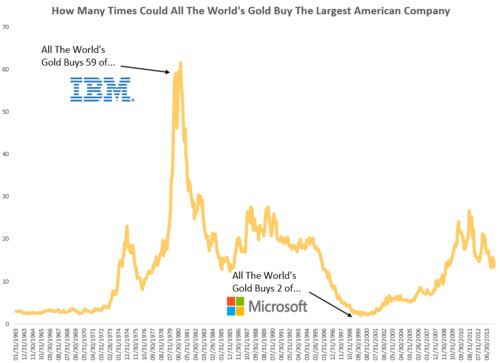
This first chart shows, since 1963, how many times over all the world’s gold could buy the largest American company (whether it be Exxon, GE, AT&T, IBM, Microsoft, or Apple). So, for example, in February 1980—near a huge peak in the price of gold—the world’s supply of gold ($2.3T) was worth 56 times more than the value of IBM ($41B), the largest company in the U.S. stock market at that time.
So with a pile of metal—beloved for its beauty and mutually agreed upon value (but not so much for its utility)—you could buy IBM 56 times over. Fast forward 20 years and the low point on the graph comes at two simultaneous market extremes: the tech bubble peak, and a multi-decade low for gold. In March 2000, you could only have purchased 2 Microsofts ($535B) with all the gold in the world ($1.2T). You get a much better deal today: the world’s gold ($7.1T) would net you about 14 Apples ($529B).
It’s more fun to calculate based on just one company, but the story is almost identical if you apply the same principle to the entire U.S. stock market (seen below). Some of these numbers are amazing. In the early 1980’s—the major equity valuation low of our lifetimes and a peak in gold prices—the world’s gold could have bought you the U.S. stock market two times over, but in 2000, at a equity valuation peak, it could only have bought a 7% stake!
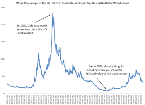
Gold tends to do well when the stock market is skittish, so it is no surprise that many of the “peaks” in these charts come near major market bottoms in 1974, 1980, 1990, and 2009. I think these charts are an interesting way to look at the market’s perception of the U.S. stock market. If they indicate anything today, its that we somewhat complacent and heading towards more overvalued territory, but we are not near the 1972 and 2000 lows of gold vs. the market. They also put in perspective how crazy the 1980 peak in gold was. Regardless of these fluctuations over the years, I am sticking with the productive asset (stocks) and only buying gold on my wife’s birthday.
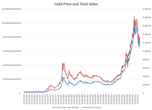
NOTE ON CALCULATION. There were 165,000 metric tons of gold in the world in 2011. I have assumed 2,500 more tons have been mined in each year since. Prior to 2011, I adjusted the total world tonnage based on the data available here (http://www.numbersleuth.org/worlds-gold/), which reveals how many tons were mined each year since 1963 (and prior). The price of gold, in U.S. dollars, is from Global Financial Data, and I used 32,150.7466 as the number of troy ounces in a metric ton . For U.S. total market cap, I simply summed the market cap of every publicly traded company domiciled here in the U.S that had a market cap>$200MM (a standard floor I use in most tests). Here is the historical price and total value of gold in U.S. dollars:
May 21, 2014
Following Trends Across and Within Industries
Last week, I posted about two ways to improve a momentum strategy by using value and quality to screen out dangerous momentum stocks. It so happens that lots of the momentum high-fliers from 2013 were concentrated in several key industries, like social media and biotechnology. This concentration begs the question, how much of the momentum effect comes from riding the hottest industries?
One of the more interesting elements of factor/quantitative investing is the industry effect. For any style/factor—like value or momentum—how much alpha is the result of just making industry bets? For example, any unconstrained value strategy over the past 50 years has been chronically underweight tech stocks (until very recently), and this underweight has been beneficial because tech has been one of the worst performing sectors. The ability to make industry bets—like the one against tech— can be a significant advantage even though it increases some traditional measures of risk like tracking error.
So what about momentum? Does the excess return from momentum investing come mostly from rotating between industries, or can you also benefit from buying stocks within each industry that have the best momentum relative to other companies in the same line of business.
For this analysis, I use two different definitions: industry group, and industry. There are 24 industry groups and 68 different industries (you can even get more specific to sub-industry, but in many cases there aren’t enough companies in each sub-industry for this type of analysis).
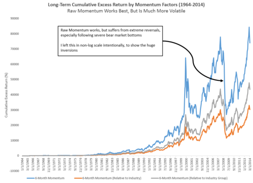
Here are the results (return and volatility), by decile since 1964, for 3-calculations of momentum: raw 6-Month return (which would allow you to rotate between industries freely), and 6-Month return relative to both industry group and industry. These second two calculations would result in a portfolio that was more spread out across industries and looked more similar to the overall market[i].
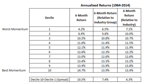
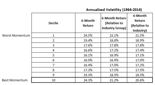
A few interesting points stand out. First, momentum works both within and across industries. This means that you can do well by using momentum to determine your industry allocations, but you can also do well by using momentum to select stocks in the industries that you like. Second, the unconstrained, raw version of momentum provides the best overall returns, but requires a bumpier ride. The annualized volatility is much higher than the industry relative calculation.
The chart below shows the rolling 3-year excess return for high momentum strategies. As you can see, momentum investing is quite cyclical, and returns can be painful for years at a time. The period following 2009, for example, was one of the worst factor inversions we’ve ever seen.
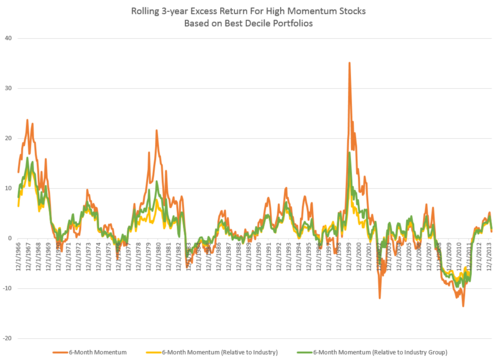
Bottom line, the flexibility to rotate more between industry groups and industries has added a significant amount of alpha over the long term. Of course, you pay for this alpha by having to endure higher volatility. Either way, the trend is your friend more often than not.
-->
-->
-->[i]--> Specifically, these are percentiles calculated within different groups. The percentiles which are relative to industry or industry group would result in portfolio with lower overall momentum, because you’d own some stocks that may not have great momentum compared to the market, but do have good momentum compared to other stocks in the same industry (think Telco stocks in 2013, or some other laggard).
May 20, 2014
Skin in the Game
They say you should put your money where your mouth is. With that in mind, I really liked the spirit of Meb Faber’s recent post about having “skin in the game,” and so here I copy his idea (and hope others follow suit).
To reiterate something Meb said, my situation is unique and my investment allocation isn’t relevant for other investors with different preferences, risk tolerances, and time horizons. None of this is investing advice.
I have 100% of my invested assets in quantitative, long only strategies. The vast majority (90%+) is invested in strategies run by O’Shaughnessy Asset Management (“OSAM”). The only reason that it is not 100% is that I cannot access OSAM’s emerging markets strategy in my retirement account, so I have to get my EM exposure through another option (DFA, in this case—although whenever the OSAM EM strategy becomes available I will switch 100% of my EM exposure to that strategy. I also have a small amount in Meb Faber’s Global Value strategy).
Some key points about my allocations.
I’m 29, have a high tolerance for equity volatility (in fact I’d welcome it for the chance to buy more at better prices), and have a very long time horizon.I believe that automatic allocations are one of the keys to investing success because, like quant strategies, automatic allocations take most of the emotion out of investing. I contribute to my 401(k) automatically, and I also contribute automatically to other investment accounts.Some key points about the strategies I use to invest.
I believe investing should be completely rules-based/systematic/quantitativeEvery strategy I use to invest is predicated on four key factors: valuation, yield (dividends, buybacks, debt paydown), quality, and momentum. I have a roughly equal exposure to these key factors. I use a number of different strategies and allocate across them using a contrarian approach. I add to strategies that have 1) better current valuations (i.e. lower expectations) and 2) negative recent results (absolute and relative). For example, for the past year or so I’ve been adding mostly to our global, yield driven strategy because 1) international and emerging markets are cheaper than the U.S. market and 2) the strategy has underperformed. Like the strategies that I use themselves, my allocations across strategies are rules based. I have a very global portfolio, and am underweight the U.S. market. This is because 1) the U.S. is more expensive than almost all global markets and 2) my career and earnings are concentrated in U.S. dollars and U.S. markets, so I like the diversification. To give you a flavor for where these strategies are pointing right now, I own a lot of international energy and telecom companies, and “old world” tech stocks in the U.S.Because of the nature of value investing, it’s usually easier to tell a scary story about many of the stocks that I own than a rosy, growth story. If I wasn’t comfortable with that, I’d just buy index funds.


