
Tim McGiven's Blog, page 10
December 11, 2024
Snow Time Like the Present for WordPress.com
About 17 years ago we added an option called “Show falling snow on my blog” to WordPress.com. The name said it all: it added falling snow to your blog. Then, one day, it disappeared. It wasn’t because spring came and melted the snow away. We were cleaning up code, juggling lots of different priorities, and the snow was shoveled away.
When we first announced this bit of fun in 2007, we were inspired because WordPress co-founder and our CEO Matt Mullenweg was missing out on a White Christmas in his hometown of Houston. Ever since it went away, some of you have let us know you’ve also been missing out on snow — on WordPress.com. Thanks to everyone who reminded us, we’re bringing back this frosty feature today, available now for every WordPress.com user.
Want to join the fun? Log into your WordPress.com account and visit Settings in the left-hand sidebar. There, you’ll find an option to add some fresh powder to your site:
 Your personal snow machine, free for all WordPress.com users.
Voilà! With one click, your visitors can enjoy a wintry surprise, no matter where they are in the world:
We like to think of it as a fun gift for a time of year when so many people around the world will be sharing gifts — whether or not it’s snowing where you’re writing on your blog.
Now, we know not everyone appreciates snow as much as we do. So, we’ve been working hard on a flurry of other gifts over the past few months too, adding tons of improvements to WordPress.com. Until now, we just haven’t told you about them on our blog! This seems like a great time to recognize all those other small features, improvements, and wishlist items that make the WordPress.com world just a little bit nicer:
With all these new features and improvements, there’s snow time like the present to build your websites with WordPress.com. Feeling the giving spirit too? It’s easy to share WordPress.com with a gift subscription. No pressure, of course. Enjoy the snow, and look for even more enhancements and features to come in 2025!


December 4, 2024
Hot Off the Press: New WordPress.com Themes for December 2024
Another month means another fresh batch of excellent themes for WordPress.com. Let’s look at some of the latest additions to the WordPress.com themes gallery, with great options for content creators, small businesses, event organizers, and personal sites. Preview each one below (and maybe try taking one for a spin).
CoachAva Designed for: Professional coachesAlso great for: Consultants, thought leaders, speakers, and content creators with paid course offerings
With a clean, single-hued design, minimal photography, and approachable fonts, CoachAva is built for professional coaches looking to highlight their core offerings and showcase their expertise.
Whether you’re a seasoned executive coach, a life coach, or a subject matter expert looking to sell digital or in-person services, CoachAva can help you establish trust with potential clients by putting your thought leadership front and center. Blocks make it easy to share blog posts, podcasts, and/or customer testimonials on your homepage. The flexible design makes it easy to define, package, and showcase your different offerings, connecting clients to the perfect programs.
CastCore Best for: PodcastersAlso great for: Bloggers, serial content creators, news sites with limited photography
Ideal for podcasters building their first site, Castcore features bold, attention-grabbing titles and a minimalist aesthetic that keeps your listeners focused on what matters most – your content.
With a simple homepage design, this template makes it easy for listeners to scroll through your recent content to find the right episode. Castcore is a great option for podcasters who want to build their subscriber base. The Podcast Player block makes it super easy to create an embedded mini-player for your episodes: simply copy your podcast’s RSS URL to engage listeners right on your page. Choose a grey and black color combo for a classic design or go young and bold with bright yellow.
CoachBen Designed for: Professional coachesAlso great for: Thought leaders, speakers, and content creators with paid course offerings
CoachBen’s dark theme with bright accents offers a bold and professional design that perfectly reflects a coach at the top of their game. Striking and to the point, this theme allows professional coaches to quickly articulate their value proposition and define their services.
With pre-designed blocks for displaying company logos of past clients, a calendar of speaking events, and a blog subscription, there are plenty of ways to show potential clients your expertise and experience. When they’re ready to dig in, they can learn more about specific offerings on your courses page or reach out to schedule a call.
GreenSeed Designed for: Flexible visual sitesAlso Great for: Brick and mortars, Restaurants, Personal care providers, Digital portfolios, visual artists, photographers
Greenseed is a beautifully simple, highly adaptable theme that makes it easy for businesses to take their brick-and-mortar brands online. Designed with full-site editing in mind, Greenseed can be customized to match any brand style, but its open spaces and bold visuals make it a particularly great choice for businesses looking to establish a streamlined online presence that embraces custom photography.
This minimal, approachable layout gives your photos space to breathe while providing key business information like address, phone number, and store hours. Link to your reservations page or provide visitors with a contact form to make it easy for potential customers to make an appointment or plan a visit.
Aether Designed for: Small jewelry or accessory brandsAlso great for: Eco-conscious consumer brands, wedding suppliers
 Like the jewelry and accessory brands it was built for, Aether embodies modern elegance. With delicate fonts and natural-toned color palettes, this product-focused template offers a tasteful design that allows artisan accessories and jewelry to truly sparkle.
With social media integrations and the ability to highlight products on your homepage, Aether creates a flexible hub for your digital brand. You can allow your customers to purchase products directly through WordPress’s e-commerce plugins or you can link your website to an existing storefront. With Aether, you can be sure your customers will understand your brand’s commitment to quality and design.
Miko Designed for: Personal professional websiteAlso great for: Writer portfolios, speakers, brand consultants
With a bold split-page design and minimalist elements, Miko keeps your brand center stage. Best for individuals, creators, or service providers who want to make a lasting visual impact, this template allows visitors to navigate through all of the pages of your site on the left side without ever navigating away from the image and title anchored on the right.
Featuring a variety of hyper-modern font options and cool color combos, Miko can lean sweet and delicate or bold and artistic, effortlessly complimenting a huge range of personal and professional website identities. Regardless of the style you choose, Miko is the perfect theme for anyone who wants to present themselves as a modern, polished professional with an eye for design.
Conference
The best way to market your upcoming conference is with a sleek custom website. Conference is a flexible template that helps conference planners create a credible online presence.
The Conference template can support both marketing and event logistics: You can highlight your speakers, sponsors, and conference news to draw in new attendees via the signup form. Once attendees register, the site acts as a home base for key information, providing pages for the conference location, daily schedules, and lists of attendees to help your participants connect in advance. Whether you are hosting a multi-day affair or an intimate workshop, Conference can scale to meet the needs of your event.
Ready to give your site a makeover? You can explore these themes by clicking the “Demo” button on each theme page. Whether you’re starting a coaching business or looking to improve your professional online presence, you might just find the perfect jumping-off point for your future website.
Most premium themes are available to use at no extra charge for customers on the Personal plan or above. You can explore all of our premium themes by navigating to the “Themes” page, which is under “Appearance” in the left-side menu of your WordPress.com dashboard, or by clicking the button below:
Explore all WordPress.com themesPartner themes are third-party products that can be purchased for $99/year each on the Business or Commerce plans, so if you haven’t found what you’re looking for today, there are plenty of alternatives available.
December 3, 2024
Introducing WordPress.com’s New Hardened DDoS Protection Setting
Spam bots and denial-of-service attacks are a reality for many website owners. Depending on timing and scale, they can be an annoyance or a detriment to your business’s bottom line. Services like Cloudflare, Fastly, and Vercel are popular choices for mitigating these attacks with sophisticated techniques beyond the firewall rules many hosts (WordPress.com included) employ to examine and potentially block incoming traffic.
WordPress.com’s defensive mode introduces similar, sophisticated DDoS protection that further enhances your site’s security. It works by issuing proof-of-work challenges to browsers visiting the site. Legitimate users will briefly see a challenge page while their browser completes the work before accessing the site. The feature is powered by our global edge network, but it can still be enabled independently of our global edge cache feature.
What is defensive mode?If you notice an inordinate amount of traffic to your website that is slowing it down, this setting filters spam traffic by requesting that they complete a proof-of-work challenge. When visitors come to your website for the first time, they will see the following screen:

This proof-of-work challenge page has a unique random puzzle embedded in it, along with JavaScript that can solve the puzzle. The puzzles are designed to take a typical CPU a few seconds to solve, and they deter botnets, which are not able to run the scripts to solve the puzzles.
How to enable itThis system protects all sites hosted on WordPress.com. Sites on Free, Personal, and Premium hosting plans are managed for you. For sites on Business or Commerce hosting plans, this setting can also be managed manually from your site’s Hosting Dashboard.
Here’s how to enable it:
Visit your Sites page by clicking on the WordPress logo in the upper left corner of your dashboard.Click on your site title.Click on the “Server Settings” tab on the site overview page.Scroll down to the Defensive mode section.Select a duration and click the “Enable defensive mode” buttonNote that WordPress.com staff may proactively enable defensive mode on your behalf, regardless of what hosting plan you have, if your site is attacked.
Get it all on WordPress.comMany hosts charge extra for capabilities like this, or they require integration with a third-party provider. On WordPress.com, defensive mode is included on every plan and can be managed manually on Business and Commerce plans.
Host with WordPress.comThis is just one more reason why WordPress.com stands out as the premier managed host for WordPress sites. With staging sites, SSH and WP-CLI access, or GitHub deployments, we’re always working on new tools to make WordPress.com an essential component of your development workflow.
What other features would you like to see on WordPress.com? How can we make WordPress.com an even more powerful place to build a website? Let us know in the comments below.
November 27, 2024
Build Your Website with WordPress.com and Save on Black Friday
Having a well-designed, functional website helps you reach a broader audience, build credibility, and connect meaningfully with customers or followers. In today’s digital-first world, your website is often the first impression you make, and right now is the time to make it count.
Why now? Black Friday savings, of course!
Until December 2nd, save 25% on the first year of any new annual hosting plan from WordPress.com.
Save on HostingWhy having a reliable website mattersThere are many reasons a website is important. Let’s take a look at three that impact the relationship you can build with your audience:
Trust and credibilityWe live in an “informed consumer” society and having a website allows you to share important details about your business or products. Your customers look for a website to help them form opinions, understand your offerings, and ultimately make a purchase decision. If you don’t have one, it can raise questions of legitimacy and cause your customers to look elsewhere for the products or services they require.
User experienceYour WordPress.com website gives you full control over how people experience your brand. A well-organized site not only sets the right tone but also makes it easy for visitors to find what they need, continuing to build trust and showing your commitment to a positive experience.
Accessibility and convenienceThe internet never closes or sleeps. With a website, your audience has 24/7 access to everything you offer—any time, from anywhere.
Putting your audience first is essential to your success.
This is why our Black Friday sale is about so much more than the 25% savings you’ll receive on the first year of any new, annual hosting plan.
Sign Up and SaveWhy WordPress.com?Choosing WordPress.com as your website host means choosing a team committed to your success. Our self-help resources, AI Assistant, and Happiness Engineers are all focused on helping you be successful with your website.
Our managed WordPress hosting also offers unmetered visitors, unmatched speed, and unstoppable security for one low price. With WordPress.com, you always have what you need to get online (and stay online) so you can grow your audience.
And if you take advantage of our Black Friday sale before December 2nd, you get even more with your purchase:
25% off any new, annual hosting planA free custom domain for one yearExpert support from our Happiness EngineersWhat’s possible on WordPress.comWordPress is a powerful and flexible website building platform, and WordPress.com gives you that functionality alongside powerful, secure, and scalable managed hosting. Whether you want a simple blog, a complex eCommerce store, or anything in-between, WordPress.com is the right hosting platform for you.
Check out what’s possible on WordPress.com in our demo site showcase:
 Screenshot
 Screenshot
 Screenshot
 Click to view example sites.How to unlock powerful WordPress hosting
Ready to get started with WordPress.com? We thought you might be.
Click the button below to learn more about each of our plans, choose the right plan for you, and purchase your discounted hosting plan. Your 25% off discount will apply automatically at checkout.
Sign Up and SaveFrequently asked questionsWhat if I change my mind, can I get a refund?
Absolutely. We offer a risk-free, 14-day money back guarantee on annual plans.
Can I use a domain I already own?
For sure. You can transfer or connect your domain and we can guide you on the steps as needed.
Can I migrate an existing site?
Absolutely. Whether your existing site is built with WordPress or another platform, we have guides available to walk you through the process. We also offer free migrations of WordPress sites. And yes, our Black Friday offer applies to site migrations too.
Is this offer available on renewals or upgrades?
No, this discount only applies to new annual plans. Current users can, however, use this offer if they’re adding a new plan or site.
How do renewals work?
Our Black Friday offer gives you a 25% discount off the first year of your hosting plan. Our annual plans automatically renew 30-days prior to your expiry date at the regular full price.
Sign up today to take advantage of powerful managed WordPress hosting from WordPress.com and save 25% on the annual plan of your choice.
This offer expires on December 2nd, 2024.
November 25, 2024
I Bet You Never Thought to Use a Form For That!
When you’re building a WordPress website, there are some essential elements you likely want to include, such as a contact form. However, limiting your use of forms to your contact page is a missed opportunity to increase leads, boost engagement, and enhance the overall user experience (UX) on your site.
There are many ways you can use forms on your WordPress site beyond providing visitors with a contact method. From collecting user feedback to generating leads and expanding your mailing list, forms offer dynamic and convenient ways to drive conversions.
In this post, we’ll start by discussing the role forms play in WordPress and how they can help you collect valuable information. Then we’ll introduce you to eight creative ways to use them on your site with some tips for making them effective.
Note: We’ve saved the most surprising ways for the end, so keep reading!
An introduction to using forms on your WordPress siteWhen most people think of website forms, they likely think of contact forms. These simple, embedded features let your visitors enter basic information to get in touch with you:

However, the use of online forms extends far beyond contact points. These documents allow you to easily and conveniently collect a wide variety of information from users and visitors directly from your website. You can also use them across other channels such as email and social media.
Website forms are beneficial because they provide straightforward ways of collecting lead-generating data that you can store and use in the future. Therefore, forms are essential tools to help you with marketing, sales, and promotions.
Another benefit of using forms on your WordPress site is that creating and embedding them is quick and easy. There are several plugins you can use to build forms if you require different functionality.
If you’re looking to create a standard form, you can also use the Form block on WordPress.com, which is powered by the Jetpack plugin (which is included on every WordPress.com website):
 Six creative examples of forms you can create right now
Now that we understand more about the role forms play in websites, let’s look at their different use cases. Below are six creative ways to use forms on your WordPress site, aside from your contact page.
1. Run fun contests and giveawaysRunning contests and giveaways on your website is an excellent way to boost engagement. Giving away freebies can help promote your brand and spread awareness about specific products and offerings.
To make it as simple as possible for your customers to enter the contest, you can use an embedded or pop-up form to collect their information, such as names and email addresses:

This form provides you with customer contact information that you can use for future campaigns. People will be more likely to hand over their details when they know they have a chance to win something in return.
If you run a membership site or host events, you can use website forms to make user registration a breeze:
 Source: WordPress VIP
You can also utilize them for event registration, such as an upcoming webinar. Like a giveaway, this can be an effective lead-generation technique because you’re giving users something in exchange for their contact details.
3. Conduct user and reader surveysCurious to know what your readers or customers think about a topic? Use a questionnaire and find out! You can easily create a poll or survey using Crowdsignal, our service for creating surveys and polls. Get started with a free account and learn how to set it up:
Source: CrowdsignalYou can also effortlessly capture insights from your audience by creating a simple poll using the Poll block:
 4. Let users sign up for your mailing list
Email marketing is a powerful way to grow your audience, expand brand awareness, and increase engagement. However, figuring out how to grow your subscriber list can be challenging.
One way to expand your subscriber list is by embedding a newsletter signup form on your website. It lets you easily capture the email addresses of your visitors:

One of the benefits of signup forms is that there are so many different areas you can place them. For example, you can insert them in the header or footer of your website. This placement ensures the forms are easily accessible no matter which pages your users are on.
You can also use forms as exit-intent pop-ups. For example, as visitors are about to leave your website, you can have the signup form appear with a convenient Call To Action (CTA).
5. Enable applicants to apply for jobsRecruiting and hiring new talent is a staple in any successful business. However, the application process you use can influence the number of applicants and the quality.
Today, many job seekers want a quick and convenient way to apply to jobs they’re interested in. To make the process as convenient as possible for your prospects, you can add a form on your website that enables potential employees to apply to open positions:

You can embed these forms directly below the job descriptions. Plus, you can enable applicants to attach documents, such as resumes and cover letters. This feature eliminates the number of steps users must complete to submit their information for different positions.
Using a form also helps you keep all the necessary information of applicants in one place for easy access. This can streamline the vetting process and, ultimately, help you find the most qualified applicants.
6. “Name It!” campaign – involve users in product decisionsRaise your hand if you’ve ever eagerly suggested a name for someone’s new puppy, or your local zoo’s newborn giraffe. Users love feeling useful, so give them a fun job. Create a form that allows visitors to suggest a name for your latest product or mascot. An entire viral campaign can sometimes emerge simply from a “name this” campaign.
Be forewarned that if you let your audience name something, the results might get a little bit silly. Source: BBCA few simple tips for creating effective website formsOnce you decide to create a particular type of website form, the next step is to build it. As we mentioned earlier, there are various tools you can use to do so.
However, regardless of which plugin you use to create your forms, there are some essential tips to keep in mind to ensure effectiveness. For example:
Keep things simple. Only include the necessary information to keep the forms as brief and concise as possible. Otherwise, you risk overwhelming users and reducing the likelihood of completing the form.Minimize the amount of typing involved. In most cases, your customers won’t want to spend considerable time filling out lengthy responses to form questions. Therefore, it’s a smart idea to include multiple choice answers when possible (and where applicable).Provide clear instructions. To make your forms as effective as possible, it’s vital to ensure that users understand what you’re asking and how to complete the fields correctly. You might consider adding example answers to demonstrate the type of responses you’re looking for.Best practices for creating website forms vary based on the type you’re building and what your end goal is. However, it’s crucial to prioritize the UX to make the data collection process quick and effortless for your customers.
What will you do with forms next?Most website owners understand the importance of including contact forms on their websites. However, many overlook the various ways that forms can help drive conversions and generate leads.
As discussed in this post, you can use plenty of strategies to get creative with your forms. For example, you can use them to register users for events, conduct user surveys, let visitors sign up for your mailing list, and offer a seamless way to apply for jobs.
Ready to build a site of your own? Get started with WordPress.com now.
November 21, 2024
Seasonal Color Palettes and Style Tips to Refresh Your Website for the Holidays
The end of the year is here, and with it comes a season of excitement and celebration! Whether you’re bundling up in cozy sweaters and snow boots or soaking up the sun in swimsuits, this time of year has something special for everyone. No matter where you are in the world, the final quarter brings festive holidays and celebrations to look forward to.
If you’re looking to capture the magic of the season on your website, try a pop of festive, holiday-inspired color or a cozy new theme. It’s the perfect way to welcome the season for you and your site visitors—whether they’re browsing for a holiday recipe, shopping for gifts, or exploring a guide to the best cross-country ski destinations.
Today we will show you how you can bring those festive feelings to your site with a few of our favorite color palettes and themes, along with where to find free illustrations and images to bring a refreshing seasonal touch to your site.
Festive color palettesHere are four festive color palettes––ranging from bright and bold to chill and subtle––that will give your site some holiday spirit:
Joyful winterThis winter-inspired color palette features warm, inviting hues of soft coral and deep red, balanced by a neutral blush and grounded by cool teal and navy. Incorporating these colors into your WordPress site creates a cozy and joyful vibe.
 Blush Ember
#E37C77Crimson Hearth #B84138Rose Mist
#DFC5C6Teal Drift
#3D8391Midnight Fjord
#1C4864
 Blogorama themeWinter frost
This winter color palette offers a harmonious blend of soft neutrals and cool blues, creating a warm and calm earthiness on your website. Perfect for a more sophisticated Hanukkah palette or a serene winter feel.
 Frosted Silver
#DDDFDECozy Taupe
#C1B4A8Chestnut Glow
#A48E7FWinter Night
#365A72Icy Horizon
#6A91A9
 Byrne themeClassic gingerbread
This palette captures the essence of a cozy, rustic holiday with its warm earthy tones and timeless charm—perfect for creating a welcoming, homey Christmas atmosphere. It’s so inviting, that you can almost smell the gingerbread baking!
 Deep Forest Green
#2E4D34Warm Burlap
#A67B5BCranberry Red
#B22222Creamy Beige
#F5F5DCBurnt Orange
#D2691E
 Marl themeJewel box winter
This palette is the jewel box of winter—perfect for those who prefer bold, vibrant colors in their branding and design. Its rich, saturated tones add a pop of color that stand out beautifully against classic autumn and winter hues. Best of all, it’s incredibly versatile, making it easy to expand and adapt throughout the year.
 Golden Spice
#E99739Plum Wine
#693551Harvest Olive
#686610Forest Ember
#273223Creamy Chai
#F8E1C8
 Aether themeUpdating your site colors
Use any of these palettes as a starting point for your site’s color refresh. To begin, take a look at your existing site and see if one of these palettes align well with your existing site branding. You can do this by swapping in just a color or two—you likely won’t use every color in the palette.
After choosing a palette, consider updating product or lifestyle images to echo these colors. If you need help sourcing stock photos, we’ll dive into that below.
If you’re new to customizing your site’s look, don’t worry—the WordPress.com Editor makes it easy. You can set a custom palette, add custom colors, and apply updates across your site, covering all the consistent elements like text, headings, links, backgrounds, buttons, and more.
When you’re ready to start implementing your new color palette, this tutorial is the perfect guide to get you going: Custom Colors on WordPress.com.
Winter-inspired themesIf you’re looking for a bigger site refresh, changing not just your colors but your theme can instantly elevate the look and feel of your website in a more impactful way. Here are a few of our favorite themes that instantly bring the cozy-cottage charm to life:
Cottage
Cottage is a beautifully-crafted theme that brings the charm of the countryside to your online space. Featuring a warm palette of earthy tones, subtle textured backgrounds, and timeless serif fonts, Cottage is all about rustic simplicity and warm natural elements.
Nook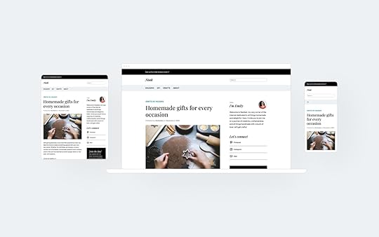
Nook is a classic two-column blog theme with a sidebar. Its versatile, timeless design creates a warm, familiar feel, providing the perfect space for sharing your DIY projects, tasty recipes, and creative inspirations.
Dorna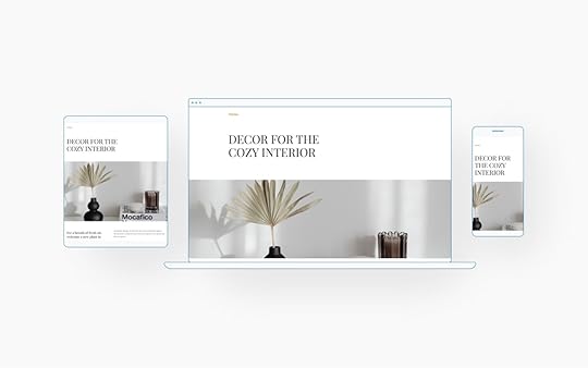
Dorna is a clean, product-focused theme, and its warm, inviting design and simple layout make it ideal for online shops featuring cozy, modern homewares and furniture.
Resources for seasonal photography and illustrationsPhotography and illustrations are fantastic ways to bring your new color palette and/or theme to life. If you’re not capturing photos yourself or just want a fresh look, Pexels, Unsplash, and Pixabay all offer a wide selection of free, high-quality photos and illustrations. Even better, Pexels is fully integrated into your WordPress.com media library, allowing you to easily add copyright-free images directly to your site.

When searching for images to add to your site, here are a few seasonal keywords to get you started: warm ambiance, hygge, fall leaves, snug nook, warm lighting, autumnal vibes, natural tones, fireside, rustic charm, homey feel, earthy tones, woolen textures, and cozy fall.
You can also incorporate seasonal pops of color by adding custom graphics to your site. Canva is an excellent tool for creating custom visuals, with easy-to-use templates for everything from banners to sidebar graphics. It’s a simple, freemium way to add that extra festive touch to your WordPress site.
As we start looking at the new year ahead, it’s the perfect time to refresh your website with a look and feel that captures the spirit of the season—whether it’s fall and winter in the northern hemisphere or spring and summer in the southern hemisphere.
So go ahead—dive into the season with a new look! Try out one of our free or premium themes, and let your creativity run wild.
November 14, 2024
11 Website Layout Examples for Every Type of Page
Everyone who uses the Internet looks at website layout examples every day. Yet, unless you are a designer or in the process of building your own site, few of us ever stop to think about what actually makes a good web-page structure.
You may instinctively feel it when you encounter one that is less than satisfactory. But do you know how to design a website layout that both pleases your visitors and allows you to achieve what you want with your site?
If the answer to that question is no, don’t fret. We’ll show you examples of different types of website layouts you can choose from and help you understand which are most appropriate in different situations. Then, we’ll explain how to choose a layout for your own website, as well as share some tips and tools you can use to create layout mockups.
Table of Contents
11 Common Types of Website Layouts1. Z-pattern2. F-pattern3. Magazine4. Grid5. Modular6. Single-Column7. Content-Focused8. Full-Screen9. Hero10. Split-Screen11. AsymmetricalHow to Choose a Website LayoutUnderstanding website layout vs. website structureWhat Is the Goal of Your Website Layout?Consider the Type of Website You Are BuildingDo Your ResearchConsider What You LikeBase Your Design on Common LayoutsCreating a website layout mockupWireframing your layoutAdditional TipsTools for WireframingFind the Right Website Layout for Your WordPress Site11 Common Types of Website LayoutsIn order to give you ideas about what a website layout can look like, let’s go over some common types, the kinds of websites they are most suitable for, and examples. Be aware that for some of these, the distinction is a bit fluid. You can often apply more than one layout principle to a single site.
1. Z-patternThis Z-pattern layout is based on the way many people naturally look at website content. They start at the top left, scan to the top right, then go down to the left and to the right again.

You can take advantage of that, for example, by placing the logo in the upper left corner and the navigation menu across from it. Your most important information, such as your heading and visuals, appears diagonally down left from that, while the call to action is to the right of it again.
This website layout is very skim friendly and most appropriate for sites that have relatively little content that you want to give much attention to, like CTAs, forms, and buttons.
You can also line up several Z-patterns with alternating elements to lead visitors down in zigzag form and keep them engaged.
 2. F-pattern
This layout is also based on common page-scanning behavior, first discovered and defined by the Nielsen Norman Group.
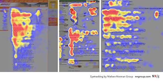
It is observable on both desktop and mobile and especially for more text-heavy sites. That makes it well suited for websites with lots of options or written content that needs to be scanned quickly, e.g. news sites or search result pages. You can take advantage of it by using the left side as an anchor.

However, it is important to note that NNG has come out in recent years saying that, while the F-pattern is a natural reading sequence, it is not good for users and websites. They state you should encourage readers to consume the rest of your content through text formatting like bullet points or visuals like icons and images.
3. MagazineMagazine layouts are inspired by printed newspapers and magazines and there are many examples of this kind of website out there. They usually consist of multiple columns made up of individual containers that create a complex visual hierarchy.

In this website layout, different elements often have different weights assigned to them to show their relative importance. You can do this, for example, with bigger headlines or the use of images. This creates a multi-level hierarchy.
The goal is to allow visitors to scan a great amount of information quickly. As a consequence, it’s a great choice for content-heavy websites, especially those covering a multitude of topics. Dashboards, such as for web applications, are also good candidates. The Gazette theme is another great example for how to use a magazine layout.
 4. Grid
Also called box-based website layouts, grid layouts distribute elements across the page according to a clear underlying order.

The result is a well-structured and geometrically-arranged design. It’s ideal for sites that have a lot of content of equal importance, e.g. portfolios. Linked pages often appear in the form of an image plus title and a short abstract.
If your content does not all have the same priority, there are lots of options to determine relative importance of different elements as well.
 5. Modular
Next in our list of website layout examples, we have a special kind of grid structure, which is also known as block layout. In it, each unit of content has their own space, is evenly spaced, and thus easy to locate. You might be very familiar with it from Pinterest and other sites that use a card layout.

This website layout is also great for mobile design, as it rearranges well for smaller screens. If you want to use it, it is most suitable for business websites, content collections like product pages, or the display of custom post types.
6. Single-ColumnOur next website layout example arranges all content in one vertical column and orders it sequentially.

Single-column layouts are popular and easy to use, especially on mobile, where users prefer to scroll over clicking from page to page. To that end, it benefits from a back-to-top button and sticky menu.
If your content is very text-heavy, remember to break it up with images to ensure readability. As you can imagine, this website layout is frequently used for blogs and anything that has a feed-like content pipeline. Landing pages are also a good candidate.
7. Content-FocusedAs the name already suggests, this layout is most appropriate for websites whose primary appeal is (written) content. It’s similar to the single-column variety, often with one main column and one or more side columns for additional information.

While the focus is on the primary content, you can surround it by other elements that you want visitors to notice after landing on the page for the main attraction. This could be a newsletter signup form in the sidebar, advertisement for your product or service, or a sales banner.
Naturally, this page structure lends itself best to blogs or other websites that mainly deal in writing. At the same time, singular pages on websites with a different layout can also benefit from a content-focused approach.
8. Full-ScreenThis is a website layout that covers the entire page. There are no sidebars, the screen comes across as a singular unit.

Sometimes this design is coupled with a modular build that scrolls screen by screen, so that each section is like a separate page. It often has an image or even video in the background.
Full-screen layouts are best suited for one-page designs, storytelling, and product pages. They work best if you couple them with captivating colors and/or visuals. If you like this look, the Afterlight theme might be a good option for you.
 9. Hero
A special type of full-screen website layout with a large image at the top (also called “hero image”) that contains the main elements like your site title, CTA, etc.

Hero layouts are a good way to quickly capture attention and clarify the topic of the page, especially for products. It’s a big, bold visual statement with additional information in the form of text elements.
The layout works best for product pages and ecommerce websites in general. However, some blogs also use it.
10. Split-ScreenIn this website layout, the screen is divided in the middle.

Split-screen layouts provide a balanced symmetry allowing you to represent two different ideas and give them the same consideration. Alternatively, you can also show off the same idea from different angles or use it to divide ecommerce customers at the start of their journey.
Split screen is a great option for websites that use two different types of content (e.g. images and text) or provide two distinct customer journeys. It’s also suitable simply for websites that want a modern look. However, it’s not so great for text-heavy designs because it doesn’t scale well, especially on mobile.
11. AsymmetricalA design similar to split screen or grid but with uneven distribution, offering an added dynamic.

You can use scale, color, width, and more to provide different focal points and highlights on the page. However, asymmetry does not mean chaos. There’s an underlying order that provides elegance and congruity.
What are good candidates for asymmetrical website layouts?
Websites that want to go for something modern, innovative and guide the user’s attention in dynamic ways. Business websites, online portfolios, or landing pages are prime beneficiaries.
How to Choose a Website LayoutWith a better idea about what types of website layouts exist, how do you pick the right one for your website? Here are a few practical tips to do so.
Understanding website layout vs. website structureFirst, make sure that a website layout is what you’re looking to implement. In a sentence, this means the way that the elements on your web pages (content, navigation, header, footer, and everything else visible) are arranged to present the information included within them.
In contrast to website structure, layout focuses on the individual page experience and how users consume the content on your pages. It is less concerned about leading them around your site as a whole (though, of course, that’s part of it as well).
While different web pages on your site can (and should) have different layouts, the basic structure usually stays the same. For example, the information needed on a shop page is very different from that of a product page or something like an About section. At the same time, the basic layout elements, especially header and footer, usually stay constant across most pages.

This makes for a consistent user experience, while allowing for flexibility to deliver different types of content to users.
What Is the Goal of Your Website Layout?Good layout has the power to keep users on your page longer and engage them. Bad layout can do the opposite. In times where most visitors leave your site within ten seconds, you need all the edge you can get. Here are some things that good website layout accomplishes:
Makes a good first impression – Users decide within less than half a second whether they like your site or not, so you better make sure your layout is on point.Naturally leads the eye to important content – The focus of every website is content, whether that is products or information. Your page structure can either direct users towards it or away from it.Provides strong user experience (UX) – A good layout helps visitors find what they are looking for, both on page as well as sitewide. It also sets elements in relation to each other, determines their sequence, and gives weight to the right elements.Gives guidance – Layout provides guide rails for your users. It places the most important content at the top and leads them down the page toward your goal.The best website layout is one that you barely notice because you can easily find every element you are looking for. It is also one aimed at your target group, their preferences, behaviors, and needs.
Consider the Type of Website You Are BuildingAs you have seen above, different website layouts are more or less suitable for different types of websites. Therefore, in order to choose the right one for you, you first need to be crystal clear about what kind of site you are building.
Business sites, shops, blogs – they all have very different focal points and demand different layouts. Clarity in this area is the first step towards making the right choice.
Do Your ResearchYour website does not exist in a vacuum. Look at websites that are the same type as yours (e.g. blog, ecommerce, B2B, B2C, etc.) but sell different types of products/services or serve different industries/niches than your own.
When you do, identify common website layouts, best practices, what looks good, and see what you can do better with your layout.
Consider What You LikeYes, a website is primarily there to serve other people. However, at the same time, it also needs to be something you like. If you are turned off by your own website, it’s unlikely that you will put in the energy and enthusiasm needed to run it and make it successful.
For that reason, while considering which website layout to choose, also do some introspection. Think about what you personally like and would like to see on your site.
Base Your Design on Common LayoutsThe website layouts we discussed above are commonly known because they work. They have proven to be usable over time, are familiar to users, and ready to go. Therefore, it’s a good idea to go with one of the established layouts and then add your individual flavor to it.
Creating a website layout mockupWordPress themes are flexible enough to support different types of page layouts out of the box. But what if you are designing your own theme or are working with a website developer? In this case, you might want to create a wireframe. This helps to map out your page layout and is also good to clarify your ideas and get them onto paper.
Wireframing your layoutA wireframe is like a map of your page. It’s not the finished design but something that shows its structure.

Here’s how to create a simple wireframe:
Think about the user journey – Be aware what your goals are with your layout, where you want to steer visitors and what you want them to do.Get sketching (and start with mobile) – Wireframes are not meant to be superfancy or detailed. Therefore, you can get started right away (see the tools below). A good idea is to start with the mobile design, then move on to larger screen sizes.Create the basic framework – Take a bird’s-eye view, tackle the basic design problems first. Think about where to place the navigation and other basic UI elements.Identify content areas – Mark where your content goes. For that, it’s important to know the content you will use ahead of time (both word count and images) so that you can accurately include it in the map.Iterate – Even if you are satisfied with your first idea, do a few more passes to give yourself options. It often takes a while for the best ideas to bubble to the surface.Test – Once you have some website layout ideas collected, it’s time to put them in front of potential users and collect feedback. The tools listed below are suitable for that as well. Getting some real-life feedback is great to improve and get closer to the final version.Rinse and repeat – Do this over and over until you are satisfied with the results and ready to move to the design phase.Pro Tip: Did you know that sites hosted with WordPress.com includes wireframe block patterns that you can use? These are patterns that are closer to a blank slate for your page without much design, but they include a basic structural layout. Just choose a wireframe pattern you like from the patterns library and customize it to suit your needs.
 Additional Tips
In order to create the best possible website layout, here are some tips and concepts to keep in mind:
Create a visual hierarchy – Decide which elements are the most important and build your website layout so that it focuses on them. Make sure that they are placed where they are easily noticeable and identifiable.Use a grid – Almost all web design is based on some sort of grid. It provides order and a basic structure and scaffolding that you can order your page elements along.Employ the rule of odds – Use odd numbers of elements rather than even. That way, the focus is always on one element instead of in between two of them.Ensure scanability – We have already talked about reading patterns. When designing your website layout, be sure to accommodate the way visitors consume content to make it easy to catch the gist of your site.Focus on the fold – The fold is where the screen cuts off when someone first gets to your site. Above it, in the part that visitors see first, you should have your most important content and call to action.Use enough white space – Negative space, the part without content, is as important as the content itself. It provides space to breathe and allows the emphasis to be where you want users to focus.Tools for Wireframing
You can use different kinds of tools to build wireframes:
Pen and paper – Classic but powerful, easy to use, and great to quickly whip up some website layout ideas without having to learn a new tool.Whimsical – A collaboration tool that works for wireframes and also allows you to get feedback. It’s also easy to use and has a free plan.Invision – Similar to Whimsical. Also works for collaborative designing. Comes with wireframe templates and has a free plan for up to three online whiteboards.Figma – A popular tool for design and prototyping that has free wireframe kits to hit the ground running. Use the free plan to get started without paying.WordPress.com’s wireframe patterns – If you want to start with an pre-designed wireframe template, and adjust from there, WordPress.com has some patterns to make this simple.Find the Right Website Layout for Your WordPress SiteThe layout is one of the most decisive factors for the usability of your website. For that reason, it deserves ample consideration so that you can serve your visitors in the best way possible.
Established page structures are a great way to get started. They have proven themselves over time and are able to fulfill established user expectations. While you can (and should) add your own flavor, you don’t have to reinvent the wheel. It’s also often feasible and sensible to use more than one layout in a website, especially on different pages.
When making decisions, consider your type of website, goals, industry, and personal likes. Then, use wireframing to capture your ideas for your website layout. And remember, it’s all about your users. The best layouts are those that they hardly notice.
Build fast, ship faster with Studio, a fast, free way to develop locally with WordPress. Get started now .
November 12, 2024
WordPress 6.7 Brings New Power and Flexibility
Welcome to the latest in WordPress innovation with the release of WordPress 6.7! This update brings a wave of new features, design flexibility, and performance enhancements to elevate your WordPress experience, whether you’re building your first site or fine-tuning a complex project.
From the introduction of the Twenty Twenty-Five theme to powerful new editing tools and developer capabilities, WordPress 6.7 empowers you to create a site that’s dynamic, engaging, and uniquely yours.
As always, WordPress.com sites are updated automatically, so you may already see these new features live. Read on to discover what’s new and how these updates make it easier than ever to build, design, and manage a standout site on WordPress.com.
Table of contents
The basicsTwenty Twenty-Five theme releaseExpanded block customization optionsStreamlined creation with Zoom OutSimplified Query Loop blockImproved font management toolsCustomizable Data ViewsDeveloper featuresTemplate Registration APIData Views APIBlock Bindings improvementsAnd moreThe basicsWordPress 6.7 brings a host of new features, design tools, and bug fixes to enhance your website creation experience. WordPress.com updates sites automatically, so there’s nothing you need to do before you can enjoy these benefits.
As a WordPress.com user, you may have already enjoyed early access to some of these improvements, reflecting our commitment to keeping you equipped with the most up-to-date features. If you experience any issues, our Happiness Engineers are here to help at wordpress.com/help.
Let’s look at some new enhancements that can help take your site to the next level.
Twenty Twenty-Five theme releaseAs part of the annual tradition, WordPress 6.7 introduces a new default, block theme: Twenty Twenty-Five.
Twenty Twenty-Five is designed for bloggers of all scales—from hobbyist writers to major news sites—capturing a balance between simplicity and versatility. It allows you to intuitively create a site that feels truly personal while offering the flexibility for complex designs. With a diverse array of patterns and templates for everything from landing pages to photo blogs, the theme is tailored to enable seamless storytelling for any purpose. Natural, universal imagery and thoughtfully chosen typography bring warmth and a timeless aesthetic that resonates on a global scale.
Built to support multiple languages and visual styles, Twenty Twenty-Five includes a curated selection of color palettes and font pairings, ensuring both accessibility and elegance in design. Whether you lean toward a minimalist personal blog, a striking photo gallery, or a content-rich magazine layout, the theme’s templates and design tools empower you to build a site that is uniquely yours


 Expanded block customization options
WordPress 6.7 also introduces even more styling flexibility, adding additional options for borders, backgrounds, shadows, and spacing across numerous blocks. These updates allow you to create custom designs without extra code. Notably, the Group block now supports shadow effects and the Content block allows for a background image, while blocks like Paragraph, Heading, and Buttons offer additional options for borders, color, and padding.
Streamlined creation with Zoom OutThe new Zoom Out feature offers a fresh way to view and design your content at a high level. By toggling to this zoomed-out perspective, you can easily style entire sections or adjust the arrangement of blocks across a page, all without getting caught up in the details of individual blocks.
With Zoom Out, you can make broader edits using patterns, giving you control over top-level containers and block groups. Click or drag-and-drop to add patterns and use the arrows to the left to rearrange them. When you’re ready to dive back in, simply double-click the content area or click the Zoom Out icon to return to the standard editor view. This feature is a game-changer for efficient layout creation, whether you’re building pages or fine-tuning templates.
Simplified Query Loop blockThe Query Loop block, known for its power and complexity, has been refined to make it more user-friendly. A new toggle allows you to choose between “Default” and “Custom” modes, simplifying the creation of content-rich sections on your site. In Default mode, the block automatically inherits settings from your template, so posts display instantly without extra configuration. This means you can drop in the Query Loop block and see your content right away, saving setup time. For more specific use cases, switch to Custom mode for precise control over what content is displayed.
Additional refinements include a cleaner layout of the Settings Sidebar on the right, making it simple to adjust display options in one place.
Key features and updates to take note of:
Quick preview when adding the block from the inserterDisplay controls moved from the toolbar to the sidebarNew post format filter for customized content display (on select themes) Improved font management tools
The latest updates bring powerful new options to font management for block themes, making it easier to customize typography across your site. In the Global Styles section, you can now create, edit, and delete custom font size presets. These presets let you define reusable font sizes site-wide, with options to customize names, base sizes, and fluid scaling, which automatically adjusts font size based on screen dimensions.
Additionally, fonts are now grouped by source (theme or Google Fonts), giving you a clear view of where each font originates. A convenient “Select All” option lets you quickly activate or deactivate fonts as needed, with active fonts visibly highlighted for easy management.
Customizable Data ViewsData Views, a powerful tool for managing pages, patterns, and templates in the Site Editor, now features several enhancements to simplify navigation:
Grid Layout Preview Size: Choose the view that works best for you.Customizable Columns: Reorder columns based on your preference.Bulk Actions on Grid Layout: Select multiple items and take action quickly.These refinements make it easier than ever to organize your site, whether you’re handling a few pages or hundreds.
Developer featuresWordPress 6.7 introduces several enhancements for developers, making it easier to create unique site experiences.
Template Registration APIThis release allows developers to register custom block templates directly within plugins, simplifying the process of creating and managing front-end template outputs. The Template Registration API enables developers to define default content for custom post types, taxonomies, and virtual pages—all built on the block system, so both themes and users can customize templates to their needs.
Data Views APIDevelopers can now use a new API to register and unregister Data Views actions, offering more flexibility in managing project-specific actions. Learn how to use Data Views in your own plugins and for adding images to the Media Library. This update is part of ongoing work in Gutenberg’s Phase 3 and the Admin Redesign project, providing expanded tools for custom workflows.
Block Bindings improvementsBuilding on Block Bindings introduced in previous releases, this update adds a user interface for admins and editors to connect block attributes with custom field data directly in a block.
And moreThere are too many great updates to cover them all here, but here are a few smaller yet valuable enhancements worth noting:
Block inserter: The block inserter now stays open while you interact with the editor canvas, making it easier to navigate your content as you add blocks.Editor topbar: The action icons in the top right corner have been reordered for improved accessibility.Pre-publish check buttons: The second Publish (or Save) button has been repositioned within the pre-publish panel, so you won’t need to move your mouse after clicking the initial Publish (or Save).WordPress 6.7 brings hundreds of improvements, developer features, and bug fixes. The above highlights are only a taste of what’s available. If you’d like to dive deeper, the official WordPress 6.7 Field Guide has all the technical details.
Click below if you’re a developer and want to leverage the benefits of hosting your sites with WordPress.com:
Learn moreNovember 11, 2024
Slow WordPress Site? Our Free Site Speed Tool Can Help
When you’re browsing the web, how quickly do you navigate elsewhere if a website isn’t instantly loading? We all know from experience that every second counts. If your website takes too long to load, visitors won’t hesitate to move on—sometimes straight to your competitors.
Faster load times not only improve user satisfaction but also boost your search engine rankings and ultimately drive more conversions.
That’s why you’re going to love using our new Site Speed Tool. It can quickly identify areas impacting your site’s Core Web Vitals (CWV), like load times, interactivity, and visual stability and provides actionable insights and recommendations, making it easier to optimize your site’s performance and deliver a smoother, faster user experience.
Use the free Site Speed Tool The need for speed
 The numbers speak for themselves:
Nearly 70% of consumers admit that page speed impacts their willingness to buy from an online retailer.Almost half of consumers say they’ll try to refresh a page at least once when it takes 3 seconds to load. But 22% say they’ll close the tab, and 14% say they’ll visit a competitor’s site.47% of consumers expect a web page to load in 2 seconds or less.If a website takes more than three seconds to load, 40% of the people will leave that site.Website performance plays a critical role in the success of any online business. Slow websites will cost you not only visitors but also potential revenue. Investing in performance optimization could be the difference between closing a sale and losing out to a competitor.
A faster website gives you a competitive edge by capturing traffic from slower sites. Visitors are more likely to stay, explore, and convert into customers when your site loads quickly. Speed isn’t just a nice-to-have—it’s a key driver of business growth.
Optimize your WordPress site for lightning-fast performanceIs your WordPress site as fast as it could be? Test the speed of your WordPress site with free our Site Speed Tool and get detailed performance metrics and tailored recommendations with just a few clicks. Simply enter any public WordPress URL, and we’ll run real-time tests on your site to assess its performance.
Our tool evaluates key areas, such as:
Loading speed: How fast your site loads for users.Core Web Vitals: Metrics that focus on user experience, including loading, interactivity, and visual stability.Historical performance: Tracking your site’s performance over time to spot trends and areas for improvement.Once analyzed, you’ll receive an easy-to-understand performance score and WordPress-specific, AI-enhanced recommendations to boost your website’s speed and overall performance.
You can access our developer documentation for more specifics about the report.
If you already have a site on WordPress.com with a Business or Commerce plan, you can also easily access the speed test directly in your dashboard. Test your performance across all of your sites to better understand correlations between site changes and performance.
 Get weekly performance change alerts
Want to stay ahead of performance issues? Sign up for weekly performance change alerts, which provide a comprehensive overview of your website’s metrics over the last handful of weeks. These reports will highlight trends, performance fluctuations, and areas where further optimization is needed—keeping you informed and in control of your website’s health.
 Test your site today
Your website’s performance can make or break your success online. With our easy-to-use performance measurement tool, you can take the guesswork out of optimizing your site.
Test your URL now for free and get personalized recommendations to ensure your site performs at its best, or head to the Performance tab in your site’s Hosting Overview menu to get automatic performance data about your WordPress.com sites.
Don’t leave your website’s success to chance—start optimizing today.
Use the free Site Speed ToolNovember 6, 2024
Why a Recipe Plugin is the Secret Ingredient for Your Food Blog’s Success
You’ll likely need the help of several WordPress plugins to build a successful food blog, but none are as important as the mighty recipe plugin. To put it in perspective, if I were thinking of a recipe blog as a pie, the recipe plugin would be the biggest piece of that pie and the ice cream à la mode. It’s that big of a deal.
A recipe plugin is basically a tiny little translator that meticulously parses and organizes the details of a recipe into robot-ready pieces of data that search engines need to display your content accurately and beautifully in search results. But that’s not all it does.
Recipe plugins serve three main purposes:
They supply search engines with the structured data needed to display your recipes accurately in search results with rich snippets. If this sounds like gobbledygook, don’t worry—we’ll explain it more below.They provide an easy-to-use recipe template for you, making it simple to add a recipe to your WordPress post without hassle.They give readers a visually consistent, well-organized recipe format, often including useful features like ingredient checkboxes, unit converters, and serving size adjustments.Search Engine OptimizationRecipe plugins work behind the scenes (as the tiny translators) to add structured data to every recipe you publish. This structured data (specifically JSON-LD) makes it easy for search engines to understand and showcase your recipes in search results with extra details like images, videos, ingredients, cook times, ratings, and more.
When these enhanced details appear in search, they’re known as rich snippets, and they’re what makes your recipe stand out. This can increase your click-through rate (CTR) and boost your search rankings because of the extra information shown for your content within the search itself.
Luckily, you don’t need to worry too much about structured data. Just know that a good recipe plugin adds this data to display rich results, like Google’s rich snippets or Pinterest’s Rich Pins.
Here’s a fun fact: Pinterest, essentially a visual search engine, is a major traffic driver for food bloggers. With constant algorithm changes in search, diversifying your traffic sources is always a smart strategy.
Here are a few examples of how rich snippets are displayed in Google and Pinterest search results:

 Templates for adding a recipe to a post
Let’s not forget that recipes are really just instructions. Using a clear, organized template helps you include all of the important details that your recipe plugin needs to create the structured data.
Here’s an example of a recipe card template from the WP Recipe Maker plugin. You’ll find a similar template with each of the plugins we recommend.
 Improved reader experience
Recipe cards come jam-packed with reader-friendly features designed to make cooking easier—like the popular “jump to recipe” button at the top of recipe posts.

It’s easy to feel overwhelmed by all the options. Try to focus on a handful of features that truly add value for your readers. For instance, if your site is focused on baking, a unit converter is a must-have.
Some of the most useful reader-facing features include:
Accurate unit conversions – Test these out, as not all converters are created equally! Recipe scaling options – Adjust servings by 1/2x, 2x, or 3x.User ratings display – Helps readers feel confident in the recipe they’re about to make.‘Jump to recipe’ button – A shortcut to “jump” the reader from the top of the post to the recipe.Hands-free cook mode – Keeps the screen awake for readers while cooking.Customizable templates – Allows you to easily style the recipe card to match your brand without the help of a developer.Here’s an example of hands-free cook mode in Mediavine Create:
 How to choose a recipe plugin
Starting a food blog often comes with a bit of a learning curve, but being a great recipe writer doesn’t mean you also need to be a tech expert. When deciding on a recipe plugin, choose one that aligns with your current comfort level and can support your needs as you grow.
When evaluating plugins these are a few of the most important things we recommend looking for:
Actively maintained plugins“Actively maintained” means the plugin receives regular updates, ideally every few months. Recipe publishing evolves quickly, and it’s essential that the team behind this vital part of your site stays on top of the latest changes in search, ad placements, and performance optimization.
Community feedbackThe next thing you want to consider is reviews. If it’s free in the WordPress.com plugin repository and the WordPress.org plugin repository, then you can find reviews there. If it’s a premium plugin that’s not in the repository, you can look on the website for testimonials or reviews.
It’s also helpful to ask for recommendations from other food bloggers; Facebook groups and Reddit forums for food bloggers are excellent resources.
Evaluate supportFree plugins on WordPress offer a support forum—take a peek to see if questions are promptly answered. Premium plugins may handle support through a dedicated support channel or email. Try reaching out with pre-sales questions, and if you get a helpful response, that’s a great sign. If support seems lacking, you might want to keep looking.
The technical partsJSON-LD is the preferred schema markup for search engines like Google and Pinterest, so verify that your recipe plugin includes it.
For search engines to interpret your recipe accurately, your plugin needs to support all required and recommended structured data fields. Google provides a list of these fields, so double-check that your plugin covers them all.
Once installed, test the plugin by completing the fields in the template and running the recipe post through Google’s Rich Results Test to catch any errors or warnings.
Popular recipe pluginsInvesting in a paid recipe plugin may seem intimidating at first, but it’s one of the best (bite-sized) investments you can make as a food blogger because it offers you so many benefits that are important to get right from the start. Many plugins offer a lighter free version or a trial period, so I strongly encourage you to test out a few options before making a decision.
WP Recipe MakerWP Recipe Maker (WPRM) is a powerful recipe plugin, with over 50,000 active installations. They offer a free version, along with premium upgrades that are definitely worth considering. This plugin is the most feature-rich of all of the options.

The main drawback is that WPRM can be somewhat complex to set up with so many features to enable, disable, and customize. It will require some effort, and if you have an eye for design, you may need to customize the templates to achieve a polished look.
Tasty RecipesTasty Recipes is part of the WP Tasty plugin suite of plugins, all built for bloggers. While they don’t offer a free version, they do have a 14-day free trial. It’s the easiest of the bunch to set up, and the cards are beautiful right out of the box. It has everything you need and nothing you don’t!
 Create
Create is a popular free option developed by Mediavine, a full-service ad management company. With a selection of well-designed card templates and a responsive support team, it’s a solid choice for food bloggers. Create also offers built-in functionality for list and how-to cards if you publish more than recipes.

The only downside of Create is that it doesn’t receive updates as frequently as some other plugins.
Start a food blog on WordPress.comStart sharing your favorite recipes with a blog hosted on WordPress.com.
Run ads and install plugins, including your favorite recipe plugin, on our Business plan, and let us manage the rest. Get unlimited traffic, unstoppable security, and the power of WordPress, all for one low price.
Get WordPress.com hostingTim McGiven's Blog

- Tim McGiven's profile
- 1 follower

