Seth Apter's Blog, page 93
August 26, 2013
Contemporary Art Fair NYC
I am excited to be exhibiting at the Contemporary Art Fair NYC.
This will take place on October 25th through October 27th at the Jacob Javits Center. In its 4th year, CAF is held in conjunction with both the American Fine Craft Show NYC and Art Off the Main, which highlights artists from Africa, the Caribbean, and Latin America. All three shows are artist, rather than gallery, driven. As a result, you will have a chance to meet all the exhibiting artists, including myself. You can have a look at the list of participating artists here.
If you are able to attend, please contact me as it gets closer to the exhibition. I will likely have discounted cards for entry that I can provide.
-----------------------------
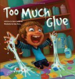
Sending out congratulations to Barbara Israel and Gina Sismilich, each of whom won a copy of the book "Too Much Glue"from my recent giveaway.

This will take place on October 25th through October 27th at the Jacob Javits Center. In its 4th year, CAF is held in conjunction with both the American Fine Craft Show NYC and Art Off the Main, which highlights artists from Africa, the Caribbean, and Latin America. All three shows are artist, rather than gallery, driven. As a result, you will have a chance to meet all the exhibiting artists, including myself. You can have a look at the list of participating artists here.
If you are able to attend, please contact me as it gets closer to the exhibition. I will likely have discounted cards for entry that I can provide.
-----------------------------
Sending out congratulations to Barbara Israel and Gina Sismilich, each of whom won a copy of the book "Too Much Glue"from my recent giveaway.


August 22, 2013
'Too Much Glue' Giveaway
I am often contacted by companies who offer me the opportunity to review their products on my blog. 99% of the time I say no. But 1% of the time I am presented with something that I think might really appeal to my readers and I say yes. The book Too Much Glue was one of those instances.
 Too Much Glue
Written by Jason LefebvreIllustrated by Zac Retz
Too Much Glue
Written by Jason LefebvreIllustrated by Zac RetzWhile this book seems at first glance to be primarily aimed at kids...I think it also connects to the kid in all of us no matter what age. From the press release: Although his teacher has warned him that too much glue never dries, Matty loves glue...So one day during art, he searches for the fullest glue bottles in the classroom and the fun begins...
And fun is what this book is all about. From the story that cannot help but make you laugh and smile to the colorful and exuberant illustrations, Too Much Glue will resonate with the artist in everyone. You cannot help but like this book. Take a peek inside here.
----------------------------------The people at Flashlight Press have provided me with two copies of this book to give away. To be eligible, please leave a comment on this post by end of day Sunday, August 25th. And please make sure I have a way to contact you should you be the winner. Good luck!
August 20, 2013
Western Red

Red is such a strong and powerful color. I often use it as an accent in my work. I have been holding on to hoarding a found, red metal washer for the longest time. Today was the day to actually use it!
I started with a piece of hand painted watercolor paper with subtle shades of reds and greens, plus hints of blacks and blues. I cut it into a rectangle and then die cut (using Spellbinders Standard Circles) out a circle in the center. I edged the rectangle with black ink.

I created a base for this piece by cutting a vintage book cover into a larger rectangle. I chose an army green color, as it picked up the accents of green in the hand painted paper. In order to add some character, I distressed the book cover with sandpaper and ran both a brown and a black ink pad around the outside edge.

Always wanting to add texture to my work, I found a piece of corrugated cardboard, cut it to size to fit under the hand painted paper rectangle, and dry brushed gesso over the ridges for contrast.

Using a die cut (Spellbinders Sprightly Sprockets) that matched the size of the cut-out circle, I cut some red/maroon color card stock into a shape that I thought would draw the eye toward the center of the piece.

I chose to die cut (Spellbinders Labels Thirty-Two) a lighter shade of decorative paper for more contrast and cut it into a shape that echoed the red sprocket. I edged it with black ink to make it pop.

Again, wanting to add more texture and interest I used a die cut (Spellbinders Gold Facets) to add a circular design to the paper.

I knew that I wanted to highlight my found red washer in the center of it all, but I didn't just want it to sit there alone. It was time to draw from my bezel collection. I chose a circular bezel (Spellbinders Circles Three), edged in hobnails for even more complexity.

I decided not to use the attached jump rings and for a more finished look, I snipped off the prongs from two brads and glued them into the rings.

I took out my red washer and looked through my stash of other found metal objects until the perfect combination to fit inside my bezel and to fit with the look of my artwork appeared.

A perfect fit!
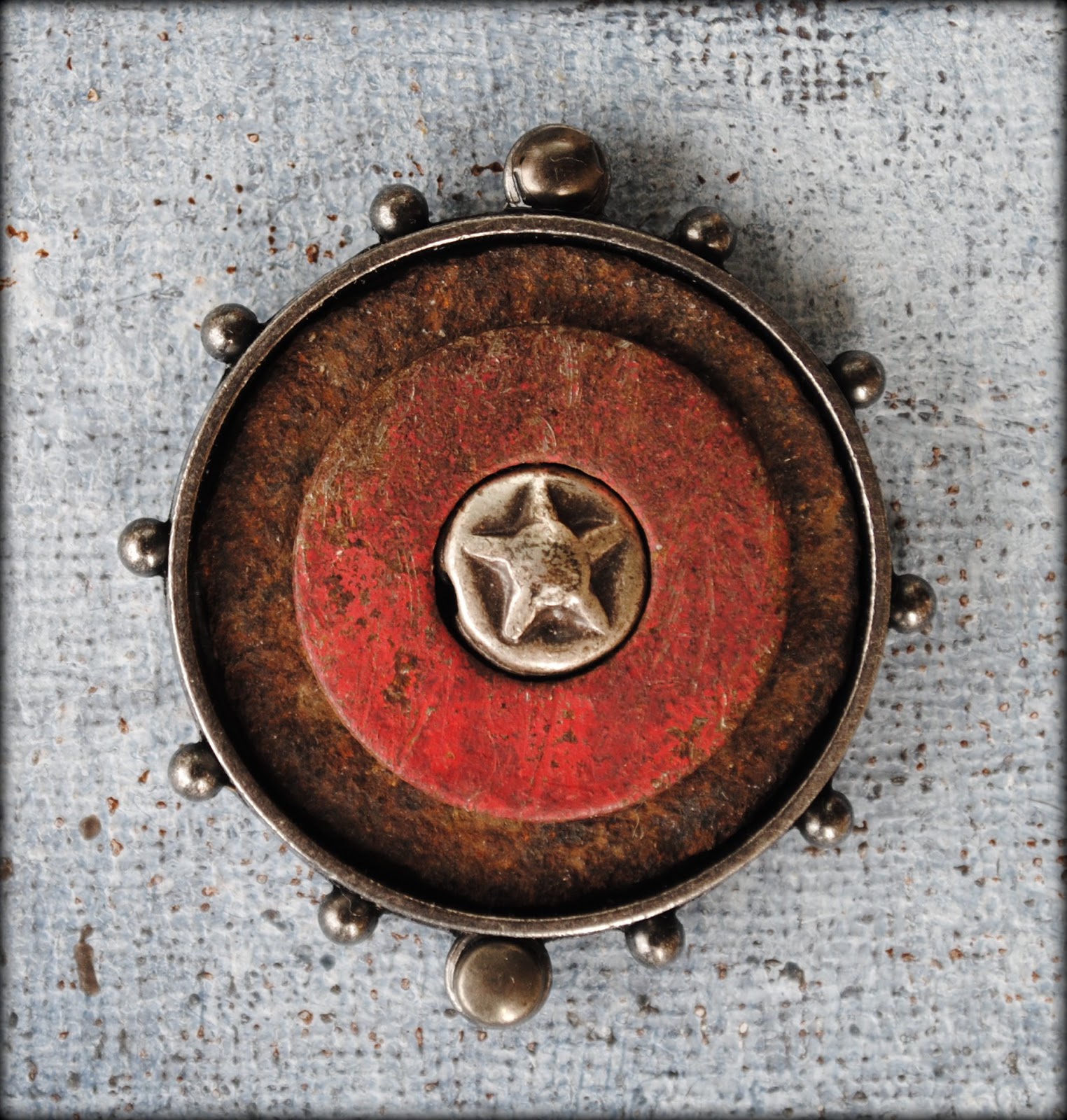
Time to layer and glue. My favorite time for sure.


Available for purchase in my Etsy shop.------------------------------
Supply List
Spellbinders Paper Art Supplies:
GC-001 Spellbinders® Grand Calibur® MachineGC-015 Spellbinders® Grand Calibur® Junior Magnetic Placement MatS4-114 Spellbinders® Nestabilities® Standard Circles LargeS5-048 Spellbinders® Shapeabilities® Sprightly SprocketsS5-203 Spellbinders® Imperial Gold Shapeabilities® Gold FacetsS4-407 Spellbinders® Nestabilities® Labels Thirty-TwoMB1-007 Spellbinders® Media MixageTM Bezels Circles Three
Preferred Promotional Partners: Tsukineko StazOn Ink Pad
Cross Promotional Partners: 7 Gypsies Paper
Other: card stock, corrugated cardboard, vintage book cover, decorative paper, hand painted paper (watercolor paper, gesso, acrylic paint, acrylic medium, ink), gesso, found metal hardware, brads, adhesive, sandpaper, guillotine cutter, scissor, tin snips
August 19, 2013
Real or Fake? The Results
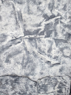
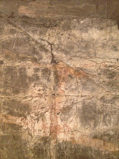
Real or Fake? Ten abstract images that I have photographed. Eight of them are found photos, randomly shot in NYC. Two of them are details from gallery artwork. Can you tell the difference?
Did you play? If you haven't yet and still want to, click here to be taken to the original post before you read any further.
42 people did play. Of these, nobody guessed the correct two images. Here are the guesses, in order of frequency:
#Eight: 20 votes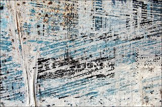
#Nine: 14 votes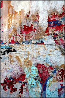
#Two: 12 votes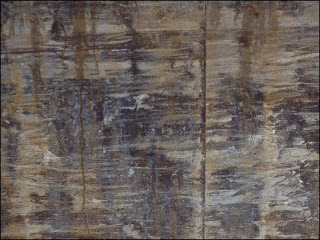
#Three: 11 votes
#One: 9 votes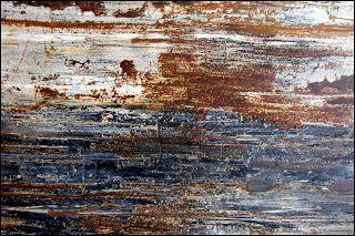
#Six: 9 votes
#Seven: 3 votes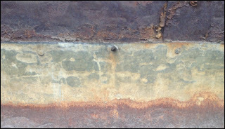
#Four: 2 votes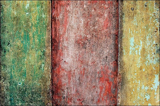
#Ten: 2 votes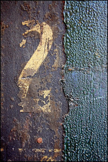
#Five: 0 votes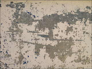
The correct answers are:
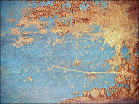 Number 3 - a detail of one of Richard Serra's monumental metal sculptures taken at the Museum of Modern Art.
 Number 6 - a detail of a piece by Pier Paolo Calzolari at his exhibition entitled When the dreamer dies, what happens to the dream which took place at both Pace Gallery and Marianne Boesky Gallery in NYC in 2012. This was an extraordinary and rare exhibit from a reclusive artist. You can see highlights from it in this video and in the following pictures:
Did you play? If you haven't yet and still want to, click here to be taken to the original post before you read any further.
42 people did play. Of these, nobody guessed the correct two images. Here are the guesses, in order of frequency:
#Eight: 20 votes

#Nine: 14 votes

#Two: 12 votes

#Three: 11 votes

#One: 9 votes

#Six: 9 votes
#Seven: 3 votes

#Four: 2 votes

#Ten: 2 votes

#Five: 0 votes

The correct answers are:
Number 3 - a detail of one of Richard Serra's monumental metal sculptures taken at the Museum of Modern Art.
Number 6 - a detail of a piece by Pier Paolo Calzolari at his exhibition entitled When the dreamer dies, what happens to the dream which took place at both Pace Gallery and Marianne Boesky Gallery in NYC in 2012. This was an extraordinary and rare exhibit from a reclusive artist. You can see highlights from it in this video and in the following pictures:


August 16, 2013
Making Marks
Thrilled to have both my artwork Entwined...
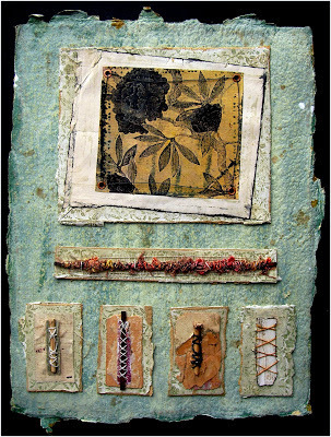
and my workshop DVD Easy Mixed Media Surface Techniques...
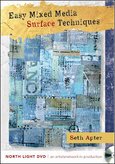
highlighted by Interweave on the Cloth Paper Scissor site.
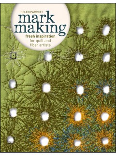
And congratulations to Helen Parrott on her newly released book Mark Making: Fresh Inspiration for Quilt and Fiber Artists...

which was also highlighted by Interweave in the same feature.

and my workshop DVD Easy Mixed Media Surface Techniques...

highlighted by Interweave on the Cloth Paper Scissor site.
And congratulations to Helen Parrott on her newly released book Mark Making: Fresh Inspiration for Quilt and Fiber Artists...
which was also highlighted by Interweave in the same feature.
August 15, 2013
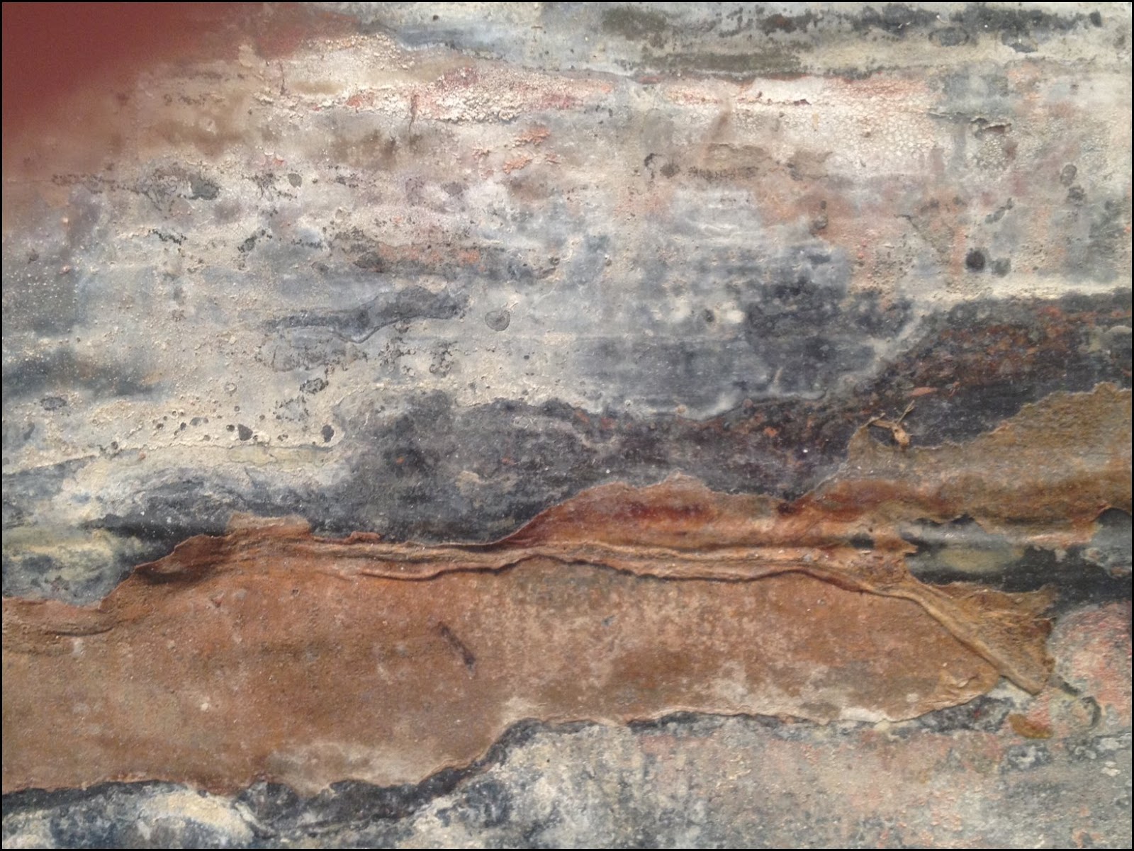
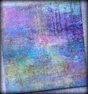
Real or Fake?
In the spirit of reality television, game shows, and just plain fun, I present Real or Fake?
Below you will find ten abstract images that I have photographed. Eight of them are found photos, randomly shot in NYC. Two of them are details from gallery artwork. Can you tell the difference?
Study the images, make a guess, and leave a comment that includes the numbers of the two images that you think have come from artwork I saw in two high profile, New York galleries. The correct answers will be posted next week.
One
Two
Three
Four
Five
Six
Seven
Eight
Nine
Ten
August 14, 2013
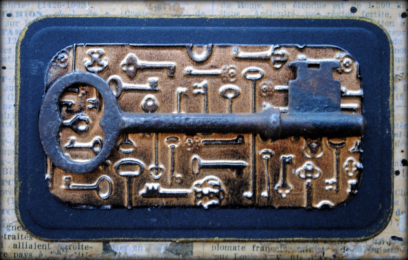
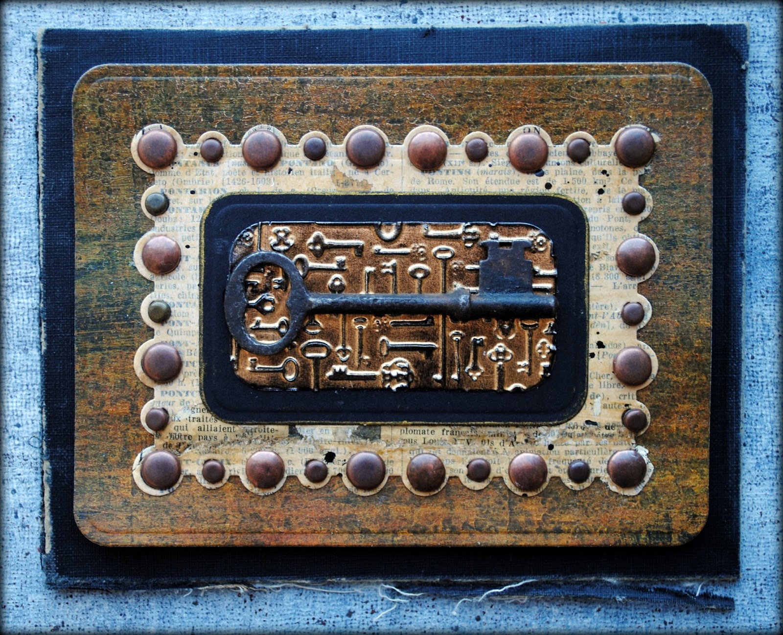
The Key

Today's mixed media artwork and tutorial was inspired by one of the vintage keys in my collection.

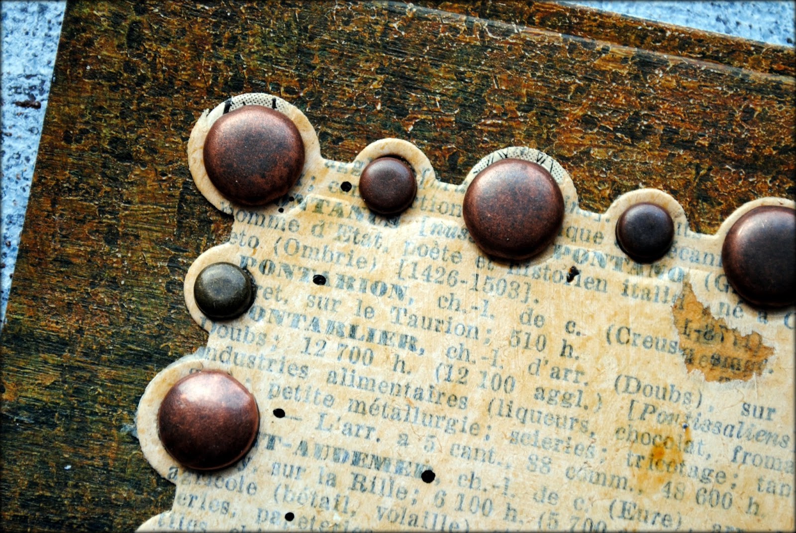
I started out by choosing some hand painted paper that I had previously made using pages from a vintage French dictionary as the substrate.

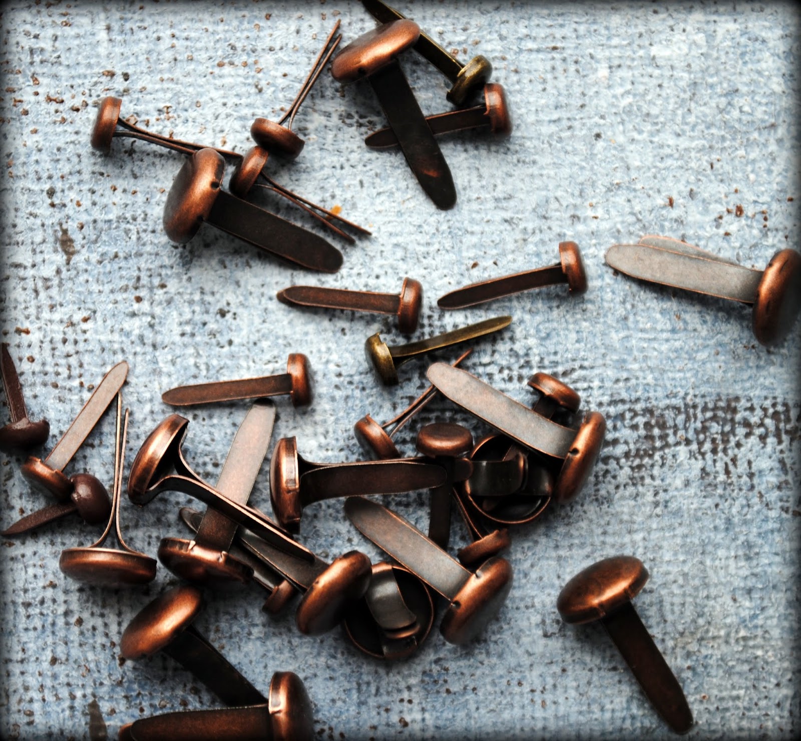
I have been noticing nailhead design everywhere and wanted to capture the look for this piece. I knew I wanted to use metallic brads to do this.
I looked through my supply of the newly released Spellbinders dies and found the perfect fit: Pearl Effects. I cut a piece of my hand painted paper using a die from the set.

I dug through more hand painted watercolor papers and found a darker piece that I knew would contrast well with the light amber paper I had already chosen. I cut the darker paper with a die from the A2 Curved Matting Basics B set.

Then I started glueing.
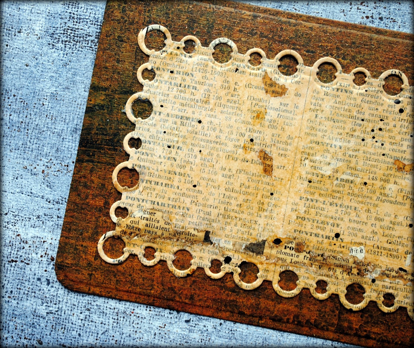
Using an awl, I punched small holes through each open circle at the edge of the paper and inserted the brads though each hole, matching the size of the brad with the size of the open circle.

Got the nailhead look I wanted.
This is what the flip side of the piece looked like with all the brad prongs folded down.

Knowing that I wanted to attach this piece to another layer and realizing that the prongs would make glueing difficult, I added a small piece of book board to the center area. That way, I could easily glue the piece to another substrate and add some dimensional life at the same time.

I cut a piece of metal foil using a smaller die from the A2 Curved Matting Basics B set.

I knew I wanted to add texture to this piece and found the perfect match for this artwork: Spellbinders new Keys Texture Plate. I ran these through the Artisan X-plorer machine to add the embossed detail.

I just loved how deep the embossing is with this technique.

I added more depth and texture to this piece by rubbing a black solvent ink pad over the surface and around the edges using a craft sponge.

Using the A2 Curved Matting Basics B set one more time, I cut a slightly larger piece of black card stock and edged it with a gold metallic ink pad.

More glueing.

I looked through my stash of loose vintage book covers and found one that I thought would be the perfect base layer for the piece. Using a guillotine cutter, I cut it to size. I distressed the edges using sandpaper.

Now comes the fun part. I put together all the layers using adhesive to create my finished piece: The Key.


----------------------------
Supply List
Spellbinders Paper Art Supplies:
MMM-001 Spellbinders® Artisan X-plorerMT1-009 Spellbinders® Keys Texture PlateS5-172 Spellbinders® Nestabilities® A2 Curved Matting Basics BS5-194 Spellbinders® Nestabilities® Pearl EffectsF-102 Spellbinders® Precious Metals Premium Craft Foils
Preferred Promotional Partners: Tsukineko StazOn Ink Pad, Tsukineko Delicata Ink Pad, Imagine Crafts Inkblushers Sponge
Other: card stock, book board, vintage book cover, hand painted paper (watercolor paper, vintage dictionary page, gesso, acrylic paint, acrylic medium, ink), vintage key, brads, adhesive, sandpaper, awl, guillotine cutter
August 9, 2013
2014 Workshops: Part 1
With still almost five months left in 2013, I have already begun to fill up 2014 with workshops. So far, I have plans to teach in New York, Connecticut, North Carolina, California and Maryland in the USA. And I am going international too, with classes scheduled in Mexico and Australia. Details are still being worked out for the majority of these and there will be many more stops added to the list as I continue to plan.
I wanted to share details of my west coast trip that will be taking place in February 2014 and make special note of the fact that registration will open next week for one of my workshops, as noted below.
February 1-2 - San Diego Book Arts - San Diego, California
 Mixed Media Memoire - 2-day workshop: registration pending
February 4-5 - Long Beach, California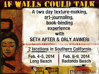 If Walls Could Talk, 2-day collaborative workshop with Orly Avineri: workshop full
February 7 - Guilding the Lily - Fullerton, California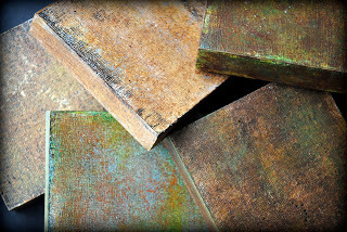
 Background Check: registration opens 8/12 at 714-757-0558
February 8-9 - Redondo Beach, California If Walls Could Talk, 2-day collaborative workshop with Orly Avineri: workshop full
February 12 - Todos Santos, South Baja, Mexico1-day workshop, details to be announced: registration pending
February 13-14 - Todos Santos, South Baja, Mexico2-day workshop, details to be announced: registration pending
Stay tuned for additional workshops soon to be scheduled. And click on the Workshop Tab under the blog header to see the remaining workshops on my 2013 schedule as well.
I wanted to share details of my west coast trip that will be taking place in February 2014 and make special note of the fact that registration will open next week for one of my workshops, as noted below.
February 1-2 - San Diego Book Arts - San Diego, California

 Mixed Media Memoire - 2-day workshop: registration pending
February 4-5 - Long Beach, California
 If Walls Could Talk, 2-day collaborative workshop with Orly Avineri: workshop full
February 7 - Guilding the Lily - Fullerton, California

 Background Check: registration opens 8/12 at 714-757-0558
February 8-9 - Redondo Beach, California
 If Walls Could Talk, 2-day collaborative workshop with Orly Avineri: workshop full
February 12 - Todos Santos, South Baja, Mexico1-day workshop, details to be announced: registration pending
February 13-14 - Todos Santos, South Baja, Mexico2-day workshop, details to be announced: registration pending
Stay tuned for additional workshops soon to be scheduled. And click on the Workshop Tab under the blog header to see the remaining workshops on my 2013 schedule as well.
August 4, 2013
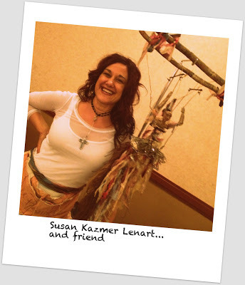
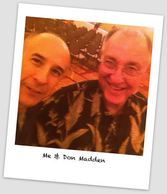
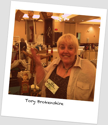
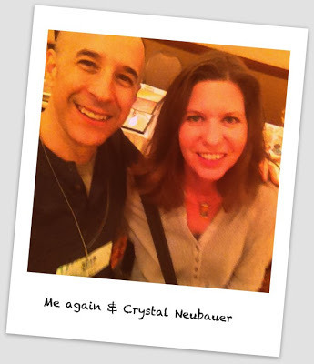
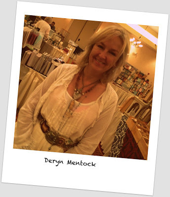
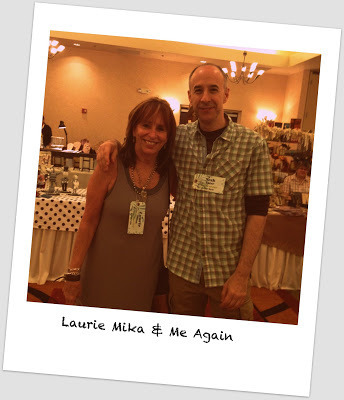
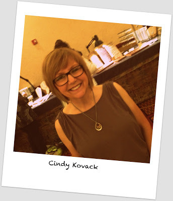
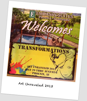
Shake it Like a Polaroid Picture
Art Unraveled 2013
Wish you were all here with us...
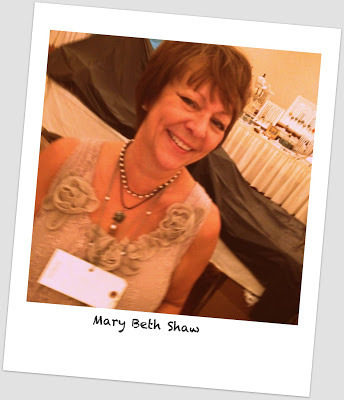
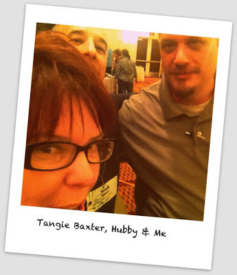
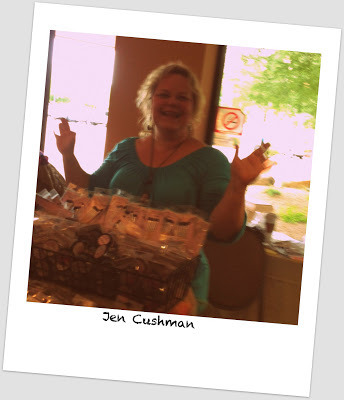
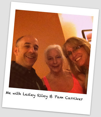
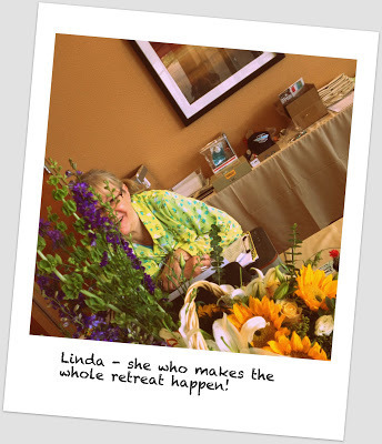
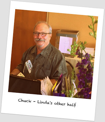
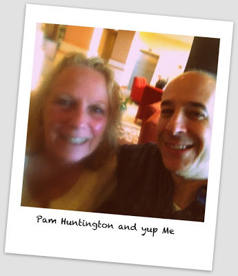
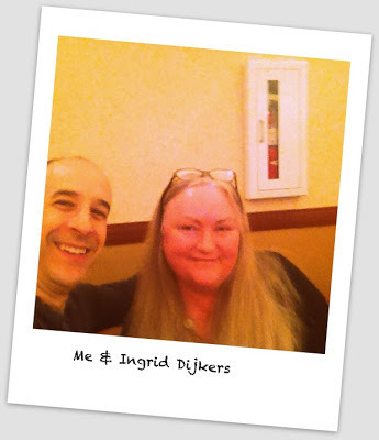
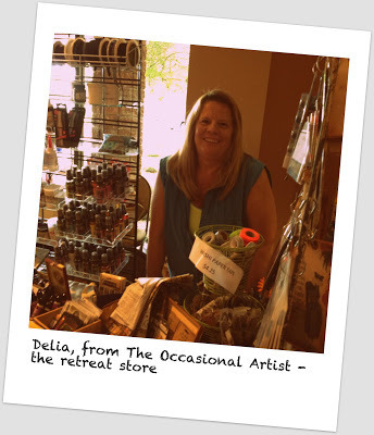
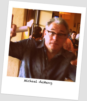
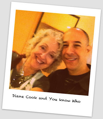
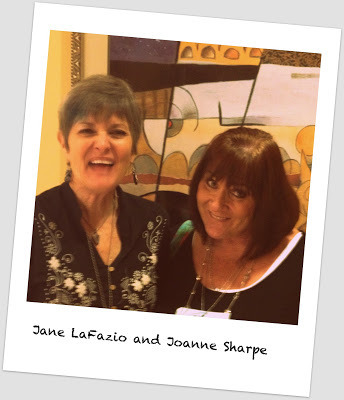
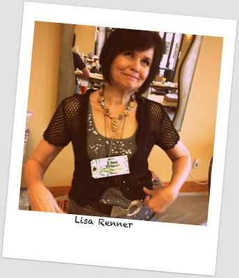
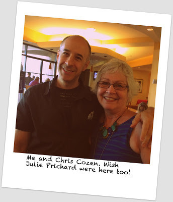
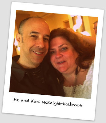
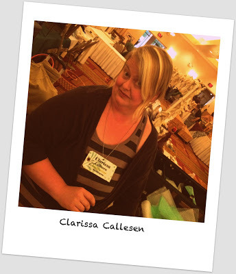
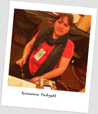
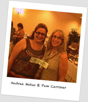
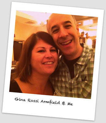
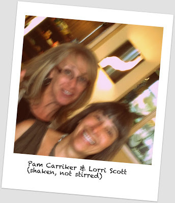

Wish you were all here with us...


August 2, 2013
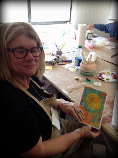
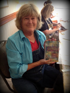
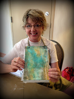
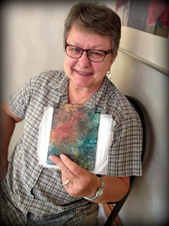
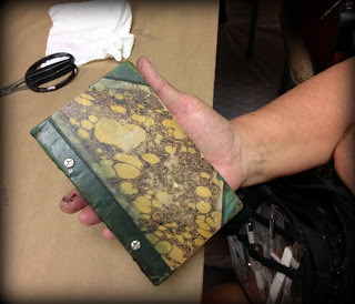
Art Unraveled: My Workshops
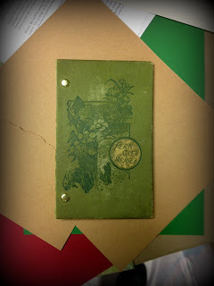
Mixed Media Dossier
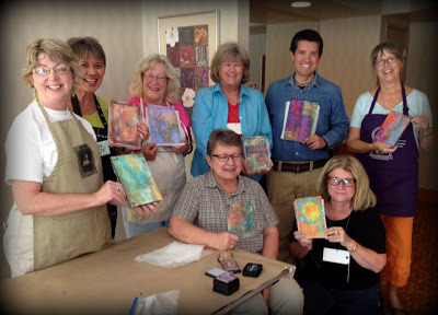 Class in Session
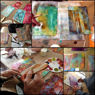 Work in Progress
Dossiers Delivered
For Your Eyes Only
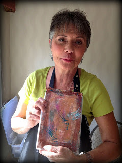
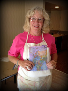
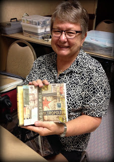
 Yearbook Picture
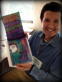
 Work in Progress
Birthing Books!
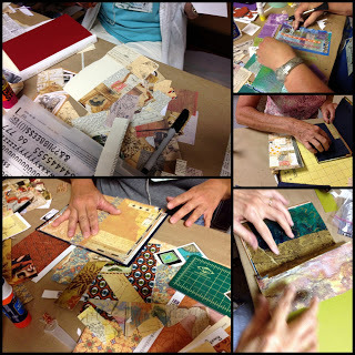
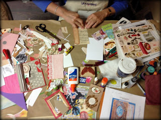 Messy worktable equals great art!
Text Tiles
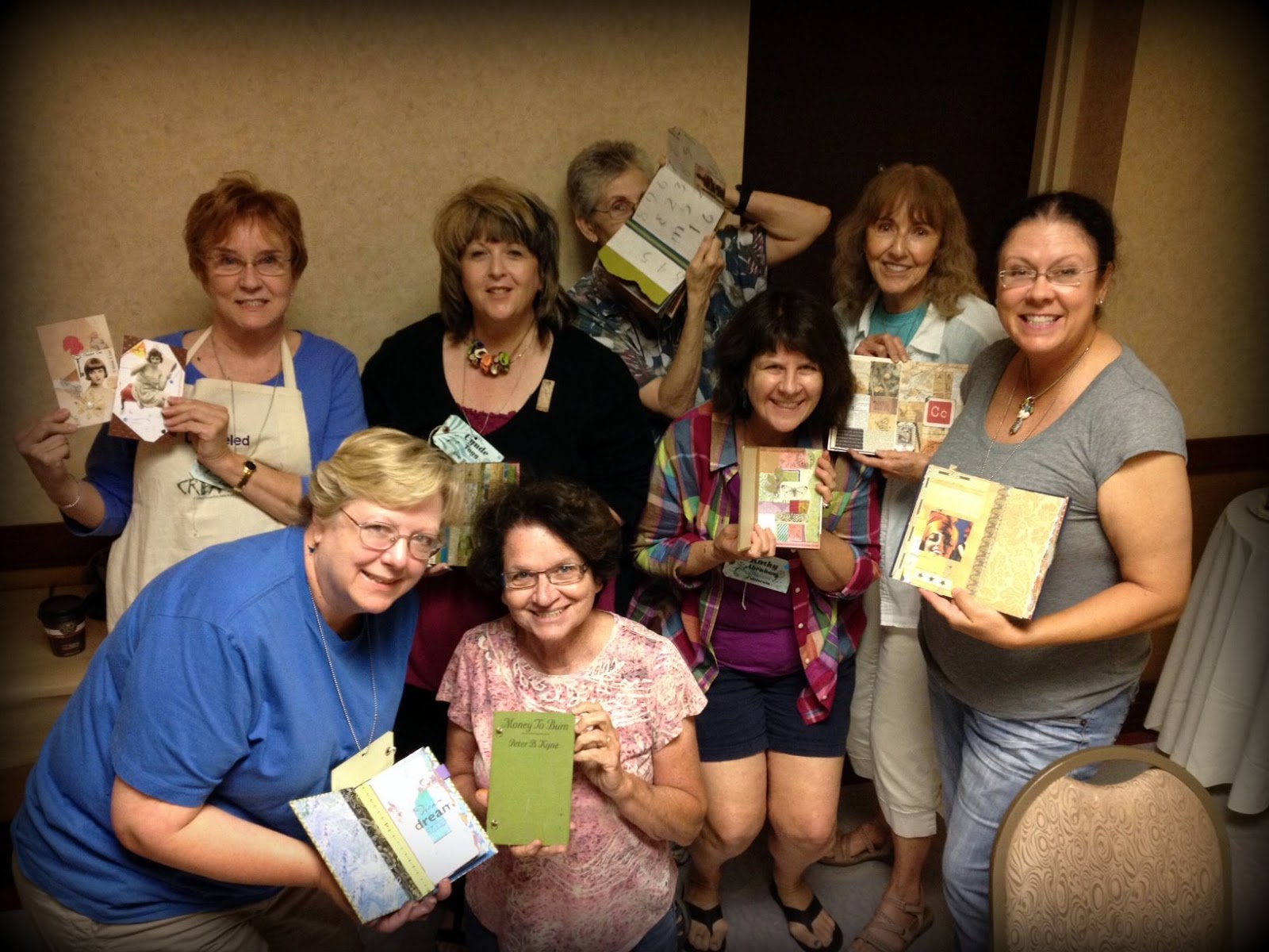
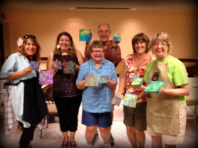 12 panels and 6 happy artists!
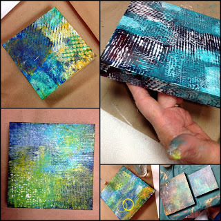 Work in Progress
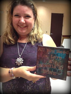 All You Need...from Amy!
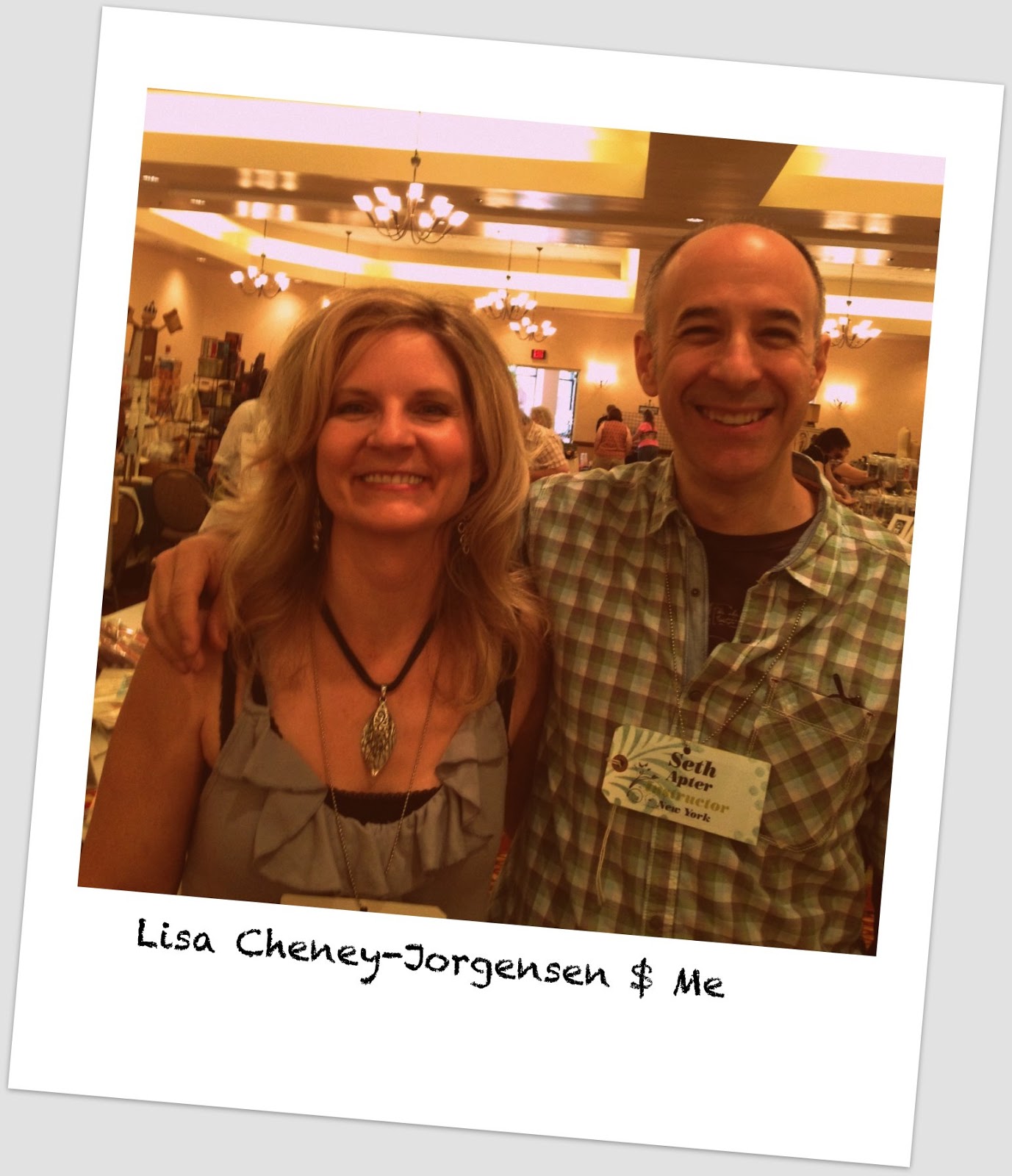
 With Angel.
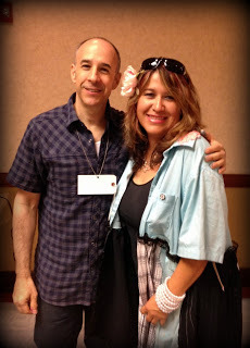
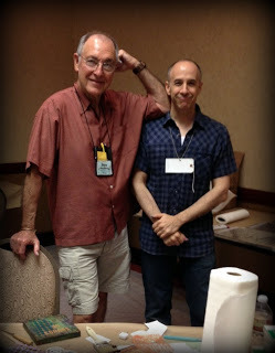 With Don.
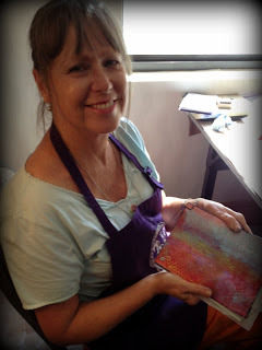
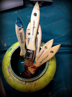 Happy brushes!
 Class in Session
 Work in Progress
Dossiers Delivered


For Your Eyes Only
 Yearbook Picture
 Work in Progress
Birthing Books!


 Messy worktable equals great art!
Text Tiles
 12 panels and 6 happy artists!
 Work in Progress
 All You Need...from Amy!
 With Angel.
 With Don.
 Happy brushes!