
Lukas Mathis's Blog, page 18
March 16, 2012
The New iPad's Screen Under the Microscope
Like any self-respecting UI designer, I have a microscope sitting on my desk.1 Here are some pictures comparing a bunch of different screens. They're all taken at approximately the same magnification.2 At the scale that the pictures were taken, the width of this bar equals about 1mm:

Note that not all screens are oriented the same way; sometimes, I had to turn the devices to take the picture.
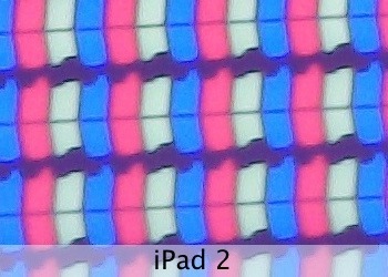
Here's the iPad 2's screen:
And here's what the third generation's screen looks like:
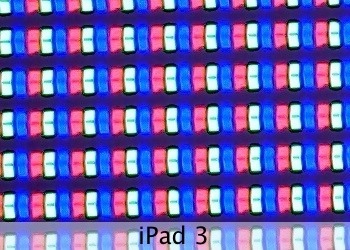
It's easy to conceptually understand the idea of quadrupling the pixel count, but once you actually see what this means, it's frankly pretty astonishing. The iPad 2's pixels look gargantuan next to the diminutive pixels from the third-gen iPad.
By the way, Apple's PR makes it sound like there's almost no space between individual pixels. While there's much less space than on the old iPad, rows of pixels are still placed quite a bit apart from each other.
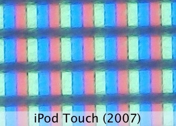
Similarly, here's an iPod touch (2007):
Here's an iPhone 4S:
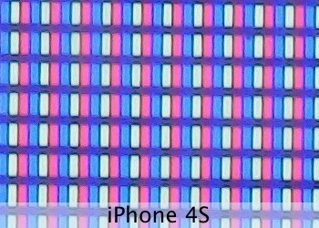
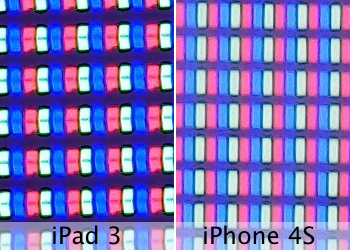
Comparing the iPad 3 to the iPhone 4S shows the iPhone's slightly higher resolution:
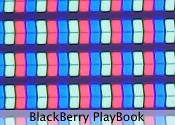
Let's see some other recent devices. Here's a BlackBerry PlayBook:
And its similar competitor from Amazon, the Kindle Fire:
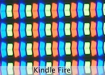
There were some rumors that the two used similar hardware. Clearly, this doesn't apply to the screen at all.
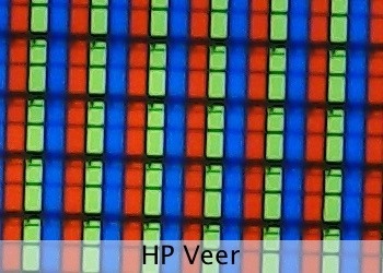
Moving on to some cell phones. First, the HP Veer:
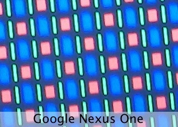
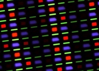
Next, the Google Nexus One.3 It sports one of these horrible PenTile RGBG OLEDs:4
Let's look at some recent gaming devices. This is a Nintendo 3DS:
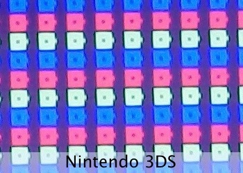
Note how this screen doesn't have square pixels; two pixels fill up one square. This is so the screen can send a different pixel to each eye, creating the 3D effect.
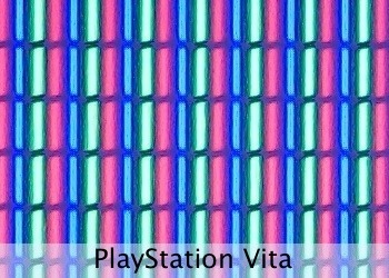
Here's the PlayStation Vita:
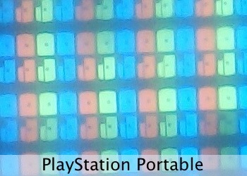
For comparison, its predecessor, the PSP:
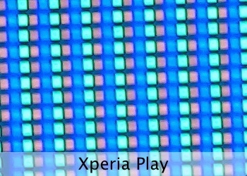
And Sony's «other» portable console, the Xperia Play:
And finally, here's the OpenPandora:
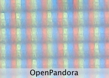
This screen looks a bit blurry under the microscope because it has an anti-glare coating. In real life, the screen looks great, especially in situations where the other screens show distracting reflections.
Update
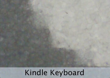
Somebody asked for an e-paper Kindle. Here's the Kindle Keyboard (third generation), at the same magnification:
Update 2
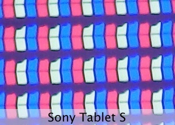
Somebody asked for a more recent Android device. Here's a Sony Tablet S:
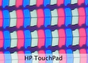
Update 3
Here's the HP TouchPad:
Update 4
This is a picture of the Galaxy Nexus's screen that should be roughly at the same scale:
It was taken by Keyan Mobli (via imahotdoglol). It's another PenTile RGBG OLED, so it only has two subpixels per pixel.
In all seriousness, as displays with super-high resolutions start to be more widely used, this might become a more common sight. 
At «80x», although what exactly that means depends on how you're viewing this post.
I would have like to include some more recent Android or WP7 phones, but I just don't have access to any, sorry! This isn't so much meant as a comparison, as it is an interesting look under the hood of these devices.
The Samsung Omnia 7 has a very similar screen. I'd include a picture, but I can't. I sent my Omnia 7 to Samsung's support for repair back in June 2011 (they shipped some Omnia 7s with a broken firmware). Samsung's support acknowledged receiving it, and that's the last I heard about that.
If you require a short url to link to this article, please use http://ignco.de/437
If you liked this, you'll love my book. It's called Designed for Use: Create Usable Interfaces for Applications and the Web. In it, I cover the whole design process, from user research and sketching to usability tests and A/B testing. But I don't just explain techniques, I also talk about concepts like discoverability, when and how to use animations, what we can learn from video games, and much more.


March 15, 2012
Mystery Meat
The world's first gesture based calculator, via Steven Troughton-Smith.
If you require a short url to link to this article, please use http://ignco.de/436
If you liked this, you'll love my book. It's called Designed for Use: Create Usable Interfaces for Applications and the Web. In it, I cover the whole design process, from user research and sketching to usability tests and A/B testing. But I don't just explain techniques, I also talk about concepts like discoverability, when and how to use animations, what we can learn from video games, and much more.

Interpreting User Feedback
Griffin McElroy on The Verge, writing about how developer Gearbox interpreted feedback from user testing sessions for their game Borderlands:
«A couple of things were very clear to us when we started working on Borderlands, and a few things took a few tests for us to really understand,» Armstrong explained. «There are rules that we've come to interpret as key things we need to follow, things like: Testers try to speak in fact, but they speak in emotion.»
(…)
«For instance, Borderlands is a game about wanting things,» Armstrong explained. «But one of the common things we hear people say is 'Boy, I'd like to build my own gun.' Okay, you can build your own gun. Now the game's over, congratulations. The quest for the perfect gun is over. It ends when you can build your own gun, and if you can do that in the first hour of the game, the game's over.»
If you require a short url to link to this article, please use http://ignco.de/435
If you liked this, you'll love my book. It's called Designed for Use: Create Usable Interfaces for Applications and the Web. In it, I cover the whole design process, from user research and sketching to usability tests and A/B testing. But I don't just explain techniques, I also talk about concepts like discoverability, when and how to use animations, what we can learn from video games, and much more.

March 14, 2012
iPhoto's Mystery Meat Gestures
Back in 1998, websites would often force visitors to aimlessly move their mouse around, trying to reveal hidden icons or pieces of text that would explain where to click. Frustrated with these hidden, obscure navigation elements, web designer Vincent Flanders coined the term «Mystery Meat Navigation».1
After downloading and playing around with Apple's new iPhoto for iOS, I felt like I was teleported back to 1998. Touching and gesturing in different ways would make seemingly random things happen. I regularly unintentionally activated features, changed views, opened or closed pictures, and got iPhoto into states I wasn't sure how to get out of again.
Hidden Gestures
It was only after I watched Apple's Keynote, where Apple's Randy Ubillos explains some of the gestures and features of iPhoto, that I finally started to understand how the application is supposed to work.
Apple can't expect every iPhoto user to watch its Keynote, just to figure out how to use the app. It should be accessible to anyone.
While playing around with iPhoto, I didn't discover most of the features shown in the Keynote. For example, you can darken or lighten the sky in a photo, but you do that by touching the sky, waiting for new ui elements to appear, and then sliding your finger. How is a novice user supposed to find this feature?
There's some on-screen help, but it's mostly useless. For example, Apple's help tells you to «touch and hold with two fingers to use the magnifying loupe.»
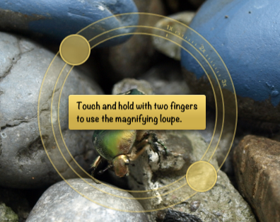
But once you do that, there's no further help or information!
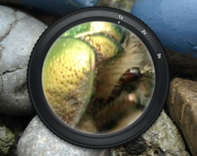
The loupe seems to support different zoom levels. How do you access them? I don't know. Are there other features the loupe supports? I don't know. Can you access the help system again, to get additional information? Nope, trying to do that just closes the loupe.
It's okay to have a few gestures that aren't easily discoverable, if they are simple, universally applicable, and fun enough that people will teach them to each other. Pinch-to-zoom is one such gesture. Most people probably won't discover it on their own, but it's such a fun gesture that the people who know it will show it to those who don't. It's also easy to learn and remember, and it works pretty much everywhere, so pinching pictures quickly becomes second nature.
Unfortunately, iPhoto's hidden gestures aren't particularly fun, and they only work in iPhoto. iOS's built-in «Photos» app is a completely different application, despite doing essentially the same thing as iPhoto, running on the same device, and coming from the same company. Almost nothing you learn in iPhoto can be applied to Photos, or to any other iOS app. In fact, being proficient at using iPhoto will probably make you worse at using Photos.
Button Overload
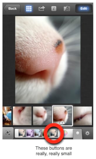
Not every feature in iPhoto is hidden behind a gesture. Many other features in iPhoto are exposed using buttons, but they don't fare much better. Almost none of the buttons have text labels, just (sometimes rather inscrutable) icons; it's reminiscent of Microsoft Word's insane toolbars.


There are so many unlabeled icons that I really have no idea what most do.

In fact, there are so many buttons in iPhoto that when you run it on the iPhone, many of them become tiny. You can barely hit them with your finger.
And even if you realize what the buttons do, and manage to hit them with your finger, it's often not clear how they work. Sometimes, you tap a button to activate a mode, but then you also have to do some other gesture (like sliding your finger over the picture) to trigger the actual effect.
Feedback
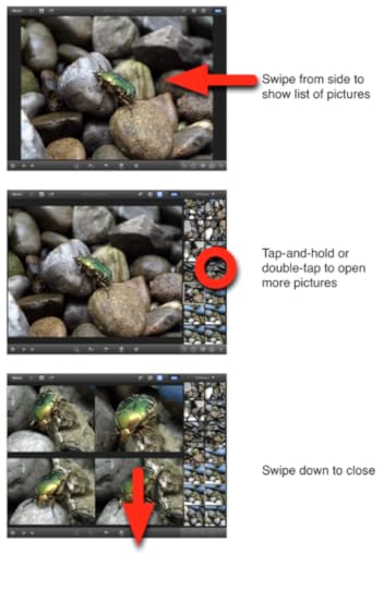
In addition to having many hidden gestures, iPhoto also commits the mortal sin of only showing the effect of many gestures once the gesture is finished. For example, iPhoto allows you to see a number of pictures side-by-side. You can remove pictures from this list by swiping down. On webOS, which offers a similar user interface for its cards view, swiping a card immediately gives feedback; the card moves with your finger, and you understand that something is happening. On iPhoto, on the other hand, there's no feedback. You need to finish the gesture; once you've done that, the photo disappears.
That's a rookie's mistake. It simply shouldn't happen in one of Apple's flagship products.
Something I like
But I want to close with something I really like about iPhoto: it looks distinctive and unique. But apart from a few examples (like the fanning-out brushes), it doesn't fall into the skeuomorphism overkill trap — unlike many other recent Apple apps.
This Stuff Is Hard
It's easy to find flaws in iPhoto, but it's important to remember that Apple is sailing uncharted waters here. There are few (if any) other iOS applications that offer anywhere near the functionality that Apple managed to cram into iPhoto. In some way, Apple is trying to define a new language for touchscreen user interfaces. Perhaps they're going too far with iPhoto: a little close button is much more obvious and easier to figure out than a hidden «swipe down to close» gesture. But then, if you have hundreds of rather complex features, you just can't add a new button for every last one of them.
Microsoft's Windows 8 has similar issues,2 but over there, users just have to learn a small number of consistent, system-wide gestures. I've recently used a BlackBerry PlayBook running OS 2.0 (which I really like). The PlayBook has two different system-wide gestures that you need to know in order to be able to use the device. BlackBerry teaches its users these gestures by sending them through an interactive tutorial the first time they turn on the device.
iPhoto, on the other hand, has so many different hidden features and gestures that this approach doesn't really seem feasible.
This stuff is hard. iPhoto has many flaws, but I'm pretty sure the same could be said of the Xerox Alto's UI. We're new at this, but as we get better at designing for touch user interfaces, and as a common language starts to be established, designing touchscreen versions of complex applications like iPhoto will get much easier.
No, I didn't steal this article's title from Craig Grannell! It's a complete coincidence!
As an aside: from the video, it seems like Pirillo's dad couldn't figure out how to go back to the Windows start screen. You do that by hitting the Windows key. So it's a bit like people using an iPad for the first time, trying to figure out how to get back out of an app to the home screen, and nobody telling them that they simply have to hit the hardware home button.
Yeah, you have to be told that this is how it works, but once you know, it's hardly a major usability issue.
If you require a short url to link to this article, please use http://ignco.de/433
If you liked this, you'll love my book. It's called Designed for Use: Create Usable Interfaces for Applications and the Web. In it, I cover the whole design process, from user research and sketching to usability tests and A/B testing. But I don't just explain techniques, I also talk about concepts like discoverability, when and how to use animations, what we can learn from video games, and much more.

March 9, 2012
iOS Breaks Launch Center Prefs URLs
Just a few days ago, I wrote this on Swipe The Linen:
On many mobile platforms, changing the screen's brightness or getting to your data usage information is pretty simple. On the iPhone, it's not, which is why I have David Barnard's Launch Center on my home screen. Among other things, it allows me to jump directly to different screens of the Settings app.
Of course, just hours later, Apple broke URLs to the Settings app, effectively disabling this feature. Launch Center is still useful, of course, just a bit less. If you want to help David get this feature back, read this.
If you require a short url to link to this article, please use http://ignco.de/432
If you liked this, you'll love my book. It's called Designed for Use: Create Usable Interfaces for Applications and the Web. In it, I cover the whole design process, from user research and sketching to usability tests and A/B testing. But I don't just explain techniques, I also talk about concepts like discoverability, when and how to use animations, what we can learn from video games, and much more.

February 21, 2012
Please Steal These webOS Features
When Apple introduced the first iPad in 2010, I bought one immediately. I didn't know what I'd use it for, but I was sure that I would find some use for it. I never did. I played around with it, wrote some code for it, but eventually stopped using it. I would pick it up from time to time to read something or watch a YouTube movie, but even that was a rare occurrence. I have since picked up an iPad 2, and I'm using it a lot more than the first iPad, but again, I'm pretty much only using it to consume content.
I suspect that most people use their iPads similarly: to surf the web, watch movies, play games, read books, and graphic novels. Essentially, to consume. Of course, there are always exceptions. There are great music and painting apps for the iPad, for example. But how many iPad owners are musicians or like to paint with their fingers? In the grand scheme of things, not many, I suspect.
So when I bought a TouchPad after HP discontinued it, I never assumed that I would use it for actual work. But I am doing just that. I'm using it to respond to email, to do research on the Internet, to take notes during meetings.
So why was it so easy for me to use the TouchPad for work, but not the iPad? I think it's because there are a number of things the TouchPad does that make it more suitable for work.
Now that it is becoming increasingly obvious that HP won't do anything useful with webOS, it's time to start stealing1 the things it does well. Here are some of these things.
Switching Apps
Sometimes, you agonize over how something should be designed. And then you come up with an idea, or see somebody else's solution, and you're just blown away by how obvious it seems. The cards UI for switching between apps in webOS is such an idea. I don't think I need to elaborate.2 Nothing else I've seen comes close. By now, many other platforms have implemented their own versions of this concept, but the original remains the best.
One App, Many Screens
Almost every time I try to use the iPhone or iPad for writing a response to an email that is longer than «Okay» or «I'll be there», I have this problem: I need to refer to another email. Maybe it's something somebody said in an earlier conversation. Maybe it's something from the mail I'm replying to, and I've already deleted it. Regardless, it constantly happens to me.
On iOS, it's almost impossible to leave a draft, read another mail, and go back to the draft. It can be done, but it's ridiculously cumbersome.3 On webOS?
Yep, the new email opens in its own card that's attached to the Mail application's card. You can easily go back to your other mails, search them, read them, copy text from them, do whatever you want. You can even start writing another mail, and easily switch between the two drafts.
Organizing Windows
Recently, I was in a meeting where we discussed color schemes for an application. We wanted to keep the number of colors as low as possible, but still have enough color to clearly show the difference between content foreground, content background, and application chrome. It occurred to me that 90s videogames did a pretty good job differentiating between layers — characters, environment, background, HUDs — using a very limited color palette. I wondered how they achieved this. So I did a quick Google search for screenshots from different games, and opened a few of them. Here's what this looked like in webOS.
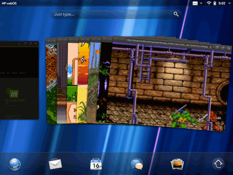
I'm looking at six different web pages at the same time. I can easily switch between them, add new ones, or removes ones I don't need anymore. On the iPad, I'd be looking at a bunch of tabs with cryptic names.
Accounts
Document management on iOS is a mess. Every application implements its own scheme. They all work differently. Some allow you do open documents in other applications that support a matching file format. Others don't. Some support Dropbox, or other services. Others don't. Some allow you to organize your documents hierarchically or spatially, others don't.
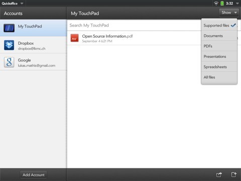
In webOS, you can set up different system-wide accounts.
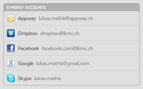
Each of this account can provide a number of different services.
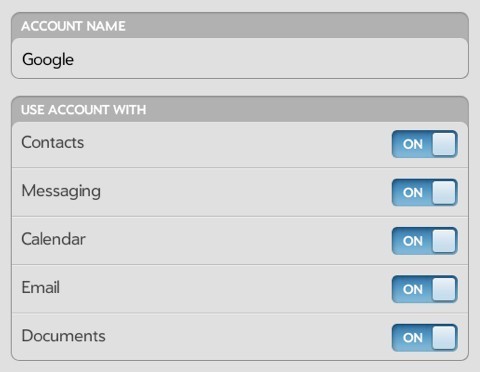
These services are immediately available in all webOS applications. QuickOffice doesn't need to support Dropbox, or your Google Documents account; webOS handles this. QuickOffice just has to be a good citizen, support the proper webOS APIs, and it gets access to all of these services automatically.
Related to this, Windows 84 has a concept called «contracts», which allows applications to interact with each other, and provide services that can be used by each other. This way, a photo application can call upon a Twitter application to share a picture on Twitter without implementing any Twitter-specific code, or a text editor can open a file from a Dropbox application without knowing what Dropbox is.
Neither of these two solutions are perfect, but both are much better than simply providing a global way of storing Twitter credentials.
Aside: I don't think either webOS or Windows Phone 7 (even with contracts) «solve» the «documents problem» on mobile devices, though. Documents should not be relegated into applications. Documents should be a first-level OS concept, the same way apps are. Document management, including document creation, should be handled by the system.
Splitting document management up into two parts, the way Windows and the Mac do it (with parts of it happening in the Finder, and parts of it happening in applications' open/safe dialogs) is one of the dumbest things desktop systems do. It's probably a result of technical constraints, rather than a conscious design decision (there wasn't enough RAM to keep the Finder and an app in memory at the same time, thus apps had to replicate parts of the Finder). But somehow, it has survived into the present day.
The Keyboard
For a long time, Apple had the best touchscreen keyboard, bar none. Recently, others have caught up. The keyboard in Windows Phone 7 is fantastic, and the one in webOS also does a number of things right.
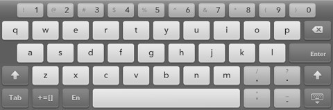
To begin with, it has a number row. No more switching between different modes to type numbers. You can access them directly.
My biggest problem with text input on iOS is its flaky autocorrection. I'm regularly typing words iOS doesn't auto-correct properly, so I need a simple, quick way to revert autocorrection. iOS doesn't have that. webOS does. Simply hit delete after webOS corrects something. Rather than deleting the last character, this undoes the autocorrection. Boom. Done.
But quite often, I type a lot of text, and don't pay any attention to autocorrection. On iOS, this means I have to go back and closely read through my text to find every instance where iOS made a ducking error. Not so on webOS.
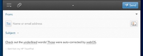
Autocorrections are underlined, can be easily identified, and, if necessary, quickly reverted. webOS will even make a small noise when it auto-corrects something, so you know when to pay attention.
Notifications
This could be an essay all on its own. iOS 5 has introduced a system for managing notifications, and it's not bad.5 But webOS still wins, doing a number of things that make notifications less intrusive, more useful, and more manageable.
One feature I particularly like is that you can just «shove» a notification away with your finger if you don't want to see it anymore. It's just a tiny thing, but it feels so much better and more satisfying than carefully hitting the tiny «delete» button on iOS.
Another neat feature is that webOS apps can resize to pretty much any size. So when a new notification appears, it doesn't cover the application. Instead, the application shrinks a bit to make room for the notification.
Quick Access to Regularly Changed Settings
On my iPhone, I'm using David Barnard's Launch Center to get to the Brightness setting. I don't know if the people at Apple never change their phone's brightness, but I do this quite often. It's a chore.
On webOS?
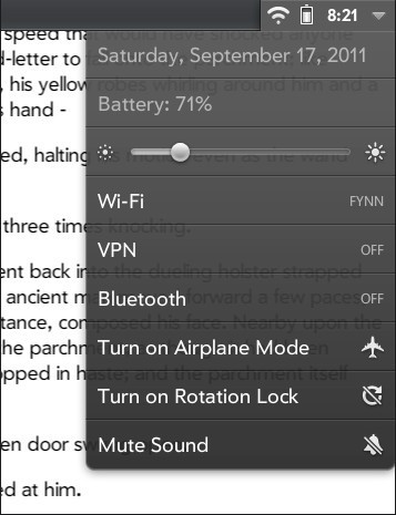
Much easier.
Just Type
It's a bit like a simple version of Quicksilver, except it's built right into the OS. Of course, this works best with a hardware keyboard.
This Isn't All
Of course, this article doesn't list all of the amazing things webOS does. These are just some of the things that made it easier for me to do actual work on a TouchPad, compared to an iPad. But there's a lot more webOS does right. For example, I really love the way you develop applications for webOS. And I actually think that the Veer is a pretty great phone.6
The Future
webOS isn't quite dead yet. It's just being open-sourced, which, when it happens to commercial software, often turns out to be the digital equivalent of being reanimated as a walking corpse in a George Romero movie. You're still shuffling around a bit, and occasionally making some (mostly incomprehensible) noises, but you probably won't make it too far anymore.
Of course, it's not assured that this is the end of webOS. Maybe open-sourcing it will be the best thing that ever happened to webOS.7 But maybe it just means that HP doesn't care anymore, and that webOS won't receive much attention anymore. This would be unfortunate, because webOS is one of the few current mobile operating systems that are actually a joy to use. It's been hurt by HP's incompetent management, rather than any egregious faults of its own.
The least we can do now is to keep its best ideas alive, even if webOS itself won't make it.
You can discuss this article on Hacker News.
I'm using the word the way Brian Ford defined it: take the idea, but make it your own. Don't just copy it; be inspired by it, and improve upon it.
For those who have never seen it, watch a video of the original implementation here.
Here's a nifty shortcut that makes this a bit less annoying on iOS.
I originally mistakenly claimed that contracts exist on WP7. I'm not sure where I got that impression, but as Ryan Versaw pointed out, and as far as I can tell, that was wrong. Contracts don't yet exist on WP7, but seem to be planned.
In an earlier version of this article, I had a complaint about Android's notification system here. But since I haven't used ICS (it doesn't run on any of my devices), I've removed this complaint. Seems unfair to complain about something that might be fixed in a newer version of Android.
Obviously, I'm in the minority here, but I don't think all phones need to look exactly like an iPhone; there should be a market for smaller (and yes, also for larger) devices. Even if you assume that everybody has the same needs, not everybody has the same hands. I also think there should be a market for devices with different form factors and input methods. Personally, I really like hardware keyboards and styluses; I wish my iPad would allow me to write and draw on it with a real, pressure sensitive pen.
And I've heard positive things from people inside HP. All hope is definitely not lost.
If you require a short url to link to this article, please use http://ignco.de/419
If you liked this, you'll love my book. It's called Designed for Use: Create Usable Interfaces for Applications and the Web. In it, I cover the whole design process, from user research and sketching to usability tests and A/B testing. But I don't just explain techniques, I also talk about concepts like discoverability, when and how to use animations, what we can learn from video games, and much more.

February 2, 2012
Organizing Documents in iOS
Via Jesper, Pierre Lebeaupin writes:
If one remembers a document, but not the app which was used to create it, it's hard to find it again, as the system-wide search in iOS cannot search in third-party apps (at least it couldn't when this feature was released in iPhone OS 3.0, and I am not aware of this having changed), so one has to search each and every app where this document could have been made.
In some cases, for a project for instance, it is necessary to group documents created by different apps: sometimes there is no single app that can manage all the different media for a single project. On iOS these documents can only exist segregated into their own apps with no way to logically group them.
Organizing documents based on their app is akin to organizing notes based on the pencil you used to write them.1
Further Reading
The most extraordinary invention would have to be the digital canvas. A weave not of components, but of some sort of primordial ooze. Something that would have digital natural laws, on top of which you could build new things and reuse it for completely unintended purposes.
Yes, there are exceptions. Sometimes, this makes sense. But more often, it doesn't.
If you require a short url to link to this article, please use http://ignco.de/426
If you liked this, you'll love my book. It's called Designed for Use: Create Usable Interfaces for Applications and the Web. In it, I cover the whole design process, from user research and sketching to usability tests and A/B testing. But I don't just explain techniques, I also talk about concepts like discoverability, when and how to use animations, what we can learn from video games, and much more.

January 25, 2012
The Zynga Abyss
Benjamin Jackson, in an excerpt from one of the first Distance essays:
The primary characteristic of unethical games is that they are manipulative, misleading, or both. From a user-experience standpoint, these games display dark patterns, which I define as common design decisions that trick users into doing something against their will. Dark patterns are usually employed to maximize some metric of success, such as email signups, checkouts, or upgrades; they generally test well when they're released to users.
For example, FarmVille, Tap Fish, and Club Penguin play on deep-rooted psychological impulses to make money from their audiences. They take advantage of gamers' completion urge by prominently displaying progress bars that encourage leveling up. They randomly time rewards, much like slot machines time payouts to keep players coming back, even when their net gain is negative. And they spread virally by compelling players to constantly post requests to their friends' walls.
If you require a short url to link to this article, please use http://ignco.de/424
If you liked this, you'll love my book. It's called Designed for Use: Create Usable Interfaces for Applications and the Web. In it, I cover the whole design process, from user research and sketching to usability tests and A/B testing. But I don't just explain techniques, I also talk about concepts like discoverability, when and how to use animations, what we can learn from video games, and much more.

January 22, 2012
Follow-Up
Aforementioned xScope is now available in a new version.
Also, Nick Disabato, who successfully funded his design book Cadence & Slang using Kickstarter, is at it again. This time, he's funding Distance, a quarterly publication featuring long-form essays about design and technology. Help fund Distance by clicking here.
If you require a short url to link to this article, please use http://ignco.de/423
If you liked this, you'll love my book. It's called Designed for Use: Create Usable Interfaces for Applications and the Web. In it, I cover the whole design process, from user research and sketching to usability tests and A/B testing. But I don't just explain techniques, I also talk about concepts like discoverability, when and how to use animations, what we can learn from video games, and much more.

January 8, 2012
SnapRuler
I typically use xScope for all of my on-screen pixel measuring needs, but recently, I've often found myseful using SnapRuler instead. It's very simple, but has three really useful features.
First, hitting shift immediately snaps the measuring rectangle to the nearest visible edge (like the border of a button or window). Second, once you've measured something, you can copy the values as CSS or Objective-C code, and directly paste them into your text file. And third, you can easily resize your selection rectangle by single pixels using the arrow keys (something I have to do often when I'm working with a trackpad).
Both xScope and SnapRuler are really nifty, and get along nicely with each other.
If you require a short url to link to this article, please use http://ignco.de/422
If you liked this, you'll love my book. It's called Designed for Use: Create Usable Interfaces for Applications and the Web. In it, I cover the whole design process, from user research and sketching to usability tests and A/B testing. But I don't just explain techniques, I also talk about concepts like discoverability, when and how to use animations, what we can learn from video games, and much more.

Lukas Mathis's Blog

- Lukas Mathis's profile
- 2 followers

