
Lukas Mathis's Blog, page 16
September 27, 2012
Different People Have Different Hands
Apple notes that the top left and bottom right areas of the new iPhone’s screen can easily be touched with your thumb, without contorting your hand.
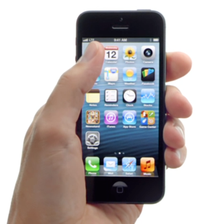
I’ve seen a number of iPhone reviews talk about this. Some noted that the screen was uncomfortably big, others reported that the phone had just the right screen size, and even others preferred larger Android phones.
It’s a bit of a strange claim either way, because different people have vastly different hands. Apple probably strikes a good balance, but it’s not surprising that, for many, the iPhone is either too big or too small. There is no one perfect screen size that fits everybody’s hands.
If you require a short url to link to this article, please use http://ignco.de/478


September 26, 2012
Car Dashboard Typeface Usability
Nifty research (PDF) from MIT’s AgeLab:
This paper reports on the results of a project examining the impact of typeface design on glance
behavior away from the roadway when a driver interacts with a multi-line menu display designed to
model a text-rich automotive human machine interface (HMI). (…) Across the two studies, among men,
a “humanist” typeface resulted in a 10.6% lower visual demand as measured by total glance time as
compared to the “square grotesque” typeface. Total response time and number of glances required to
complete a response showed similar patterns. Interestingly, the impact of different typeface style was
either more modest or not apparent for women on these variables. Error rates for both males and
females were 3.1% less for the humanist typeface.
If you require a short url to link to this article, please use http://ignco.de/477

September 9, 2012
Progress
With the transition from DOS to Windows, Microsoft put what used to be «the computer» inside an application.
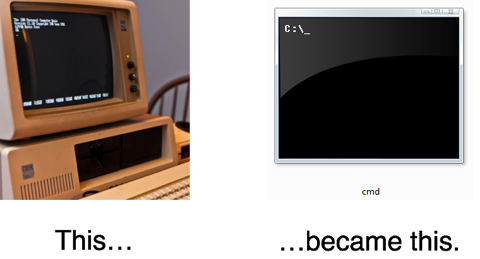
Now, Microsoft is doing it again. In Windows 8, what used to be «the computer», the Windows Explorer, is now hidden away inside what essentially looks like just another application.
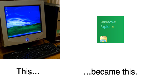
Which is why I think that this Verge video of a hands-on with a Windows RT tablet is a bit peculiar. It spends a lot of time in the Explorer; that’s a bit like demonstrating Windows 95 by opening the DOS shell.
Image Credits
Picture of DOS PC by Steve Petrucelli.
Picture of Windows PC by Karl Frankowski.
If you require a short url to link to this article, please use http://ignco.de/470
If you liked this, you'll love my book. It's called Designed for Use: Create Usable Interfaces for Applications and the Web. In it, I cover the whole design process, from user research and sketching to usability tests and A/B testing. But I don't just explain techniques, I also talk about concepts like discoverability, when and how to use animations, what we can learn from video games, and much more.

September 2, 2012
Buttons
Let’s say you’re designing some way to send video from one device to another device (for example, from your phone to your TV), and you think «ah ha! instead of pressing a boring button, what if we made it so you could just flick the video off your phone’s screen up to the tv?»
I admit, it sounds neat at first. But it’s classic jetpack design, putting «wow» before «it just works». In real world usage, the interaction falls apart.
(…)
You could remove the gesture, leaving you with a button. A single, understandable, discoverable, button that can work for multiple outputs. It’s not sexy and new, but it works. And we need more «it just works» design in the world.
Lots of designers seem reluctant to rely on buttons when designing user interfaces for touchscreens, opting to go with more unusual interactions instead. Sure, gestures are sexy. They’re also easy, allowing you to remove clutter from your user interface.
But buttons are discoverable. They can have labels that describe what they do. Everybody knows how to use them. They just work. It’s why we use them to turn on the lights, instead of installing Clappers everywhere.
If you require a short url to link to this article, please use http://ignco.de/468

August 25, 2012
Apple vs. Samsung
In the long term, we’re sure to see lots of UI behaviors change across Android — most companies have already moved away from the bounceback scrolling behavior protected by the Apple patent in this case, and we’re sure to see tap-to-zoom and multitouch scrolling behavior affected on new devices as well.
In closing arguments, Apple attorney Harold McElhinny told the jury:
«If you find for Apple in this case, you will have re-affirmed the American patent system.»
(…)
I must admit I’m uncomfortable with the idea that the world’s largest corporation, whatever its name, could be given such a big stick as early as this week. However the verdict falls, I feel like there are no winners here in the long term — certainly not us.
Yep. This could turn out to be really, really bad for everybody. Creating new hardware and software is already a minefield so filled with mines, you can only cross it by stepping on them and hoping they’re not going to blow.1 This just made it even worse.
I think I just made a completely inappropriate analogy even more inappropriate. 
If you require a short url to link to this article, please use http://ignco.de/465
If you liked this, you'll love my book. It's called Designed for Use: Create Usable Interfaces for Applications and the Web. In it, I cover the whole design process, from user research and sketching to usability tests and A/B testing. But I don't just explain techniques, I also talk about concepts like discoverability, when and how to use animations, what we can learn from video games, and much more.

August 3, 2012
Meaning Trumps Sound
David Hewson on writing clearly, rather than beautifully:
Something pops up into your head and it sounds so good and cool you can’t wait to tap it into the machine, never once stopping to ask yourself along the way, ‘But does this actually make sense?’
(…)
The older I get the more I think the best writing is pretty much invisible. If you notice it something’s wrong. With The Killing I made a deliberate attempt to simplify my writing to the extent that it mirrored the blunt, monochrome nature of the TV series itself. I worried that might make me less ‘readable’, whatever that means. Judging by the feedback I get it actually makes me more.
If you require a short url to link to this article, please use http://ignco.de/463

August 1, 2012
MagSafe 2
The MagSafe 2 connector fails that balance test. Badly. The magnet is too weak. It’s so weak, it keeps falling out. It falls out if you brush it. It falls out if you tip the laptop slightly. It falls out if you look at it funny. It’s a huge, huge pain.
That weakness is compounded by a second problem: a return to the “T” design of older MagSafe connectors. In other words, this thing comes straight into the side of the laptop — the cable shoots out at 90 degrees — instead of hugging the side with the cord parallel, like the old “L” connectors. As a result, it protrudes a half inch beyond the left edge. You can’t rest the left side of the laptop on your thigh. It’s constantly getting bumped. And since the magnet has all the grip strength of an elderly gnat, guess what happens?
I ordered a Retina display MacBook the moment Apple announced them, and received it shortly thereafter. I had it for about two days, when the following happened.
The MacBook was sitting on my desk. I moved it a few inches to the left. This caused the power cable to bump against a book sitting on my desk. Which, in turn, caused the MagSafe connector to fall out of its socket. The cable, coming straight out of the connector, then pushed it on top of my MacBook:
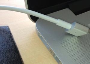
Not having noticed what had happened, I closed the screen. Apparently, the glass on Apple’s new screens is really thin, because it immediately broke.1
Obviously, I should have been more careful. But with either an L-shaped connector or the MagSafe 1’s stronger magnets, this probably wouldn’t have happened. And perhaps the thicker glass on the older MacBooks would have survived this accident. Tiny design decisions can add up.
Interestingly, the people at the Apple store said they couldn’t yet repair or replace Retina screens. This was on June 30. The broken MacBook is still sitting on my desk, waiting for Apple to figure out how to repair it.
If you require a short url to link to this article, please use http://ignco.de/462
If you liked this, you'll love my book. It's called Designed for Use: Create Usable Interfaces for Applications and the Web. In it, I cover the whole design process, from user research and sketching to usability tests and A/B testing. But I don't just explain techniques, I also talk about concepts like discoverability, when and how to use animations, what we can learn from video games, and much more.

July 22, 2012
On Patents
Copy protection company Uniloc has filed a patent infringement lawsuit against Mojang, the development company behind popular block game Minecraft. Uniloc claims that the Android version of Minecraft infringes patent number 6,857,067 describing a «system and method for preventing unauthorized access to electronic data.»
Let’s say you’re Neo, and you were the first person ever to come up with the idea of a novel. It’s like a short story, but longer, and you’re really proud of it.
If you require a short url to link to this article, please use http://ignco.de/461

July 20, 2012
Designing for Android
Designing the app was difficult. It wasn’t just difficult for the obvious reasons, like implementation details, aesthetic preferences, and because you want to add more and more to an application as you go along designing it, but also because Android is simply a really hard platform to design for.
Take for instance all the screen technologies and qualities between the hundreds of Android devices out there. doubleTwist Alarm uses a very dark color scheme to ensure it is pleasant to use in dark spaces and uses a small amount of battery power on most Android devices — AMOLED screens actually use over double the power of ‘normal’ screens, like the iPhone’s, when displaying bright colors — and it prompted numerous other designers to ask me what the secret was: how did we overcome the challenge of designing for such a wide target and ensure a legible design that didn’t appear banded, jagged or otherwise completely screwy on [insert screen technology]?
If you require a short url to link to this article, please use http://ignco.de/460

July 17, 2012
iPad mini
While a device of that size might technically enable well-authored apps to work within a ‘comfortable’ range for touch interaction, most devs design for the current form factor and how that feels, not for specific numbers. Games and apps are designed for hitting targets on a ten-inch device. (…) At best, the app would be fiddlier, harder and less fun to use.
While this is true, there’s something else to consider: not everybody has the same hands. The iPad works well for the average adult man, but children and women often have smaller hands and fingers. Decreasing the screen size from a diagonal of 9.7 inch to 7.85 would only decrease the width and height of each touch target by about 20% — this difference is way smaller than the size difference between the hands of an adult man and a child.
In fact, back in 2009, I argued that Apple should make an iPhone mini for people with smaller hands. I still think so, and similar reasoning applies to the iPad.
Of course, not all apps would work well when scaled down. But for the vast majority of apps, it shouldn’t be a problem, and might actually make them more usable for some people.
If you require a short url to link to this article, please use http://ignco.de/459
If you liked this, you'll love my book. It's called Designed for Use: Create Usable Interfaces for Applications and the Web. In it, I cover the whole design process, from user research and sketching to usability tests and A/B testing. But I don't just explain techniques, I also talk about concepts like discoverability, when and how to use animations, what we can learn from video games, and much more.

Lukas Mathis's Blog

- Lukas Mathis's profile
- 2 followers

