
Lukas Mathis's Blog, page 14
February 10, 2013
Jargon
What’s more, the remarkably annoying female voice that tells you needlessly that the doors are closing and that the train is about to start moving says «Transit is departing.»
(…)
I wish I understood the strange compulsion that makes people in the transportation industry reach for technical words that nobody uses in ordinary conversation: board for «get on» is one example, since very few people say «I boarded the bus» for «I got on the bus,» but clearer examples include depart for «leave», and disembark or deplane or alight for «get off». These are really very rare in conversation. Why does the transportation industry feel they must be used nonetheless?
This applies to all user interactions. Use words your users understand easily. Avoid industry jargon they may not be familiar with.
If you require a short url to link to this article, please use http://ignco.de/512


February 3, 2013
A List Apart's Redesign
Other people will write more insightful things about A List Apart’s latest redesign. I generally like it, but I will note one thing: having your site look like it’s cut off above the fold is a bad idea in a world where most devices don’t show scrollbars anymore.
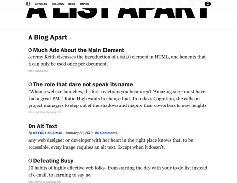
Nope, can’t scroll up further than that. That’s what the site looks like all the way scrolled up. When I saw the redesigned site for the first time, I automatically tried to scroll up.1 When it didn’t work, my immediate reaction was that something was broken.
Granted, the cut-off logo looks pretty cool. Still, this is usually not the kind of reaction you want to evoke in your users.
In fact, designing layouts so elements will be cut off is something designers often do intentionally to indicate scrollable areas. 
If you require a short url to link to this article, please use http://ignco.de/511

January 31, 2013
Camera+ 4
Tap Tap Tap has a great parody of the oversimplified «everything is a gesture, no buttons needed» apps that have become somewhat popular recently.
The first thing you’ll notice is that we’ve killed-off the viewfinder. The viewfinder is an antiquated concept and we’re trying to get with the times here.
The second thing you’ll notice is that the shutter button has also been retired. It just doesn’t get any simpler. But how do you actually take photos? Our innovative shake to shoot system is the answer to that. We’re still tweaking this as pics are coming out a bit blurry, but that’s a minor detail compared to the elegance of the feature.
If you require a short url to link to this article, please use http://ignco.de/509

For 100 of Our Closest Friends, Volume Three
Together with Jon Bell, I’ve been working on a trilogy of short books. Each is only forty pages long. Each is filled with essays on design (though some of the essays might be stretching the definition of the word «design»). And each is limited to a print run of 102 copies.
The first two have sold out. We’ve now started working on the last book in our trilogy. If you’d like to have a copy (as well as digital versions of all three books), you can get it here.
If you require a short url to link to this article, please use http://ignco.de/508

January 29, 2013
Gas Powered Games' Crazy Zoomable Mod Tool
Note: This blog post contains video or JavaScript effects that are illegal in RSS and will be removed by most feed readers. It should display perfectly if you open it in Safari, Chrome, or Firefox, though.
Gas Powered Games’ Chris Taylor shows Project Mercury, the mod tool for their new game Wildman. It has a crazy awesome zoomable user interface. I wish my whole computer worked like this.
I contributed to their Kickstarter for Wildman, but this mod tool interests me way more than the actual game they’re working on.
See also: Oberon.
If you require a short url to link to this article, please use http://ignco.de/507

If you liked this, you'll love my book. It's called Designed for Use: Create Usable Interfaces for Applications and the Web. In it, I cover the whole design process, from user research and sketching to usability tests and A/B testing. But I don't just explain techniques, I also talk about concepts like discoverability, when and how to use animations, what we can learn from video games, and much more.

January 2, 2013
Global Edge Swipes
[Ubuntu for phones] looks OK aesthetically, but the purely swipe-and-gesture based UI is a loser. It’s confusing. Swipe from the right takes you to the next most recently used app, but swipe from the left does something completely different (show a list of favorite apps). I’ve said before: gestures are the touchscreen equivalent of keyboard shortcuts: a convenient alternative, but almost never a good choice for the primary interface for a task. Ubuntu has designed a phone interface consisting entirely of gestures; it’s like a desktop interface with nothing but keyboard shortcuts.
I agree in principle, but I think OS-level edge swipes are an exception. They work well for phone and tablet OSs. Android and iOS use them for notifications; Meego and PlayBook OS use them more widely, for switching applications and as a home button replacement. I’ve used Meego for a few weeks, and it took me only minutes to get used to its edge swipes. In fact, weeks after going back to iOS, I still found myself trying to use the edge swipes.
There’s only one downside: when playing games that require vigorous swiping, it’s easy to accidentally trigger the edge swipes. There’s an iOS game I can’t play without constantly activating the notifications drawer.
If you require a short url to link to this article, please use http://ignco.de/505

December 17, 2012
Satisficing
My experience is that users don’t like to see too many options at once, but that more items on screen where one is clearly the one you want is preferable to having to go through different modes to find the desired item that’s hidden.
When navigating a user interface, most people employ a behavior psychologists call «satisficing»: they pick the first UI element they find that looks like it will bring them closer to where they want to go. I’ve written about this in my book:
A rule similar to the “the fewer clicks, the better” rule is that you must constrain the number of options given to the user; do not make her choose from more than seven options. The reason given for this idea is that humans are incapable of processing more than seven possible choices. Like the “fewer clicks” rule, this rule is wrong.
The “seven rule” originates from a paper published in 1956 by Princeton University’s cognitive psychologist George A. Miller. In the paper the author concludes that the average human can hold only about seven different objects in working memory. Although this may be true, it doesn’t apply to picking from a number of options, because you don’t have to keep all the options in working memory. You merely have to look through them and pick the first one that seems like it would bring you closer to your goal. This behavior is called satisficing, a term coined by psychologist Herbert Simon in 1956. Instead of comparing all available options in order to find the perfect choice, most people will simply pick the first option that seems sufficiently satisfying.
In The Paradox of Choice, however, Barry Schwartz notes that some people are “maximizers”—those who try to find the best possible solution, rather than the first suitable one. What’s more, although most people can cope with a large number of choices, many don’t like doing so. Schwartz writes that “a large array of options may discourage consumers because it forces an increase in the effort that goes into making a decision.”
In other words, even though most people are perfectly capable of picking from many choices, they may not like it.
A great user interface is not one where each goal can be reached with the smallest number of clicks possible, or where the user has to pick from only a small number of choices at each step, but one where each individual click is as obvious as possible. If your users have a clear goal in mind, each level of the hierarchy should have one option that clearly satisfies their goal—or at least gets them closer to that goal. As long as users feel that they are getting closer to their goal with each step, they don’t mind drilling down into a deep hierarchy.
Needless to say that, compared to previous versions, iTunes 11 is much worse for this kind of behavior. It’s much harder to find the UI element that brings you closer to where you want to go, and there are more UI layers you have to navigate through to get to your goal.
If you require a short url to link to this article, please use http://ignco.de/504
If you liked this, you'll love my book. It's called Designed for Use: Create Usable Interfaces for Applications and the Web. In it, I cover the whole design process, from user research and sketching to usability tests and A/B testing. But I don't just explain techniques, I also talk about concepts like discoverability, when and how to use animations, what we can learn from video games, and much more.

December 14, 2012
iTunes 11
iTunes desperately needs a complete rethinking. iTunes 11 isn’t that. It seems as if Apple tried to hide iTunes’ complexity under a shallow veneer of simplicity. Unfortunately, a new coat of paint won’t fix the leaning tower of Pisa.
Sure, iTunes 11 looks as if it was way more friendly than previous versions of iTunes. But while those previous versions were at least honest about their complexity, iTunes 11 isn’t. iTunes’ user interface used to promise a complex application, and then deliver one. iTunes 11 promises a simple app, but delivers the opposite.
One of the main problems introduced in iTunes 11 is the new bar atop the iTunes window. This tiny thing combines a vast number of features that were previously served by many different UI elements in iTunes. Sure, the bar seems simple and friendly. How much damage could this tiny thing possibly do? Well, you can’t cram so much stuff into such a small UI element without causing problems.
Here’s an example. I’m in the App Store and want to go back to my music.

Do I click on the «Music» tab? Nope, this goes to the iTunes Music Store. On the right-hand side of this bar, I click on «Library». This opens a menu where I can select «Music»:
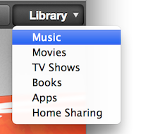
Now I’m in Music, but I want to switch to my movies. No problem, just click on the same «Library» menu again, and select «Movies», right? Nope, the menu is gone:

To get from «Music» to «Movies», you have to click on «Music» (yep) on the exact opposite end of the screen from where «Library» used to be.

To reiterate: if I’m in the store section, I don’t click on «Music» to go to my music, I click on «Library». But if I’m in my music section, I click on «Music» (which is on the opposite side of the screen from the previously-clicked «Library» button) to go to my movies.
Let’s go back to music. By default, iTunes 11 shows your albums. But I’d like to see a simple list of songs again. This is usually under «View»:
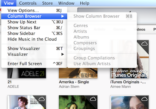
Nope, not there. Instead, you have to go back to the tabs, and select «Songs».

Now let’s jump to the books section. Again, iTunes 11 shows my audiobooks as a list of covers. Again, I want to jump to a pure list view. Can I do the same thing here, click on one of the tabs?

Nope. The exact same UI element that was just used to jump between different views of the same data is now used to jump between entirely different sections. Actually, now that I go back to my music, I notice that the tabs there also have entries that open entirely different sections of iTunes.
The best part: jumping between different areas of iTunes, and selecting the view of these areas, used to be simple in iTunes 10. Sure, the UI looked more complex, but it actually reflected how iTunes works.
In order to get all of iTunes’ features to fit into this tiny bar, Apple had to completely overload all of the UI elements inside that bar. Its very difficult to form a correct mental model of an application that exposes the same kind of feature in very different ways (there are at least four different ways of jumping between different sections in iTunes), and uses the same kind of ui element for very different features (the exact same tabs, sitting side-by-side, are used to change how the current screen is shown, and to jump to an entirely different screen).
Compare this to how iTunes 10 used to work. To jump to a different screen in iTunes, select it from the sidebar. To change how the screen is shown, select one of the options in the toolbar. The basic organization of iTunes 10 can be explained in two sentences.
You can’t make a complex application simple by adding a veneer of simplicity on top of it. in fact, that will just add to the confusion, because now you’re sending the user misleading signals about what’s really going on. Apple promised a «dramatically simplified new interface». They were right; the interface does look more simple. Unfortunately, this just makes the rest of iTunes all the much worse.
Note: I know that you can bring back the sidebar. The people who are confused by this kind of convoluted UI design, on the other hand, do not.
If you require a short url to link to this article, please use http://ignco.de/498
If you liked this, you'll love my book. It's called Designed for Use: Create Usable Interfaces for Applications and the Web. In it, I cover the whole design process, from user research and sketching to usability tests and A/B testing. But I don't just explain techniques, I also talk about concepts like discoverability, when and how to use animations, what we can learn from video games, and much more.

December 6, 2012
Back in iOS
Every time I spend time with an Android phone [the back button] drives me nuts. Windows Phone seems a little more predictable, but I still think iOS has this right: let each app provide its own internal navigation between screens, and let the system provide a way to switch quickly between recently used apps.
The problem with iOS’s solution is that developers can’t expect users to know how to go back to the previous app. As a result, iOS apps almost never send you to other apps. This has a number of negative effects.
For example, almost every single iOS app that allows you to open web links implements its own web browser, with its own user interface, and its own set of features. So when I open a link in Facebook, I can’t send it to Instapaper. Safari has the necessary bookmarklet, but I’m in Facebook’s own special little browser.1
This is another case where webOS2 got it right. No cross-app back button, but still a simple way of getting back to the previous app.
Previously on this site: The Back Button Dilemma.
Of course, on Android, I wouldn’t need the bookmarklet at all: «Tap the share button in any app that supports the share menu and then tap Instapaper.»
And, for that matter, Blackberry PlayBook OS, which is actually a fantastic little OS that deserves much more kudos than it gets.
If you require a short url to link to this article, please use http://ignco.de/501

December 4, 2012
Wii Woes
When the Wii originally came out back in 2006, I immediately bought one. In the last six years, I’ve bought dozens of games from its online store; almost a hundred, all told. So when I bought a Wii U a few days ago, I wanted to transfer these games to my new console.
Now, on most other system, this would have been easy. I would have entered my account details, and simply redownloaded the games. Not so with Nintendo’s system. With Nintendo, purchases are locked to the device you bought them on. Your device breaks or is stolen? Too bad. All you can do is call Nintendo, and hope for the best.
So, what do you do when you have a Wii with heaps of games on it, and want to move them to your new Wii U?
You just have to go through one of the worst and most convoluted systems ever devised for the simple task of moving data from one computer to another.
In order to get games from the Wii to the Wii U, you first have to go to each system’s online store, and install a transfer application. Well, actually, it’s a bit more complicated than that. The Wii U has a Wii mode, with its own, completely separate online store. So what you have to do on the Wii U is go into the Wii U’s Wii mode, open that online store, and download an app from there.
Once you’ve done that, you have to insert an SD card into the Wii U, prepare the card with the Wii U’s Wii mode’s transfer application, and move the card to the Wii. Next, you have to run the Wii’s transfer app, which moves some of your stuff onto the SD card.
«Some of your stuff?»
Yep, only some. See, the Wii only has 512 MB of internal storage. Fortunately, you can expand the console’s storage space with an SD card. But since you need the SD card slot for the transfer process, the stuff that you had on the SD card can’t be moved. Fortunately, that’s not as bad as it sounds. You can’t move these things, but once the transfer process is complete, you’ll be able to redownload your purchases.
Of course, this step doesn’t always work properly. But if it does (and it did for me), your Wii is now effectively decommissioned. All of the stuff you had on your Wii is gone.
To get your games back, you put the SD card into your Wii U. Go back into the Wii U’s Wii mode’s transfer application, and start restoring your purchases. This is where things went horribly wrong for me. The progress bar remained stuck on 0% . After about ten minutes, I got an error message.
«The device inserted in the SD Card slot cannot be used.»
The button said «Try Again», so I did. And again. And again.
At this point, all of my stuff had been deleted from the Wii, but the Wii U had decided that it couldn’t read my SD card. Which meant that all of my games were in limbo, neither on my Wii, nor on my Wii U. I was starting to come to terms with the idea that Nintendo had effectively stolen my Wii games from me.
So I tried again. Restarted the console. Tried again. This time, it took a bit longer until the error message came up. So I tried again. And again.
Eventually, the Wii showed a message. «Purchases restored». Then, it failed again. I stopped the process, went to my Wii U’s Wii mode’s store. Phew! While all of my other data — Miis, save games — were gone for good, at least I was able to redownload my purchases.
Now, my games are back, but they’re still locked inside a specific mode in my Wii U. They’re not even synchronized with the «normal» Wii U store. What will happen when my Wii U breaks? What will happen when Nintendo releases its next console? Will I be able to get my Wii games back?
This is a horrible user experience. And it’s needlessly horrible. Most other systems don’t lock purchases to a specific device, they lock them to an account. Your iPhone or Android phone breaks? No problem. Get another one, log in, all of your stuff is there. In fact, if you have an Android phone, you can buy a lot of games completely free of any DRM.
That Nintendo still can’t get this right is hilariously pathetic, especially compared to the amount of polish they put into many of the other aspects of their hard- and software.
If you require a short url to link to this article, please use http://ignco.de/499
If you liked this, you'll love my book. It's called Designed for Use: Create Usable Interfaces for Applications and the Web. In it, I cover the whole design process, from user research and sketching to usability tests and A/B testing. But I don't just explain techniques, I also talk about concepts like discoverability, when and how to use animations, what we can learn from video games, and much more.

Lukas Mathis's Blog

- Lukas Mathis's profile
- 2 followers

