Lukas Mathis's Blog, page 15
November 27, 2012
Nielsen on Windows 8
Jakob Nielsen has written a column about Windows 8’s usability, and he pretty much nails the major issues.
On the topic of the vestigial Desktop:
Unfortunately, having two environments on a single device is a prescription for usability problems.
This is probably the biggest issue with Windows 8, and, while playing around with the OS, the one that bothered me the most. Microsoft should have just killed the Desktop, and perhaps allowed people who really needed it to download a traditional file manager from its Store.
On window management:
When users can’t view several windows simultaneously, they must keep information from one window in short-term memory while they activate another window. This is problematic for two reasons. First, human short-term memory is notoriously weak, and second, the very task of having to manipulate a window—instead of simply glancing at one that’s already open—further taxes the user’s cognitive resources.
While Windows 8 supports showing two windows at the same time, the UI for it is undiscoverable, and, worse, confusing once discovered.
On the iconography:
Icons are flat, monochromatic, and coarsely simplified.
I actually think that the flat, simplified icons are a good idea. I was never a big fan of the detailed 3D rendered icons used in modern systems. These plainer icons make for a much simpler and more easily recognizeable iconography. However, the lack of color is inexcusable.
The tiles suffer from a similar issue, but for a different reason: they are so dynamic that it’s hard to figure out what exactly you’re looking at. Windows Phone’s tiles are mostly icons, with some dynamic, colorful tiles mixed in. This works well. On Windows 8, on the other hand, many of the tiles start out showing an icon, but eventually display dynamic images, which ends up being confusing and overwhelming. Or they just show text, and forego iconography altogether.

Much of Windows 8 just lacks polish. For example, turning a tablet running Windows 8 doesn’t rotate the screen; it just jumps from one orientation to the other. It’s just a tiny detail, but one that can be disconcerting when actually using Windows 8.
In general, I think Windows 8 is a step in the right direction. It makes sense to combine tablets and notebooks into a single class of computers that run a single operating system.1 Unfortunately, it’s a bit of a stumbling half-step. Much of it is poorly executed; many of the UI mistakes seem unprovoked, and should have been avoidable.
I found it surprising how quickly I got used to the touchscreen on a Samsung Series 5 I was using. While I was typing, I’d use the trackpad; when my hands were off the keyboard, it felt very natural to just touch the screen to get it to do what I wanted. 
If you require a short url to link to this article, please use http://ignco.de/497

If you liked this, you'll love my book. It's called Designed for Use: Create Usable Interfaces for Applications and the Web. In it, I cover the whole design process, from user research and sketching to usability tests and A/B testing. But I don't just explain techniques, I also talk about concepts like discoverability, when and how to use animations, what we can learn from video games, and much more.
November 18, 2012
An Experiment
Together with Jon Bell (whom you probably know from fuckjetpacks.com), I’ve been working on a trilogy of short books. Each is only forty pages long. Each is filled with essays on design (though some of the essays might be stretching the definition of the word «design»). And each is limited to a print run of 102 copies.
The first one is sold out, has been written and printed, and should be sent out shortly. We’re currently working on the second book. If you’d like to have a copy,1 you can get one here.
As well as digital versions of all three books. 
If you require a short url to link to this article, please use http://ignco.de/496

Touch on Desktop
But why put the touch/tablet UI on all PCs? A touch-optimized UI makes no more sense for a non-touch desktop than a desktop UI makes for a tablet.
Most of the things required for a great touch user interface are also good ideas on the desktop. Large touch targets, fast, responsive1 user interfaces, a simple, intuitive information architecture, uncluttered screens that don’t offer too many different features, easily understood screenflows, lightweight applications, simplified window management — all of these things work on the desktop just as well as on a tablet.
In fact, for the average user, the current tablet operating systems would probably make for better desktop operating systems than the current desktop operating systems.
You can’t port a desktop UI to a phone. Going in the opposite direction, on the other hand, might just work.
It’s really too bad that the term «responsive» has come to mean «adaptive to different devices». Now I can’t think of a good term for «reacts immediately to user input». 
If you require a short url to link to this article, please use http://ignco.de/495

November 6, 2012
The Magic of Pagination
The Magic of Reality for iPad is a great example of an ebook that uses pagination to get the most out of the iPad’s screen.
Benedict Cohen, who worked as a book infrastructure developer on the project, writes:
[The app] maintains the convenience of paging (the designer can predict how things will be displayed; stronger content structure; less navigational responsibility for the user) and the digital niceties of scrolling (direct content manipulation, unconfined by physical restrictions).
He also brings up another point related to this discussion:
I see the parallaxing as the most interesting aspect of the scrolling/paging in Magic of Reality as I think it provides a solution to one of the problems faced by digital publications: Compared to a hardback book such as Magic of Reality (and magazines) the amount of content that can fit on an iPad screen is tiny. Parallaxing creates the illusion of the screen being larger and thus feels more immersive. I only realised this in hindsight. The project pitch described the app as one long stream of content. My initial concern was that the content would feel lifeless and that user interaction would feel like menial labour. Parallaxing was my attempt to address this; the fact that it addressed the screen size issue was good fortune.
The same technique can be found in videogames of the 80s and 90s, where it was used to add depth, detail, and a kind of verisimilitude to the basic, sprite-based graphics that the systems of the day were capable of producing. It made you feel as if you were looking into a a vast, deep world, rather than at a bunch of flat, basic sprites.
If you require a short url to link to this article, please use http://ignco.de/492

November 5, 2012
More on Pagination
Paging is clearly an artifact of the technology of paper books.
I don’t think that is clear at all.
Take the iPad. iPads have screens that have a specific size. In terms of points, every iPad ever made has the exact same screen size. Designers design content for that specific screen size. If they can avoid it, why should they design chunks of content that are longer or wider than that specific screen size?
Look at iOS’s home screen. There are pages of apps. You jump between pages, you don’t scroll. Is the home screen’s pagination an artifact of paper book technology, or is it simply a better idea than having a home screen that can be scrolled? I’d argue that it’s a better idea.
This example also shows that a simple interaction model isn’t pagination’s only advantage. How do you find apps on your home screen? For many of the apps you use often, you probably find them by their position. Pagination allows you to organize things spatially.
This (typically) doesn’t apply to automatic pagination, where page breaks are chosen in a way that can’t be predicted by the author, but it does apply in many other situations. If you use iBooks author, you design individual pages that perfectly fit the iPad’s screen. This means that you can ensure that paragraphs that belong together are on the same page. You can make sure that illustrations and pictures are next to the text they belong to. And your users can identify things by their position: «look at the image at the bottom left of page 35!»
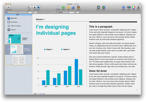
Pagination isn’t just an artifact of paper books. It actually has real advantages over scrolling.
Dr. Drang continues:
I read shitloads of stuff on scrolling web pages—as I’m sure Michael does—and I don’t get exhausted doing it.
Similar sentiments were expressed in a lot of the feedback I’ve received. I’m sure scrolling doesn’t feel like a particularly problematic or burdensome interaction to most readers of this website. But we are not good approximations of the average user. I’ve seen too many iPhone users, holding the phone in their left hand, painstakingly scrolling with their right index finger. For most people, scrolling on a touch device isn’t as easy and automatic as it is for us (and on a PC, it’s even worse).
This may change. Today, many children are growing up with iPads. Maybe in 20 years, everybody will have such well-developed fine motor skills that they can easily and precisely interact with any touchscreen, without consciously thinking about it at all. On the other hand, mice have been around since the 60s, but if you’ve been to a few usability tests with a wide variety of participants, you’ve seen people struggle with lining up the mouse cursor to a link on a web page, or to a window’s close button.
It’s certainly easier to become proficient with a touchscreen than with a mouse, but as of right now, a lot of people still are not.
If you require a short url to link to this article, please use http://ignco.de/491

If you liked this, you'll love my book. It's called Designed for Use: Create Usable Interfaces for Applications and the Web. In it, I cover the whole design process, from user research and sketching to usability tests and A/B testing. But I don't just explain techniques, I also talk about concepts like discoverability, when and how to use animations, what we can learn from video games, and much more.
November 4, 2012
Crappy Computers
This game works, especially in the downward-price-pressure direction, because consumers and the press overemphasize specs when comparing tech devices. In practical use, though, most people don’t need more than the entry-level capacities.
This is a sentiment you often hear from people: casual users only need «entry-level» devices. Even casual users themselves perpetuate it: «Oh, I’m not doing much on my computer, so I always just go with the cheapest option.» And then they buy a horrid, underpowered netbook, find out that it has a tiny screen, is incredibly slow, the keyboard sucks, and they either never actually use it, or eventually come to the conclusion that they just hate computers.
In reality, it’s exactly backwards: proficient users can deal with a crappy computer, but casual users need as good a computer as possible.
Let’s look at space. I don’t have any issues using a notebook with a 128GB SSD, because my iTunes library and my photos are on a home server. I also use cloud storage extensively, and don’t store a lot locally. Most casual users, on the other hand, store everything on their local hard drive: music, pictures, movies, it’s all on there.
Similarly, I can make do with a small iPhone, because I regularly synchronize it, and backup and delete all photos I’ve taken. Most casual iPhone owners I know never synchronize their iPhones, but take tons of pictures with it. As a result, the ones who have 16GB iPhones always run it filled to the brink with games and pictures, which means that it runs slowly, constantly throws up error messages, and forces them to manually delete data from their iPhones regularly (which isn’t fun).
Let’s look at speed. If my MacBook runs slow, I can open Terminal, figure out which app is hogging all the CPU or RAM, and kill it. I know how to check which of the graphics cards in my MacBook is active. I know how to find the bottleneck, and fix the problem. If a casual user’s computer runs slow, on the other hand, that’s it. The only reaction is to restart it, and if that doesn’t help, be pissed off.
I also know how to get rid of any pre-installed crapware, and how to avoid installing more of it. Casual users probably don’t, so they’re much more likely to end up with a computer that’s gunked up with junk. The slower the computer, the bigger an issue this is.
Let’s look at screen size. I know how to use Exposé and Spaces to make the most out of limited screen space. I know how to install utilities like Moom or Cinch to help with window management. Casual users just make do with what they have; the smaller the screen, the harder it is to manually manage windows, and still know where everything is.
So the sentiment that «entry-level» computers are good enough for casual users is exactly backwards: casual users are the ones that need high-end computers, while proficient users are the ones who can work around the limitations of low-end computers.2
Update: Discussion on Hacker News.
Addendum 1: I apologize to Marco for using his quote as a starting-off point for my rant. Obviously, he’s not advocating that casual users buy crappy computers. I’ve been thinking about this for a while, and his quote triggered this rant, but now I’m kind of feeling bad for cherry-picking this single quote out of an essay that is on a completely different topic. Sorry, Marco! 
Addendum 2: The same logic applies in many other areas. User interfaces, tools, cars: pros can deal with crap, and get something useful out of it; casual users are the ones who really need the good stuff. 
If you require a short url to link to this article, please use http://ignco.de/489

If you liked this, you'll love my book. It's called Designed for Use: Create Usable Interfaces for Applications and the Web. In it, I cover the whole design process, from user research and sketching to usability tests and A/B testing. But I don't just explain techniques, I also talk about concepts like discoverability, when and how to use animations, what we can learn from video games, and much more.
November 1, 2012
Scrolling vs. Pagination
Dmitri Fadeyev on scrolling vs. pagination in ebooks:
The scroll interface suits the variable nature of the digital content that it holds, but more so, it gives the user more fine-grained control over the reading experience.
While that’s technically true, the kind of control scrolling gives to users seems completely meaningless in the context of the task the user is engaged in. She’s reading a book. It’s a mostly linear affair. Her main goal is to go through the text from beginning to end. The additional control isn’t helping with that goal, it’s just creating more work.
This is not like the kind of control afforded by, say, manual transmission in a car.1 There, the user is doing more, but she also genuinely has more control over how the car drives.
Scrolling affords a completely empty kind control. The user is doing more, she’s controlling more, but she’s not actually achieving more.
But maybe it’s really only about experience, and not about the actual task. And maybe the additional control afforded by scrolling somehow creates a more satisfying experience than mere paging would. But when the user is reading a book, shouldn’t the experience be about the actual book, not the app she’s using to read the book? For a book reading app, shouldn’t the UI itself be as invisible and non-intrusive as possible?
If I’m reading a novel, the experience I’m having should be the book’s story unfolding in my head, not my fingers scrolling the page every few seconds. In this case, good UX design means not interfering with the actual experience the user is having: the book’s story.
Pagination gets out of the way. Read a page. Push a button. Read the next page. Repeat. No needless interference with the actual text being read, no unnecessary interactions that could pull the reader out of the book’s world.
With scrolling, I feel like I have too much control. I constantly have to “measure” how far to scroll and make the proper precise movement. My eyes have to track the content as it moves. It’s exhausting because of the concentration it requires compared with just pressing a button and having the right thing happen.
Yep, a car example. So sue me :-) 
If you require a short url to link to this article, please use http://ignco.de/488

If you liked this, you'll love my book. It's called Designed for Use: Create Usable Interfaces for Applications and the Web. In it, I cover the whole design process, from user research and sketching to usability tests and A/B testing. But I don't just explain techniques, I also talk about concepts like discoverability, when and how to use animations, what we can learn from video games, and much more.
October 18, 2012
Users
It’s that time of year again. The time of year when we complain about the term «user», that is. So I’m just reusing what I said in my book:
It was astronomer and author Cliff Stoll who famously asked, «Why is it drug addicts and computer aficionados are both called users?» It’s unfortunate that the term user is used in both contexts, but I don’t have a good alternative to the word. So, it is with considerable chagrin that I admit defeat and begrudgingly continue to use the word in this book.
Whenever possible, I try to use a better term, though. Human and person and customer are each often perfectly serviceable replacements for user.
If you require a short url to link to this article, please use http://ignco.de/486

October 2, 2012
Maps
There’s a common theme running through all these improvements: speed. Maps have to be accurate, yes, and by most accounts Apple has their work cut out for them in that area. But as I found out when I was testing Google Maps back in the bad old days of flip phones, speed can make or break a mapping app just as effectively as bad data, and any improvement in that area is welcome.
This applies to all user interactions. Speed — both how streamlined and interruption-free the user interface is, and how fast the application performs — can be the difference between an awesome user experience, and a horrible one.
If you require a short url to link to this article, please use http://ignco.de/482

September 30, 2012
Helpability
And no matter how much easier the iPad might be, I don’t think it could overcome the increased difficulty of solving problems at a distance. There’s no way to do screen sharing to fix things or see what [my grandmother is] referring to, and with so many unlabeled icons and “invisible” gestures, communicating interface details via phone would likely be even more difficult than usual.
An interesting aspect of a product’s usability: if something goes wrong, how easy is it to help people?
If you require a short url to link to this article, please use http://ignco.de/480

Lukas Mathis's Blog
- Lukas Mathis's profile
- 2 followers


