
Lukas Mathis's Blog, page 13
May 9, 2013
Overloading Behavior
Don’t worry, though–in a couple years, we’ll be apparently able to use future iterations of Glass much less weirdly. A Redditor discovered some code implying that we’ll be able to snap photos merely by winking. What could be more natural and effortless than that? Designers at Fjord speculate that these kinds of body-based micro-interactions are the future of interface design. “Why swipe your arm when you can just rub your fingers together,” they write. “What could be more natural than staring at something to select it, nodding to approve something?… For privacy, you’ll be able to use imperceptible movements, or even hidden ones such as flicking your tongue across your teeth.”
These designers think that the difference between effortless tongue-flicking and Glass’s crude chin-snapping is simply one of refinement. I’m not so sure. To me they both seem equally alienating–I don’t think we want our bodies to be UIs.
I don’t think that’s the problem. People are probably quite okay with the idea of using their bodies as input devices. Implemented well, even crude devices like the Kinect can create surprisingly usable interfaces.
Consider this: when you’re typing on a keyboard, you’re not thinking of it as pushing buttons; you’re moving your fingers to create letters. You could do that without a keyboard, and it wouldn’t feel strange for more than a minute.
The problem with winking to take a picture, or looking at something to select it, or nodding to approve, is that these gestures already have existing, established meaning. Overloading existing behavior with new semantics is bound to create problems.
If you require a short url to link to this article, please use http://ignco.de/533


May 7, 2013
Common Misconceptions About Touch
In my work as a UX design consultant, working for many different organizations, I’ve encountered lots of myths and half-truths about designing for touchscreens.
Via Khoi Vinh.
If you require a short url to link to this article, please use http://ignco.de/532

April 12, 2013
Designing for Idealized Usage
Sometimes a designer doesn’t completely account for the reality of how a solution or product will be used, and instead designs around a set of requirements that seem to be fully representative of the problem at hand, but are actually narrower in scope.
If you require a short url to link to this article, please use http://ignco.de/531

April 9, 2013
Facebook Home
Facebook has announced . Basically, it shows content from Facebook on your home- and lock screens.
A sentiment I’ve heard from many technology journalists is that Facebook Home is too intrusive. I think they’re making the mistake of extrapolating from their own experiences and needs. When technology journalists think of Facebook Home, they think «I’m following 400 people on Twitter and have 5000 followers who send me messages; I need more ways to curb the flood of incoming data, not more ways of letting it through!»
Most people, however, aren’t technology journalists.
While the average Facebook user has 190 friends, this number is heavily skewed by a small number of people who have extremely large friend lists. The median Facebook user only has around 100 friends, not all of which are active Facebook users. This is at the lower end of the proposed values for Dunbar’s number. For most Facebook users, it should easily be possible to keep up with these hundred people without feeling overwhelmed. Indeed, these people might want to have better (that is, more intrusive) ways of keeping up with their friends.
So how does Google feel about Facebook Home?
At the least, I expect an increased emphasis from Google on the virtues of «stock» Android, and an increased push to make that consistent for consumers.
I think it’s important to note that Facebook Home is nothing new. Android manufacturers have shipped their phones with custom lock screens and launchers for years. You’re hard-pressed to find a non-Google-branded Android phone that ships with Android’s default launcher. Facebook Home won’t replace Google’s launcher. It will replace HTC’s launcher (and Samsung’s launcher, and LG’s launcher).
But wouldn’t Google prefer «stock Android»? Well, the ability to replace the home screen is a built-in, fully supported Android feature. Google intentionally implemented it. This feature is, in fact, part of «stock Android».
Android’s home screen is largely irrelevant to how Google makes money with Android. Google cares very much if you ship an Android phone with a different default search provider, with a non-Google default browser, without Google Play, or without Google Now. But replacing the home screen? Probably not a big deal.
In other words: the fact that Google makes no money from the Kindle Fire has nothing to do with the Fire’s home screen.
It could even be argued that the HTC First (at least the way it exists at the moment) is an improvement over other HTC or Samsung Android phones. The HTC First ships with an unaltered version of Android; it just has Facebook Home installed on top of it. This is different from how Android phones are usually skinned, where the custom launcher replaces the stock Android launcher.
If Google truly cared about the home screen, they might well see Facebook Home as preferable to the status quo.
Facebook Home can only reside on Android because only Google was daft enough to allow it.
Given that Android’s source is open, the alternative to having a supported, reversible way of replacing the home screen would have been to let phone manufacturers replace it in an unsupported, non-reversible way. I think Google picked well.
I have no idea whether Facebook Home will be a success. If Facebook doesn’t find enough hardware partners to ship phones with Home preinstalled, it probably won’t be. But I don’t think it will fail because Facebook users don’t want it, and I don’t think it will fail because Google will sabotage it.
If you require a short url to link to this article, please use http://ignco.de/529

If you liked this, you'll love my book. It's called Designed for Use: Create Usable Interfaces for Applications and the Web. In it, I cover the whole design process, from user research and sketching to usability tests and A/B testing. But I don't just explain techniques, I also talk about concepts like discoverability, when and how to use animations, what we can learn from video games, and much more.
You can find out more about it (and order it directly, printed or as a DRM-free ebook) on the Pragmatic Programmers website. A Chinese translation is available from Amazon.cn.
April 8, 2013
Immediate Feedback
Natural language processing of calendar entries isn’t new or unique to Fantastical. Way back in 2007, there was Sandy, a server app that accepted emails to organize your calendar. The last couple of versions of OS X’s own Calendar (née iCal) have had a quick entry field that uses NLP. And iPhone users have Siri, which includes both NLP and voice recognition.
What separates Fantastical from these others is that its window shows both the free-form entry field and the individual time/date/etc. fields, and as you type in the free-form field, animations show you how Fantastical is interpreting what you’re typing.
Immediate feedback is an important aspect of any user interface. If you click on a button and nothing happens for a few seconds, that immediately destroys your suspension of disbelief. It reminds you that you’re not really looking at a button. You’re looking at a computer, and the damn thing probably needs more RAM.
Immediate feedback is particularly important when the interface interprets fuzzy user input. If you’re not 100% sure how the computer is going to interpret what you’re doing, you need to see the computer’s interpretation as soon as possible. Seeing interpretation errors immediately allows you to fix them in your current context. You don’t want to enter an appointment in a natural language user interface, switch to a different mode with a different user interface, and then check your appointment and fix mistakes in that mode’s UI.
If you require a short url to link to this article, please use http://ignco.de/527

April 7, 2013
404 Usability
Just in case, though, I thought I’d smarten up the 404 to offer possible options based on the URL that a person comes in on.
Even when somebody enters a broken URL, It’s often possible to figure out quite a bit about where that person intended to go. I wonder why most websites don’t do more with their 404 page.1
Guilty as charged. 
If you require a short url to link to this article, please use http://ignco.de/526

April 3, 2013
Software Patents
What does this sound like? Yes, it’s a textbook case of a protection racket. It is organized crime, plain and simple. It is an abuse of the legal system, an abuse of the patent system, and a moral affront.
If you require a short url to link to this article, please use http://ignco.de/525

March 3, 2013
App Switching in Windows 8
In Windows 8, it’s possible to switch back to a previous app by swiping in from the left screen edge. Which previous app? That’s not always clear. Bardi Golriz explains:
See, on Windows 8, the app that’s swiped in from the left edge depends on when you last did a left swipe to switch apps. If like in my example you wait a second or more, you’re returned to the previous app. The time delay results in an assumption made that you’re continually switching between two specific apps. For example, you’re writing an email but consulting a website/document/etc. as you write it. However, if you do a swipe within a second or so of the last, the switched to app is not the one you were on previously, but the next in the queue. The assumption here is because of the minimal time interval between swipes, your intention is to swipe through your running apps rather than jumping back to the last app.
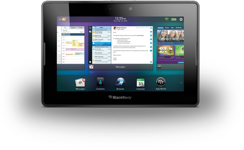
This is pretty clever, but probably often results in showing an app the user did not expect. I think webOS and the Blackberry PlayBook solved this better, by spatially arranging running apps horizontally. This way, it’s always clear which app you switch to when you edge-swipe, because apps never «move»; the same apps are always located to the left and right of any given running app.
If you’re not sure, just zoom out, and you’ll see all of your running apps neatly arranged.
If you require a short url to link to this article, please use http://ignco.de/515

February 28, 2013
The Little Manual of API Design
Trolltech’s Jasmin Blanchette has written a manual outlining how to best design APIs. Since APIs are a type of user interface (albeit a text-based one aimed at programmers), many of the lessons taught by this document apply to all user interfaces. I think it’s worth reading for UX designers in general, not just API designers.
I particularly like the section on misuse. Blanchette notes that well-designed APIs are hard to misuse.
A well-designed API makes it easier to write correct code than incorrect code, and encourages good programming practices. It does not needlessly force the user to call methods in a strict order or to be aware of implicit side effects or semantic oddities.
This clearly applies to design in general. Your application should be resilient to error. Each of the user’s actions should have a plain and obvious effect, and if possible, the order in which actions are triggered should not influence the result.
I also like what Blanchette says about consistency:
«Consistency» coincides broadly with «conceptual integrity», the principle that a complex system should have a coherent design, reflecting the vision of one architect. Decades ago, Frederick Brooke wrote:
«I contend that conceptual integrity is the most important consideration in system design. It is better to have a system omit certain anomalous features and improvements, but to reflect one set of design ideas, than to have one that contains many good but independent and uncoordinated ideas.»
One only needs to look at an application like iTunes to see what happens if complex systems are designed one feature at a time, without a coherent, overarching vision.
There’s one final point Blanchette makes that I want to highlight. He writes:
Beware of false consistency
Asymmetry of function should be reflected by asymmetry of form.
It’s easy to take «consistency» to mean that everything should be the same. That’s wrong, however. Consistency also means that different things should be different, to prevent people from forming wrong expectations.
If you require a short url to link to this article, please use http://ignco.de/514
If you liked this, you'll love my book. It's called Designed for Use: Create Usable Interfaces for Applications and the Web. In it, I cover the whole design process, from user research and sketching to usability tests and A/B testing. But I don't just explain techniques, I also talk about concepts like discoverability, when and how to use animations, what we can learn from video games, and much more.
You can find out more about it (and order it directly, printed or as a DRM-free ebook) on the Pragmatic Programmers website. A Chinese translation is available from Amazon.cn.
February 19, 2013
"Designed for Use" in Chinese
My book, Designed for Use, has been translated to Chinese.
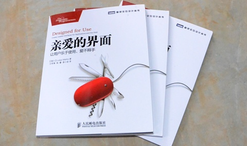
People seem to like it:
书很实用 着重方法讲解
The Chinese translation is available from Amazon.cn.
If you don’t yet own a copy, the English version is available directly from The Pragmatic Programmers on paper or as an ebook, and Amazon.com sells the paper version.
If you require a short url to link to this article, please use http://ignco.de/513

Lukas Mathis's Blog

- Lukas Mathis's profile
- 2 followers

