
Lukas Mathis's Blog, page 9
November 3, 2014
Android's Audio Annoyances
For a long time, the main difference between Android and iOS was polish. Both systems offered roughly the same basic features, but iOS just did them better. Scrolling was smoother, the visual design was more consistent, the keyboard worked way better, and so on. While the difference is still there today, it is much less noticeable than it once was. But there are still pockets of awfulness in Android, and one of these pockets is how it deals with audio.
Let’s first look at how this works on iOS. Audio is integrated into the OS extremely well. Regardless of the application that plays the audio, you get lock screen controls, and headphone controls. Swipe up to get a media control UI that works with whichever app is currently playing audio.

Want to pick where audio is sent to, whether it’s sent to an AirPlay device, a bluetooth headset, or the built-in speakers? There’s a single UI element that unifies all of these features, and works consistently across apps.
None of these things are true on Android.1
Lock Screen
Controlling audio from the Lock Screen is hit-or-miss. Sometimes, apps manage to put controls on lock screens. Other times, they don’t. On my Note 3, this even depends on which lock screen it is. If my case is open, lock screen controls sometimes work. If the case is closed, and a smaller lock screen is available through the case’s window, only Samsung’s own audio app can be controlled.
Of course, sometimes the audio controls don’t show up at all. Sometimes, the lock screen shows an image of the audio that’s playing, sometimes it doesn’t. Oh, and sometimes it does everything at once, with multiple different apps seeming to struggle for control of the lock screen, which results in this:

Yep, I made a looping animated GIF to help you get an impression of how incredibly annoying this is.
Controlling Output
There’s no real output control. If the phone is connected to a Bluetooth device, audio comes out of that device. Otherwise, it seems to be completely up to the app. Some applications support things like Chromecast, others don’t. Because there seems to be no unified way of dealing with audio output in Android, every app handles it differently, and every app supports different features at different levels of reliability.
Play and Pause
Android supports wired headphones with play/pause buttons in principle, but for me, they’ve never worked reliably. Sometimes, I’m listening to a podcast, hit pause, wait a few minutes, hit play, and nothing happens. Android has completely forgotten about the fact that I just listened to a podcast a few minutes ago.
Or it starts audio from a different app. Listen to The Skeptic’s Guide to the Universe in Pocket Casts, pause, play, now I’m listening to The Girl with All the Gifts in Audible. Uhm… thanks? At least that’s better than hitting play/pause, and, instead of pausing the current app, another app starts to play, so that I now have two different apps playing audio concurrently. Yes, that has also happened.
The controls on one of my two Bluetooth headphones don’t really work. Play and pause never works, at all. Forward and backward only work sometimes. Other times, they don’t register, or have seconds of lag.
The controls on another pair of headphones, weirdly, seem to work better, as I can usually play and pause. But even with that one, they’re not reliable.
Notifications
Since there seems to be no unified, OS-supplied way of controlling audio in Android, every app pushes its own controls into Android’s notifications. So you’ll end up with situations where you have three (or more) different audio controls on screen at the same time, all of which behave differently. Which can be nice for switching between different audio sources — except that some of them only show up when their app is already playing audio, while others can’t be removed at all.
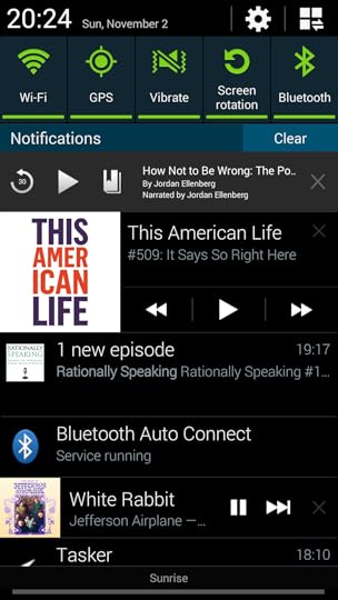
Either way, you can easily end up with a full screen just showing different audio players, and that’s on a Note 3. I pity the fool with a smaller screen.
More Bugs
Other, non-audio Bluetooth devices interfere with music playback. Music pauses whenever my Withings step tracker auto-sends data to the phone. It also pauses when my phone connects to the Pebble or loses connection to it, which happens almost every time I leave the house or come back.
One final annoyance: I usually use my Bluetooth headphones to listen to Podcasts. When I have to talk to somebody, the easiest thing to do is to just turn off the headphones; that also preserves its batteries. However, when I do that, Android doesn’t immediately stop the audio when the headphones turn off. Instead, suddenly, a tiny John Siracusa is in my pocket, loudly complaining about HFS+ for five or six seconds, until Android finally figures out that something is wrong and turns him off.
I really love a lot of the things Android offers, and in many ways, its user experience is now so close to what iOS offers that the UX differences between the two are really a matter of taste. I’m also happy about where Android is heading in the future.2 But the way audio works in Android right now is just abhorrently broken. Playing audio is a basic feature that should just work. As of right now, in Android, it does not.
Obligatory Defensive Note
This is the obligatory defensive note acknowledging that my experience with audio on Android may not be representative of other people’s experiences, particularly if they are running a different version of Android. I’m sure that there are a lot of people who have no issues with how Android handles audio, and I’m happy for them. I’m just not one of them.
Addendum: Android 5 has new APIs that might fix at least some of these issues, once people actually have phones with that system, and the apps are updated for the new APIs.
The issues described in this post occurred with a Samsung Galaxy Note 3 with the Samsung-supplied Android build, and the Samsung-supplied lock screen. I’ve had similar (but different, in general slightly less severe) issues with Cyanogenmod in the past. I’m not sure what the current state of stock Android is — but the fact that this works differently across different Androids is part of the problem. 
As a related aside, Google’s Google Now powered vision for smart watches, where the watch automatically shows contextual information like the show times for the cinema you’re standing next to, or the bus schedule for the bus station you’re currently at, or location-based reminders, or the gate number for your next flight, seems much more compelling and focused than Apple’s «everything but the kitchen sink zoomable app page with dozens of apps» approach. If you hadn’t know that these would be what the two companies would do, wouldn’t you have guessed that Google would throw in every feature they could think of without explaining why you’d want any of it, while Apple would offer a focused product with a clear, compelling story?
And while it’s easy to make fun of Moto 360’s «flat tire», what Apple has to offer — a thick square that lacks battery power despite of it sheer size — doesn’t really seem any better, particularly if it’s hanging from somebody’s wrist, rather than positioned perfectly a pristinely designed keynote slide.
This is not to say that the Apple Watch won’t sell well; just that it seems more compelling as a status symbol or a fashion item, rather than as a truly useful device that can stand on its own, based just on its utility. And I think Apple knows this, as evidenced by the way they market their watch.
If you require a short url to link to this article, please use http://ignco.de/613

If you liked this, you'll love my book. It's called Designed for Use: Create Usable Interfaces for Applications and the Web. In it, I cover the whole design process, from user research and sketching to usability tests and A/B testing. But I don't just explain techniques, I also talk about concepts like discoverability, when and how to use animations, what we can learn from video games, and much more.
You can find out more about it (and order it directly, printed or as a DRM-free ebook) on the Pragmatic Programmers website. It's been translated to Chinese and Japanese.


November 1, 2014
Modulares Interface B.A.
Note: This blog post contains video or JavaScript effects that are illegal in RSS and will be removed by most feed readers. It should display perfectly if you open it in Safari, Chrome, or Firefox, though.
Via Gus Mueller, Modulares Interface B.A. is a way of turning an iPad into a modular input device with physical knobs, sliders, and buttons.
Modulares Interface from Florian Born on Vimeo.
If you require a short url to link to this article, please use http://ignco.de/626
If you liked this, you'll love my book. It's called Designed for Use: Create Usable Interfaces for Applications and the Web. In it, I cover the whole design process, from user research and sketching to usability tests and A/B testing. But I don't just explain techniques, I also talk about concepts like discoverability, when and how to use animations, what we can learn from video games, and much more.
You can find out more about it (and order it directly, printed or as a DRM-free ebook) on the Pragmatic Programmers website. It's been translated to Chinese and Japanese.
October 30, 2014
Supporting Feminism in Gaming
There’s really nothing I can say about Gamergate that you haven’t already read. And the whole story is so absurd and sad and depressing and disappointing that I wouldn’t know what to say.
There is one thing you can do, though. You can help change what games are, and make them more inclusive and more mature, by supporting the people who drive that change.
You can help Anita Sarkeesian publish thoughtful criticism of games by making a recurring donation to Feminist Frequency, her nonprofit.
You can help Brianna Wu make more games that feature well-developed women by buying her game, Revolution 60.
You can help Zoë Quinn make more games by supporting her on Patreon.
You can help Leigh Alexander write interesting essays about games by buying her books.
If you require a short url to link to this article, please use http://ignco.de/625
If you liked this, you'll love my book. It's called Designed for Use: Create Usable Interfaces for Applications and the Web. In it, I cover the whole design process, from user research and sketching to usability tests and A/B testing. But I don't just explain techniques, I also talk about concepts like discoverability, when and how to use animations, what we can learn from video games, and much more.
You can find out more about it (and order it directly, printed or as a DRM-free ebook) on the Pragmatic Programmers website. It's been translated to Chinese and Japanese.
Nintendo, One Year Later
Last year, there was a short period of time when a lot of Apple bloggers started to call for Nintendo to just give up making hardware, and start making iOS games. I thought, and still think, that this would be bad for the quality of Nintendo’s games, and bad for their bottom line. I also think that Nintendo knows this. Back then, I wrote:
Here’s what I think the most likely scenario is for this console generation: the 3DS will continue selling well, though not at DS levels. The Wii U won’t, but will get some good games (mostly from Nintendo), and eventually sell about as well as the Gamecube. Meanwhile, as hardware prices fall, the installed base of its consoles goes up, and more first-party games are released, Nintendo’s profits will increase gradually. Nintendo won’t go out of business, nothing spectacular will happen, the world won’t end.
If Nintendo releases any iOS apps, it’ll be more Pokémon stuff.
Now, one year later, Nintendo just announced that it made a quarterly profit of 24.2 billion yen (about 224 million US$). Ars Technica notes that this is mainly due to strong sales of its first-party titles, mostly on the 3DS. However, even the Wii U is starting to show sustainable game sales numbers. So far, Mario Kart 8 sold roughly 3 million copies on the Wii U, and it continues to sell well. At 60 US$ a piece, it’s not clear to me that Nintendo could make the same amount of money selling games for iOS. Even a platform that’s doing poorly, like the Wii U, might be a better option if you can sell games for 60 bucks a piece, and reach a 50% attach rate.
Clearly, Nintendo is not out of the woods yet. For Nintendo to maintain its profitability, they need to continue releasing strong first-party titles. At least in the short term, they seem to be on track, with new Pokémon games coming out for the 3DS, and a new Super Smash Bros for the Wii U. Longer-term, the picture is less clear. Fortunately, Nintendo has a strong back catalog of underused franchises it can rely on.1
Also a year ago, Asymco wrote:
The implications are that Nintendo, Sony and Microsoft are beyond the point of no return in this industry. Gaming, as a business, cannot be sustained as a platform independent of a general purpose computer. Like other «applications» that used to have systems built around them conforming to their needs the dedicated-purpose solutions came to be absorbed into the general-purpose platforms. And the modern general purpose computer is the smartphone.
I think the website confused the end of a console generation with the end of consoles,2 which is something that happens at the end of every console generation. In the past, people used to think that PC gaming would finally absorb console gaming. Today, they think it’s mobile phones. Of course, the fact that this kind of panic about the console market happens every time doesn’t mean that it can’t be true this time, but it does put things into perspective.
Back then, I wrote:
There’s really nothing unusual happening this time around. We’ve all seen this exact thing happening before. What Asymco’s charts show is very likely not Apple crushing the console market. It’s simply the end of a generation of consoles, and the beginning of another. Sales of the previous generation are petering off, and the new consoles haven’t yet taken over. No need to panic. At least not just yet.
If nobody buys the PS4, then you should start panicking.
I specifically called out the PS4 because, before the new consoles were released, the Xbox One’s hardware and price made it look like a bit of a dud, while the PS4 looked like a winner. I think it’s important not to confuse mistakes made by hardware makers with actual evidence for a declining console market. The Xbox One launched overpriced and underpowered, and with very unclear messaging from Microsoft. This alienated a lot of buyers — not because they didn’t want a console, but because the Xbox One didn’t appeal to them. In other words, if the Xbox One had sold poorly, this would have been evidence for Microsoft’s incompetence, not evidence for a declining console market.
Fortunately, even the Xbox One didn’t do too badly.
Both the PS4 and the Xbox One launched in November 2013. Both consoles have been on the market for roughly 11 months. So far, the PS4 sold 12.3 million units; the Xbox One sold 6.1 million units. These numbers, even the Xbox One’s numbers, compare favorably to the previous generation. In its first 11 months, the PS3 sold just 5 million units, and the Xbox 360 sold just 4.8 million units.
Of course, this generation’s higher sales numbers are partly due to the fact that the Wii U is not selling well, which leaves more room for the other two consoles. But I think it’s also a pretty strong indicator that consoles as a whole aren’t going anywhere.
Part of the issue is that Nintendo has to maintain two incompatible platforms. This fragments their own market, since most games only appear on either the 3DS, or the Wii U. But now that the chips in our mobile phones have become so powerful, maybe their next-gen console will unify the mobile and TV platforms?
I think it’s fair for Apple writers to complain about the fact that a lot of people who have no clue about how Apple’s business works make crazy pronouncements about what Apple should do. But I do think that they should measure their own expertise by the same yardstick. The fact that you have a lot of expertise about a specific company or a specific area of business does not mean that you have a lot of expertise about every company and every area of business. If there’s not some kind of eponymous law about this, somebody should make one up. Maybe something like «expertise in one field does not imply expertise in all fields»? :-)
If you require a short url to link to this article, please use http://ignco.de/622
If you liked this, you'll love my book. It's called Designed for Use: Create Usable Interfaces for Applications and the Web. In it, I cover the whole design process, from user research and sketching to usability tests and A/B testing. But I don't just explain techniques, I also talk about concepts like discoverability, when and how to use animations, what we can learn from video games, and much more.
You can find out more about it (and order it directly, printed or as a DRM-free ebook) on the Pragmatic Programmers website. It's been translated to Chinese and Japanese.
October 29, 2014
HP Sprout
Note: This blog post contains video or JavaScript effects that are illegal in RSS and will be removed by most feed readers. It should display perfectly if you open it in Safari, Chrome, or Firefox, though.
The HP Sprout is a Windows PC with a built-in projector that basically draws a second screen on a large touchpad/graphics tablet combo. Oh, and it also has a built-in 3D scanner.
It’s crazy enough that I want one, just to see how I would use it. Via Ars Technica.
If you require a short url to link to this article, please use http://ignco.de/621

iPad at a Crossroads
I’m not entirely sure it’s in the best interest of the iPad to be tied so closely to the iPhone. Ultimately, a more aggressive branching of the iPad’s operating system away from the iPhone’s operating system may be necessary. Doing so may be the only way that Apple starts to answer the critical questions at the heart of the line: “What, exactly, is unique about the iPad? What can it do better than any other device? And why can’t customers live without it?”
If you require a short url to link to this article, please use http://ignco.de/620

October 27, 2014
Wherefore art thou iPad?
Dr. Drang suggests some reasons why the iPad isn’t selling better:
Finally, there’s the big problem: storage. How does someone on a iPad access all of the photos and music and video and other files that are part of the modern digital life that Apple wants us to lead? None of us can be post-PC until all of our stuff is where we can get at it without a PC. That there’s been no clean, obvious, and reliable solution to this problem is definitely Apple’s fault, and it’s kept the iPad from being a complete PC replacement.
Here’s another reason:
Apple’s behavior severely limits the types of apps that are available on iOS. Whether it is due to actual restrictions, or just due to fear on the part of developers, there are a lot of «safe» apps on iOS, but very few apps that try to break the mold of what people expect from their devices. You get a lot of games, podcast clients, todo lists, camera apps, text editors, things like these — but not a lot of stuff that colors outside of these lines.
None of these app types work substantially better on larger screens. In fact, there are very few apps on iOS that you really need an iPad for if you want to get the most out of them. There’s Microsoft Office,1 and iMovie — but even for these apps, it’s not entirely clear to me that most people wouldn’t be perfectly happy running them on an iPhone, particularly on a 6 or 6 Plus. There are some niche apps (audio apps, for example), but they are just that — niche apps.
Hence, there is very little reason to own an iPad if you already own an iPhone. Unfortunately, the primary target audience of iPads — people who are inside Apple’s ecosystem — probably do already own an iPhone.
In short, if you have an iPhone, and you want a second, more powerful device, why would it be an iPad? There’s almost nothing you can do on an iPad that you can’t do on an iPhone. It’s just as restricted as the iPhone, and as a result, can’t differentiate itself from the iPhone. But at the same time, the iPad is less portable, and lacks the phone features of the iPhone.
While a lot of people might be okay with their phones running only a limited set of app types, the same does not seem to be true when it comes to other kinds of devices.
The iPad isn’t selling better because Apple’s own rules prevent it from being the truly compelling device that it could be.
Addendum
The problem is that must-have apps are exactly what the iPad needs to become indispensable. (…) I can’t help but reminisce about what might have been had Apple harnessed the incredible developer enthusiasm for the iPad in 2010-2012. More than any other iOS device the iPad needed help to make it indispensable to everyone, but Apple famously doesn’t like depending on anyone. And now no one cares.
I think I know only two people who own and use iPads regularly. Both of them use their iPads to run Word.
If you require a short url to link to this article, please use http://ignco.de/619
If you liked this, you'll love my book. It's called Designed for Use: Create Usable Interfaces for Applications and the Web. In it, I cover the whole design process, from user research and sketching to usability tests and A/B testing. But I don't just explain techniques, I also talk about concepts like discoverability, when and how to use animations, what we can learn from video games, and much more.
You can find out more about it (and order it directly, printed or as a DRM-free ebook) on the Pragmatic Programmers website. It's been translated to Chinese and Japanese.
October 25, 2014
Yosemite's Visual Design
My biggest complaint, personally, is that this fresh coat of paint does a poor job on visual contrast. Interface elements are often so light in color and/or so close to one another in color that they “bleed” into each other all the time. The effect is a blown-out look, as if a novice photographer stepped up the exposure on her camera well beyond advisability. In previous versions of OS X, it was common to use dark, sometimes hard edges to help delineate where one piece of UI ends and another one begins. Apple’s designers have seemingly restricted themselves from employing that very basic technique throughout Yosemite, or at least have sought to dial back its use significantly.
Some UI elements, particularly windows, feel washed out and vague. The problem is particularly egregious on non-retina displays, but it also exists on retina displays. Yosemite needs a lot more contrast in some areas.
In other areas, there’s too much contrast. One problem I have is that it is difficult to see where the focus is, since there’s so much saturated blue in the UI. Look at this screenshot, with all of its competing blue areas. Where’s the focus?
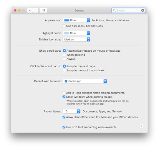
It’s in the search field, but there’s a lot of blue to go through until you find the one you’re looking for.
While not perfect by a long shot, the difference between a normal UI element and an active one was more obvious in earlier versions of OS X.

Translucency
I do want to push back a bit on one particular bit of criticism: the translucency. I’ve seen a number of people complain about Yosemite’s inconsistent application of translucency. You see through some windows sometimes, but not always, and some windows behind other windows are not taken into account when drawing the translucent areas.
I think these complaints are missing the point.
This is not about the physics of light. It’s not about how windows are stacked. It’s not even really about translucency. This is about personalization.
I don’t think it’s a coincidence that Apple is running an ad showing how people personalize their Macs.

Personalization is important. All the way back to early Macs, Apple allowed users to personalize their computers. Here’s a screenshot of System 7’s Color control panel that allowed you to change the color of your windows.
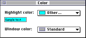
Yep, changing the color of your windows was a thing Apple allowed you to do back then. Meanwhile, today’s Mac don’t allow you to customize a whole lot of their user interface. You can change the desktop background, but that’s about it. And changing the desktop background is uniquely pointless, since you’re always covering it up with windows. You never actually see it!
Apple’s translucency fixes that. This is not about seeing through your windows. This is about personalizing your computer. Yosemite’s translucency allows you to see a bit of the color of your desktop background, for the first time giving the desktop background an actual point.
Here’s a screenshot from Apple’s website that shows how translucency allows the calendar app to take on a bit of the color from the desktop:

This is not there so you can see what’s behind the window. This is there so the calendar looks like your calendar, not just like any calendar. You like red? Cool, use a red desktop background, and your Mac’s user interface takes on a red hue.
All in all, this feels a bit like what happened to Windows 8, but on a smaller scale. It’s a step in the right direction, but it has lots of poorly executed, poorly thought through details. Still, between the two, it’s hard to deny that Windows 8 is the more daring, more interesting take on what a modern desktop operating system should be.
Yosemite’s Finder is still the same basic Finder Apple shipped in the first Mac. The world has changed around the Mac, but the Mac has remained the same.
Perhaps now that Apple has rethought the visual design of OS X, it’s time to also rethink its functionality on a more basic level.
If you require a short url to link to this article, please use http://ignco.de/617
If you liked this, you'll love my book. It's called Designed for Use: Create Usable Interfaces for Applications and the Web. In it, I cover the whole design process, from user research and sketching to usability tests and A/B testing. But I don't just explain techniques, I also talk about concepts like discoverability, when and how to use animations, what we can learn from video games, and much more.
You can find out more about it (and order it directly, printed or as a DRM-free ebook) on the Pragmatic Programmers website. It's been translated to Chinese and Japanese.
October 13, 2014
Designated Jerks
The internet security world has for years had white-hat hackers—people whose job it is to test code for security flaws. It’s time for designers to adopt the idea. Next time you’re working on a long-term project, appoint a designated white-hat jerk; someone whose job it is to keep thinking about how a person or group with a bit of time on their hands might try to bend and twist your system for a few laughs.
Via Daring Fireball.
If you require a short url to link to this article, please use http://ignco.de/614

October 3, 2014
Responsive Typography
Text already looks smaller on hand-held devices than on larger devices. This is fine because people tend to hold small devices closer when reading. Current popular wisdom is to preserve the measure by further reducing the font sizes for held-held devices. In practice, retaining a comfortable font size as much as possible better preserves readability. The result will be a less-than-ideal measure but a more comfortable reading experience.
If you require a short url to link to this article, please use http://ignco.de/612

Lukas Mathis's Blog

- Lukas Mathis's profile
- 2 followers

