
Lukas Mathis's Blog, page 7
January 5, 2015
State of Apple
I suspect the biggest force keeping stories [of people switching from OS X to other platforms] from being more common is that Windows is still worse overall and desktop Linux is still too much of a pain in the ass for most people. But it should be troubling if a lot of people are staying on your OS because everything else is worse, not necessarily because they love it.
My main computer is still a Mac, but not thanks to anything Apple has done.1 It’s things like Coda, Pixelmator, Sketch, BBEdit, Kaleidoscope, OmniGraffle, or Interarchy that keep me on the Mac — despite the issues I have with Apple’s OS. By now, I’ve stopped using any of Apple’s own applications.
Ubuntu itself is more than good enough to replace my Mac — but despite looking, I haven’t found good alternatives to stuff like Coda, Pixelmator, or Sketch.
The same isn’t true for tablets and phones. There are no compelling apps that kept me on iOS, and as a result, I’m not using any iOS devices anymore. My Android phone does things my iPhones never could, and my Surface 3 is the versatile, powerful tablet that the iPad should have been.
Marco notes:
I fear that Apple’s leadership doesn’t realize quite how badly and deeply their software flaws have damaged their reputation, because if they realized it, they’d make serious changes that don’t appear to be happening.
I get the same impression: Apple doesn’t see what’s happening.
It seems to me that the media covering Apple is partly to blame for this. There seem to be two main factions covering Apple: people who dislike Apple, and whose opinions can thus be disregarded. And people who like Apple, but would rather talk about how wrong the first faction is, and how badly Samsung and Google are doing, than discuss the problems Apple’s own products have.2
As a result, the people covering Apple are either not credible, or seem to think that it’s their job to defend Apple.3 And while defending a «beleaguered» Apple might have been necessary in the 90s, a lot has changed since then. What Apple needs now is not a partisan media that will rationalize whatever issues Apple has; what Apple needs now is honest feedback about what’s going wrong.
Why are there no compelling apps that kept me on iOS? Because of the way Apple’s iOS app ecosystem works. And why has that not improved? Because any criticism Apple receives for it is either tainted by partisanship, or so timid that it is pointless.
You’re really not helping Apple if you’re just defending whatever they’re currently doing.
Addendum
Ben Thompson links to this article by Guy English:
I believe that many Apple observers have been too invested in picking off the low hanging fruit of obviously out-of-touch commentators, columnists, and analysts. Apple is winning. It’s fun to pick on the idiots, and we do tune in for the affirmation that engenders, but that’s not insight. It’s a tag team wedgie patrol.
Marco is right but perhaps his framing is too narrow. This simply isn’t an issue that developers grouse about and move on from. This is something that, at least in my experience, has been affecting customers who have otherwise loved their Apple devices.
I was wondering if it was just me getting cynical, but more and more seasoned Apple users – I’ve owned Macs since 1991 – have been echoing these problems.
I’ll bet you know several people who bought a Mac, an iPad, or an iPhone because they saw you using one and noticed how easily you did things that were difficult for them. They may have asked for a demonstration of Fantastical; they may have asked whether they could still do X, Y, or Z on a Mac; they may have asked for a recommendation on which iPad to buy; but however it happened, you were largely responsible for Apple sales beyond your own collection of devices. That’s leverage.
(…) Apple’s stuff really was easier to use, both initially and as your expertise increased. All you had to do was use it, and those around you would see it.
Well, technically, the apps that keep me on the Mac use Apple’s APIs, so there’s that. 
But if I’m using an iPhone, how much money Samsung makes doesn’t really affect my experience at all — and actually, neither does how much money Apple makes, or how many bugs Android has. What affects my experience is how good the iPhone is. And if nobody talks about the iPhone’s problems, it’s not going to get any better.
Yes, there are exceptions.
If you require a short url to link to this article, please use http://ignco.de/657

If you liked this, you'll love my book. It's called Designed for Use: Create Usable Interfaces for Applications and the Web. In it, I cover the whole design process, from user research and sketching to usability tests and A/B testing. But I don't just explain techniques, I also talk about concepts like discoverability, when and how to use animations, what we can learn from video games, and much more.
You can find out more about it (and order it directly, printed or as a DRM-free ebook) on the Pragmatic Programmers website. It's been translated to Chinese and Japanese.


December 24, 2014
Business Calendar 2
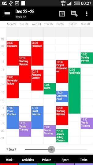
Last month, I wrote about Android Calendar’s low information density. Its «week view» only shows five days, and each day only shows seven hours. As an alternative, I mentioned Business Calendar, an Android calendar app that has a much better week view, but looks kind of outdated.
Well, there’s an update available that looks much better. Business Calendar 2 is now my main smartphone calendar app.
If you require a short url to link to this article, please use http://ignco.de/656
If you liked this, you'll love my book. It's called Designed for Use: Create Usable Interfaces for Applications and the Web. In it, I cover the whole design process, from user research and sketching to usability tests and A/B testing. But I don't just explain techniques, I also talk about concepts like discoverability, when and how to use animations, what we can learn from video games, and much more.
You can find out more about it (and order it directly, printed or as a DRM-free ebook) on the Pragmatic Programmers website. It's been translated to Chinese and Japanese.
December 16, 2014
App Store Discovery
Imagine how hard it must be to find a particular game in the vast wilderness that is the App Store if you don’t know exactly what you’re looking for. Until Apple decides to take definitive steps to improve search results, either via human curation, or by lowering dependencies on popularity, easy discovery in the store will continue to be a major problem. Unfortunately for small developers who need paying customers to survive, time is quickly running out.
Via Michael Tsai.
If you require a short url to link to this article, please use http://ignco.de/653
December 14, 2014
Project Xanadu
Project Xanadu isn’t just a really interesting UI for browsing hypertext,1 it’s also the world’s most delayed software.
Space-up or space-down moves between segments, space-left and space-right moves between documents, space-shift switches views.
If you require a short url to link to this article, please use http://ignco.de/652
December 13, 2014
In-App Browsers on Android
M.G. Siegler likes the fact that Facebook on Android now has a built-in browser, instead of sending you to a dedicated browser app when you open a link. Me, I’m not a fan. Instead of opening links in the browser of my choice that provides the features I actually want, I get a sub-par, slower browser that lacks even basic features like a working share button.1
The worst part is that it’s not necessary. Built-in browsers make sense on iOS, where users can’t easily go back to the originating app once they’re kicked into a browser app. But on Android, you just hit the back button, and you’re back in the previous app. That’s one of the reasons why I think OS-level back buttons are a good idea, despite of their issues.
And, in some use cases, causes a security problem.
If you require a short url to link to this article, please use http://ignco.de/651
December 11, 2014
Watch Aaron Draplin Design a Logo
Note: This blog post contains video or JavaScript effects that are illegal in RSS and will be removed by most feed readers. It should display perfectly if you open it in Safari, Chrome, or Firefox, though.
via Tested.
If you require a short url to link to this article, please use http://ignco.de/650
December 10, 2014
Finally, Turn Off That Surface Home Button
Right now, the Surface Pro 3 is probably my favorite computing device.1 It’s the right size for a tablet. Small and light enough to be very portable, but sporting a screen that is big and high-res enough for working, drawing, or watching movies. The aspect ratio is just right: it’s perfect for comic books, wide enough for movies, but still tall enough for productivity apps.
The battery usually lasts through a day, the device has a fantastic pressure-sensitive pen, it’s fast enough for most gaming needs, and the kickstand is pure genius. The keyboard cover is fantastic, and can easily be removed to turn the Surface into a «real» tablet. It’s also quiet and looks good. The Metro apps work perfectly on the touchscreen, but if needed, the Surface also runs regular Windows apps. It’s open, so there’s nobody intentionally scaring developers into not creating innovative new apps for it.
In short, I love using my Surface Pro 3. This is what the iPad should have been, and what the iPad needs to become, if Apple wants to reverse its sales trend: a tablet that’s more than just a big phone without the phone parts.
The only major issue I still had with my Surface was its Home button, which is positioned exactly where you put your palm when drawing, and which triggers on touch, because it’s a capacitive button.
Well, this morning, I had an email from Bardi Golriz in my inbox, with a link to the Surface Hub app.
Install it on your Surface, launch it, and you get this setting:
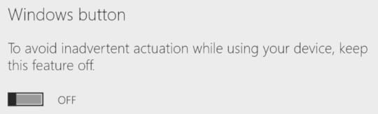
Yep, it’s finally possible to turn off the Home button. Weirdly, the button still vibrates when touched, but at least it doesn’t actually do anything anymore.
Thanks, Microsoft! Next time, put in a real button.
Proving the old adage that Microsoft requires three attempts to get anything right.
If you require a short url to link to this article, please use http://ignco.de/649
If you liked this, you'll love my book. It's called Designed for Use: Create Usable Interfaces for Applications and the Web. In it, I cover the whole design process, from user research and sketching to usability tests and A/B testing. But I don't just explain techniques, I also talk about concepts like discoverability, when and how to use animations, what we can learn from video games, and much more.
You can find out more about it (and order it directly, printed or as a DRM-free ebook) on the Pragmatic Programmers website. It's been translated to Chinese and Japanese.
December 8, 2014
Jolla
Note: This blog post contains video or JavaScript effects that are illegal in RSS and will be removed by most feed readers. It should display perfectly if you open it in Safari, Chrome, or Firefox, though.
Being the first to create a new kind of device has many advantages. You get a lot of recognition, and a temporary monopoly on a market. But entering that market later also has advantages. Not only do you get to learn from your predecessors’ mistakes, you also have a much better understanding of what makes a product work, what people want out of a product, and what kinds of features a product needs to offer. This knowledge allows you to be much more considerate in how you design your product.
Take the iPhone. When it came out, it didn’t have an app store, or an app switcher, or push notifications, or a large screen. Apple added these features later, but in many ways, they still feel tacked on, not a fully native, fully thought through part of the OS.
Devices that came later — most notably webOS — already knew that they had to offer app switchers and a way to manage notifications, and thus created systems that integrated these features into the OS in a much tighter, more natural, more powerful, more versatile way.
Jolla1 is another system that took many of the lessons of iOS and Android, and rethought how a mobile system should work. Since Jolla’s tablet crowdsourcing project ends tomorrow, this seems like a good time to talk about some of the things Jolla does really well.
One-Handed Operation
Phones have become humongous recently, and much of the screen is not easily accessible with one hand. But phone operating systems are still designed as if people used small phones where every part of the screen could easily be reached.2
Jolla knows this and uses gestures to work around this. There’s still a «back» button in the top-left corner that allows you to move back inside an app, but swiping from left to right does the same thing; it moves you back. Swiping from right to left moves you forward, if you’re in an «assistant»-like user interface, where you move through multiple consecutive screens.
Even better, dragging down opens the menu. For example, this is the notes application:
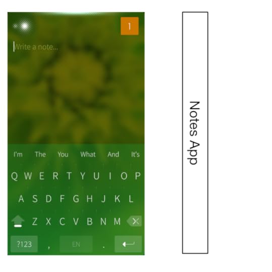
This app, like most Jolla apps, has very little UI chrome. So what do you do if you want to create a new note, or send this note to somebody? You simply drag down, which moves the UI down, and shows a menu sliding in from above, similar to the «pull to refresh» gesture. Except that, depending on how far you drag down, a different menu entry is selected.
Spatially, the menu is a part of the Notes UI that’s hidden above the edge of the screen, until you drag it into the screen.
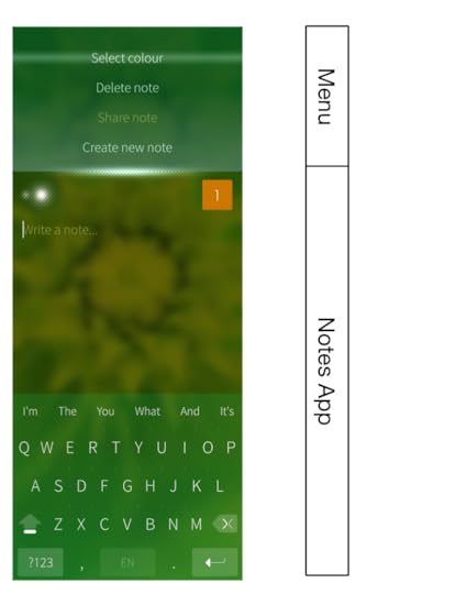
So, to send a note, touch the screen anywhere, start dragging down until «Share note» is selected, and release. It’s a simple, quick gesture, it works with one hand, and it doesn’t matter how large your screen is.
Spatiality
The way the Notes menu is arranged above the edge of the screen in the Notes app hints at something else that Jolla does really well: it arranges things spatially. While features in iOS and Android are tacked on seemingly at random, without any real logic about how they appear, or where they would be located if iOS was a physical «thing,» the people at Jolla took great pains to think through how Jolla’s pieces fit together.
Take the way Jolla’s lock screen, home screen/app switcher, and app screen fit together. On iOS and Android, these are three disparate things that aren’t really connected. On Jolla, they’re three different sections of the same virtual space, and you can move between them by dragging up or down.
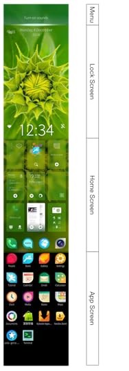
When you turn on the Jolla device, you see the lock screen. Drag down to reveal the lock screen’s menu. Drag up to reveal the home screen, which combines the app switcher and a dock. Drag up again to reveal the app screen. To go back to the app switcher, drag down from the app screen, and to lock the phone, drag down from the home screen.
You only have to see this once to immediately understand how each of these pieces fits together, and how you’re supposed to switch between these screens. That’s the power of a system that is designed as a whole, rather than starting out simple, and growing over time.
In this video, Myriam Joire shows some of the Jolla UI:
Additional Notes
The Jolla hardware itself is nice. It’s a bit thick, but it looks good. The hardware buttons (volume and power) are all arranged on the right side of the device, which prevents the problem where you’re trying to change the volume, and accidentally turn off the phone, because the power button is on the exact opposite of the volume button, and pushing one makes you accidentally also push its counterpart on the other side of the phone.
The grid of running apps allows you to get quick access to your running apps, and doesn’t force you to scroll through apps until you find the one you’re looking for.
Jolla even runs Android apps, though not always perfectly.
Amongst all of the fringe phone operating systems (Sailfish, Firefox OS, Ubuntu Mobile), Jolla’s Sailfish is easily the most mature. Firefox OS is interesting, but a Jolla phone is something you could actually use — and even something you could genuinely prefer over Android, iOS, or Windows Phone.
Technically, the Jolla OS is called Sailfish.
Which, by the way, was never actually true, even with the original iPhone.
If you require a short url to link to this article, please use http://ignco.de/644
If you liked this, you'll love my book. It's called Designed for Use: Create Usable Interfaces for Applications and the Web. In it, I cover the whole design process, from user research and sketching to usability tests and A/B testing. But I don't just explain techniques, I also talk about concepts like discoverability, when and how to use animations, what we can learn from video games, and much more.
You can find out more about it (and order it directly, printed or as a DRM-free ebook) on the Pragmatic Programmers website. It's been translated to Chinese and Japanese.
December 4, 2014
Apple CarPlay, Android Auto
Note: This blog post contains video or JavaScript effects that are illegal in RSS and will be removed by most feed readers. It should display perfectly if you open it in Safari, Chrome, or Firefox, though.
Via Daring Fireball:
All I could think while watching this movie was «how can this possibly be legal?» Dialling numbers while driving? Receiving notifications in your car? Liking songs while on the wheel? And all of this on a super-laggy touchscreen?
I guess there will be an «I’m the passenger» button, and as we know, nobody ever lies when they see those.
People were incensed when Google lobbied to make it legal to use Glass while driving, calling it «reckless, disgusting, and disgraceful», but at least Glass allows you to keep your eyes on the road while interacting with your phone. CarPlay and Android Auto seem ten times worse.
If you think that hands-free systems actually solve this issue, evidence suggests the opposite.
The study also separately assessed Apple’s Siri (version iOS 7) using insight obtained from Apple about Siri’s functionality at the time the research was conducted. Researchers used the same metrics to measure a broader range of tasks including using social media, sending texts and updating calendars. The research uncovered that hands- and eyes-free use of Apple’s Siri generated a relatively high category 4 level of mental distraction.
Researchers at Texas A&M Transportation Institute found that driver reaction times doubled while texting – whether they did it manually or hands-free. Another study conducted by AAA came to a similar conclusion.
I think the National Safety Council has it right:
The auto industry and the consumer electronics industry are really in an arms race to see how we can enable drivers to do stuff other than driving.
This whole thing seems utterly insane to me. Road safety trends are already not doing too well. Every single day in the US alone, about 100 people die in road accidents. The last thing we need is to make driving even less safe.
As Marco put it:
There’s no gentler way to put this: When — not if — distracted drivers using Glass kill others or themselves in accidents, those deaths are now partly on Google.
Unfortunately, unlike Glass, there will be a lot of people actually using CarPlay and Android Auto.
User interface design is not just about how simple something is to use. It’s also about the impact it has on people’s behavior. On this metric, these systems are a complete user interface design failure.
Addendum
Thibaut Sailly offers this proposal for a vastly improved redesign of these user interfaces:

If you require a short url to link to this article, please use http://ignco.de/645
If you liked this, you'll love my book. It's called Designed for Use: Create Usable Interfaces for Applications and the Web. In it, I cover the whole design process, from user research and sketching to usability tests and A/B testing. But I don't just explain techniques, I also talk about concepts like discoverability, when and how to use animations, what we can learn from video games, and much more.
You can find out more about it (and order it directly, printed or as a DRM-free ebook) on the Pragmatic Programmers website. It's been translated to Chinese and Japanese.
November 27, 2014
What's a Pixel?
Here’s a question that used to have a really simple answer, until a few years ago, but has become surprisingly complicated in the last few years:
If you require a short url to link to this article, please use http://ignco.de/643

Lukas Mathis's Blog

- Lukas Mathis's profile
- 2 followers

