
Lukas Mathis's Blog, page 4
February 14, 2016
PragPub
I’ve written an essay for the February issue of PragPub. You can get it here.
If you require a short url to link to this article, please use http://ignco.de/741


January 19, 2016
Web Bloat
Via Daring Fireball, Maciej Ceglowski:
To repeat a suggestion I made on Twitter, I contend that text-based websites should not exceed in size the major works of Russian literature.
(…)
If you open that tweet in a browser, you’ll see the page is 900 KB big.
That’s almost 100 KB more than the full text of The Master and Margarita, Bulgakov’s funny and enigmatic novel about the Devil visiting Moscow with his retinue (complete with a giant cat!) during the Great Purge of 1937, intercut with an odd vision of the life of Pontius Pilate, Jesus Christ, and the devoted but unreliable apostle Matthew.
For a single tweet.
On a related note, Bauke Roesink recently asked a bunch of web developers what kinds of CSS frameworks they used. If there’s any kind of bright spot in this, it’s that a quarter of people responded with «none», making «none» the third most used CSS framework.
To quote Alex Papadimoulis:
What if I were to tell you…CSS is already a framework for styling HTML, and that by actually taking the time to learn it, one can make significantly less shitty websites that are actually responsive, don’t require a quad-core with 8GB of ram just to render, and that another front-end-developer who isn’t hip on whatever flavor-of-the-month bullshit framework can actually be able to maintain it?
This also applies to JS frameworks, by the way.
If you require a short url to link to this article, please use http://ignco.de/737

January 11, 2016
Newton
Thomas Brand, Why I Carry a Newton:
When you turn on a smartphone you are presented with a grid of applications that represent tasks your phone can do. When you turn on a Newton you are presented with your content. On a Newton [there] is no workflow to follow to get back to your writing because you are already there. There is no file system past a simple index. No open or save dialog boxes because what you write and read is always in front of you. A pad of paper never gets in your way because there is nothing between you and the content.
If you require a short url to link to this article, please use http://ignco.de/738

January 5, 2016
Designing for Touch
A few days ago, Josh Clark sent me a copy of his latest book, Designing for Touch. I’ve been reading it over the holidays, and I’ve really enjoyed it. It’s well organized, succinct and to the point, but also manages to cover a lot of ground, and go in depth on the most important topics. Like all books from A Book Apart, it’s beautifully designed.
In short, if you are designing for touchscreen devices (and really, who isn’t, nowadays?), go pick it up.
If you require a short url to link to this article, please use http://ignco.de/735

December 31, 2015
Nintendo, Two Years Later
Two years ago, I wrote about NIntendo and the console market. I wrote a follow-up a year ago. I’m doing it again this year. I’m going to cover the same two points I covered in the last follow-up:
Did mobile devices kill the console market?
Can Nintendo survive without making mobile games?
Did mobile devices kill the console market?
Here’s the quote from Asymco’s article that triggered this whole discussion:
The implications are that Nintendo, Sony and Microsoft are beyond the point of no return in this industry. Gaming, as a business, cannot be sustained as a platform independent of a general purpose computer. Like other «applications» that used to have systems built around them conforming to their needs the dedicated-purpose solutions came to be absorbed into the general-purpose platforms. And the modern general purpose computer is the smartphone.
Two years later, what does the data tell us? 26 months after its launch date, the PS3 had sold around 20 million consoles. Today, after the same amount of time, the PS4 has sold over 33 million consoles. The Xbox One, a console generally not seen as a huge success, is also outselling its predecessor. Currently at slightly over 18 million consoles sold, its predecessor had sold just under 16 million consoles at the same point in its lifespan.
The one console that is failing to outdo its predecessor — by a huge margin — is the Wii U. Currently, it stands a bit under 12 million consoles sold, with monthly sales numbers trailing the PS4 and Xbox One by quite a margin.
I think it’s fair to say that the console market has not become unsustainable, given that two of the three major consoles are outselling their predecessors. Mobile gaming has not displaced console gaming; the two serve different markets.1
Can Nintendo survive without making mobile games?
When I made the prediction2 that Nintendo would not enter the mobile games market, I based that on three premises.
Nintendo can make a healthy profit selling first-party titles for its own consoles.
There is no market for the kinds of games Nintendo makes (high-quality games sold at high prices) on the iOS App Store.
Dedicating resources to App Store development is an opportunity cost for Nintendo. It makes more sense to develop Pikmin 3 for the Wii U and sell a million copies at 60 bucks, than to dedicate those resources towards developing a Pikmin game for the iPhone, sell it for 6 bucks, and hope that they’ll sell ten million copies.
I think those premises are correct. Nintendo is now back to being consistently profitable, without mobile games. There is still not a huge market for paid high-quality games on iOS. And the Wii U’s installed base is now large enough that Nintendo can consistently sell around a million copies of their own first-party titles, with some outliers like Splatoon or Super Mario Maker selling substantially more.
What I did not consider (apart from the Pokémon franchise) is that Nintendo could simply opt to develop cheap or free-to-play games for iOS (the kinds of games that can do well on iOS), and outsource part of the effort to a third-party. I don’t know if that’s what people were expecting when they were asking for Nintendo to make mobile games, and it’s probably not what they were hoping for, but it seems to be what we’re getting.
Conclusion
There’s still a console market. Mobile devices didn’t kill it. Nintendo can be profitable on its own platforms, but that hasn’t kept them from also starting to work on mobile titles. Unfortunately, we probably still won’t see a «real» Nintendo title — a full Mario Kart or New Super Mario Bros title, for example — on iOS anytime soon.
I think the whole premise on which Asymco’s prediction is based — dedicated-purpose solutions being absorbed into general-purpose platforms — is not true for home computing. It’s true for things we carry with us, because space matters, but space doesn’t matter that much at home. Convenience and usability matters. We’d all rather have a great camera with us, instead of using our phones, but we don’t, because great cameras are big, and we don’t want to carry more stuff with us than we need. Also in that category: wrist watches, notepads, video cameras, etc.
At home, we do have the luxury of being able to use devices that are specifically made for their tasks. As mobile platforms have made small, high-performance computing devices extremely cheap, we will have more and more dedicated-purpose computers in our homes.
In other words, playing games on consoles is extremely convenient and cheap. If you like playing games, why would you not pay a few hundred bucks for an experience that is much better, and much more convenient, than anything you can have on your phone? 
I was wrong.
If you require a short url to link to this article, please use http://ignco.de/729

If you liked this, you'll love my book. It's called Designed for Use: Create Usable Interfaces for Applications and the Web. In it, I cover the whole design process, from user research and sketching to usability tests and A/B testing. But I don't just explain techniques, I also talk about concepts like discoverability, when and how to use animations, what we can learn from video games, and much more.
You can find out more about it (and order it directly, printed or as a DRM-free ebook) on the Pragmatic Programmers website. It's been translated to Chinese and Japanese.
November 20, 2015
Blogs by Women
For a thing I’m working on, I wanted a list of blogs that:
Are of interest to Mac/iOS developers, designers, and power users, and
Are written by women.
There’s an OPML file.
If you require a short url to link to this article, please use http://ignco.de/733

November 12, 2015
Usability on Mobile Is Getting Worse
:
The legibility of the text is only one of Apple’s many design failures. Today’s devices lack discoverability: There is no way to discover what operations are possible just by looking at the screen. Do you swipe left or right, up or down, with one finger, two, or even as many as five? Do you swipe or tap, and if you tap is it a single tap or double? Is that text on the screen really text or is it a critically important button disguised as text? So often, the user has to try touching everything on the screen just to find out what are actually touchable objects.
Apple is hardly the only company guilty of this, but it is true that they are among the worst offenders.
3D Touch on the iPhone 6S, while technically astonishingly impressive, is only the most recent example. Apple, who steadfastly refused to add a second mouse button on the Mac, has now needlessly added one to iOS, a platform that never had a second mouse button, and where nobody ever asked for one.
I really think this can’t be overstated: Apple has added a hardware feature to the iPhone whose sole purpose is to help developers add hidden features to their apps.1
I can’t get over the feeling that Apple added 3D Touch to the iPhone because it is incredibly cool, not because it makes the phone easier to use. It’s «wow!» design, not «it just works» design.
That’s not a great way to make design decisions. Remember how funny we thought the Blackberry Storm was, with its «sometime you just tap it, but sometimes you have to press harder and make it actually click» screen? Well, that’s now your iPhone.
Likewise, people made fun of Windows 8, and how people found it hard to use at first, but one of its genius decisions was to put all of its hidden features behind edge swipes. In order to figure out how to find possible actions in Windows 8, you had to learn exactly one thing: swipe from the sides of the screen to see your options.
There’s no such rule for iOS or Android.
I think people should stop being so preoccupied with things like the burger menu,2 and start worrying about all of the hidden interactions Apple — and, to a slightly lesser degree, Google — are adding to their mobile platforms.
Some people think that this is just a way of creating a two-tiered user interface that is simple to use for normal people, but offers additional features for power users. This used to be true, a few years ago, when iOS tried to surface commonly used features, and hid a small number of additional power user features behind non-obvious interactions.
But today, commonly used features are hidden behind gestures, and there are so many different features hidden behind different kinds of interaction patters that it teems unlikely that even most power users know about them. And why should they? You can expect people to figure out that the app switcher is hidden behind double-tapping the home button, or that you can rearrange apps on the home screen by long-tapping them, because these are commonly used features, and there are only two of them. By now, though, every single app is full of these things, and it’s only getting worse.
So I agree that Apple’s intention is likely to create a two-tiered user interface. But that doesn’t mean it’s not also bad usability. Thinking that it must be either or the other is a false dichotomy.
At least the hamburger button is something people can actually see, and as it has become more prevalent, people are getting good at recognizing it.
If you require a short url to link to this article, please use http://ignco.de/731
If you liked this, you'll love my book. It's called Designed for Use: Create Usable Interfaces for Applications and the Web. In it, I cover the whole design process, from user research and sketching to usability tests and A/B testing. But I don't just explain techniques, I also talk about concepts like discoverability, when and how to use animations, what we can learn from video games, and much more.
You can find out more about it (and order it directly, printed or as a DRM-free ebook) on the Pragmatic Programmers website. It's been translated to Chinese and Japanese.
Is Usability on Mobile Getting Worse?
:
The legibility of the text is only one of Apple’s many design failures. Today’s devices lack discoverability: There is no way to discover what operations are possible just by looking at the screen. Do you swipe left or right, up or down, with one finger, two, or even as many as five? Do you swipe or tap, and if you tap is it a single tap or double? Is that text on the screen really text or is it a critically important button disguised as text? So often, the user has to try touching everything on the screen just to find out what are actually touchable objects.
Apple is hardly the only company guilty of this, but it is true that they are among the worst offenders.
3D Touch on the iPhone 6S, while technically astonishingly impressive, is only the most recent offender. Apple, who steadfastly refused to add a second mouse button on the Mac, has now needlessly added one to iOS, a platform that never had a second mouse button, and where nobody ever asked for one.
I really think this can’t be overstated: Apple has added a hardware feature to the iPhone whose sole purpose is to help developers add hidden features to their apps.
I can’t get over the feeling that Apple added 3D Touch to the iPhone because it is incredibly cool, not because it makes the phone easier to use. It’s «wow!» design, not «it just works» design.
That’s not a great way to make design decisions. Remember how funny we thought the Blackberry Storm was, with its «sometime you just tap it, but sometimes you have to press harder and make it actually click» screen? Well, that’s now your iPhone.
Likewise, people made fun of Windows 8, and how people found it hard to use at first, but one of its genius decisions was to put all of its hidden features behind edge swipes. In order to figure out how to find possible actions in Windows 8, you had to learn exactly one thing: swipe from the sides of the screen to see your options.
There’s no such rule for iOS or Android.
I think people should stop being so preoccupied with things like the burger menu,1 and start worrying about all of the hidden interactions Apple — and, to a slightly lesser degree, Google — are adding to their mobile platforms.
At least the hamburger button is something people can actually see, and as it has become more prevalent, people are getting good at recognizing it.
If you require a short url to link to this article, please use http://ignco.de/731
If you liked this, you'll love my book. It's called Designed for Use: Create Usable Interfaces for Applications and the Web. In it, I cover the whole design process, from user research and sketching to usability tests and A/B testing. But I don't just explain techniques, I also talk about concepts like discoverability, when and how to use animations, what we can learn from video games, and much more.
You can find out more about it (and order it directly, printed or as a DRM-free ebook) on the Pragmatic Programmers website. It's been translated to Chinese and Japanese.
August 17, 2015
Physical Keyboards
This is kind of funny:
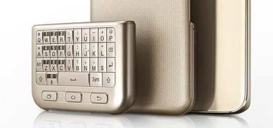
Not because I think it’s useless, but because this just arrived in my mailbox today:

I originally backed this physical iPhone keyboard on Kickstarter because typing Swiss German on an auto-correcting German virtual keyboard is difficult. If I turn off auto-correction, typing English and German becomes difficult. There’s no built-in auto-correction for Swiss German.
On Android, Kännsch helps a lot. It’s a dedicated keyboard for Swiss German.
Still, at least for me, typing on a physical keyboard always worked better. It helps me type correctly without relying on auto-correction.
Of course, I no longer use an iPhone at all, so my new Spike keyboard case is not much use to me anymore.
I do have a friend who is legally blind, and recently asked me if I knew of a way of attaching something physical to an iPhone to get a tactile feel for where the keys are, so I’m going to give it to him and see whether he likes it.
Clearly, these keyboards are niche products. But I’m not sure why people sometimes seem to be almost angry about the fact that they exist at all. If you’re perfectly happy with your virtual keyboard, that’s great. Nobody is ever going to take your virtual keyboard away from you.1 But the fact that you don’t like physical keyboards shouldn’t mean that nobody else is allowed to like them, and I’m quite glad to see Samsung do something in this space.
So I don’t think the problem with the Samsung keyboard is the fact that it exists. The problem is the fact that it seems to suck.
For reasonable values of ever.
If you require a short url to link to this article, please use http://ignco.de/723
If you liked this, you'll love my book. It's called Designed for Use: Create Usable Interfaces for Applications and the Web. In it, I cover the whole design process, from user research and sketching to usability tests and A/B testing. But I don't just explain techniques, I also talk about concepts like discoverability, when and how to use animations, what we can learn from video games, and much more.
You can find out more about it (and order it directly, printed or as a DRM-free ebook) on the Pragmatic Programmers website. It's been translated to Chinese and Japanese.
August 14, 2015
iPad: A Consumption Device, After All?
Via Daring Fireball, Neil Cybart writes:
When compared to the latest iPads, these first two iPads are simply inferior tablets with slow processors, heavy form factors, and inferior screens. But none of that matters with owners. This is problematic and quite concerning, suggesting that many of these tablets are just being used for basic consumption tasks like video and web surfing and not for the productivity and content creation tools that Apple has been marketing.
The Apple media has long been pushing against this narrative, and, in doing so, has helped shield Apple from much-needed criticism at a time when decreasing sales had not yet forced Apple to acknowledge that something was wrong with the iPad.
I wrote about this a while ago.
Cybart continues:
In reality, one reason sales momentum was slowing was iPad owners weren’t upgrading their device.
I think this is a highly problematic argument. The fact that Apple is bringing this up shows just how poorly the iPad doing. If it is already relying on upgrade sales for a major portion of its sales, and sales are actually falling without upgrade sales, it is not reaching enough new customers to maintain growth. That’s bad.
The PC market relies on upgrade sales. The plastic spoon market relies on upgrade sales. The pants market relies on upgrade sales. But a device as young as the iPad should not be relying on upgrade sales to this degree. If Apple thinks that the iPad’s sales are falling because of a long upgrade cycle, the implication is that the iPad has already reached a large portion of all people it’s ever going to reach.
By selling a device that is truly designed from the ground-up with content creation in mind, the iPad line can regain a level of relevancy that it has lost over the past few years. In every instance where the iPad is languishing in education and enterprise, a larger iPad with a 12.9-inch, Force Touch-enabled screen would carry more potential.
Better hardware would help, but I think it’s very important to acknowledge that the thing standing in the way of productive work on the iPad is not its hardware. It’s iOS.
iOS is a cumbersome system for even reasonably complex productive tasks. Apple has started fixing the window management problem, but there’s still the document management problem1 (most real-world tasks involve multiple documents from multiple sources — there’s pretty much no way to organize and manage document from different applications in iOS), and the workflow problem (many real-world tasks involve putting the same document through multiple apps, which iOS is still not great at, albeit getting better).
And then there’s the fact that few developers are willing to invest a lot of money into productive apps on the iPad. They are expensive to create, the market is small, and Apple’s handling of how apps are sold on its devices does not instill confidence.
The thing that’s preventing people from using the iPad productively is not the small screen, it’s the operating system.
Right now, for most of its users, the iPad is a consumption device. It’s not a PC replacement, and it’s not really much better than a phone for gaming or watching movies or reading. That puts it into an awkward position. But it doesn’t have to be. There’s no reason the iPad couldn’t replace most PCs in people’s homes, and be better than those PCs at most tasks people currently use PCs for. No reason — except for Apple’s lack of willingness to make the iPad into that device.
Fixing this problem does not mean «giving access to the file system.» When I say that Apple needs to fix document management, people sometimes assume that I’m saying that they should bring something like the Finder to iOS. I’m not. The Finder approach to file management is broken. It was designed for a time when people had a tiny number of apps, and almost no storage space. That time doesn’t exist anymore, and neither should the Finder.
If you require a short url to link to this article, please use http://ignco.de/720
If you liked this, you'll love my book. It's called Designed for Use: Create Usable Interfaces for Applications and the Web. In it, I cover the whole design process, from user research and sketching to usability tests and A/B testing. But I don't just explain techniques, I also talk about concepts like discoverability, when and how to use animations, what we can learn from video games, and much more.
You can find out more about it (and order it directly, printed or as a DRM-free ebook) on the Pragmatic Programmers website. It's been translated to Chinese and Japanese.
Lukas Mathis's Blog

- Lukas Mathis's profile
- 2 followers

