
The New iPad's Screen Under the Microscope
Like any self-respecting UI designer, I have a microscope sitting on my desk.1 Here are some pictures comparing a bunch of different screens. They're all taken at approximately the same magnification.2 At the scale that the pictures were taken, the width of this bar equals about 1mm:

Note that not all screens are oriented the same way; sometimes, I had to turn the devices to take the picture.
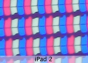
Here's the iPad 2's screen:
And here's what the third generation's screen looks like:
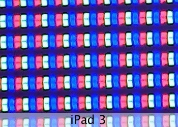
It's easy to conceptually understand the idea of quadrupling the pixel count, but once you actually see what this means, it's frankly pretty astonishing. The iPad 2's pixels look gargantuan next to the diminutive pixels from the third-gen iPad.
By the way, Apple's PR makes it sound like there's almost no space between individual pixels. While there's much less space than on the old iPad, rows of pixels are still placed quite a bit apart from each other.
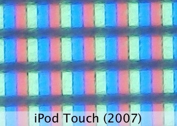
Similarly, here's an iPod touch (2007):
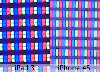
Here's an iPhone 4S:
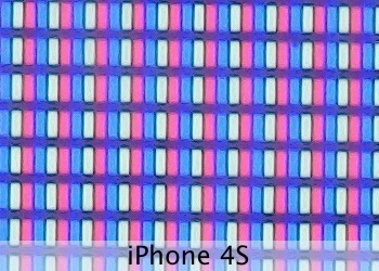
Comparing the iPad 3 to the iPhone 4S shows the iPhone's slightly higher resolution:
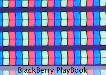
Let's see some other recent devices. Here's a BlackBerry PlayBook:
And its similar competitor from Amazon, the Kindle Fire:
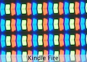
There were some rumors that the two used similar hardware. Clearly, this doesn't apply to the screen at all.
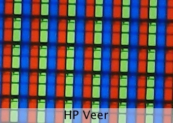
Moving on to some cell phones. First, the HP Veer:
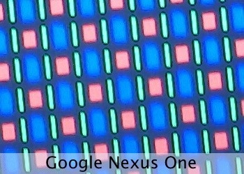
Next, the Google Nexus One.3 It sports one of these horrible PenTile RGBG OLEDs:4
Let's look at some recent gaming devices. This is a Nintendo 3DS:
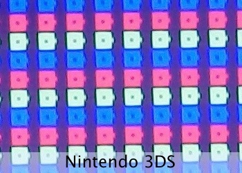
Note how this screen doesn't have square pixels; two pixels fill up one square. This is so the screen can send a different pixel to each eye, creating the 3D effect.
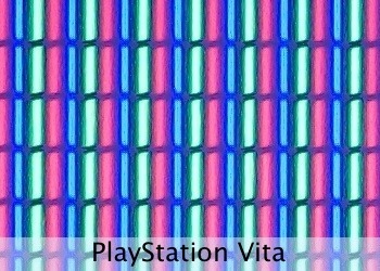
Here's the PlayStation Vita:
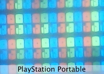
For comparison, its predecessor, the PSP:
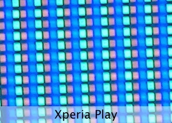
And Sony's «other» portable console, the Xperia Play:
And finally, here's the OpenPandora:
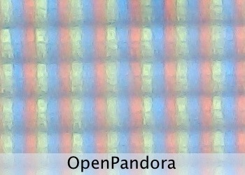
This screen looks a bit blurry under the microscope because it has an anti-glare coating. In real life, the screen looks great, especially in situations where the other screens show distracting reflections.
Update
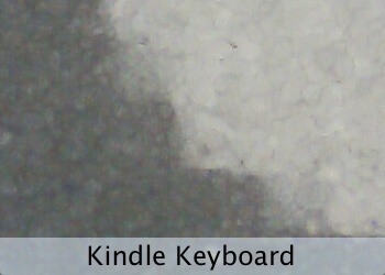
Somebody asked for an e-paper Kindle. Here's the Kindle Keyboard (third generation), at the same magnification:
Update 2
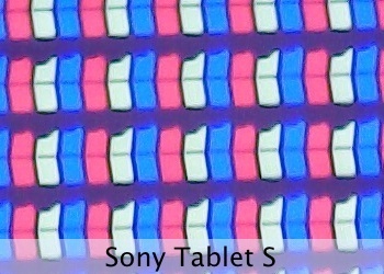
Somebody asked for a more recent Android device. Here's a Sony Tablet S:
Update 3
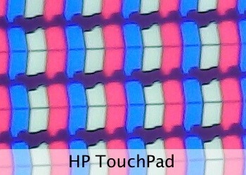
Here's the HP TouchPad:
Update 4
This is a picture of the Galaxy Nexus's screen that should be roughly at the same scale:
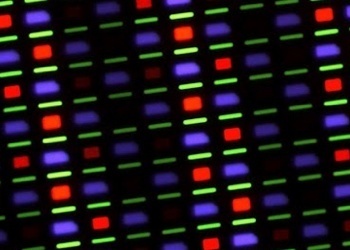
It was taken by Keyan Mobli (via imahotdoglol). It's another PenTile RGBG OLED, so it only has two subpixels per pixel.
In all seriousness, as displays with super-high resolutions start to be more widely used, this might become a more common sight. 
At «80x», although what exactly that means depends on how you're viewing this post.
I would have like to include some more recent Android or WP7 phones, but I just don't have access to any, sorry! This isn't so much meant as a comparison, as it is an interesting look under the hood of these devices.
The Samsung Omnia 7 has a very similar screen. I'd include a picture, but I can't. I sent my Omnia 7 to Samsung's support for repair back in June 2011 (they shipped some Omnia 7s with a broken firmware). Samsung's support acknowledged receiving it, and that's the last I heard about that.
If you require a short url to link to this article, please use http://ignco.de/437

If you liked this, you'll love my book. It's called Designed for Use: Create Usable Interfaces for Applications and the Web. In it, I cover the whole design process, from user research and sketching to usability tests and A/B testing. But I don't just explain techniques, I also talk about concepts like discoverability, when and how to use animations, what we can learn from video games, and much more.


Lukas Mathis's Blog

- Lukas Mathis's profile
- 2 followers

