Virginia S. Anderson's Blog, page 29
June 17, 2016
Think You Couldn’t Possibly Lose Your Amazon Publishing Account? Think Again.
I’m not In KU, but this news certainly makes me think twice about signing my books up. What do you think? Are you a member of KU, either as an author or reader?

There’s this indie author I know a little bit from the Kboards.com forum. Her name is Pauline Creeden, and she’s an ordinary midlister, like so many of us. I remember PMing her some time ago and gushing about how particularly beautiful one of her book covers is — the one for Chronicles of Steele: Raven. Here, I’ll include an image. Gorgeous, eh?
Anyway, today I tuned in to Kboards and noticed that Pauline had started a thread. It contained what’s surely the worst news possible for an indie author: Amazon had closed her publishing account. All her ebooks had been taken off sale. Permanently. Here’s the email she got from Amazon:
We are reaching out to you because we have detected that borrows for your books are originating from systematically generated accounts. While we support the legitimate efforts of our publishers to promote their books, attempting to manipulate…
View original post 1,085 more words


InDesign Cheat Sheet! Add Some Text!

Okay, time to enter some text into your InDesign file.
In this post, I’ll discuss my experience with the basics of adding text. You’ll have many decisions to make once you’ve populated your pages, but I’ll get to those later. For now, let’s just get some text in.
Here’s a warm blanket if you need one: Until you actually save a file, InDesign allows you infinite “Undos.” If you don’t like what you just did, hit CTRL/COMMAND + Z. You’re back where you were, ready to try again.
One problem you may face that I mentioned earlier: If your workspace doesn’t show the tool menu to the left, or any panel options to the right, go to Windows > Workspace > Advanced. The various components should appear.
Remember: You’re now working with content pages rather than master pages. You can’t change master-page elements on content pages. For example, you can’t fool around with the font in your running heads, assuming you created some. You must return to your masters and make the alterations there.
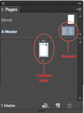
You can override master-page elements, but you’ll only need to do so in a couple of specific places, and the process is quite simple, as I’ll explain below.
An important step: clean up your Word file first!
If you have already formatted your text for Kindle or for one of the other ebook platforms, like Smashwords, and it came out without odd line breaks and other formatting errors, you’ve probably done this work. If not, I recommend following Mark Coker’s formatting guidelines at Smashwords. At their most basic, and as Joel Friedlander of The Book Designer web site tells us, these guidelines say you should:
Run your text through a plain-text program like TextEdit for Mac or Notepad to strip hidden formatting behind your Word document
Then use Word’s “Styles” to format, rather than tabs and returns.
Above all, NO TABS and no stacked returns! Styles allows you to set features like first-line indents and spaces before and after paragraphs or headings.
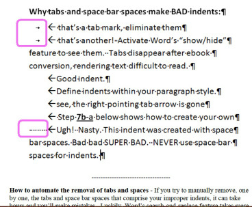
Here’s a fragment from Mark Coker’s guide to formatting for Smashwords, discussing the need to eliminate tabs and spaces for formatting.These guidelines also apply to interiors for print books.
Here’s help with Word’s Styles process. As one of the footnotes tells us, this is the way to “clean” text for print as well as for ebooks.
Now that you have a clean Word file, it’s time to adopt a very different basic process from the one you’re used to in Word:
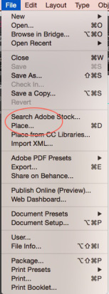
You CAN type directly into text boxes in InDesign, and you CAN copy/paste from your Word files. But the preferred process is to use the “Place” command, under “File.”
In fact, Joel Friedlander considers using copy/paste instead of “Place” one of the four basic formatting mistakes beginners make. For one thing, he says, if you copy/paste, you’ll lose your italics, if you have used any. He also says that you will lose a number of important formatting options.
So the basic steps are these:
Create a clean Word file of the text you want to insert into your InDesign document.
In InDesign, go to File>Place
When offered the chance to browse, select the file you want to insert. The file will “load” onto the cursor; you’ll see it as miniature text attached to the cursor.
Position the loaded cursor in the upper left-hand corner of the first page of your document in your Pages Panel (not the master!).
When the little black cursor arrow turns white, click.
You still have formatting to do, but the text is now in your InDesign document.
I recommend that you load your book a chapter at a time. It is possible to load an entire 90K manuscript at once, but in my view, doing so has disadvantages:
Handling larger files creates more opportunities for your program to get annoyed with you and make mistakes, perhaps garbling page order or even leaving out portions. I’m not saying it will; I am saying that if it ever does, the only way you’ll know is if you read the entire ms.
You’ll be doing this anyway, but will have no reason to do so until your formatting is in place, since you’ll want to limit the number of times you have to read the whole book all the way through. If you find a major error midway through after formatting, correcting the error can affect all the work you’ve done all the way to the end of the book. Better to be able to do a quick inspection a chapter at a time so you can catch any misbehavior on the program’s part before you do a lot more work.
You will need to apply the correct style to each chapter title and subhead or subsection (I use Arabic numerals to denote subsections within larger chapters). To me, it’s a lot easier to catch all of these in a chapter than if I have to comb through a long manuscript looking for them, even using the Find and Replace option in InDesign.
These are just my preferences. If you want to load the whole book at once, you should be able to.
Ooops!
What if this process loads only one page!
It’s possible that this can happen when you insert a multipage file. If so, you’ll see a tiny red square low on the right margin of the page into which you placed the file. This means the text is “overset”: you haven’t made provisions for such a long document.

Here’s the “overset” symbol, telling you that there’s too much text for the space you’ve allotted.
So what are those provisions you should have made?
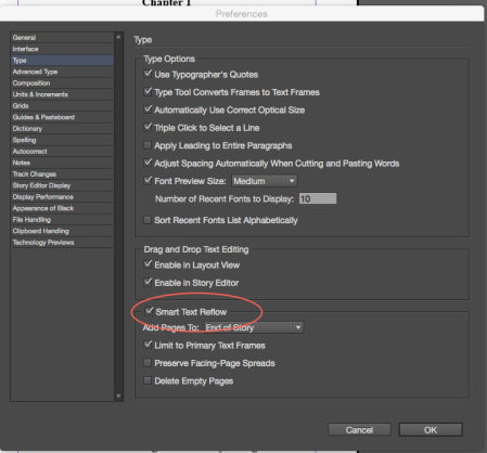
Ideally, you should have your document set up for “Smart Text Reflow” (STR). This toggle is supposed to automatically create pages as needed when you load a multipage file. To see if STR is turned on, go to Preferences, which is located under “Edit” on a PC and under the InDesign logo in the upper left corner on a Mac. Choose Type, and in the box that appears, you’ll see the STR button about two-thirds of the way down.*
You’ll have a couple of options; I suggest going with the defaults unless you run into a problem, then trying other options to see if they change anything.**
There’s another easy solution if by some chance your full file won’t load:
Select the last page in your current Pages panel (probably the one with the single page of the text you’re trying to add)
Go to Layout>Pages>Insert Pages and just add a bunch of pages.

Your pages should flow right into the new space.
My final Beginner’s Cheat Sheet tip for today: removing the running heads and page numbers on your opening chapter pages.
According to the designers, best practices state that these pages should not carry the running heads (nor should your “front” and “back” matter, but we’ll address those in future posts).
To clear the heads from these pages, simply select the page in the Pages panel, go to Layout>Apply Masters to Pages, and in the dialogue box that opens, select “none.”

Done!
Note that you can add your chosen master, or no master, to a range of pages. Just type the range into the box.
Next: Beginner’s Formatting Tips from the Beginner in Chief (me). 
* When I was working on my latest book interior, STR went into a snit. The first chapter loaded beautifully, but subsequently, only a single page of Chapter Two marked with the overset emblem would load.
I jiggled around in the program for a while to see whether I had changed a setting somehow. Everything appeared normal.
Finally, I went to my masters to see if I had inadvertently done something to them.
Poking around, I found a small icon of a manuscript page with an arrow attached to the upper right margin of each of my master pages. Hovering the cursor, I read that “This story is your primary text flow.” Wondering whether this had anything to do with my problem, I clicked both these toggles to “off.”
Bingo! STR leapt into action on the next try.
I’ll leave it to the experts to explain what happened. So far, the chapters seem to be loading fine.
**BTW, in case you’re wondering, “Story” is an alternative editing space you can choose to use. My book suggests that it can be superior for editing work, but I only used it for a single option I’ll discuss in future posts, and I can’t see that failing to use it regularly for editing caused any problems.


June 15, 2016
10 Cliches in Mystery Novels
As a mystery writer, I love the analysis in this list! My favorites:
No. 2) Isn’t it great when the police are conveniently so stupid that the detective can look smart with very little effort? That dates at least to Arthur Conan Doyle (remember Lestrade?), but it’s a long way from the truth. Rachel is absolutely right that police work can be a difficult and thankless task.
No. 3) Follows from No. 2, as Rachel points out. The detective is the only one with the basic common sense to detect foul play.
What am I guilty of? Well, My Failed Novel had a depressed detective hero. Never again. I plead guilty to inserting some attractive female characters in my first two books, now online. I hope these women are just a little bit nuanced so that they’re not total clichés.
What would I add?
The info dump at the end where the hero lines all the characters up and exhibits his or her brilliance by explaining the whole case, which he or she was the only one smart enough to unravel.
That, and books where people just tell the detective what he or she needs to know rather than allowing the detective to work for his or her discoveries.
And finally, detectives who don’t share things they’ve learned. Of course they’re smarter than everybody else if they’re keeping secrets!What would you add?

Have you ever had that feeling of deja vu? You know, when you feel as though something has already happened, but it’s happening again?
Sometimes that happens in books, but when that happens it’s called a cliche.
A cliche is something that is overused and has no original thought put into it.
Cliches are everywhere. In books, TV shows, blog posts (like this one), and in real life conversations and actions. Some cliches we can put up with, some we can’t. The bottom line is, they’re never going to go away.
Then again, there are so many ideas out there that there are bound to be some repeats.
I mean, have you ever had that feeling of deja vu? You know, when you feel as though something has already happened, but it’s happening again?
…Wait….

Some cliches are easy to avoid, but as stated earlier, some aren’t. There are only…
View original post 664 more words


June 14, 2016
Are You a Romance Writer? Here’s Help!

You might want to check out this list of 31 romance publishers who accept unagented work from Authors Publish!


June 9, 2016
InDesign Master Pages: No Big Deal!
Setting up your masters is one of your most important steps; these govern your format throughout your POD book.

Like much in InDesign, the process is easier than it looks.
Throughout this post, you’ll be working only on your masters. Once they’re done, you’ll be ready to spring forward into entering text.
If you are eager to include some kind or graphic or design element, for example on the first pages of chapters, you’ll need to consult that how-to book I suggested that you buy. I am not going to discuss graphics in these posts. In my view, you don’t need them to create a perfectly respectable book.
As you work, always look for the “Preview” box and keep it clicked so you can see your changes as you apply them.
Note that whatever you do on the masters will show up on every page in your book unless you specifically set the master to “none” (easily done; I’ll explain in an upcoming post).
These are poorer quality screen shots than I’ve been able to get in the past. I’ve included captions to make what’s going on in each a little clearer. The comments in the captions match the steps in the main text.
You will have already entered your margins, which will show up in the masters. As a general rule, the only other things you want to set up on the masters are your running heads—your name and the book title—and your page numbers.
Remember that you made the top margins larger than the side margins? Your purpose in doing so was to make room to add your running heads.
I’m going to discuss a couple of options for headers. Headers rather than footers seem to be the more common location for author name and book title, although you can use these instructions to place anything you choose in footers as well. The principles are the same.

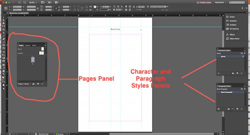
Not a very clear screen shot, but the line on the right points to the guide that will allow you to align your running heads. On the left is the Pages Panel with the Masters icons circled, and the Tool Menu with the Black Selection Arrow and the Text Tool indicated.
Step 1: Open the Pages panel. If you don’t see it, go to Window–>Pages. Double click on the double icon above the spread to bring up the masters in your workspace.
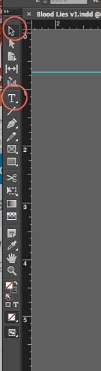
Step 2: Choose the black-arrow selection tool in the tool bar that appears by default on the left of the workspace.
Position the arrow in the ruler at the top of your workspace and double click.
Step 3: Now you can drag a “guide’ down onto your masters. It should extend across both master pages. Position it roughly where you want to establish what I’d call your “actual” upper margin, the top of your headers. Ingram requires a margin of at least 0.5 inches, so don’t position the guide any closer to the upper edge of the document than that.
You need this guide to make sure the running heads on the left and right pages align with each other and with the page numbers if you choose to enter them separately from the text, for example, in the upper right and left corners in a header where the other text is centered.

Here, I’ve used the Type Tool to create two text boxes and the Black Selection Arrow to position the boxes in the outer corners of the pages. Both boxes are currently selected; as in most apps, you can simultaneously select multiple objects by holding down the shift key as you click.
Step 4: Select the type tool (the icon in the tool menu is a capital T).
Step 5: Click with the text tool above the top margin. You’ll be able to draw a text box. If you created a guide, the top of the new box should align with the guide. Draw this box pretty wide and deep so that it will be large enough to contain all the text you need to enter.
You can position this box by simply using the black selection arrow to drag it around. If you want it on the outsides of your pages, it should align automatically with your margins.
Step 6 (Optional): If you want to center your box, as I did, you’ll need an additional step.
This is one of those things I figured out by detective work, but it’s also in that book I keep yammering about.
The things to note here: a) Both the running head box and the main text box are selected on both pages (you can do one at a time); and b) the red line points to the “Align Horizontal Centers” icon, which centers your running head box over your eventual text.
Step 6a: Use the black selection arrow to select your header text box. Then, just as in Word, you hold down Shift while clicking in the main text box below, and bingo, both boxes are selected.
Step 6b: Now you just need to “Align Horizontal Centers.”
My book tells me to go to Window–>Object and Layout–>Align, but I discovered that the “Align Horizontal Centers” icon is also located in the Control Panel (that scary array at the top) once I’ve selected one or more objects. One click, and it’s done.
(Of course, you can avoid this step by choosing to left- or right-justify your running head box to the outside corners of your master pages.)
Repeat your steps with your other master page.
Now, with your running head text boxes created and positioned, you have my permission to type in them. Title goes in one, your name as author in the other. Most books seem to place the author’s name on the left (even) pages and the title on the right (odd) pages, but I’m not sure this is written in stone.
If your title or name won’t fit, either use the handles to make the box larger, or change your font or font size (by selecting with the Type tool, just as in Word), then selecting the font features you want from by making another trip to the Control Panel at the top.
You can align your text inside these running head boxes using exactly the same process as in Word: selecting the text, finding the little icons in the Control Panel for whatever justification you want, and clicking. I centered mine.
I’ve selected my name in the text box; then I can go up to the Control Panel and align it however I like, in this case, centered.
Next decision: where do you want your page numbers?
The easy way is to insert the page number in the centered text box you’ve already created and positioned, probably before your name on the left page and after the title on the right. As in Word, just position your cursor. Then go to Type–>Insert Special Character–>Markers–> Current Page Number.
How did I find this pathway? That darn book.
You’ll see a little “A” appear where you inserted the page number. When you begin entering text, these “As” will be the correct page numbers.

This is how my Masters look with separate text boxes for the page numbers (you don’t have to do this; you can position your page numbers in the same box with your name and book title). The “As” are placeholders for the page numbers (really, those are “As”)..
I chose to create separate new text boxes for my page numbers and position them in the outer corners of my masters. The procedure is the same as just explained, except that the only text is the inserted page number. I left justified my page number on the left page and right justified it on the right.
Again, you don’t have to do this unless you really like the effect.
In the upper left of the Control Panel, you can select a different font and font size for your running heads. Numbers can be in a different font or size from the text.
Later, when you look at your pages, you may feel that the text in the running head box and/or your page-number box, if you created a separate one, isn’t positioned as you’d like—too high, probably. To fix this, go to “Object” in the menu at the top, then “Text Frame Options.” You’ll get a dialogue box. Play around with the “Inset” numbers until you like what you see.

I’ve lowered the text in the “author name” box by typing in different values and seeing how they look. Once I’ve chosen a value, I’d enter the same numbers for each box in the running heads.
So: Your Steps
Double-click your Masters icons in the Pages Panel.
Create a guide above your main text area to define where your header will go.
Create text boxes in the space above your main text area and position them, aligning them with the guide.
Enter your text in these boxes; format and align it however you wish.
Put in your page numbers wherever you prefer using the pathway I’ve provided above.
Bravo. Your masters are done.
Next: time to enter text.


June 7, 2016
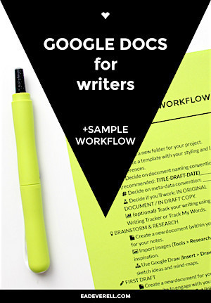
THE ULTIMATE GUIDE TO GOOGLE DOCS FOR WRITERS (+ WORKFLOW VIDEO & PDF CHECKLIST)
Everything you want to know about Google Docs. I plan to learn more about this platform, and this post will be a go-to source!
 Chris The Story Reading Ape's Blog
Extract from an article by E.A. Deverell (Eva) founder of the Lady Writers League:
I’ve been learning so many new Google Docs features as I work on THE STORY CHALLENGE, that I felt I had to document them and share them with my fellow writers!
I’ve created a detailed workflow which you can download at the end of this post and use as the basis of your own experimentation.
I think you’ll still be surprised by some of GD’s secret features.
You can now watch the workshop below!
Hopefully it’ll help to see the features rather than just read about them.
To read the full (long and detailed with lots of related useful links), click on the link or image below:
Google Documents for Writers


June 3, 2016
Why Readers Stop Reading a Book.
The folks at Lit World Interviews conducted a survey. See where you fall on the spectrum! I posted my reasons for not finishing a book and for feeling kicked out of the story world; see if you agree!

Recently, we here at LitWorldInterviews.com conducted a survey, “Why do you put a book down?” and through the assistance of the writing community we had a very nice response. Now it’s time to share what we found.
First, I want to say why the survey was conducted. We wanted to help writers by giving them the information they most need. If a reader takes the time to check out your book and don’t like it, they are unlikely to give you a second chance with your next work. First impressions mean a lot.
86.30% of those responding were Female, thus leaving the remaining 13.70% Male. Considering the majority of those reading novels are Female, although not quite this extreme, I’m comfortable with sharing what we found.
There were 34 sub-categories as a result of the survey. Those results were then placed into 5 main categories: Writing, Editing, Proofreading, Taste, and…
View original post 1,269 more words


Why you need both CreateSpace and IngramSpark…
Here’s a post on POD printing options from Build Book Buzz featured on The Story Reading Ape. This post provides reasons why my decision to go with Ingram first rather than CreateSpace in publishing a print version of King of the Roses (and eventually Blood Lies) was a sound one. Follow my series on my “Crazy Journey” through the Ingram process: it doesn’t look all that crazy when seen through the eyes of book-marketing expert Amy Collins!
Chris The Story Reading Ape's Blog
Extract of an article by Author Amy Collins in Build Book Buzz:
I have been asked one question more than any other: “Do I need IngramSpark if I have CreateSpace?”
I know it’s tempting to avoid the extra expense and hassle of taking on a second print on demand (POD) provider, but I want to take a moment and share some of the experiences we’ve had at New Shelves Books with our POD work. I hope these statements help you determine if you need one or both.
So . . . do you need both?
See the full article (and read the comments already there) by clicking the link, or Amy’s photo below:
Why you need both CreateSpace and IngramSpark


June 1, 2016
What is “Literary” Fiction? Donald Maass has a definition!
This post at Writer Unboxed is among the best discussions of the distinction between “literary” and “commercial” that I’ve seen. Donald Maass’s comparison between excerpts from two books, one “commercial,” one “literary,” makes the difference visible. This discussion ties in well with my own attempts to define “voice” and effective “world building.” Let me know what you think! 


May 31, 2016
InDesign Cheat Sheet 2: How to Get Started
As promised: Exploring my Crazy Journey through InDesign. Today: Some basics I skipped over.
A couple of exchanges I’ve had suggest that I need to back up a step and make sure it’s clear how to initiate your wrestling match—uh, your friendly encounter—with InDesign. Getting started is not that much different from getting started in Word, but it looks a little different.
The screen that opens for me when I first click the InDesign app is black with white lettering, but you can change the colors if you want. via Preferences—>Interface, located, as usual in many programs, under the program icon in the upper left-hand corner.
Not unlike a Word menu, the opening screen presents you with two choices, “Open” and “New.”
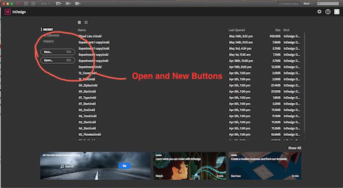
Again not unlike the command in Word, “Open” in InDesign allows you to return to something you’ve already created. “New” says what it means. Here’s where you start.
And here’s where there is a small difference from Word. My version of Word gives me a blank document, cursor just a-blinkin’ away. In the more recent versions of Word I’ve used on PCs, the program offers you a choice of kinds of documents, but once you pick one, it once again welcomes you with little Mr. Blinking Cursor, your best friend.
In contrast, InDesign offers you a dialogue box. But this is really almost the same dialogue box you’d use if you wanted to make changes to the default Word document you’re used to seeing.
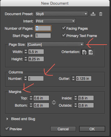
For now, all it really wants you to do is set the size of your page, the number of columns and the margins within which you’ll place your materials.
For the kind of book I’m discussing, the correct number of columns is one.
The most common page sizes, or “trim sizes,” seem to be 5X8 or 5.5X8.5. You can just type your preference in.
You should set your margins based on the particular look you want, or on the recommendations of whoever will be printing your book. Ingram required 0.5 inches. I went with 0.8.
Make your top margin larger, at least one inch, since you’ll need to add running heads with your name as author and your book title. I also put my page numbers in the heads, but if you want to put them at the bottom, you should set the bottom margin larger as well.
I also decided that for the next book, I’ll expand the “inside” margin by about 0.025 inches, because I felt it came out ever so slightly narrower than I liked if the inside margin was the same as the outside.
Margins matter, of course, because you don’t want your lovely text cut into when they cut the pages to “trim size.”
You’ll see all this at work—running heads, page numbers, margins versus trim size, by taking a look at any published book on your shelves.
Once you make these three decisions and click OK, bingo. You have a page!
Go to Window—>Pages and open the Pages Panel. You’ll see your newly birthed page sitting there as well, a little white icon in the dark field.
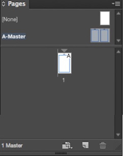
You can’t type in anything just yet. I’m getting there.
First, in the Pages Panel, note the “spread” above the dividing line. These are your master pages. Double click on either one, and you’ll open the masters in your main window. You’ll see that they are set up with the specifications you selected for size, columns, and margins.
Next, click on your lonely page icon in the Pages Panel. It returns to your window. If necessary, go to “View,” and tell it to Fit Page in Window.
Your screen may not automatically provide you all the elements you need. An easy fix: Window—>Workspace—>Advanced. Almost every panel you’ll need to format your book will pop up. (Choosing “Book,” oddly, hid my Pages panel.)
Ignore all the stuff at the top. You’ll only use it once in a while, for example, to choose a different alignment, font, and font size for titles, etc.
By default, the Tools menu will be lined up along the left side of your screen. Now I’m going to tell you about the only two tools you’ll really use that much.
The black “Selection” arrow at the very top.
The Text tool, indicated by the letter “T,” probably about a third of the way down.
If you choose the black selection arrow and click inside the margins of your document, you’ll see that the margins become selected. They have the little handles you should have encountered in boxes in other programs. You can tinker with size and whatnot with these handles. More on that later when I try to convince you that running heads are no big deal.
You’ll use the Selection tool much less often than you’ll use the Text tool. If you click on its icon in the Tool menu, your pointer becomes a large cursor image. Use this shape to click inside your margins, and guess what? Mr. Blinking Cursor appears.
Now you can type to your heart’s content. Except that you probably won’t want to. In the next installment, I’ll tell you why.