Virginia S. Anderson's Blog, page 27
August 12, 2016
Grammar Rules: Split Infinitives | Writing Forward
Here’s my take on this article:
I agree with this post: what to do with infinitives is a judgment call. Some observations:
In the 18th century, pundits thought English needed to be more like Latin, a “more mature” language. You can’t split an infinitive in Latin (nor in Romance languages like French or Spanish–such languages have one-word infinitives). But since English needed to emulate Latin, its two-word infinitive needed to be treated like a Latin one-word infinitive. So there. Obviously English is a very different language from Latin–it’s not a Romance language at all, it’s Germanic–so following a rule meant for a Romance language doesn’t make sense.
Second, one reason “to boldly go” sounds so good is that placing “boldly” within the infinitive creates an iambic phrase: ././ Iambic is the “natural” meter for English; it’s Shakespeare’s meter, for example. It just plain has a ring.
So place your adverbs wherever you think they create that ring. (And don’t eschew adverbs universally, either. They have important roles in prose.)
 Silver Threading ~ Fairy Whisperer ~

FINALLY! Split infinitives explained and how to NOT use them!❤
What are split infinitives and do grammar rules tell us whether or not we can use them or when it’s appropriate to use them?
Source: Grammar Rules: Split Infinitives | Writing Forward


August 9, 2016
Language Warning! But You Better Read Anyway!
 As usual, Chuck Wendig has his own way of saying things. So put your fingers in your ears so you won’t hear the bad words, and read! 25 Reasons I Stopped Reading Your Book!
I’ve posted my own reasons more than once. Here’s what I wrote on Chuck’s post:
I’ve posted more than once about my own answer to this question. Lack of voice is way up there. Too many characters and scenes feel pasted out of the Universe of Stock that we all have access to. No surprises, not in the characters’ actions, not in the diction, not in the rhythm. All stuff I’ve seen a thousand times (and don’t subject myself to any more).
What I call “illogic” fits several of these points: When something a character does or something that happens serves the prefabricated plot and not the story that wants to emerge from the characters’ interactions. I got into trouble myself once making characters do something they were screaming that they didn’t want to do. Ruined a potentially good novel, and boy, did I pay. Nothing in this post is truer than that the characters write the story. Listen to them.
And gosh, pages of exposition (and no, that’s not “literary fiction”). And too much info, too many characters, on page 1. And books that start with action before I can understand the conflict. And . . . and . . . and . . .
This post could easily be required reading in every “creative writing” class or critique group (though it would require a language warning in most settings, i fear).


August 6, 2016
Closed for business: Two big things that could penalize your Amazon author account (and how to prevent them)
Here’s help negotiating Amazon’s review process! So much mystery!

Make no mistake. If you have heard me speak before almost anywhere or read anything I have to say about writing, I emphasize one thing above all else:
“You can be as artsy as you want to be while you are writing your book, but once it is finished, it is a product. A product you must distribute and market in order for it to sell.”
There’s another part to this reality of writing as a business: the number one distributor of ebooks remains Amazon, and for most authors about 80% of their sales would disappear, should the online giant refuse to sell their work. Discoverability on Amazon is the number one trick authors, publishers, and book marketers are trying to crack. Of course, if it works on Amazon, the same method will likely increase sales on iBooks and Nook as well, provided an author even offers their books for…
View original post 1,331 more words


August 4, 2016
InDesign Beginner’s Cheat Sheet: Finally Formatting Part II
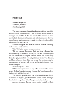
My formatted Page 1 of King of the Roses. The titles are in Minion Pro, the text in Garamond.
This is the next installment in my Beginner’s Cheat Sheet meant to help you format your own book interiors using InDesign. Note, again, that this series covers only plain text formatting, not graphics. But the fact is—YOU CAN FORMAT YOUR OWN BOOK INTERIOR!
In the previous post in this series on using Adobe InDesign to format your own book, you used the Paragraph Styles dialogue box to make basic decisions about font, font size, leading, and justification.
In this post, we’ll consider options you can choose in InDesign that might not be offered in Word.
The first of these options:
Aligning your text to the baseline.
This ensures that the lines of text on facing pages align with each other. This feature will become part of your main body style going forward.
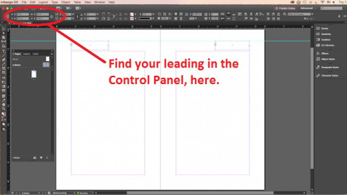
Step One: Make a note of two pieces of information: your leading, which you can recover from the Control Panel if you’ve forgotten it, and the actual top margin value—how far it is from the top margin of your text box to the top of the page. You can recover this by opening Layout>Margins and Columns. If you set the margin to 1 inch, this is the number you want, NOT the margin from the top of the header where your running heads are.
Step Two: Reselect the paragraph you’ve been working with.
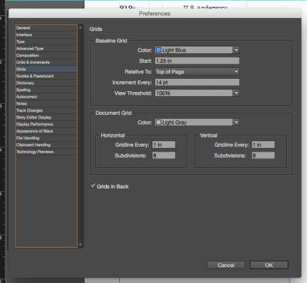
Step Three: Go to your “Preferences” menu—under “Edit” for a PC and under the “InDesign” logo in the upper left-hand corner on a Mac. Choose Grids.
In the “Baseline Grid” box that appears, type your top margin number, for example, “1 in,” in the box that says “Start.”
Type your leading number in the box that says “Increment every.” This can be in points.
The “View Threshold” number allows you to tell the program when it can display the grid for you to see, assuming you want to (and I think you will). Mine defaulted to 75%. If you leave it at the threshold, you’ll be able to see the grid only if your zoom is 75% or higher. This appears to be a good value for this box.
Don’t mess with anything else. Leave the defaults.
Click OK.
Step Four: Go to Type>Paragraph.
You get a new little dialogue panel (not the same as the Paragraph Styles box you’ve already worked with). In the lower righthand corner of this panel you’ll see a little double-columned icon. Hovering your cursor should reveal that this is the place where you click to “align to baseline grid.” Click this icon.
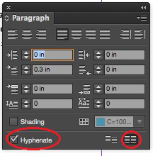
Align to baseline in lower right, hyphenate option in lower left.
You should see the lines of text in your selected paragraph move a little.
I suggest that you check to see whether your text actually did align to baseline by going to View>Grids & Guides>Show Baseline Grid, then select “View>Actual Size.” You’ll see the gridlines across your page/spread. If your text has aligned, it will sit on these gridlines.
Possibly it hasn’t aligned. In the experimental file I’m using to write these posts, the text didn’t align when I clicked the icon. I discovered how to correct this. I’ll get to that below.
For now, you have set your baseline grid. You can turn off the view by clicking the “Hide Baseline Grid” option which you might as well do for now, even if your text hasn’t aligned.
Other Options—Hyphenation:
While in the Paragraph Panel where you aligned to the baseline, click “hyphenation” in the lower lefthand corner.
Now reopen the Paragraph Styles panel from the righthand side of the workspace. Double click on the style you’ve created and named—the one you’re working with. “Paragraph Styles Options” should open.
The description of your style (Style Settings) should now note that you have added a hyphenation choice and, if your icon obeyed you, a desire to align to baseline.
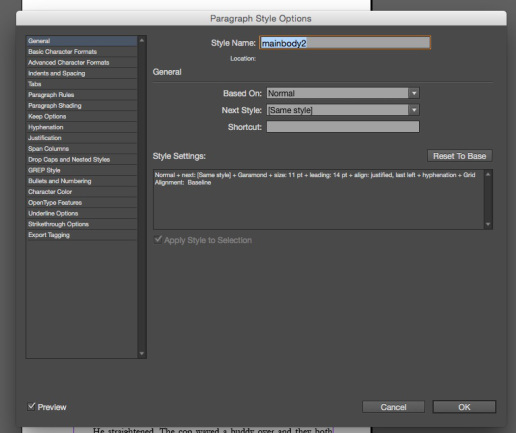
On the left of this main box, you’ll see a list of options you can apply.
If you click on “Hyphenation,” you get some choices as to exactly when your document is allowed to hyphenate. I haven’t messed much with these options, but you certainly can.
Widows and Orphans
You now have to make the fateful decision about widows and orphans. To do so, in this same Paragraph Styles Options dialgue, click on “Keep Options.”
In my research, I discovered that this isn’t a hard and fast choice. It boils down to whether or not you want “square pages” or uneven pages, which occur if the program moves single lines of text around to avoid leaving one alone at the top or bottom of the page.
I deliberately chose not to have the program eliminate widows and orphans. This created some more work for me (which I’ll discuss in a later post), but I just like the square-page look. You can decide.
If Your Text Didn’t Align to Baseline—
Open the “Indents and Spacing” option. Here, when the alignment command seemed unresponsive, I found a drop-down box labeled “Align” and noticed that “none” was selected. When I discovered that another option was “All lines,” I chose that.
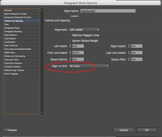
Bingo. My text dropped obediently to the baseline.
You will be able to confirm that your text has aligned when you apply the style to more pages. If so, your bottom line of text will sit almost right on the bottom margin.
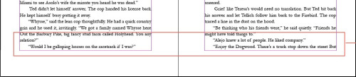
Test aligned to baseline sits right on the bottom margin of your pages.
Final Option: Optical Margin Alignment
Say what?
This is really neat!
InDesign offers you the option of “hanging” your punctuation—periods, quotation marks, hyphens—ever so slightly outside the margins of your document. The idea is that those kinds of nearly invisible marks, when left inside the margins, create a slightly ragged-looking page.
To see what this option does, leave your paragraph selected and go to Type>Story.
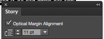
Remember to adjust the font size to match yours.
The tiny “Optical Margin Alignment” box appears. Adjust the font size to match your font and click in the checkbox to activate. This feature will be added to your style, although I haven’t been able to make it show up in the style description in the Paragraph Styles panel.
You won’t be able to tell if you like this feature until you apply the style to several pages. But you can disable it by simply selecting all, re-opening the little box, and turning it off.
Now, you can select all your text with CTRL/COMMAND + A, click on your new style, and see what it looks like in actual text.
If you don’t like some feature, just select the text where the style will apply, reopen the Paragraph Styles box, and use the options in the list on the left to make changes. Any changes you make will impact all the text to which you have applied this style.
Next Post: Additional and Character Styles for Chapter Heads and Italics


August 2, 2016
Fantasy vs. Magical Realism
Here’s a useful article on a meaningful distinction. I’ve started pitching my work in progress, The Drowned Man, as magical realism. It certainly isn’t fantasy. Yet I’m not so sure it meets this definition either. What’s your definition of magical realism? Share your favorite examples!
Silver Threading ~ Fairy Whisperer ~
In the quest to define the genre of my novel, The Heart Stone Chronicles – The Swamp Fairy, I stumbled across a definition of a genre I had not previously explored. It is called magical realism.
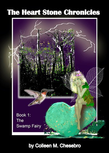
Although I have categorized my novel into the fantasy realm, after further reflection, I do believe it falls more into the magical realism category.
“Fantasy is defined as a work of fiction where magic is the main plot element, theme, or setting. Many fantasy novels take place in imaginary worlds where magic and magical creatures are common.” Wikipedia.
EMWelsh.com in her post, “Magical Realism, What is it?” defines magical realism with the following traits:
“Real World Setting:
Magical realism is almost always rooted in a real place, though like in Wizard of the Crow or One Hundred Years of Solitude, it can often be a made-up city or town within the real world that is…
View original post 1,012 more words


The Adverb Problem and Why Authors Should Care
Here’s an article about an old controversy: to adverb or not to adverb. My thoughts on this issue:
I agree with one of the comments in the original post that a blanket ban on adverbs is unworkable. In the sentence “After I had breakfast, I went to the store” (okay, it’s not literature), the first dependent clause, “After I had breakfast,” is an adverbial clause. Anything that fleshes out where, when, why, or how may well be adverbial. To ban adverbs completely would be to impoverish a piece of writing beyond recognition. Does “completely” in that sentence add anything? It does add emphasis. Whether it should be cut is a judgment call.
I do agree that it’s better to find the precise verb that does the work rather than to tack an adverb onto a weak verb. Sometimes that can be tricky, though. “He closed the door firmly” conveys an intentionality that ‘He closed the door” does not. “He slammed the door” won’t work. “He jerked the door shut” might work to replace “firmly.” It can take a long time for the word that works best to float up (and “best” is an adverb in that sentence). Finding the word that Mark Twain compared to lightning rather than the lightning bug should always be the goal, IMHO.
What’s your take on adverbs—the “ly” kind and its sometimes (adverb) invisible brethren?


by Gary Smailes
In this article I will set out to explain why so many famous authors (Stephen King being perhaps the most vocal) warn other authors against the use of adverbs. In fact, King’s hatred of adverbs is so intense that he’s been quoted as saying, “Adverbs are evil.” You will discover the role of adverbs in fiction writing, and I’ll demonstrate why removing adverbs from your writing will make your book more enjoyable to read. In short, I’ll explain just why adverbs are evil.
View original post 2,700 more words


July 27, 2016
Do’s and Don’ts of Asking for Reviews
Do you review books? Can you add to this good advice? What makes you decide to write a review—or makes you decide not to? I find that I’m least likely to review something I’m reading if I’m unsure whether I’m reacting to the book itself or to conventions of a genre that I just don’t understand or care for. What about you?

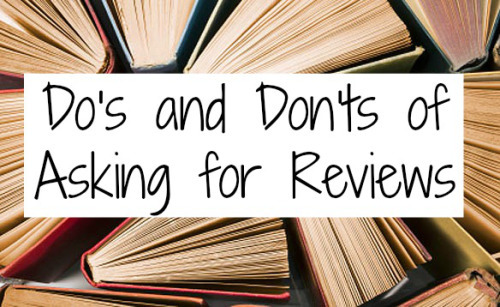
Hello my lovely bookworms! I spend a lot of time talking about what to do in order to GET books to review, but today I wanted to switch gears a little and address authors that want to get their BOOKS reviewed. Some may not know this, but there is actually etiquette that goes into asking a reviewer to read your book. Reviewers are not obligated to read your book, and they certainly aren’t required to like your book, so here are a couple of pieces of advice for the author who is looking to get their book reviewed.
Take into consideration what the reviewer likes to read.
Many reviewers, but not all, have a section on their blog that tells authors, publishers, and other people what their interests are regarding the genre of books they like to read. I do not have a specific list of genres that I will…
View original post 819 more words


July 25, 2016
New Writers’ Comprehensive Reality Check!
 Joel Friedlander at The Book Designer shares this comprehensive discussion of myths and truths for first-time novelists from Florence Osmund. I would argue that you CAN format your books yourself if they’re not graphically complicated (i.e., just text). Check out my InDesign Beginner’s Cheat Sheet series. But this advice is worth taking to heart!


July 19, 2016
It Ain’t Just Talk: 3 Crucial Elements of Great Dialog
Here’s some good stuff on dialogue! I have to say I’ve been reading a lot of dialogue recently that’s either way too generic or waaaaay too cute (the kind that goes on for pages because, it seems, the writer just likes hearing all that clever patter). And I confess, I struggle to stay within these parameters myself.
I think creating the best dialogue comes down to working with characters who are not generic themselves, who have something to say—and, as this article suggests, are in conflict in some way. For example, one wants something the other doesn’t want to give. The screenwriting books I’ve read called this “no” dialogue. Great stuff happens when “no” underlies the scene. Sound too negative? Next time you’re bored or stuck with your scene, try it.
One final thought: too much dialogue, and you’ve got a stage play, not a novel, not even a movie. This is one of my greatest challenges: making sure that conflict-filled dialogue scenes are tempered by scenes where characters do things instead of just talk.
What are your challenges, pet peeves, and strategies when it comes to dialogue?

She’s baaaaack. Well, sort of. Today I have an extra special treat. This is going to sound super conceited but whatever, it is MY blog
July 17, 2016
International Poetry competition – one of the biggest and best
Some readers might like to consider this contest! Sounds great for poets.

One of the world’s biggest and most prestigious poetry contests, the National Poetry Competition is now open for previously unpublished poems of up to 40 lines on any subject. (Publication includes being posted on blogs, twitter etc etc)
The competition is judged by Moniza Alvi, Gerry Cambrige and Jack Underwood. Every entry will be read by at least two judges – they don’t just get to see a selected short list. All poems are judged anonymously.
1st prize is £5,000
2nd £2,000
3rd £1,000 and there are seven commendations at £200 each.
Winning poems are also published in an anthology and on the Poetry Society website, and there are other exciting opportunities for each year’s winners, including the opportunity to read at some of the UK’s biggest literary festivals and events.
Entry fee: The first poem submitted costs £6.50. Subsequent entries in the same submission cost £3.50 per poem. Poetry…
View original post 27 more words