Nicholas P. Desbarats's Blog, page 3
October 30, 2024
“I don’t want red on my dashboards. It looks too negative.”

I first heard this objection from a client a number of years ago and it took me so off-guard that I just stared at them and then mumbled something about getting back to them on that. It just seemed like such a bizarre thing to say…
Since that time, I’ve heard this objection at least half a dozen times and have had a chance to formulate a couple of responses that usually convince dashboard users to rethink their “no red” policy. Specifically, these responses are questions that prompt dashboard users to reflect and reconsider:
Question 1:
"OK, just to confirm that I understand your request, you want the dashboard to say that everything is O.K. all the time, and to not show problems in the organization. Did I understand correctly?"
The answer is usually something like, "Well, maybe that’s not exactly what I want," and users eventually realize for themselves that avoiding flagging problems is going to make for a pretty useless dashboard.
Question 2:
"If our users have detailed background knowledge about all the metrics on the dashboard and can easily tell which numbers are good or bad on their own, then you're right, the dashboard doesn’t need red indicators to flag problems. Do our users have detailed background knowledge about all the numbers on the dashboard?"
The answer to this question is virtually always “no,” which, again, usually prompts people to rethink their “no red” policy.
Ultimately, dashboards that don’t visually flag problems will probably be abandoned by users because users don’t have time to manually review all the numbers and figure out which ones require attention, assuming that they even have the background knowledge needed to do so (which they usually don’t).
Having said all this, there are good ways and bad ways to determine which metrics to flag as red and green (or blue and orange for colorblind users). For example, flagging metrics that are worse than the previous period (yesterday, last month, etc.) or flagging metrics that are below a target don’t work well at all. Instead, I use a technique called “action dots.”
BTW…
There are still some spots left in my in-person workshop in London, U.K. next week (Nov4-7). Info and registration: https://www.eventbrite.co.uk/e/nick-desbarats-practical-charts-practical-dashboards-tickets-981495037077


October 20, 2024
New video! Why I don't use Marimekko charts (and what I use instead)
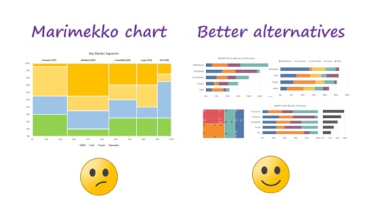
You may or may not be familiar with Marimekko charts, but they're popular in some fields, such as management consulting.
To see why I avoid using this chart type and what I use instead, check out my latest video (8 mins.) on LinkedIn or YouTube:
BTW, there are still some spots left in my upcoming in-person workshop in London, U.K., on Nov. 4-7. Interested in taking my Practical Charts and/or Practical Dashboards course? Check out the London workshop info/registration page.
October 8, 2024
Dashboards should only show the “most important” metrics… right?
I regularly hear complaints from dashboard creators that go something like this…
🗣️ “My users consider dozens of metrics (or more) to be ‘KPIs’ and they want me to put them all on the dashboard.”
🗣️ “My users don’t understand that, among all the metrics that we could show on the dashboard, only three to five of them are truly important. The rest are just noise that distract from the truly important numbers, and so don’t belong on the dashboard.”
Think about that for a second, though. Does it seem plausible that someone could run an entire team, department, or organization based on just five numbers?
In every organization in which I’ve ever taught or consulted, there were dozens of metrics (or more often, tens of thousands, once they’re segmented by region, business unit, etc.) that would genuinely require action if they went south. If those metrics aren’t on a dashboard somewhere, many problems in the organization will go unnoticed and bad things will happen.
When your users ask for lots of numbers on their dashboard, then, maybe they’re being perfectly reasonable. Calling most of those numbers “unimportant” or “just noise,” however, maybe isn’t so reasonable. But how can we show that many numbers on a dashboard without it being visually overwhelming?
In my Practical Dashboards course, I recommend creating nine different types of dashboards for users, including a family of three dashboard types called "tactical monitoring dashboards.” These dashboards show a large number of metrics that are associated with a single role (CEO, account rep, etc.), area of the organization (marketing, call center #3, etc.), or “entity” (transactions, customers, etc.). Here’s an example of a “area” dashboard (the “Operations” area, in this example):
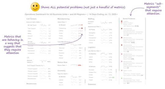
As you can see, it’s possible to show a large number of metrics without overwhelming users; the key is to build intelligence into the dashboard so that it automatically identifies and visually flags metrics that require attention. This allows users to instantly zero in on metrics that require attention (if there are any), so far more metrics can be included on the dashboard without it becoming overwhelming. In other words, we can show all potential problems, not just those that happen to impact four or five metrics. This isn’t easy to pull off (it takes about half of my 14-hour Practical Dashboards course to teach others how to do it), but it is possible.
This approach reflects the reality that, despite what many people believe, there’s never a handful of “truly important” metrics; there are only metrics that are important right now, and those change from one day/week/month to the next, so all potentially problematic metrics need to be on the dashboard.
Want to learn how to design dashboards like this? There are still seats remaining in my in-person workshop on Nov. 4-7 in London, U.K. Workshop info/registration page: https://www.eventbrite.co.uk/e/nick-desbarats-practical-charts-practical-dashboards-tickets-981495037077
September 23, 2024
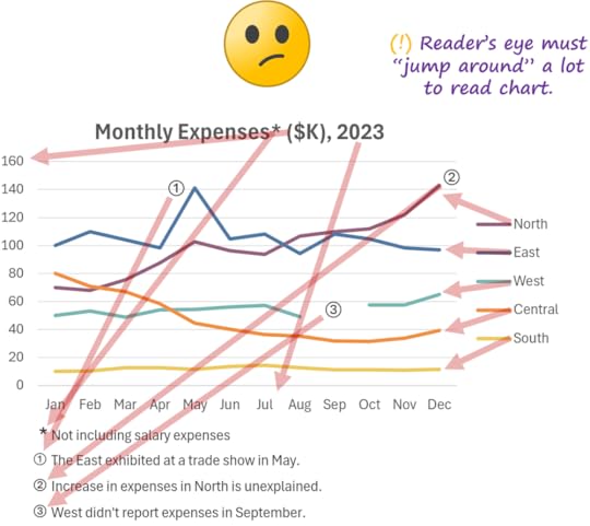
Avoid legends, footnotes, and other forms of "indirect" labeling in your charts! (whenever possible...)
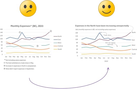
I often come across charts that don't label the bars, lines, scales, etc. directly, and instead force readers to "look up" what those chart elements represent somewhere else in the chart, i.e., in legends, footnotes, etc. While charts like this are readable, they force a lot of work onto the reader:
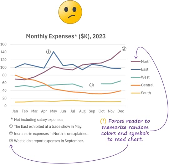
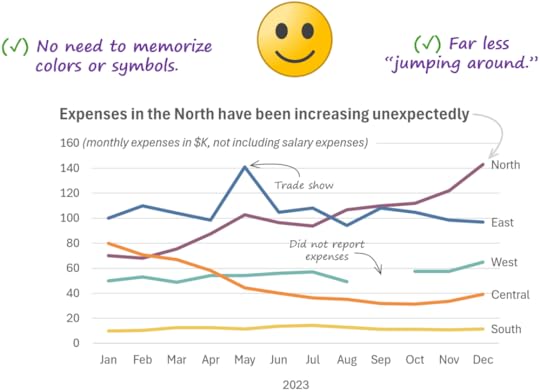
Labeling chart elements directly makes the chart easier to read:
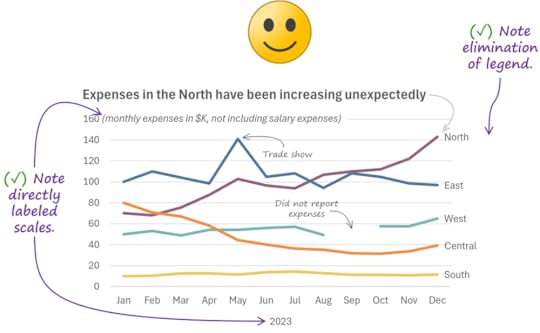
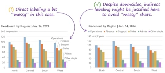
There are times, however, when direct labelling can look a bit "messy," so a legend and/or footnotes might be warranted to keep the chart clean looking. If you're not sure, try both.
Agree? Disagree? Leave a comment below!
BTW…
Want to take my Practical Charts and/or Practical Dashboards courses in person? I'll be delivering them in London from Nov. 5 to Nov. 8. Early-bird discount extended to Sep. 27! Check out the workshop info and registration page to learn more.
Want more tips like these? Subscribe to my email list to make sure that you never miss a new post or video.
September 11, 2024
Creativity is great in charts... except when it gets in the reader's way!
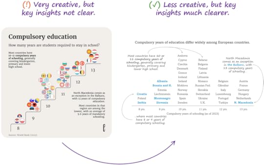
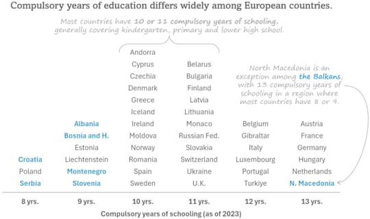
I recently saw people praising this chart from The European Correspondent on social media:

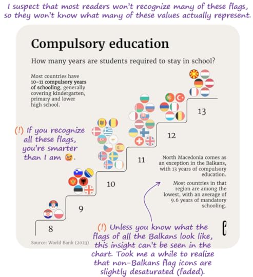
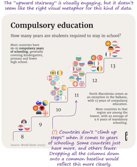
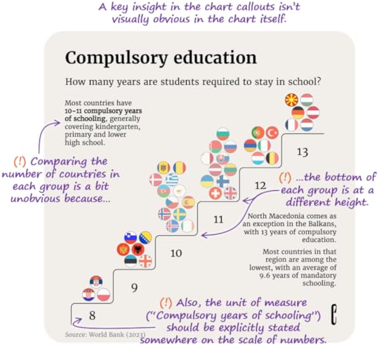
While it's certainly creative, when I tried to actually read the chart and spot the insights that were in the callouts, I had to work pretty hard, and some insights were difficult—or even impossible—to spot:
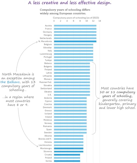
In the spirit of pointing out solutions and not just problems, I redesigned the chart to make it easier to read, and to make the key takeaways in the callouts more obvious:
While perhaps less visually engaging than the original, my guess is that, ultimately, a chart like this might generate more engagement because it's so much easier to read and it makes the key insights in the callouts so much more obvious.
I'd also argue that this makeover is actually somewhat creative, as well. The stacks of country names act like bars in a bar chart (taller stacks of names are like taller bars, i.e., more countries in a group), which wasn't an obvious design choice. The most obvious (and, therefore, least creative) design would have been a bar chart like the one below, but it wouldn't have made the key insights as clear and would be more visually busy than the "more creative" makeover:
What does this mean when creating your own charts? A few things, I think:
Creativity is important in data visualization and should be encouraged, but...
...creative design choices should make key insights easier to see, not harder, and...
...they shouldn’t impose excessive cognitive effort on the reader, or they might skip reading the chart altogether.
Making charts that are visually engaging in order to grab attention is perfectly justifiable in many situations, but...
...there’s no point in getting readers’ attention if, once you have their attention, they fail to grasp key takeaways because of attention-grabby design choices.
Note that none of this applies of you’re creating data art, which serves a very different purpose.
BTW…
I'll be delivering my Practical Charts and Practical Dashboards courses in person in London, U.K. from Nov. 5 to 8! Learn more or register here, but note that early-bird prices end Sept. 14. I hope to meet you there IRL!
Subscribe to Nick’s email list to get more posts like this.
August 27, 2024
Stop using confusing date formats in your charts!
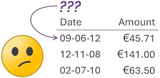
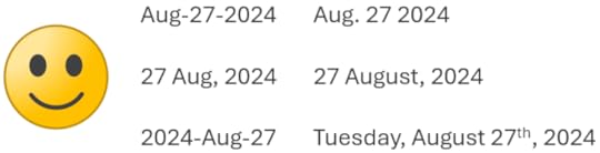
One of my pet peeves is dates in charts that are ambiguous:
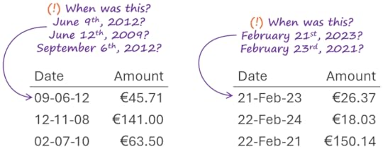
This can be easily fixed by simply choosing different date formats:
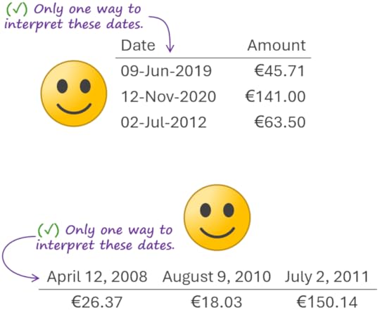
What, exactly, makes these date formats clear and unambiguous? Two things:
The month is alphabetic (“Feb”, “September”, etc.), not numeric (“02”, “9”, etc.).
The year is four numbers (“2024”, “2015”, etc.), not two (“24”, “15”, etc.)
Here are a few more date formats that meet these criteria and so are clear and unambiguous:
Have something to say about this article?
Reply in the comments below, or comment on the post of this article on LinkedIn.
Want more tips like this? (Like, A LOT more?)
Until 09-04-24 (just kidding 😆)... Until Sept. 4, 2024, readers of my blog can get 25% off my Practical Charts On Demand course (6.5 hours of video in 45 lessons) by using the coupon code newsletter-04 at checkout!
August 21, 2024
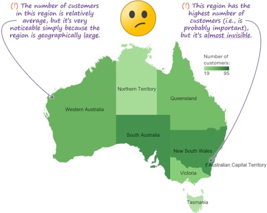
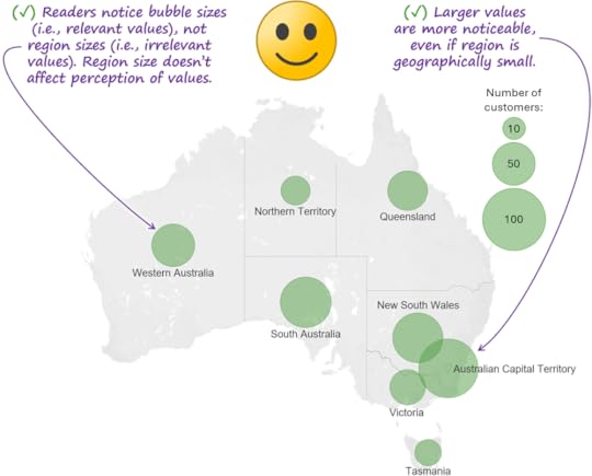
I've stopped using colored-region ("choropleth") maps. Should you?
Probably the most common way to show values on a map is the "colored-region" or "choropleth" method. I'm not the first to notice, however, that this method presents some potentially serious perceptual risks (this was first pointed out to me by Stephen Few):
Other map types such as "colored dot" maps don't pose these same risks:
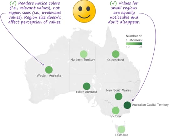
"Bubble maps" (a.k.a., "proportional symbol maps") also avoid the risks of choropleth maps:
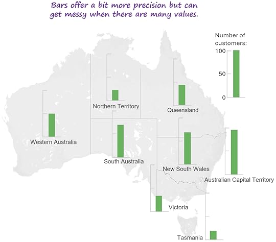
You could also use bars, which would actually allow values to be estimated a bit more precisely than colored dots or bubbles. The downsides of bars, however, (there are always downsides...) are that they can make it tougher to spot patterns (clusters, gaps, etc.) when there are a lot of values, and the chart can look visually busier:
When I posted these examples on LinkedIn, a few people said that choropleth maps are O.K. as long as the map is showing "ratio" values, such as "Inhabitants per square kilometer." Well, if you were to show those values for, say, the countries in East Asia, the values for regions like Singapore and Hong Kong would be almost invisible in a choropleth map, even though they would be some of the largest values in the whole map, so I'm not sure choropleth maps would be O.K. when showing these "ratio" types of values, either.
IMHO, the only time when it would be "safe" to use a choropleth map would be when all the regions being shown happen to have roughly the same size and shape. The issue is that, of course, that's almost never the case for any area of the world at any scale (Asian countries, South African provinces, Californian counties, etc.).
BTW…
European friends! I'll be in your continent of the woods next month, and the week of Sep23-27 just opened up for me. If you'd like me to deliver my Practical Charts and/or Practical Dashboards courses in person to your team or speak at your event during that week, contact me asap!
August 7, 2024
Free webinar recording: "How to choose a chart type (it's trickier than you think)"
I was recently invited to deliver a webinar as part of JMP's great Statistically Speaking series. The webinar consisted of a 35-minute talk entitled "How to choose a chart type (it's trickier than you think)," followed by about 25 minutes of Q&A from a very engaged (and large) audience. A few key points from my talk and the Q&A:
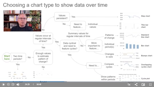
Simple rules of thumb such as, "To show data over time, use a line chart" or "To show the breakdown of a total, use a pie chart" are problematically over-simplistic, and frequently lead to poor chart type choices.
The simple chart-type-selection diagrams and taxonomies that regularly pop up online are also too simplistic and also often lead to poor chart type choices, however, more robust chart-type-selection diagrams can work very well.
What I think of a few "controversial" chart types such as pie charts, funnel charts and radar graphs (in the Q&A at the end).
Watch the webinar recording now (on JMP's site).
BTW...
Nordics and Central Europe friends! I'll be delivering an in-person workshop in your part of the world in Tallinn, Estonia on Sep10-13. If you're interested in taking my Practical Charts and/or Practical Dashboards course, register for the workshop here (registration page is hosted by my Estonian partner, Dmitrij Zatuchin). Note that seats are limited and early-bird registration prices end on Aug. 15.
July 31, 2024
New video! Step-by-step makeover of an email subscriber count chart
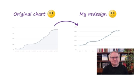
I recently logged into the dashboard for my email list management app and noticed that the chart of my subscriber count over time suffered from several common design problems that made it unnecessarily hard to read and potentially misleading. In particular, the quantitative and time scales were less than ideal.
Check out this short (8-minute) video of me fixing these problems step-by-step:
BTW...
Nordics and Central Europe friends! I'll be delivering an in-person workshop in your part of the world in Tallinn, Estonia on Sep10-13. If you're interested in taking my Practical Charts and/or Practical Dashboards course, you can register for the workshop on the following page, hosted by my Estonian partner, Dmitrij Zatuchin . Note that early-bird registration prices end on Aug. 15.
July 28, 2024
New video: Redesigning a chart of ages of first-time mothers in European countries
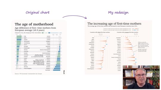
I recently recorded a video of me turning an “OK” chart into a great chart, step-by-step, to make it easier to interpret and to make key takeaways much more obvious.
Let me know if you agree or disagree with any of my changes!