Nicholas P. Desbarats's Blog, page 4
July 26, 2024
How many slices can you put in a pie chart? (New video!)
Prefer to watch than to read? Watch a video version of this article on LinkedIn or YouTube:
tl;dr: When it comes to the maximum number of parts that should be shown as a pie chart, there are plenty of opinions floating around out there. In this article, I argue that the maximum number of slices depends on the situation and that, in certain situations, even a 30-slice (!) pie chart can be the best choice.
As usual, before saying anything about pie charts, I need to point to this article, which outlines why I don’t think that pie charts are Satan’s chart type and which describes the specific situations in which I think they can be the best choice. With that out of the way, on to the question at hand: How many slices can you put in a pie chart?
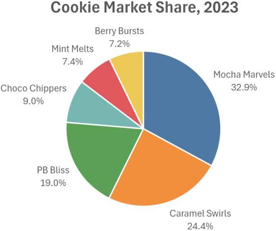
In the Pie Chart Wars, many pie-chart-hesitant people say that pie charts should only be used to show the breakdown of a total with two (or, according to some, three) parts, and that a bar chart should be used if there are more parts than that.
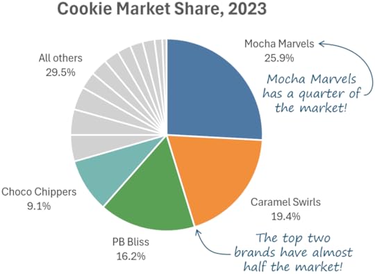
According to that guideline, the pie chart below would be a bad chart because it’s showing six parts (i.e., six slices):
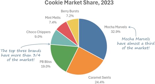
I think this chart communicates insights like those in the blue callouts more clearly than a bar chart would, though:
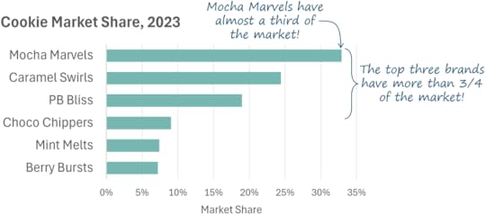
So, a pie chart with more than two or three slices can be the best option in certain situations, I think. A bar chart would be a better choice in the previous scenario if the insight to be communicated were something like, “Mocha Marvels have the largest market share,” but that’s not the kind of insight that we needed to communicate in that scenario.
How far can we push it, though? What if we needed to show a total with, say, 15 parts?
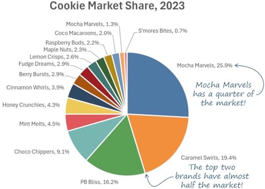
We probably all agree that this is a pretty messy chart, however, insights such as those in the blue callouts are clearer than they would be in a bar chart of the same data. What to do?
Well, since the smaller categories aren’t very relevant to the insights in the callouts, we might be able to get away with grouping those into an “all others” category, which makes for a cleaner-looking pie chart:
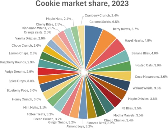
What if we couldn’t get away with lumping less relevant categories together, though, and we needed to show them all individually, as in the scenario below?
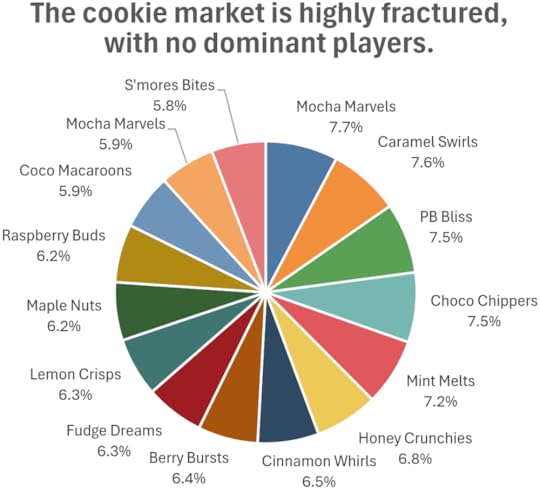
I know many experienced chart creators will recoil when seeing a chart like this and, yes, I agree that it does look pretty messy. It also, however, communicates the insight in the chart’s title more clearly than a bar chart would:
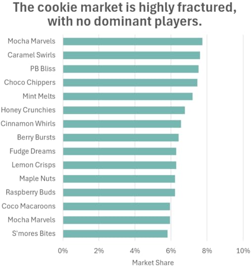
While this bar chart does look cleaner, it also doesn’t look like a total with many parts, but that’s the main message in this scenario. The bar chart looks like a set of similar values (which may or may not be parts of a total), which isn’t the same thing. Yes, readers of the bar chart will figure out that these are parts of a total, but only after reading the (textual) title and (textual) horizontal axis scale and extrapolating from there, whereas the pie chart skips those cognitive steps altogether. If the main message were about how the parts compare with one another, the bar chart would be a better choice, but that’s not the kind of message that we needed to communicate in this scenario.
How about a treemap?
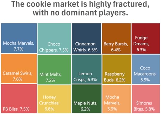
To my eye, this is pretty similar to the 15-slice pie chart, both in terms of “messiness” and how well it communicates the insight in the title, so I could see going with either option in this case. If there were fewer than six or seven parts, though, I wouldn’t use a treemap because a pie chart makes fractions of the total (1/4, 2/3, etc.) easier to perceive when there are fewer parts. I’d also favor a pie chart if my audience wasn’t very data-savvy, since treemaps are a less common chart type that might not be familiar to them.
What if we needed to show a total with even more parts? Like, say, 30?
Yes, at this point, a pie chart starts to look a bit ridiculous, but this is due partly to the fact that all the parts are similar in size and all of them are labeled in this particular example. There are, however, (admittedly rare) situations in which that wouldn’t be the case, and in which even a 30-slice pie chart could be the best choice:
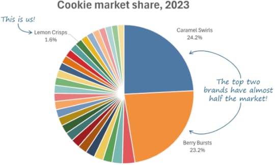
Yes, a 30-bar bar chart would be cleaner looking, but it wouldn’t communicate the insights in the blue callouts as effectively, and neither would a treemap (which also wouldn’t be much cleaner looking with data like this).
So, what’s the bottom line, here? How many slices can you put in a pie chart? As with most other chart design decisions, a simple rule of thumb such as, “Never use a pie chart to show more than X number of parts,” is, IMHO, problematically oversimplistic and will routinely lead to poor design choices. I wish it were that simple but, as I hope I’ve illustrated, it’s not. It depends on both the nature of the data (the distribution and number of parts, in this case), and the specific purpose of the chart (what insight you’re trying to communicate, what question you’re trying to answer, etc.).
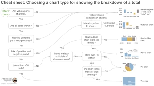
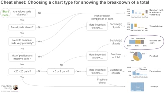
The best advice I can offer is (as always) to make sure you’ve figured out why you’re creating a chart in the first place (what specific insight you need to communicate, what specific question you need to answer, etc.) before you start designing it. Then, try visualizing the data in various chart types and ask yourself which one best communicates the specific insight/answer/etc. that you needed the chart to communicate. Note that a lot of this trial-and-error process can be avoided by using the decision tree below, which is included in my Practical Charts On Demand course:
Agree? Disagree? Awesome! Let me know in the comments below!


June 18, 2024
Big news! Practical Charts ON DEMAND will be available on June 25th!
That's right. For last few months, I've been busily recording an on-demand version of my popular Practical Charts course. I'm pretty happy with the results at this point, and so have scheduled the launch for June 25th, with a short "pre-sale" period beginning today.
Practical Charts On Demand features the same course content that I've delivered in live workshops for NASA, Bloomberg, Yale, Visa, Shopify, the IRS, the U.N. and many others, but in pre-recorded video lessons that can be watched on your own schedule (and in your own time zone!) at an affordable price.
During the current pre-sale period (i.e., before June 25th), Practical Charts On Demand can be pre-ordered for 25% off the regular price of US$649 per student. Volume discounts are also available when ordering three or more licenses for your team (contact us for details).
Practical Charts On Demand includes:
6.5 hours of professionally produced video in 44 easy-to-digest lessons, plus one hour of offline exercises to practice what you learned
Complimentary EPUB (eBook) and PDF editions of my Practical Charts and More Practical Charts books (U.S. and Canadian customers can also get 25% off paperback editions)
30-page Cheat Sheet PDF for quickly referencing essential guidelines after you’ve completed the course
Access to biweekly live online “office hours” Q&A sessions with Nick (see the schedule of upcoming office hours sessions)
A certificate of completion
The goals of Practical Charts On Demand are the same as those for the live version of the Practical Charts course, i.e., to...
Teach you how to create charts that are as effective and professional looking as those created by someone with decades of chart-making experience, and that wow audiences with their clarity and usefulness.
Teach you these skills quickly (the course takes about 7.5 hours to complete).
Allow you to learn these skills easily, with many guidelines and frameworks not found in other courses that are explained using simple language and realistic examples with no theory or jargon.
Equip you to competently handle all common data visualization challenges and design choices (choosing a chart type, deciding when to include zero in a chart’s scale, handling outliers, etc.).
Ensure that you avoid dozens of common data visualization mistakes that leave audiences confused, unmoved or misled.
Make you the go-to data visualization pro in your team or organization and add a highly in-demand data skill to your resume.
A detailed description of the course content can be found on the Practical Charts course information page.
I'm confident that Practical Charts On Demand will fundamentally change the way that you think about creating charts, as it has for so many others already. Ready to get serious about becoming a true dataviz pro? Pre-order Practical Charts On Demand before June 25th to get 25% off.
April 29, 2024
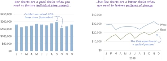
When to use a bar chart
When should you use a bar chart instead of another chart type? Easy question, right? After all, bar charts might just be the simplest (and most common) chart type on the planet.
If you look to the many chart-type-chooser diagrams and chart type catalogs floating around online, you’ll typically see guidelines like…
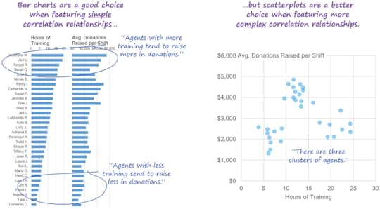
“Use a bar chart when you need to feature a comparison relationship.”
This sounds reasonable, but the minute you put two or more values in a chart, you’re automatically featuring a comparison relationship, e.g., a comparison of values from different time periods, a comparison of the parts of a total, a comparison of values in different parts of a distribution, etc. Basically, all charts feature comparison relationships of one type or another, so, if you follow this guideline, all of your charts would be bar charts.
…or…
“Use a bar chart when you need to compare categories with one another.”
This also sounds reasonable until you realize that most chart types compare categories with one another, including line charts, heatmaps, pie charts, choropleth maps, arrow charts, scatterplots, and many, many others. If you follow this guideline, then, once again, most of your charts would be bar charts.
Clearly, all of your charts shouldn’t be bar charts, so what’s going on here? Well, bar charts are actually unique among chart types because they’re the only chart type that can show virtually any kind of data:
Because bar charts could be used to show any kind of data, does that mean that all charts should be bar charts? Well, no, as you can probably guess, there are good reasons to use other chart types in many situations, for example…
…and I could show dozens more examples of situations in which the choice between using a bar chart and another chart type depends on the specific purpose of the chart, the number of values to be shown, and a variety of other factors.
For example, the decision tree below from my Practical Charts course provides guidance on when to use a bar chart instead of another breakdown-of-total chart type such as a pie chart, waterfall chart, stacked bar chart, Pareto chart, or treemap. (Note that this decision tree isn’t intended to be self-explanatory; I’m just showing it here to illustrate that this kind of decision-making isn’t as simple as many people think it is.)

…and there are seven other, similar decision trees in the Practical Charts course for choosing a chart type to show data over time, distributions of values, values with locations, etc.
As it turns out, then, choosing when to use a bar chart or another chart type is surprisingly complex. In fact, I’d argue that, in a way, bar charts are actually the most complex chart type, because in order to know when to use a bar chart, you have to know when to use virtually every other chart type.
Weird, right?
By the way…
If you’re interested in taking my Practical Charts course to learn when to use bar charts and 50 other common chart types, there are still some spots left in my upcoming open-registration workshop, which kicks off this Monday (May 6). I hope to see you (online) there!
To be notified of articles like this in the future, subscribe to Nick’s email list (one to four emails per month to level up your dataviz and dashboard design skills).
April 15, 2024
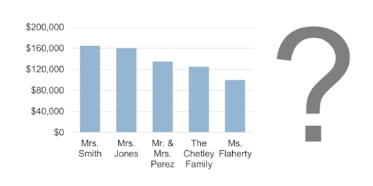
The one (rare) situation in which it makes sense to use a single stacked bar chart
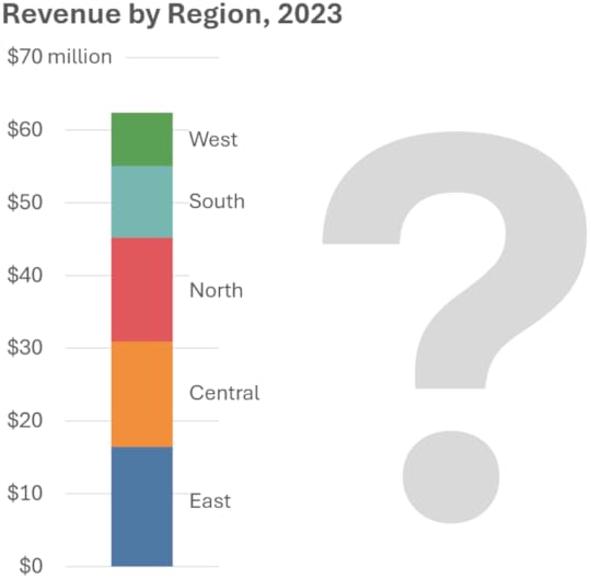
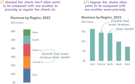
I’ve recently seen a few comments on LinkedIn from people who don’t feel that it ever makes sense to use a stacked bar chart to show the breakdown of a single total, like this:
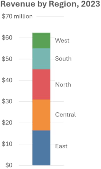
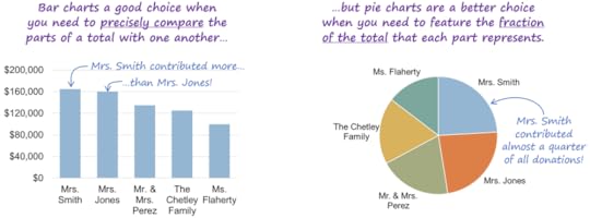
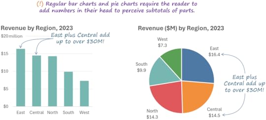
It’s true that, if the main message of the chart involves precisely comparing the parts of a total with one another, a regular bar chart would be a better choice:
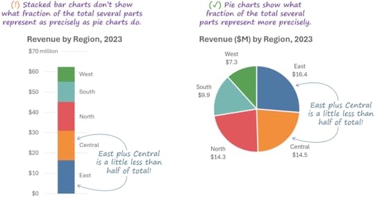
It’s also true that, if the main message of the chart involves showing what fraction of the total each part represents, a pie chart would be a better choice:
(BTW, if you believe that pie charts are the devil’s chart type, read this.)
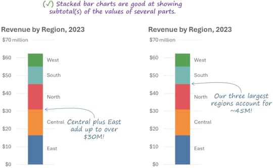
If other chart types are better choices in those situations, when would it possibly make sense to choose a stacked bar chart? TBH, it took me a while to realize that there’s another type of insight that one might need to communicate about the breakdown of a total, and for which a stacked bar chart would be the truly best choice, specifically, an insight that involves showing subtotal(s) of the values of several parts:
If you were to use a regular bar chart or pie chart to communicate this type of insight, it would force the reader to do math in their head, which is definitely something to avoid since it dramatically slows down interpretation and increases the effort required from the reader:
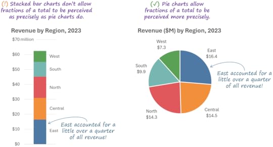
Note, however, that if the main message of your chart involves showing what fraction of the total several parts represent, a pie chart becomes a better choice than a stacked bar chart:
So, to sum up, when showing the breakdown of a single total…
Consider using a stacked bar chart when showing subtotal(s) of parts is more important than…
…allowing the parts to be compared with one another precisely, or…
…allowing fractions of the total to be perceived precisely.
So, yes, there is a situation in which it makes sense to use a stacked bar chart; it’s just that that situation doesn’t occur all that often in practice.
These guidelines (and others) are summarized in this handy-dandy decision tree, which is one of eight such tools that are included in my Practical Charts course:
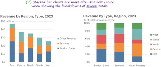
Having said all this, if you need to show the breakdowns of several totals (not just one total, as we’ve seen so far), stacked bars become the best choice considerably more often:
When, exactly, are multiple stacked bars the best choice? That would require a whole other article, or you could just take the course😊, speaking of which…
My next open-registration, online workshop kicks off on May 6. Registration is now open, and there are still a few seats left. Ready to become a true dataviz and/or dashboard design pro? I hope to see you (online) there!
To be notified of articles like this in the future, subscribe to Nick’s email list (one to four emails per month to level up your dataviz and dashboard design skills).
April 3, 2024
“Keep it simple” is NOT good chart-design advice

WTF…? Am I suggesting that chart creators should make charts that are needlessly complicated?
No, but there are two reasons why I don’t think “keep it simple” is good advice:
This advice assumes that the reason why so many charts are needlessly complicated is that chart creators don’t realize that they should try to make simple charts, and, therefore, that simply telling them to “keep it simple” will solve the problem. In reality, of course, almost all chart creators already know that they should avoid making charts needlessly complicated; it’s just that their charts often turn out that way despite their best efforts. Telling chart creators to “keep it simple,” then, is useless advice: in the vast majority of cases, they’re already trying to do that.
Creating “simple” charts is much harder than it sounds. Telling a chart creator to “keep it simple” is like telling a student driver to “avoid traffic accidents.” Well, yes, obviously, but how, exactly, does one do that? While avoiding accidents sounds simple, it requires learning hundreds of rules of the road and days of training and practice.
When it comes to creating charts, it takes me about 14 hours to teach someone how to “keep it simple” in my Practical Charts course. Creating charts that look simple and straightforward to audiences requires knowing how to choose from among about 50 common chart types, how to decide how wide or narrow to make quantitative scales, how to choose colors, how to formulate effective chart titles and callouts, and a slew of other skills that many chart creators have never learned, and that require hours or days to master.
Telling a chart creator to “keep it simple,” then, is kind of like telling them to “design good charts.”
Umm… thanks (?)
BTW…
Interested in taking my Practical Charts and/or Practical Dashboards course to become a true dataviz pro? Registration is now open for my upcoming live, open-registration workshop in May. I hope to see you (online) there!
March 5, 2024
How I wrote "Practical Charts"

I’ve been asked a number of times how I went about writing Practical Charts because it’s so, well, practical. This is a wonderful compliment to receive and so, as a cheap thank-you, here’s the story behind the book.
It started with someone else’s workshop…
In 2013, I attended a training workshop delivered by legendary dataviz educator Stephen Few. Prior to that, I’d been making charts as best I could, but that workshop was my first exposure to underlying concepts and best practices, and it blew me away. Steve and I stayed in touch after the workshop, and a few months later I pitched a partnership to him under which he’d train me to teach his courses in exchange for a share of the revenue from workshops that I’d teach. Incredibly, he accepted my offer, and I ended up training thousands of professionals in workshops in over a dozen countries from 2014 to 2019.
While delivering those workshops, I noticed that the dataviz mistakes that chart creators made were remarkably consistent from one client organization to the next, and the specific chart-making challenges that arose were also remarkably similar. I also noticed that many of those mistakes and challenges weren’t covered in any of the dataviz courses or books that I was aware of, so I started noting them, as well as clever solutions that I came across (often, from uncredited geniuses who attended my workshops) or solutions that I thought of on my own.
In 2019, Steve retired from teaching and encouraged me to develop my own courses (though I continued to offer his courses, as well). The first step was to go back and review my notes and… yikes. Hundreds of completely random thoughts and ideas, with no discernable sequence or structure. Not even a central theme. Just a bunch of “If I ever develop my own course, make sure to mention…”
At the time, the only thing of which I felt confident was that those notes contained at least 90% of the common mistakes and 90% of the common challenges that arise in real-world chart-making. How could I know that? Because, after teaching workshops for three or four years, almost all of the dataviz mistakes and challenges that I came across among new clients were already mentioned somewhere in my notes, and it was quite rare for me to get a new question that I hadn’t been asked already in a past workshop.
If I could develop a course that taught participants how to avoid all of those mistakes and handle all of those challenges, that course would, almost by definition, turn participants into expert chart makers, able to make clear, compelling, and problem-free charts, every time.
Developing the Practical Charts course
The hardest part of developing the Practical Charts course was organizing all of those hundreds of random ideas into a structure and sequence that made sense and that would be easy for participants to follow. Oh, and cramming all those ideas into a course that could be taught in two days (or four half-days). I was worried that the course would feel like a quasi-random collection of tips and guidelines that would be hard for participants to absorb.
The organizing and sequencing process took many weeks and fried many brain cells. Figuring out which concepts or guidelines I needed to talk about before I could talk about which other concepts or guidelines was difficult. One of the techniques that I used to group and sequence ideas in my own mind was to sketch out decision trees for making various chart design choices, which turned out to be very helpful. I’m embarrassed to admit that it didn’t occur to me to actually include those decision trees in the course itself until quite late in the course development process, since many people now consider those decision trees to be the most valuable parts of the course.
Over time, a structure emerged, and I was able to organize all the ideas into a sequence that made sense. I was amazed that all my hundreds of random notes somehow “fit together,” like a puzzle. There were many small refinements and iterations after I launched the course in 2020, but I was lucky enough to get lots of positive feedback from participants from day one. As I’d hoped, the most common adjective that people used to describe the course was “practical,” that is, that it provided specific guidance on how to tackle almost all of the real-world challenges that they faced when creating charts.
I should mention that early drafts of the course contained a certain amount of dataviz theory (pre-attentive attributes of visual perception, visual hierarchy, color theory, subitizing, etc.). Like many other experienced chart creators, I assumed that people would need to know at least some of those theoretical concepts in order to create effective charts. I did want to minimize the amount of theory in the course, though, so I started cutting everything that wasn’t necessary in order to fully understand a particular practical guideline in the book. When I was done cutting, there was no theory left. I realized, then, that, if you’re just creating “everyday” charts for reports and presentations (and not highly customized, scientific, or artistic charts), I don’t think you need to know any dataviz theory.
BTW, I still regularly deliver the Practical Charts course and continue to update and improve it. If you’re interested in attending an upcoming online public workshop or scheduling a private online or in-person workshop for your team, contact us.
I provided (and still do provide) a PDF of the course slides to workshop participants, but I was often asked for a book version that would be easier to reference after the workshop, since the course slide PDF contains over 500 slides (!).
Writing the book
Once the course had undergone multiple iterations and was in a pretty fine-tuned state, I thought that it would be relatively easy to write the book, since the book would basically just be a transcript of me delivering the course.
Hah.
I’d been cobbling together passages for a book for quite some time, but progress was slow, and I figured that the only way that I’d ever finish it was to block off weeks of uninterrupted writing time in my calendar. During an eight-month period in 2022, I only delivered a handful of workshops so that I could focus mostly on writing, and that turned out to be the right call since I finished the manuscript in early 2023, with monumental amounts of help from my colleague, Bryan Pierce. Even though I thought that the course was very fine-tuned already, I ended up tweaking many of the examples and guidelines from the course while writing the book, which I then worked back into the course after the book was written. As they say, if you want to understand something fully, write about it…
The first draft of the manuscript ended up being almost 400 pages long, which was far more than the 250 pages that I was aiming for (most people don’t want to read a brick). I noticed, though, that about 20 of the 50 chart types that I covered in the book were ones that roughly half of my workshop participants told me they’d never use because their audiences “weren’t data-savvy enough” to grasp them, such as scatter plots, histograms, and cycle plots. To address all of these issues, I decided to split the book in two:
Practical Charts, which covers 30 common chart types for the many chart creators who only create charts for “non-data-savvy” audiences and clocks in at a manageable 302 pages
More Practical Charts, which covers 20 additional chart types that should only be used with data-savvy audiences and is a very manageable 98 pages
Since the book was published…
When Practical Charts was released in November 2023, it was the top-selling new release in two (admittedly niche-y) Amazon categories and, thankfully, it’s been selling well since. It’s also been picked up as a textbook at Yale and is currently being evaluated by several other universities. Even more gratifying is the fact that I see social media posts and get messages virtually every day from readers who’ve found the book to be valuable, and from workshop participants who’ve found it to be an essential post-workshop reference. One review on LinkedIn read, “I have many great dataviz books on my shelf, but Practical Charts is the one that stays on my desk,” and there have been many similar comments which have been particularly gratifying, since that that was one of my main goals when writing the book.
How is the book holding up against my other goal of making it complete enough so that, if I came across a chart that I considered to be poorly designed for any reason, I could point to a part of the book that described the problem and what to do about it? Thankfully, pretty well. Over 90% of the chart design problems that I see “in the wild” are covered somewhere in the two books. As the field of data visualization continues to evolve, that percentage will undoubtedly start to drop, but that’s what second editions are for 😊.
So what?
What can you get from this story, especially if you’re thinking of developing your own course or writing your own book? To be honest, I’m not sure, but here are a couple of random thoughts:
As you can see, Practical Charts was written “from the bottom up,” not “top-down.” I didn’t start out with a central idea or theme that I developed into increasingly detailed sections, as is so often taught in writing courses. It started out as a collection of details, which were then cobbled together into a structure and sequence that only emerged relatively late in the process. A central idea (i.e., that charts are “graphics for doing a job”) only emerged very late in the process. Basically, “bottom up” can be a valid way to develop a course or book, even though that’s not how it’s normally taught.
The book also isn’t “the important things that I think people should know about data visualization.” Instead, it’s “what I saw that people needed to know in order to create expert-level charts, regardless of how important or unimportant that I felt that it was.” Each workshop that I taught provided invaluable “market research” that allowed me to identify the common gaps chart creators’ knowledge, what challenges they faced most often in real-world practice, and which solutions they found to be most useful. I tried to focus only on that and forget about what I, personally, thought was important or unimportant for them to know.
I waited several years before starting to work on the book in earnest and, in hindsight, I think that that was the right decision. If I’d started writing it as soon as I’d decided that I wanted to write a book, the ideas wouldn’t have been fully baked and the book would have been considerably less useful. I mention this because it goes against the common advice that the best time to start any big project is today. Sometimes it is, but sometimes you’re better off waiting until you feel like things are more fully formed in your mind.
I hope you enjoyed this look at the messy process of writing Practical Charts. Did anything jump out at you as surprising or useful? Have you had similar experiences working on a large project? Let me know on LinkedIn or Twitter, or in the comments below.
BTW…
If you enjoyed this article, consider subscribing to my email list (one to three emails per month to level up your data visualization and dashboard design chops).
February 20, 2024
Video: Choosing a chart type is trickier than you think - A conversation with Enrico Bertini
I recently had a great conversation with data visualization researcher and professor Enrico Bertini, about how surprisingly tricky it is to choose a chart type. Watch the video above (20 mins) to discover...
Why both the nature of the data AND the purpose of the chart must be considered when choosing a chart type
Why traditional "chart-type-chooser" diagrams and catalogues are often unhelpful, and even unreliable
Examples of more reliable and helpful chart-type-choosing decision trees from my Practical Charts course
Agree with what we said? Disagree? Great! Let us know in the comments below or in this LinkedIn thread.
February 14, 2024
Are “smoothed” line charts OK?
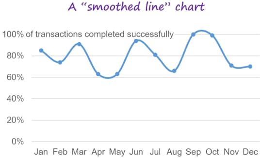
You’ve probably seen “smoothed” or “curvy” line charts like this before:
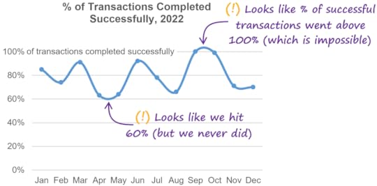
If you do a bit of research about this chart type, you’ll find that some people like them and others definitely don’t. Among those who say that smoothed lines should be avoided, the main concern seems to be the “overshooting” problem, whereby the line can end up going outside of the actual range of the data:
I’ve also come across a few other concerns regarding smoothed lines, such as the risk that they might imply that there are “intermediate” values in between the actual values in the chart when there aren’t any, or that they imply that the data is sampled from a continuous process like the temperature of a lake, even if it’s not. Personally, I don’t think that most audiences will perceive smoothed lines in those ways—especially if the values are indicated with small markers on the line—but I’m not aware of any studies that support these opinions one way or the other.
Another concern with smoothed lines is that the chart creator must choose the degree of smoothing to apply, i.e., whether to make the line segments curvier or straighter. This is a subjective choice and the degree of smoothing that the chart creator chooses could, theoretically, alter how readers perceive the underlying data.
Why would a chart creator decide to smooth the lines in a chart, then? In all the examples that I’ve seen, it seems that it was a purely cosmetic decision, i.e., the chart creator just thought that smoothed lines looked nicer.
Should you avoid using smoothed lines, then? Well, if your chart is intended to entertain or inspire readers and potential, small misrepresentations of the data don’t matter much, smoothed lines are probably fine:
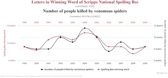
(BTW, this chart is from Tyler Vigan’s “Spurious Correlations” site, which is hilarious. Visit it immediately).
If, however, your chart is going to be used in a business or technical setting in which communicating information quickly and clearly is a high priority, I’d avoid them. Even though I don’t think that the risks of smoothed lines are as significant as some people make them out to be, I’m not aware of any actual benefits of using them aside from purely cosmetic ones. (And, are smoothed line segments really that much prettier than straight ones?)
As with any good guideline, there are exceptions (two, in this case):
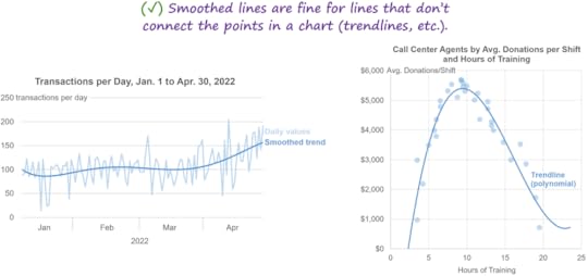
1. Smoothed lines are fine for lines that don’t directly connect the points in a chart, such as trendlines, because the risks that I just mentioned aren’t risks for these types of lines:
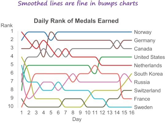
2. Smoothed lines are fine in bumps charts because the risks that I mentioned don’t really apply when showing changes in rank, and a different smoothing algorithm can be used that forces the lines to be perfectly horizontal when they pass through each point, which eliminates the “overshooting” problem:
[Feb. 14, 2024, 2pm ET update: Shortly after this article was published, smart cookies Daniel Zvinca and Kerry Kolosko pointed out that the overshooting problem can be solved by using a type of smoothing algorithm called a "monotone" algorithm, similar to what's used in the bumps chart above. This is absolutely true, but this type of smoothing sacrifices much of the aesthetic appeal of smoothed line charts (to my eye, anyway), especially when the values don't occur at regular intervals:
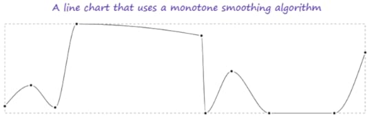
Personally, I don't think this is a great solution, then. While it does solve the overshooting problem, it also negates the main advantage of smoothed line charts (i.e., aesthetic appeal), although I recognize that this is subjective.]
What do you think? Are there any benefits or downsides of smoothed lines that I didn’t mention? Let me know on LinkedIn or Twitter!
BTW…
If you’re interested in taking my Practical Charts and/or Practical Dashboards course, registration just opened for a May 2023 online workshop. Hope to see you (online) there!
February 1, 2024
Avoid problematic date formats in your charts!
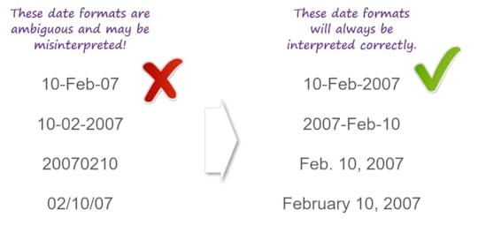
You're looking at a chart and it contains a date labeled “10-02-2007.” What day is that, exactly? Feb. 10, 2007? Or October 2, 2007?
How about “10-Feb-07”? Is that Feb. 10, 2007, or Feb. 7, 2010?
To ensure that your chart readers know what the dates in your chart actually are, choose a date format in which:
✔️ The month is alphabetic (e.g., “Aug” instead of “08”)
✔️ The year is four digits (e.g., "2011" instead of "11")
As long as the date format that you choose checks both of those boxes, your readers will always interpret the dates in your charts correctly.
BTW…
At the moment, I have a small number of openings in March and April for private workshops. If you're interested in having me deliver my Practical Charts or Practical Dashboards course live online or in-person to 15 to 60 employees of your organization, contact us for private workshop scheduling and fee details.
December 13, 2023
New book announcement! "More Practical Charts" will be published on Jan. 16!
You read that right: MORE Practical Charts! 😉
My first book, Practical Charts, covers about 30 common chart types that are familiar to most audiences, such as bar charts, line charts, and maps. More Practical Charts covers 20 additional, more "advanced" chart types that tend to be unfamiliar to audiences without scientific or technical backgrounds:
Box plots
Merged histograms
Overlapping histograms
Distribution line charts
Distribution heatmaps
Merged bar charts
Scatter plots
Colored-dot scatter plots
Bubble charts
Scatter plot matrices
Pareto charts
Heatmaps
Shape size charts
Overlapping cycles charts
Cyclical heatmaps
Cycle plots
Strip plots
Jittered strip plots
Merged strip plots
Histograms
If you have a technical or scientific background, you might assume that most people know how to read most of these chart types but, after working with thousands of chart creators in hundreds of organizations, I've realized that that's not the case (unfortunately). There's a reason why you rarely see these chart types in the mainstream media: editors know that many readers/viewers won't understand how to read them.
If, however, you do create charts for relatively data-savvy audiences, by all means, pick up a copy of More Practical Charts 🙂. The book will be published on January 16th, but you can pre-order your copy now to get it shipped to you on the publication date. It's relatively short (about 100 pages) and is priced at less than half the list price of Practical Charts.
Why split these 20 chart types out into a separate book? Well, a large fraction of my readers can't use these chart types because their audience would struggle too much to grasp them, or simply wouldn't be able to grasp them. I didn't want to force those chart creators to buy and read content from me that they'll never use in practice, so I packaged that content in a separate, optional companion book.
BTW...
Interested in taking my Practical Charts course and/or my Practical Dashboards course? Registration for my January live, online workshop is now open (but it's already 50% sold out and early-bird prices end January 8th, so don't wait too long if you plan on registering). I hope to see you (online) there!