Nicholas P. Desbarats's Blog, page 5
December 6, 2023
Have I resolved the pie chart debate? (New article in Nightingale)

For decades, chart creators have disagreed on whether pie charts should be used, but I think there are a few important arguments that have been missing from the debate and that might—just might—help to bring it to some kind of conclusion.
Find out what those arguments are in my latest article for Nightingale, the Journal of the Data Visualization Society.


November 22, 2023
How to quickly teach an audience to read an unfamiliar chart type
When creating charts for “everyday” reports and presentations, it's generally best to stick to chart types that you know are familiar to the audience. Sometimes, though, you can’t use a familiar chart type, either because there aren’t any familiar charts that can accurately represent the type of data to be shown, or because there aren’t any that can communicate the specific insights that you need to communicate about the data.
In these situations, you might have to use a chart type that you know is unfamiliar to the audience. For example, you might have to use a scatterplot or step chart, even though you suspect (or know) that the audience is unfamiliar with that chart type. What to do?
There are three techniques that I use to quickly teach audiences how to read an unfamiliar chart type:
Gentle reveal
Bait-and-switch
Duh insights
What, exactly, are these techniques? Let’s see some examples, starting with…
The “gentle reveal” trick
Let’s say that you work for a charity that raises donations over the phone from a call center with 32 call center agents. The management team wants to know if agents who’ve had more hours of training also raise more in donations. You determine that a scatterplot would be an effective way to show that relationship, but you’re pretty sure that some members of the management team don’t know how to read a scatterplot. Instead of showing the unfamiliar chart type (i.e., the scatterplot) all at once, consider revealing parts of the chart in steps:
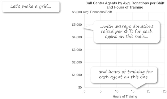
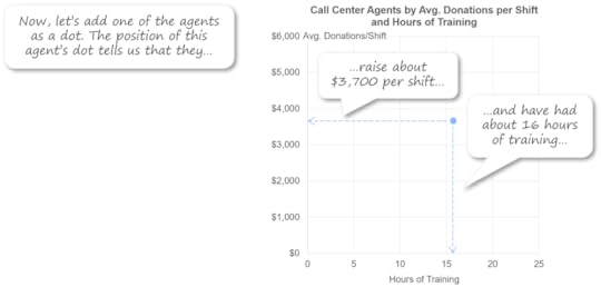
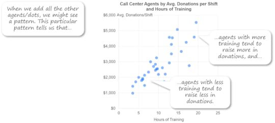
Revealing the chart one part at a time allows the audience to build up an understanding of the chart in steps, which is a lot easier than trying to absorb the whole thing at once.
The “bait and switch” trick
Let’s say that you need to show the price history for a particular model of TV. If you read my recent article on step charts, you know that irregular, persistent time series values like those must be shown as a step chart, not as a standard line chart. What if you suspect (or know) that your audience isn’t familiar with step charts, though? Instead of just showing them this unfamiliar chart type right off the bat, consider starting by showing the data in a familiar chart type (e.g., a standard line chart), and then explaining why the familiar chart type isn’t working well in this situation:
This opens up a “mental space” in the mind of the audience to learn about a new chart type because the one that’s familiar to them isn’t working. Once the audience understands the problems with the familiar chart type in this situation, then show them the unfamiliar one:
This technique also helps the audience understand why it was necessary for you to show them an unfamiliar chart type, so they’re less likely to be annoyed with you, which is a real risk when showing chart types that are unfamiliar to the audience (“Why are you making things unnecessarily complicated?”).
The “duh insights” technique
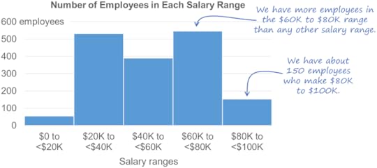
Let’s say that you need to show how the salaries of employees in your organization are distributed and you determine that a histogram is needed. You’re pretty sure, however, that a histogram is going to fly over the heads of some members of your audience. In that case, you could consider adding a few “duh insights” to your histogram to help the audience figure out how to read it:

“Duh insights” are insights that would be very obvious to anyone who already knows how to read that chart type (hence the “duh”) but that are very helpful to those who aren’t familiar with it and must figure out how to read it on their own. That’s why this technique is particularly useful when the chart is in a document that the audience will be reading on their own, i.e., without you there to explain the unfamiliar chart type to them.
I hope that you find these tips to be as useful as I’ve found them to be. Did I miss any? Are there any other tricks that you use to help audiences to quickly learn how to read new chart types? Let me know in the comments below or on LinkedIn or Twitter.
BTW…
Interested in taking my Practical Charts course (which includes the tips in this article) and/or my Practical Dashboards course? Registration for my January live, online workshop is now open. I hope to see (online) there!
October 31, 2023
Six common pie chart formatting mistakes
tl;dr: There are six formatting mistakes that I commonly see in pie charts “in the wild.” This article discusses how to recognize and avoid those formatting mistakes in your own pie charts.
Let’s address the elephant in the room right off the bat: In this article, I’m not going to address the question of whether pie charts are a “good” or “bad” chart type because I’ll be publishing an article shortly on that very topic (gulp). If you don’t know what I’m talking about or why anyone would consider pie charts to be “bad,” forget that you ever read this opening paragraph and carry on. Nothing to see here.
Formatting pie charts isn’t terribly tricky but there are some formatting mistakes that I see regularly in pie charts “in the wild.” Of course, what I consider to be a “formatting mistake” is subjective; let me know in the comments if you disagree with any of the ones listed below.
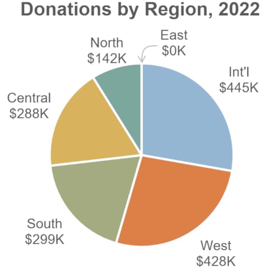
To see these formatting mistakes in action, let’s start with a poorly formatted pie chart and then fix it one step at a time. There are a number of formatting improvements that would make the nasty pie chart below easier to read and more professional looking; just for fun, try to spot as many as you can before moving on to my list of improvements.
Here’s the nasty pie chart:
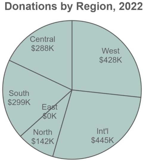
Spotted all the formatting changes that you’d make? (Yes, I know, a bunch of you are thinking, “Change it to a bar chart.” Ha-ha. Very funny. No, really. Moving right along…)
Here are the formatting improvements that I’d recommend:
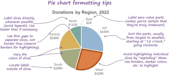
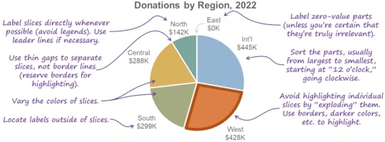
1. Make the slices different colors.
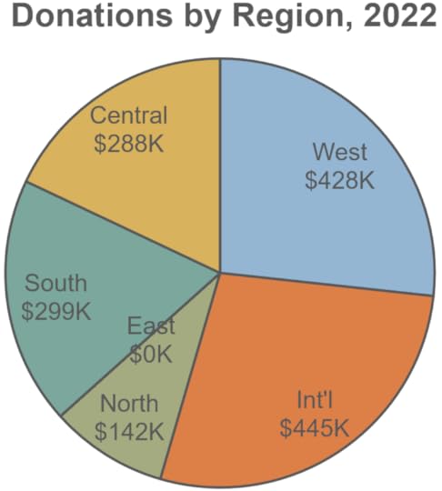
This is usually the first improvement that participants in my training workshops suggest. Technically, however, it’s not necessary because the categories are already distinct from one another, so you don’t need to further distinguish the categories by making them different colors. Having said that, I actually agree that making the slices of a pie chart different colors is an improvement.
Why? I think it has to do with a weird limitation of how human vision works. To see this limitation for yourself, try focusing on the label for the West region in the pie chart above and, without shifting your gaze, try to read the labels for the other slices. Weird, right? Because our vision is surprisingly blurry outside the exact center of our field of view (called the “fovea”), when we look at one slice, the other slices tend to “blur together” into a single, amorphous blob if they’re all the same color.
Making the slices different colors makes them visually distinct enough that they look like separate shapes in our peripheral vision while we’re focusing on one of the slices, so I think it’s warranted.
2. Remove the borders and use thin gaps to separate the slices.
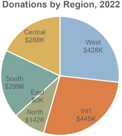
Two benefits:
Reduces visual clutter
Allows borders to be used selectively to visually highlight specific slices (we’ll see an example of that in a moment)
Depending on the software you’re using, you might need to “fake” thin gaps between slices by applying a border to the slices that’s the same color as the background behind the chart (white, in the example above).
3. Move the labels from inside the slices to outside.
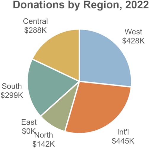
Three reasons:
Text labels are easier to read against a plain background than against a busy background of colored pie slices.
There’s more room outside of the slices to show longer pie slice (category) names, if necessary.
We aren’t very good at comparing the sizes of pie slices, and overlaying visually distracting text labels on top of the slices probably doesn’t help.
4. Sort the slices.
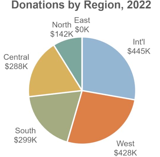
Regardless of what type of chart you’re creating, whenever you have non-sequential categories (such as the “region” categories in the pie chart above), it’s usually a good idea to sort them from largest to smallest (or, sometimes, smallest to largest), and this applies to pie charts, as well. In the pie chart above, the audience is probably most interested in the regions with the largest donations, so the regions should be sorted from largest to smallest. In a pie chart, sorting begins at the “12 o’clock” position and then moves clockwise, so the region with the highest donations starts at the 12 o’clock position, and the smaller regions appear after it in a clockwise direction.
5. Do something about “East, $0K.”
In my workshops, participants sometimes suggest removing the “East, $0” label altogether because they assume that the fact that it’s zero means that it’s unimportant. The fact that a value is zero doesn’t automatically mean that it’s unimportant, however. Maybe the East region was expected to have high donations, so the fact that it’s zero could be the single most important piece of information in this chart.
That’s why it's often necessary to visually emphasize very small or “zero-sized” slices, i.e., so that they don’t go unnoticed. “Leader lines” such as the gray arrow in the pie chart above are a good way to do that.
Before summarizing these pie chart formatting guidelines, I want to mention a technique that you’ve probably seen before for visually highlighting slices in a pie chart, called “exploding” pie slices:
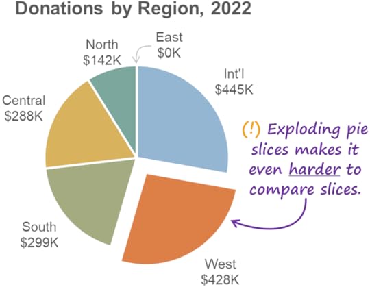
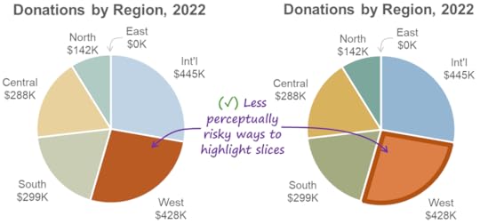
I avoid this technique because putting distance between pie slices makes it even harder for audiences to compare the sizes of the slices with the total or with one another. There are perceptually safer options for highlighting slices, such as using a color that’s darker than the rest of the palette or putting a border around slice(s) that you want to highlight:
Wouldn’t it be handy if we were to summarize everything that we saw in this article in a quick-reference “cheat sheet”? I agree:
By the way…
This article is based on a section from my Practical Charts book. Click here to learn more about the book or for purchase details.
Interested in taking the Practical Charts course? The next open-registration, live, online workshop kicks off on Jan. 30!
October 17, 2023
You should probably be using “step charts” a lot more often.
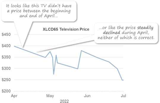
Imagine you’re a data analyst for an electronics retailer and the management team has asked you for a chart of the price history of one of the TVs that you carry. Since the data consists of values over time, you decide to show it as a standard line chart:
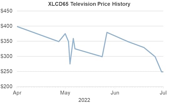
Hmmm. Some things about this chart don’t look quite right, do they? For example, it looks like the TV had a price at the beginning of April ($400) and then nothing until the end of April, when the price was $350. That’s not what happened, though. This TV did have a price between the beginning of April and the end of April: It was $400. Indeed, it had a price continuously throughout the entire period shown, but that’s not what this standard line chart suggests.
There’s another, more insidious problem with this chart: I’ve seen readers with less chart-reading experience interpret a chart like this to mean that, for example, the price of the TV steadily declined from $400 at the beginning of April to $350 at the end of April. That, for example, the price in mid-April was around $375. But it wasn’t; it was $400 that whole time.
That’s why I consider that showing data like this as a standard line chart is a data visualization mistake, i.e., a design choice that poses a high risk of misrepresenting the data.
What’s going on? What is it about this particular data that makes showing it as a standard line chart so problematic? Two things:
The values in this data occur at irregular intervals of time. For example, the price of the TV can change five times in one day and then stay the same for three weeks. Standard line charts, however, only work well when the values occur at regular intervals of time (one value per day, one value per month, etc.).
The values in this data are persistent. For each value (i.e., each new price of the TV), that value remains in effect until the next value occurs. For example, when the price of the TV changes from $400 to $350, the new price of $350 remains in effect until the next price change occurs. Because each value “persists” until the next value, I call time series values like these “persistent.” They’re quite different from “non-persistent” values like, for example, “daily sales totals,” because, if a daily sales total for one day is $104,762, that value doesn’t “persist” into the following day if there’s no value for the following day. As you can see in the chart above, standard line charts don’t work well when the values are persistent.
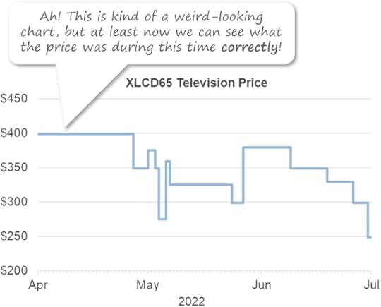
Is there a way to show this kind of irregular, persistent time series data accurately? Yes, you could use a step chart (a.k.a., a stepped line chart):
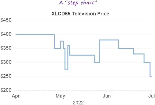
Sure, this is a less common chart type, and it might be unfamiliar to your audience, but at least it shows irregular, persistent time series values correctly, which a standard line chart does not.
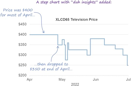
What if you need to show some time series data that consists of irregular, persistent values, but you know that the audience is unfamiliar with step charts? Well, if you’re able to “narrate” the chart for them (“During most of April, the price was $400, then, at the end of April, it dropped to $350…”), they’ll probably grasp it quickly. If you’re not able to narrate the chart, you could include what I call “duh insights,” which are insights that would be very obvious to anyone who already knows how to read that chart type (hence the “duh”), but very helpful to those who are unfamiliar with it:
Now that you know how to recognize irregular, persistent time series values, you’ll probably come across them fairly often. For example, all of these are irregular, persistent time series:
The inventory level of a product
The current highest bid on an auction item
A bank’s prime lending rate
A bank account balance
So, if you haven’t been using step charts, there’s a good chance that you’ve been misrepresenting at least some of your data to your audience. That’s why I suggest that, if you can, try to start using step charts whenever you need to show irregular, persistent time series values, and start getting your audiences used to seeing this chart type. If you’re not sure how to create a step chart in your dataviz software of choice, just Google “how to make a stepped line chart in [name of dataviz software you’re using]” and you’ll get plenty of decent tutorials and videos.
By the way…
This article is based on a section from my Practical Charts book. Visit the official book page to learn more about the book and for purchasing information.
September 28, 2023
Interested in reading the Practical Charts book before Nov. 15?
Looking forward to the release of the Practical Charts book on November 15th? Interested in getting a free chapter right now, reading an advance review copy weeks before the release date, and in helping others to discover the book? Want to pick my brain during invite-only “Ask Me Anything” Zoom calls?
Awesome! To get all of these benefits and other goodies, and to help promote the book, I’d love it if you were to sign up as a Practical Charts VIP Reader!
September 20, 2023
The tricky business of designing charts that will be printed in black and white
tl;dr: While less common nowadays, it’s still possible that you might need to create a chart that will be printed in black and white. For charts that were originally designed in color, just printing the color chart on a black and white device will often make it uninterpretable, so it must be redesigned. Redesigning a chart so that it only uses black and white can be tricky, though, and different design changes are needed depending on the chart type, number of data series shown, and a variety of other factors.
You’re putting the finishing touches on a chart for your manager when they mention to you that, oh, by the way, the chart will be printed, photocopied or *gasp* faxed on a black and white device before being shown to the target audience. So, can you, y’know, only use black and white in the chart? Not grayscale (which I’ll mention a little later), but truly just black and white, so that it would survive being faxed, or photocopied on your office’s crappy photocopier?
Uh-oh.
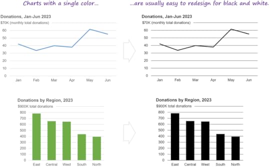
If you’re lucky, your chart only uses a single color, in which case redesigning it to only use black and white usually won’t require significant design changes (though the final result will be less visually appealing):
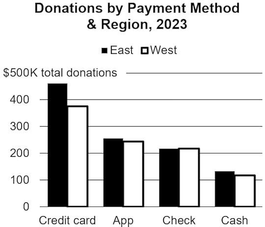
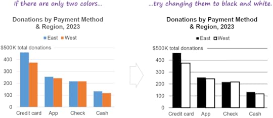
If you’re a little less lucky and your chart uses two colors, you might be able to just change those two colors to black and white:
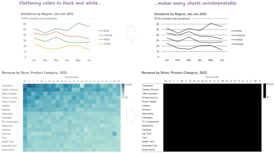
If, like many charts, your chart uses several colors, just changing them all to black or white will probably make the chart uninterpretable, so a more significant redesign would be required:
Unfortunately, there’s no single magic-bullet design change that will make all charts work in black and white. Depending on the chart type and a variety of other factors, different design changes will be needed. I’ve listed some common ones below, but all of them come with significant downsides:
Applying any of the design changes below will almost certainly make your chart some combination of visually busier, less appealing, less intuitive, and more effortful to read compared with the original color version. Sorry. There are good reasons why most charts use color…
In some cases, redesigning a chart in black and white might unavoidably increase the risk that the audience will misinterpret the chart.
Some of the design changes below require features that your particular dataviz software may or may not support. If your software won’t cooperate for a given design change, you’ll need to try some of the other design changes.
Because there’s no single magic-bullet solution, you’ll probably need to try several different solutions—or maybe even a combination of solutions—and then choose the “least bad” option. There’s definitely some creativity and trial-and-error involved here.
Consider labeling chart elements directly instead of using a legend.
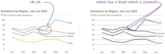
If you’re lucky, you can just label elements in your chart directly rather than using a legend (which is generally a good thing to do in color charts, as well, btw), and that will be enough for the chart to work in black and white:
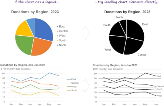
Unfortunately, though, there are plenty of situations in which direct labeling won’t work. For example…
A common-but-not-ideal solution in these situations is use different line styles to identify different lines in a black-and-white line chart:
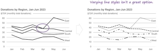
This isn’t a great solution because a) it looks very visually busy, and b) readers tend to perceive dotted and dashed lines as representing data of lower certainty (estimates, projections, targets, etc.), which isn’t the case in the chart above, in which the values are all known, historical values. Is there a better way? Yes…
Consider using different symbol markers.
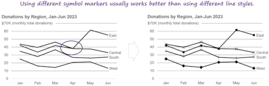
Yes, this is visually busier than the original color version, but a little less so than the “varied line styles” version, and at least the values look like “known” values rather than estimates or projections.
Another common solution when direct labeling isn’t practical is to use “pattern fills,” a.k.a. “hatch patterns”:
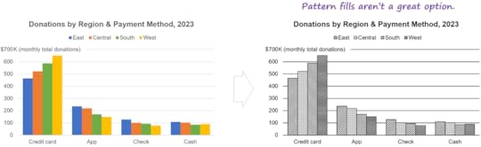
Using pattern fills can cause several potentially significant problems, though:
Many people find dense, repeating patterns uncomfortable to look at, and a 2017 study suggested that they could trigger migraines or even epileptic seizures among some readers.
Fax machines or poor-quality printers might not reproduce the fill patterns properly.
In the same way that striped clothing can make people look taller or wider, pattern fills can cause optical illusions in charts by, for example, making shapes in a chart look longer or shorter than they really are, or making straight shapes looked curved.
Pattern fills may not be discernable in small shapes, such as short bars or thin pie chart slices.
A safer approach is to…
Consider re-arranging the chart into “small multiples.”
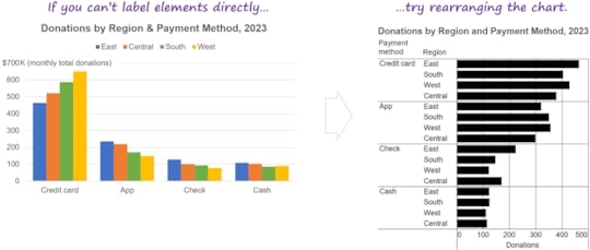
More visually busy than the color version? Yup. Harder to compare payment methods for a single region? You betcha. Like I said, most charts use color for a reason…
For “heatmap” charts that use darker and lighter shades of the same color to represent higher and lower values, you could…
Consider using “shape size” (a.k.a. “proportional symbol”) charts.
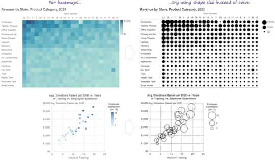
Visually busier than the heatmap versions? Uh-huh. Harder to spot patterns? Indeed. But at least the chart will be interpretable…
There are other types of design changes that you might need to consider when adapting a chart to be shown in black and white; the examples above are really just ideas to get you started. Like I said, creativity and trial-and-error are your friends in these situations.
As you can see, black-and-white versions of charts are virtually always worse than color versions in a variety of ways. This is why I’m surprised when I occasionally meet chart designers who deliberately try to avoid using color in their charts. To me, that’s like trying to avoid using adjectives in your documents. If your target audience can read adjectives, your documents will be a lot clearer and easier to read if you use them.
What about higher-quality black-and-white printers that can simulate shades of gray by “dithering” tiny black dots on the page? If you know that your chart will be printed on a printer like that, having access to different shades of gray can make things considerably easier, but there are still some potential issues to keep in mind:
Shades of gray on a printed page can vary significantly from what you see on your screen, depending on the quality of the printer, the quality of the toner/ink, quirks of the printer driver software, and other factors. Basically, don’t assume that the shades of gray that you see on your screen will be the same as those on a printed page, and do test prints if you can.
The inability to use different “hues” (red, green, blue, etc.) will often require the chart to be redesigned, since those hues can have specific meanings (e.g., red to indicate problem values).
Typically, darker and lighter shades of the same hue (i.e., gray) represent higher or lower quantities, or categories that are earlier or later in a sequence (e.g., different schooling levels). Using shades of gray to represent categories that have no inherent sequence (e.g., regions, departments, etc.) can be confusing, then, since this can make some categories look like they have “more of something than other categories” or “come after other categories,” regardless of whether that’s true.
You’ll probably be limited to four or, at most, five shades of gray, since they get hard to tell apart if there are more than that.
It’s likely, then, that you’ll still need to redesign your chart if it will be printed on a high-quality black-and-white printer that can simulate shades of gray (though perhaps not as drastically as if it will be printed on a low-quality printer or fax that can’t simulate shades of gray).
Have other suggestions for, or examples of, adapting charts for black and white? Great! Let me know in the comments below, or on LinkedIn or Twitter!
By the way...
If you’re interested in attending my Practical Charts or Practical Dashboards course, here’s a list of my upcoming open-registration workshops.
September 13, 2023
The Practical Charts BOOK will be available on Nov. 15!
At embarrassingly long last, I’m relieved to announce that the Practical Charts book is finished! The book will be released on November 15th, with pre-orders beginning in a week or two.
The goal of the book is as ambitious as the course on which it’s based: to teach chart creators of any experience level to create expert-level charts in just a few days. Given how many common data visualization challenges and mistakes need to be tackled to accomplish that, it was a tall order to keep the book down to 300 pages, but, flipping through the advance copies that I just giddily unwrapped, I think it might actually deliver. You tell me, though, when you read the book (you’re gonna read it, right?). More details about the book can be found on the official Practical Charts book page.
There will be more book-related announcements in the coming weeks, so make sure you’re subscribed to my email list to be notified when…
Pre-orders can be placed so you get the book shipped to you automatically on the release date (you might even get an extra goodie or two from me if you let me know that you pre-ordered it).
Bulk orders for team leaders and educators are available (which will be before November 15th).
Free advance reviewer copies can be requested (we’ll be sending out a limited number of free advance reviewer copies so that there are reviews on Amazon when the book is released).
Sneak peeks of content from the book are released.
Also, make sure you're subscribed to my email list if you’re interested in becoming a “VIP Reader” of the book. WTH is a “VIP Reader”? Well, VIP Readers will receive perks such as preferential consideration when requests for free advance reviewer copies of the book are being considered, and access to private “ask me anything” Zoom group calls just for VIP Readers. In exchange, I’ll be asking VIP Readers to pre-order the book (so that Amazon’s algorithms quickly learn who to show the book to), then post a review on Amazon and chat up the book on their social media channels when the book is released in November. Interested? Awesome! I expect to put out the call for VIP Readers in one to two weeks via my email list.
September 5, 2023
Connected scatterplots make me feel dumb. (article in Nightingale)
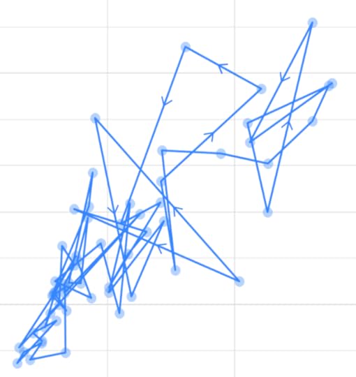
Connected scatterplots are sometimes used to show how two variables are related over time. In my latest article for Nightingale (the journal of the Data Visualization Society), I argue that connected scatterplot are virtually never the best choice, and alternatives like stacked line charts and indexed line charts can communicate the same insights as connected scatterplots, but are much easier to read and less prone to misinterpretation. Read more...
By the way...
If you’re interested in attending my Practical Charts or Practical Dashboards course, here’s a list of my upcoming open-registration workshops.
July 19, 2023
There are no bad chart types... Right?
About a year and a half ago, I wrote an article in Nightingale about why I stopped using box plots and why I now use alternatives such as strip plots and distribution heatmaps instead. That article created quite a stir, with many readers agreeing and some disagreeing (which is great!). Among those who felt that box plots could sometimes be the best choice, a common objection was that “there are no bad chart types; each chart type has situations in which it’s the most effective choice.”
When I was developing my Practical Charts course, one of my goals was to define specifically when each of about 60 common chart types should be used, i.e., to define the specific circumstances in which each chart type would be a more effective choice than any other chart type. I managed to do that for about 50 of those chart types, but there were about a dozen that I struggled with (including box plots). Try as I might, I couldn’t come up with even hypothetical, cherry-picked scenarios in which those chart types seemed to be a more effective choice than others.
Does that mean that those chart types are “bad”? No, they’re all useful because they’re able to feature patterns and relationships within data. What I am suggesting is that, for those dozen or so chart types, alternative chart types are virtually always more informative, easier to read, less likely to misrepresent the underlying data, or some combination thereof. I don’t think those chart types are “bad”; I just think that there are better alternatives in virtually all situations, so there’s no reason to use them.
Now, it’s entirely possible that there are situations that I haven’t thought of in which those chart types would be the truly most effective choice. That’s why, for many of those chart types, I’ve asked literally thousands of workshop participants and blog post readers if they can think of situations that I might have missed. I’ve written articles about two of those chart types (box plots and bullet graphs) and will publish articles about the others over the next few months to ask as many people as I can to think of scenarios that I haven’t considered, in which a chart type that I don’t currently recommend would be a more effective choice than any other chart type.
Workshop participants and blog post readers have already sent me a fair number of example situations, but they almost always only featured the chart type that I was concerned about, without comparing that chart type to alternative chart types showing the same data in the same situation, so they weren’t particularly convincing. Until someone shows me at least one plausible situation in which a given chart type is a truly more effective choice than any other, I can’t really recommend using that chart type. How could I, if I can’t provide a single scenario (even a made-up one) in which it seems to be a more effective choice than other chart types?
Why do some people balk at the idea that some chart types might never be the most effective choice, and insist that, for every chart type, there must be situations in which that chart type would be the most effective choice? Well, I suspect that it has something to do with the fact that it’s easy to forget that chart types are just human inventions, like printing presses and electric toothbrushes; they aren’t fundamental properties of the Universe, like mathematical principles. Like any other human invention, some chart types are more useful than others, and the fact that a chart type was invented doesn’t automatically mean that there must be situations in which it’s the truly best solution. Indeed, the pantheon of human inventions that are the truly best solution in exactly zero situations is well populated.
This is probably a good time to mention that there’s a big asterisk beside anything that I say about chart types, which is that I’m talking about “everyday” charts for communicating insights as quickly and clearly as possible in reports and presentations. Charts can be used for all sorts of other purposes, however, such as for data art, entertainment, humor, advertising, experimentation, and research. For those other purposes, it’s entirely possible that the chart types that I don’t recommend for “everyday” charts would be good choices.
If you want to continue using box plots, bullet graphs, or any other chart type that I currently don’t recommend, that’s OK. I’m just offering my opinion and won’t call you out if you choose to use one of those chart types. I might not understand your choice, but I’ll respect it.
You might also decide to use one of the chart types that I don’t recommend because that’s what your audience is used to seeing. That’s also fine, but I’d suggest that your audience might have been better off if, in the early days, they’d gotten used to seeing a different chart type. “The chart type that people got used to seeing” isn’t the same thing as “the most effective chart type for a given situation.”
I will mention, however, that a concern I have with some chart types like box plots, connected scatterplots, and radar graphs is that they can make chart readers feel stupid because those chart types are, IMHO, pointlessly hard to understand compared with simpler chart types that can communicate the same insights. I’m not a fan of making people feel stupid for no reason, so I might suggest an alternative chart type when I see those particular chart types being used.
What do you think? Is there such thing as a “bad chart type”? Chime in in the comments or on LinkedIn or Twitter.
By the way…
If you’re interested in attending my Practical Charts or Practical Dashboards course, here’s a list of my upcoming open-registration workshops.
June 20, 2023
Should you learn dataviz theory?
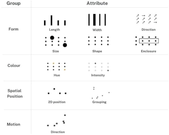
Image source:
https://www.dannidanliu.com/what-is-preattentive-attribute-why-is-it-important-for-effective-data-visualisation/
Occasionally, I come across a claim on social media that, in order to become truly competent at dataviz, you need to know about theoretical concepts such as graphical objects, encoding channels, and preattentive attributes of visual perception.
Is that true, though? Or can you still create effective charts without knowing about those theoretical concepts? Well, if it were true, graduates of my Practical Charts course still wouldn’t be competent chart creators because that course includes virtually no theory. Workshop alumni frequently tell me, however, that their charts are much more effective after taking the course, and that their charts no longer leave audiences confused, bored, or misled. Clearly, then, it’s possible to create highly effective charts without knowing dataviz theory.
Does that mean that no one needs to learn dataviz theory? Well, if you create data art, scientific charts, data journalism pieces or other types of highly customized visualizations, you’d probably laugh at that idea because theoretical concepts such as marks (or geoms), encoding channels, and spatial transformations are so central to your work.
So, should you learn dataviz theory or not? Well, as dataviz guru Andy Cotgreave is fond of saying, it depends. For this question specifically, I think it depends on what kind of work you’ll be doing:
I do think you need to learn dataviz theory if you’ll be…
Creating highly unusual, novel, or customized visualizations, such as data art, scientific charts, domain-specific charts, or data journalism pieces, or…
Doing dataviz research, or…
Developing dataviz software, or…
Creating visualizations by writing code that leverages low-level charting libraries such as ggplot or D3.
I don’t think that you need to learn dataviz theory if…
You won’t be creating any of the types of visualizations listed above, and…
You’ll only be creating “everyday” charts for reports and presentations (which can virtually always be accomplished using a few dozen common chart types), and…
You’ll only be using GUI (Graphical User Interface) applications such as Microsoft Excel, Google Sheets, or Tableau Desktop to create charts.
The vast majority of people who create charts fall into that second group, that is, they’ll only ever need to create everyday charts using a GUI application (or, probably very soon, natural language prompts). Therefore, some chart creators need to learn dataviz theory, but most don’t, IMO.
Does this mean that, if you’re just creating everyday charts, you don’t need to learn anything? No, creating effective, accurate, everyday charts requires quite a bit of practical know-how, including knowing how to choose chart types, quantitative scale ranges, and color palettes, as well as how to tackle common challenges such as handling outliers or showing very large numbers of values. You also need to know how to avoid many common dataviz mistakes, such as failing to annotate bars of zero length in a bar chart, or using a sequential color palette to identify non-sequential categories.
If you only create everyday charts, why not learn practical guidelines and dataviz theory? Learning theory in addition to practice can’t hurt, right? Well, no, it wouldn’t hurt, but…
It would substantially increase the time required to learn how to create effective everyday charts. For example, despite containing virtually no theory, my Practical Charts course is still two full days or four half-days in length, and adding fundamental theoretical concepts would make it considerably longer.
Some theoretical concepts can be hard to grasp and may involve advanced mathematics, so it can require quite a bit of effort to learn them, depending on your background. If you’ll never need those theoretical concepts in practice, then, learning them could suck up a lot of effort for little benefit.
What about only learning theory and skipping learning the practical guidelines? Would you be able to create effective everyday charts if you only know theory? No, I suspect that your everyday charts wouldn’t be as effective as those created by someone who’s been trained with a good set of practical guidelines. If you’ve only learned theory, it might, for example, not occur to you to include helpful callouts, comparison values, inset charts, or other features that make key takeaways obvious, or you might create charts that are too complex or unfamiliar for the level of data savviness of the audience.
Theoretical concepts are also harder to translate into real-world chart design choices compared with practical guidelines that are more “concrete” and specific. Theoretical concepts tend to leave many possible design choices open, but practical guidelines quickly narrow down those design choices, and often point to a single design choice.
Now, I can already hear some experienced chart creators objecting that guidelines that are that specific constrain creativity, but that’s only true if one considers practical guidelines to be unbreakable rules, which I do not consider them to be. Good guidelines reliably point to good design choices, but an experienced chart creator may occasionally think of better—or even brilliant—design choices in specific situations. Therefore, an experienced chart creator can—and should—deviate from guidelines, as long as the chart creator is aware of those guidelines and has good reasons for deviating from them. I think of practical guidelines as “training wheels” that help learners become competent quickly, and that help them avoid common chart design mistakes; they’re not unbreakable rules that define what’s “correct” or “incorrect.”
Many people—including me—think of dataviz as a language. In that analogy, I consider dataviz theory to be the “linguistics” (morphology, phonetics, etc.) of the language of dataviz. If you want to study language, invent new words, or use language in very unique or creative ways, you should learn linguistics. If, however, you just need to write clear emails and reports, you might want to spend your time learning more practical writing skills instead.
Agree? Disagree? Awesome! Let me know in the comments or on LinkedIn or Twitter.