Nicholas P. Desbarats's Blog, page 2
March 3, 2025
New video: When should you use a table vs. a graph?
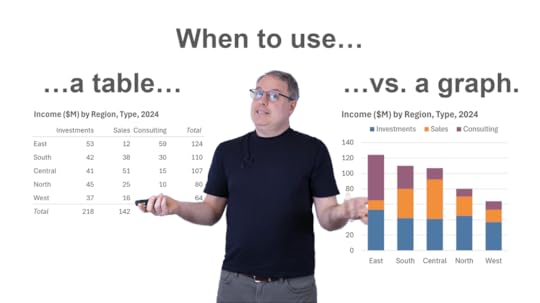
It's probably a lot less often that you think. In fact, there are just three specific—and quite rare—situations in which I'd show data as a table only (as opposed to a graph or a graph plus a table).
What are those three situations? Find out in my latest video (10 mins):
BTW, European friends:
I'll be in your neck of the woods in May and am looking to add one or two more workshops to my trip. Interested in an in-person dataviz and/or dashboard design workshop for your team, or in hosting an open-registration workshop in your city? Contact me for deets.


February 24, 2025
Should pie chart labels go inside or outside? + European workshops in May!
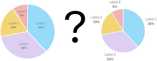
I recently had a great exchange with dataviz luminary Salma Sultana about where best to locate slice labels in a pie chart. The consensus that we came to was that it depends on the lengths of the category names and whether or not there are any very small slices.
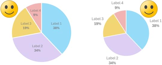
If the category names are short and there are no very small slices, placing the labels inside slices or outside works well:
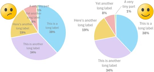
If, however, the category names are long and/or there are very small slices, placing the labels outside of the slices tends to work better:
BTW, European friends:
I'll be in the Benelux and Nordics regions in May and am looking to add one or two more workshops to my trip. Interested in an in-person dataviz and/or dashboard design workshop for your team, or in hosting an open-registration workshop in your city? Contact me for deets.
February 4, 2025
New video: XmR chart redesign with Stacey Barr

When looking at a line chart for an important metric, people often panic when the line goes down and celebrate when it goes up, even though those fluctuations can—and often should—be ignored because they're just random "noise" that doesn't need to be acted on.
There are, of course, also times when a metric genuinely does require attention because it's behaving in way that indicates that something meaningful has occurred and that action may be warranted.
Is there a way to tell the difference between random fluctuations that can be ignored and meaningful patterns that require action? When I first came across XmR charts a number of years ago via Stephen Few, it was a real revelation because they do exactly that. No more pointless panicking or celebrating!
Steve first discovered XmR charts (as far as I know, anyway) via Stacey Barr, a world-renowned expert on performance measurement and improvement, which is one reason why I was thrilled when Stacey asked if I'd be up for trying to improve the design of the XmR charts that she's been using for many years in her globally recognized courses and books.
While the chart design that she's been using worked well, I was able to suggest about a dozen small improvements to make it more visually obvious and self-explanatory.
Stacey and I recorded a video in which she briefly explains XmR charts, and I then review the various improvements that I proposed, along with my reasons for suggesting those changes. You can watch the video below and check out Stacey's blog post about the new chart design.
As a bonus, Power BI guru Greg Deckler created this super-helpful video that explains how to create the new XmR chart design in Power BI.
January 28, 2025
New video: Why "% change vs previous period" numbers on dashboards are useless
“% change vs. previous period” numbers are ubiquitous on dashboards and they look useful, but they don't actually tell users anything!
Don't believe me? Check out my latest video (8 min.), which I recorded during a recent workshop for the lovely folks at Funnel, makers of great marketing dashboard software.
BTW…
Want the same training that Funnel received? There are still a few spots left in my Feb. 4-7 Practical Charts Practical Dashboards live online workshop. Info/registration: https://www.practicalreporting.com/feb-2025-workshop
January 8, 2025
New video: Don't make charts like this!
We often need to show deviation values over time, e.g., deviation of our monthly expenses from the budget for each month but, unfortunately, these values are often shown as line charts, which can be very confusing or misleading for audiences.
To see a better solution, check out my latest video (5 mins.):
BTW…
Early-bird prices for my live online public workshop end on Jan. 15! If you're interested in taking my Practical Charts and/or Practical Dashboards course, check out the workshop info/registration page.
January 2, 2025
I kind of hate beautiful hotel shower faucets
Trigger warning: This post isn’t (directly) dataviz-related.
Not to flex or anything, but I’m somewhat of a connoisseur of hotel shower faucets. I travel frequently to deliver workshops, so I’ve seen many different models. A lot of them look almost like modern art sculptures. Clean lines. Pleasing symmetry. Modern aesthetics.

But how do I, y’know, have a %#*$ing shower? Which knob controls the flow rate? Which knob (or knobs) control the temperature? Do I tilt the knobs up and down, or rotate them? Or push/pull them? If I rotate a knob, say, 45 degrees, will that make the water a little hotter, or a lot hotter? How do I redirect water to the shower head, hand-held hose, or tub spout?
First-world problems, I know, but if I’m coming off a transatlantic redeye, my desire to conduct trial-and-error experiments to answer these questions is precisely 0.000. Why do so many faucets force me to do just that, then?
Well, I think these are classic examples of prioritizing aesthetics over usefulness. When these faucets were designed, the number one priority was to design a “beautiful object,” rather than a useful one. Something that would impress the head of the design team or look great in a plumbing supply showroom, but that no one actually tried to use before installing 1,000 of them in a hotel. You can see evidence of these priorities in some faucet models in particular, which have “H’s” and “C’s” on them, but in lettering that’s so small or etched so faintly that most people won’t even notice it. Why not add more noticeable, helpful icons? Because that would ruin the aesthetics.
If, however, a hotel chain were to install faucets like the one in the 3D rendering below (created by my talented daughter, Jennifer, in Blender), I might just become monogamous with that hotel chain:
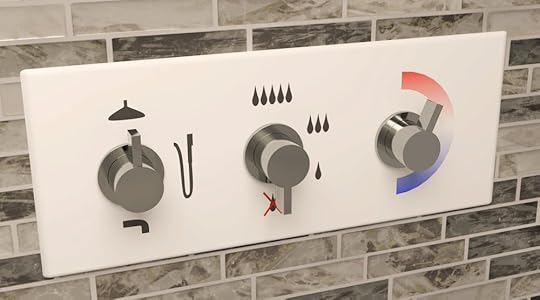
Is this a beautiful object? No. Is it at all distinctive or creative? Definitely not. Can I have a shower without reverse-engineering the plumbing first? SOLD.
I love beautiful objects, but they don’t belong everywhere. If they get in the way of performing mundane tasks like having a shower, then they’re in the wrong place, IMHO. In the context of a hotel shower, the value of a beautiful object is lower than the value of being able to figure out how to have a shower in 1 second, instead of 30 or 40.
Now, even though this fictional faucet is simple-looking, I did have to put some thought into it to make it immediately grokkable:
The shape of the knobs makes it clear that you rotate them (you don’t tilt them or push/pull them), and the rectangular paddle in each knob doubles as a pointer that makes it clear what each knob is “doing” at the moment.
The available range of motion of each knob is clear (all knobs rotate within a 180° range to the right).
Having one knob per function makes it easier to do what you want (change the water outlet, change the flow rate, etc.), rather than having just one or two knobs that combine multiple functions.
The sequence of the knobs reflects how people start having a shower: select the desired outlet, then turn on the water, then adjust the temperature.
The icons are recognizable by people from different parts of the world (kind of important in a hotel) and are large and high-contrast enough to be easily seen by people who aren’t wearing their glasses (because, y’know, people generally don’t wear their glasses in the shower).
Because of these design choices, a faucet like this would almost certainly reduce the incidence of water shooting out of unexpected places at unexpected temperatures (a surefire way to tank guest satisfaction) and, more importantly, would probably be easier to use for those with mild visual, motor, or cognitive impairments.
Yes, the modern-art faucets might look simpler at first glance because they don’t have lots of icons on them, but the thing is, those icons contain information users need in order to use the faucet. If that information isn’t there, users are forced to deduce that information for themselves, which actually makes it more complicated. Prominent, explicit icons might not look as “clean,” but they remove annoying guesswork.
While I warned you that this article didn’t have anything to do with dataviz, there actually might be a few analogies with chart-making, here:
Beautiful charts have their place, but it’s probably not in “mundane” contexts like business reports and presentations, where more useful but less beautiful charts may be more appreciated by users.
Sometimes, adding information to a chart makes it simpler, especially when users would have to deduce that information on their own if it wasn’t in the chart.
Making a chart look simple and obvious actually requires quite a bit of thought and a surprisingly high degree of skill.
Speaking of skills, registration is now open for my February live online workshop! Interested in taking my Practical Charts and/or Practical Dashboards course? Early-bird prices end Jan. 15. Course info and registration page: https://www.practicalreporting.com/feb-2025-workshop
December 17, 2024
“Basic” chart types that many audiences don’t know how to read
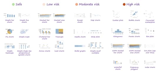
In last week’s post, I described how, while teaching data visualization to thousands of professionals, I was surprised to discover that many audiences don’t know how to read chart types that many chart creators assume are widely understood, such as scatter plots and histograms.
In this post, I’ll list the specific chart types that, in my experience, stump audiences most often (including, sometimes, senior executives).
I want to be clear that I’m not saying that these chart types should be easier or harder for audiences to understand. I’m saying that these chart types are the ones that I see audiences getting stumped by most often out there in the real world, regardless of whether you, I, or anyone else thinks that should or shouldn’t be the case.
In my experience, common chart types and techniques tend to fall into the following four groups, listed from the lowest risk of stumping an audience to the highest:
🟢 Safe for most audiences: Simple bar charts, line charts, pie charts, maps, heatmaps and shape size (proportional symbol) charts
🟡 Low risk: Stacked bar charts (yup, I’ve seen people misread the top of the stack as the value for the top-most segment instead of the whole stack), stacked area charts, clustered bar charts, treemaps, arrow charts, inset charts
🟠 Moderate risk: Bumps charts, step charts, needle charts, strip plots, bullet graphs, simple small multiples
🔴 High risk: Scatter plots and bubble charts, connected scatterplots, histograms, Pareto charts, box plots, 100% stacked bar charts, 100% stacked area charts, dot plots (especially when showing time series data), waterfall charts, frequency polygons, index charts
I know that the risk of using each of these chart types varies from one organization to the next, and that there are plenty of data-savvy organizations in which all of these chart types are “safe.” My point is that there are also plenty of organizations in which people don’t know how to read the “riskier” chart types.
Also, I’m not saying the higher-risk chart types should be avoided (except possibly for box plots and connected scatterplots). I’m saying that it isn’t safe to assume that most audiences know how to read them, or that they can be grasped in a few seconds. If you need to use one of the riskier chart types—and, sometimes, you have no choice—don’t be surprised if you get confused looks and must spend several minutes (or more) teaching the audience how to read them, assuming they’re willing to give you the time and attention to do so.
BTW…
Registration is now open for my upcoming live online public workshop in February! Interested in taking my Practical Charts and/or Practical Dashboards course? Early-bird discount ends Jan. 15. Info/registration page: https://www.practicalreporting.com/feb-2025-workshop
December 12, 2024
No, everyone DOESN’T know how to read a scatterplot

When I’m chatting with other chart creators, it sometimes feels like there are two different groups that live in two completely different worlds:
The first world is populated by those who create charts for relatively data-savvy audiences. In this world, chart types like scatterplots and histograms are “basic” chart types that everyone knows how to read.
The second world is populated by those who regularly create charts for “non-data” audiences who often struggle with anything other than simple bar, line, or pie charts.
When I’m chatting with chart creators in the first world and I suggest that the second world is actually huge, and that many audiences don’t know how to read chart types like scatterplots and histograms, they’re often astonished, and sometimes they simply don’t believe me.
The thing is, over the years, I’ve stood in front of literally thousands of blank faces when showing these chart types—even faces with “data” in their job titles. There’s a reason why you don’t see these chart types in mainstream news media outlets very often, even in high-brow pubs like The Economist and The New York Times: Editors know that many of their readers won’t know how to read them.
When I suggest that many people don’t know how to read these chart types, though, I get plenty of objections, such as…
“These chart types are taught in high school! Everyone who’s graduated high school should know how to read them!” If these audiences did learn to read these chart types in high school, they’ve either forgotten or they didn’t really grasp them in the first place.
“OK, maybe Jane-Q-Public/man-on-the-street might not know how to read them, but anyone who’s reached any kind of managerial position would know.” It would be great if that were true, but there are plenty of senior executives in a wide variety of industries who don’t know how to read these chart types. I know this can be hard for some to believe, but I’ve seen it many, many times.
“Even if someone doesn’t know how to read these chart types, they’re very easy to explain and understand.” As someone who’s explained these chart types to thousands of people, I can confidently say that no, they’re not easy to understand. If you’ve been using scatterplots and histograms for years, they may seem almost self-explanatory, but they’re actually quite abstract and require several leaps in understanding to read correctly. And, yes, even for people who are quite sharp in other domains.
Exactly which chart types do I see general audiences struggle with? Stay tuned for my next post, in which I’ll provide the full list.
BTW…
Registration is now open for my upcoming live online public workshop in February! Interested in taking my Practical Charts and/or Practical Dashboards course? Early-bird discounts end Jan. 15. Info/registration page: https://www.practicalreporting.com/feb-2025-workshop
December 4, 2024
Chart makeover Video: Choosing meaningful Colors
Prefer to watch than read? Watch a video version of this post:
You might have seen this brilliant piece of viral marketing from cybersecurity firm Hive Systems, that seems to pop up every year in my social media feeds:

While it's a great piece of content marketing, the color choices leave a few things to be desired, IMHO:
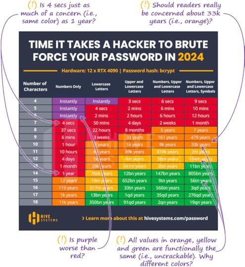
When choosing colors, you want to put some thought into what the colors should mean to the reader. In this scenario, there are probably three levels of password vulnerability that readers should care about:
Vulnerable to batch attack: A password that could be cracked if it were in a batch of many leaked passwords, i.e., that could be cracked in a few hours or less.
Vulnerable to targeted attack: A password that could be cracked by a determined hacker who was targeting the reader individually, and who could wait up to a few months.
Secure: A password that would take more than a few months to crack, i.e., longer than even a determined hacker would be willing to wait (and the reader would probably change their password within that time anyway to protect something that would warrant such an elaborate attack).
With this in mind, let's assign colors based on these categories to make these values more meaningful to readers:
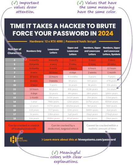
It would be interesting to test this redesign to see if it generates more or less engagement from readers, but what I can say with some confidence is that it's more meaningful than the original.
November 26, 2024
Should you avoid using “advanced” chart types? (+ Black Friday Sale!)

I’ve seen the following scenario play out many times in the organizations with which I work:
A chart creator decides to “get creative” by using a histogram, connected scatterplot, ribbon chart or some other chart type that they know to be unfamiliar to the audience. They could have used a simpler, more familiar chart type to say the same things about the data, but they wanted to “challenge the audience,” or “teach them new chart-reading skills.”
The chart then goes over like a lead balloon. The audience misreads the chart, skips reading it altogether, or gets annoyed with the chart creator, who then feels bitter, believing their audience to be intellectually lazy or just dumb.
The thing is, I think the audience would have every right to be annoyed. Most people aren’t interested in data visualization (shocking, I know) or in learning new chart types. They’re interested in treating patients, minimizing defects, raising donations, or maximizing investment returns, and charts are just tools that help them do those things more effectively. They want useful information that can be consumed with as little cognitive effort as possible and, IMHO, that’s OK. If bar charts and line charts get them the information that they need to do their jobs, teaching them to read more “advanced” chart types isn’t a good use of their time, and they know it.
Yes, people should know how to read scatterplots, histograms, and other “advanced” chart types. They should also know basic coding, how the economy works, and world capitals. The reality is that we all have limited time and cognitive energy to learn new things and forcing people to learn new chart types that they don’t actually need because you thought they should learn them isn’t very considerate. If the audience wants to learn about more advanced chart types, great! Teach them! But don’t force them to learn them just because you think that it’s important.
Now, sometimes, the data and/or insights to be communicated are fundamentally complex and the simplest possible way to tell the audience what they need to know might require chart types that are unfamiliar to them (which is why I cover over 50 chart types in my Practical Charts course). That should be the last resort, though, when there really are no simpler options that can communicate the same insights.
If you want to play around with more advanced chart types for your own interest or to share with other dataviz enthusiasts, or if you’re creating data art, go for it! I love that stuff, too. I just also think that there’s a time and place for that kind of thing, and it’s generally not with busy people who are just trying to do their jobs.
Black Friday Sale!
BTW, my books and my Practical Charts On Demand course are on sale for 25% off until Dec. 2 (Cyber Monday)!