Free webinar recording: "How to choose a chart type (it's trickier than you think)"
I was recently invited to deliver a webinar as part of JMP's great Statistically Speaking series. The webinar consisted of a 35-minute talk entitled "How to choose a chart type (it's trickier than you think)," followed by about 25 minutes of Q&A from a very engaged (and large) audience. A few key points from my talk and the Q&A:
Simple rules of thumb such as, "To show data over time, use a line chart" or "To show the breakdown of a total, use a pie chart" are problematically over-simplistic, and frequently lead to poor chart type choices.
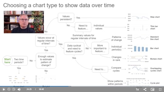
The simple chart-type-selection diagrams and taxonomies that regularly pop up online are also too simplistic and also often lead to poor chart type choices, however, more robust chart-type-selection diagrams can work very well.
What I think of a few "controversial" chart types such as pie charts, funnel charts and radar graphs (in the Q&A at the end).
Watch the webinar recording now (on JMP's site).
BTW...
Nordics and Central Europe friends! I'll be delivering an in-person workshop in your part of the world in Tallinn, Estonia on Sep10-13. If you're interested in taking my Practical Charts and/or Practical Dashboards course, register for the workshop here (registration page is hosted by my Estonian partner, Dmitrij Zatuchin). Note that seats are limited and early-bird registration prices end on Aug. 15.