Victoria Olsen's Blog, page 2
November 27, 2017
Transformation, digital and personal
 Our first publication!
I’ve spent the past few months since leaving my full-time teaching job diving into the world of self-publishing and small presses. The result is an exciting new venture: Sense & Respond Press, which publishes short business titles on digital transformation and innovation. My partners, Josh Seiden and Jeff Gothelf, and I started from scratch and needed to set up an LLC, design covers and logos, create accounts with all the print and ebook distributors…, so I’ve learned a lot. Our first book is now out (woo!), our next is available for pre-order, and we have several others queued up over the next few months.
At the same time I’ve been writing case studies on higher education for Google’s blog. (Here’s one recent example I worked on about the innovative use of virtual reality for teaching at Brown.) That’s been eye-opening too as I research projects and interview academics to understand how they use technology to teach and collaborate in new ways. Even higher education, one of the slowest-moving institutions around, is transforming itself. It’s been fascinating to have a window into the process.
It’s been an immersive experience and a big shift from teaching writing to first-year college students. I attended the Business of Software in Boston in September and Lean Startup Week in San Francisco earlier this month — and wrote about both on Medium here. Stay tuned!

The post Transformation, digital and personal appeared first on Victoria Olsen.


July 14, 2017
Biennial Impressions
Here are a few excerpts from this morning’s viewing of the Giardini at the Venice Bienniale:
I admired the simple and surprising, like the pavilion of books (though there was some irony there in the inflated wall texts). Above is a beautiful troupe l’oeil painting by Liu Ye. Look, no words!
Another really simple and really moving piece called “Niagara” by Mark Bradford in the U.S. Pavilion: it’s three minutes long and my sister and I watched it over and over marveling at the painterly flatness of the setting, while the young man, larger than life then smaller and smaller as he walks away, just walking, compels attention. Here the catalogue text quotes Zadie Smith: “he does more than is necessary with less than he needs.” Exactly.

Finally, I was glad to see that the national pavilions had a sort of consistency and modesty that I hadn’t expected. The Biennial looks like a World’s Fair but it doesn’t exactly seem to be about competition. I’m clearly not in the art world, but as a visitor all the pavilions seemed the same size, of the same importance etc. My favorite, though, has to be Canada’s, which was so understated (I know, cliche) that I couldn’t even find the label that identified or described it. There was just this really interesting, dynamic space that actually had some relationship with its location: the water and light and wood in an unexpected composition.
More disappointing:
France’s pavilion, where various musicians enact their routines by setting up, rehearsing, performing at random. Just not that interesting to watch, though when the music finally starts it’s a nice break from the visual.
The over-sized, over-decorated stuffed sculptures by Phyllida Barlow in Great Britain’s pavilion. Admittedly not my thing.
Olafur Eliasson‘s over-complicated social project “Green Light,” which was not engaging despite its good intentions and despite my usual appreciation for his work.
Overall, though, lots to think about and admire, with more work stretching all across the city.
The post Biennial Impressions appeared first on Victoria Olsen.
July 12, 2017
On (Not) Reading a Romanesque Altarpiece
 Day Three. I’m sitting in an anteroom of the Cathedral San Martin in Lucca. Called a sacristy, it’s a side note off the huge main cathedral space with its stained glass and frescoed ceiling, its tessellated floors and soaring archways. The exterior of the cathedral is known for its striped pattern and the stripes show up here too in the corner columns holding up the ceiling. It’s a language I don’t know how to read.
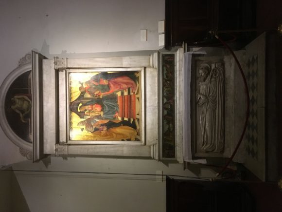
Here in this room are the duomo’s greatest hits: a funeral monument by Jacopo Della Quercia and an altarpiece by Fra Filippino Lippi and Domenico Ghirlandaio. But I can’t figure them out. The altarpiece itself is a vertical mishmash of seemingly unrelated ideas: a semicircle on top of a square bound by a horizontal ribbon of separate pictures and anchored by a marble slab. The horizontal band, called a predella, seems to be a series of non sequiturs lined up next to each other like a proto-storyboard. The altarpiece as a whole is held together by its rigid geometry: the columns on either side of the main tableau serve as bookends. But what’s going on inside? What are you trying to say? I’d ask of my students. Indeed, I’m reminded of an essay I used to teach– E.M. Forster’s “Not Looking at Pictures” in which he does exactly this: he struggles to understand how to “read” a painting of St. George and the dragon, finally enlisting help from an art historian.
Here’s what I could see for myself. The central image by Ghirlandaio is astonishingly beautiful: the gilt haloes shine brightly, delicately etched, as four saints gather around a madonna and child. The baby Jesus stands with a finger poised as if instructing his elders from his mother’s lap. The image is a symbolic window into the church itself, reflecting its architecture and patterned floor. Like the cathedral, the deep perspective draws the viewer/worshipper into the interior, up the carpeted steps, behind the central figures, and past the theatricality of those parted golden curtains. If the painting is a church, the vertical lines of saints flank the madonna to form each nave, and the madonna’s halo, appropriately, is the altar. The composition, then, has a logic that the content doesn’t…for me, which is no surprise since no one imagined me as its audience.
Luckily I have an art historian at hand too–in my sister, who wrote a dissertation on Romanesque art. When I relayed my confusion she shrugged. The connections between the parts of an altarpiece were subtle and complicated, she explained, but there would have been something there even if we may not be able to discern it any more. Sometimes the relationship was of part to whole: the narrative of the predella might refer to a character in the painting, just as the altarpiece echoes the church itself. Sometimes there were implied relationships about donors or saints’ days or doctrine…. There could be lots of connections between the parts, she said, but the composition was never random. The cathedrals were living documents to be read and embodied by parishioners. Even the facades were designed to reinforce the messages within.
There weren’t many parishioners in the cathedral today. I saw one woman praying but everyone else seemed like a tourist, wandering vaguely through the space, peering at inscriptions and snapping photos. But the sacred imposed upon us and no one spoke or interacted. With everyone left in their quiet solitude, I could sit on a pew and type this out on my phone, glancing up to look some more. If it seemed like I was just texting, no one cared. Random mournful sounds emerged from the organ, as if it were being tuned.
I look again, still reaching for some understanding of the room as a whole. There are blank spaces on the wall where something was moved and other wall paintings arranged higgeldy piggeldy around the main attractions. The other focus of attention is the tomb of a young noblewoman, Ilaria Del Carretto, preserved in Carrara marble by Jacobo Della Quercia. (I admired the snow-like white-tipped hilltops of Carrara on the drive to Lucca but couldn’t get a good photo from my phone). What is she doing here, this anachronistic teenager, her dog devotedly stretched out at her feet for all eternity? Her flesh is oddly creamy; her features barely register in profile. Her head rests on two hard pillows. Life-size, she watches impassively, eyes closed, while the infant Jesus is circumsized in a huge tableau over her head. Quercia spent two years on this work, immortalizing this girl in 1407. She was moved here to this room in 1995 after restoration. Her survival into the 21st century seems utterly random.
 Illaria’s tomb, in a different location. Via Wikimedia Commons.
Incoherence. These stories are elusive and their forms unfamiliar. There is no “original” art here and no authentic experience that hasn’t been altered ad infinitum. This location was consecrated in the 800s, the church begun in the 1100s, then continually and continuously restored, with interruptions like the plague of 1348. Those frescoed ceilings made their Pre-Raphaelite appearance in the 1800s. My experience today, though, clearly meant something to me because I’ve spent hours writing and thinking and conversing about it. It began as a jumble of loosely-related ideas, but it was the strongest impression of my first three days in Italy. I’m traveling with my sisters and their teenage children, reminiscing about our trips to Europe together as adolescents and how foreign it all felt. It was like being pushed into a deep lake, a shove into the unfamiliar. That has not been our own childrens’ experience today though, we noticed. Blame globalization or iPhones or their generation, but they know this place before they get here. To be fair, this medieval walled city seemed familiar to me too. The boutiques, the cobblestones, the trattorias…. I’ve seen them elsewhere. Inside the cathedral was my first return to that welcome sense of utter confusion and novelty, which is what we travel for in the first place.
The post On (Not) Reading a Romanesque Altarpiece appeared first on Victoria Olsen.
June 22, 2017
Wonder Women and Fearless Girls
It’s turning me into a shrew. All around me there are women going crazy for Wonder Woman and I don’t get it. I’m out of it, again, when I wish I could celebrate too.
 courtesy of allthingsclipart.com
I had my suspicions before I even saw the film on Sunday for Father’s Day. The word of mouth was so excited (“I heard it was so good!”), even though it seemed like just another action flick. And then it started breaking box office records and everyone was over the moon: “see! a woman director and a female superhero can make money too!” When the high-brow reviews were also enthusiastic I started wondering if the film were that rare cultural phenomenon that arrives in a moment when it can’t be touched…. The zeitgeist just gives some things a pass. This must be one of them.
Because it’s not that great. It looks okay. The acting is good, though Chris Pine is a baffling romantic lead. He’s got some comic timing and good looks, but he’s not charismatic. The story and screenplay are downright bad: predictable and heavy-handed, filled with stereotypical bad guys and side kicks. Admittedly, Gal Gadot is as good as she can be. She’s wonderful at fresh, wide-eyed puzzlement. I kept wondering where I’d seen that particular facial expression until I realized it was on Geena Davis’s Thelma. She too sold a certain naivete that was based on inexperience, not stupidity. But a little more worldliness might come in handy in a superhero.
Which is what makes me so cranky. Diana Prince/Wonder Woman is strong in battle, fierce in her defense of the helpless, and unyielding in her pursuit of peace even though she’s still burdened with all the traditional expectations of femininity: niceness, beauty, innocence, and a kind of blandness that is incapable of offending anyone. Even her mild forms of disobedience — sneaking off to train before her mother lets her or escaping with Chris Pine’s Captain Steve Trevor to end the war to end all wars — feel like a predetermined part of her “heroine’s journey,” not an assertion of any kind of will of her own. The heroine’s story, however, must include love so even Wonder Woman gets an understated hetero romance, which becomes the frame for her character’s growth.
Two particular scenes demonstrate the film’s ambivalent message about women. In one, we see the status of women in Edwardian England through Diana’s clear eyes as a foreign (almost alien) visitor. It’s not just the corsets that are and are not “armor” but her very presence in a governing chamber that is shown to be absurdly shocking and disruptive. That’s great visual storytelling — as is its opposite scene, when Wonder Woman bolts out of the trenches and crosses the barren No Man’s Land (ha!) to lead the Allies to an unexpected victory. Here again she’s fresh and energizing: where there was a stalemate, a settling into (literal) ruts, she brings change and vigor, swatting away bullets with a flick of her wrists and catapulting into the air.
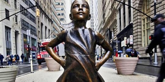 The Fearless Girl on Wall Street
Shouldn’t this be good enough? Maybe. A similarly ambiguous story played out recently on Wall Street in the Fearless Girl statue that now faces down the Charging Bull on lower Broadway. Sculpted in bronze by Kristen Visbal, the statue was installed on International Women’s Day in February by State Street Global Advisors as a publicity campaign to promote women in finance. Since then it has been an enormous success: tourists flock to take selfies with the spunky girl and one article estimated it had generated over $7 million dollars in social media and advertising for the firm. While many viewers read her as a diminutive symbol of female empowerment, others have balked at this young girl as the face of feminism. Yes, she stands her ground against a wild animal but she’s a child. While Charging Bull‘s artist Arturo DiModica protests that his bull was never meant to represent masculinity, a State Street Global representative insists coyly that the Fearless Girl “wasn’t intended to be confrontational.” This is exactly the kind of hedging one’s bets that happens in Wonder Woman too. Apparently we love girls and princesses who assert themselves, as long as they only do so in art. As one Salon writer argued about Fearless Girl, the real problem is “treating girl power as a suitable stand in for actual feminism.”
Why am I surprised? You can’t get more mainstream than Hollywood and Wall Street. But the popular response to both works has been so over the top that it’s an unsettling reminder of how low expectations have fallen. Is it too much to relate this to the crushing disappointment of Hillary Clinton’s loss at the polls? Why wouldn’t we rather celebrate these ambivalent fictional heroines than wrestle with the misogyny that real women face in our real world all the time? Wonder Woman begins and ends with a working woman in her office, but the setting has been idealized: no coworkers, no bosses, no partners to negotiate power with. Last week someone temporarily turned The Fearless Girl statue into a Wonder Woman — and all she needed was a tiara.
The post Wonder Women and Fearless Girls appeared first on Victoria Olsen.

March 2, 2016
The Loneliest Number
 My review of Olivia Laing’s new book The Lonely City is just out.
I was offended and dismayed by The New York Times review last week, which not only brings up Laing’s appearance but then refers us to the author’s photo to conclude that she is “utterly unhideous.” If you read the book she’s painfully self conscious about being judged by the beauty standards imposed upon women, so just — wow.

The post The Loneliest Number appeared first on Victoria Olsen.
December 4, 2015
Victoria Amongst the Victorians

Angel of the Nativity by Julia Margaret Cameron, 1872; albumen silver print.
Just back from London, where I saw the new Julia Margaret Cameron retrospective at the Victoria and Albert Museum— it’s a big show for the 200th anniversary of Cameron’s birth and it focusses on her relationship with what became the V&A (then the South Kensington Museum) and its founder Henry Cole. The V&A was one of the first museums to collect photographs and Cameron’s work was amongst their first acquisitions. Using letters from their collection as well as the photos themselves, curator Marta Weiss makes a great case that Cameron’s so-called “sloppy” technique was due at least in part to her habit of sending her artist-mentor-friends imperfect prints so she could save the better ones to sell. Unfortunately for her, those seconds given to her famous friends (like painter G.F. Watts and astronomer J.F.W.H. Herschel, whose album of Cameron photos is now on display at the Science Museum) ended up in museum collections all over the world — which gave an unrepresentative view of her work. That is not to say that Cameron never exhibited or sold photographs that her contemporaries considered flawed: the soft-focus edges and smeary lines of the “Angel of the Nativity” photo shown here demonstrate how her style emphasized artful composition and emotional effect over technical precision. But this exhibit provides some much-needed context for all the controversy about Cameron’s technique, which inevitably was gendered around her status as an early woman photographer. The catalogue to the show also breaks down the usual linear chronology of her work to organize it around the five surviving letters Cameron wrote to Cole. All in all, the exhibit provides a striking new look at an old “mistress,” to quote a now-old term by art historian Griselda Pollock….
[I’m grateful to the V&A staff who invited me to give a Works in Progress talk there. I uploaded a PDF version of my slides here: Jane and Julia]
The post Victoria Amongst the Victorians appeared first on Victoria Olsen.
October 9, 2015
Playing the Orchestra
I saw the new Danny Boyle film at a screening this week. I’m not sure which was more impressive — the film or the Q&A afterwards…. Boyle was there with the film’s editor Elliot Graham and the composer Daniel Pemberto n and they talked about their collaborative process in interweaving the three parts of the film. What I loved most about the film was its construction. I’ve admired the beauty and intelligence of Boyle’s films in the past– across a range of genres– but this one impressed most with its structure.
Organized in three parts around three product launches, the film has three different aesthetics that Boyle described in the Q&A. The first section takes place in 1984 at the Macintosh launch and it’s filmed in 16mm that gives it a home-video feel. The second takes place in a San Francisco opera theater in 1988 for the product launch of NEXT and it’s shot in 35 mm with a sharp, documentary focus and a roving handheld camera. The last section takes place at the 1998 product launch for the iMac and it’s shot on digital video, which Doyle pointed out later was a sort of gesture toward Jobs’ technological innovations in the Pixar-produced Toy Story in 1995. Boyle explicitly described this three-act composition in the Q&A as a theatrical metaphor and it works very well to focus what could otherwise be a sprawling narrative or a dull chronological biopic. Boyle then knits the pieces together through a small cast of characters with a few ongoing conflicts– like the ones between Jobs and Wozniak or between Steve and his daughter. This structure gives the film both a sort of universal human story as well as a specific reality in one man’s life.
Jobs, of course, was notoriously difficult and Boyle and the actor Michael Fassbender don’t shirk from his negative side, though the film will certainly be critiqued as a romanticized view because of its warm and fuzzy ending. Specifically, the film emphasizes Jobs’ inability to give credit to colleagues, or even to acknowledge other people (including his daughter). This becomes a sort of megalomania: he’s the god-like creator who sits above it all but doesn’t do any of the actual work. In Aaron Sorkin’s script Jobs describes himself as a conductor, who “plays the orchestra” instead of being a virtuoso musician. Yet throughout the film I imagined asking Boyle during the Q&A how he felt about the obvious parallel between directing a film and running a visionary company like Apple, between him and Jobs. I didn’t have to ask, though, because during the conversation he brought it up himself, admitting that he had none of the actual skills of his editors or composers or actors, but only the ability to recognize and synthesize those skills. It was a remarkable acknowledgment, that revealed both how close Boyle was to Jobs and how very far away. Sitting there at his own “product launch” with three colleagues talking about collaboration was yet another ending to a remarkable film.
The post Playing the Orchestra appeared first on Victoria Olsen.
August 19, 2015
NEW Cameron Interview!
I recently had the pleasure of talking with Kirsty Stonell Walker, biographer of Pre-Raphaelite model Fanny Cornforth, on her blog The Kissed Mouth. Our conversation about Julia Margaret Cameron and my middle-grade novel Word Blind is posted here. Thanks, Kirsty!

This is a good time to announce that Word Blind is now out on several new ebook platforms. If you’ve read it please consider posting reviews on any of these pages!
COMING SOON: Open Letters Monthly article on the Romance Writers of American convention and the ebook of my biography From Life: Julia Margaret Cameron and Victorian Photography.
The post NEW Cameron Interview! appeared first on Victoria Olsen.
July 27, 2015
#RWA
I’m working on an article for Open Letters Monthly on the Romance Writers of America annual conference, which just ended in NYC. Here are some quick notes while I think about it…. [I know, I know I should have been tweeting and posting the whole time! But how do people get to all that?! she whines]
Best snippet of a session I heard: Liz Pelletier’s Spotlight on Entangled, where she wowed me with ten minutes of anecdotes about her editing process, including how she trains their interns in editing. As it ended the woman next to me said with similar awe: “who was that?”
Strangest snapshots: Goody Room Before and Afters. The last day the room looked like a tornado had hit it– with boxes of Harlequins of every stripe and sub-stripe on the floor; piles of bookmarks, buttons, and random swag; and a handwritten note from a peeved author: “To the person who took my promo out of its basket, left the promo, and took the basket. I hope karma bites you in the butt.”
Most appreciated gesture from a total stranger: At the Avon Meet and Greet author Candis Terry saw me standing alone, nervously, and went out of her way to introduce me to her editors. I was painfully grateful and now I’ll go read her books!
Worst moment of the conference: on my way there on Saturday morning I was late and rushing and when a stroller on the sidewalk blocked my path I must have shown something BAD on my face because the woman pushing it said “seriously? you’ve got to lose the attitude!” And I brooded on it ALL DAY. Because I hated that I gave her grief and I hated that she gave me back even more than I gave her.
Best quote from a session: romance novelist Eloisa James saying “E.L. James did not make my life any easier.”
New vocabulary words I learned: perma-free, street team, lookalike audiences
Most common advice to writers: “ask for what you want!”
The post #RWA appeared first on Victoria Olsen.
July 18, 2014
Epiphany

Cape Kennedy, Florida (1969)
I’ve always had a fondness for Garry Winogrand’s work, especially this iconic photograph.
I remember seeing it when I was a child and understanding it. The woman faced the wrong way! And the photographer caught her photographing the wrong thing! Figuring that out was a delicious surprise. Photographs could say things they didn’t seem to say. This photograph wasn’t about the rocket launch at all.
At the huge Garry Winogrand retrospective now at the Metropolitan Museum in New York I expected to feel fondness for all of his photos, to experience that flash of understanding over and over again. But I didn’t. Seen all together in such a large group it’s harder to make sense of it. There are the early photos for magazines, the city scenes from the 1950s, then suburban tableaux from the 1960s and 1970s. Then his untimely death in 1984 at age 56. In between he received Guggenheim fellowships, and exhibited at the Museum of Modern Art. He had plenty of success and recognition, though this is the first show that includes the full range of his work and even some chosen from the many rolls of undeveloped film he left behind.
The exhibit shows off his eye, his ability to see and capture the interesting angle, but the photos also blurred together after awhile. There were too many; they were too alike. When Winogrand is quirky, as in the photo above, I think Diane Arbus does it better: she implicates us in the subject’s difference more than Winogrand does. When he is more sociological, as in the photograph below, I think Robert Frank does it better: he stays with his subjects longer whereas Winogrand seems to drift past them. I was disappointed. Did the show take on too much? Or do I just miss that first epiphany?

New York World’s Fair (1964)