
Todd Klein's Blog, page 279
April 29, 2013
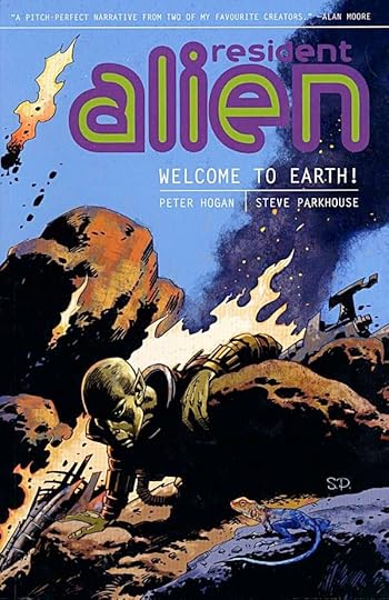
And Then I Read: RESIDENT ALIEN Vol. 1
Images © Peter Hogan and Steve Parkhouse.
I sampled this series in DARK HORSE PRESENTS, and liked it enough to get the first collection. Both Hogan and Parkhouse are long-time British comics creators whose work I enjoy. Parkhouse, in particular, I haven’t seen new work from in some years, so this series was a pleasant reintroduction.
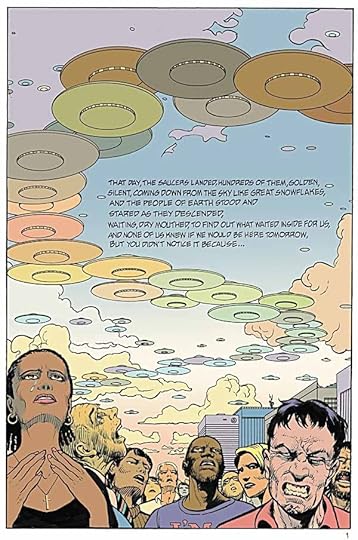
We’ve seen stories of aliens who have crash-landed on Earth before—E.T. comes to mind—but there have been others. What sets this story apart is what happens next. The alien in this case does not expect to be rescued by his own people for years, if ever, so he must make a place for himself among the population of the western United States, where he’s fallen. He finds a small town in a remote area and creates a life for himself as a retired doctor who wants to be left alone to fish and relax. While we, the readers, can clearly see he’s not human, no one else apparently can, through some mental power he wields.
All is fine for a while until a violent murder takes place in town, of the only doctor in the area. Soon Dr. Vanderspiegle, as the alien calls himself, is enlisted by local authorities to fill in for the missing doctor (despite his protests), and eventually to try to solve the murder case. As the story unfolds, things continue to get more complicated for the resident alien, and we meet the townfolk, an interesting bunch. Another murder happens, and worse yet, someone enters the new doctor’s life who can see what he really looks like.
The story by Peter Hogan is excellent, the art by Steve Parkhouse equally so. My one problem with the book is the lettering. Steve once hand-lettered his work (and that of others), and I always liked his distinctive style. For this volume he’s using a computer font made from that hand-lettering, but unfortunately not made well. The letterforms are fine, but the letters are too close together in many places, making the words hard to read. Less important is the wide space between the lines of lettering. Doesn’t affect readability, but it wastes space on the page. Don’t get me wrong, the book is readable, but these and other lettering issues kept pulling me out of the story. Maybe that’s just me.
In any case, the collection is highly recommended.


April 28, 2013
New Fonts for FAIREST
Images © DC Comics, Inc. and Todd Klein.
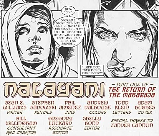
One of the books I letter regularly is FAIREST, a spinoff from FABLES. It concentrates on the many strong female characters, the “princesses” if you will, of the FABLES universe. So far there have been story arcs about Sleeping Beauty and Rapunzel, the latter taking place in Japan. When I received the script for issue 15, the beginning of a new story arc written by Sean E. Williams, I learned that it would take place in the FABLES version of India, which Sean calls Indu, and I found this note near the beginning:
Todd: All the “Indu” dialogue and captions should appear in a Devanagari-esque font to indicate they’re speaking a non-English language (which is most of the six issues).
This is not the first time I’ve been asked to letter in the style of a particular language. In fact, I’ve created fonts that, while still readable English, suggest the appearance of Arabic, German Blackletter, Chinese (capitals in inked brushwork), Russian (Cyrillic), Greek, Norse Runes, and Tibetan. But though I’ve designed over 120 fonts since 1994, none of them were close enough to Devanagari (the alphabet used for Hindi and other languages) to work. I needed to design some new fonts!
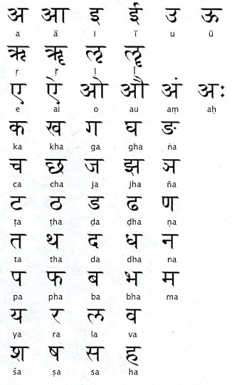
First I did some research online, looking for examples of hand-lettered Devangari alphabets. The one above appealed to me, and I decided to use it as a style guide. The most important identifying characteristic of this alphabet to my eye was the strong horizontal bar at the top of most letters. When run together in words and sentences, this gives an impression of a horizontal line that all the characters hang from. Beyond that, there were lots of vertical bars and handsome curves. Very few of these glyphs could be used directly in English, though. To give me more ideas, I made another copy flopped left to right:
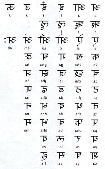
Looking at them this way, I saw more shapes I could use to simulate Devangari in English. With these two images printed out, I sat at my drawing board, drew in some horizontal guidelines, and began drawing an alphabet or two.
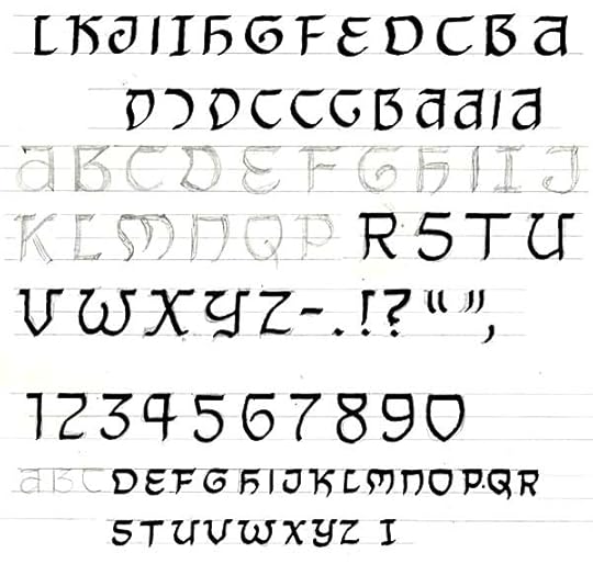
Here’s what I drew, and with much of it inked. I felt the direction worked well, I was getting as much of that top horizontal line as possible, but I wasn’t happy with my inking. Normally there are plenty of small imperfections in hand-lettered glyphs like these that help give the final font a looser, more hand-made look, but in this case I wanted all those horizontal strokes to be dead even and consistent. So, I scanned this stuff, placed it in an Adobe Illustrator document, grayed it down, opened a new layer, and drew the letters over the drawing using the pen tool.
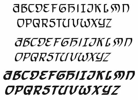
Here’s the result. The Italic font is simply the regular one slanted. The Bold Italic version is the slanted one with a black outline, and some adjustments made. When I drew the letters I used a wedge-tipped “brush” that gave the strokes the same kind of thick and thin line weights as my hand-drawn pen points, which were also wedge-tipped. While I could have drawn numbers and punctuation, I decided to save time by using existing ones from another of my fonts.
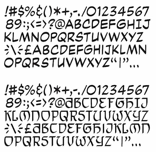
At the top is a partial character set from my font ToddKlone-Wedge. (I’ve left out all the international characters and punctuation.) Below is the new font TKIndu-Regular with the new characters dropped in, and the numbers and punctuation from the existing font retained. As with all my traditional comic book fonts, there are no lower case letters, those spaces are filled with slightly different upper case glyphs, for variety. If you compare this to the drawn font above you’ll see some changes were made, the most obvious in the letters D and M. I had begun lettering with the previous version and my editor, Shelly Bond, felt the fonts were a bit hard to read, so we agreed on those changes. I also made smaller adjustments and changes on many of the other glyphs to help with readability.
Creating the glyphs is the fun part of font creation, and the quick part. The rest is the dull drudgery of spacing and kerning: adjusting the space between each pair of glyphs so that it all looks right when you use the font. I saved a lot of time by working with an existing font, but even so, each of the three new fonts: TKIndu Regular, Italic and Bold Italic took about eight hours to kern. I could have taken more shortcuts by only kerning the most likely problem pairs like TA and LY, but I just can’t work that way. I’d rather put the time in at the kerning stage, and know that I won’t have to make repeated adjustments at the lettering stage.
The top image in this post is from the finished page 1, using my new fonts except for the identifying tags in the credits like “writer” and “letters.” (That’s another of my fonts, TKOrnate.) Here’s a closer look at the fonts as they will appear in the printed comic, FAIREST #15, due out next Wednesday. Of course, the art will look a lot better, and be in color! Hope it works as intended, suggesting the Hindi language while still being relatively easy to read. Let me know what you think!
April 27, 2013
And Then I Read: SNOWED UP by Rosalie K. Fry
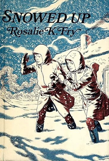
© Rosalie K. Fry, cover illustration by Robin Jacques.
This is a Weekly Reader Book Club book I never saw as a child, though I do have a few others by the author. It’s the story of three British children on a Christmas holiday with relatives in Wales who become trapped in a blizzard and take shelter in an abandoned farmhouse. They were supposed to be on the bus home, but missed it, so no one knows they’re missing. It’s a good adventure story, if fairly tame, more “Swiss Family Robinson” than “Robinson Crusoe,” as they keep finding things, or have brought things that help them get by, from food to matches to shovels to fuel for the fire. The many full-page illustrations by Robin Jacques are marvelous, full of great drawing and Virgil Finlay-like pen work, as on the cover above. Actually, I buy any book I see with his illustrations. This was a fun read.
Recommended.
April 26, 2013
Pulled At Random From My Files #7
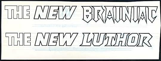
Images © DC Comics, Inc.
In 1983 DC decided to revamp two of Superman’s oldest foes, with ACTION COMICS writer Marv Wolfman giving them new back stories and I think artist/designer Ed Hannigan giving them new visuals. They first appeared on the cover of this issue:
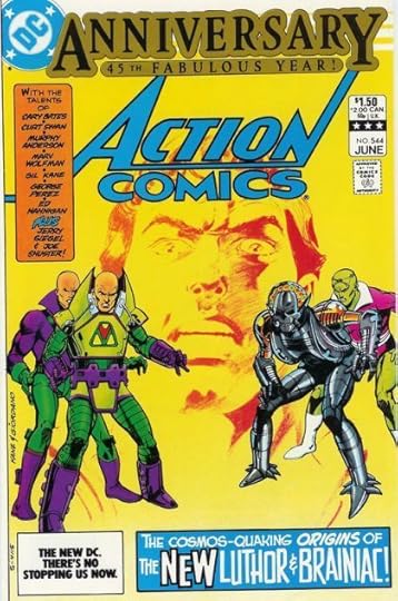
As you can see, the new version of Luthor put him in a Kirby-like space suit, while the new Brainiac made him a rather scary robot. I was asked to letter new logos for them, but I don’t think they were intended to be cover logos, at least I don’t see them on any covers of the period that I’ve looked at. Probably they were used on interior splash pages, and possibly also for licensing of the new looks. They did appear on these versions of the characters in WHO’S WHO IN THE DC UNIVERSE in 1986-87, but when John Byrne revamped the entire Superman mythos a few years later, these versions were retired, and as far as I know have not been back (though I could certainly be wrong about that). The lettering I did was on regular DC art board the way I would have handled cover lettering rather than a cover logo, and I suspect that’s how I was paid as well. Consequently, I didn’t spend as much time finessing the designs as I might have, but I still think the Brainiac one is pretty good.
April 25, 2013
And Then I Read: WONDER WOMAN 18
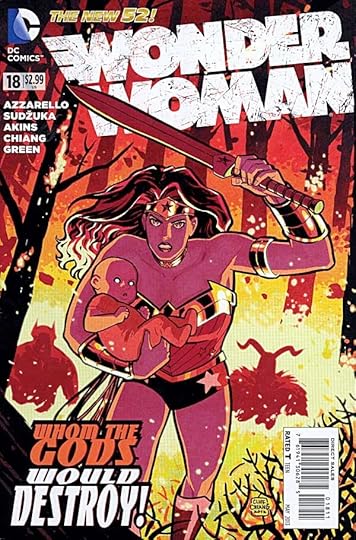
Image © DC Comics, Inc.
This comic has been a strange one, and it’s getting stranger. We have a tug-of-war of sorts over a baby, a son of Zeus and a mortal woman, but it’s not as if it’s the first, there are several half-god children of Zeus in the story. For some reason this one has everyone grabbing for it, and Diana trailing along always one step behind. Then we have Orion from The New Gods helping Diana, but apparently also after the baby. He has lines like, “You’re kinda cute when you get mad.” Neither Orion nor Diana are anything like other versions of them I’ve seen, including the current Diana in JUSTICE LEAGUE. The Greek gods are also nothing like any previous versions. This seemed like an interesting direction for a while, but they’ve become just another group of argumentative, double-dealing entities with powers they hardly use. There’s no resonance here with the original Greek mythology. Nor is there anything noble or uplifting, except perhaps Diana’s naive attempts to fight the right battles. Her efforts turn out to be wasted at the end of this issue, as I read it.
The art is by several hands, the best being those of Cliff Chiang on the last three pages. The rest is okay but nothing particularly special as I see it. I’m beginning to think about dropping this title, as it no longer entertains me very much.
A Reminder and Request for Support…
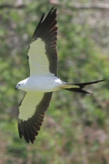
Swallow-tailed Kite, seen yesterday in Cape May, photo © Mike Crewe. One of those rare beauties of the avian world we’ll be searching for on the World Series of Birding in a few weeks in our quest to raise money for conservation, education and research. More info in the link, please considering backing my effort on May 11th with a small pledge. You can receive one or more of my signed prints, and my sincere gratitude.
April 24, 2013
And Then I Read: GREEN LANTERN NEW GUARDIANS 18
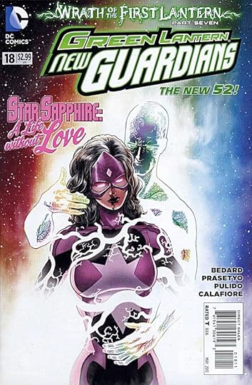
Image © DC Comics, Inc.
This time it’s Carol Ferris, Star Sapphire getting the alternate life explorations from the First Lantern. As in the other titles, it’s an interesting look at Carol, showing her as a fighter pilot herself, for instance. Other members of the New Guardians get similar treatment, with only Larfleeze able to defy him and deny him. Not a bad issue, but very much in the template of every other GL book this month, no forward movement in the plot as I see it. The art is by different artists in different sections; Hendry Prasetyo, Jim Calafiore and Javier Pulido. The all work fine, and go together reasonably well, though none are in the very realistic style this book once had, they all lean toward an animated look.
Mildly recommended.
April 23, 2013
And Then I Read: THE COMPLETE PEANUTS 1987-1988
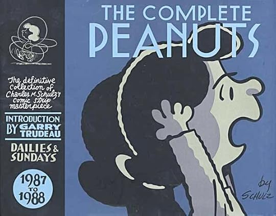
Images © Peanuts Worldwide LLC.
If you’ve been reading this blog for any length of time, you know I love these PEANUTS reprints. Nothing about that has changed. Yes, the lines are getting a little shaky, you can even see it on the cover, but the humor and wisdom, the sly sarcasm, the surprising turnabouts, the social commentary, the pure laugh-out-loud moments? All still here.
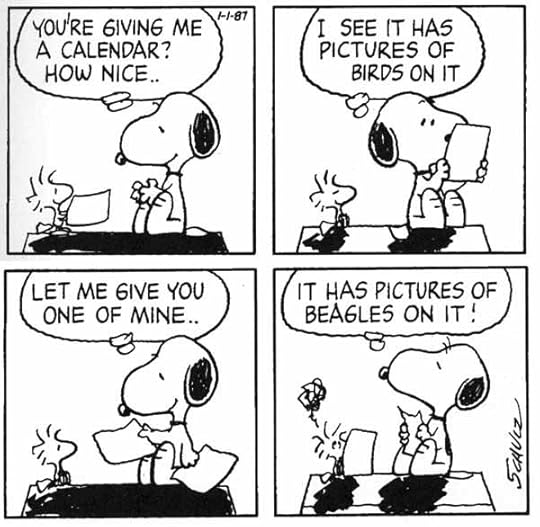
The very first strip in the collection had me laughing already. I know of no better way to spend some time than reading these volumes. It will do wonders for your body, mind and soul.
Highly recommended.
April 22, 2013
And Then I Read: GREEN LANTERN CORPS 18
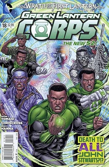
Image © DC Comics, Inc.
The “Wrath of the First Lantern” is taking a familiar path in this issue, as he explores the life of John Stewart, feeding on the emotions of what might have been if key decisions had been made differently. While the idea is getting played out, it does allow for writer Peter Tomasi to look deeper into Stewart’s life than we’ve seen before, and that’s not a bad thing. First Lantern is rather a one-dimensional villain, but the Lanterns he’s torturing get to shine. The art is by Chriscross with Scott Hanna this time, and works well, his John Stewart is convincing.
Recommended.
April 21, 2013
More New Lettering from Gaspar Saladino
Images © Dark Horse Comics and Neil Gaiman.
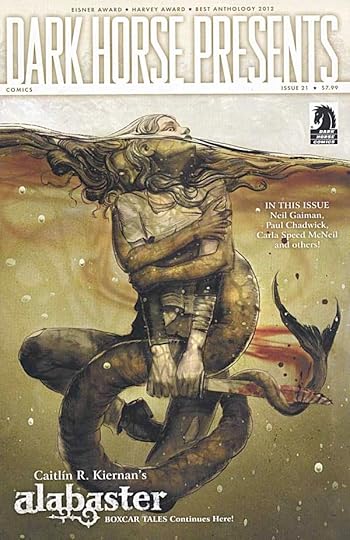
Readers of DARK HORSE PRESENTS #21 will not only have a fine selection of stories to peruse, they’ll be able to view a historic moment in comics lettering history.
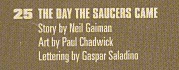
On pages 25 to 31 is a story with NEW lettering by The Master, Gaspar Saladino. The story itself is not completely new. Another version with different art was released by Neil as a limited edition print a few years ago. This version was produced in 2012, I believe, with great art by Paul Chadwick, and lettered by Gaspar, probably on vellum overlays. Last year I wrote about Gaspar’s first new lettering for comics in quite a while in THIS article, but that was for a proposal that is still unpublished, as far as I know. The story in DHP, then represents Gaspar’s first PUBLISHED lettering in a number of years.
Here’s the first page in full, looking quite good. The story has only captions, and Gaspar was asked to “float” them, in other words, not to put them in boxes, and using his standard style.
A closer look at the lettering. Gaspar is my favorite letterer of all time, and looking at this, my reaction is, “He’s still got it.”
Last year I wrote a series of blog posts revealing my research into Gaspar’s very first lettering for DC Comics. In the third part I identified that first work as appearing in ROMANCE TRAIL #5, cover-dated March-April, 1950. Because of the way comics are dated ahead of when they actually go on sale, that work had to be completed in 1949, and was probably on newsstands in January of 1950. Therefore, the new lettering by Gaspar represents an astounding career span of at least 63 years of published work! And who knows, perhaps there will be more! I hope so. Long live The Master!
Todd Klein's Blog

- Todd Klein's profile
- 28 followers

