New Fonts for FAIREST
Images © DC Comics, Inc. and Todd Klein.
One of the books I letter regularly is FAIREST, a spinoff from FABLES. It concentrates on the many strong female characters, the “princesses” if you will, of the FABLES universe. So far there have been story arcs about Sleeping Beauty and Rapunzel, the latter taking place in Japan. When I received the script for issue 15, the beginning of a new story arc written by Sean E. Williams, I learned that it would take place in the FABLES version of India, which Sean calls Indu, and I found this note near the beginning:
Todd: All the “Indu” dialogue and captions should appear in a Devanagari-esque font to indicate they’re speaking a non-English language (which is most of the six issues).
This is not the first time I’ve been asked to letter in the style of a particular language. In fact, I’ve created fonts that, while still readable English, suggest the appearance of Arabic, German Blackletter, Chinese (capitals in inked brushwork), Russian (Cyrillic), Greek, Norse Runes, and Tibetan. But though I’ve designed over 120 fonts since 1994, none of them were close enough to Devanagari (the alphabet used for Hindi and other languages) to work. I needed to design some new fonts!
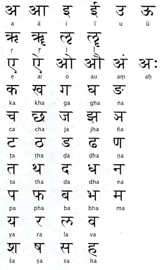
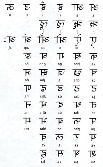
First I did some research online, looking for examples of hand-lettered Devangari alphabets. The one above appealed to me, and I decided to use it as a style guide. The most important identifying characteristic of this alphabet to my eye was the strong horizontal bar at the top of most letters. When run together in words and sentences, this gives an impression of a horizontal line that all the characters hang from. Beyond that, there were lots of vertical bars and handsome curves. Very few of these glyphs could be used directly in English, though. To give me more ideas, I made another copy flopped left to right:
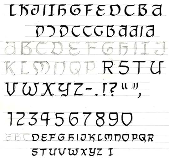
Looking at them this way, I saw more shapes I could use to simulate Devangari in English. With these two images printed out, I sat at my drawing board, drew in some horizontal guidelines, and began drawing an alphabet or two.
Here’s what I drew, and with much of it inked. I felt the direction worked well, I was getting as much of that top horizontal line as possible, but I wasn’t happy with my inking. Normally there are plenty of small imperfections in hand-lettered glyphs like these that help give the final font a looser, more hand-made look, but in this case I wanted all those horizontal strokes to be dead even and consistent. So, I scanned this stuff, placed it in an Adobe Illustrator document, grayed it down, opened a new layer, and drew the letters over the drawing using the pen tool.
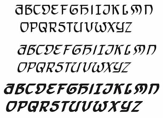
Here’s the result. The Italic font is simply the regular one slanted. The Bold Italic version is the slanted one with a black outline, and some adjustments made. When I drew the letters I used a wedge-tipped “brush” that gave the strokes the same kind of thick and thin line weights as my hand-drawn pen points, which were also wedge-tipped. While I could have drawn numbers and punctuation, I decided to save time by using existing ones from another of my fonts.
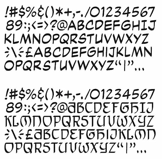
At the top is a partial character set from my font ToddKlone-Wedge. (I’ve left out all the international characters and punctuation.) Below is the new font TKIndu-Regular with the new characters dropped in, and the numbers and punctuation from the existing font retained. As with all my traditional comic book fonts, there are no lower case letters, those spaces are filled with slightly different upper case glyphs, for variety. If you compare this to the drawn font above you’ll see some changes were made, the most obvious in the letters D and M. I had begun lettering with the previous version and my editor, Shelly Bond, felt the fonts were a bit hard to read, so we agreed on those changes. I also made smaller adjustments and changes on many of the other glyphs to help with readability.
Creating the glyphs is the fun part of font creation, and the quick part. The rest is the dull drudgery of spacing and kerning: adjusting the space between each pair of glyphs so that it all looks right when you use the font. I saved a lot of time by working with an existing font, but even so, each of the three new fonts: TKIndu Regular, Italic and Bold Italic took about eight hours to kern. I could have taken more shortcuts by only kerning the most likely problem pairs like TA and LY, but I just can’t work that way. I’d rather put the time in at the kerning stage, and know that I won’t have to make repeated adjustments at the lettering stage.
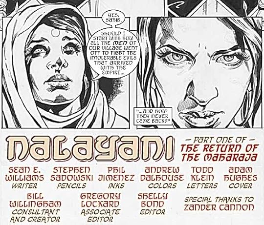
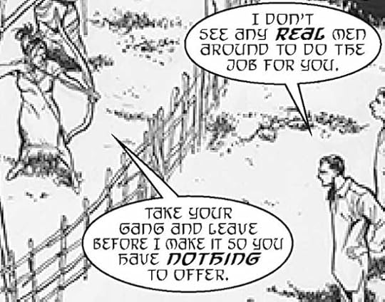
The top image in this post is from the finished page 1, using my new fonts except for the identifying tags in the credits like “writer” and “letters.” (That’s another of my fonts, TKOrnate.) Here’s a closer look at the fonts as they will appear in the printed comic, FAIREST #15, due out next Wednesday. Of course, the art will look a lot better, and be in color! Hope it works as intended, suggesting the Hindi language while still being relatively easy to read. Let me know what you think!
Todd Klein's Blog
- Todd Klein's profile
- 28 followers


