
And Then I Read: RESIDENT ALIEN Vol. 1
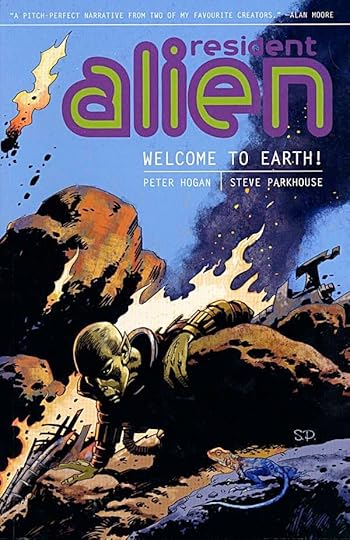
Images © Peter Hogan and Steve Parkhouse.
I sampled this series in DARK HORSE PRESENTS, and liked it enough to get the first collection. Both Hogan and Parkhouse are long-time British comics creators whose work I enjoy. Parkhouse, in particular, I haven’t seen new work from in some years, so this series was a pleasant reintroduction.
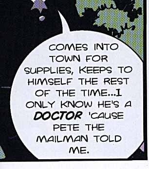
We’ve seen stories of aliens who have crash-landed on Earth before—E.T. comes to mind—but there have been others. What sets this story apart is what happens next. The alien in this case does not expect to be rescued by his own people for years, if ever, so he must make a place for himself among the population of the western United States, where he’s fallen. He finds a small town in a remote area and creates a life for himself as a retired doctor who wants to be left alone to fish and relax. While we, the readers, can clearly see he’s not human, no one else apparently can, through some mental power he wields.
All is fine for a while until a violent murder takes place in town, of the only doctor in the area. Soon Dr. Vanderspiegle, as the alien calls himself, is enlisted by local authorities to fill in for the missing doctor (despite his protests), and eventually to try to solve the murder case. As the story unfolds, things continue to get more complicated for the resident alien, and we meet the townfolk, an interesting bunch. Another murder happens, and worse yet, someone enters the new doctor’s life who can see what he really looks like.
The story by Peter Hogan is excellent, the art by Steve Parkhouse equally so. My one problem with the book is the lettering. Steve once hand-lettered his work (and that of others), and I always liked his distinctive style. For this volume he’s using a computer font made from that hand-lettering, but unfortunately not made well. The letterforms are fine, but the letters are too close together in many places, making the words hard to read. Less important is the wide space between the lines of lettering. Doesn’t affect readability, but it wastes space on the page. Don’t get me wrong, the book is readable, but these and other lettering issues kept pulling me out of the story. Maybe that’s just me.
In any case, the collection is highly recommended.


Todd Klein's Blog

- Todd Klein's profile
- 28 followers

