
Todd Klein's Blog, page 276
June 1, 2013
Rereading: THE GREAT WHEEL by Robert Lawson
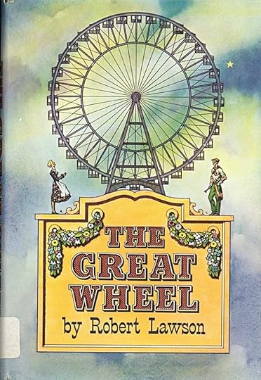
Images © estate of Robert Lawson.
Robert Lawson first came to prominence as an illustrator of children’s books written by others, such as “Ferdinand” about a bull who loved flowers and didn’t want to fight in the bull ring. Before long, Lawson was writing and illustrating his own books for children, a few picture books for young readers, but mostly longer books for middle grade kids. Some of his books are about animals, like “Rabbit Hill” and “The Tough Winter.” Some profile animals and famous figures from history, like “Ben and Me,” the story of a mouse who gave Benjamin Franklin all his best ideas. There are also a few adventure stories, and some historical ones. “The Great Wheel” is the latter, the story of an Irish lad, Conn Kilroy, who emigrates to America in the early 1890s and becomes involved in the building of the first Ferris Wheel at the Chicago Columbian Exhibition of 1893. Along the way we meet Conn’s large Irish family on both sides of the Atlantic, other emigrants like the charming German girl Trudy that Conn falls for, and the brilliant engineer of the wheel, George Washington Gale Ferris whose vision for a giant wheel to entertain visitors to the Exhibition is declared foolish and impossible to build. Ferris proves his critics wrong, with help from Conn and many other hard-working men.
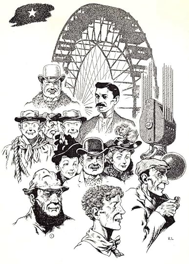
Lawson did most of his art in pen and ink linework, as on this back cover montage featuring the main characters of the book. His pen work is terrific, and his characters are full of almost theatrical exaggeration that makes them memorable.
If you’ve seen modern Ferris Wheels, you will be surprised at the size of the original. Each of the cars is the size of a railroad car and holds about three dozen people comfortably. At the top, passengers are about 250 feet off the ground, gaining wonderful views of the fair and the city of Chicago, and much of the lands around. The wheel’s axle alone was 45 feet long and several feet wide. Quite an engineering marvel, and one that was not surpassed until modern times, with wheels like the London Eye.
The story is old-fashioned and charming, an uplifting tale of American can-do optimism and hard-working immigrants, as well as a predictable romance for Conn that is nonetheless heartwarming. A fine book, as are all Lawson’s own tomes, and highly recommended.


May 31, 2013
Incoming: SHAME #2: PURSUIT
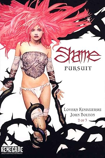
Image © Lovern Kindzierski, John Bolton and Renegade Arts Entertainment.
Just arrived, my contributor copy of the latest issue of this fine trilogy. It’s about two years or so between issues because each page is painted by John Bolton, but this is well worth the wait, in my opinion because each page is painted by John Bolton. The story by Lovern is good, too. I enjoyed lettering it, and if you like fantasy with a large dose of horror and page after page of drop-dead gorgeous women, you might enjoy reading it. Not sure if it’s in U.S. shops now, but you can buy both issues directly from the publisher HERE.
May 29, 2013
A Blog Recommendation
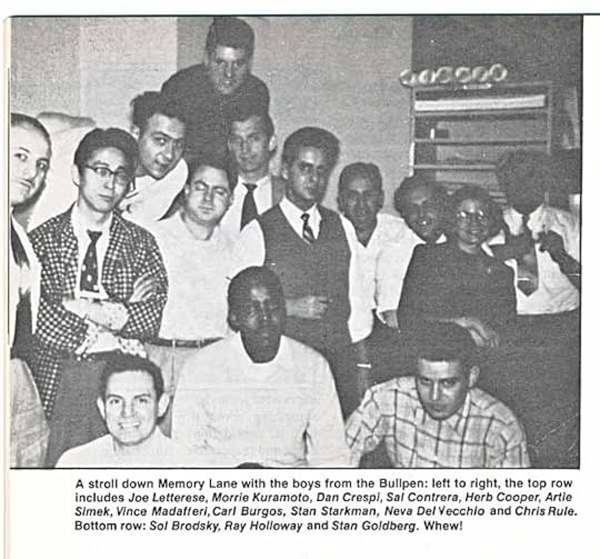
Image © Marvel Comics.
I’m real busy this week and probably won’t have time for a blog post today or tomorrow, but in the meantime, I’d like to recommend the blog of fellow logo designer and comics historian Alex Jay. It’s called Tenth Letter of the Alphabet, and features many of articles that I find fascinating, like the recent in-depth study of the Star Wars logos, as well as Alex’s research into comics letterers and designers. Most recently he put up this picture of the Marvel Bullpen. It’s not dated, but it has to be from the early to mid 1950s, as it includes Joe Letterese and Stan Starkman, who were laid off with most of these guys when publisher Martin Goodman decided to drastically cut his comics line. Letterese and Starkman came to DC, and both were working there by the later 1950s. Too bad the picture isn’t better, I’ve never seen photos of some of these folks, but at least we have this one. Take some time to look through Alex’s blog, if you like mine you’ll probably like his.
May 28, 2013
And Then I Read: WORLDS’ FINEST 12
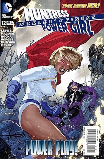
Image © DC Comics, Inc.
I’m enjoying the writing and art on this book, but somehow it always feels like it’s on the edges of other stories that I’m not following. The involvement of things from Apokolips, the home of Darkseid, for example…is this something going on in other books? I don’t know. We have one of Darkseid’s main lieutenants battling Power Girl in this issue, though she and Huntress are the only ones who seem to know it. That cover by Ryan Sook is a stunner, very much in the style of Adam Hughes, and inside the book the art by several artists, including Kevin Maguire is fine, too. There seems to be a vendetta by Apokolips against this heroine team that again feels like part of a larger story. The issue is still a good read on its own, though.
Recommended.
May 27, 2013
Ice Cream Mondae
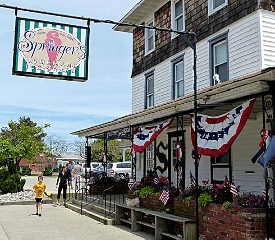
We haven’t done much to celebrate this Memorial Day Weekend. I have lots of lettering work, and did some yardwork yesterday, Ellen has lots of housework and spring cleaning. We did go out to a local Italian restaurant for dinner Saturday evening, and this afternoon we drove out to Stone Harbor for our first Springer’s Ice Cream of the year. It’s the best in our area, made on the premises and very delicious!
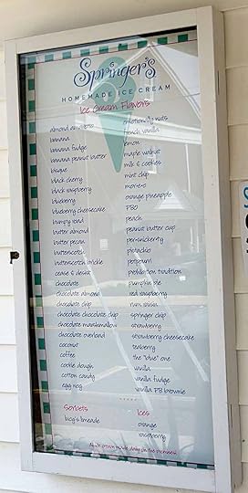
Here’s this year’s flavor selection, all good depending on your taste. (Some, like Cookie Dough and Cotton Candy don’t appeal to me.)

I chose Almond Amaretto, first on the list. Maybe I’ll eat alphabetically this year, and see how far I get. Ellen had Chocolate Delight (an unlisted special), which is chocolate ice cream with a raspberry swirl. Both were great. Can’t wait until we go back!
May 26, 2013
Now Blooming (and Roaming) in the Garden

My spring plantings and the perennials are all doing well this year, though at the moment they and we are covered in pollen. It’s been a good spring for the oak and pine trees as well. This begonia is happy in its small pot so far.

You can really see the pollen on this close view of a Columbine flower. We planted a few many years ago, and they naturalized. This one is coming up in the compost pile.

I planted some new Dianthus, but this returning one is even prettier, I think.
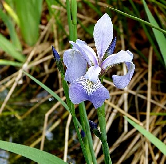
The Blue Iris in the pond have started opening.

Our Lilac isn’t so much to look at, the flowers are very pale lavender that quickly fade to white, but the smell is heavenly. I don’t think it’s ever bloomed this much.

One of the ground covers I planted is Lithodora, with pretty blue flowers that have continued to bloom for several weeks, but are now fading.

The Rhododendrons have also bloomed more than usual, and it’s hard to believe these were about two feet high when planted some 12 years ago or so. Now I can’t reach the tops.

The first Roses are opening.

I think this is a perennial Salvia, it blooms for several weeks.

Spiderwort are opening, one bloom in each cluster a day.

The Viburnum looks nice in the sunshine. Those large white flowers are really just specialized leaves to attract insect attention, the real flowers are the small clusters above.

And here’s the roamer, an Eastern Box Turtle I see almost every morning. Not sure if it’s a returnee or not, I have to look at previous years’ turtle pics, but I bet he (or she) is hoping a mate will turn up to roam with!
May 25, 2013
Logo Study: THE ADVENTURES OF CYCLOPS AND PHOENIX
Images © Marvel Characters, Inc. except as noted.
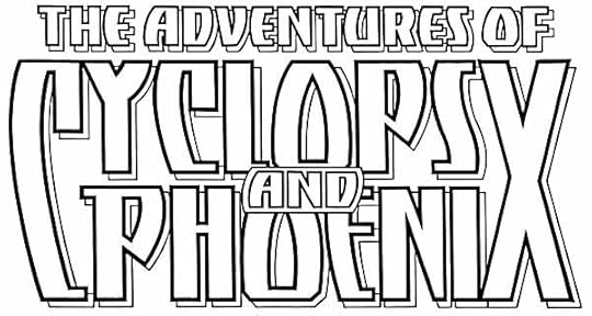
Friday, on my Todd Klein, artist page on Facebook, I put up the logo above as part of my series, “Logo of the Day,” which is nearing 400 entries. It’s a logo I designed for Marvel Comics in 1993, and it first appeared on the miniseries of the same name in 1994. Fellow letterer and friend Jon Babcock wrote there:
“Do you keep any of your roughs around? It would be great to see a series of roughs that led to this. That is a damn tough logo to pull off and I would probably have tried about 10 different things and never made it look this good. I love this stuff!”
I wish I had time to go into more detail on all the logos of my own that I put up on “Logo of the Day,” I don’t, but Jon’s question prompted me to look in my files to see what I did have on this one. What I think Jon most wanted to see are the preliminary idea sketches, and I didn’t save those. Typically I will sit at my drawing board with a few sheets of copy paper and doodle ideas, small, like thumbnails, trying to come up with a few starting points I like. Sorry, Jon, don’t have ‘em, but I do have the next step, which are marker layouts over pencils. (At least that’s what I was doing in 1993, now I often go from pencils to computer drawing.)
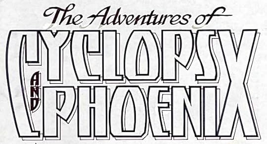
Each layout would be pencilled out on copy paper and inked with markers, pretty tight, but not as precisely as the final. My first idea, as you can see, was mostly what ended up on the final logo. With characters from the X-Men, any opportunity to get a big X in there is welcomed, and in this case we have the word PHOENIX, which ends in X. That led me to this idea of a large C and X bracketing the two names. I did the top line smaller and in script, for contrast and variety, and I put the AND vertically in the opening of the C. I went with block letters that have thick vertical strokes and thin horizontal ones, and I added style with gentle curves on some of the letters, probably initially as a way to get that large C in CYCLOPS to fit the space well, and extrapolating from there.
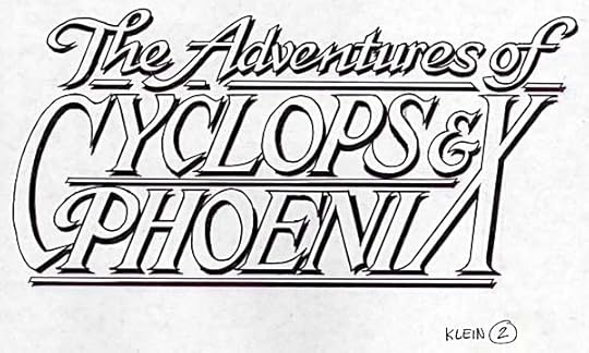
Version 2 follows the same idea, but slanted and with curvier serif letterforms for the character names and horizontal bars between each line. I thought this was a more elegant approach and I particularly like the & symbol.
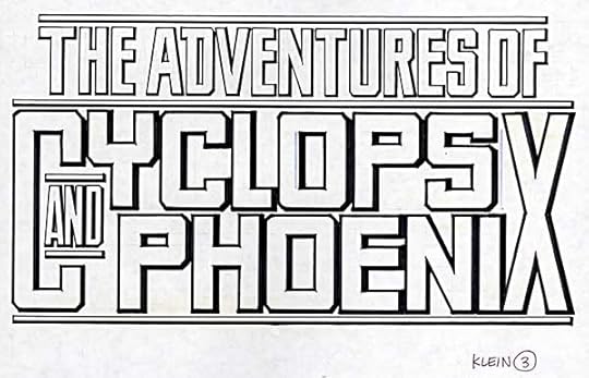
For version 3 I went very blocky in a style I thought would show a lot of super-hero power, again using horizontal lines as a design element.
Those three marker sketches, all begun as pencil sketches from my original thumbnail ideas, were submitted to the editor. They liked the first version best, but asked for some changes.
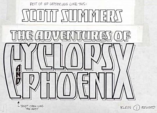
First, they wanted the top line in the same style as the character names, so did a marker version of that and taped it over the original script one. I made a note about having the AND be open letters, that may have been at their suggestion. As it turned out, they wanted it in a horizontal row, in the same style and size as the top line, and in a box, so it could be positioned in front of the character names. I thought this was a poor idea, but did what they asked by lettering the final AND separately, letting them put it where they wanted it. I’ve simulated the way it looked on the printed book in my first image above. Still don’t like it, but so it goes. In this sketch, there’s the character name SCOTT SUMMERS above the logo in a similar but less curvy style, with a note about it being on an ad. That would be a house ad for the book, which I don’t have a copy of, so I’m not sure if I did that lettering eventually or not. In any case, with the logo approved, I inked a very precise version on Denril plastic vellum and sent it to Marvel as the finished product.
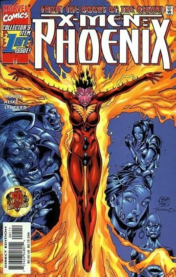
In interesting follow-up to this logo came a few years later, when JG Roshell of Comicraft got in touch with me to let me know that Marvel had commissioned him to create a font based on the letterforms in the logo. He had started work on it, and sent me what he’d done. JG is a fine designer, so it was good work, though I think there were some letterforms I felt I would have done differently. I agreed to help with the font, as long as I got a copy and was allowed to use it as I wished. I think JG did most of the work, and we shared credit. Comicraft agreed not to sell the font, and I don’t believe they ever have. My name for the font is TKurve, and it has two versions: Regular, matching the logo and Heavy, where all the strokes are the same weight. Not sure if Comicraft’s version is exactly the same, but if so, I’m pretty sure they don’t have the Heavy one. Here it is on a cover from 1999 with the logo by Comicraft:
I’ve used it in various places, including this 1996 logo for DC:
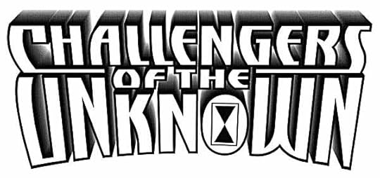
Image © DC Comics, Inc.
That’s all I can recall about this particular logo, hope you’ve enjoyed reading about my process. Lots more logo studies can be found on the LOGO LINKS page of my blog.
May 24, 2013
And Then I Read: JUSTICE LEAGUE 19
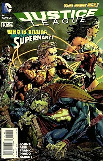
Image © DC Comics, Inc.
Interesting things going on in this book, which for once is not connected to a crossover. First someone breaks into the Bat Cave and steals something. Something that Batman has put under lock and key in the event he needs to take down one of his teammates. And it’s not the only such item! Great idea, that. Then we have two Leaguers undercover in the Middle East, the new Atom playing video games from the inside, a talk between the big three about the relationship between two of them, and real big trouble on the League satellite, with a surprise guest that should make next issue interesting, too.
In the Shazam backup, this issue is full of back-story and explanations, after very little of that previously. Black Adam is searching for Shazam, but can’t find him as Billy Batson. Batson wants help from his mentor on the Rock of Eternity, but can’t get to it without becoming Shazam. Unexpected help comes from someone I don’t think we’ve seen before, but Billy does not benefit from her advice.
Good writing on both from Geoff Johns. The Shazam story reminds me of a teenager: hardly telling you anything you want to know, then it suddenly all spews out at once and things get even more complicated! Great art on both stories by Ivan Reis with three inkers, and Gary Frank alone on Shazam.
Recommended.
May 23, 2013
And Then I Read: LEGION OF SUPER-HEROES 19
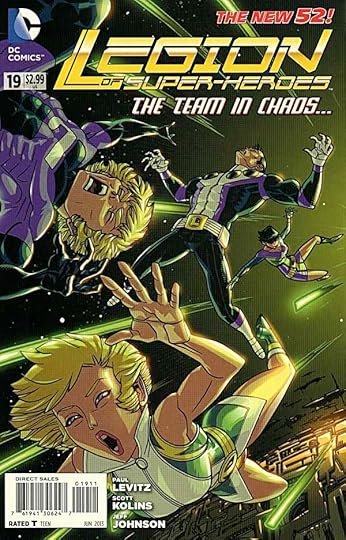
Image © DC Comics, Inc.
Word is out that this book’s final issue will be #23, until it’s relaunched again for the umpteenth time. Paul Levitz’s run as writer this time is actually longer than that, as he was writing in the previous version, really it was just a reset of the numbering with little or no revamp. I’ve enjoyed this run, though I wouldn’t put it at the top of Legion runs I like. Still, Paul knows the team well, and plays out their dynamics and personal interactions with skill.
Right now in the book, everything’s blowing up, though. Was this an attempt to find new readers? Keith Giffen came aboard in the role of spoiler and destroyer, not for the first time, and things in the Legion universe are well messed at this point. The Fatal Five are loose and killing everyone in sight, some of the group are stuck aboard a sleeping giant who’s not completely asleep, and…well, no one is having a good day.
Giffen seems to be off the book except for plot advice. The art by Scott Kolins and Jeff Johnson is veering toward the cartoony, which has worked okay in the past but doesn’t serve this storyline well. Even the distortions on the faces on the cover, above, seem extreme and unappealing to me, though the cover is by someone else. The book feels like a sinking ship at the moment. We’ll see how the end pans out, I know Paul will deliver a satisfying conclusion.
Mildly recommended.
May 21, 2013
And Then I Read: GREEN LANTERN NEW GUARDIANS 19
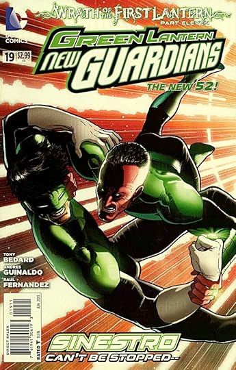
Image © DC Comics, Inc.
The crossover is nearly over. At least Sinestro is in this one. He’s back from the Dead Zone and flaming mad about the fate of his homeworld, Korugar, which has been destroyed. Kyle Rayner has the power of a White Lantern (all the colors combined), but even that, and help from Star Sapphire aren’t very effective against Sinestro’s wrath. (He’s the Kahn of the GL Universe, don’t you think?) Soon they’re joined by more Lanterns, including Simon Baz, the newest Earth one. Will that put a stop to Sinestro? Lots of fighting to find out.
Nothing wrong with the writing by Tony Bedard or the art by Andres Guinaldo and Raul Fernandez, I’m just tired of this storyline. Mildly recommended.
Todd Klein's Blog

- Todd Klein's profile
- 28 followers

