
Todd Klein's Blog, page 274
June 24, 2013
Championship Sand Sculpting, Atlantic City 2013 Part 2

Photos © Todd Klein.
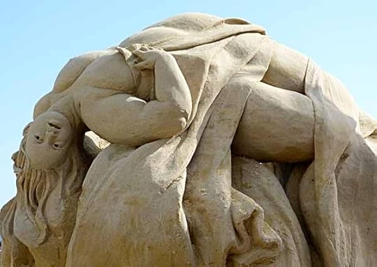
Finishing up my photos from our visit to the sand sculpting championship in Atlantic City on Saturday. This Escher-like solo sculpture had one head on this angle…

…and another head on this one. Quite clever.

This one is “Watchers”…

…and I was pleased to see it’s by “Sandy Feet,” the author of a book on building sand castles we own, though we didn’t see her at work.

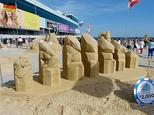
The rest of the photos are of the Duo sculptures, each one the effort of two artists working together. The Duo competition had begun Friday morning, and by late Saturday was well underway, but some elements of each were unfinished, and would be continued Sunday. Some of the duos worked together on a single structure, some, as here, did two sculpts that would be tied together at the end.
This one is called “Weightless.”

This is “Rooms for Rent,” a fabulous castle…

…and here are the sculptors. The competitors were from all over the world, a truly international group.

Brett Stocker through the archway…

…and Amazin Walter builds another archway by supporting the wet sand with his hand.

Here’s “Eye of the Beholder,” full of graceful curves…
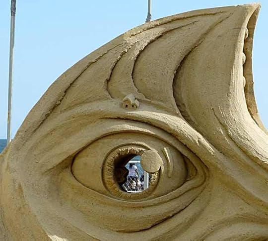
…and look at the tiny house detail on the other side, not to mention the cool eye.

I don’t recall the name of this one, but it’s of two angels, looks like.

Here’s one of the sculptors…
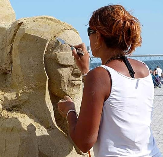
…creating a face with sunglasses.
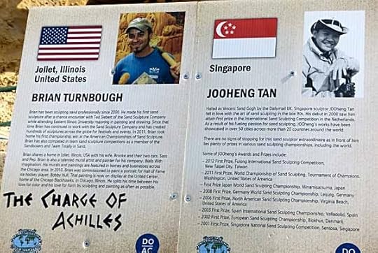
I’ve saved my favorite Duo sculpture for last, “The Charge of Achilles.”

Whille there was still work to do, the design and execution of this one were breathtaking.
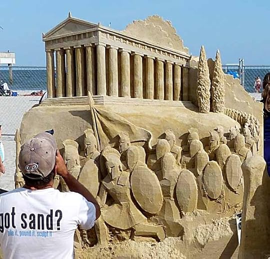
This column of Greek soldiers marching out of the Acropolis is amazing enough…
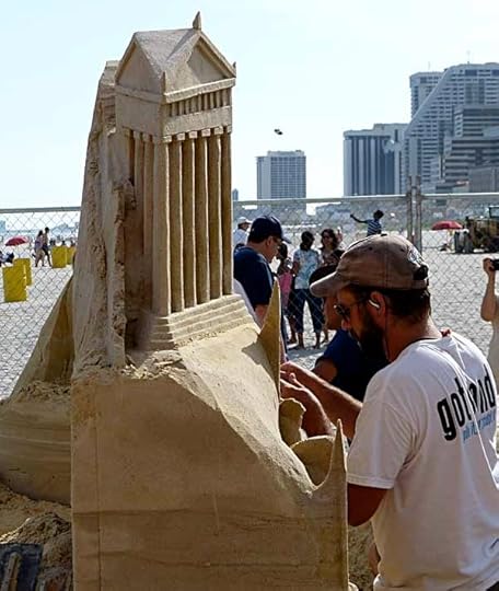
…but from the side, look how flat it is! the perspective is all an illusion, allowing them to get much more apparent depth into the front view and still keep inside the boundary.
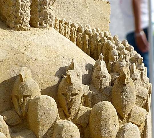
A detail of the small soldiers, and you can see where the sculptor is adding the crests.
I’m so glad we had time to see this in person, though it does make my feeble attempts at sand sculpture look pretty sad. The ephemeral art has never looked better.


June 23, 2013
Championship Sand Sculpting, Atlantic City 2013 Part 1
 All photos © Todd Klein.
The annual World Championship of Sand Sculpting has been going on this week on the beach in Atlantic City, next to the Pier Shops in front of Caesar’s casino, from where this shot was taken. We’ve been reading about it in the paper, and we both love sand sculpture (you can find some of ours in the “Sand Sculpture” topic on this blog’s sidebar) and wanted to go, but it’s been a crazy-busy week, so I didn’t think we’d have time. Finally, yesterday afternoon, Ellen said, “Let’s go now and have dinner there afterward,” and we did.
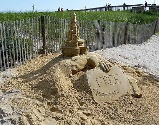
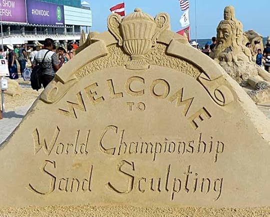
The first thing you see as you approach the beach entrance from the boardwalk is this small “teaser” sculpture. And how great that it’s free! Not much else is in Atlantic City.
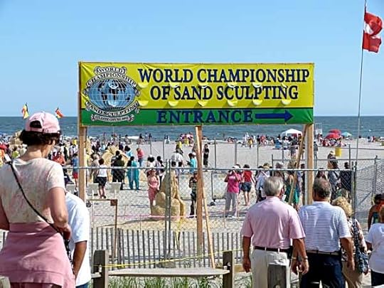
Ellen approaches the entrance.
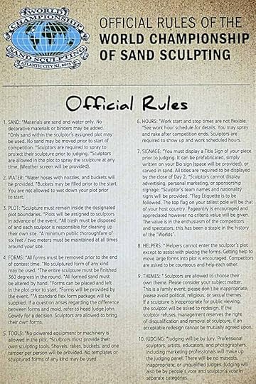
The official rules are on a sign as you enter. Solo sculptures had been done earlier in the week and awarded prizes, the Duo or team sculptures were underway Saturday, and would be finished and judged today, Sunday.
Another sample of sorts, larger, and with nice lettering.
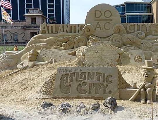
Part of the Atlantic City sampler sculpture, not part of the contest I think, and created by several sculptors.
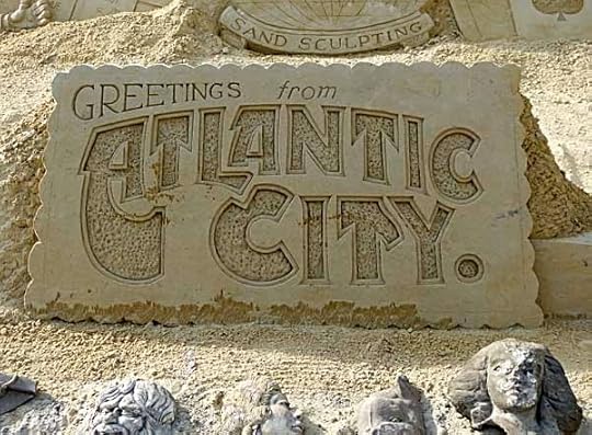
Excellent lettering on this faux postcard! Wish I knew how to do that in sand…
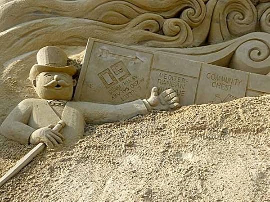
Monopoly, long associated with AC…

…as is Mr. Peanut.
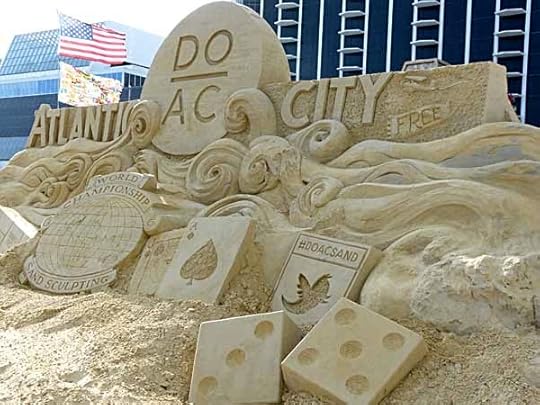
More of the AC sampler with the city’s newest motto, “Do AC.”

The solo sculptures were next, and there had been rain since they were finished, so some were damaged, like this “thinker.” All part of the sand sculpture game.
Others like this one titled “Amazon’s Pet” looked to be in better shape, and may have been repaired by the sculptors after the rain.
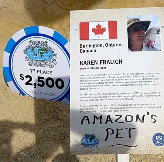
This was the first place winner, and I think my own favorite of the Solos.

“Amazon’s Pet” detail.
Second place went to this more abstract piece of a reclining woman broken into sections.

A creepy bat head.

I think this one is meant to be a dig at the beauty industry.

Part of a crazy wild sculpture on the theme of “Don’t Smoke!” That vertical split is amazing. Somewhat rain damaged at the bottom.

Eve and the Apple is another one I liked.

Another nice one of a woman playing a lyre.
There are just too many good photos from the event for one blog post, so I’m going to have the rest here tomorrow. Stay tuned!
June 21, 2013
And Then I Read: LEGION OF SUPER-HEROES 20
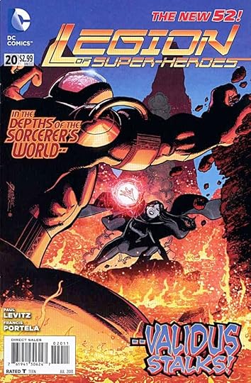
Image © DC Comics, Inc.
Things fall apart; the centre cannot hold;
Mere anarchy is loosed upon the world…
Two lines from “The Second Coming” by William Butler Yeats that sum up what’s going on in this book. Writer Paul Levitz, with some advice from world-destroyer Keith Giffen, are taking apart the whole United Planets with the Fatal Five at the heart of the disasters. Validus is one of those, a mindless monster set on “DESTROY.” And even if the combined might of the Legion can find a solution to him, there are more lined up for their shot. Even knowing that everything will eventually be reset, this kind of mass meltdown is compelling reading. On the art side, Francis Portela returns for the first time since issue 15 I think, and his more realistic and detailed style adds to the gravitas of the storyline.
Recommended.
June 20, 2013
Incoming: THE UNWRITTEN #50
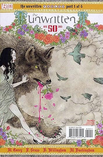
Images © DC Comics and the respective copyright holders.
I don’t usually note the arrival of individual issues I’ve worked on, but this one is unusual: the beginning of a crossover between THE UNWRITTEN and FABLES characters, but all contained in this one series. It’s also the 50th issue anniversary issue, meaning extra length on this one. I designed the first two pages, a story recap for new readers and the credits page.
I also had fun combining my two most common balloon lettering fonts, the one with a thick and thin line always used in THE UNWRITTEN and the one with an even thickness line always used in FABLES. I don’t think I messed it up this issue, but you can look for yourself, and there are four more to come…!
June 19, 2013
And Then I Read: THE KING’S MULE by Dwight Akers
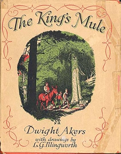
This 1933 hardcover found at a book sale seemed like a sure winner. Published by the Junior Literary Guild, an early book club for children with many titles I admire, and a glance through found many excellent illustrations by Illingworth. I thought it well worth reading. Sadly, the writing by Akers is quite bad. It hardly seems worth detailing the many ways in which it’s bad, but let’s just say Dwight Akers was not an author well suited to this kind of fantasy, and probably not well suited to writing for kids at all. The book is full of sappy off-putting verse, most of which I skipped, and the remaining story of three boys, a talking mule, and anthropomorphic animals of all kinds, has many faults, but the most annoying is, it’s written down to the audience, not from the heart, but in the spirit of, “here’s a funny, cute thing for the kiddies.” Akers wrote a few other books that were not fantasy, and those may have been better, I don’t know. If I ever see one I will not look at it.
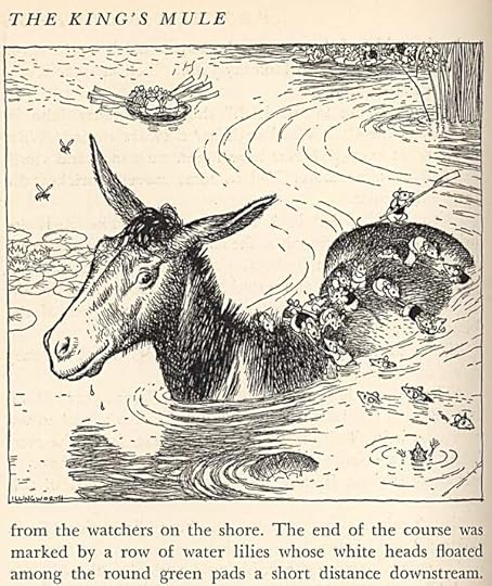
The illustrations, though are excellent, and kept me at least skimming the story and turning the pages. I’ve looked up Leslie Gilbert Illingworth (1902-1979), and he was a prolific political cartoonist for British papers. THIS site has over 4,000 of them. He seems to have illustrated only a few books. How he came to do so for this mess of a story is a mystery.
You’re not likely to find this long out of print tome, but if you see it, enjoy the illustrations, which are highly recommended, but do not read the book.
June 18, 2013
And Then I Read: JUSTICE LEAGUE 20
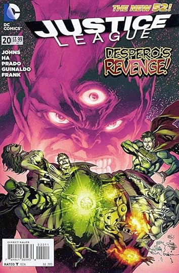
Image © DC Comics, Inc.
Another big crossover thing is about to begin, but this issue is still entertaining and does not feel like part of a story with things missing. Despero is on the JL satellite and looking for the “real” Justice League, but finding only the newbies, who are definitely not ready for his kind of power, size and anger. Despite that, Element Woman, Firestorm and The Atom team up and work together well to deal with him as best they can, which essentially means staying alive first, calling for backup second, and generally keeping their cool and thinking fast. Help arrives from an unexpected quarter to drag Despero off, but by that time the satellite itself is in big trouble. Meanwhile, Superman, Batman and Wonder Woman are still dealing with the revelations of last issue about the secret suitcases in The Batcave designed to deal with each JL member in the event of their going rogue. Great art by Zander Cannon, Gene Ha, Andres Guinaldo and Joe Prado.
In the Shazam backup, we learn more about the origins of Black Adam as he confronts Billy Batson and friends in their very vulnerable human forms. This story has been more fun than I expected, and will wrap up next issue. The usual excellent and consistent art by Gary Frank, who does it all himself every month. Yes, it’s a backup, and not so many pages, but Gary’s still to be commended on all counts.
Recommended.
June 16, 2013
Blogging Break
A quick note to say I haven’t been able to find time to blog the last few days, and that will probably continue through tomorrow. I am working on a multi-part post that I think will be popular with comics fans, especially those of my generation, but I may not have that ready until the following week. I’ll be back with a few reviews this coming week once I have time again.
June 13, 2013
And Then I Read: THE FLASH 20
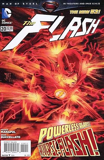
Image © DC Comics, Inc.
Francis Manapul is back on the art this issue, and I couldn’t be happier. In fact, since Brian Buccellato colors and both of them co-write, only the letterer is needed to complete the story. There can’t be many DC comics with as few as three creators doing the work these days, and letterer Carlos M. Mangual does a fine job, too.
Barry Allen is still picking up the pieces of his life interrupted by previous adventures, and moving in with his girlfriend, Patty, is on the agenda. That brings up the issue of each of their parents, and some nice character development. Barry’s job has changed, too, he’s back in the Police Crime Lab, but relegated to the basement, sorting unsolved cases. More good character stuff there. The action erupts quickly when one of the small group of people trapped in the Speed Force needs help, and Barry soon finds out some things he didn’t know about all of that group, as well as an unusual device back in his basement office. A nice setup for next issue ensues. Well written, fabulously warm and inviting art, great action and even better character acting, and all looking effortless and perfect.
Highly recommended.
June 12, 2013
And Then I Read: DARK HORSE PRESENTS #21
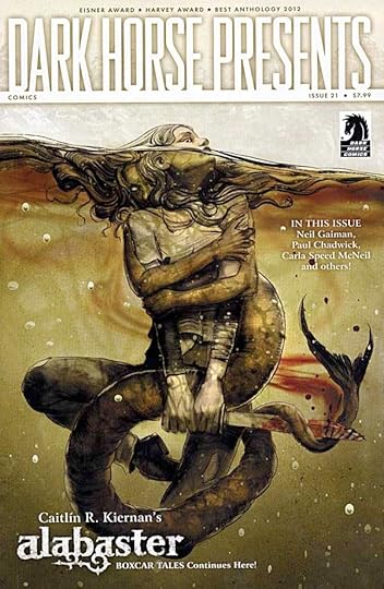
Image © Caitlín R. Kiernan and Dark Horse Comics, cover art by Greg Ruth.
Kiernan and Steve Lieber’s “Alabaster” is cover featured, and I’m still liking this tale of ghosts and trickery a lot. One technical problem I noticed this time is the resolution of the art is too low, making the lettering look like it’s running together in many places, and a little hard to read. I don’t recall this on previous chapters. It’s less obvious on the art.
Oeming’s “The Victories” is pretty a pretty entertaining approach to superheroes, though so far they aren’t doing well with their terrorist opponent.
I don’t quite follow “Journeymen.” It’s a trickster story with a monster and a box full of important stuff that turns out to be…well, that would spoil it. Some interesting moments, but I’m not quite sure what’s going on, and the captioned internal dialogue is distracting.
I’ve already written about “The Day The Saucers Came” by Neil Gaiman and Paul Chadwick HERE. The story, or poem really, is light weight but entertaining. The art is great. The lettering is my favorite part, the first new lettering by Gaspar Saladino to see print in many years.
I’m continuing to enjoy “Station to Station” by Bechko and Hardman, a tale of science gone very wrong and Lovecraftian monsters.
“Beneath The Ice” is a new serial by Simon Roy and Jason Wordie. Have you ever had one of those dreams where you’re crawling in a tunnel, and it keeps getting smaller and smaller…? Here it is.
The new “X” by Swierczynski and Nguyen is not my cup of tea, an ultra-violent vigilante fighting mob types. The preview ends with this issue.
“Villain House” by Shannon Wheeler is a funny look at two villains in jail for good reason: they’re classic losers locked in co-dependent misery.
“Finder” is appealing to me again, as the delivery man finally meets his employers while stuck in a very dangerous place.
Lots to like this time, highly recommended.
June 11, 2013
And Then I Read: GREEN LANTERN 20
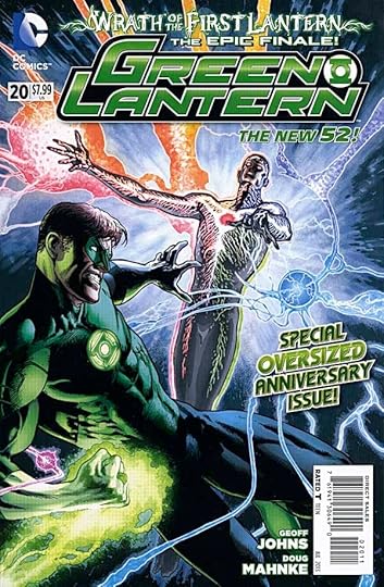
Image © DC Comics, Inc.
This issue is remarkable in several ways beyond its story and art. First, it’s the finale of not only the current GL crossover, but the culmination of several past ones all written or created by writer Geoff Johns. Second, it’s Geoff’s swan song on the title. It’s impossible to miss this fact because, instead of ad pages, the book has many pages full of tribute quotes to Geoff from the famous and familiar, people who worked with him and/or admire his writing. I’m all for that, but placing these throughout the story was distracting, they should have been at the end.
As a story, it’s very appealing. Hal Jordan is finally back on the scene, confronting the First Lantern and Sinestro. All the GLs from all the spinoff books are there with their own bits of wrap-up and action to do. There are happy reunions, well-resolved plot threads, a cast of thousands, and an emotionally satisfying conclusion. Most of the art is pencilled by Doug Mahnke with his usual excellence, and with the other regular GL artists filling in the rest. there’s a wonderful double gatefold spread to finish the story, so essentially a four page spread of all the colors of Lanterns in flight. Good stuff. Kudo’s to Geoff on a fine nine years of work on the Lanterns. I haven’t loved every minute, but overall it’s been a great ride.
Recommended.
Todd Klein's Blog

- Todd Klein's profile
- 28 followers

