
Todd Klein's Blog, page 280
April 21, 2013
More New Lettering from Gaspar Saladino
Images © Dark Horse Comics and Neil Gaiman.
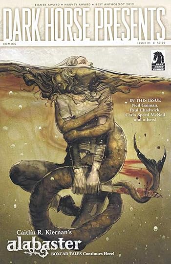
Readers of DARK HORSE PRESENTS #21 will not only have a fine selection of stories to peruse, they’ll be able to view a historic moment in comics lettering history.
On pages 25 to 31 is a story with NEW lettering by The Master, Gaspar Saladino. The story itself is not completely new. Another version with different art was released by Neil as a limited edition print a few years ago. This version was produced in 2012, I believe, with great art by Paul Chadwick, and lettered by Gaspar, probably on vellum overlays. Last year I wrote about Gaspar’s first new lettering for comics in quite a while in THIS article, but that was for a proposal that is still unpublished, as far as I know. The story in DHP, then represents Gaspar’s first PUBLISHED lettering in a number of years.
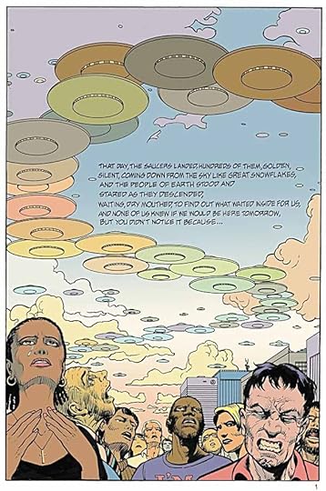
Here’s the first page in full, looking quite good. The story has only captions, and Gaspar was asked to “float” them, in other words, not to put them in boxes, and using his standard style.
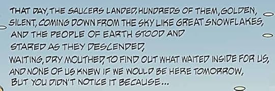
A closer look at the lettering. Gaspar is my favorite letterer of all time, and looking at this, my reaction is, “He’s still got it.”
Last year I wrote a series of blog posts revealing my research into Gaspar’s very first lettering for DC Comics. In the third part I identified that first work as appearing in ROMANCE TRAIL #5, cover-dated March-April, 1950. Because of the way comics are dated ahead of when they actually go on sale, that work had to be completed in 1949, and was probably on newsstands in January of 1950. Therefore, the new lettering by Gaspar represents an astounding career span of at least 63 years of published work! And who knows, perhaps there will be more! I hope so. Long live The Master!


April 20, 2013
Hummingbird Prep Time
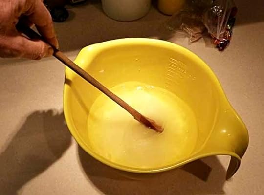
The third weekend in April is when we put out our hummingbird feeders every year. That may seem early, but as you can see on THIS map, first sightings have already been reported as far north as Maine! It’s still chilly here, 55 degrees today, but the hummers are arriving, and if we want to have them in our yard all summer, now is the time to put out our two feeders. First step is to mix up a batch of nectar or sugar water: 1 cup of white granulated sugar to four cups of water, stir until dissolved. Only takes a few minutes.

Get out the feeders and hangers from the closet where they’ve been in a plastic bag since I washed and dried them last fall. The hooks attach by suction cup to our windows, the red cups go on the hooks and are filled with water to prevent ants from raiding the feeders, and each feeder hangs below an ant cup. We use HumZinger feeders, they work well and have no small parts to fall off or get damaged, just a base and a lid. Easy to clean, too, and that’s good as you have to wash them before each refilling. I fill each base with nectar, assemble the feeders, and everything is ready to go.
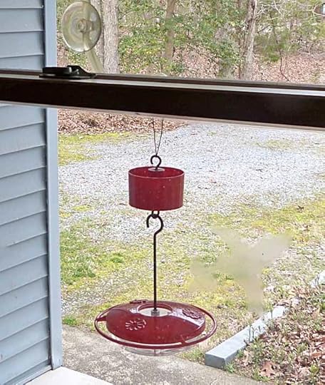
One feeder goes on a front porch window…
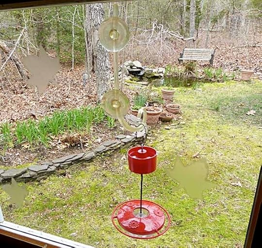
…the other goes on a back window. This cuts down on hummingbird fights a little. If you have two or more feeders in sight of each other, one feisty male will try to monopolize all of them. This one will go on a different window, one in my studio, in a few weeks.
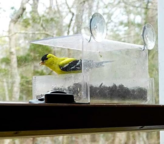
At the moment there’s a window sunflower seed feeder in that spot, where I’m still enjoying birds like the American Goldfinch. When it warms up, the songbird traffic will slack off, and hopefully I’ll be about out of seed. That’s when I’ll take this feeder down until next fall and put up the hummer feeder. We’ll see how long it takes for the first hummingbird to arrive in our yard, some years it’s the same day I put up the feeders. They’ll keep us and the cats entertained until September, and I’ll wash and refill the feeders at least once a week until then (more when it’s very hot).
April 19, 2013
And Then I Read: JUSTICE LEAGUE 18
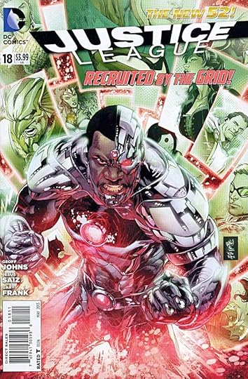
Image © DC Comics, Inc.
Most of this issue pertains to the new members that were suddenly recruited during the war with Atlantis in the last arc, and who I guess will be the focus of JUSTICE LEAGUE AMERICA. I’m not reading that book. I might have tried the first issue, but I didn’t get it in my comps from DC, and decided not to seek it out. Maybe I’ll give the first collection a look. If I can make a side point, it’s the job of comics publishers and creators to increase profits by selling more comics. One tried and true way to do that is a spin-off series. I’m all for them as long as they aren’t required reading to make sense of the original series. The former is an option, the latter is coercion, to which the response is often rejection.
The new members are a mostly familiar bunch, at least on the surface. I’m sure they all have somewhat different stories than the ones I remember, but that’s okay. The team dynamic is a bit hard to get a handle on at this point because so much is going on, and frantically at times. It’s the old new vs. old, let’s fight scenario…sort of. A few nice moments when the action quiets. Let’s see how things develop in this book. Artistically, it looks terrific. Jesus Saiz does an amazing job on the art, capturing individual expressions and body language and handling everything well.
Oh yes, the backup. Despite all the differences from any Shazam or Captain Marvel in the past, I really like the way this is being handled. Geoff Johns is doing a great job of writing about realistic young people, in over their heads, facing the somewhat whimsical villains like Black Adam and the Seven Deadly Sins in now equally realistic and deadly form. The art by Gary Frank continues to be wonderful.
Recommended.
April 18, 2013
My Favorite Superman Memory
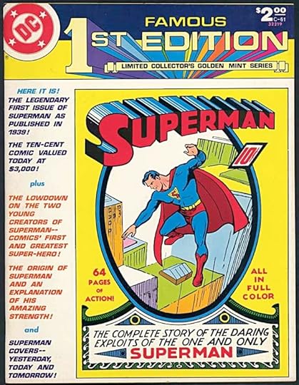
Images © DC Comics, Inc.
I began working in the DC production department in 1977, and by 1978 the big news was the upcoming Superman movie, the first one with Christopher Reeve as Superman. The creators of the character, writer Jerry Siegel and artist Joe Shuster, had been battling with the company for years over what they felt was unjust treatment both financial and as creators, and in 1976 a deal was reached that they were happy with at the time (with the help of public outcry and the efforts of comics pros like Neal Adams). In 1978, in anticipation of the movie, DC prepared this tabloid-sized recreation of the first issue of SUPERMAN from 1939. I did some production work on it, and designed the “FAMOUS FIRST EDITION” logo seen above, as well as a futuristic Superman logo used on the back cover.
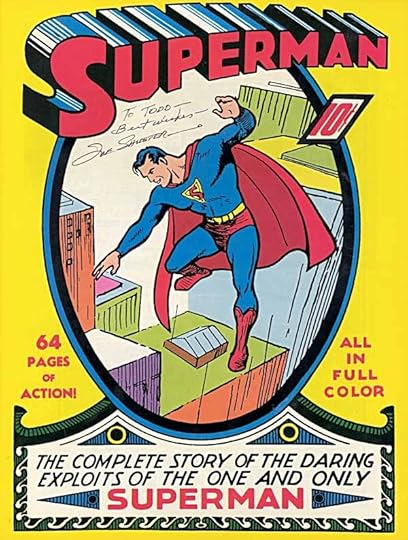
One day, probably in early 1979, Joe Shuster came to the DC offices, and was brought into the production department and introduced to everyone. The printed copies of the tabloid were on hand, and I was introduced to Joe as someone who had worked on it. I was thrilled and excited to meet him, and delighted when he agreed to sign the full-size cover to me. This was a second cover on glossy stock INSIDE the outer cardstock cover (top picture) reproducing the original issue’s cover at tabloid size. I was impressed at the time, but I was a kid. I didn’t know much about the man and his journey, his vital place in comics history, the difficult times he’d had, his health problems, and all the things that make it so much more meaningful to me now. It’s a memory and an object I’ll always treasure.
And Then I Read: LEGION OF SUPER-HEROES 18

Image © DC Comics, Inc.
Okay, last issue was the beginning of a new story arc co-written by Paul Levitz and Keith Giffen. I expected major shake-ups, and got them. This issue begins with Legion headquarters on Earth in flames, and an angry mob outside who want the Legion’s hides. An away team has crashed onto a giant creature, and it’s waking up, not a good thing for them. All over the United Planets, things are going wrong and falling apart. They’ve once again come up against their most deadly foe…Keith Giffen.
All kidding aside, Keith does know how to rattle the cage, and it could be a fun ride, we’ll see. One thing different this time is the art. Keith’s pencils are only evident on the cover. Interiors are probably from his rough layouts, but the art credit is to Scott Kolins and Tom Derenick, each handling some of the pages. Kolins provides some needed continuity with the previous arc, and Derenick’s style is more traditionally super-heroic. I love Giffen’s art on the right project, but I think this is a wise choice for the Legion.
Recommended.
April 17, 2013
And Then I Read: TIME WARP 1

Image © DC Comics, Inc.
I have two reasons to look favorably on this comic at the outset. First, it features a digital recreation of the TIME WARP logo I designed in 1979 for the first iteration of this title. Second, I lettered one of the nine stories inside, the “Dead Boy Detectives” one. The rest of the issue was new to me, and here are some thoughts on that.
“R.I.P.” by Damon Lindelof and Jeff Lemire. Rip Hunter, Time Master, is the very appropriate central figure, or rather, several of him in a complex but rewarding time travel tale, the kind that takes your mind on an exercise. Wish I liked the art of Lemire better, but this is worth reading.
“It’s Full of Demons” by Tom King and Tom Fowler. Another kind of time travel story, in which we follow a character through the times of their life, from a very odd and violent beginning to an equally violent end. There’s a surprise ending that makes it work even better. Well done.
“I Have What You Need” by Gail Simone and Gael Bertrand. This one is a true time warp story, in which characters are stuck in repeating events, but there are still lots of surprises in it. The art on this one is appealing in a cartoony way, and makes a good foil for the serious moments. Also well done.
“The Grudge” by Simon Spurrier and Michael Dowling. Schoolboy pranks and practical jokes carried to incredible levels by two very smart but very socially-arrested scientists. Not a bad idea, and the art is quite good.
“She’s Not There” by Peter Milligan and M.K. Perker. If you could buy the ghost of your lost love, and have her haunt your home, would you? If that ghost began to have ideas of its own, what would they be? Can we be judged by the dead? Good stuff, this, and nice art.
“00:00:03″ by Ray Fawkes and Andy MacDonald. Kind of a future all-digital war story that didn’t do much for me, though the art is attractive.
“Warning: Danger” by Matt Kindt. Another future war story, one with a biological weapons angle. Kindt’s art style doesn’t appeal to me that much, but I like his writing.
“The Principle” by Dan Abnett and Inj Culbard. Kind of the flip side of the second story above, two time travel agents are determined to prevent the changing of history by other time travelers. Not bad, but two stories with the same focal character seems too much for one anthology of this kind.
In all, recommended.
April 16, 2013
First Belleplain walk of the spring

We’re getting to the best part of the year for birdwatching: late April through May (at least here, and in my opinion). Went for a walk in nearby Belleplain State Forest to see what spring migrants/nesters have arrived on a beautiful sunny morning. As always I heard more than I saw, but the paths and roads were fun to walk on anyway.

The best-looking bird I saw was a Yellow-Throated Warbler like this one, but not nearly close enough for a photo, I found this uncredited picture online.

Blue-gray Gnatcatchers were everywhere, and curious enough to come close for a photo, though not a great one.

A few other birders were at the bridge on Sunset Road, a well-known spot for birds in Belleplain. Here I heard Ovenbird, Pine Warbler, Black-and-White Warbler, Eastern Towhee, and more of the birds above.

A walk down this road brought me to the other nearby bridge where a Louisiana Waterthrush was singing loudly, though I couldn’t see it, as often happens. This is a good time to find warblers and other songbirds arriving on nest sites, as they sing often to establish their territory, move around a lot, and the leaves aren’t out yet to hide them. Even so, you hear a lot more than you see.
I’ll be doing this sort of thing to warm up for the World Series of Birding coming up in a few weeks. You can read more about that HERE.
Now I’m home and getting back to work!
April 15, 2013
And Then I Read: AQUAMAN 18
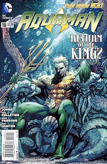
Image © DC Comics, Inc.
Aquaman began as “King of the Seven Seas,” decades ago, living in the ocean, helping and working with all kinds of sea creatures, and the humans he came into contact with. His kingship was more honorary than real, and Atlantis was generally not in the picture. Now he’s been returned to the seas as the actual king of Atlantis, and seems quite unhappy about it. Life as Atlantis’ ruler is a cold and harsh one. He has few allies, and his rule is constantly being challenged. He’s left behind the life he’d built on land, with Mera, who is undergoing her own struggles with human authority. While this storyline creates interesting conflicts, no one in it is having any fun, and that’s a shame. Aquaman should have at least some element of fun in it somewhere, I feel. But in the final page reveal, we meet a character who might bring welcome change to the current status of Arthur…or he might just signal another round of fighting. Guess we’ll see. The art by Paul Pelletier and Sean Parsons looks good.
Mildly recommended.
April 12, 2013
Pulled At Random From My Files #6
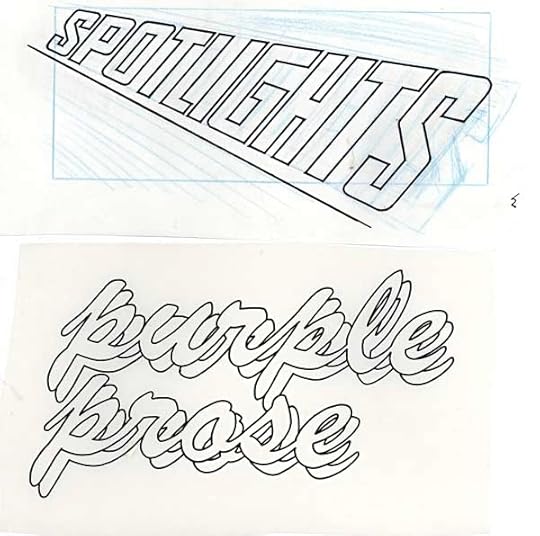
Two more lettercolumn headings, or at least the lettering/title part. Above, for TEEN TITANS SPOTLIGHT, in my standard open block lettering, and not too dissimilar to the book’s logo, which was designed by Gaspar Saladino:
[image error]
I don’t have the comics anymore, but I imagine the blue rectangle is where the address and such went on the final lettercolumn masthead.
Below is “Purple Prose” for AMETHYST, PRINCESS OF GEMWORLD. This looks like I set up some type on staff at DC, either with the Varityper Headliner or with rub-down type, and then traced that to create open lettering. The style of the script is not one I would have created from scratch. Perhaps artist Ernie Colon had a font in mind for it. I think I have his art for the lettercolumn heading somewhere, that may turn up in another of these posts.
April 11, 2013
And Then I Read: THE FLASH 18
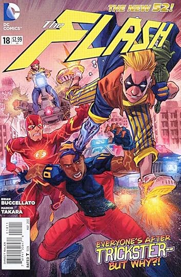
Image © DC Comics, Inc.
While the dust from the recent super-gorilla attack settles, Barry Allen is trying to pick up the pieces of his former non-super life. Surprisingly, he’s still working in that bar where the super-villains hang out, getting an earful from the new version of The Trickster. Also spending time with his girlfriend Patty, who I have to say seems like a lesser choice to Iris, and investigating crimes on the sly. As Flash, he’s dealing with Trickster’s latest crimes, and trying to help some of the folks who were trapped in the Speed Force, including new wanna-be heroes Sprint and Turbo-Charger. A nice change of pace, and I always enjoy the character development stories. The art this time is by Marcio Takara. Don’t know if he’ll be on for an arc, or if this is just a fill-in. His style is quite different from Manapul’s but not bad.
Recommended.
Todd Klein's Blog

- Todd Klein's profile
- 28 followers

