
Pulled At Random From My Files #6
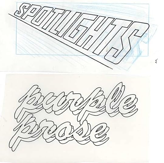
Two more lettercolumn headings, or at least the lettering/title part. Above, for TEEN TITANS SPOTLIGHT, in my standard open block lettering, and not too dissimilar to the book’s logo, which was designed by Gaspar Saladino:
[image error]
I don’t have the comics anymore, but I imagine the blue rectangle is where the address and such went on the final lettercolumn masthead.
Below is “Purple Prose” for AMETHYST, PRINCESS OF GEMWORLD. This looks like I set up some type on staff at DC, either with the Varityper Headliner or with rub-down type, and then traced that to create open lettering. The style of the script is not one I would have created from scratch. Perhaps artist Ernie Colon had a font in mind for it. I think I have his art for the lettercolumn heading somewhere, that may turn up in another of these posts.


Todd Klein's Blog

- Todd Klein's profile
- 28 followers

