
Todd Klein's Blog, page 282
March 31, 2013
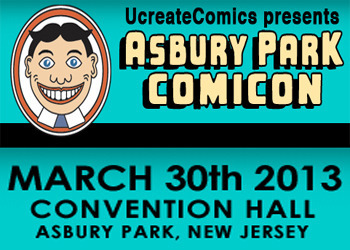
Asbury Park Comicon
Images © Todd Klein.
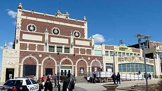
I spent a few hours at this show in Asbury Park, NJ yesterday, a town on the Jersey Shore which is still recovering from Hurricane Sandy. It’s the third such con, and the first at Convention Hall on the boardwalk, which is part of this structure, though the con area was off-camera to the right, on the pier over the beach.
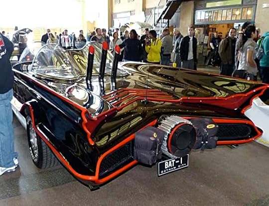
Inside, in the section of “boardwalk” that runs through the building making, in essence, a large lobby, were the 1960s Batmobile and a “Back to the Future” DeLorean you could have your picture taken in, or just take pictures of. A pretty good way to entice people into the show. Actually, the show seemed well-attended, the aisles were busy.
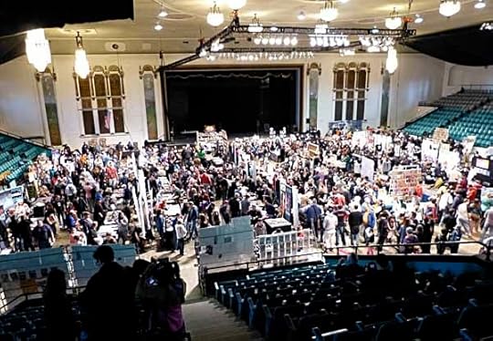
The main room of the con was on the floor of a large old theater where rock acts used to play in the 1960s, and still used for concerts in the summer I believe. Looking down from the seats with the con floor lit up and the seats dark, it reminded me of a sporting event like a boxing match.
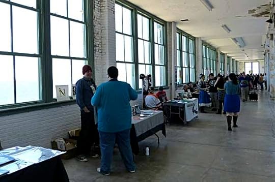
The con was also on the upstairs gallery running around the outside of the building with great views of the ocean and beach. Most of the exhibitors up here were artists and small press publishers.
Dave Bullock was one of the artists I talked to there, I’m a fan of his work, but I don’t think we’d met before. He was kind enough to give me this cool poster he’s done.
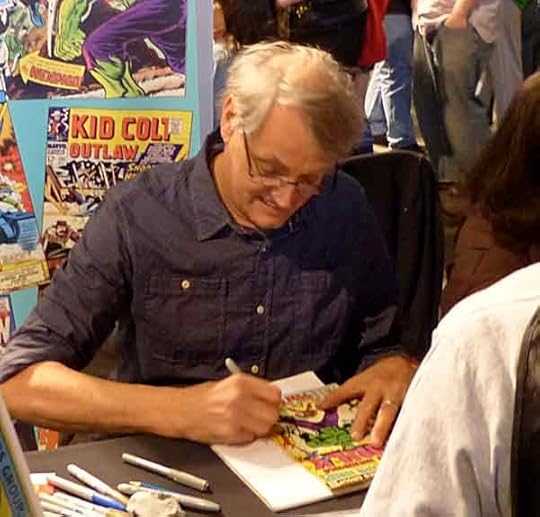
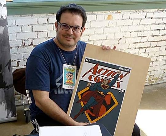
On the main floor, guests like Herb Trimpe were busy signing their work.
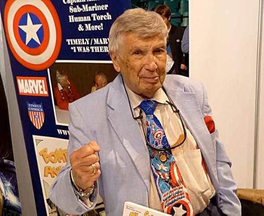
Batman producer Michael Uslan was kept busy. I had a chance to talk to him a bit, and learned he grew up in Asbury Park, one reason why he was here to support the con.
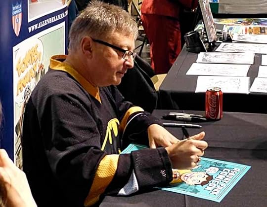
I also talked to Allan Bellman, an comics artist of the 1940s-60s whos work I wasn’t familiar with. I asked him if he worked on staff at Marvel, and he did, in the early 1950s before the Martin Goodman laid off most staffers during hard times. “Did you know Artie Simek?” I asked, “Oh sure,” he said, “he used to play his harmonica to entertain us.”
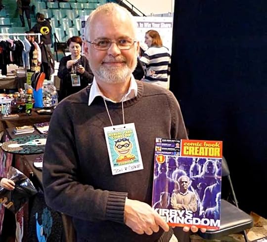
Comics historian Jon B. Cooke was there with an advance copy of the first issue of his new magazine, cover by Alex Ross. Looks great!
Writer Don McGregor was there, talking a mile a minute as usual. I didn’t have a chance to say hi, he was so busy, but it was good to see him.
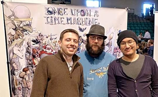
Also there were the editors/creators of “Once Upon a Time Machine” Andrew Carl and Chris Stevens, with someone whose name I’ve forgotten unfortunately. Chris and I talked about a new anthology they’re planning for which I designed a logo, and a show he’s organizing in Philadelphia.
Several of the guys from the TV show “Comic Book Men,” like Mike Zapcic, were there helping run things. I wouldn’t be surprised to see footage from the con on their show in future.
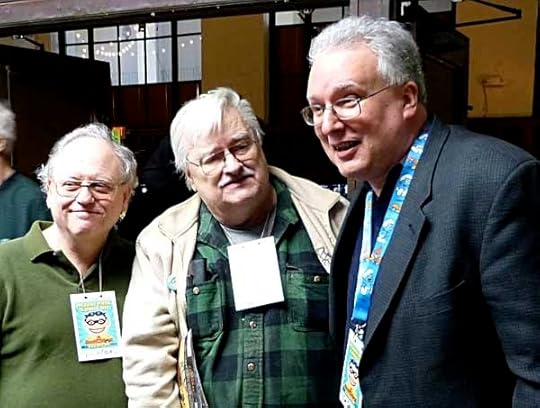
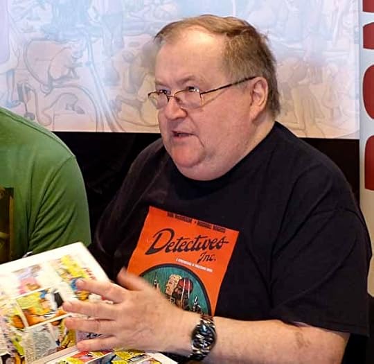
Two old friends that I had planned to meet there were John Workman and Dave Hunt, here with Jim Salicrup. It took me a while, but I did get together with them and we had some good conversation. John’s wife Cathy was also there, and our friend Ron Jordan. I talked to about a dozen other folks as well, my favorite thing to do at cons.
A fun afternoon, well worth the 1.5 hour drive up, and while I was there Ellen was spending time with friends. We went to dinner afterwards. Not a large show, but a good one, I’d certainly go again.


March 30, 2013
Comics Show Today
 I’ll be at this show today for a few hours in the afternoon, just wandering around looking and talking to friends. If you see me, say hi. I’ll blog about it tomorrow.
March 29, 2013
And Then I Read: JUSTICE LEAGUE 17, AQUAMAN 17
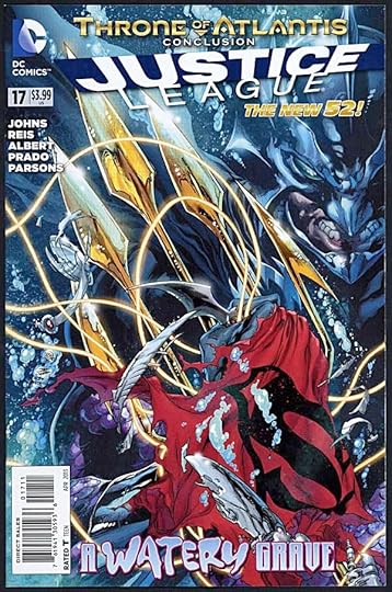
Images © DC Comics, Inc.
Like so many epic battles, it comes down to a face-off between leaders, and this one is between brothers: Aquaman and the king of Atlantis. Arthur, betrayed by Vulko, a man he thought a friend, is the only one who can stop the madness, but doing so will cost him dearly. Plenty of impressive visuals of the battles between the Atlanteans and the Justice League, but the family story at the heart of it is what makes it work. Writer Geoff Johns delivers! The art by Ivan Reis and others is as impressive as ever, full of detail and realism as well as energy, excitement and drama.
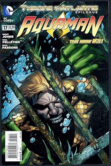
It’s a little confusing to have a conclusion and then an epilogue, so if you’re reading both these books, read this one last. King of the Seven Seas. The responsibilities are as immense as the territory, and Arthur seems determined to live up to them, despite the personal hardship that brings. Leaving behind the life he’s led for some years, returning to the oceans and their inhabitants, Aquaman—in the hands of writer Geoff Johns—has become a truly important and perhaps even tragic figure with depths never before seen in the character. Well done, sir! The art by Paul Pelletier and Sean Parsons is fine, not as good as Ivan Reis, but that’s a high mark to match.
Both books are recommended.
March 28, 2013
And Then I Read: ONCE UPON A TIME MACHINE

Image © Andrew Carl and Chris Stevens, illustration by Farel Dalrymple.
I lettered one story in this thick anthology, but it’s taken me a while to read the rest of it. As anthologies go, this one is impressive physically: 432 pages on high-quality glossy paper, square bound and about an inch thick. There’s an excellent wraparound cover by Dalrymple, and the contents are impressive, too.
The theme is in the title, but it takes a little while to sink in. Think of lots of favorite and perhaps less known fairy tales (the “Once Upon a Time” part) imagined in a futuristic setting, often with science fictional elements (the “Time Machine” part). There are twenty-five such tales here, plus many single page images between the stories. As in all anthologies, the variety of material means not everything is equally good, or will appeal to every reader, but as in all GOOD anthologies, most readers will find things they like here. One of my favorites was the very first story, a new version of 1001 Nights written by Tara Alexander, art by Nelson Evergreen. It’s a story set in a future publishing business where comics are about to be made obsolete, until the young daughter of a former comics legend comes to work there and is asked to pitch her new ideas for the market. A great idea, well executed, and the self-reference to comics makes it all the more fun. Lots of others I enjoyed, some more than others. Many of the tales used an older tale as a mere springboard for new things, and that worked most of the time. A few of the stories had art styles that didn’t appeal to me, but that’s to be expected.
Chris Stevens is the co-owner of the Locust Moon comics shop in Philadelphia, and his own story for this book was the one I lettered, at his request. I’m happy to be among good company in this anthology. Check it out at your own shop, or library, it’s worth a look. Recommended.
March 27, 2013
And Then I Read: WONDER WOMAN 17
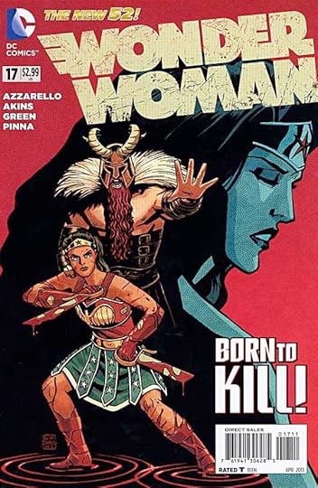
Image © DC Comics, Inc.
While I like some things about this title, I’m not sure I’m happy with the way writer Brian Azzarello characterizes Diana, Wonder Woman. He writes her as warlike and fierce, but also naive. She’s surrounded by gods, demi-gods and humans who all seem to take advantage of her in some way or other, and she doesn’t seem to notice that. I’d like to see her get a clue at some point.
Still on her quest to find the lost child of Zeus for her friend Zola, Diana finds Ares, god of war in a bar, and convinces him to help. That takes her into a very strange world, and more trouble. Meanwhile, a subplot about another child of Zeus is playing out far away. He’s been resurrected from the Antarctic ice, and is now trying to locate his ancient weapons.
The art by Tony Akins and Dan Green is fine, but the subplot art by Amilcar Pinna really appealed to me. I’d like to see more of that.
Mildly recommended.
March 26, 2013
More Books!
[image error]
Have I mentioned I like books? Oh yeah, yesterday. Here’s my favorite way to get them. Sure, I do read some on my phone and iPad, I buy from Amazon and brick and mortar bookstores, but the best way is a good used book sale, the kind put on all around the country as fundraisers. Today I attended such a sale at the Princeton Country Day School put on by an alumni society from Bryn Mawr and Wellesley colleges to raise money for scholarships to those schools. It’s an annual affair, but this is only the third time I’ve been. Here’s the line going into the sale at the opening, a surprisingly short one, we all fit into this hallway.
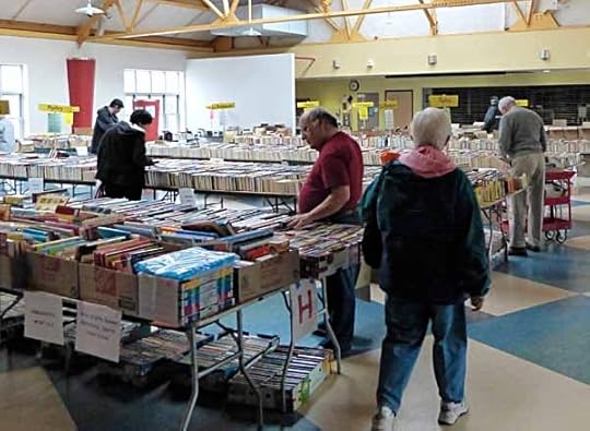
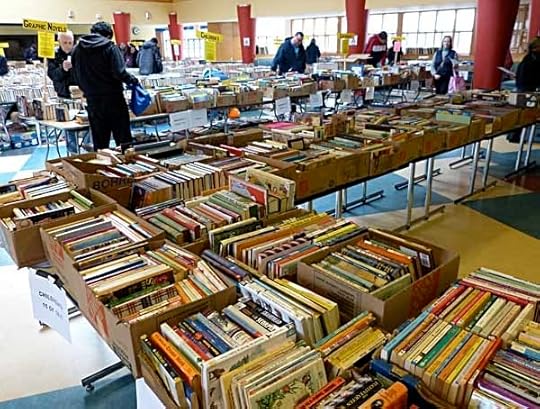
There were two large rooms full of tables packed with books. I spent most of my time in this one looking through the childrens’ books and science fiction, as well as “old and unusual.” The other room had mostly non-fiction, I had a quick look but didn’t get anything there.
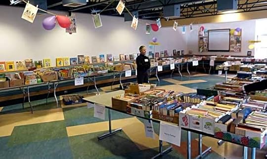
Here’s more of the children’s section. Princeton is a well-to-do area, and that means lots of choice hardcovers and brand new paperbacks at their sale.
It can be overwhelming, but with not too many other people looking, I had time to go through everything a few times to get what I wanted. Some book sales I’ve been to have been mob scenes. Of course, this was the second day of the sale. On the first day you pay $20 to get in. Nope. Not for me. I’m looking for good reading at a bargain price!
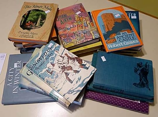
Here’s what I brought home for $23. A few are for Ellen, but most will go on my “to be read” shelf and end up reviewed here. There were no breathtaking finds, but quite a few good books that I’ll enjoy reading. And the money goes to a worthy cause, so it’s a win-win.
March 25, 2013
Lettering Style Reference Books
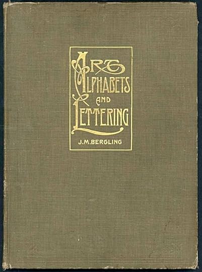
I love books and I love lettering. While I usually focus on fiction when I’m looking through old book stores and used book sales, occasionally a visit to the Art section will turn up a treasure like this, an ideal reference book for hand-lettering of the past. This one was published in 1914.
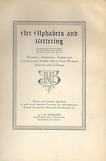
The title page with the author’s monogram. This book is pretty old-fashioned, leaning heavily toward Art Nouveau which was already going out of style I think, but it has lots of great work and interesting alphabets and lettering samples.
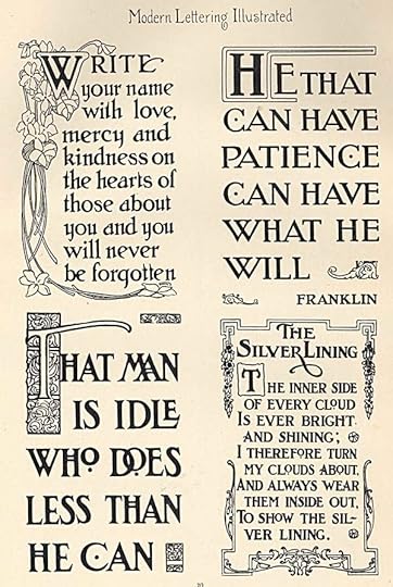
I look through it from time to time for ideas. I don’t do much hand lettering any more, but there are places where I can still use it, in my own prints for instance.
Berglin was clearly good at what he did, and published several other similar books that I haven’t seen. This one was reprinted in paperback by Dover Books at some point, though I don’t see it in their current catalog.
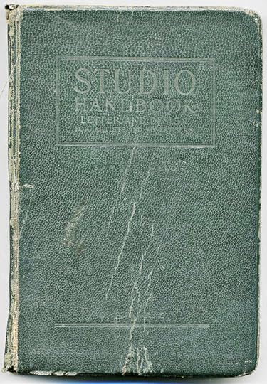
On Facebook, a group of letterers are talking about this similar book by Sam Welo from 1927.
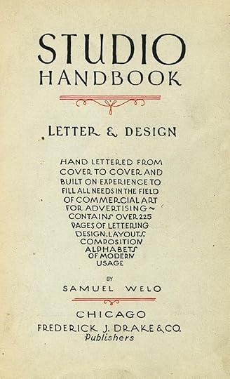
Welo is another fine craftsman, and his book has been a long-time reference for ace letterer Tom Orzechowski.
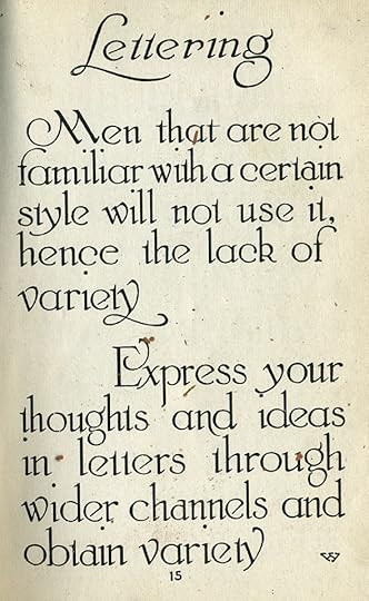
Some of the pages could fit right in with the older book I have, like this one.

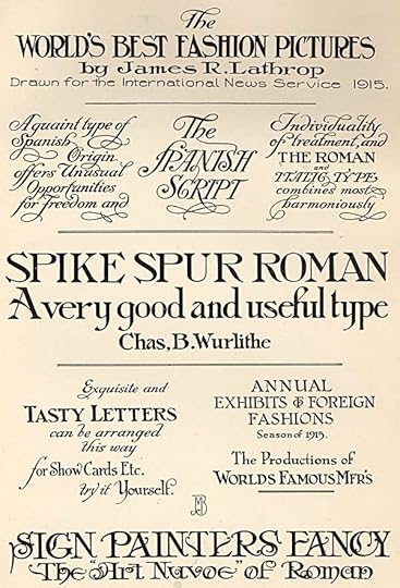
Others are more obviously from the 1920s, and lean toward Art Deco and showcard lettering of that period.
You can clearly see in it not only the styles used in advertising through the 1940s, but also the kind of logo and title design used in early comics as well as pulps, slick magazines, movie posters, film titles and so on. Lots more interesting ideas, and much of it can be found online HERE.
Styles have changed a lot, and this sort of thing is dated now, but still useful for reference and inspiration, especially when going for a period look. Keep an eye out for this sort of volume when you’re book-hunting.
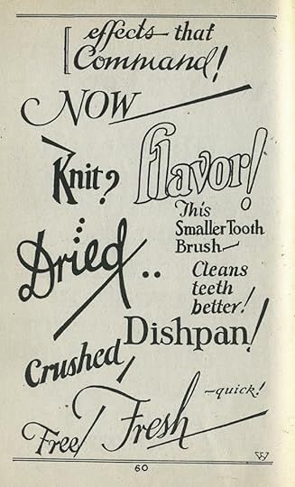
March 23, 2013
Pulled At Random From My Files #4
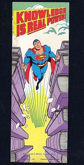
Images © DC Comics, Inc.
Here’s something I worked on thirty years ago. I did the logo for this image created for the American Library Association. This is the bookmark, rather small and a bit the worse for wear. It’s been sitting on one of my bookshelves ever since, occasionally used as intended. There was also a much larger poster. The Superman figure is from the DC Style Guide, 1982 edition, pencilled by José Luis Garcia-López, inks by Dick Giordano. Don’t know who did the books, but probably someone on the DC production staff.
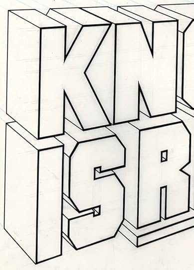
I did the logo quite large on Denril plastic vellum, I’m just showing part of it here. You can see some of the faint pencil guidelines for the front of the letters (black pencil) and the two-point perspective telescoping (blue pencil). A fun project, and the sort of extra thing that came my way when I was on staff at DC.
March 22, 2013
And Then I Read: GREEN LANTERN CORPS 17, GREEN LANTERN NEW GUARDIANS 17

Images © DC Comics, Inc.
In this issue writer Peter Tomasi is exploring the life of Guy Gardner, particularly his pre-Corps life in an interesting way, by having the First Lantern open up Guy’s past to feed off his emotions. There are some impressive visuals by Fernando Pasarin and Scott Hanna, particularly the opening spread on pages 2-3, which forms an overview of that life in detail. The villainous First Lantern seems a typical bully in the “I’ve been tortured for aeons, now that I’m free I’m going to torture everyone else” style, not terribly interesting, but the looks into Guy’s past are. Nicely done.
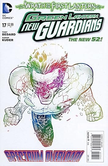
In this book the First Lantern gives Kyle Rayner a similar treatment, though here his focus is more on showing Kyle how his life could have been better if he’d never become a Green Lantern. In both these books, while the villain isn’t too compelling, the back stories revealed are, and it’s a clever way to introduce character development rather than just stage another slugfest. Again, the art by Aaron Kuder is quite impressive.
Both books are recommended.
March 21, 2013
Incoming: NEMO, HEART OF ICE
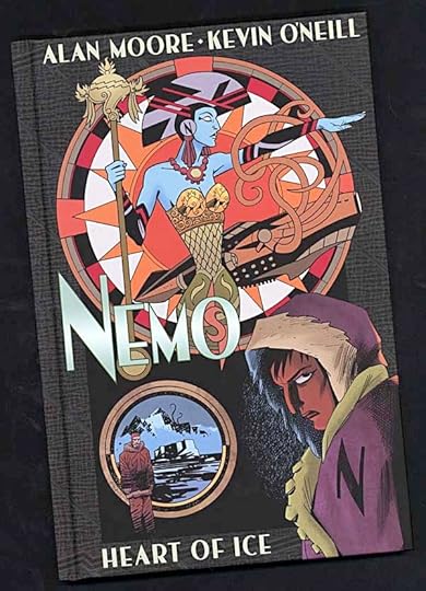
Image © Alan Moore and Kevin O’Neill.
Just arrived in my mailbox, a copy of the latest installment of The League of Extraordinary Gentlemen that I lettered and designed (with Kevin) signed and with notes of appreciation from Alan and Kevin. Looks great. It’s hardcovered with a glued binding, since someone always asks about that. Vibrant colors by Ben Dimagmaliw, and sent from the Gosh Comics signing in London by co-publisher Joshua Palmano. I love my job on days like this!
Todd Klein's Blog

- Todd Klein's profile
- 28 followers

