
Todd Klein's Blog, page 286
February 15, 2013
Volunteer Appreciation
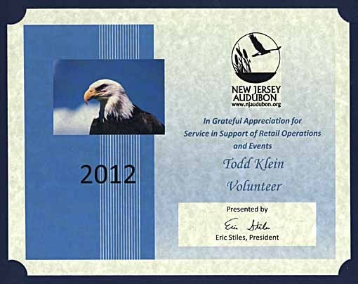 this evening I went to the annual party for volunteers of New Jersey Audubon’s Cape May Bird Observatory and came home with this certificate of appreciation, as did about 30 other volunteers. I’ve been helping out there since 1990, putting a few hours in at the Cape May Point center’s front desk once a week (when I can) and helping lead field trips on the spring and fall weekend events. It’s always nice to be appreciated! The volunteer force there is strong, and it feels good to help an organization that I believe in, one that helps preserve and educate about the natural world.


February 14, 2013
And Then I Read: RASL Volume 4 by Jeff Smith
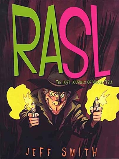 Image © Jeff Smith.
This is the finale of the story that’s taken some time, and four collections to tell, and a very satisfying one. Jeff Smith has deliberately gone in a very different direction from his BONE for this series, and it has paid off for this reader. The story is told in a film noir style, grim and gritty, terse dialogue, suspense, sex and sly trickery. Add to that a science fictional theme of alternate realities opened up by the discovery of lost notebooks of maverick science pioneer Nikola Tesla. The main character, called RASL by some, begins to explore these worlds and steal artwork from them, but he’s soon pursued by the guy seen above, who also has the world-hopping technology. The girl — there’s always a girl in these stories — has different personas on different worlds, but all are somehow involved with or attracted to RASL. Then there’s the massive project in the desert also using Tesla’s lost knowledge to try to create weaponry and energy, but things are going all wrong.
It’s a complex story told with deceptively simple and appealing art, and Smith fills us in on some of his research in each collection. It reads like a great 1940s-50s film combining the paranoid science fiction of, say, “Invasion of the Body Snatchers” with, perhaps, “The Maltese Falcon.” Great stuff and highly recommended!
“Logo of the Day” reaches #300!
 Image © DC Comics, Inc.
Over on my “Todd Klein, artist” page on Facebook I’ve just posted this logo, designed by me probably in 1985 for WHO’S WHO IN THE DC UNIVERSE #10. While lacking the research and detailed info of my Logo Studies here on the blog (see my LOGO LINKS page), “Logo of the Day” does get a lot more logos out there for people to view and enjoy, and each entry includes what I know, if anything, about the designer and first use.
Even if you’re not on Facebook you can still access these albums at the following links:
Or so I’m told, when I go to the links it opens my albums from within FB. See if it works for you, and click on individual logos to read more about them. A new album will begin tomorrow.
February 13, 2013
And Then I Read: AQUAMAN 14, WONDER WOMAN 14
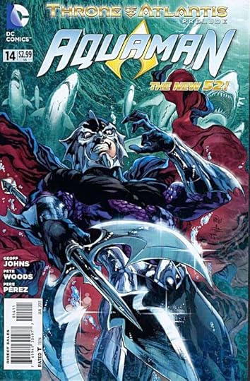
Images © DC Comics, Inc.
This issue is a prologue to the “Throne of Atlantis” event. I’m pretty tired of these events, though I suppose they drive sales. At least in this case Aquaman is the focus, and I’m also reading JUSTICE LEAGUE, where the story goes next. While the story opens with an 1820 shipwreck, the main storyline focuses on a meeting between Aquaman and his brother, apparently the current ruler of Atlantis. It’s a meeting that intrigues, but poses more questions than it answers. Meanwhile, Black Manta is a prisoner in Belle Reve, DC’s prison for super villains. There he has an interesting encounter with his jailers. And in Norway we see life for former Atlantean Vulko is getting more complicated. Okay, so far so good. The art by Pete Woods and Pere Pérez is pretty good, though not as good as the previous regular team.
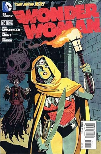 In WONDER WOMAN, the focus is on the children of Zeus. Perhaps it’s not giving to much away to say the other children of Zeus, since Diana has been revealed as one, too. Diana is on a quest to find and apparently befriend her siblings, and they are a suspicious and violent bunch. With good reason, as they’ve been persecuted by Hera, Zeus’s wife, as we learn about Siracca, the one shown above. Another is in Antarctica, motives still uncertain, and on Olympus the backbiting and intrigues continue. I’m enjoying this book, though the Wonder Woman here doesn’t seem to have much in common with the one in JUSTICE LEAGUE. The art by Tony Akins and Dan Green looks good.
Both books are recommended.
One million views PLUS…

When I opened my blog stats page this morning I noticed that the all time views had topped 1 million! It’s actually well over that, as I didn’t install the stats plug-in until May 2008, but began the blog in July of 2007. So there are probably at least 100,000 more views, I just can’t prove it. No matter, I’ll take this and be quite pleased with it. Recent high traffic to my post about Comic Sans from 2009 put it over the top, traffic from a mere link in a YouTube video about that silly font. Views of my recent Thor Logo Study have been good, though. On we go…
February 12, 2013
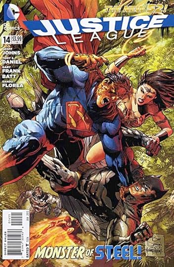
And Then I Read: JUSTICE LEAGUE 14, GREEN LANTERN CORPS 14
Images © DC Comics, Inc.
Cheetah, the Wonder Woman opponent, is the focus of this second of two parts. The history of the Cheetah persona is explored when the League meets her worshippers in the Congo jungle, while Diana is battling Barbara Minerva, the woman who has taken on the persona and made it an evil, angry, vicious thing. At the end of the story we get more romance between Superman and Wonder Woman, which should make some folks happy. Hey, it’s a nice break from the violence at least. The Shazam backup has plenty of violence as Sivana and Black Adam come to New York in search of the Rock of Eternity. Meanwhile Billy Batson is just beginning to get a handle on his Shazam powers and what they might do for him and his friends. I see trouble ahead for them. The art on the main story by Tony Daniel and two inkers is quite good, as is the backup by Gary Frank.
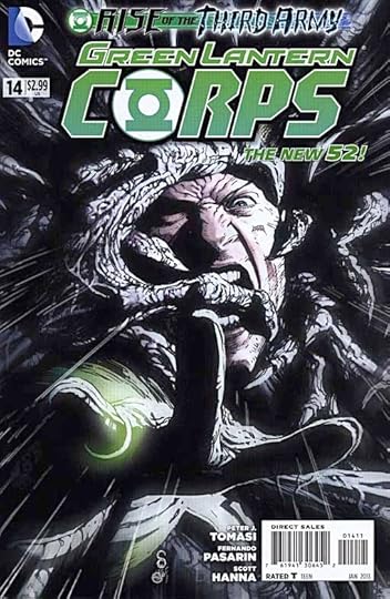
The “Rise of the Third Army” event is going on in all the GL titles, but the Third Army itself is mainly in this one. It’s kind of a typical zombie-like group who want to turn all the Corps members into zombie-like beings such as themselves, and they’ve been given lots of power by the Guardians to do so. Even Guy Gardner barely escapes their clutches in this issue. Of course the Guardians are behind it all, hoping to wipe out the Corps and replace it with their mindless drones, who will gradually add every sentient being in the universe to their number. Those Guardians, always making trouble. Why they need such an elaborate method to reach their goal is unclear, but it does make for eventful action. Back on Oa, Salakk and Kilowog are still trying to be true to the Corps and their masters, but it’s getting clearer all the time that can’t last long. And John Stewart has an interesting reunion of his own. The art by Pasarin and Hanna is quite good.
Both books are recommended.
February 11, 2013
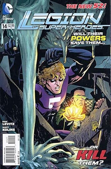
And Then I Read: LEGION OF SUPER-HEROES 14, FLASH 14
Images © DC Comics, Inc.
I’m not sure what appeals to me about the Legion of Super-Heroes at this point in my life. Perhaps it’s that team dynamic set against a future world where, in general, life is good and science has continued to advance in cool ways, much like the Star Trek universe. Of course, life is often not so good for members of the Legion, or there would be no story. Brainiac 5 is trying to uncover the way that Comet Queen was turned against the group in the last storyline, delving into her mind. Cosmic Boy is seriously wounded and in hospital. Element Lad and Chemical King are trailing raiders from Braal with powers greater than their own. Other crises and investigations continue in other places. One thing that’s different these days is, the League is very spread out. The art by Scott Kolins is in an open line style, which I think might be new, that I find appealing, and is probably quicker for him, too. At times it’s a little cartoonish, but not enough to distract from the story. Good coloring by Javier Mena helps.
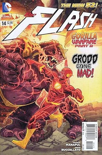 In FLASH 14 we have more battles with Grodd and his super gorillas. While I’m still not fond of the current belligerent but kind of stupid Grodd, giving him the Speed Force powers of Flash himself makes this a tough battle for Barry Allen, and a story that held my interest. Subplots involving the Central City police crime lab, the injured Doc Elias, and the missing Iris West are moving along slowly this time, but it all works pretty well. And the painted-style art and coloring by Manapul and Buccellato looks great, as always.
Both books are recommended.
February 10, 2013
And Then I Read: VON BEK by Michael Moorcock
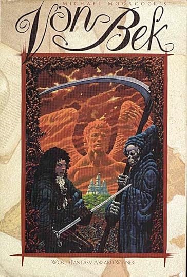
© Michael Moorcock, cover art by Janet Aulisio Dannheisen.
I’ve now completed this Moorcock omnibus, volume 2 in his “Eternal Champion” saga, as collected by White Wolf. I’ve already reviewed the first two Von Bek novels inside, The War Hound and the World’s Pain, and A City in the Autumn Stars.
The third novel is “The Dragon in the Sword,” and while most of it takes place in an elaborate fantasy setting with multiple worlds, the main characters are from our Earth in a fairly modern time. The viewpoint character is not a member of the Von Bek family this time, but Moorcock’s “Eternal Champion,” here calling himself John Daker, but acknowledging many other roles and names, including that of Elric, probably Moorcock’s best-known version of the character. Ulrich von Bek plays a sidekick role throughout the book, and he comes from Germany in our world, or one much like it, during the time the Nazis are in power. The two men meet in the Middle Marches, Moorcock’s name for a variety of fantasy realms and other dimensions connected to our own by diffcult to find gateways, and resembling our world in varying degrees, though most seem to have magic and godlike beings or talking animals at least.
Daker and von Bek form a partnership against a hostile world, fighting off attacks from the first humans they meet, until gaining the deck of a huge ship that sails/travels the endless marshes of the world they’ve found themselves in, one of six joined worlds. Daker is recognized as a famous person on this world, Prince Flamadin, apparently another persona of the Eternal Champion, and does not dispute the claim. Important people on the six worlds are gathering for a massive meeting/celebration at a place where the six worlds can occasionally join together. They are soon embroiled in all kinds of politics and intrigue at this meeting, where Flamadin is denounced as a murderer. His sister (or Flamadin’s sister, it gets complicated) is out to become the despotic ruler of the entire six worlds by aligning herself with a prince of Chaos. Flamadin and von Bek, and their allies begin a desperate quest for a magic sword that is the only thing which can stop her. The sword lies deep within Chaos itself.
While I did enjoy the action and creative world-building of this novel, I have to say I don’t like the narrator/viewpoint character as much as the other books. Daker/Flamadin/Elric and on and on is a glum and often depressed character forever mooning about his lost love. Von Bek is more to my liking, I would have preferred him as the narrator. The sword they seek seems to be the same one that Elric used, but at a different place in the saga, not yet the deadly absorber of souls. The other characters in the story are entertaining, including an Amazonian race of warrior women and a group of intelligent bears. The villainess and her many allies are effective foes. The quest itself is well done.
There’s also a short story rounding out the book, “The Pleasure Garden of Felipe Sagittarius,” which is a noir detective murder mystery in brief, full of characters that we know from Adolf Hitler to Albert Einstein, but all playing different roles than in our world. Not a bad story, but the character identification game kind of distracts from the plot.
In all I enjoyed this book and would recommend it. I have to admit it hasn’t convinced me I need to read a lot more of the “Eternal Champion” saga any time soon, but I might try more eventually.
February 9, 2013
Blog problems
If you’ve tried to access my blog’s home page in the last 24 hours, you probably got an error message. I’ve been working on this problem, and I believe it’s now fixed. Please report any broken links or error messages you get while visiting my blog. Thanks!
February 8, 2013
Logo Study: THOR Part 3
[image error]
All images © Marvel Characters, Inc.
The character Thor’s own title was missing for a few years during the mid 1990s, as part of a deal with Image Comics, but he returned to a relaunched title in 1998 that reused the Alex Jay logo, still looking as timeless and appropriate as ever. Even fighting all the other trade dress on this cover, it shines.
In the fall of 2001, Marvel asked Comicraft to design a new Thor logo. John “JG” Roshell took the design lead, as he often does, and has graciously shared his design sketches and notes, which are quoted below.
[image error]
JG writes, I’m a huge fan of Celtic manuscript lettering, so my first few attempts were along those lines. This was a combination of two alphabets I scanned out of some Celtic lettering books. I used the H O and R pretty much as-is, while creating a new T and taking the knot work to fill it in.
[image error]
The same lettering shapes (except on the T) without the fill.
[image error]
A basic type treatment using our font Golem for THOR.
[image error]
I’m pretty sure the editor asked for a shorter, squatter version without “The Mighty” tagline. They were going back and forth on whether to use that or not.
[image error]
[image error]
Hey, these are pretty cool! Did I really do these?  I dig the heavily stylized thick-and-thins!
3A is the same thing without the shading and outlines. I’m pretty sure the letters-along-the-edges-as-roughening idea came from Richard (Starkings). I definitely wouldn’t have thought of that. The font for that is Stonehenge (also used for THE MIGHTY in #2).
I dig the heavily stylized thick-and-thins!
3A is the same thing without the shading and outlines. I’m pretty sure the letters-along-the-edges-as-roughening idea came from Richard (Starkings). I definitely wouldn’t have thought of that. The font for that is Stonehenge (also used for THE MIGHTY in #2).
[image error]
Changing gears to something more typically comic booky, using our font Treacherous Curves.
[image error]
A gothic/olde Englishe attempt. I was probably picturing the AC/DC logo.
[image error]
Aaaand everything old is new again. The editor liked the little edge letters, but suggested trying them on (something more like) the Alex Jay Thor logo.
[image error]
Getting close — combined the weight and proportions of #6 with the corners and ends of #4. (The taglines are all in Treacherous Curves.)
[image error]
Final: shrank “The Mighty” and added a gold outline. Done! I believe they used it with and without the tagline.
[image error]
Thanks for your insights, JG! The logo first appeared on THOR #45 in 2002, shown above. Of JG’s sketches, I love #1! That would have made a great THOR logo, even if it does use Celtic knot work and uncial letterforms, which were associated with the Norsemen’s foes rather than themselves. 2 and 2A have an appropriate notched roughness, and Norse Runes look, while 3 and 3A are more like European calligraphy. The addition of the rune-like font as texture/shading is clever, and adds Norse context to the idea. I think it works even better on the final version. 5 is cool, but perhaps too Germanic. The final version works well for me, even though it does borrow some elements from the Jay logo, or maybe because of that. My only suggestion would have been to widen THE MIGHTY and move it away from the T in THOR a little. And the starker color contrast for the runes makes them too obvious in this color treatment, I like them better in the more subtle style Roshell submitted. In all, it’s a fine logo, with good weight, historic context and visual appeal. It stayed on the book and other Thor titles for several years.
[image error]
Marvel’s Max titles always go their own way, and for this 2003 book, a new logo was created, though I don’t know by whom. The slightly rough stone-like beveling is a Photoshop effect, but one that I think looks good here, giving the title an archaic feel. The letter forms are just a bit rough and primitive, and I like the way the left leg of the H tucks under the T. VIKINGS is not as well done, and may have begun as a font.
[image error]
Later issues dropped the beveling and gave THOR a thicker outline. Still looks good to me, though VIKINGS is now revealed as much weaker and a bit hard to read.
[image error]
2007 brought another relaunch of the title using Roshell’s logo, but without the runes and taglines. Still looks fine, and is perhaps is cleaner and more iconic this way.
[image error]
For a few issues in 2009 the Thor logo was replaced by this rather bland type treatment.
[image error]
But a stronger influence from some point in 2010 was the release of the Thor movie logo, which uses the font Trajan, like dozens of other films. The modern digital version of Trajan that’s most used was designed by Carol Twombly in 1989 for Adobe, and the film “Titanic” was one of the first to use it in 1998. Since then, it’s become almost the standard movie poster and title font, not to mention lots of other uses on book covers, magazines, TV show titles, and even comics, with Marvel’s “Civil War” event being a good example.. It’s based on the carved letters from Trajan’s Column in ancient Rome, which has long been a cornerstone of all Roman alphabets, but the overuse of the font is becoming tiresome and almost comical. Hollywood seems to think it adds gravitas and importance to any film. I can only sigh and beg for more diversity!
[image error]
This new Thor title from 2010 followed the Trajan highway, though made the letters a little thicker for better impact. Having them closer together also allows them to be larger. The tagline and credits use Serpentine Bold, another font that has been ridden into the ground in my opinion.
[image error]
This Thor logo from 2011 is similar to Trajan, but actually a little less interesting. I’m sure it uses a font, not sure which one.
[image error]
Another new Thor title from 2011 also uses a type treatment with very thick sans serif letters, but interesting textures and art inside the letters, and clever design work, make it attractive. Again, I’m not sure what font this is. In the current age of type-based logos, one might wonder where the originality of logo design has gone, and where the Thor logo might go next.
[image error]
Here’s your answer: back to the Alex Jay logo for this new 2012 relaunch, with a type-based tagline. Even so, this is a welcome return, and one that I’m very happy to see! I hope Marvel continues to use this fine logo for many years to come.
Looking back over the Thor logos, it strikes me as interesting that no one ever tried to incorporate his hammer into the logo, either as the T or behind the letters. I guess the relatively thin handle on the hammer would make it a poor T, but having it behind might have worked.
Hope you’ve enjoyed this logo study, more can be found on the LOGO LINKS page of my blog.
Todd Klein's Blog

- Todd Klein's profile
- 28 followers

