
Todd Klein's Blog, page 287
February 7, 2013
Logo Study: THOR Part 2
[image error]
All images © Marvel Characters, Inc.
With issue 338, cover-dated December, 1983, THOR gained a magnificent new logo that I feel is the best one he’s ever had to this day. It was designed by Alex Jay, who has written about the logo’s creation in depth on his own blog. Here are links: Part 1, Part 2, Part 3, Part 4, Part 5, Part 6, Part 7, Part 8. Go there for the full story, I’m going to pull a few images and discuss them below.
[image error]
What Alex Jay did in approaching this logo is to look at ancient letterforms that might suggest the age and Norse origin of the mythic character the Marvel one is based on. This would be Norse Runes, whose very angular shapes can be seen in this first set of logo sketches. Runes were essentially made of all straight lines, easy to carve in stone or other hard materials. One characteristic feature is the angling of cross strokes like the one in the H in THOR, but you can see it in THE MIGHTY as well. Since the first line needed to go at the top, he’s made the T very large and put THE MIGHTY next to the top stroke so the logo keeps a rectangular shape. And in the second sketch above we can already see the beveling that will emerge in the final version, another way of adding bulk and depth to the letters besides the more typical telescoping seen in the other sketches.
[image error]
In these sketches Alex is incorporating another ancient style from Celtic manuscripts like “The Book of Kells,” Uncial letterforms, which are more curved and rounded. It’s most obvious in the O of THOR, but also in THE MIGHTY, and there are subtle curves everywhere. While Uncial is not associated with the Norse, and in fact was used by their enemies and prey in the British Isles, it’s probably equally ancient. By blending the two styles he’s come up with a unique and appealing approach. Both the O and R in THOR are unusual open shapes that still read well, yet have a freshness that illustrates Alex’s talent.
[image error]
Here’s a later sketch of the THOR version chosen by Walt Simonson, with his suggestion for the R incorporated, he didn’t feel Alex’s was what he wanted.
[image error]
And developmental versions of THE MIGHTY, with the final one at the bottom. This leans more heavily on Uncial with almost no Rune influence. The forms are a mix of upper and lower case, the T, G and Y are upper, the H and M are lower, the E and I could be either. There’s something appealing about having the H’s extend above the top line and the Y and G a bit below the baseline. It adds interest that letters all the same height would lack. And the letter forms have a nice bounce to them with no true straight lines and just the suggestion of serifs.
[image error]
The final logo adds one more element, a heavy outline on the inner shapes of THOR with lighter ones on the surrounding bevels, something that will help the letters read well and stand out no matter the color scheme. I love this logo, I think it’s Alex’s best ever. It stayed on the book through Simonson’s run and beyond, until issue 432 in 1991. But in comics, nothing is forever. New creators and editors want to put their own stamp on continuing titles, and one way to do that is to give them a new logo.
[image error]
Issue 433 saw the debut of this logo, but it’s a little hard to see with such dark coloring, so here’s a brighter version:
[image error]
I don’t know who designed this logo, but I have to say I don’t like it much. THE MIGHTY uses a simpler type of beveling on standard block lettering while THOR tried to take a modern approach with an opening in the left stroke of the R. I don’t find that particularly effective or appropriate for the character, but what I like even less is the O. It’s drawn with circle and oval templates, but does not follow the slant of the other letters correctly, looking all wrong and standing out like a sore thumb to my eyes. Sure, it’s big and readable, but quite a disappointing follow-up to the Alex Jay logo that came before it.
[image error]
Issue 467 in 1993 had another new logo, but this cover hides much of it, so here’s a complete version:
[image error]
Once again I don’t know who designed this logo. While I like it better than the previous one, it seems kind of an odd approach for a superhero based on a Norse god. Very curvy, almost suggesting 1960s rock posters in THOR. The large, blocky serifs add a little power, but the mix of those with the curves seems mismatched to me. THE MIGHTY looks like it might be a font, though not one I can put my finger on. Could THOR also be a font? If so, it’s one I don’t know. The outline shape and drop shadow add depth and open an area for a second color, good ideas, but the overall effect doesn’t seem right for the character to me.
[image error]
Issue 491 brought another logo, and I do know the designer of it: myself! Here’s a more complete (and vertically stretched) version:
[image error]
I was asked to design a new Thor logo in 1995, and I’m pretty sure I suggested they go back to the Alex Jay one, but instead they wanted a new design. This was done on the computer, and my submitted versions are below.
[image error]
Designing logos using an Apple computer was still pretty new for me at the time, and I was experimenting with adding to existing fonts. This idea began with the font Albertus, but I changed or added on to almost every part of it. The only real survivor I see are the top ends of the H. I added diamond-shaped serifs at the bottom, diamond-shaped elements through the middle, and large serifs at the top of the T, among other things. I was going for something with a Norse feel, perhaps suggesting pointed weapons or metal studs, and I thought this direction worked pretty well. Marvel was always going for pointy and dangerous logo approaches then, too, so it had that working for it.
[image error]
The second idea began with the font Benguiat Bold, and again I built on to it, though the shapes of the font are more visible, particularly in the R. I added those pointed diamond-shaped serifs to the bottom, this time with regular squared serifs incorporated as well, and exaggerated serifs on the top of the T. I don’t think this version is as successful as the first one.
[image error]
Marvel liked the first idea best, but asked me to widen the bottom of the font. I did this reluctantly, I thought it would have looked better with the top wider, but they were paying, so I gave them what they asked for, including a version with telescoping, which I don’t think they ever used. Later they came back with another change I liked even less, which you can see in the printed version above: stretching the right arm of the T out across the entire logo and dropping the other letters below it. To me this throws off the balance of the entire logo and looks quite wrong. But again, they wanted it, and I provided it. Sometimes that’s the way it goes with logo design.
Thor’s logos since 1995 follow in the third and final part of this study. More logo studies can be found on the LOGO LINKS page of my blog.


February 6, 2013
Logo Study: THOR Part 1
[image error]
All images © Marvel Characters, Inc.
Like several other important characters in the Marvel Comics superhero revival of the 1960s (Iron Man and Ant Man for example) Thor first appeared in an ongoing anthology title, JOURNEY INTO MYSTERY. As the title suggests, it previously featured short horror and mystery tales, but issue 83 brought a new hero culled from Norse myths by writer Stan Lee and artist Jack Kirby, though Lee handed the actual scripting (really adding dialogue to Kirby’s pages) to his brother Larry Leiber for many of the early stories. The title began in 1952, and the logo designer is unknown to me, but may have been Artie Simek who seems to have lettered at least some of the early covers. He lettered this one too, including the burst introducing The Mighty Thor. The word THOR is in the rough, ragged style Simek often used for the names of monsters, but it does at least have the look of something quite old, which is appropriate for a character from myth. This lettering style for Thor was used by Simek, who was lettering nearly all the Marvel covers then, on other JOURNEY INTO MYSTERY covers.
[image error]
On the splash page inside we see a larger version of THOR by Simek in a similar style, but with the edges even more angular like chipped or pitted stone. MIGHTY is more rounded, and more like the cover blurb, while THE is in simple rounded open lettering. Not a great superhero logo, but again it does at least have an archaic feel. I’m not sure if this version was used on later splash pages, I don’t have them. Was this the only time the character was “Thor the Mighty” rather than “The Mighty Thor”? I don’t know.
[image error]
Here’s another JIM cover with a similar approach for THOR, though the very dark coloring makes it almost unreadable.
[image error]
For issue 89 a different approach gives the character’s name a more superheroic style that is almost a logo, and shows the direction that will be followed when the character gets a real cover logo. The letterforms are open and sans serif with very wide strokes. The edges are mostly clean and smooth with rough edges only at the stroke ends. Clearly this cover was pushing the superhero aspect of the character in every way, including the blurb. And unlike many characters, Thor’s name is short, allowing for the letters to be large, usually a good thing.
[image error]
Nothing was really settled yet, as we see on the following cover, where THOR is in a much more typical block letter style with slightly rounded and curved outlines.
[image error]
With issue 99 in 1963 the block letters of THOR are straighter again, and for the first time THE MIGHTY is inserted into the top of the T. The stroke weights on this version are uneven, but it’s not really a logo, just a cover blurb by Artie Simek, perhaps done in a hurry.
[image error]
A very similar approach was used on inside splash pages around this time. Here’s the one from issue 106, the next earliest I’ve found. Again, sort of a logo, but not quite.
[image error]
With issue 104 in 1964 the success of the character finally gets him a real cover logo. This was very likely designed by the team of Sol Brodsky and Artie Simek, as per information from Mark Evanier. While we don’t know who did what exactly, it’s likely Brodsky, then Marvel’s production man, probably did a layout or design sketch, or possibly even full pencils, while Simek did the finished logo. You can see how it follows ideas from JIM 89 and 99, but now the letterforms are much more regular and even. The horizontal strokes are wider than the vertical ones, which also taper a little toward the bottom. The edges are mostly smooth, but stroke ends are jagged, and jagged gaps are used in the O and the top of the R so the balance of smooth and jagged is more evenly distributed. The outline is heavy, and there’s a telescoping dropshadow in black to give the letters more weight and help them pop off the page. THE MIGHTY is in more even and regular sans serif block letters, once again inside the top of the T, which wisely keeps the logo compact and rectangular, an easy fit with other cover lettering. As a superhero logo, it’s not bad. There’s nothing particularly Norse about it, nothing that really relates to the character, but I found it appealing as a kid, and still do.
[image error]
Marvel must have liked it, too. When the title dropped JOURNEY INTO MYSTERY and became just THOR with issue 126, they kept the same logo. And this logo continued on the title for a very long time, until issue 337 in 1983. It was the longest-lasting of the 1960s Marvel logos, I believe.
[image error]
Two other logos did show up on Thor Annuals. This one from 1971 is clearly based on the splash page logo of Artie Simek seen above. I find it a bit too cartoonish for the character.
[image error]
This one from the 1976 Annual is better, but still not as good as the regular logo. I don’t know who designed it, but perhaps it’s the same person who tended to mix square letters with round ones in other Marvel logos of the time. Either the oval O or the squared R need to be changed for this to look good for me, probably making the R rounded would be the best idea. Either way, not a great design.
[image error]
Walter Simonson took artistic control of the regular title with issue 337, cover-dated November, 1983, both writing and illustrating the character. He wanted to give Thor an entirely new look, and that included a new logo. As we see here, he had his character Beta Ray Bill smashing the old logo, heralding that change. There’s no denying the Thor logo had outlasted its time, in 1983 it looked old-fashioned and had to go. We’ll continue with the new logo next.
More logo studies can be found on the LOGO LINKS page of my blog.
February 5, 2013
And Then I Read: RAGEMOOR by Strnad and Corben
[image error]
Image © Richard Corben and Jan Strnad.
I think this is the first book I’ve bought after reading an excerpt or related story in DARK HORSE PRESENTS. Corben is always great on horror material, and Jan Strnad has had a long and effective partnership with Corben since they teamed up at Warren in the 1970s. There’s something a bit crude about Corben’s art, and he’s somewhat cartoony in his approach to figures, which I think makes him all the more effective at horror. The contrast of the lighter approach with sometimes grim and gruesome subject matter makes it work, at least for me. Strnad has concocted a gothic tale of a sort of living castle and its caretakers that have survived in some unnamed mediaeval setting for centuries. Castle Ragemoor is both setting, stage and character for the melodramatic and horrific events of the story. There’s a beautiful and well-endowed woman (as in many Corben works), a somewhat hapless young man infatuated with her, his resourceful manservant, and all sorts of creepy creatures in Ragemoor. It reminds me a bit of the work of writer William Hope Hodgson, but filtered through underground comix and EC horror sensibilities. The art is presented in black and white (except the covers of the four original issues) with classic Corben airbrushing for added atmosphere. The entire book is fun to read in a guilty pleasure sort of way, nothing too intellectual here, but you’ll have a good time.
Recommended
February 4, 2013
And Then I Read: GREEN LANTERN 14, GL NEW GUARDIANS 14
[image error]
Images © DC Comics, Inc.
As the “Rise of the Third Army” storyline rolls along in this title we begin with the Guardians being devious, then switch quickly to the newest Earth Green Lantern, a Mr. Baz, being confronted by the Justice League. Baz is almost as much in the dark about his own new ring and powers as the League is, and no one is trusting anyone here. Later we see the long-imprisoned missing brethren of the Guardians having an unexpected visit from someone who will undoubtedly cause lots of trouble.
Not much about the actual Third Army here, and no sign of Hal Jordan, but the story by Geoff Johns is entertaining and the art Doug Mahnke and a quartet of inkers is quite good.
[image error]
Over in New Guardians, Kyle Rayner is still working on absorbing the powers of all the different colors of power rings, with the help of Carol Ferris as Star Sapphire. Dealing with the Indigo and Yellow powers in this issue, Kyle is making progress, though it remains to be seen toward what exactly. The story by Tony Bedard is keeping me reading, and the art by Andrei Bressan and Amilcar Pinna is pretty good.
Both titles are recommended.
February 2, 2013
Video clips from our Belize trip
As mentioned previously, my camera also does video. I didn’t take a lot, but linked below are some of the best clips. Includes parrots. Note that a clearer version of this is on my “Todd Klein, artist” page on Facebook.
February 1, 2013
And Then I Read: SWAMP THING 14, WORLD’S FINEST 6
[image error]
Images © DC Comics, Inc.
Since I’m not reading ANIMAL MAN, I’m getting only half the “Rotworld” storyline. I think half is about enough, maybe more than. As often happens, we’re in an end-of-the-world-as-we-know-it situation, with most of the population of earth apparently wiped out or part of The Rot, with only a small island of The Green still fighting, the area where Swampy finds himself. Sorry, but I can’t buy into this scenario. If it were happening in all the DC books, maybe, but even then you know it’s going to be temporary. I’d much rather focus on the smaller but more interesting stories of a few key characters, as we were before “Rotworld” began. Yes, it’s a chance for Swampy to get large and stomp on things, but really, so what? The few pages devoted to Abby in this issue were the only ones that really interested me. The art by Yanick Paquette is great, though his layouts can be difficult to “read,” which doesn’t help a story like this which is already somewhat confusing.
[image error]
In this title we have the alternate world Huntress and Power Girl battling Robin from the current Batman and Robin title. Have they always been on the same world, or did something happen that I missed? Maybe it happened in the EARTH 2 book that I’m not reading.
In any case, Paul Levitz tells a good story almost in spite of the lack of explanations as the ever cocky Robin tackles a Huntress who used to be a Robin on her original Earth. Lots of nice dialogue and entertaining action. The Power Girl story has her trying to track down “energy” from Apokolips, Darkseid’s world, where the monster she’s recently faced apparently came from. Again, nice character moments even though the story doesn’t get far. The art by Kevin Maguire on Huntress and George Perez and Sandra Hope on Power Girl is mostly quite good, though Maguire’s final image of PG is pretty far off model. I like the note on which the issue ends, makes me want to know more.
SWAMP THING is not recommended this time, WORLD’S FINEST is.
January 31, 2013
Rereading: GLORY ROAD by Robert Heinlein
[image error]
© Estate of Robert Heinlein, cover art by Paul Lehr.
“Glory Road” was the first novel of Heinlein’s I read that was not aimed at younger readers (his “Juvenile” series, which is anything but juvenile). I actually read it serialized in “Fantasy and Science Fiction Magazine, where it was graced with two wonderful covers by Ed Emshwiller, both miles better than the one above. Here they are:
[image error]
[image error]
I was twelve when I read it, and though I was already a Heinlein fan, this book enshrined the man as one of my favorite authors, and he remains so. It had many elements that appealed to me, not the least of which was a sexy woman who first appears without clothes, and continues to be uninhibited throughout. Though it would take me a few years to get to it, Heinlein was, I think, taking a break from the heavier works like “Stranger in a Strange Land,” one of his most important books, and having some fun with this lighter work that is more of a fantasy adventure story harkening back to pulp novels like those written by Edgar Rice Burroughs. Of course, Heinlein uses that framework to expound on his philosophical ideas, as always, but the main thread of the book is adventure, romance, and action.
E. C. Gordon has just come off a tough Army stint in Southeast Asia, and has managed to get discharged in Europe, where he soon gravitates to the French Riviera, specifically an island where clothing is optional. There he is approached by a stunning beauty who calls him “beautiful,” but leaves without giving a name or abode. E.C. is distracted by the fact that he may have an Irish Sweepstakes ticket worth a lot of money, but soon an advertisement grabs his attention, one that begins, “Are You A Coward?” and promises danger, adventure and rich rewards for the right man. The ad seems almost written for E.C., so he applies, and finds his mystery woman, who E.C. calls Star, is behind it. She whisks him off to a distant planet, along with her assistant Rufo. The three soon embark on a dangerous quest to find an artifact called “The Egg of the Phoenix.” E.C., now calling himself Oscar, is in charge of combat operations, a role he finds he’s pretty good at, though he’s not so good at dealing with the locals on this planet, and his homegrown morals keep getting the three of them in trouble. Together they face many physical threats, from fire-breathing dragons to a being called the “Eater of Souls,” before reaching the object of their quest. What happens afterwards puts the entire adventure into a whole new light, and turns things around in a way that only a master like Heinlein could.
Great book, and I think one that will appeal to anyone who likes adventure stories. This is just at the point in Heinlein’s career before his personal philosophies began to take such a strong role in his work that it puts off some readers who might not like or agree with them. There are plenty of things to provoke thought, but it’s done lightly, and with humor, and doesn’t get in the way of the fun.
Highly recommended.
January 30, 2013
And Then I Read: CURFEW & OTHER EERIE TALES by L.M. Boston
[image error]
© Estate of L.M. Boston, illustration by Elisabeth Vellacott.
There’s something a bit melancholy about reading the last new book you’ll ever read by an author you love. Boston is a favorite of mine, best known for her series of “Greene Knowe” children’s novels, six long ones and some shorter books for younger readers. They are full of magic and wonder, and haunted throughout, as was her own home, an 11th century house called Hemingford Grey in Cambridgeshire, England, the setting for many of her works. The one title published by Boston in her lifetime that I could never find is a play called “The Horned Man,” which makes up the second half of this book, the first half collects short stories by Boston, three never before published.
I have to admit the short stories did not appeal to me much. They are all horror/ghost stories that can bring a chill, but none of the characters came to life for me as the ones in her children’s books do, even though some of the stories feature children. Perhaps the most unusual of the lot is a story called “Pollution” about the corrupting influence of factories in the English countryside and the strange evil things it brings forth, a story that I think H.P. Lovecraft would have recognized as kindred to his works.
“The Horned Man” is much better. It takes place in the home of an English judge in what I’d guess is the late 16th century, a time when witches were being hunted and persecuted by King James and his lawyers. One such, Mr. Upjohn, is about to visit Sir Martin’s home, using it as a base for his witch hunting. The judge is not pleased about this, but his daughters, particularly the older two, Philippa and Bess, are thrilled that an important young man from London will be visiting, and they hope to impress him. Just before the arrival of Upjohn, a wandering, homeless old woman appears before the home of Sir Martin, and before long is caught up in the witch hunting, accused by Martin’s daughters, unjustly, as they offer the old woman in sacrifice to handsome, clever Mr. Upjohn. Once the wheels of justice (or injustice) begin turning, the girls find they’re unable to stop them, and their spiteful trick becomes deadly serious.
The characters are well developed in their personalities, covering a wide range from innocent to intentionally evil, brave to foolish, sincere to slyly subversive, a great cast in a story that has some echoes of “The Crucible” as well as “The Children’s Hour.” Boston was clearly someone who understood the danger of superstition and how it can be used for evil. And, despite the obvious innocence of the accused witch, there is real witchcraft going on in this story, leading to the destruction of good people by evil hearts and deeds.
I probably won’t go back and reread this book as I do with Boston’s “Green Knowe” series, but it was well worth getting. (And even this recent edition is hard to find, being limited to 350 copies.)
Recommended, if you can locate it.
January 28, 2013
Belize Day 5: Sun At Last!

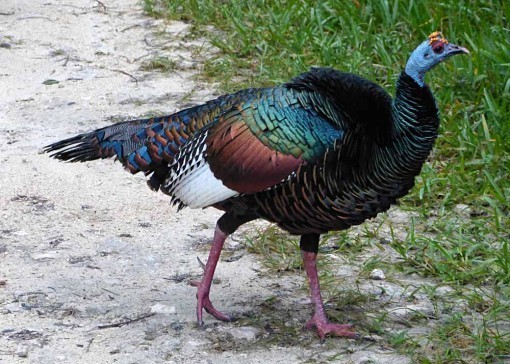
Sunday began for us with a drive to Laguna Seca to look for some water birds. It began well, and we saw some good ones, but after about half an hour it began to pour rain again, so we came back to the lodge. After lunch the weather began to clear, and by mid-afternoon the sky was completely clear and sunny, and we had a great birding walk with Marvin on the trails.
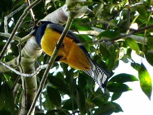
Here’s the Violaceous Trogon, one of three of this showy bird family on the grounds. They are about the size of a large pigeon. They eat fruit and move slowly, so can be hard to find, but are a treat when you do.

The butterflies were also out enjoying the sun. I don’t know the name of this one.

There are over 30 birds of several species with the word Ant in their name, so you can guess what they probably eat, and there are plenty of ants here. I have videos of leaf-cutter ants and army ants that I’ll put up later. This is a Red-crowned Ant Tanager. The largest family of birds here, and worldwide, are the flycatchers. We saw quite a few of those.
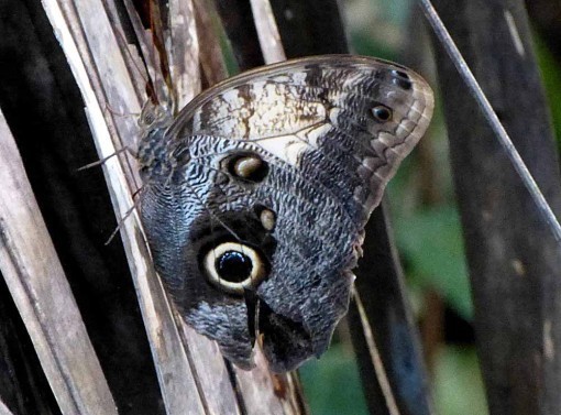
Here’s a Yellow-fronted Owl Butterfly with characteristic large eye spot.
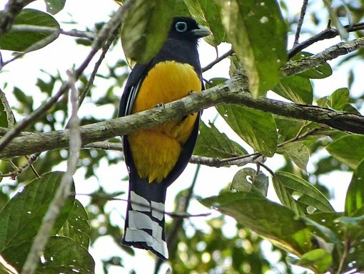
This is a Black-headed Trogon, similar to the one above, but the markings on the tail are different.

The entrance road to the lodge in the sunshine.

The suspension bridge on the lodge road, which the guides are proud to point out is the second-largest in Belize. We saw lots of great birds in this open area.
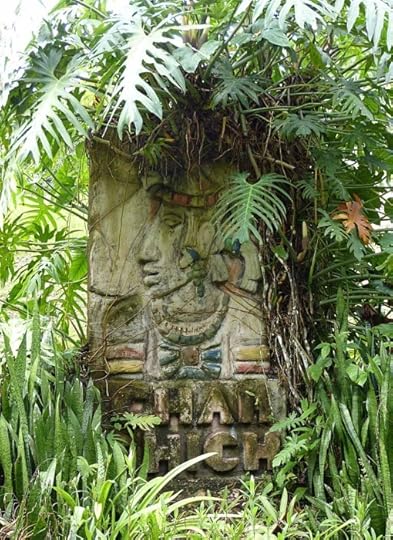
On past cloudy and rainy walks we hadn’t even noticed this entrance carving for the lodge, overshadowed by tropical greenery.

Every day at breakfast and lunch we were entertained by the frantic battles of many hummingbirds at the feeders on the lodge verandah. After numerous tries, this is the best photo I could get of a Long-billed Hermit, the mascot bird of the lodge, and the largest hummingbird here.
We’ve loved our time at Chan Chich lodge, and enthusiastically recommend it to nature lovers everywhere. We’re heading home today, with an overnight in Miami tonight, back home Tuesday. I’ll have some videos from the trip to put up eventually, but regular posting should resume by week’s end.
Todd Klein's Blog

- Todd Klein's profile
- 28 followers

