Todd Klein's Blog, page 290
January 2, 2013
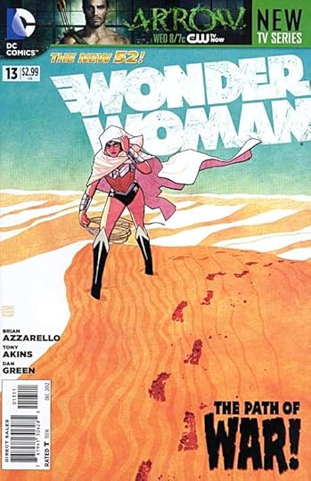
And Then I Read: WONDER WOMAN 13, LEGION OF SUPER-HEROES 13
Images © DC Comics, Inc.
Wonder Woman is back on Earth with an unlikely combination of gods and semigods, and soon finds herself setting out on a new quest to find another semigod that may be able to help her locate the missing child she’s searching for. Meanwhile, on Olympus, things continue to be strange, though the gods are as full of themselves as ever. The art by Tony Akins and Dan Green appeals to me more this time, so I found it a good read. I think Green is a good inking choice for Akins, his heavy outlines work well here.
[image error]
In this title, writer Paul Levitz serves up a mix of Earth-bound politics and space-born action with a number of ongoing storylines amid the dozen or more characters featured. While the character relationships seem rather soap-opera-ish at times, it does keep me interested and coming back for more. This is one book where I don’t habve a favorite character but I like the group dynamic. The art is by Scott Kolins, using an open-line style that reminds me a bit of Moebius, though it’s not as deft as that. Not a bad approach, though, it has a fresh feel, and if details are a little distorted here and there, in this style that works okay.
Both books are recommended, but neither are good jumping-on issues.
January 1, 2013
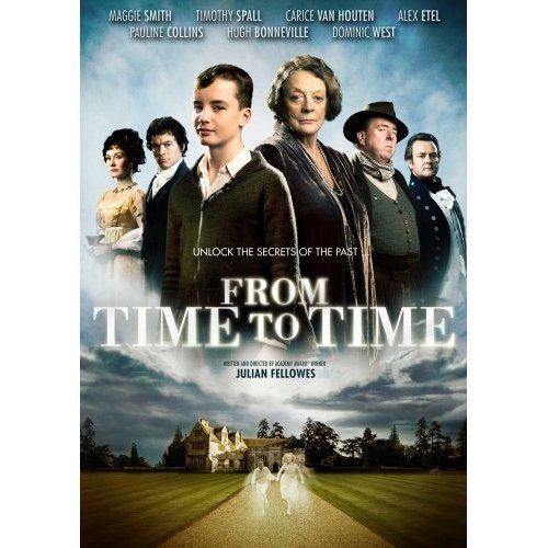
Watching FROM TIME TO TIME
Image © From Time To Time Ltd.
Ellen and I watched this film last evening on DVD, and enjoyed it. It’s based on a book I love, the second in the “Green Knowe” series by L.M. Boston, variously titled “The Chimneys of Green Knowe” in England and “The Treasure of Green Knowe” in America. I like all Boston’s books, but the Green Knowe series is her best work. They center on an ancient family home, “Green Knowe” inhabited by Grandmother Oldknow and in some of the books her visiting grandson Tolly. The house is also inhabited by ghosts to those who can sense them, specifically the ghosts of children who once lived there over the centuries, and in this one the focus is on a sea captain and his family of the early 1800s, especially his blind daughter Susan, and an escaped slave Captain Oldknow has brought home to be her companion, Jacob. Susan is often thwarted by her brother and mother as well as the head servant Caxton, all of whom dislike Jacob and the new freedom he brings to Susan, acting as her eyes. The young black youth is tormented by Susan’s brother Sefton, but manages to get the better of him more often than not.
The film handles all this well, but adds an additional storyline, setting the present visit of Tolly to his grandmother in 1944, and having his father lost during battle in World War Two Europe. Worry about Tolly’s father hangs over everyone in the house, adding drama to the film that wasn’t in the book. Tolly soon finds himself not only meeting the ghosts of Susan and Jacob, but traveling back in time to witness key events in their lives, and even taking part in them a little, culminating in a fire that threatens to destroy the house. In the present day, Mrs. Oldknow’s home is also threatened by mounting bills she can’t pay, and may have to be sold. There’s a mystery and a lost treasure that Tolly is soon in pursuit of adding excitement to the story.
Writer/director Julian Fellowes is best known for his film “Gosford Park” and the TV series “Downton Abbey,” neither of which I’ve seen. He’s done a fine job with this film, even where it strays from the book. Perhaps the biggest change is the house itself, much larger and grander than the one in Boston’s books, which are based on her own home, “Hemingford Grey” in Cambridgeshire, England. I’ve visited that house, where her son and his family still live, it’s open for occasional tours, and it’s a unique experience to walk through and see because so much of the books come to life there. Filming in that house would have been impossible, and the mansion used instead works well enough. All the actors and actresses perform well, with Maggie Smith as Mrs. Oldknow capturing top spot in my eyes. The writing, sets, effects, music, all are well done. I think I’d still choose the book over the film, but I like both. If only the film’s title were better, there have been so many with “Time” in them it becomes impossible for any new one to stand out. “The Chimneys of Green Knowe” would have been infinitely better!
Highly recommended.
December 31, 2012
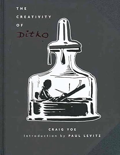
And Then I Read: THE CREATIVITY OF DITKO by Craig Yoe
Images © Gussoni-Yoe Studio.
The second of these beautifully designed and printed oversized coffee-table art books focused on the work of Steve Ditko is just as appealing as the first one, perhaps more so because of some fine articles about Ditko by Paul Levitz, Mike Gold, Amber Stanton, Jack C. Harris, Mykal Banta, and Yoe himself. The bulk of the book reprints stories from Ditko’s years working for Charlton from both the seminal 1950s period and the post Marvel time in the late 1960s-70s. All are reproduced quite large, and scanned well from the original comics. The earlier stories are more appealing to me, presenting Ditko’s art as it was when he began: moody and full of shadows, stylized in a way that I like, showing lots of craft and enthusiasm for the medium. The later work is stiffer, and not helped at all by the very poor Charlton printing, but there are some fine moments there as well.
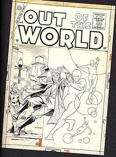
Interspersed throughout are examples of Ditko’s original art from auction scans, not only early Charlton covers like this, but Marvel and DC work too. Then there’s the pencilled unfinished story written by Jack C. Harris and never before published, a gem for Ditko fans, plus early photos of the man from high school and his first studio, shared with artist Eric Stanton.
If you’re a Ditko fan, you’ll want to add this to your collection. Even if you’re not, it’s well worth a look. Highly recommended!
December 30, 2012
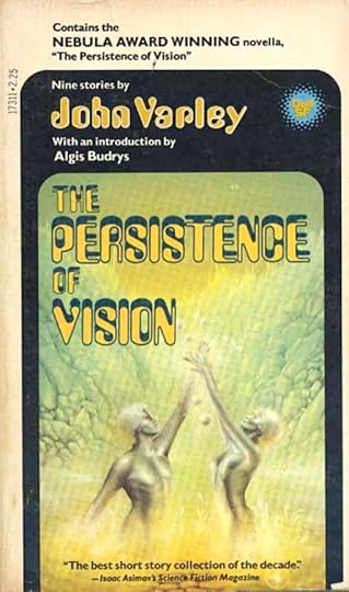
Rereading: THE PERSISTENCE OF VISION by John Varley
© John Varley, cover by James Warhola.
Writer John Varley is best known today for his novels, but he first made a huge impact on the science fiction world with his short stories beginning in 1975. This 1978 paperback collects nine of those early stories, and I can tell you it was quite an unusual thing for such a new writer to have a short story collection published at the time. I read most of these stories in their original magazine publications (in The Magazine of Fantasy and Science Fiction, Galaxy and Isaac Asimov’s Science Fiction Magazine) and they made a strong impression on me. I think most readers of the time felt the same way. Here was a writer who was going places. He had a fine insight into human nature, fascinating ideas about what the future might hold for humanity, and was well-grounded in science. I thought of him as an inheritor of the type of storytelling based on ideas pioneered by Robert Heinlein, and so he has proved to be.
Rereading these stories, I found them just as good as I remembered, but no longer as surprising or shocking in some ways. The world has caught up to Varley at least a little. His vision of technology as not only a tool but as something embedded in every human life has almost come to pass in our wired world. True, we haven’t gone as far as Varley’s imagination yet, but we’re getting a lot closer than we were in the 1970s.
“The Phantom of Kansas” brings us into a world where people can store their entire memory in an electronic “bank,” where gender is something that can be changed at will, where clones are commonplace, and where crime is almost unknown. Despite that, the title character has been murdered several times. She’s an artist, and her medium is weather. She creates events that take place not on Earth, but in vast underground nature parks beneath the surface of the Moon. She’s determined to get her latest creation of tumult and tornadoes performed, and to be there to see it despite the danger it will present to her life.
“Air Raid” is the one story in this collection I don’t care for. It was expanded into a novel, “Millennium” I think (without checking), and made into a TV movie I believe (also without checking). It’s about people from the future to time-travel into past airline disasters with a very complex and specific plan.
“Retrograde Summer” could have been part of the Heinlein “juvenile” series of novels for young readers, right after “Podkayne of Mars” if it were longer and by Heinlein. It reads a lot like his work, and there’s no higher praise from me. A visitor to Mercury has a tough time adjusting to the unusual living methods there, and her family has an equally hard time adjusting to her presence.
I could go on, but let me just recommend this book highly. If you’re a fan of idea-based fiction, you’ll love it.
December 29, 2012
Gaspar Saladino’s First Lettering for DC Comics Part 3
All images © DC Comics, Inc.
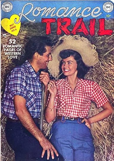
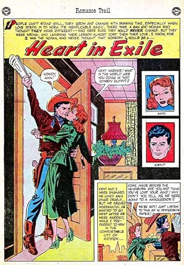
When we spoke in mid December, Gaspar had put some doubt in my mind about JIMMY WAKELY being the first DC comic he worked on, so I did more research. I found a site that shows covers of all the comics published by the company in each month of each year. Looking through 1950 I came to this title, which I’d never seen or heard of before. It ran six issues from cover dates July-August 1949 through this one, May-June 1950. It’s DC’s first romance title, though just by two months, GIRLS’ LOVE STORIES came along shortly after. It was edited by Julie Schwartz, and is certainly a western romance comic, exactly what Gaspar had described. Issue 6 was published the same month as issue 5 of JIMMY WAKELY, where we’ve already seen Gaspar’s work. It looked like I’d hit the jackpot!
Perhaps because it covers two genres, inexpensive reading copies are scarce, but I was able to once again get scans from Michael T. Gilbert of splash pages and then full stories for issue 6, and I thank him for his help.
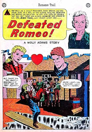
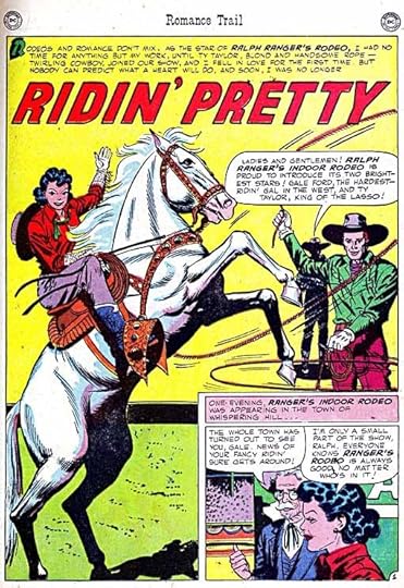
This splash page for the first story certainly has balloon and caption lettering that look like the work of Gaspar to me. Better yet, the art is by Carmine Infantino and Frank Giacoia (as per the Grand Comics Database). Gaspar remembered his first story being drawn by Carmine, so perhaps this was it.
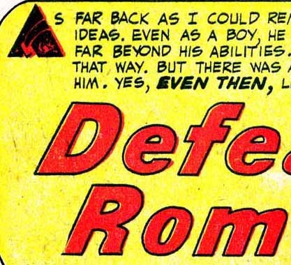
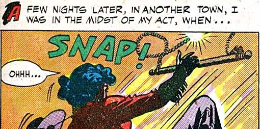
I’m not sure what’s going on with that triangle representing A as the first letter of the caption, I can’t see what it’s meant to be, but the remaining letter forms certainly look like Gaspar’s work, though perhaps just a little less even that what we’ve seen so far. The story title is rather bland, and looks more like something Ira Schnapp might do than Gaspar, but notice the way the R is designed, like a P with the right leg added. This is a characteristic element of Gaspar’s title lettering throughout his career.
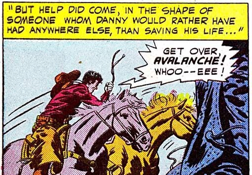
A detail from page 5 has a typical Gaspar burst balloon with all straight lines. The one slightly odd thing is the squared letter A’s in the word AVALANCHE, a variation which appears in this issue but not later work, and only on emphasized words.
On page 7 we find the first of several initial capitals with black shapes behind them, a little more rounded than what we’ve seen before, but quite similar.
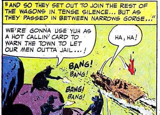
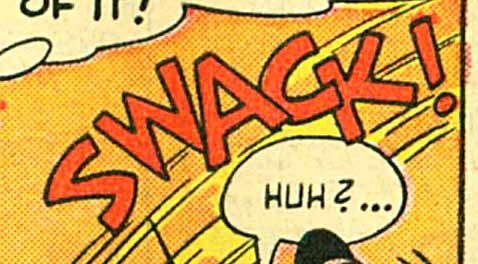
And on page 10 we have some very Gaspar-ish sound effects. In all, I’m sure this story was lettered by Gaspar. And it wasn’t the only one in the issue!
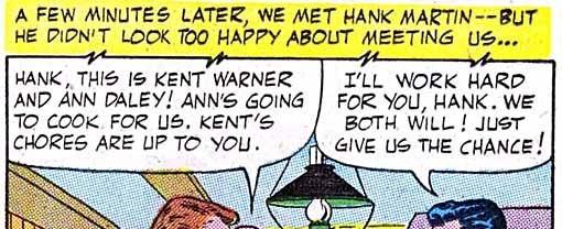
The second story also looks like it has Gaspar’s lettering. The art is again attributed to Infantino/Giacoia on the GCD, but with a question mark. Doesn’t look as much like their work to me, and I think it’s unlikely Julie would have run two stories by the same art team in the same issue and one after the other. Notice the R’s in the title with the same style as story one, and the black shape behind the initial capital.
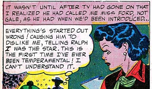
This detail from page 3 has a very Gaspar sound effect and another of those initial capitals. It’s subtle, but I again see some slight unevenness in the letter forms perhaps suggesting that Gaspar was still learning to doing this.
Page 6 has this very typical Gaspar thought balloon and squared, bold I.
The next panel features one of those caption borders with zigzags, clearly tying the lettering style to examples we’ve looked at in earlier parts of this article. I don’t recall seeing anyone else but Gaspar do that, and it’s representative of the kind of energy he always adds to his work.
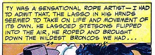
There was plenty of hard slogging for the letterer in those days, as Gaspar remembers. I believe the lettering on this page covers nearly 50% of the entire surface!
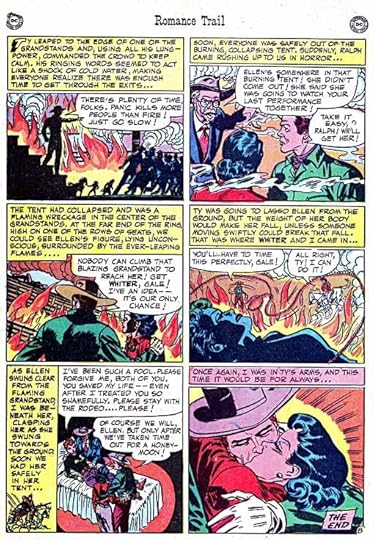
Here’s the third long story in the issue, once again I believe with Gaspar lettering. This title also looks like he was using the work of Ira Schnapp as a guide, but it’s not as well crafted as Ira’s work.
One more example of the zigzag caption line, and here I think the slightly uneven letter forms are more obvious. Don’t get me wrong, this is still great lettering, but I have to admit I feel a little better about my own early work after seeing that Gaspar didn’t lay pen to paper on his earliest stories with a fully developed professional lettering style. From this example, I think we can see him still working that out.
So, ROMANCE TRAIL 6 has three stories lettered by Gaspar, but are they the earliest? Michael T. Gilbert had sent me splash pages for all six issues, and while I didn’t see any sign of Saladino lettering in issues 1-4, there were two stories in issue 5 I thought might be by him. Michael was kind enough to send his largest scans of those stories, but unfortunately they aren’t as clear as the ones for issue 6.
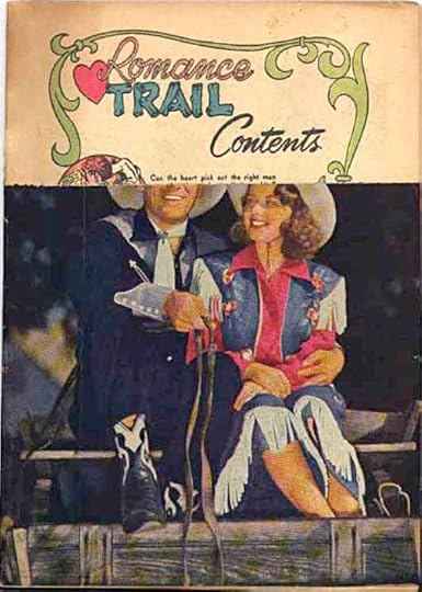
I looked again on eBay, and this time found a low-grade copy of issue 5 with the logo stripped off, something done by newsstands to get credit for unsold copies. (They sent the stripped logos to the distributor for credit, and then sometimes still sold the defaced comics at lower prices, which must have happened here). As you can see, I bought it, and it arrived yesterday, just in time for me to make new scans for this article.
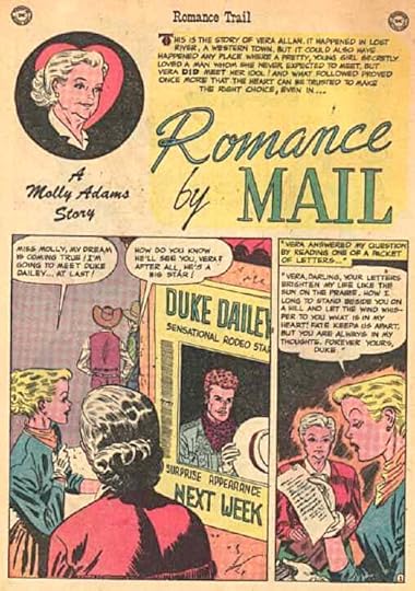
The first story in the book has art by Carmine Infantino and Joe Giella according to the GCD. It certainly looks like Infantino pencils to me. The story title is well done, if rather conservative. I think “A Molly Adams Story” is set in type.
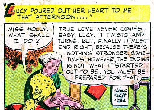
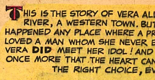
A closer look at the caption shows a decorative T that is not as well done as later ones by Gaspar, but still has a creative approach, a black circle behind it. Again, the letterforms are a little uneven, perhaps a bit more so than the ones in issue 6. The handling of the emphasized DID is not typical of his later work, but many of the style points that indicate Gaspar’s letter forms to me are here.
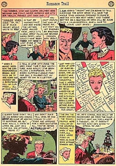
We can certainly say the story had tons of “copy” or things needing lettering, as you can see on this page. There are some details to notice here. The first speech balloon has three quoted words underlined. No doubt they were underlined in the script, but in those pre-computer days that usually meant it should be lettered italic or slanted. I made a similar novice mistake once on an early job for Julie Schwartz, and he came to the production room at DC, where I was working on staff, to tell me “NEVER underline!” I’m not sure why these weren’t fixed before the pages went to the printer, either Julie missed it, or he wasn’t yet set on that rule. The words that are emphasized are uneven in size, look how big ACTUALLY is at lower left. The thought balloon border in that panel uses smaller ovals than usual for Gaspar, and they aren’t as well shaped as later ones, more evidence he was still learning.
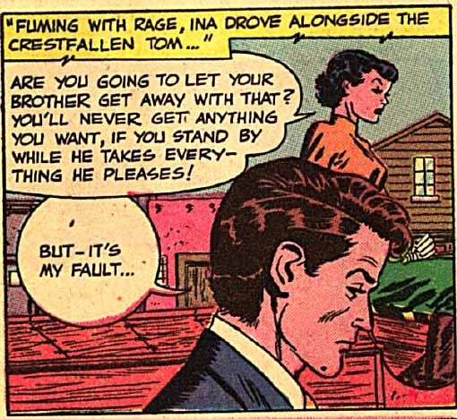
Here’s what I’d call the “smoking gun” of my research: a zigzag caption line found on page 6, one of several in the story. If there was any doubt in my mind that Gaspar lettered it, this dispelled it. I’m convinced I’ve found the very first story lettered by Gaspar for DC! Because it’s not typical of his later work in some ways, I might have missed it if I hadn’t worked my way back like this, so my research has paid off!
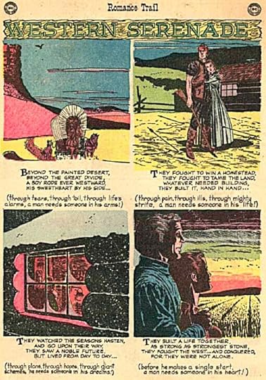
The other piece in the issue I think Gaspar lettered is this one-page filler of illustrated verse with art by Alex Toth. There’s a very nice western title at the top, and then four sections of verse in all caps. then lower case.
The upper case letter forms are very much in Gaspar’s style, and the lower case, while less practiced, shows lots of promise, and puts him on the road to the signature upper and lower case handwriting style that Gaspar used throughout his career.
I called Gaspar again a few days ago to tell him about my new research. “See if this rings a bell,” I told him, “a comic called ROMANCE TRAIL, combining romance and western themes.”
With only a moment’s hesitation he replied, “Yes! That sounds like it. I think you’re right! And the art was by Carmine?” I told him it was on the earliest story. Gaspar agreed it all sounded correct. I said I’d be presenting my evidence in these blog articles, and he could see it there soon. “Okay, I’ll be interested to read that,” he said, and added, “and don’t be afraid to tear me apart, tell it like it is.” While I’ve tried to be honest in my comments here, even starting out I feel Gaspar was way ahead of all the letterers I’ve known. No tearing apart required!
One interesting thing to consider is the timing of this work. Issue 5 of ROMANCE TRAIL was cover-dated March-April 1950. Comics regularly hit the newsstands two months ahead of their cover date for two reasons. First, it would make them seem fresh and new longer, and second it told the sellers when it was time to take unsold copies off the stands. So, this issue would have appeared in January, 1950, and be pulled off in March or April, in time for the next bimonthly issue. I don’t know what the lead time was for separations, printing and distribution, but I’d guess the finished art had to be sent to the color separators at least one month before the on-sale time. That puts the date of actual work being done on the book back into November of 1949 or earlier.
So, if this evidence is accurate, Gaspar’s memory of starting work at DC in 1951 is off by about two years. It also means that the lettering legend, revered by so many of us who came after him, has now produced work in EIGHT decades, from the 1940s to the 2010s! And he’s not done yet. Gaspar told me he recently lettered a story for Dark Horse Comics. I’ll be looking forward to that, and will probably blog about it.
Hope you’ve enjoyed this trip back into comics and lettering history, similar articles can be found on the COMICS CREATION page of my blog.
December 28, 2012
Gaspar Saladino’s First Lettering for DC Comics Part 2
All images © DC Comics, Inc.
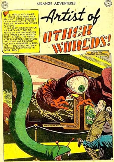
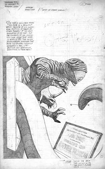
The more I looked at the lettering in JIMMY WAKELY #7, the more I felt convinced that Gaspar had lettered three of the stories in it, even though the man himself didn’t think so. What could I use for evidence to bolster my case? I’d already written about the story above from STRANGE ADVENTURES #13, cover dated Oct. 1951 in THIS article. The art is by Alex Toth (who also did many stories for JIMMY WAKELY), and I knew it had to be lettered by Gaspar. Why? Artist Steve Leialoha owns an unused version of this first page with a note to Gaspar on it! Here’s the page:
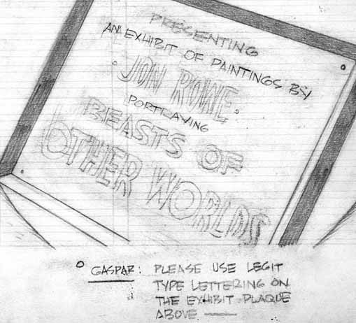
And here’s the note to Gaspar larger:
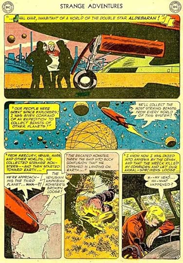
As it turned out, the revised first page didn’t include this sign Alex was writing to Gaspar about, but he clearly knew who would be lettering the story. So I decided I should look for style clues in the pages of “Artist of Other Worlds.” Writer/artist and comics historian Michael T. Gilbert was kind enough to send me scans of the entire story (he’d provided the one I already had of the first page), and lots of style clues emerged. But first, let me point out the story title above as lettered. Once again it doesn’t look at all like Gaspar’s work. Still quite puzzling, but at least consistent with the JIMMY WAKELY stories!
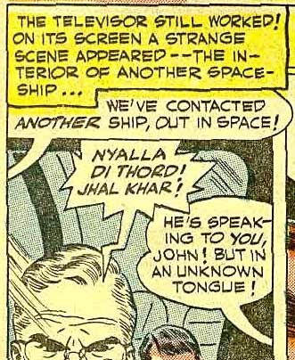
Here’s a detail from the second story page. While the scan is a little wonky, the similarities to the JIMMY WAKELY work are clear. Same initial cap style, same wide lettering with all the characteristic Saladino style points. Same wide balloon tails.
On this detail from a later page, we see the same kind of radio balloon used in the JW stories.
This full story page has more radio balloons, the same initial cap style in the first caption, which also ends in the same kind of scrollwork. I felt I had my case. I made large printouts of both the “Desert Justice” story from JW and this one from SA on my 11 by 17-inch printer and marked them up with notes pointing out all the similarities, and mailed them to Gaspar.
It took him a while to get to them, but when he’d gone over the pages he called to tell me he thought I was absolutely correct. It WAS his work in both, except for the story titles, which is just as puzzling to him as to me. That left only the matter of the date. “You know,” I said, “The STRANGE ADVENTURES issue is dated October, 1951, but that meant it was on the newsstands in August, and likely lettered at least a month or two before that.” Gaspar admitted I must be right. When I pointed out the stories in JIMMY WAKELY #7, cover dated Sept.-Oct. 1950 would have been lettered no later than June of that year, he reluctantly agreed he must have started at DC earlier than he remembered.
Over the weeks this process was going on I continued to look for more reference on JIMMY WAKELY, and on eBay I hit the jackpot. Someone was selling a CD filled with scans of the entire 19 issues for a few dollars! While of questionable legal standing, this was something I had to have, and I bought it. The CD arrived after I had the above conversation with Gaspar, and as I was starting to assemble material for these articles. I began going through the issues page by page. Again, the scans vary in quality, though all are readable at least, and most are clear enough to see the lettering style.
Here’s a sample of the lettering from the first issue. There are a few minor similarities to Gaspar’s work like the long central stroke in the S, but overall it’s very different with narrower, rounder letters, a G with a serif, and so on. Much the same was true for all of issues 1-4. Then I opened issue 5, and my jaw dropped. There were four main stories, and every one of them seemed to be lettered by Gaspar! I had to have a better look, and soon found another reading copy on eBay that wasn’t too expensive. When it came, the actual comic did nothing but confirm my opinion. Here are some scans.
Story one splash page, art by Alex Toth and Joe Giella. Look at that thought balloon’s wide ovals, and the style of the initial capital Y in the caption. The title, while a bit odd, is closer to something I could see Gaspar doing, especially if he hadn’t quite figured out title lettering yet.
Here’s a closer look. The letterforms are very much in Gaspar’s style: wide with mostly straight strokes. The G has a straight right side but no serif, the C is half an oval, the S has that very long center stroke, and so on.
Here’s a detail from page 2 of the story with a very Gaspar radio balloon and another of those open initial caps with black brush shapes behind it.
A detail from page 4 with an interesting very bold and square I, and notice the unusual zig-zags in the caption border. It’s the sort of thing I’ve used to denote a radio or TV caption, but that’s not the case here. I think Gaspar just put it in as a design element to break up that dull straight line. Remember this detail, we’ll get back to it.
A detail from page 5 showing Gaspar’s two most common small balloon styles. Rounded for speech, large ovals for thoughts.
A sound effect from page 6, very Gaspar, especially that angular S!
Are you getting the picture? Here’s the splash page from the second story I believe Gaspar lettered with art by Alex Toth and Bernard Sachs (all art credits are from the Grand Comics Database). The title and logo on this one are by Gaspar too, I’m sure, and look at those elegant scroll captions.
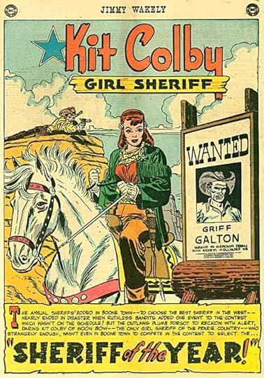
The third story Gaspar lettered, again with a title that looks more in his style, quite creative in the use of broken dry-brush strokes for SHERIFF and YEAR. (The logo is probably an existing one by Ira Schnapp.) The art is by Joe Kubert and Bernard Sachs.
The fourth story has a different style to the initial cap and the title is not as well done or very typical of Gaspar’s work, but again, perhaps he hadn’t quite figured out the best ways to do titles yet. Art by Alex Toth and Frank Giacoia.
Here’s another of those captions with a few zig-zags, and some nice open lettering from the fourth story.
And another sound effect that’s classic Gaspar work.
So, I was convinced that Gaspar had lettered these stories, but before I had a chance to talk to him about it, my research was interrupted by Hurricane Sandy. Ellen and I evacuated to my mother’s place for a few days, then brought her here. Gaspar and his wife live on Long Island in an area hit by the storm, and he wasn’t reachable by phone or email for a few weeks, which had me worried. I finally heard from Clem Robins that the Saladinos had been sent down to Florida by their children, and would stay there until after Thanksgiving.
When Gaspar was home and I finally was able to talk to him on the phone, I told him about my new discovery, but he was skeptical. He’d been looking at the samples I’d sent from Jimmy Wakely 7 again, and wasn’t sure he’d done them. “The STRANGE ADVENTURE story is definitely me,” he said, “but I don’t remember working on JIMMY WAKELY.” I had to say I felt he was wrong, but I probed for anything he could remember about his first lettering work for Julie Schwartz at DC. “It was a romantic western,” he said. “I think the first story I did was drawn by Carmine Infantino. All I remember is there was tons of captions and dialogue.”
After we talked I thought about this and decided to do more research. Could there be another comic I was missing that contained Gaspar’s first DC lettering? The answer will follow in Part 3 of this article. Similar articles can be found on the COMICS CREATION page of my blog.
December 27, 2012
Gaspar Saladino’s First Lettering for DC Comics part 1
All images © DC Comics, Inc.
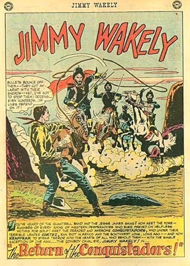
It’s no secret that my favorite letterer and role model in lettering is Gaspar Saladino, and lately I’ve been talking to him about his early days in comics. Gaspar has said in past interviews that his first work for DC was lettering western romance stories for editor Julius Schwartz. Creator credits for comics are usually a matter of guesswork for stories of that era, and educated guesses can be found on the Grand Comics Database, I checked under “Letterer” and “Gaspar Saladino” and “sort by date” and reached page. The chronological first lettering credit they have for Gaspar is for ALL-STAR COMICS #33 cover-dated Feb.-March 1947. That’s way too early, Gaspar was in the service then, so it’s a wrong guess. The next listing is for issue 7 of the comic JIMMY WAKELY that ran for 19 issues, cover-dated Sept.-Oct. 1949 to July-Aug. 1952. The series is about a singing cowboy, so I surmised that might qualify as a romantic western. I thought it might be interesting to see if I could identify the first work by Gaspar on the title.
Gaspar was born in 1926 in Brooklyn, NY. For his high school education, he attended the School of Industrial Art (later the High School of Art and Design) in Manhattan, commuting by subway from Brooklyn. The school was attended by a number of other artists who made careers in comics including Bernard Krigstein, Carmine Infantino, Joe Orlando, and Gaspar’s classmate in the class of 1945, inker Joe Giella. Later graduates included Sy Barry, Alex Toth, John Romita Sr. and Dick Giordano. While in high school, Gaspar did a some inking for the Lloyd Jacquet studio, a packager of comics for various publishers, though he doesn’t remember any specific titles or features. Jacquet was clearly looking for new talent at the school, and was helpful to Gaspar in getting him a desk job in the Army when he enlisted after graduating. That experience provided Gaspar with some familiarity with several aspects of comics work, including the lettering, as in those days (and for many more decades) the lettering would have been already on the pages when he inked them. He says he didn’t do any lettering at that time, though.
Gaspar was in the service about two years, stationed in Japan in a public relations job that didn’t involve art at all. When he got home in 1947, Gaspar told me he was out pounding the pavement looking for work. At some point he put together sample comics pages that he drew, lettered and inked and took them to DC Comics, hoping to find work there. This seems like a natural idea, as several of his high school classmates were already working for the company. Sol Harrison, then in charge of production, showed the samples around to the editors. Julie Schwartz said that, while he didn’t like Gaspar’s art enough to hire him for that, he did like his lettering, and offered him regular lettering work. Gaspar was happy to get it.
When he started, Gaspar told me, they sat him in the Production room between logo and cover lettering man Ira Schnapp and then production artist Mort Drucker (later of MAD fame), and he began lettering work for Julie, and soon other editors like Robert Kanigher and Mort Weisinger. It was freelance work paying $2 a page, but he did it in the office five days a week, lettering about nine pages a day on average, or 45 pages a week. At the end of the week he’d fill out a voucher for the work and get a check. Gaspar said $90 a week pay was good money in those days, and he was quite happy with his new job.
I suspect having on-premises letterers was a fairly new thing for DC then. Ira Schnapp had not been in his staff job for long, but was now busy doing most of the company’s logos, cover lettering, house ads, and some story pages as well. Gaspar told me there were two students from his old high school that were also coming in to do lettering, probably after school. One was a young man named Artie Secunda, the other was a young lady, he doesn’t remember her name. From the early days of comics and in comic strips, lettering was usually provided by the artist, or more often an assistant, but it was part of the product delivered by the artist. Some comics packagers or “shops” had guys specializing in lettering, like Howard Ferguson at Joe Simon’s shop and Abe Kanegson at Will Eisners, but in general lettering was seen as an entry level job one would do on the way toward inking and eventually pencilling. Many artists who came into the comics business in the early days followed that route.
If there were errors or changes needed in the lettering, staff production folks (like Mort Drucker) could do them if there wasn’t time to send it back to the artist, but I can see how editors would benefit from having the lettering done in-house where they could read over it and have changes made on the spot either before or after the art was inked. At DC the inker was often NOT the penciller, further breaking up the art chores into different assembly-line jobs. In essence, DC was creating a production shop of their own, along the lines of those run by Lloyd Jacquet, Joe Simon and Will Eisner, among others. The difference was, DC had more control over the process by hiring each individual worker in the assembly line. Gaspar doesn’t recall anyone else doing freelance lettering at the time he started, though there might have been some working for other editors, and not in-house.
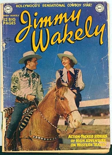
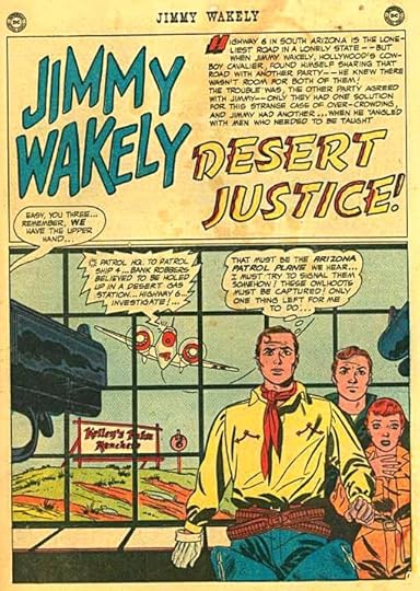
Knowing the time period and the title, I thought I should be able to identify Gaspar’s seminal lettering on JIMMY WAKELY. First I had to find scans of the comics. Some were available online, but not all the issues, and the scans were of varying quality. Of the issues I could view that way, the earliest pages that looked like Gaspar’s work were indeed from issue 7. Wanting a closer look, I ordered a well-worn and not very collectible copy on eBay, above.
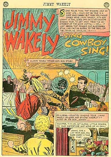
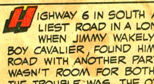
Here’s a detail from the first story in the issue, clearly NOT by Gaspar. The letters are all quite narrow, the S is curved throughout, the G has a serif on the bottom, and the letters are generally not very even. The title page is also not him, nor is it by Ira Schnapp, a possible candidate. GCD lists the letterer as Morris Waldinger, but that seems very unlikely, as he hadn’t started working for the company yet, I believe, so I’d call that a wrong guess.
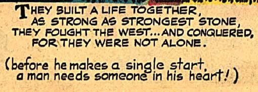
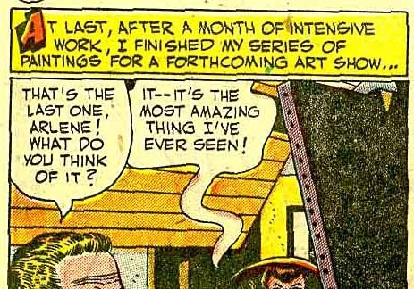
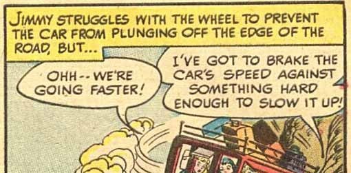
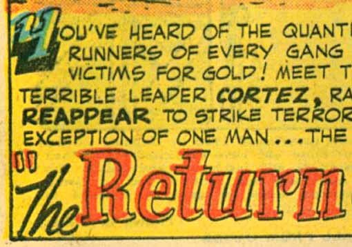
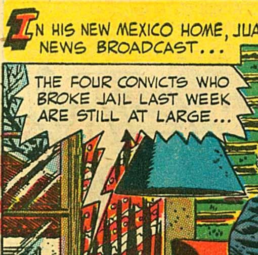
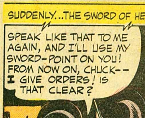
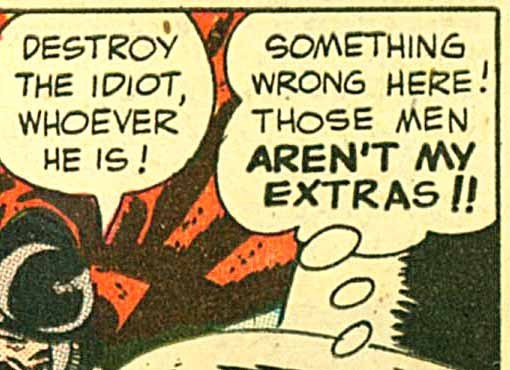
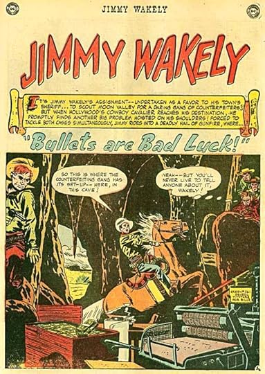
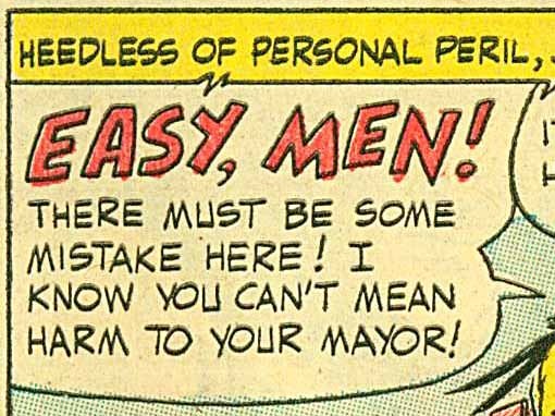
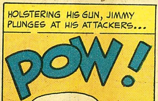
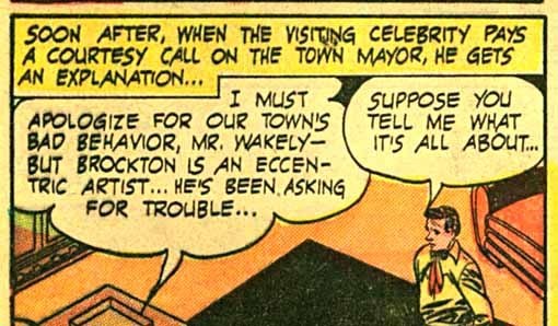
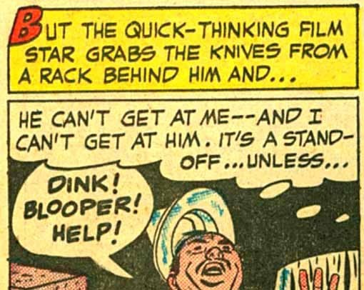
The detail above, and the one at the top of this article are from issue 7′s second story, “Desert Justice,” with art by Alex Toth and Bernard Sachs (all art credits here are from the GCD) and clearly look like Gaspar to me. The letters are wide and even, well formed. The S has a long straight central stroke, the G is squared on the right side, the U is square at the bottom, the loops of the P and R are narrow, the question marks and exclamation points are large. Those are just some of the clues that I look for in Gaspar’s work. In the first example above there’s a scroll caption with a notched end. The radio balloon has large straight points. In the second example, the thought balloon has large loops and a trail of oval pointer bubbles. The other balloon tails are wide. Above all, I was impressed with how consistent and professional this work is! My earliest lettering is pretty awful even compared to what I did a year later, so to see Gaspar starting out at such a high level made me admire his talent all the more. I asked Gaspar if he had studied lettering in high school or later, and he said no. “It was just something that came naturally to me,” he told me.
Another detail from the second story shows an open initial capital that sits on what look like black strokes made with a square-tipped brush, though I’m sure they’re actually outlined in pen and filled in. This is one of the characteristic initial capital styles I found in Gaspar’s early work, another is in the open letter B above, though that’s more typical of all lettering for the time.
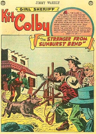
Story three was probably lettered by the same person as story one, not Gaspar, but story four, “The Stranger from Sunburst Bend” with art by Gil Kane and Bob Lander, again looks like his work, including the story title in a handsome scroll.
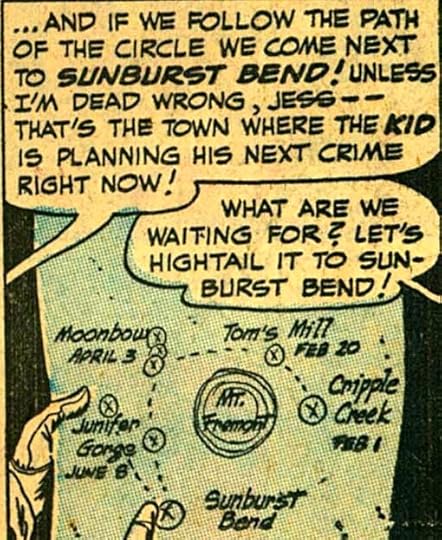
The above example from that story even has some upper and lower case letters on a map that I find very convincingly Gaspar.
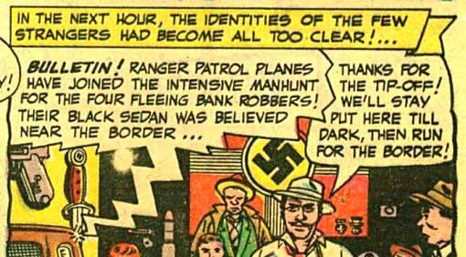
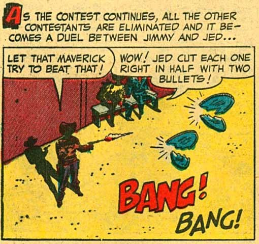
Story five again looks like Saladino lettering. There’s the same initial cap style, and sound effects very familiar to me from his later work. So, even though I hadn’t seen all the issues yet, I was pretty confident issue 7 had three early examples of Gaspar’s lettering.
The only problem was the story titles. Except for “The Stranger from Sunburst Bend,” they didn’t look like Gaspar’s work. This is quite puzzling. Possibly editor Julie Schwartz didn’t have confidence in Gaspar’s title work and had someone else letter them. Or perhaps Gaspar was still finding his way with lettering styles for titles on this western comic.
So, with this much knowledge, I emailed scans of a few of these full pages from issue 7 to Gaspar to see what he thought. “Parts of it do look like my work,” he told me, “but those titles are definitely not my style. No, I don’t think I did these stories.” And when I told him the date of the issue, Sept.-Oct. 1950, he thought it was too early. He remembered starting at DC in 1951. This set me back a bit. More research was needed, and I’ll continue with that next time.
Other similar articles can be found on the COMICS CREATION page of my blog.
December 24, 2012
Christmas Trains
[image error]
You may recall I wrote here a few weeks ago about a train set Ellen and I hoped to set up this Christmas at her sister Ann’s house. The trains, and the houses and other accessories were bought by her dad in Germany when the family was stationed there in the 1950s. The trains are made by Fleishmann, and it’s HO gauge, so quite small, but very well made. After Ellen had this idea at Thanksgiving, we got the trains out of their box (they’ve been in it for about 40 years) and tried them out at our house. They needed oiling, but we ascertained they did work, so we brought them up to Ann’s and here they are. Dave set up a plywood board on saw horses, Zach painted it white, and Ann, Ellen and I set things up last night and this morning.
[image error]
Ann and Ellen enjoyed this trip down memory lane, their father set them up every Christmas for many years.
[image error]
This is the large steam engine.
[image error]
Here’s the diesel engine, which runs, but we weren’t able to get it well lubricated, so it squeaks a lot. We’re keeping it on a siding.
[image error]
The small steam engine is a real work horse and both pulls the best and runs the fastest.
[image error]
Here’s Ellen enjoying running the trains. Later I managed to hook up some street lights, we’ll see how they look this evening. It’s a fine train set, probably worth a good deal of money, but worth more in memories to Ann and Ellen.
If you’re on Facebook, you can see the trains running HERE.
December 23, 2012
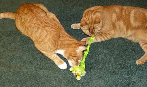
Cat Presents
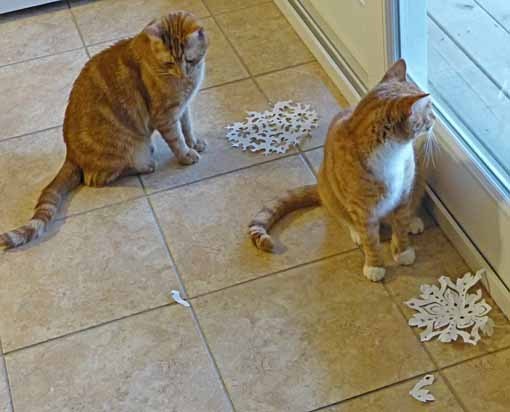
Leo and Tigger say, “Thanks for putting those new paper presents on the window for us…”
“…but we like THIS new present better!”
December 22, 2012
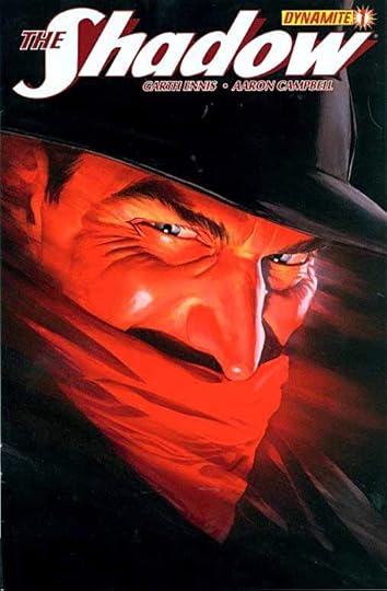
And Then I Read: THE SHADOW 1
Images © Advance Magazine Publishers, Inc.
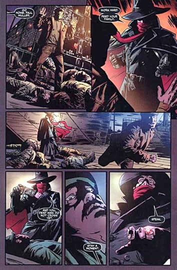
This new SHADOW series from Dynamite, under a great cover by Alex Ross, is written by Garth Ennis. I haven’t read anything by Garth in a while, and I’d forgotten how good he is. He completely gets the pulpy melodrama of this period story, taking place not long before World War Two, and his writing goes beyond that to reach convincingly into the mind and personality of the title character and his urbane alter ego, Lamont Cranston. Cranston plays the cold fish playboy on the outside, but through Garth’s inner dialogue we know more. We also know something that may not have appeared in the original pulp stories: The Shadow has a slight ability to see the future, as well as his famous one of clouding men’s minds. Above all the character is fascinating in his ability to control and/or frighten others, clearly a great intellect as well as a man of action. This is choice stuff, I’ll have to read the collected edition when that comes out.
The art by Aaron Campbell is quite good, full of atmosphere and double-lit shadows that add mystery and menace. It’s not as stylish and art deco as the great work of Michael Wm. Kaluta for DC’s version of the character, but it complements the script well, and is solid work in every way.
Recommended.
Todd Klein's Blog
- Todd Klein's profile
- 28 followers


