
Todd Klein's Blog, page 262
November 15, 2013
Pulled From My Files #15: Marvel Logos
Images © Marvel Characters, Inc.
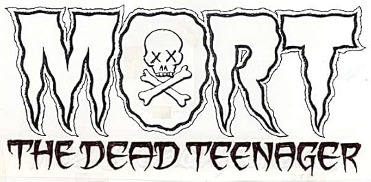
My usual method of designing logos is to work out some ideas in small thumbnail quick sketches, then create full-size marker sketches, like the one above. This is the only sketch I saved for the assignment, so I’m not sure how many I did, but it was usually three to begin with, more if needed.
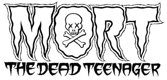
The finished logo is very close to the sketch, with the most obvious difference being the bottom line has thicker letters.
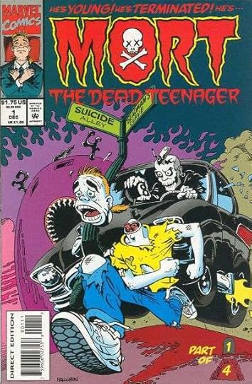
Here’s the printed book, which I never read. Was Mort a ghost or a zombie?
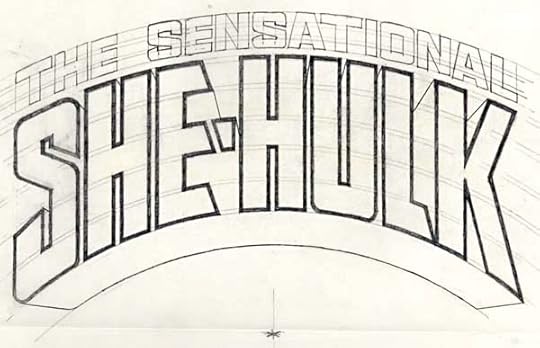
Occasionally I would work out a finished sketch in pencil rather than markers, especially when it required careful measurement like this one. You can see the curved guidelines that kept everything spaced properly horizontally, and the focal point of the perspective lines at the bottom.
The finished logo was made on a piece of Denril plastic vellum laid over the pencils and inked with my Castell TG-1 technical drawing pens. Corners could be made sharp, and any extra ink removed by scratching away the dried ink with an exacto knife.
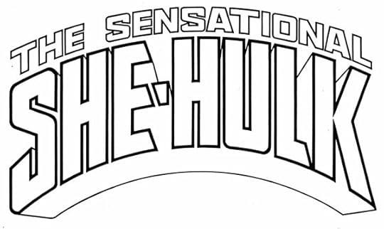
Most issues had at least part of this very tall logo covered by art. Here’s one that’s nearly complete.


November 13, 2013
And Then I Read: BLACK MANTA 1
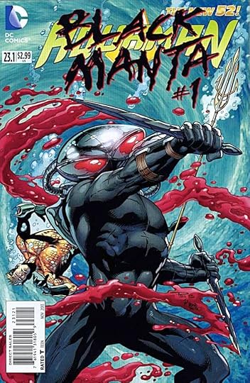
Image © DC Comics, Inc.
Black Manta has never interested me much as a foil for Aquaman or as a character. And I always thought the helmet looked silly. Writer Geoff Johns made him more interesting to me in his AQUAMAN issues, but not a lot, so I thought I’d have a look at this one-off to see if it would change my opinion. Co-plotted by Johns, it’s written by Tony Bedard, who does a good enough job with the task given him, but this issue turns out to be mostly a setup for another crossover event: “Villains United,” which I have no interest in following. We see recaps of Manta’s early past, and he reiterates the reason he has a vendetta against Aquaman, but it’s essentially the same material seen in Aquaman. He comes off here as more of a pawn in a larger game than anything. The art by Claude St. Aubin is quite good: clear and clean storytelling, fine action scenes, and overall a very professional job.
If you’re following “Villains United,” this is for you. I’m not, so I can’t recommend it.
Logo Design: GAMBIT

covers and logos ©Marvel Publishing, Inc.
A short one this time, as I don’t have much material for it. Gambit, one of the X-Men, was created by Chris Claremont and first appeared in 1990. The Cajun card-throwing mutant proved popular, and in 1992 I was asked to design a new logo for the character who would star in his own mini-series the following year. I only have two remaining sketches, here’s the first one:

This is the one they went with, minus the ragged outer line and the four aces. The other sketch I still have is here:

I still like this one, though it doesn’t quite have the pointy impact of sketch 2, which was all the rage at the time. I don’t know what happened to sketch 1 or any other versions. My final, inked by hand on Denril plastic vellum, as was my method in the pre-computer days, ended up very large on the cover of the mini-series, but quite distorted — stretched vertically, and with a drop shadow created digitally, I think. At least, it’s not done the way I probably would have done it. And, on this first cover, printed in gold foil, making it a bit hard to read.

The other three covers of the series hid even more of the logo, but it did turn up again on another series in 1997, and on a continuing series in 1999, the first issue of which is at the top of this article. That version has been digitally traced by someone at Marvel, not me, and given a rounded outline, which I think kind of dilutes the whole pointy thing, but at least it’s fairly close to my original design.
Not much more to say about this one except that I had fun doing it.
November 12, 2013
And Then I Read: ARCANE 1
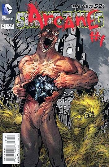
Image © DC Comics, Inc.
I’ve only read a few of the Villains Month special titles, and those because of the writer. Charles Soule has impressed me with his run so far on SWAMP THING, with the exception of his handling of John Constantine. The rest of the cast he’s doing quite well. In this one-off we see Abigail Arcane, the new avatar of The Rot, visiting her uncle Anton in is own private hell. Anton was the previous avatar of The Rot, as well as one of the nastiest people imaginable, and he has not changed here. Abby wants to know more about her mother. With some coaxing and treats, Anton tells her. One can’t imagine it was what she wanted to hear, though, it’s a story of heartless cruelty as only Anton could have engineered and reveled in. And just when you think it can’t get any worse…it does.
The art by Jesus Saiz is excellently creepy and horrific, from the cover on. Too bad you can’t tell who did it until you open the book, but I think fans will notice and remember.
Recommended.
November 11, 2013
And Then I Read: CURSED PIRATE GIRL by Jeremy Bastian
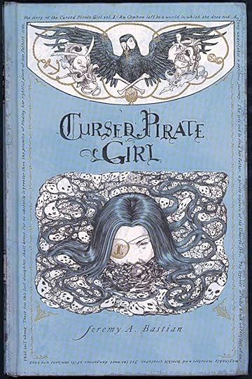
Image © Jeremy A. Bastian.
This handsome hardcover book from Archaia does not stint for effort. From the artist’s intense and detailed drawings (in black and white) to the top quality production values and extras like deckled paper and a sewn binding, it’s a quality package. The story has some entertaining and quirky elements, but the main character did not convince me. She is eternally confident, bloodthirsty and good-humored in the face of every monstrous threat. Yet she looks like a young girl of perhaps 10 or 12 years old, and there is little credibility in her being able to thwart and defeat the huge, strong pirates and other threats she meets without any apparent effort. It’s kind of like putting a girl like that into an action movie against battle-seasoned adult fighters, and having her win without breaking a sweat.
The fantasy elements of the story are interesting, but also hard to accept at times, like a parrot that travels the oceans inside a living fish. Really? The characters other than the pirate girl are actually more convincing, and in general the book is entertaining, but the lettering is quite small, not so good for eyes my age, so that was another problem for me. I wanted to like the book more than I did. As it stands, I can only mildly recommend it.
November 10, 2013
And Then I Read: GREEN LANTERN 24
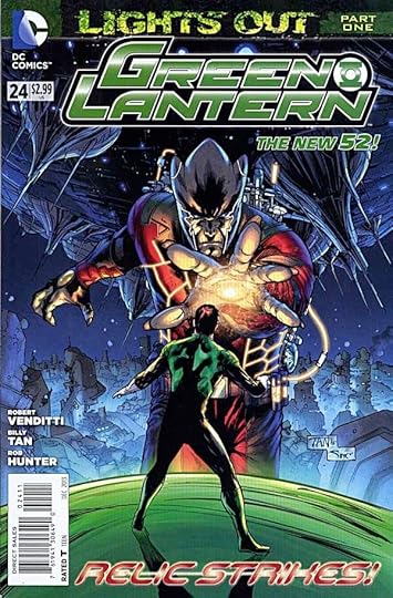
Image © DC Comics, Inc.
This issue purportedly starts a new story arc, but in fact just continues the previous one. The giant, powerful new threat “Relic” has finally arrived on Oa to suck up all the GL power. Corps members from all over, including the other GL titles, are assembling to try to stop him, along with the Guardians (new at their job, and seemingly rather weak). Hal Jordan, the new leader of the Corps, marshalls his forces as best he can, but nothing seems able to stop Relic and his robotic power-leeches. Reasoning does no better than physical attacks. Things look bad. Of course, this is about the sixth time we’ve been to the edge of obliteration with the Corps in the last few years, so I can’t say I’m very worried. Writer Robert Venditti does a good job with the script and dialogue, and the art by Billy Tan and Rob Hunter is fine. Despite that, I feel I can only mildly recommend this issue. It feels like we’ve been here before, and not that long ago.
November 9, 2013
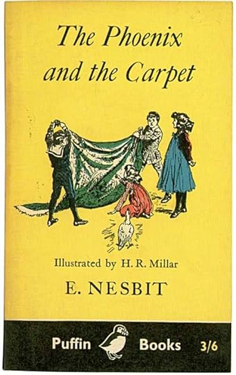
Rereading: THE PHOENIX AND THE CARPET by E. Nesbit
I have this edition as well as a hardcover, but I reread this as a free iBook on my phone and iPad. It’s the second of three connected books featuring the same kids, all involving magic. In “The Five Children and It,” we met The Psammead or sand fairy who granted one wish a day, which always turned out wrong somehow. In this book, the children are at home in London, it’s a dreary late fall when they are looking forward to setting off some fireworks their father bought for Guy Fawkes Day, and in a rash moment, they decide to try them out in the basement play room. The ensuing disaster ruins the carpet, and gets the children punished by having no Guy Fawkes celebration at all, but it also brings magic in the door.
When a new carpet is delivered in a Turkish style, a very large egg rolls out of it. The children try to return it to the store, but find no one wants it there, so they bring it home and put it on the fireplace mantel. Later they decide to do some magic of their own by burning all kinds of smelly things in the fire, in place of real incense. (With matches and real fires available to children of the time, it’s a wonder so many lived to adulthood!) The egg is knocked into the blaze, and suddenly begins to glow with heat, then hatches into a beautiful golden bird. It soon speaks, telling them it’s The Phoenix. The one and only legendary bird, reborn in fire every 500 years.
The Phoenix is one of Nesbit’s most entertaining characters: vain and self-important, always making assumptions about this strange new world it has come to based on very old and out-of-date knowledge. At the same time, The Phoenix wants to help the four children, who deeply desire more magical adventures. Fortunately they have just the thing for that: the carpet now in their play room is a magic carpet that can take them anywhere they can imagine!
Of course things don’t go smoothly. On their very first adventure they get stuck inside a ruined castle because The Phoenix has forgotten to tell them they can only command the carpet to take them somewhere three times in a day. As with all Nesbit magic, trouble is never far away, though there are also some moments of triumph, as when The Phoenix is taken to visit a Fire Insurance company that uses his likeness as their logo, and somehow they all accept him as their actual and spiritual leader. The carpet journeys to all sorts of places, from a tropical island to a real Turkish bazaar, and before long it starts to wear out. As you can imagine, that leads to even more problems!
Nesbit is great reading. Her children are very real, her magic is convincing, and her wisdom and insight into human nature are spot on. Highly recommended.
November 8, 2013
Pulled From My Files #14: Marvel Cover Lettering

Images © Marvel Characters, Inc.
After I left my staff job at DC Comics in 1987 I started picking up some work from Marvel, which I wasn’t allowed to do previously with a very few exceptions. At that time I was doing lots of cover lettering for DC, still all by hand, and pretty soon I was doing quite a bit for Marvel as well. There was a period in the late 80s to early 90s when about half the covers at both companies had some of my lettering on them. Here are a few samples that I saved. Don’t know what issues or even what books they’re from, though the one above is clearly a Spider-Man book.

This batch definitely has some X-Men books in it. The blurb “To Stalk A!” matches the Sabretooth logo I did for Marvel. “Mystique” could have been a logo, I think it’s pretty good still, but it wasn’t.

This batch seems to be all Spider-Man stuff again. In the early years of the Stan Lee Marvel Comics rise, Stan’s cover copy was often this kind of bombastic over-the-top melodrama, while DC blurbs remained much more conservative. By this time period, both companies were doing about the same thing, and lots of it.
November 7, 2013
And Then I Read: SWAMP THING 24
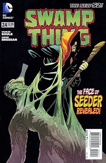
Image © DC Comics, Inc.
This is quickly becoming my favorite New 52 title. The writing is good, and the storyline keeps going in unexpected directions. Plus, it’s a more personal story with a fairly small cast of characters rather than a huge event. Seeder is the new villain that has been troubling Swamp Thing’s world in the last few issues, and his true identity is revealed here. It’s an interesting surprise. Then Seeder and Swamp Thing battle for control of The Green before the Parliament of Trees (looking much reduced from their original majesty). As battles go, it’s rather interesting, reminded me a bit of the wizard’s duel in T.H. White’s “The Sword In The Stone,” though it isn’t that clever. The issue concludes with a plot element I thought I’d never see in this book, and I’m quite interested to see where it goes next. Well done, writer Charles Soule. The art by Andrei Bressan is a little loose and sketchy in places, but overall works quite well.
Recommended.
November 6, 2013
And Then I Read: AQUAMAN 23

Image © DC Comics, Inc.
Aquaman used to be a typical superhero with a few tricks, like swimming at high speeds and directing fish to do his bidding. He spent most of his time at the surface of the water or on land, as I remember him. Of course, there were a lot of stories since then I didn’t read. Today writer Geoff Johns has given Aquaman a story that thrives in deep water and the wonders of the unseen depths. Yes, it’s a human story of a struggle for power in Atlantis, full of treachery and violence, but the setting is as much part of the comic as the people in it. Massive deep water battles and explosions rock an ancient city and civilization who have no interest in the surface dwellers, except as they intrude on their watery world. Huge sea creatures called forth by Arthur have an impact far beyond the cute fish he used to command. Submarines never seemed so fragile as they do in this comic. It’s good reading, if a bit predictable plotwise. Arthur and Mera are fun to watch in action. The art by Pelletier and Parsons is excellent.
Recommended.
Todd Klein's Blog

- Todd Klein's profile
- 28 followers

