
Todd Klein's Blog, page 264
October 25, 2013
Raptor Heaven

That’s where I was today, helping lead two morning birding walks around the Cape May Point State Park at the southern tip of New Jersey. When I volunteer at the Cape May Bird Observatory, people often ask, “What’s the best time to come see the raptor migration?” The answer is, it depends a lot on the weather. Ideal conditions for seeing hawks, vultures, falcons, eagles, osprey and lots of other migrating birds is after a strong cold front has passed through bringing clear skies and strong northwest winds. Those winds push the birds toward the coast, especially the young ones who haven’t done the migration thing before, and then they follow the coast south. Cape May is a migrant trap: young raptors arrive, see the eleven miles of ocean and Delaware Bay between them and the next piece of land, and stop here a while to think over their next move. Most will eventually follow the lead of experienced birds, and soar as high as they can in circling “kettles,” rising up on thermals, then glide across the water to continue their migration. Some might decide to fly up the New Jersey side of the bay to find a closer crossing. In any case, raptors collect in in these conditions, and if you like seeing them, it’s raptor heaven!

I didn’t get any good bird photos today, they were too quick for me, but here’s a photo I found online of one of the day’s best: immature Golden Eagle. Most Golden Eagles stay west of the Missisippi, but a few young birds end up in New Jersey every fall, and we were lucky enough to have good long looks at one soaring overhead today. Another rarity seen was an immature Swainson’s Hawk, another western bird normally.
The sheer numbers were exhilarating. Dozens of Sharp-shinned Hawks and probably hundreds of Turkey Vultures. Plenty of Cooper’s Hawks and Northern Harriers, and sprinkled throughout the day were Bald Eagles, Red-Shouldered Hawk, Broad-winged Hawk, Ospreys, Black Vultures, American Kestrels, Peregrine Falcons and Merlins. In fact, we saw everything you might reasonably expect to see in the fall here this time of year. A super day for raptor watching.
The weather looks good for tomorrow to be more of the same, and I’ll be out there on two walks again. Can’t wait!


Incoming: FAIREST IN ALL THE LAND
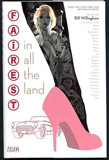
Image © Bill Willingham and DC Comics, Inc.
I had a great time lettering this. Someone is killing the most beautiful women in Fables, and Cinderella is assigned the task of finding out who. Cindy is an accomplished spy, but perhaps not such a good detective…or is she? Writer Bill Willingham has created a “fair play” mystery, in which all the clues are there if you can catch them, and there’s no cheating, particularly hard in a universe where magic is real! The artist lineup is wide-ranging and full of nice surprises.
October 24, 2013
And Then I Read: WORLDS’ FINEST 15
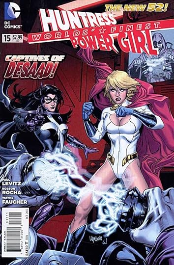
Image © DC Comics, Inc.
If these two thought they had trouble on Earth, Apokolips is bound to be even more trouble. The creative team tries hard to sell this story, but I find any Apokolips other than Jack Kirby’s to be rather dull and dreary, populated by mental midgets with big muscles and weapons, except for a few leaders like this issue’s Desaad. Kirby found ways to put energy and excitement into anything. Harder than it looks. But writer Paul Levitz does well with his heroines, making them believable and resourceful, brave and aggressive in the face of even Desaad. Power Girl does better on the physical side, Huntress better on the thinking side, just like their counterparts in the original WORLD’S FINEST team.
The art by Robson Rocha and Wayne Faucher is fine, they do well with the characters and the action.
Recommended.
October 23, 2013
And Then I Read: THE FLASH 23

Image © DC Comics, Inc.
The battle between Barry Allen and his evil twin Reverse-Flash comes to a climax in this issue, and it’s a corker. There are some character scenes with Iris and Patty, which I enjoyed, but most pages are an epic struggle that explodes with energy. Hard to imagine a more dynamic canvas for two super-speedsters in combat than this. And it’s not just physical, the emotional battle is equally amazing, and some surprising secrets are revealed. Manapul and Buccellato have done it again!
Highly recommended.
October 22, 2013
And Then I Read: LEGION OF SUPER-HEROES 23
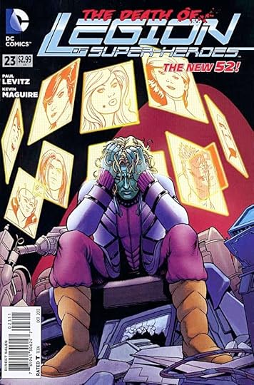
Image © DC Comics, Inc.
Last issue of this run of LSH. Last issue ever? Of course not. The series which began in 1958 has had many incarnations and several pauses, but always comes back for more, and I’m sure it will again. But there’s something really satisfying about this particular book. For once, writer Paul Levitz can give us some conclusions instead of the eternal cliffhangers. Sure, the plot resolutions may not please everyone, they certainly don’t please Brainiac-5, but in today’s comics world it’s refreshing to be able to step away from the eternal fighting, scheming and destruction of most monthly titles for a little reflection and even a smile or two. The art by Kevin Maguire is excellent, best art I’ve seen on this title in a long time. He takes it out proudly.
Highly recommended.
Incoming: SANDMAN OVERTURE 1!
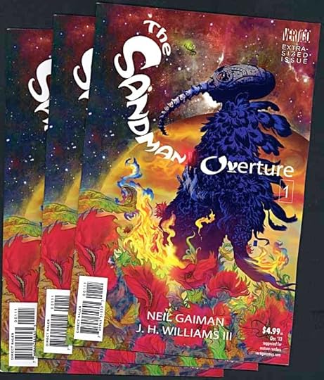
Image © DC Comics, Inc.
Just arrived on my doorstep. Looks fantastic. Prepare to be delighted, Sandman fans!
October 21, 2013
And Then I Read: JUSTICE LEAGUE 23
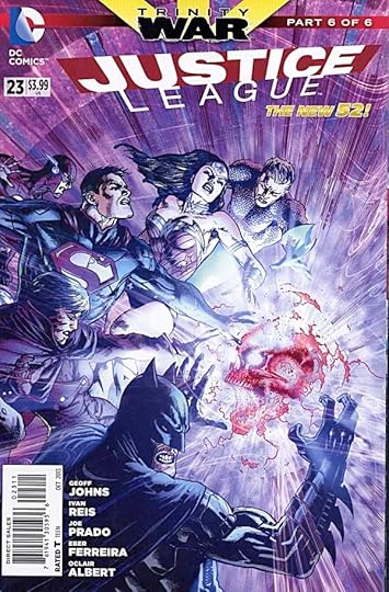
Image © DC Comics, Inc.
The “Trinity War” crossover wraps up in this issue. I’d only read the first two parts of that, but it was not hard to figure out most of the story in this one anyway. Pandora’s Box is the center of attention, a force of corrupting evil, and what everyone wants. It’s also more than that, tying into other storylines. Everybody fights, of course, but there are some nice character and plot developments. Once again there is little resolution, only a lead-in to another crossover event. Writer Geoff Johns continues to mine old continuity and repolish, I kind of like that, but the lack of any sort of conclusion is tiresome. One might enjoy roller coasters, but only if you can stop and get off at some point. The art by Reis, Prado and company is quite excellent as usual.
Mildly recommended.
October 20, 2013
Watching GRAVITY
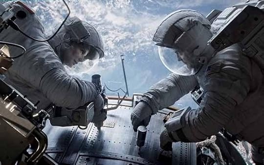
Image © Warner Bros. Pictures, Inc.
When I was a child I devoured science fiction, and dreamed of someday going out into space. Now I feel I have, through this film. I’ve seen actual video of astronauts in space, but it’s always controlled, placid, distant. This film pulls you right in the action, not just through 3D but through an immersive and intense drama that makes the visual beauty of open space as real as the dizzying dangers of free-fall without any means of controlling your own spin and movement. It makes the cluttered, claustrophobic interiors of space vehicles and the impossible fragility of man and his artificial constructs very real as well. Sandra Bullock and George Clooney are excellent in their roles, but it’s Bullock’s picture. She convincingly scrambles from one thin hope of survival to another while being bombarded with both physical and mental debris and roadblocks.
Reading the science fiction magazines, as I used to do regularly, there were some like “Galaxy,” “Worlds of If,” and “The Magazine of Fantasy and Science Fiction” that played with scientific ideas, but often fast and loose and far from reality. Then there was “Astounding,” later called “Analog,” that tried to keep things more real: basing their stories on proven science extrapolated a little into the future. No time warps, faster than light travel, aliens in flying saucers or fantasy. Their approach became known as “hard science fiction.” “Gravity” is the BEST hard science fiction film. I’ve ever seen. Parts of “200l: A Space Odyssey” came closest before this one, but “Gravity” is an amazing trip into what it’s really like out there. And that childhood dream of going into space? I think I’ll pass. It’s beautiful but oh, so dangerous up there!
October 18, 2013
Pulled From My Files #12
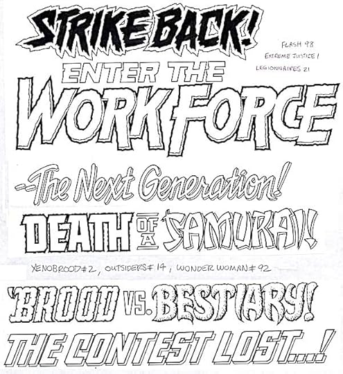
Images © DC Comics, Inc.
More hand-drawn cover lettering for DC Comics. You can check the dates on the titles listed, but this is likely to be from 1990 to 1994. Before that I was hand-carrying such work to the DC offices, and usually didn’t make copies for my files. After that I was doing most of my cover lettering on my Mac computer.
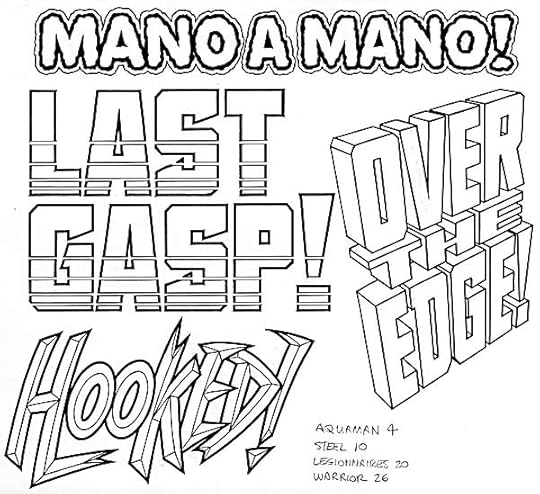
One more page. “Hooked” is in the style of the Lobo logo designed by Simon Bisley and myself, so whichever title it’s for, he was on the cover. These are originals, so at this point I think I was scanning them and emailing them to DC. That narrows it down to 1994, when I got my first scanner, or a bit later. Or, possibly I had mailed them to DC and they returned the originals.
October 17, 2013
And Then I Read: THE COMPLETE ALICE IN WONDERLAND
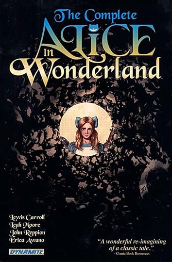
Image © Savage Tales Entertainment LLC.
This handsome hardcover collects a four issue series written by Leah Moore and John Reppion that faithfully adapts Lewis Carroll’s “Alice in Wonderland” and the sequel “Through the Looking-glass.” I haven’t compared the original books to this one, but much of the dialogue is very familiar. There are few captions, so I’m guessing what’s left out is the author’s narrative voice. Unfortunately, I missed that. The story is not as rich without it. As for the art by Erica Awano, it’s attractive, with well-drawn figures in a somewhat manga style. The depiction of the characters is close enough to the original John Tenniel illustrations to work for me. I did not like the coloring, though. The entire book uses a technique on the line art that puts a burnt sienna glow around every line. I suppose this was meant to give it an old-fashioned look, but to my eye it simply makes all the art look blurry. The rest of the colors are dull with lots of earth-tones and gray-greens. After a while I found the general effect to be depressing.
I wanted to like this book, but in the end I found I couldn’t. I’d rather read the original books to get the full flavor of Carroll’s voice and intricate genius, or if I were to look at an adaptation, my favorite is still the Disney animated film. Despite its departure from the books at times, and perhaps because I first saw it as a child, it’s the best I’ve yet seen.
Terrific logo by Jason Ullmeyer, though!
Mildly recommended.
Todd Klein's Blog

- Todd Klein's profile
- 28 followers

