
Todd Klein's Blog, page 260
December 11, 2013
And Then I Read: GREEN LANTERN ANNUAL 2
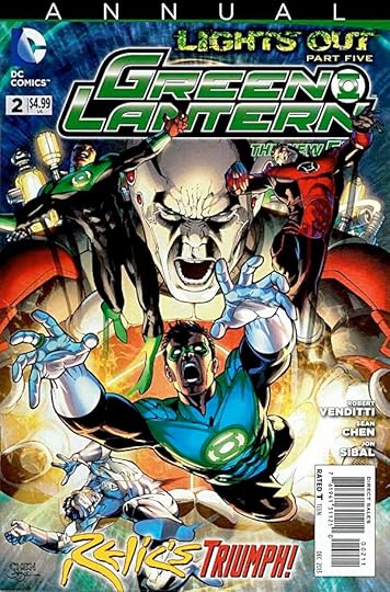
Image © DC Comics, Inc.
The conclusion of the “Lights Out” storyline in this book has some nice moments. It takes us to the wall at the edge of the universe, which I think is a Jack Kirby idea from his Fourth World books. The wall is dotted with the calcified remains of creatures who have tried to breach it, making for an interesting visual idea, though how there could actually be such a wall is a mind-twister that’s better left alone. Our giant villain Relic is, of course, determined to be the first to actually get through this wall, even if he has to use all the ring energy he’s gathered, and more. Kyle Rayner, and the entities of power within him too, as it happens. The rest of the ring-bearers arrive to help, but as usual are ineffective against Relic, so what to do? It’s a story of sacrifice, of course. And after, perhaps a new beginning for the GL Corps without Oa, we’ll see how that plays out. Nicely done by writer Robert Venditti and artists Sean Chen and Jon Sibal.
Recommended.


December 10, 2013
And Then I Read: AQUAMAN 24
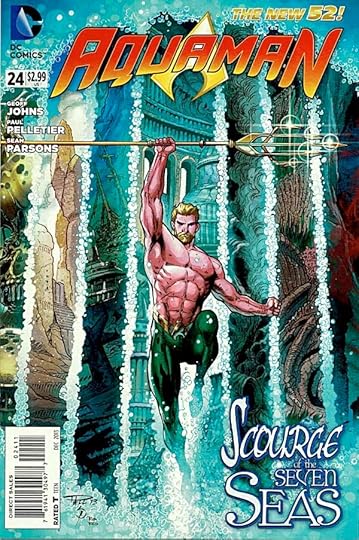
Image © DC Comics, Inc.
Writer Geoff Johns takes some time out from the usual battles to give Arthur Curry and us readers some fascinating new information about the history of Atlantis, including a detailed look at what led to its sinking. Johns is great at this sort of thing, it all seems plausible and real, even though he’s rewriting much of what DC has said about Atlantis in the past. For instance, I imagine this negates everything in the ARION comics. I like it, though, it’s a story full of the idealistic dreams and fearful foibles of human nature that we can all relate to. Arthur himself is struggling with such issues regarding his friend Vulko, the one leading him on this path of revelations. The art by Paul Pelletier and Sean Parsons continues to be excellent.
Recommended.
December 9, 2013
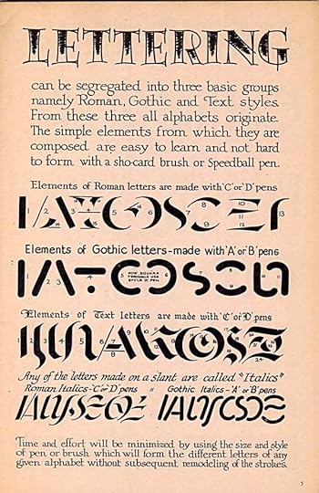
SPEEDBALL TEXT BOOK 14TH EDITION Part 2
Images © Ross F. George/Hunt Manufacturing Company.
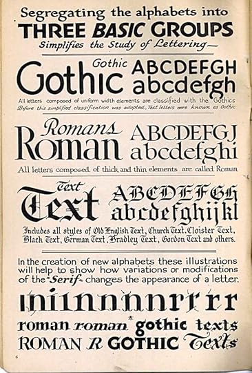
The division of lettering (and type) into groups or classes is a tricky business, and one with lots of confusion, as there are many conflicting systems and names. I find George’s three basic groups unhelpful. What he calls Gothic are all letterforms with strokes of equal width. To me, Gothic suggests the kind of letterforms he calls Text, which I would classify as Blackletter. He claims Roman as the name for all styles with thick and thin line weights, but his category right below that has them too. Yes, traditional Roman styles like Trajan have thick and thin weights and serifs, but so do many other styles. What he calls Text, as I said, is what I call Blackletter, coming from the medieval manuscripts of Germany and other European countries. I do like his examples of how different serifs change the appearance of letters. In type, the most common basic division between letter forms is Serif and Sans-Serif. Beyond that, you can tease out subcategories like Slab Serif, and styles like Art Deco, but it’s all rather subjective and unscientific, and many styles cross boundaries.
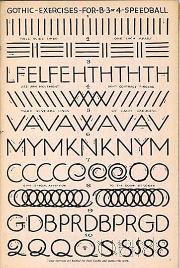
But now that I know George’s classifications, his examples make more sense, like these for the even-weight lines of his B pen points. To me, the hardest thing to do with either a brush or a pen is create a perfect or apparently perfect circle. I admire his ability! When I had to do them, I generally used a circle template and technical lettering pens. Practice strokes are boring, but like any kind of practice, necessary to develop the motor skills for good lettering. I particularly like his ideas about drawing the letter S, always difficult to get in good balance.
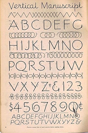
This style is closer to comics lettering, although with much thinner strokes. I say that because it has a looser, more relaxed feel, with shapes that are not as perfect. By Manuscript, I think George means what you might use to letter a large area of text.
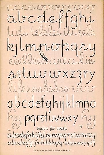
The facing page has lower case in several styles, first connected letters, or cursive, then unconnected, what we used to call “printing” in school. All these forms are clear and easy to read with lots of air.

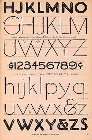
These alphabets are a little more controlled. The thicker one is even closer to comics lettering, and a style that Ira Schnapp would have recognized as similar to his balloon lettering, I think. There are some very small notes you probably can’t read: “At first make all letters at least one inch high.” “Where a curve is combined with a straight line to form a single stroke – pause slightly at the junction without lifting pen to insure a well-formed element.” and “Do not turn pen sideways for lateral strokes.” All good advice.
The second alphabet here is made with the round B point, then the corners are squared with a C-6 wedge-tipped point. I did the same thing with comics display lettering sometimes, but I used a small technical pen point for the squaring. Same idea. I love the bottom alphabet. In fact, it’s rather close to one I thought I made up! Nothing new under the sun, I guess.
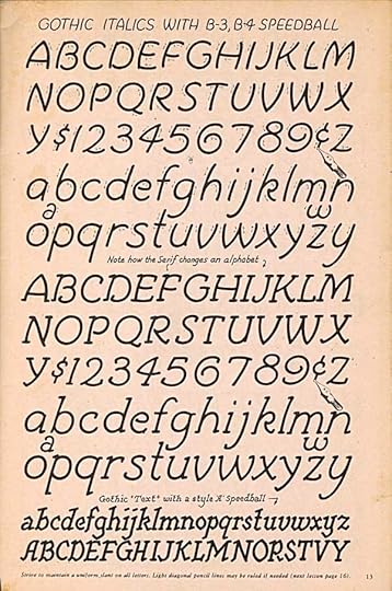
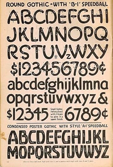
These alphabets are the liveliest we’ve seen yet, almost cartoony. I don’t really like the lower alphabet made with the square-tipped A point, but I can see it working in some situations.
To be continued.
Other parts of this series can be found in the LETTERING/FONTS category of my blog, along with more articles on that subject.
December 7, 2013
SPEEDBALL TEXT BOOK 14TH EDITION Part 1
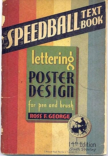
Images © Hunt Manufacturing Company.
My friend Dave Hunt recently gave me this edition of the perennial lettering how-to booklet, the “Speedball Text Book,” 14th edition of 1941, by Ross F. George. George was a talented sign painter, inventor and type designer, a student of William Hugh Gordon. In 1913 George and Gordon were asked to design a new system of lettering pens for the Hunt Pen Company, and they produced their innovative Speedball designs in four main styles, as seen here:
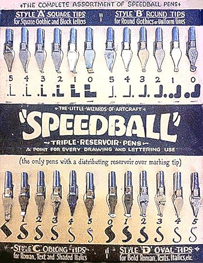
Their design not only had ink reservoirs below and above the shaft of the pen point to allow less frequent filling, the shaped points in graded sizes brought a new level of precision and predictability to the craft.
George began producing his how-to pamphlets in 1915 for the company as well, and they were so popular that new editions emerged every few years, and new printings happened more than once a year. They’re still being produced, the most recent edition is the 23rd. George continued to work on them until his death in 1959, the 18th edition being the last he was involved with.
I’ve used Speedball points almost exclusively for dip-pen lettering since I began doing it as a child, though much of my comics lettering was created with technical drawing pens instead, and of course I now do nearly everything on my computer, but often using fonts created from my hand-lettering, some with Speedball points. I thought I’d print a few pages at a time in this series of blog posts, with my comments.
The style of the 1941 edition leans heavily toward Art Deco, which should be no surprise, it was still the dominant style at the time. The title style here is shown later in the book, it’s one of George’s most memorable designs. Notice how, in the all-caps text he’s making each line the same width by changing the widths of the letters and the spaces between them. Typesetting can easily do the latter, but not the former. A computer design program can approximate the horizontal expansion of letters, but not without distorting the line weights. Note that this edition is copyrighted by Ross F. George himself, I’m assuming the Hunt company has taken that over, but I could be wrong.
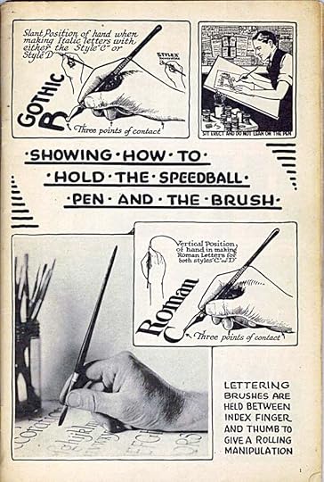
These methods of holding a lettering pen and brush work very well if you’re right-handed. I’m not, so my pen holding technique looked a little different. I compensated by working right to left whenever possible. It’s often possible in comics where you have areas of lettering spotted around a page. There were countless times when I put my hand in wet ink anyway. I never tried lettering with a wedge-tipped brush as shown here. Most comics lettering is too small for brush work. For real sign painting, it’s a must. The advice, “Sit erect and do not lean on the pen” is spot on.
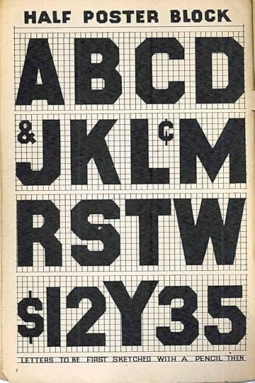
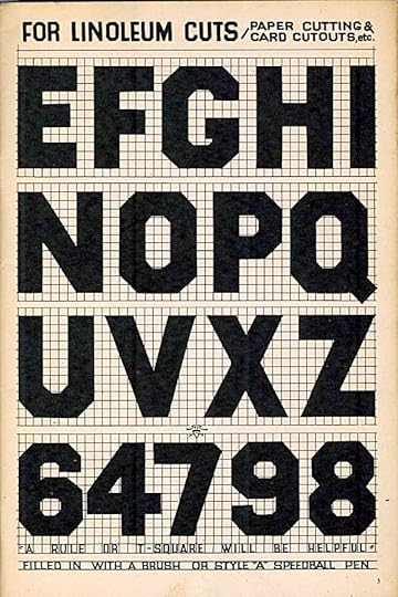
Two halves of a spread. These block letters are okay, but I see elements I would handle differently. Too many to go into here.
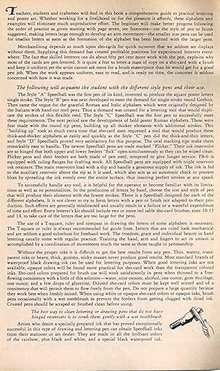
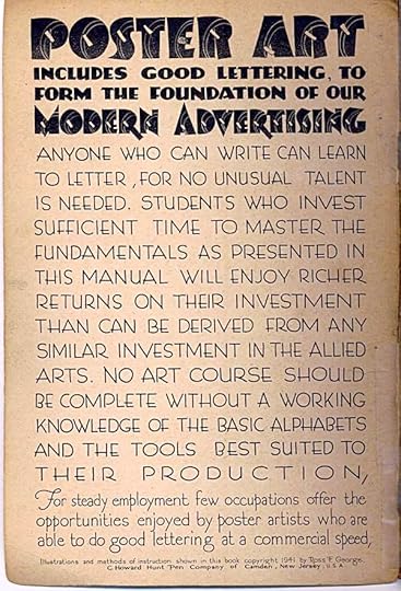
On page 4, George finally gives us his sales pitch for lettering itself, his Speedball tools, and this book. It’s well-written and a good read. At the time, “sho-card” lettering was everywhere: supermarkets used it for price cards, theaters for movie listings in lobby windows, stores for product in their windows. Magazine and newspaper ads were full of it. Hand-lettering in artful but clear and readable style was a craft that became a good career for many artists, hence the popularity of this book. Of the advice, one thing I found most interesting was George’s formula for a solution to thin poster paint to make it flow well through a pen, used a few drops at a time. The formula: water, nine ounces; alcohol, one ounce; gum mucilage, one ounce; and a few drops of glycerine. Clearly the man was as clever a chemist as he was an artist!
Here George begins actual basic instruction, breaking down different styles of lettering into sample strokes. The title is playfully bouncy, as if to say, “have fun.” This would be a great place to start learning how to handle the different pen types. In comics, I rarely had any use for the A or D styles, but once in a while I’d give them a try.
More next time.
December 6, 2013
And Then I Read: THE FLASH 24
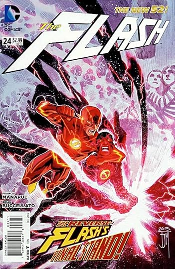
Image © DC Comics, Inc.
Francis Manapul and Brian Buccellato have ended the Reverse Flash storyline, and their run on this title, superbly. Manapul’s layouts and art have never been more creative and appealing, Buccellato’s dialogue is excellent. Storylines that have been hanging for some time get resolved in fine fashion, Barry Allen is heroic and compassionate at the same time, and…well, what more is there to say except “Bravo!”
Highly recommended.
December 5, 2013
And Then I Read: GREEN LANTERN NEW GUARDIANS 24

Image © DC Comics, Inc.
Part 3 of “Lights Out” begins with the remaining Corps and Guardians trying to regroup after the destruction of… well, some of you might not have read Part 2 yet, so I’ll just say it was a big loss. Kyle Rayner, the White Lantern seems to be the focus of their hopes, especially when the godlike embodiments of the various colors of ring energy join forces with him. This does not sit well with Hal Jordan, who is supposed to be in charge. Meanwhile, John Stewart is on another mission that gives them a bit of hope. One nice thing about this crossover is seeing Earth’s Green Lanterns in one book again, at least most of them. Guy Gardner does not appear this time. Relic is also off-stage for this issue, not such a bad thing. The art looks good, and the script kept me reading.
Recommended.
December 4, 2013
Rereading: THE STORY OF THE AMULET by E. Nesbit
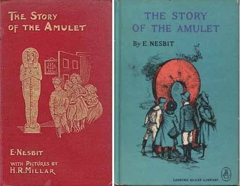
Two editions of this book, the first and a later hardcover. I read it on my iPhone.
This is the longest, and my favorite of Nesbit’s “Psammead” trilogy about four British children who find magical items that get them into all kinds of trouble. Here they’ve rediscovered the Psammead or sand fairy, captured and put on display as a monkey, which it slightly resembles. They rescue the sad creature, and while it can no longer grant them wishes, it does lead them to a magical amulet. Through it’s archway, grown huge with the right words, they walk into ancient Egypt, Babylon, Tyre, Britain, and even Atlantis. They’re searching for the Amulet’s other half, which will give them their heart’s desire…in this case, the return of their baby brother and parents.
In addition to the usual bungling on the children’s part, and all kinds of dangerous people and places, the book has plenty of humor, but also some deeper currents. Nesbit clearly put a lot of thought into the historical settings she visits, and also into the character of the “learned gentleman” living upstairs from the children, based on a real man who helped Nesbit with her research.
For those who think magical adventure stories began with Tolkien, or even Harry Potter, the three books in this series (the others being “The Five Children and It,” and “The Phoenix and the Carpet”) will open their eyes to one of the past masters of the form.
Highly recommended.
December 3, 2013
And Then I Read: THE WITCHING HOUR 1
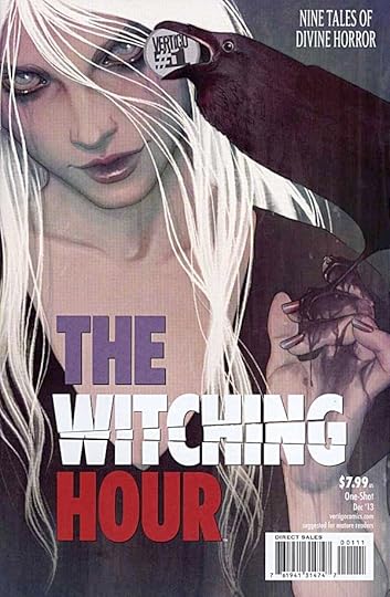
Image © DC Comics, Inc.
I lettered one of the stories in this, and work with or have worked with some of the creators, but I have to say I think these lengthy anthologies from Vertigo are quite excellent, and they’re giving DARK HORSE PRESENTS stiff competition. This one has a great variety of art and writing styles as well as subject matter, with the idea of “witches” as the unifying theme. Some get pretty far from that, but I’m not complaining. From the chilling tale of what happens to a colony on Mars when support from Earth stops coming, to the rollicking weirdness of Arthur Miller and Marilyn Monroe fleeing from federal agents, while Arthur tries to rewrite reality on his typewriter in a moving car. There are lots more, I think I enjoyed all these stories. You might, too.
Recommended.
December 2, 2013
And Then I Read: GREEN LANTERN CORPS 24
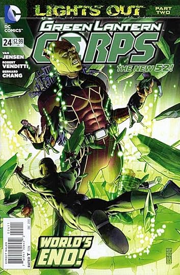
Image © DC Comics, Inc.
Relic is a powerful giant with powerful technology who is going around the universe sucking up ring power of all colors. He’s about to reach Oa, and the Corps is bracing to meet him under Hal Jordan’s command. When he arrives, they find themselves as helpless against his power as all the previous ring-bearers, so it’s a matter of a strategic retreat, with John Stewart and a band of new recruits trying to hold Relic’s attention while the others escape. In all ways, things do not go well. The story by Van Jensen and Robert Venditti is following a predictable course, but the magnitude of the disasters the Corps is trying to deal with does give the story interest, and the character interplay is effective. The art by Bernard Chang is quite good. Nothing terribly new here, but a page-turner.
Recommended.
December 1, 2013
KLEIN PRINTS HOLIDAY SALE!

This week only, order as above on my BUY STUFF page, and your shipping will be refunded as soon as I receive the order. Brighten your holidays or purchase gifts of my 11 by 17-inch prints in collaboration with ALAN MOORE, NEIL GAIMAN, ALEX ROSS, J.H. WILLIAMS III, MARK BUCKINGHAM, BILL WILLINGHAM, SHAWN McMANUS, STEVE RUDE, DAVE GIBBONS, and GENE HA, all signed by those partners and myself, and available nowhere else. As always, we thank you for support, and wish you a happy holiday season!
Todd Klein's Blog

- Todd Klein's profile
- 28 followers

