
Todd Klein's Blog, page 259
December 22, 2013
Christmas Cats and Mice

We exchanged gifts last night — early, I know — and our boys Leo and Tigger wanted to help.

We decoyed them with their own small wrapped presents, but they needed some help from Ellen to open them.

New mice were inside, with the ever-popular scent of catnip. Very intriguing!

“I will bite you!” said Leo. “Help!” said the mouse.

TWO new mice, decisions, decisions!
We enjoyed our presents, too, and hope you find something good at your house. I don’t know how often I’ll be posting the next few days, but here are some past Christmas favorites you might enjoy. Merry Christmas everyone!
I Want a Hippopotamus for Christmas
A Christmas Message from 1513 A.D.


December 21, 2013
Making More Cookies
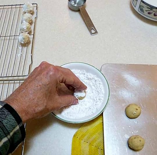
Today we made the ball cookies that we both love. My favorite Christmas cookie is this one, Butterballs. Pretty simple batter, roll into balls, bake, and roll warm cookies in confectioner’s sugar.

Here they are, cooling. So delicious! Close to shortbread, but even more crumbly and buttery.
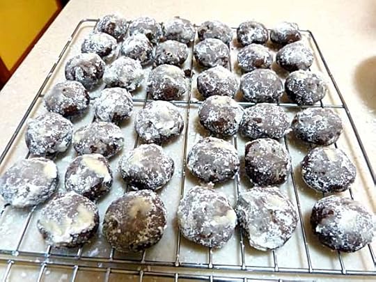
Then on to Ellen’s favorite cookies, the Mocha Nut Balls. The dark side of the ones above with coffee and cocoa added. Yum! Recipes for both are on THIS old blog post along with other favorites.
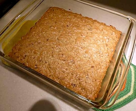
We also decided to try the date-nut bars again. The first batch tastes good, but it’s a gooey mess that is hard to eat, not really much like a cookie. This time we used twice the flour and half the dates. We haven’t cut and tasted it yet.
That’s it for this year, no shaped and decorated cookies. I guess we’re about over that. And when we go to Ellen’s sister Ann’s house, we’ll make some there with her anyway. Just between you and me, I do miss our gingerbread men…
December 20, 2013
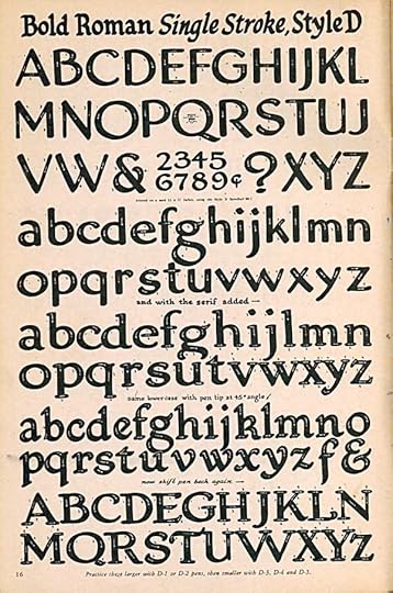
SPEEDBALL TEXT BOOK 14TH EDITION Part 4
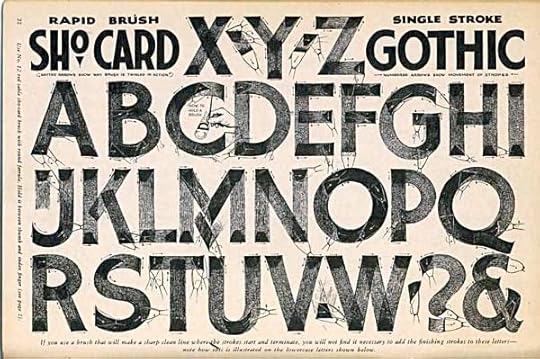
Images © Ross F. George/Hunt Manufacturing Co.
“Sho Card” lettering is a term rarely heard these days, and the actual thing is rarely seen. It was once the common technique for making signs on paper of all kinds, and clearly Ross F. George was a master of it. By “gothic” he means sans-serif, and these letters are beautifully made. He’s used a dry brush to show the strokes very clearly, as well as his usual white arrows. I never tried this, it was already becoming a lost art when I got into comics in the 1970s, replaced by photographic type and photocopying mostly. He mentions his tool is a “sho-card brush.” I never saw one specifically named that.
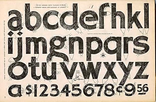
The lower case is equally attractive, I love the old-style G. Numbers and currency symbols are included, one of the form’s most common uses was for prices in stores. Love the angled square atop the I and J too. You see that small insect-like glyph between the P and Q? That’s George’s signature symbol. The fact that it’s so small gives us a rough idea of how large the original lettering must have been throughout the book, probably at least twice the printed size, if not more.
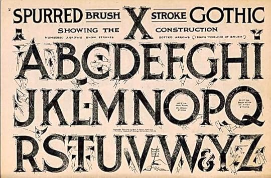
Here’s the sho-card version of the ancient Roman letters from Trajan’s column of antiquity. George calls the style “spurred gothic,” a term I’ve never heard, and I suspect one he made up. The small pointed serifs on the stroke ends originally made carved letters more readable. They’re an attractive feature of many type styles to this day.
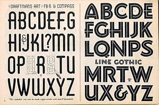
On the left, we see an alphabet made with straight lines and circles mostly. George indicates the circles are pencilled with a compass, and the letters are outlined in ink with a small pen point, then filled in, or you can make them with a very large B point. The style on the right he calls “line gothic,” I would call it an inline style for the inner lines running through it. Those add interest and give the thick strokes some extra style.
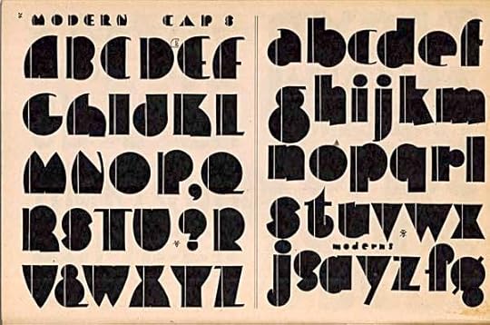
Another inline style George calls simply “modern.” In 1941 it was, though we recognize it now as Art Deco. A little hard to read in places, not a style you could use a lot of, I think.
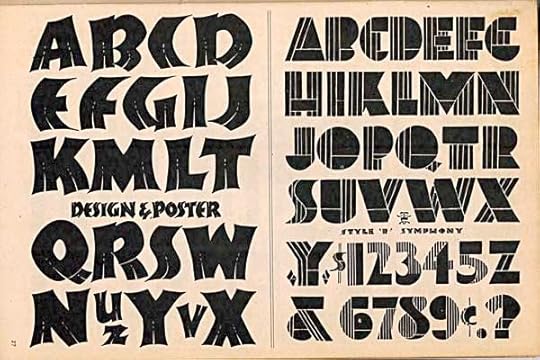
The style on the left carries the inline idea into new territory, and this alphabet is one of my favorites in the book. What life and movement it has, what personality! Very organic, yet all those sharp corners make it strong and emphatic too. The one on the left doesn’t appeal to me much, it’s going even further with inlines, sacrificing readability for design.
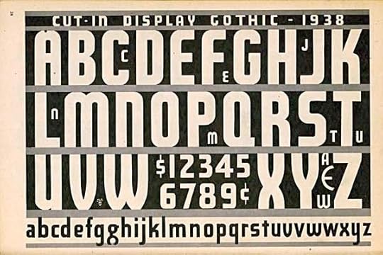
This is the first style we’ve seen with a date, 1938. There were many editions of this book, and I don’t know how often George replaced older designs with new ones. A very condensed sans-serif font, meaning narrow letters, a good way to get a lot of them in a small area. By “cut-in,” George means the letter forms are open, white, implied by the black areas around them. The same effect could be achieved by making a negative photostat of black letters, but in this case he’s done it the hard way, except for the bottom line, with the gray areas added to show where the letters might open at the tops and bottoms.
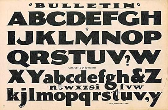
For contrast, here’s a very wide style with tiny serifs, just enough to give the corners a crisp look. Very handsome. In a few places, George shows his construction method of outlining the edges and filling with black. I often did my large letters the same way in comics, though I generally left the inner areas open for a color to be added.
To be continued. Earlier parts of this series can be found under the “Lettering/Fonts” category on the right side of this page.
December 19, 2013
And Then I Read: MIRACLE AND OTHER CHRISTMAS STORIES by Connie Willis
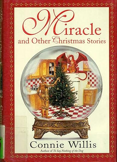
Cover illustration © Paul Youll.
This time of year I usually pull out a favorite book or two with a Christmas theme, or at least a Christmas chapter, but this year Ellen went to the library and brought home some Christmas-themed books for herself to read, and this was one. I’m a fan of Connie Willis’s novels, so of course I wanted to read it.
Unfortunately, it did not start off well for me. Willis begins with a short essay outlining what she loves and hates about Christmas, including stories and movies. She follows up at the end with a list of favorites and recommendations. All good so far, though her dislike for “It’s A Wonderful Life” is a little jarring.
The title story, “Miracle,” continues on this theme, with a young woman working in a big city office trying to get all her Christmas tasks finished, and being plagued by a Christmas spirit with very different ideas on how she should do that. Willis has a liking for a certain kind of plot that reminds me of some 1940s Hollywood screwball comedies: the main character is competent and trying to accomplish many tasks, but it constantly stymied and blocked by unhelpful people and events in an ever escalating way that makes the character frantic, and me as a reader annoyed. It works in a screwball comedy IF it’s funny, but this was not. I had to give up on the story, the plot device got in the way of any Christmas spirit Willis may have wanted to convey. The second story, “Inn” used the same plot device, so I didn’t finish that one, either.
“In Coppelius’s Toyshop” is short, a nightmare of Christmas shopping. Not a fun one. “The Pony” is also short, and I liked it better. What if the presents we wanted so desperatedly as children came to us as adults?
“Adaptation” is another sad story about a divorced man trying to get some time with his son for the holidays, while at the same time dealing with a very difficult and demanding job at a department store. Dickens’ “A Christmas Carol” is mixed in, and there are some good moments, but I left the story a little depressed.
Finally, in “Cat’s Paw,” a story I really liked. It’s a murder mystery along the lines of Agatha Christie’s “Hercule Poirot” stories, and only a Christmas story by the time of year, but Willis handles the characters and detection elements well, and there are some interesting side issues that I also appreciated reading about. The end is a nice twist, too.
“Newsletter” is pretty good, about people suddenly becoming much nicer than usual at the holidays, and why. Perhaps it’s not such a good thing, in this case.
“Epiphany” is the final story, and I also liked this one, though I found the ending a little unsatisfying. A pastor has had a personal epiphany that leads him to go on a sudden road trip across America in the midst of a fierce winter storm. Through many delays and roadblocks, he meets some friends and gradually figures out what it all means. I have to say this was the only story in the book that gave me a little of the magic of the season.
In all, I’d have to say this is only mildly recommended.
December 17, 2013
And Then I Read: ASTRO CITY 5
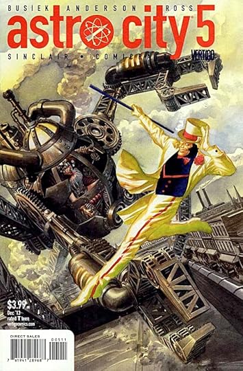
Image © Juke Box Productions.
This issue is an anthology of sorts; three short stories tied together by the tricksy Broken Man. All three stories take place well in the past. One is a Lovecraftian horror story about a team of agents trained to deal with such things, and how their mission goes wrong. Two is an unfinished tale about a demon cult in India. Three, my favorite and on the cover, is the steampunk adventure of Eulalia Jane Verne versus the ebullient Mister Cakewalk. While fun, I didn’t find any of these stories as engaging as the longer tales writer Kurt Busiek has been telling in previous issues, and the framing story also remains cryptic. Not a bad read, but not as satisfying as the very high standard set for this book.
Mildly recommended.
December 16, 2013
Watching THE HOBBIT: DESOLATION OF SMAUG (No Spoilers)
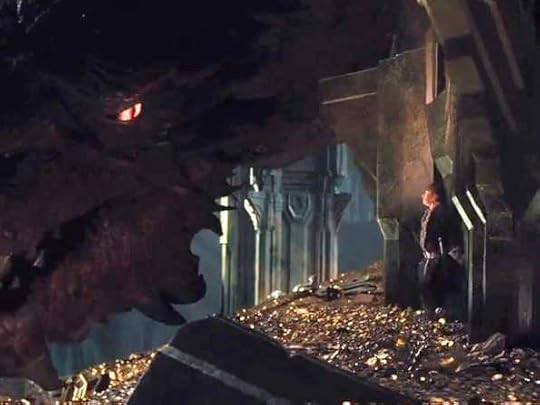
Image © Warner Brothers Pictures.
“The Hobbit” by J.R.R. Tolkien has long been one of my favorite books, perhaps my very favorite. I first read it about fifty years ago, and I’ve read it many times since. Though initially on the fence about the Peter Jackson-directed Tolkien films, I’ve come to enjoy them a great deal, but part of that enjoyment comes from not expecting them to follow the books closely. In his three “Lord of the Rings” films, Jackson did stick closely to the book much of the time. His films are epic in scale, and that book is too, so most of what Jackson added there was more screen time to the battles and action.
With “The Hobbit,” the book itself is a smaller story. Yes, it does have some epic moments, but much of the book is more intimate and personal with a relatively small cast of characters: the dwarves, Bilbo and Gandalf are the core group. The story is lighter in feel too, with only hints of the larger troubles in the land of Middle Earth in general. Now, Peter Jackson and his writers, in deciding to make this a three-film series, clearly needed to live up to their previous trilogy as far as the epic scope and the action. This meant adding things. In the first Hobbit film the additions were most obvious in extra battle scenes and a few new characters drawn from hints in other Tolkien work, or made up whole, but I’d say it was about 75% close to the book.
“Desolation of Smaug” flips that around, I’d guess it’s about 25% close to the book. There are lots of new things in the storyline, large and small, from new characters (Evangeline Lilly makes an excellent elf maiden, but she’s new) to events that diverge from Tolkien’s narrative quite deliberately for storytelling reasons. Despite all that, I enjoyed the film, it’s a fun action-adventure ride, and Jackson and company clearly love the original books. The changes they make are always respectful and understandable, in my opinion. But everything has to be larger. More action, longer and more thrilling and more complex at every turn. I saw the “higher frame rate” version this time, and I have to say it worked really well for me. You can read about Jackson’s approach in THIS article, but I did find it easier on my eyes, especially when following quick movement. There were moments when it approached a live video feel, but that only struck me occasionally, mostly it just flowed smoothly. I’d recommend that version if you have a choice.
The middle film of a trilogy usually suffers from that placement by dropping us into and out of an incomplete story at both ends. The beginning of this one avoids that somewhat by adding to the beginning of the whole story: Gandalf’s first meeting with Thorin. The end, though, is abrupt and clearly “to be continued.”
In all, I had a fine time, and recommend the film, just don’t go expecting the plot to follow the book very much. Enjoy the ride you’re on instead.
December 15, 2013
SPEEDBALL TEXT BOOK 14TH EDITION Part 3
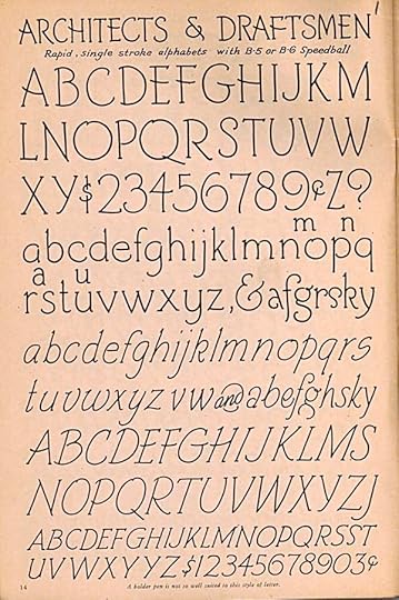
Images © Ross F. George/Hunt Manufacturing Co.
Continuing my examination of this 1941 edition of the very popular guide to hand lettering. This page shows suggested alphabets for architects and draftstmen. I haven’t seen any architectural plans from the period, so I can’t say if this came into use. Plans from the 1960s I’ve seen used a simpler and more angular lettering style.
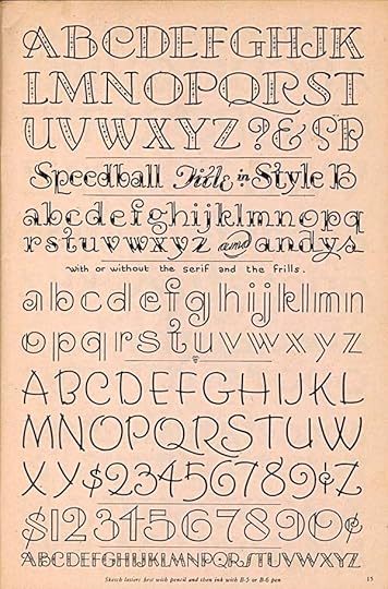
This takes the same styles, using Speedball B-5 or B-6 points, in more fanciful directions, the kind of thing I would call display lettering. It’s meant to show off the skill of the letterer and attract eyes to the piece. With most display lettering there’s a tendency to move away from the most readable letter forms toward more artistic but less readable ones, so you have to be aware of that.
Here’s a handsome style sheet using the Speedball D or oval-shaped points. It allows you to create letter forms that have some thick and thin variations of stroke, but are still bold and easy to read. Versions with and without serifs are shown, and arrows indicating stroke direction are on all of them. Some letters have been left out of the last example. they can be easily interpreted. And I like the way he added a smaller Z there where he ran out of room.
In addition to an italic alphabet using the D points, for the first time George shows us some sample poster layouts. In other words, how to design with lettering. His small note says, “Copy these posters on cards 14″ or 17″ high. Note how layouts are balanced.” Gray tones are added to the mix for the first time, not something one could do at home with black India ink, but it does help the designs, and could be done with colored ink or paint, for instance.
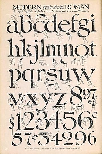
Here’s another handsome style he calls Modern Roman (kind of an oxymoron) that I like a lot. Clearly he was working much larger than printed size on these examples. He’s recommending C-1 or C-2 Speedball points, the largest of the wedge-tipped ones. Working large and reducing for print is always helpful, it minimizes any small imperfections.
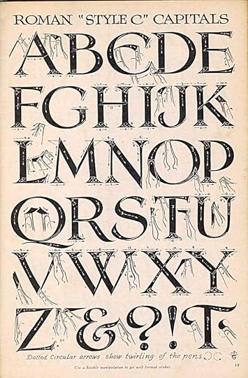
the other half of the spread focuses on the capital letters. The “Roman” style is based on the one used on the carved capital letters on Trajan’s Column of ancient Rome, photo below.
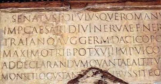
Those letters had thick and thin strokes and small serifs, George’s Modern Roman has exaggerated those elements, but they are similar. George gets into great detail on how to make each letter, including how to twirl the pen point to create certain strokes.
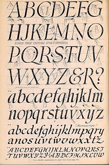
An Italic version, which like all good italics is considerably different than the Roman one. They tend to be a narrower and have elements of cursive writing, more curves and curls.
George has called this page “Evolution of Letter Styles,” which I think is a bit ambitious. He’s really pointing out the relationship of cursive or connected writing to non-cursive or unjoined letters. It’s a nice selection of styles, all the same.
To be continued. Previous chapters can be found in the LETTERING/FONTS category on the right sidebar of this blog.
December 14, 2013
Making Cookies
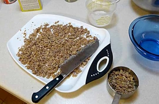
It’s time to make Christmas cookies, and Ellen was tired of the usual recipes, so today we tried two new ones. The first is a date-nut bar, actually an old recipe from her mom, but one she’d never made. I helped out by chopping the dates, which were already in pieces, but too large.
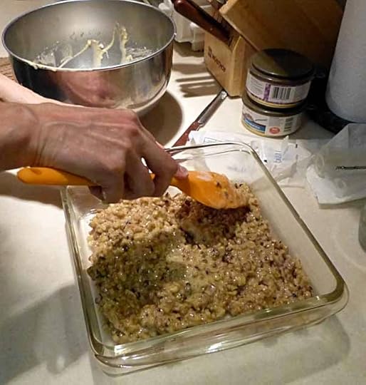
Ellen is not fond of baking, but likes the tradition of Christmas cookies, so it’s always a mixed bag for her. The dough seemed rather candy-like, but into the pan it went, and into the oven.
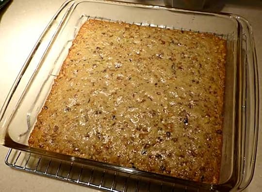
It came out looking good, but when it cooled and we cut it, the pieces were very sticky and hard to get out, not very bar-like. Probably should have had more flour, and perhaps a longer baking time. “I hate baking,” Ellen said. They taste fine, though.
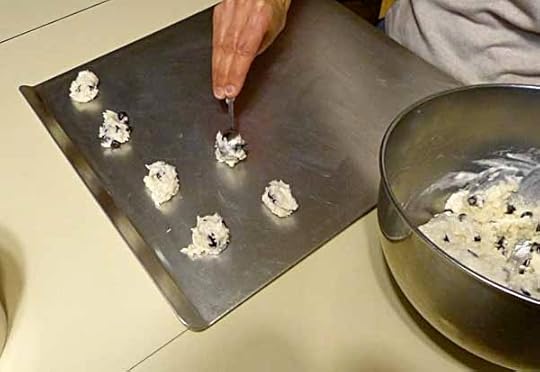
The second recipe, from a Mrs. Fields cookbook, was macaroons with chocolate chips. This involved making meringue from egg whites, something we hardly ever do. It worked okay this time. Folding it into the rest of the ingredients perhaps did not go so well, so they’re a little heavy. Ellen put them on the baking pans and into the oven.
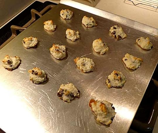
They came out looking good, but stuck like glue to the pans. I pried them off with a metal spatula much as you might remove old, dried paint from window glass, or gum from your shoe. “I hate baking,” Ellen repeated. Again, they aren’t beautiful, but they taste fine.
Next week we’ll make a few more kinds. I can almost guarantee that it will go better, as it will be recipes we’ve made often. I can also guarantee that Ellen will continue to hate baking!
December 13, 2013
And Then I Read: SUICIDE RISK 1
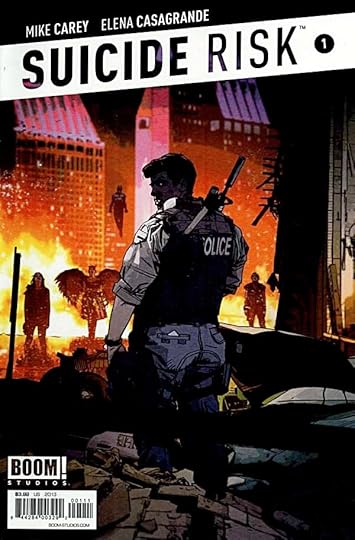
Image © Boom Entertainment and Mike Carey.
This new series by writer Mike Carey and artist Elena Casagrande falls into a genre I think of as metaheroic. One that plays with the idea of superheroes and how they might affect the real world. We can set the start of it with MIRACLEMAN and WATCHMEN, I’d say (though there may be earlier examples), and run it up through ASTRO CITY, TOP 10, KINGDOM COME, IRREDEEMABLE, and more. SUICIDE RISK has elements of a police story, where the police have to deal with powered people, most of them criminals, and further, to try to find out how these people are getting those powers. It’s a dark scenario that leans more toward IRREDEEMABLE than ASTRO CITY, for example. The story is intriguing, but the overall feel doesn’t appeal to me so much, a little too grim and depressing. I don’t like TV cop shows for much the same reason. If you do, this might be just your thing. The writing and art are excellent.
December 12, 2013
Pulled From My Files #17: PHANTOM STRANGER
Images © DC Comics, Inc.
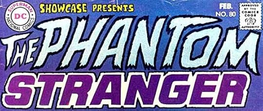
Here’s the logo for The Phantom Stranger by Gaspar Saladino, created for his appearance in 1969 in SHOWCASE. In 1987 DC Comics decided to put out a new mini-series featuring the character, and asked me to do a new logo, but one very close to this version. They liked it, but wanted it tweaked in a few areas.
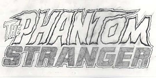
Here’s a pencil sketch version of what they asked for. The letters are all closer together, and THE overlaps the P of PHANTOM. The internal open areas of PHANTOM are a little wider than on the original, too. A rough outline contains the entire thing. I might have a photocopy of the final logo, but can’t find it at the moment.
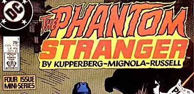
Here’s the printed comic. The creator names were added below the logo and included in the rough outline, probably by Bob LeRose or another production staffer. The pencil sketch is what I pulled from my files, in case you wondered!
Todd Klein's Blog

- Todd Klein's profile
- 28 followers

