
Todd Klein's Blog, page 256
January 27, 2014
A Stanley Kaye Superman Painting Mystery Part 1

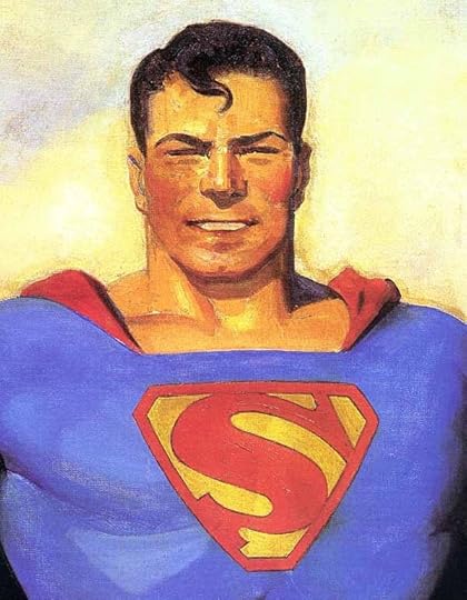
Superman on paper by Stanley Kaye, 1942, courtesy of Merredith Lowe. Superman © DC Comics, Inc.
A few weeks ago I received some photos of the above painting in an email from the owner, Merredith Lowe. Merredith had seen what I wrote about a famous Superman painting by pulp artist Hugh J. Ward that hung for many years in the offices of (then) Detective Comics / National Comics, and now DC Comics.

Superman painting by Hugh J. Ward, image from the book “H.J. Ward” by David Saunders. Superman © DC Comics, Inc.
As you can see, the face in Kaye’s painting is clearly similar to the one in Ward’s. I had written about some revisions to this painting that were done in the early 1940s, primarily (or perhaps completely) to the face, hair and chest symbol.
 Detail of photo by Larry Gordon from “The Saturday Evening Post,” June 21, 1941. Superman © DC Comics, Inc.
This is the only known photo of the original painting as Ward delivered it, and it’s a detail from a photograph printed in a magazine, so not the best quality, but you can see the differences in the face, hair and chest symbol compared to the retouched version above. Merredith thought his painting by Stanley Kaye (dated ’42) might indicate Kaye had made the revisions. I decided this would make an interesting topic to explore here, and I started doing research.
First, I wanted to know more about the Kaye painting. Merredith wrote he received the painting in 1964-66, and said, “The painting was taken off the wall of DC Comics by Jack Liebowitz and given to my Godfather Asa Herzog after being told of his godson’s (me) great interest in Superman. Asa gave the painting to my father the same day and my father Sheldon Lowe brought it home to me that night. I remember being told I would be getting the portrait of Superman. I remember being disappointed when it was not a photograph of George Reeves. I soon got over the disappointment and came to appreciate it. It came to me in the original frame.”
Asa Herzog was a well-known bankruptcy lawyer in New York State, and his firm, including partners Sheldon Lowe and Joel Zweibel, worked for Harry Donenfeld and Jack Leibowitz, the owners of what is now DC Comics. Herzog, born in 1909, had begun practicing law by 1930, and with Lowe and Zweibel wrote “Herzog’s Bankruptcy Forms and Practice” the standard book on the subject still in use today. In 1958 he became a federal bankruptcy judge and eventually the chief bankruptcy judge of the country. Merredith reports his father Sheldon Lowe also did work for Donenfeld and Liebowitz, and his parents were guests at the wedding of one of Donenfeld’s children.
So, the provenance of the Kaye painting is well documented, though I doubt anyone in the comics world knew of its existence before now. It seems likely it hung on the wall of Jack Liebowitz’s office and may have been seen by employees of the company until it was given to Asa Herzog in the early 1960s, but comics fandom hadn’t really gotten far by then, and to my knowledge no one has written anything about it. I’ve found no photos of the painting at the offices either, but then photos of any kind from the DC offices then are rare.

“H.J. Ward” by David Saunders, published by The Illustrated Press, Saint Louis, Missouri, 2010, image © estate of Hugh J. Ward.
For more information about the Ward Superman painting I was directed to this book, which has an entire chapter on it full of useful information.

Hugh J. Ward, 1938, photo from the book above, © estate of Hugh J. Ward.
Ward was born in Philadelphia in 1909 and became a prolific painter of cover illustrations for pulp magazines, as well as iconic portraits of pulp heroes like The Lone Ranger, Green Hornet and Kato and others.

Captain Bill Bones, an illustration by N.C. Wyeth for “Treasure Island” by Robert Louis Stevenson, 1911.
Ward studied in Philadelphia and cited painter and illustrator N.C. Wyeth as a major influence. That influence can be seen in the similarity of style and approach between the painting by Wyeth above and the Superman painting by Ward. (Ward had been briefly taught by Wyeth.) Wyeth combined high drama through lighting effects and character acting with a fairly loose impressionistic brush style, both elements that Ward utilized in his own work. One of Ward’s main employers was the publisher of pulp magazines (under many publisher names and imprints) Harry Donenfeld. I’ve written about Donenfeld’s pulp empire beginning HERE. Ward began working for Donenfeld’s pulps in July, 1934 and soon became Donenfeld’s premier cover artist, providing dozens of paintings for magazines like “Spicy Detective Stories,” “Spicy Mystery Stories,” “Spicy Adventure Stories” and many more. He created large iconic images of some characters as well, to be used as “fan photos,” something to be sent to fans who wrote asking for a photo, and in advertising. His painting of Superman was one of these, but it was unusually large, 60 inches high and 45 inches wide, about four times the size of a standard pulp cover painting. David Saunders reports it was delivered to Harry Donenfeld on June 24, 1940.

Bill Conley, photo from “H.J. Ward” by David Saunders, © the estate of Hugh J. Ward.
Donenfeld apparently gave his star artist a free hand to depict the character of Superman as he liked. Saunders reports that Ward used his brother-in-law Bill Conley as a model for the painting. While Conley may have had the physique needed, I don’t see much facial resemblance.

ACTION COMICS #1 cover © DC Comics, Inc.
Of course the character had been appearing in ACTION COMICS since 1938, and lately SUPERMAN, his own magazine as well, but the art by Joe Shuster (and assistants) was sketchy and perhaps no more than a rough guide for a detailed painting.

Some have seen a resemblance in the painting to actor Ronald Reagan, here in a 1941 photo.
As for the retouched version, David Saunders has what sounds like solid information about that. Superman was a sensation among young readers, he created a publishing revolution that was soon being imitated by others. Donenfeld (perhaps with the help of Asa Herzog and his law firm) began suing publishers of some of the more obvious imitations. In September, 1941, he began a suit against Fawcett, whose character Captain Marvel was so popular that he outsold Superman at times. Saunders writes, “When this lawsuit was filed it suddenly became important to eradicate any deviations from the approved model.” Superman had already gone through some changes from his debut to 1941.

SUPERMAN #6 cover © DC Comics, Inc.
Here’s a cover from mid-1940, in a pose probably influenced by the Ward painting, showing the character much as Joe Shuster originally drew him.

SUPERMAN #9 cover, © DC Comics, Inc.
About six months later, in early 1941, this cover has the larger chest symbol, and facial features that became the standard look for the character: a central spit curl in an S shape, squinty eyes, lowered eyebrows, and a more narrow and subdued smile than in Ward’s painting.
David Saunders writes, “Joe Szokoli, another cover artist who routinely worked for Donenfeld’s spicy pulp magazines, was hired to alter the painting. Along with being a cover artist Szokoli also had a sideline as a graphic technician and retouch artist. For fifty bucks he painted the prescribed changes during a single visit to Donenfeld’s office, without spilling a single drop on the rug. The revised painting conformed to the detailed design elements that were stipulated in the copyright infringement lawsuit, which was eventually settled out of court for a payment of $400,000. Giving Ward’s painting a facelift not only eliminated conflicting evidence, it also extended the painting’s lifespan as Superman’s officially approved paradigm.”
Why wasn’t Hugh J. Ward asked to alter his painting, you might wonder? The answer comes from Saunders’ book. If the painting was altered in early 1942, as suggested by the date on the Stanley Kaye study, Harry Donenfeld was then keeping Ward extremely busy painting as many new pulp covers as he could manage. The publisher was worried that Ward would soon be drafted into service in World War Two, and was trying to build up an inventory. That did happen, and sadly, Ward was diagnosed with lung cancer while in the service (he was a heavy smoker) and died in 1945. Donenfeld was able to extend his Ward cover stock some by having Szokoli alter previously used Ward paintings enough to reuse them. Szokoli’s work was not as accomplished as Ward’s, and the altered paintings are of lesser quality than the originals. Clearly Donenfeld put no value on Ward’s work except as he could make covers from it, but that wasn’t really unusual at the time. Commercial art was not considered of importance or value by most people, even some of the artists.
So, where does this leave that Stan Kaye painting, and who was Stanley Kaye? More on that next in the concluding part of this article. Similar articles that may interest you can be found on the COMICS CREATION page of my blog.


January 26, 2014
And Then I Read: GREEN LANTERN CORPS 25
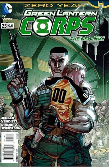
Image © DC Comics, Inc.
This is an excellent story, but it’s not a Green Lantern story. It follows John Stewart as a marine sent to Gotham City during a major storm to help evacuate people stranded in a sports stadium. Think New Orleans. Complicating things are a gang using the Batman villain Anarky as a model to terrorize the people inside the stadium and hold them, and soon the marines, as hostages. If DC still did war comics on a regular basis, this would fit right in. The power struggle and an ideological battle are played out in human terms with no super-powers, and lots of gray areas on both sides. Fine writing by Van Jensen and Robert Venditti, fine art by Victor Frujiniu, Ivan Fernandez and Allan Jefferson with a trio of inkers.
Recommended.
January 25, 2014
And Then I Read: THE LION OF SOLE BAY by Julia Jones
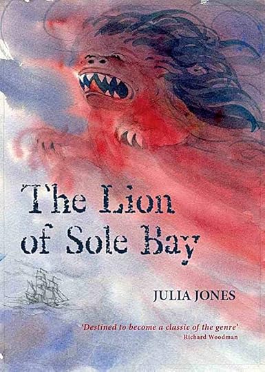
© Julia Jones, illustration © Claudia Myatt.
This is the fourth book in the “Strong Winds” series, all of which I’ve read and reviewed here. I was first attracted to the series because of connections to Arthur Ransome, a favorite author of mine and Julia Jones. She puts references and some Ransome-ish plot elements into the series, and while I’ve enjoyed them all, at first I was a little disappointed that they weren’t more like Ransome’s novels for children. I’m over that now, I was able to enjoy “The Lion of Sole Bay” for itself alone, and it’s a fine adventure story and thriller with interesting historical aspects. You don’t need to have read the previous books to enjoy it.
Luke, the protagonist, has appeared in the other books, but as one of a large cast of characters. This time he’s on his own, supposedly staying with his dad, Bill Whiting, on a boat that’s being refurbished in a remote mooring on the river Deben on England’s east coast near Southwold. Trouble is, when he shows up for his holiday, Luke’s dad is nowhere to be found. Neighbors in another boat from Holland, including a girl named Helen, are strange and unhelpful. Meanwhile, another girl named Angel who has some severe learning disabilities (including excess energy and inability to concentrate and sit still) is in a boatyard with some boys. They’ve broken in and are playing around the boats on bikes, daring each other to ever more dangerous tricks, when a serious accident happens injuring a man working there.
These three very different young people: Luke, Helen and Angel soon find their lives intertwined with plenty of trouble for all of them. There’s a plot to steal a valuable relic, a fire at the mooring that gets out of hand, and finally a kidnapping that takes them all out to sea in very dangerous weather with some even more dangerous adults, and no one on shore knows where they are! This final section of the book is quite thrilling, a sailing adventure that will keep you on the edge of your seat. In all, a fine story well told.
Highly recommended.
January 24, 2014
And Then I Read: GREEN LANTERN NEW GUARDIANS 25
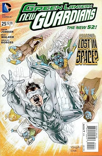
Image © DC Comics, Inc.
Most of the Green Lantern Corps thinks Kyle Rayner, the one White Lantern, died saving the universe, but if he had, this book would have become quite different, as he’s the main character. In fact, he’s alive and well, still tootling around the universe with the new Guardians, here investigating a world which may be the perfect utopia, and the Guardians hope a model for others.
Of course, if it seems too good to be true, it probably is. That’s the case here, as Kyle discovers the clever way these beings are creating their utopia by the manipulation of alternate worlds where things are not going well at all. Reminded me a little of the Eloi and Morlocks of H.G. Wells’ “The Time Machine,” but just a little. The art by Brad Walker and Geraldo Borges is quite good.
Recommended.
January 23, 2014
And Then I Read: AQUAMAN 25
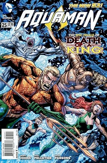
Image © DC Comics, Inc.
Writer Geoff Johns wraps up this storyline and his time as writer of AQUAMAN. His tenure has been great overall, boosting the character’s importance in the DC pantheon and bringing excellent back stories and characterizations to the leads. He will be missed by me.
There are a lot of story threads to wrap up in this issue, as Arthur Curry struggles to regain control of Atlantis and defeat the ancient king who has come back from the dead to rule it. Mera has her own problems and issues to resolve, but in the end is at Arthur’s side when he needs her most. I think that’s really the theme of the book as Johns wrote it: a powerful couple who have lots of issues and history still managing to care enough about each other to overcome their differences and work together. The art by Paul Pelletier and Sean Parsons is quite good, as always.
Recommended.
January 22, 2014
Pulled From My Files #20: TALOS OF THE WILDERNESS SEA

Images © DC Comics, Inc.
Here is a tight pencil layout for a one-shot logo I did in 1987. It’s a sword and sorcery fantasy book I think, though I haven’t seen it in decades, and that looks like the direction I was going in this design, perhaps emulating fantasy paperback logos or even epic movie logos. I’m not sure why I thought the shading lines in the deep telescoping behind the letters was a good idea, and the overlap of the L on the O bothers me now. The entire logo seems too tall as well, but logos were often taller then.

I don’t have a copy of the finished logo, but here it is on the cover. I probably hadn’t seen the cover art when I designed the logo. If I had I think I would have made it wider and less tall, and avoided the curve so it could be placed completely in the background and off the woman’s head. It was only used this once time, and perhaps it’s just as well!
January 21, 2014
And Then I Read: HELLBOY, THE MIDNIGHT CIRCUS
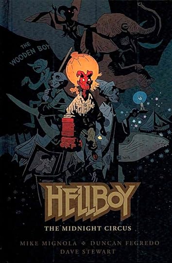
Image © Mike Mignola.
Lately the world of Hellboy seems to be concentrating on his childhood, and if anything I like it even more than his adult adventures. The hardcover format for this book signals it’s meant to be something special, and it is. It’s written by Mignola alone and with the entire art by Duncan Fegredo. Both are excellent.
Hellboy is just a few years old in our measure, but already seems to be a young teenager at least mentally, if not so much physically. He’s already a magnet for the kind of supernatural beings we would call hellish and demonic, and some of them are presenting a very odd circus to attract the boy and draw him into their influence. I’ve always thought circuses were creepy, and this book certainly plays that right up! There’s a power struggle going on over the boy, clearly, though he seems oblivious to it, and perhaps his innocence is a kind of protection. When Hellboy’s escape from the Bureau’s compound is discovered, a search party is sent out, but will they be in time? Fegredo alternates between traditional comics line art, brightly colored by Dave Stewart, and spooky wash drawings for the circus itself with much darker coloring. Oh, and since he keeps reminding me, I should point out that the lettering by Clem Robins is perfect for the book, full of life and character. I enjoy all the Hellboy material, but this book is a standout, and can be enjoyed without knowing too much of the back story, though that certainly adds value.
Highly recommended.
January 20, 2014
Snowy Owl in Cape May

There’s an unusually large number of Snowy Owls coming down from the Arctic tundra to northern North America this winter. Some come most years, but this year it’s a major irruption (the technical term). You can read more about that HERE. Birders, of course, all want to see those cool owls, and many non-birders enjoy seeing them, too. It’s the “Harry Potter” bird now, thanks to the books and movies. I’ve been hearing about them for many weeks, and today Ellen and I finally saw one in Cape May on the chimney of an apartment complex. Hope you’ll pardon me if I don’t say exactly where. There’s been some controversy about owls being harassed by people who want to get close to them, so exact whereabouts are being kept pretty quiet. If you’re in New Jersey, the best and most reliable place to see Snowy Owls is Forsythe National Wildlife Refuge, a little north of Atlantic City. A birder I spoke to today saw three there yesterday.

This particular Owl has been seen at various places around Cape May recently. We had good looks at him (probably a young male), though much of the time his head was facing away from the sun — and us. We heard that earlier he had disappeared for a while, then reappeared with a gull he’d caught, and proceeded to eat, so this bird is having no problem surviving. A resident noted he can have all the gulls he wants!

That should make him pretty happy!
January 19, 2014
Rereading: TOM’S MIDNIGHT GARDEN by Philippa Pearce
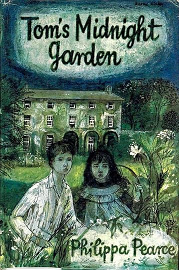
© estate of Philippa Pearce, cover illustration by Susan Einzig.
This is one of my favorite books. Not favorite children’s books, favorite books. It was first published in 1958 in England. I’m not sure when arrived in America, but I read it in the early 1960s, a recommendation from our school librarian, Mrs. Dorothy Grady.
Tom is very unhappy that he’s going to have to stay with his aunt and uncle miles away from home because his younger brother has the measles. His parents are only protecting him, but they’ve spoiled all Tom’s plans for playing with Peter in their garden during the holidays. When he arrives, glum and angry at Uncle Alan and Aunt Gwen’s home, it turns out to be even worse than he thought. They live in a small second-floor apartment in a large old house which has no garden at all, only a paved alley full of garbage cans and cars. Tom tries to be nice, but he can’t even go out in the neighborhood to play because he’s quarantined by his measles exposure. He’s miserable, though Alan and Gwen try hard to please him, and the food is good.
The one interesting thing in the house is a very old grandfather clock at the foot of the main stairs. It chimes crazily, annoying everyone in the house by never calling the right hour. Tom would like to look inside the dial, where there are interesting pictures, but the clock is owned by the old lady who owns the house, whom everyone is a little afraid of, and she keeps it locked, coming down from her third floor room once a week to wind it.
With forced idleness and lots to eat, Tom has trouble sleeping, and is often awake at night listening to the clock. One night it chimes 13 times! Tom goes down to investigate, and is drawn to the back door, which he knows looks out on the dirty alley, but somehow on that night at that time everything is changed. Tom walks out into a beautiful garden that seems to stretch on forever. He comes to realize it’s the garden of this house as it was many decades in the past. Each night the clock strikes thirteen again, and each time Tom hurries down and out into his midnight garden. There’s a family living in the house who don’t seem able to see him, as if he were a ghost, but the young girl of the house, Hatty, is different. Though at first she pretends not to see Tom, she can, and before long they are talking about Tom’s odd situation. They become friends, having many adventures together, some rather dangerous. The home’s gardener can also see Tom, and is convinced the boy is a demon out to bring Hatty to harm. He does what he can to oppose Tom’s visits, which oddly seem to jump around in time and season.
At the heart of this charming and wonderful story is a secret that adds a whole new level of greatness to it. I will say no more about that. Read the book and you’ll find out. There’s a reason it won England’s Carnegie Medal for the best children’s book of 1958. It has my highest recommendation.
January 18, 2014
And Then I Read: THE FLASH 25
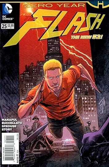
Image © DC Comics, Inc.
This is a Zero Year story, which puts it six years into the past, and in Gotham City. Barry Allen has just graduated from the Central City Police Academy and has taken an internship in Gotham just as a major storm is about to hit. Barry’s enthusiasm and impulsive actions do no endear him to fellow police, and he keeps getting pulled back from his natural impulses. Of course, Barry is not yet The Flash either, and Gotham’s streets are very dangerous. Also here is a young Iris West working as a reporter, and of course their paths collide. It’s a good story by Manapul and Buccellato that I enjoyed reading. The art is a bit jarring, as most of the issue is by Chris Sprouse and Karl Story. Chris essentially has one heroic look for his characters, and that look is not much like that of Francis Manapul. In fact, Barry Allen looks a lot more like Tom Strong than any previous version of him I can think of. His art is great, but a little distracting here. Late in the story, Manapul takes over, and brings it back home stylistically, but that only makes the style clash more obvious. Despite these quibbles, the art is all well done, and I did enjoy the issue.
Recommended.
Todd Klein's Blog

- Todd Klein's profile
- 28 followers

