
Todd Klein's Blog, page 253
March 4, 2014
And Then I Read: JUSTICE LEAGUE 26
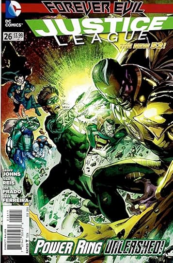
Image © DC Comics, Inc.
The “Forever Evil” storyline continues, one that doesn’t interest me much. Writer Geoff Johns is filling in the back stories of more evil versions of our own Justice League. I rather liked the Green Lantern one, with the ring as the ultimate temptation. The others were not as entertaining. The art is excellent, as usual on this book. I can’t really recommend it, though. If you’re following the entire crossover, this is probably an enlightening slice, but if you’re not, it doesn’t stand that well on its own. Particularly since only one of the title characters appears, and briefly.


March 3, 2014
Snow Day!

We’ve had a rough winter in New Jersey, with well over 20 storms passing through since December. Here at the southern end of the state we’ve escaped the worst of the ice and snow, but today’s storm got us, dropping about six inches. I shoveled the front walk, the driveway was still passable without shoveling, as Ellen proved with her car. Good thing, I shouldn’t be shoveling the driveway, bad for my back.

After our snow work we went for a walk in the woods behind our house. I don’t go there most of the year because there are plenty of ticks, but in winter that’s one thing we don’t have to worry about. Ellen is well bundled.

We had rain last night before the snow, and the changeover left a thin coating on the trees, like this American Holly, which grows throughout the woods in our area. The Robins that winter here get by on the berries when the ground is covered or frozen and they can’t dig for worms.

No matter the weather, our boys Tigger and Leo want to go out on the screened porch to watch the birds and squirrels at our feeders, but this snow thing on the porch floor is an unexpected hazard.

Tigger didn’t stay out long. Leo lasted longer, dancing from one pair of feet to the other, with lots of shaking and licking the cold toes.

He did enjoy watching the birds, but before long he was at the door wanting to come back in. We stayed in the rest of the day, too.
March 2, 2014
And Then I Read: GREEN LANTERN CORPS 26
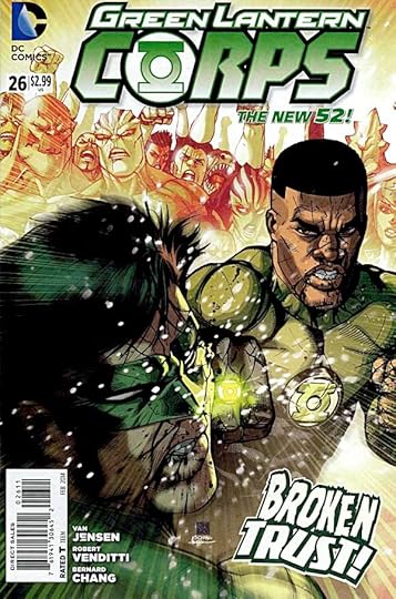
Image © DC Comics, Inc.
Mogo, the planet-sized Green Lantern created by Alan Moore, continues to play an important role in the current Corps, as he’s now their home base. Mogo seems the most calm and rational of the group these days. On his surface, John Stewart and Hal Jordan are having it out over Hal’s leadership decisions and style. Meanwhile, on a distant system, a group of GLs are investigating the continuing undermining of their influence. They haven’t figured out the cause yet. All those power rings, and no one is asking the right questions. Not a bad issue overall. I like the art by Bernard Chang, he brings some appealing visual personality to the main cast.
Recommended.
March 1, 2014
SPEEDBALL TEXT BOOK 14TH EDITION Part 7
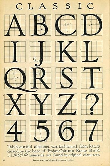
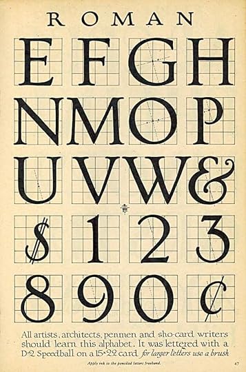
Images © estate of Ross F. George/Hunt Manufacturing.
Continuing my look at the 1941 edition of this lettering how-to booklet, on these pages George takes us back to the beginnings of the Roman alphabet as we know it. By placing each letter on a five-by-five line grid, and also showing the angle he used to work out the thick and thin variations of the strokes on some of the circular sections, he’s made it easy for anyone to reproduce these letters much larger. Simply prepare a much larger grid and sketch out the black areas in each section. It’s a time-honored way of transferring small things to large surfaces reasonably accurately, before computers. Note that, while based on the Trajan Column letters, his forms have softer and more rounded serifs and corners.
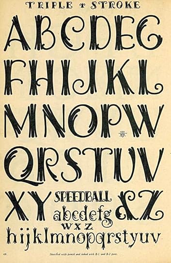
The name Triple Stroke says it all in this classy use of round-tipped pen points to create decorative letters with a New Orleans flair to my eye. At the smaller size it’s still easily readable, too.
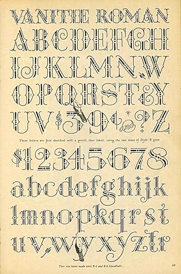
Here’s a very elaborately decorated open letter style with a Circus feel. It might also look nice on a party invitation. Rather hard to read, so something you would use sparingly.
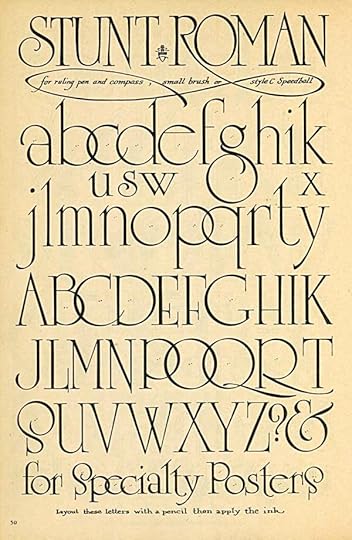
George calls this Stunt Roman signifying that he considers it a lettering equivalent of showing off or performing for the crowd. The letter forms are very stylish, Art Deco in the extreme. I like it, though again would use it sparingly. There’s a font called University which is clearly based on this.
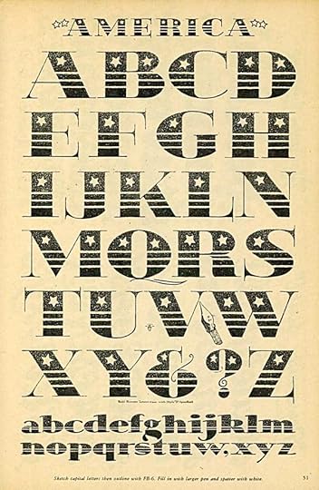
A patriotic style that works well for these large letters, the thin strokes would disappear at smaller sizes.
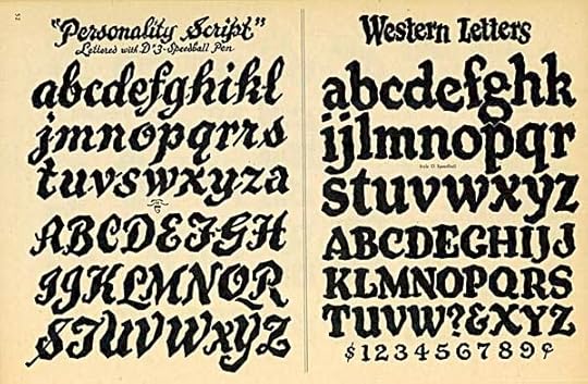
These alphabets use the idea of wobble, adding a rough or crude look by making all the strokes uneven in random ways. It’s an idea I used often when lettering comics, though not in these specific styles. “Western Letters” suggests the crudeness of signs in the Old West, I guess, though I’ve never seen anything like it in real Old West imagery.
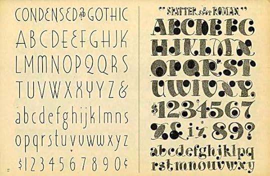
The final page in this post is full of contrasts. On the left is a stylish condensed Art Deco alphabet that I like, though the strokes are a bit thin. On the right is an experiment in tone and rounded shapes that I find almost unreadable and rather ugly. Well, they can’t all be winners! More next time.
February 27, 2014
And Then I Read: JUSTICE LEAGUE 25
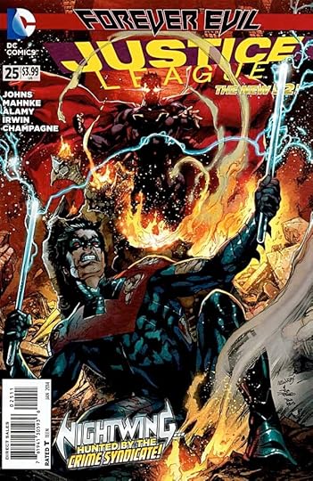
Image © DC Comics, Inc.
I thought I’d seen every possible version of the Batman origin, namely the murder of young Bruce Wayne’s parents, but writer Geoff Johns has come up with a new one. It’s an alternate universe version, the origin of the completely evil and criminal Batman-type in the Crime Syndicate, from an Earth where they, the super-humans, run everything, using their powers for personal gain. It’s an interestingly twisted version of the Batman story, but I found nothing in the main character to like or sympathize with. It’s all part of the “Forever Evil” storyline, which I’m only getting bits of in this title, and from those bits I can see I’m not missing anything I’d enjoy reading.
The writing is good, even if the subject is distasteful. The art is excellent, even in it’s very realistic depictions of cruelty and violence. If you like that sort of thing, here it is. I can’t recommend it.
February 26, 2014
And Then I Read: ASTRO CITY 7
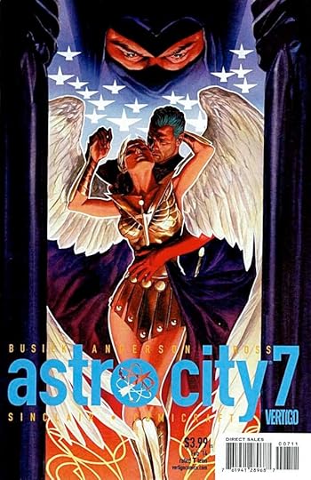
Image © Juke Box Productions.
Super-heroine Winged Victory seems to have it all: powers that include wings that work and great strength, a romance with a powerful male hero, a worldwide organization that helps women in many ways, including training those with super abilities of their own. Yet someone has it in for her, and the life and organization she’s spent so many years building is about to come down around her ears…unless she can find out who’s behind the insidious threatand deal with them directly. So far, that person or group remains elusive, and Winged Victory is forced to fight a rearguard battle for her reputation and holdings. Meanwhile, a young man with lots of trouble at home has shown up on her doorstep, even though he knows she helps only women. Great writing by Kurt Busiek and fine art by Brent Anderson, as always.
Recommended.
February 25, 2014
And Then I Read: SWAMP THING 27
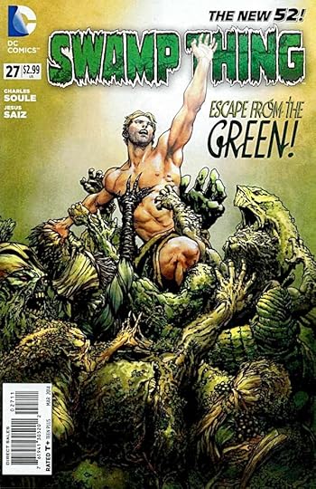
Image © DC Comics, Inc.
Alec Holland has lost his battle to be the avatar of The Green, and has been banished to their own place, a sort of heaven for past avatars. Unlike most of the residents, he’s not happy with that situation, not ready to rest and relax and let someone else take on The Green’s problems in our own world. Fortunately he finds another former avatar with a similar desire to escape the green prison. Writer Charles Soule continues to entertain me by finding new aspects and areas of the Swamp Thing mythos to explore, and by making Alec Holland as clever a man as he always should be. Power does not impress me, determination and good ideas do, and in this issue, Holland has them all. The art by Jesus Saiz is excellent, perfect for the story and characters.
Highly recommended.
February 23, 2014
When Lettering Takes Center Stage
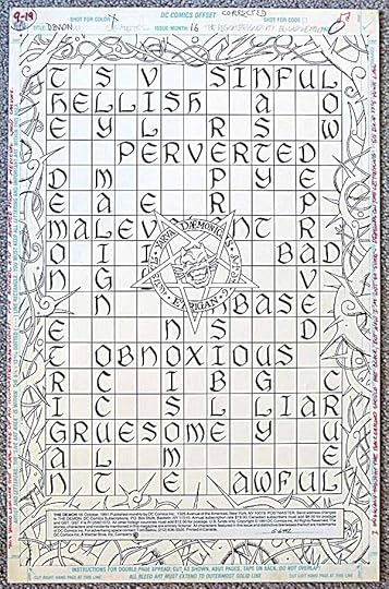
Image © DC Comics, Inc.
Usually in comics lettering takes a supporting role behind the writing, art, and even the coloring. It’s an important role, but not one that is meant to stand out, sort of like the soundtrack of a film or even more appropriately the title cards of a silent film. There are places where lettering is meant to be noticed, like the title page and certain places where sound effects are important, and occasionally lettering gets to walk right up to the front of the reader’s attention and show off. This was the case in a 1991 issue of THE DEMON, #16, written by Alan Grant, art by Val Semeiks and Bob Smith, lettering by myself. The script called for a representation of a page in a medieval book of spells, but one that was actually more of a crossword puzzle filled in. When I got the pencilled art, I probably drew in the lines of the crossword and put in the large calligraphic letters as indicated by Val Semeiks. It’s likely I also inked in his lettering on the central monogram, too. While that and the thorny borders are fine work, there’s no denying that the lettering had a chance to shine here, and I enjoyed that. When the art was eventually returned to Val, he gave me this page, a very kind gift. I thought you might enjoy seeing it. And, if you’re interested in owning this page, I have it on eBay HERE. While I’ve enjoyed owning it for many years, I feel it’s now time to pass it on. I’d be happy to sign it for you.
February 21, 2014
Pulled From My Files #22: X-MEN #30 cover
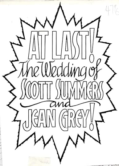
Image © Marvel Characters, Inc.
In late 1993 I was asked to letter the cover blurb for X-Men #30, as you can see, a special event. It’s always fun to have a place to use some decorative calligraphic script, and in this case I thought it worked well with some art deco open letters for the top line and character names. The lettering was done by hand.
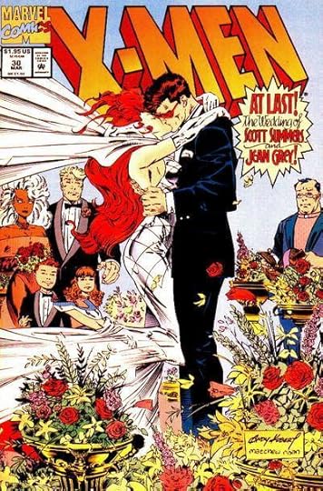
The jagged oval burst balloon with a roughened outer edge added some energy to a generally static cover scene, though one with lots of implied movement. I thought it worked well.
February 20, 2014
And Then I Read: DARK HORSE PRESENTS 24
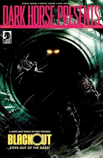
Image © Dark Horse Comics.
Still way behind on this title, but here’s another issue. The cover feature is a new series written by Frank Barbiere with fine painted art by Micah Kaneshiro featuring a burglar with the power to go invisible, a nice one to have for the trade. He actually goes into some kind of other space, which looks to add interesting elements to the storyline. Good start.
“Alabaster” by Caitlín R. Kiernan and Steve Leiber continues, but this chapter does not seem to relate to what went before, and simply left me confused.
“Bloodhound” continues in a police story that also involves an invisible villain. Looks good, well written, but what are the odds?
“Brain Boy” continues with a nice display of mental powers by the main character, and some clever thinking as well. The art looks appealing and well drawn.
I’m delighted to see the beginning of a “Trekker” serial written and drawn by old friend Ron Randall. Trekker is a bounty hunter, and as the story opens we see how good she is at her job. Then something completely different, a vacation with a girlfriend, but one that looks to have some interesting angles. Handsome work.
“King’s Road” continues with an intriguing story of a family from a fantasy kingdom in hiding on our mundane world, an odd mix of genres with a talking dog to boot, but I like it.
“Nexus” meets Sherlock Holmes AND H.G. Wells. Love it!
“Villain House” by Shannon Wheeler continues to entertain me.
Recommended.
Todd Klein's Blog

- Todd Klein's profile
- 28 followers

