Todd Klein's Blog, page 250
April 5, 2014
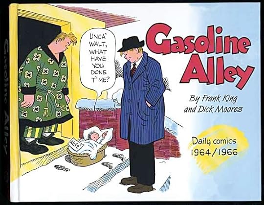
And Then I Read: GASOLINE ALLEY Daily comics 1964-66
Images © Tribune Media Services, Inc.
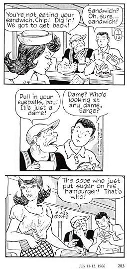
When I was a child my dad always got a Sunday paper with a comics section, and I always read and enjoyed it. I remember reading some “Gasoline Alley” Sunday pages, and while I liked the art pretty well, it wasn’t that appealing to me as a strip. Very soap opera. “Superman” was much more my thing. I don’t think we got a daily paper regularly, and when we did, I didn’t look at the comics, as far as I can recall. This new collection of “Gasoline Alley” daily strips is much more my thing now. I enjoyed the story lines and the characters, as well as the art. There’s a large cast, and a family tree at the beginning is quite helpful, but the writing is good enough that I was soon drawn into each story even if I didn’t quite know the relationships. The Wallet family are very nice folks all, the kind you’d like to have as friends and neighbors. When they are taken advantage of, they smile and get their payback in the nicest way possible. There are plenty of eccentric and entertaining supporting characters and opponents, including Mr. Pert, the strip’s version of Lionel Barrymore’s character in “It’s A Wonderful Life,” and an old junk dealer named Joel with a fascinating past and a habit of getting himself and others into trouble.
The art by Dick Moores is terrific, a canny blend of realism and dot-eyed caricature. These strips mark the transition from the very long tenure of Frank King on the strip to the ascension of Dick Moores’ complete control of it. King was still involved in the writing as these years began. The transition is seamless.
Highly recommended.
April 4, 2014
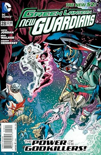
And Then I Read: GREEN LANTERN NEW GUARDIANS 28
Image © DC Comics, Inc.
Writer Justin Jordan has imagined a group of fighters powerful enough to slay gods, one that is scouring worlds across the universe in search of planets they feel are under the unjust subjugation of godlike beings. Their story bookends the main thread, where Kyle Rayner and his gang are on an alien world trying to stop a war. One side on this war is a religious group with a strong belief in their own god, and power to back it up. You can probably guess where these story lines will meet in the next issue. One thing that makes it particularly interesting to me is the eventually revealed identity of the god on this disputed world. It’s a character I once wrote. Be interesting to see what comes next. The art by Brad Walker and Andrew Hennessy is fine.
Recommended.
April 3, 2014
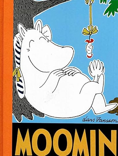
And Then I Read: MOOMIN Volume 8
The Moomins, their friends and enemies, and the entire whimsical contents of Moomin Valley and beyond were created by Tove Jansson in a series of novels written for children that I love and recommend highly. Later she created a comic strip with the characters primarily for a British newspaper, but of course syndicated elsewhere. I’d never seen or heard of it until these collections by Drawn & Quarterly started coming out. The strip is not as good as the novels in my opinion, but it’s good fun and entertaining. Tove tired of the grind of a daily strip after a year or two, and her brother Lars started writing it. A few years later he took over the art as well, despite never having drawn much before that. Artistically, the transition was pretty seamless, and Lars continued the strip for many more years on his own. The stories are full of social satire, slapstick humor of a gentle sort (think Laurel and Hardy rather than The Three Stooges), and characters that are quirky and original.
The four storylines in this issue include the Moomin version of (trying to) get shipwrecked like Robinson Crusoe, the Moomin household being taken over by an artists colony, another of them being forced to cater to holiday campers, and finally the antics of a young and impulsive policeman ready to charge anyone with any crime he can think of.
Recommended, and you don’t need to have read previous volumes to enjoy any one of these.
April 2, 2014
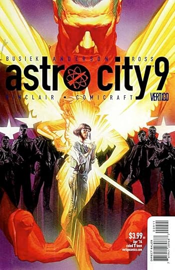
And Then I Read: ASTRO CITY 9
Image © Juke Box Productions.
The main character of this storyline, the top super-heroine of the series, Winged Victory, can obviously be compared to DC’s Wonder Woman. But the Amazon warrior has one important support that Winged Victory does not: a home base, a family of other Amazons, a refuge and retreat on Paradise Island that she can always turn to. Winged Victory has built up her own support system year by year, woman by woman; taking them in, training them, having them administer her strongholds around the world, but now that’s all crumbling. In this issue we meet one of the women who have given Winged Victory her power, and it’s a great moment, but only a pause in the battle she faces. Meanwhile, unknown forces continue to attack Winged Victory and knock down what she’s built.
Great work by Kurt Busiek and Brent Anderson, and of course Alex Ross on cover. Recommended.
April 1, 2014
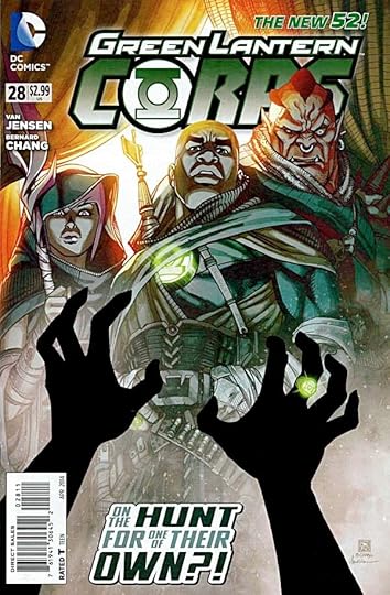
And Then I Read: GREEN LANTERN CORPS 28
Image © DC Comics, Inc.
I’m really warming to this title again. The art by Bernard Chang is very appealing, and the writing by Van Jensen is growing on me.
The first main storyline this time focuses on a disreputable trickster in an other-world marketplace. This trickster is named Von Daggle and has yellow skin and two fleshy antennae on his forehead. Readers of LEGION OF SUPER-HEROES take note. Not only is this a fun sequence with lots of action and surprises, but Chang is doing something creative and playful with the art that I like: one panel on nearly every page is in an alternate graphic style with stark black, white and red coloring. It makes a nice contrast to the yellows and greens of the rest, and adds to my appreciation of the art without slowing down the story. The other thread is on Mogo, where the remaining Corps are still trying to regroup and form a plan to deal with the heavy odds against them. A kidnapping in their ranks does not help matters.
Recommended.
March 31, 2014
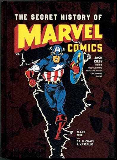
And Then I Read: THE SECRET HISTORY OF MARVEL COMICS
This large hardcover book focuses on little-known areas of the Martin Goodman publishing empire, which included the various comics companies that became Marvel Comics. The title is a little misleading because the history it details is not secret, and the spotlight is on the pulp magazines put out by Goodman, with the comics taking a back seat. Last year I read “Marvel Comics, the Untold Story” by Sean Howe, which is much more focused on the comics company, though light on details about the 1940s and 1950s, which are the main focus of this book, so they do fill different niches. The Howe book is better written, this one tends toward bombast and sensationism, and some of the information is repeated in different sections, but on the whole it’s not a bad book, and for someone like myself interested in the pulps and their connections to comics, it’s well worth reading.
Much is said about Martin Goodman, and in some ways this is close to biography for him, except that Martin’s immediate family did not contribute, so many stories and opinions are second or third hand. Still, a picture of the man and his working methods does emerge, and it’s not particularly attractive. Even Stan Lee has a hard time finding good things to say about his former boss. I’m sure this is one reason why the family stayed away if they were asked. Like the Howe book, this one has almost no images from the comics, with the Captain America one on the cover and one early comic cover being about the only exceptions. I know Marvel declined to give permission to Howe unless they could have control over the text, and that may have been the same here.
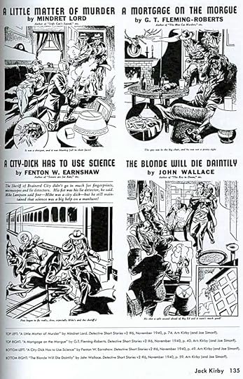
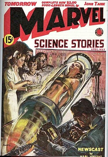
Instead the book is profusely illustrated with art and covers from the Goodman pulp magazines (and a few other types like large-size slicks and digests) in black and white and in color. After the main text by Blake Bell and Dr. Michael J. Vassallo, which comprises about the first third of the book, there are lengthy artist profiles featuring art from the pulps and magazines by artists mostly known for their comics work. Jack Kirby is first up with the longest section (and the only artist mentioned on the cover). While it’s interesting to see this early work, much of it probably collaborations with Joe Simon, I didn’t find it all that appealing for the most part. The art printed poorly on the old interior pulp paper to begin with, and the style is not as dynamic as later Kirby work. Some of the other artists represented interested me more, like Alex Schomburg (with surprisingly sadistic examples), Bill Everett, Frank R. Paul, Al Williamson, and even some cartoons by Artie Simek.
The pulp covers are great, many with paintings by J.W. Scott, who filled the “favorite cover painter” role for Goodman like H.J. Ward did for Harry Donenfeld’s pulp empire, though the example above is by Norman Saunders, a painter I like better.
If you’re looking for lots of info on the Marvel Comics of today that really began in the 1960s, this book will not help you much. For that the Sean Howe book is much better. If you’re interested in art and magazines of the 1930s-1950s, you’ll find a lot more here for you. And, of course, learning about the company bosses can be enlightening too.
Recommended.
March 30, 2014
More About Stanley Kaye
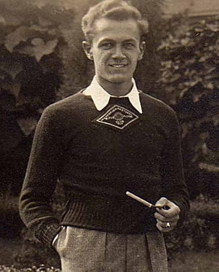
In late January I wrote a two-part blog article about a mysterious Superman painting by DC Comics artist Stanley Kaye, Part 1 and Part 2. After it was published I received some additional information about Kaye, but I’ve been too busy with paying work to write about it until now.
First, Comics historian Mike Tiefenbacher forwarded some information about Kaye written by another comics historian, Joe Desris for the book, “Batman: The Sunday Classics: 1943-1946.” Kaye did some inking for the strip, which is why he’s included. In that book, Joe Desris wrote:
Stanley Rivinas was born November 24, 1916, in Brooklyn, New York. His father died when Stan was an infant, and his mother later married Alfonse Kalinowski.
After graduating from John Adams High School in Queens, Stan attended sign painter school and then went to work for muralist William MacKay. Complaining that Kalinowski was too long to write on a paycheck, MacKay shortened the name to Kaye. He used “Stan Kaye” from then on, but it was not until he married in August, 1945 that he legally changed his name.
During the late 1930s, Kaye worked as an assistant to illustrator and muralist Dean Cornwell. Since Cornwell was left-handed, Kaye learned to paint in a left-handed manner in order to properly mimic the work. Cornwell had studied with Harvey Dunn, one of Kaye’s major influences, and may have introduced Kaye to the illustrator. Kaye attended Dunn’s class at the Grand Central School of Art for several years and in the fall of 1940, he was in the same class with Charles Paris, Cliff Young and Gene McDonald, all future DC employees. Kaye maintained a friendship with Dunn for years, occasionally visiting his Tenafly, New Jersey home.
Kaye went to work in DC’s bullpen in 1941. Due to scar tissue on his lungs from TB as a child, he was not drafted during World War II. He and his wife lived with his parents in Queens until late 1946. Moving to Larchmont, New York, he was able to work out of his studio at home and therefore left the bullpen. Kaye delivered finished art during his weekly commute to the DC offices.
Initially doing text illustrations for various DC titles, one of his earliest regular features was “Genius Jones,” which appeared in MORE FUN COMICS and ADVENTURE COMICS. Kaye’s signature could often be found on the splash page. He admired the work of cartoonist Roy Crane and brought that style to Jones. Kaye typically used a pen on this feature, although he is best known for his fluid brush and ink line. Kaye was as adept at cartoons and superheroes as he was at serious illustration and painting. He did some magazine illustrations in addition to his comic book work and belonged to the Cartoonist’s Guild.
Kaye inked six weeks of the “Batman and Robin” newspaper strip which appeared during February-March, 1946. He inked Wayne Boring’s syndicated “Superman” Sunday strips from the late 1940s into the 1950s.
He worked on all of DC’s main features during his 21 years in the business. Among his work at DC: “Cunnel Custard” (MORE FUN COMICS), “Drafty” (WORLD’S FINEST COMICS), “Hayfoot Henry” (ACTION COMICS), “Batman” (BATMAN, WORLD’S FINEST COMICS), “Superman” (ACTION COMICS, SUPERMAN, WORLD’S FINEST COMICS), as well as Jimmy Olsen, Superboy and Superman-Batman team-up stories in WORLD’S FINEST COMICS. He also inked numerous covers for ACTION COMICS, SUPERMAN and WORLD’S FINEST COMICS.
Kaye left DC around 1948 to ghost Harry Haenigsen’s daily newspaper strip “Penny” and the Sunday “Our Bill,” making a weekly sojourn to New Hope, Pennsylvania to pencil and ink the strips. It did not work out as expected, in part due to Haenigsen’s occasional last-minute writing and Kaye’s resulting marathon work sessions to finish the strips before the deadline. After several months, Kaye returned to DC.
He permanently left comics in 1961, moving his family to Racine, Wisconsin where he went to work at his father-in-law’s manufacturing firm. He died June 21, 1967.
Mike TIefenbacher put me in touch with Joe Desris by email, and I sent him the article I’d written. Joe had lots to say about it, and an interesting email exchange ensued. Stan told me he interviewed Stan’s wife Marion for his research. The article includes a photo of Kaye working in his home studio in Larchmont, NY, but I don’t have a scan of that image good enough to show here. If anyone has the book and can make a good scan for me, I’ll drop it in. Here are some excerpts from my emails from Joe:
JOE DESRIS: “I would speculate that the Kaye painting had nothing to do with the Ward and Szokoli art, and was simply Stan’s superior take on the painting, perhaps done at the request of an editor, or just for the heck of it as wall art. There is a photo of [DC editor-in-chief] Whit Ellsworth which depicts a Fred Ray illustration hanging on the wall behind Whit’s desk, so ti was not uncommon. Artists are always drawing and sketching, and there are not always BIG STORIES behind every piece.”
My theory that the Kaye Superman painting was involved somehow with the retouching of the H.J. Ward oil painting by another artist, Szokoli, perhaps a sample to show what the face should look like, is just a theory. I have no hard evidence to back it up. Joe could well be right, but there are some details that I feel make my theory plausible. First, it’s not done on canvas, it’s done on art paper of some kind. I feel if Kaye were doing the painting to be given or sold to someone the choice of materials is unlikely. Second, the style and technique closely matches the large oil painting that hung in company head Harry Donenfeld’s office. There may have been small reproductions of the original Ward version, but I feel the Kay painting had to have been copied from the original work to get so close. Some of the brush strokes are virtually identical. The painting was too large to remove from the Donenfeld office easily, and I feel it must have been done there. Why would a recently-hired comics artist be given that opportunity if there wasn’t some good reason, like the one I’ve theorized? So, with all due respect to Joe Desris, I’ll stand by my theory.
JOE DESRIS: “Stan is not known to have worked on Superman that early. Except for Jack Burnley and Fred Ray’s work, I think all other Superman art was still coming from Cleveland in 1942, so Kaye likely would not have had the opportunity to work on Superman comic or strip art at that point.”
I hadn’t realized most of the Superman art was still coming from Joe Shuster’s studio in Cleveland then, so fair enough. But that art from Cleveland came to the National Comics (now DC Comics) offices to be prepared for printing, so Stan would likely have seen it, and have been familiar with the look of the character. He captured it extremely well in his painting, better than Szokoli, in my opinion.
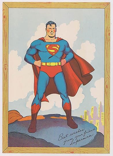
JOE DESRIS: “That Ward painting I believe was used for an early promotional card that was about 4 x 6 inches, and may have been part of the Superman Club, or something given away to those who wrote in to the company. It’s a darn big painting for a comparatively small card, but it shouldn’t be a mystery to anyone familiar with early Superman. It was reprinted many times, and was eventually redrawn by Wayne Boring (as line art, not a painting). In fact I would speculate that Szokoli’s repaint was done to make the art more current before they reprinted the card, rather than trying to cover up anything for legal issues against Fawcett. Superman’s image was always changing, with Shuster, Boring, Burnley all having different styles and takes on the character, and all of it appearing almost simultaneously. Things looked different again when Win Mortimer accidentally got off the elevator on the wrong floor, and was hired by DC in 1945.”
Image © DC Comics, Inc.
Here’s the card Joe is talking about, clearly based on the Ward/Szokoli painting, but with the figure drawn in line art by (I assume) Wayne Boring. It’s from the personal collection of Jerry Siegel, and probably dates from 1942. If there was an earlier version reproduced directly from the painting, and especially the original Ward version, I’d love to see it, but haven’t found any evidence of it. If it does exist, and is detailed enough for Stanley Kaye to have made his painting from, then Joe’s theory gains credence.
JOE DESRIS: “You define Kaye as a ‘staff production artist,’ but from interviews I’ve done with guys who worked there (Robinson, Paris, Burnley, etc.) there were no staff production artists at DC in 1942. There were artists who worked in the office [in the Bullpen], and artists who worked at home, and at that point they did their own features, stories and assignments and made their own corrections. Of course that changed over time as DC grew, published more material, and hired more staff.”
That’s good and useful information, and I’ve corrected my article to reflect it. There did have to be someone preparing work for the printer, though, doing things like assembling ads and text pages, adding indicias and cover type, assembling the trade dress on the covers, and putting the individual stories together as a package for the color separators and printer. In 1942 that may all have been done by the production manager and perhaps his assistant. I still feel it’s possible the bullpen artists might have been called on from time to time to make art corrections. Everyone makes mistakes occasionally, and I doubt they would have always had time to get the original artists to do it, especially with the Superman art coming from Cleveland.
Image © DC Comics, Inc.
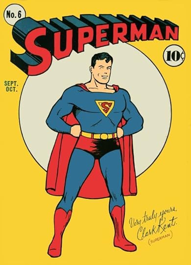
JOE DESRIS: “By the way, the comment in your first blog that the Superman 6 cover influenced the Ward painting cannot be true if the Ward painting was delivered June 24, 1940 as David Saunders states. It is the other way around! Superman 6 would have gone on sale in July and the cover would have been drawn at least two or three months earlier, AND it would have come out of Cleveland. You see similarities because Superman 6 was most likely what influenced the Ward painting, or what Ward was given as reference! The original cover art would have existed in April 1940 or earlier.”
Great point, I miscalculated the dates. I’ve amended my blog to reflect that. Thanks to Joe for his comments and corrections.
I also received a little more information from Diane Ostrander-Kaye, Stan’s daughter-in-law. She wrote:
There are two stories as to why the surname changed. I don’t doubt that Stan told his wife Marion the story aboutt “the check” and that could have happened and may have even provoked the initial idea of changing the name, but that doesn’t explain why his brother also changed his name too. I think the second story his brother Jerry told his wife sounds more credible. The Great Depression resulted in a scarcity of employment opportunities particularly when combined with the prejudices of family origins. All were contributing factors in Stan and his brother, Jerome, ultimately changing their surname from Kalinowski to Kaye.
Stan’s biological father died of TB. Stan was actually unaware he had even had TB until the scar tissue was found on his lungs during his military application.
I was told by his Aunt Helen before she passed that Stan would spend hours drawing as a child, a passion he would continue to pursue.
I have researched Stan’s birth name, originally spelled Rawinis (the name is said to be Lithuanian). His father was listed as Polish, from the town of Suwalki, Poland, then under Russia. The W is pronounced V which explains the “Americanized” spelling of Ravinis, which is how he spelled his father’s name on his marriage record.
Thanks for those additional notes and memories, Diane. More about comics creators can be found on the COMICS CREATION page of my blog.
March 29, 2014
SPEEDBALL TEXT BOOK 14TH EDITION Part 8
Images © Ross F. George estate and/or Hunt Manufacturing Co.
Continuing my commentary on this 1941 lettering and design handbook. Previous chapters can be found under the “Lettering/Fonts” category tag on the right side of this blog page.
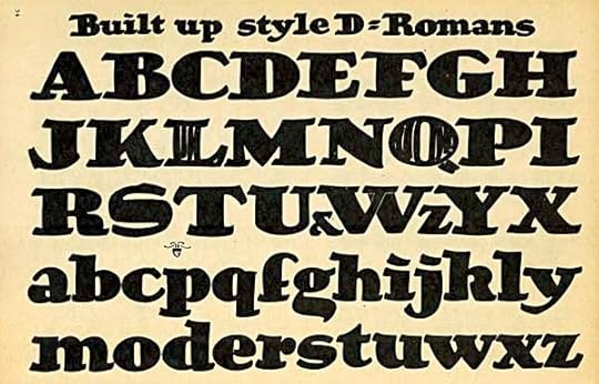
Ross F. George was a master with the Speedball pens he helped design, and this alphabet is full of appealing bounce and humor. It also looks quite old-fashioned to me now, though in 1941 it was probably right up to date. I particularly like the capital S.
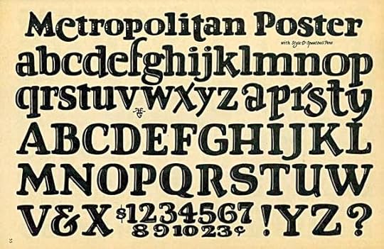
A more formal but just as appealing alphabet with a white inline that gives the letters depth. There are very few straight lines here.
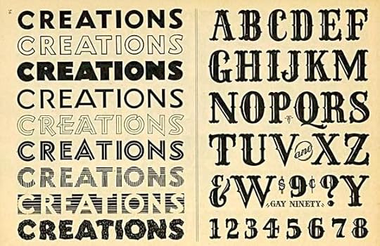
On the left we see the kind of experimentation and exploration of styles that go into the creation of new lettering styles and fonts. The last one might have come from a comic book. On the right is what, to Ross, was recent history, the “Gay Nineties,” a style we now associate with the old west and/or circus posters, and perhaps New Orleans and riverboats too.
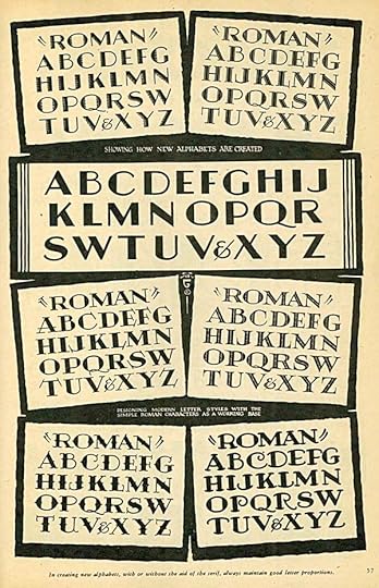
More variations on a theme, though none of these are what I (and most designers) would call Roman. Some of them are certainly Art Deco.
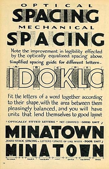
Ross takes time out from alphabets to lecture on spacing. His comments are still correct and relevant, but most people don’t run into this kind of spacing problem because they’re using fonts with kerning (individual spacing allotted to particular pairs of letters) that eliminate at least the most obvious spacing problems. When one is creating fonts, though, this is crucial knowledge.
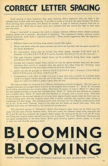
More wise words about letter spacing, and methods of approaching it, good and bad. The more you work with letters, the more obvious correct spacing becomes. You know it when you see it, it looks right. The fact that there are fonts out there with bad spacing means one of two things. Either the person creating the font hasn’t learned to see correct spacing, or he (she) doesn’t want to put the extra work into adding kerning information for all the letter combinations that will make it look right.
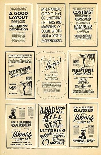
Moving on to page design using large display lettering and blocks of type. My favorite thing here is the one at bottom center. Today’s page designer works most often with color, and that leads to other kinds of design decisions, but for plain black and white design, these are excellent examples.
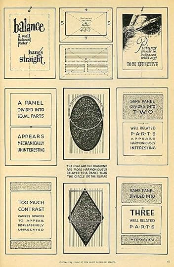
Good words on balance in page design. The one at upper right could apply to comics, and when the lettering was laid out on the page by the penciller while designing a comics page, the pictures and text worked together better in many cases. The only artist I know of that still does this today is P. Craig Russell. His pages are all beautifully designed.
More next time.
March 28, 2014
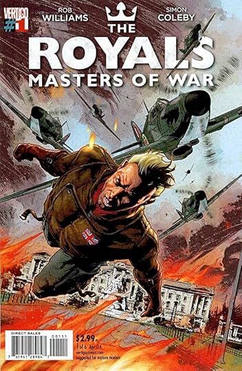
And Then I Read: THE ROYALS, MASTERS OF WAR 1
Image © Rob Williams & Simon Coleby.
In many superhero stories the character who gains power is the weakling, the downtrodden, the unlucky victim. It’s wish-fulfillment for readers, and perhaps writers and artists, too. This series goes in the complete opposite direction, giving powers to the royal families of Europe. Already privileged politically and financially, they have the added benefit of superhuman abilities. Yet, to keep the balance of power, they’ve all agreed NOT to use their abilities to help the regular citizens in wartime, instead allowing their country’s soldiers to die in droves while they play in their palaces. One young royal finds this as reprehensible as we, the readers do, and he decides to buck the trend. The result is momentarily heartening, but…will it simply bring more destruction when the other royals join in?
This series owes something to Alan Moore’s MIRACLEMAN, and making the title characters likeable is going to be an uphill battle, if that’s the plan, but the first issue is a good read, and I’m interested to see where it goes. The art and writing are both well done.
Recommended.
March 27, 2014
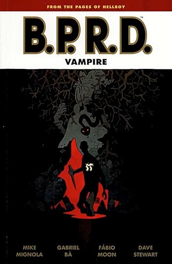
And Then I Read: B.P.R.D. VAMPIRE
Image © Mike Mignola.
This is part of the early days of Hellboy and the B.P.R.D. series, which I’m actually enjoying more than the present day series, “Hell On Earth.” Agent Anders has already been through one harrowing and life-altering episode in his early days as an agent, on a mission in Europe. Now he feels he has to go back there and try to find the vampires that are haunting his soul and making his present attempt at a normal life impossible. The Professor, head of the Bureau, allows him to go, even giving him some clues as to where the vampires might be found. Anders knows he’s not likely to return from his new mission, either dead or alive. What he can’t yet know is that the dark powers he seeks are already waiting for him.
This story is full of the atmosphere and dread of the best Universal monster movies, though of course with more blood and violence. The art by Gabriel Bá and Fábio Moon fits well into the Mignola universe, a little too sketchy at times, but mostly spot on. They also had a hand in the writing, and it all works well.
Recommended.
Todd Klein's Blog
- Todd Klein's profile
- 28 followers


