
Todd Klein's Blog, page 255
February 7, 2014
SPEEDBALL TEXT BOOK 14TH EDITION Part 6
Images © estate of Ross F. George/Hunt Manufacturing Co.
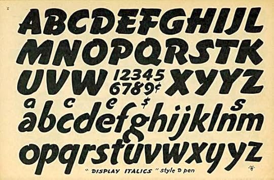
Continuing my look at this classic lettering manual that has remained in print for nearly a century, with many different editions. This page shows a typical showcard lettering style of the 1930s-40s, one that would have been seen in advertising and movie lobbies frequently. It has a friendly look and a nice bounce, an inviting style. George suggests using the Speedball “D” penpoint, but I suspect it would take multiple strokes to achieve these forms, and even then would probably require some corner adjustments with a smaller pen.
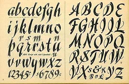
In this style the multiple strokes are obvious, and really the point. Elegand and energetic at the same time, a style for headlines rather than blocks of text, and quite appealing.
The style on the left is clever but not easy to read. It would all have to be worked out carefully in pencil before putting pen to paper. I think the idea works, but better with block letters rather than script. The style on the right is effective where the letters are filled, as in the title, but the open letters are hard to read and seem weak to my eye.
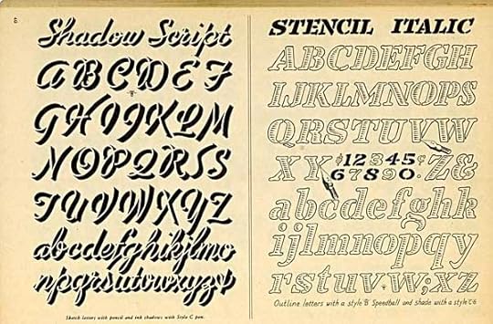
These more fanciful styles are very Art Deco. The top one I find appealing, I like the spatter texture and vertical openings. The one below doesn’t work for me at all.
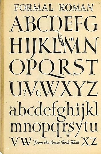
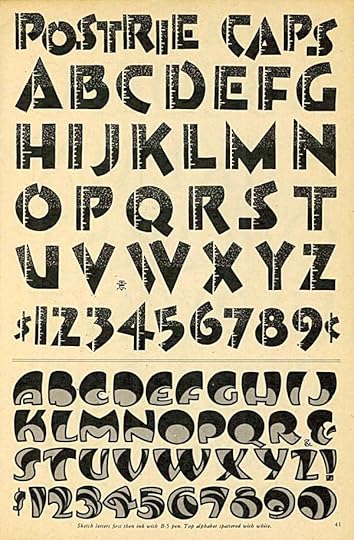
Author Ross George once more baffles me with his style names. This is certainly Roman, yet anything but formal! It has lots of informal bounce from the curved serifs while the letterforms themselves are traditional, a nice combination of elements that makes this very appealing. Note that there are no perfectly straight lines anywhere, all the shapes are tapered or curved.
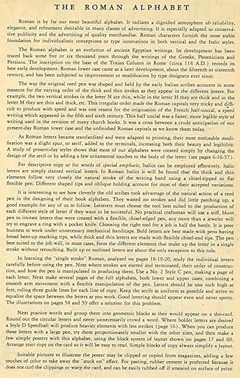
An entire page of instructional text from George, with lots of smart and sensible advice. I particularly like “Choosing the right tool for a job is half the battle.”
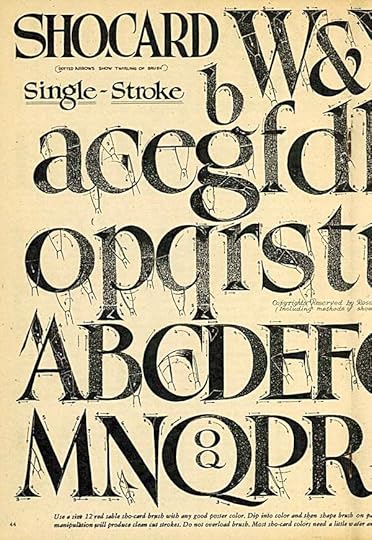
For some reason “showcard” became “Sho-card” in this and other books, but this and the next picture are wonderfully illustrated and diagrammed examples of how to create classic Roman letters with a wedge-tipped brush. I’m not sure what kind of brush would work best for this today, as I imagine no one is still making “sho-card brushes,” but it would be fun to try some out.
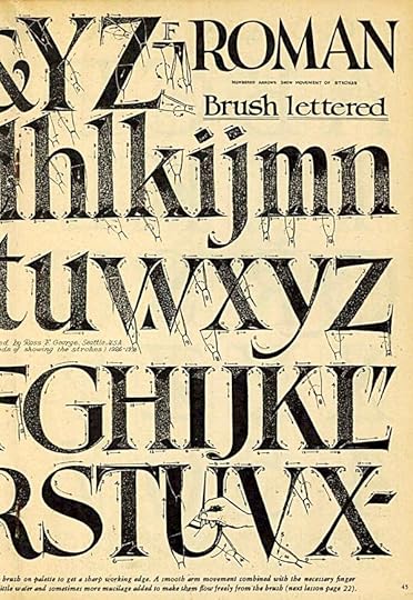
Just the method of holding the brush perfectly vertical would give me a lot of trouble! And the fact that I’m left-handed, too. Maybe it’s just as well I’ve done nearly all my hand-lettering with pens.
To be continued. Look for previous parts of this series under the “Lettering/Fonts” category on the right sidebar.


February 6, 2014
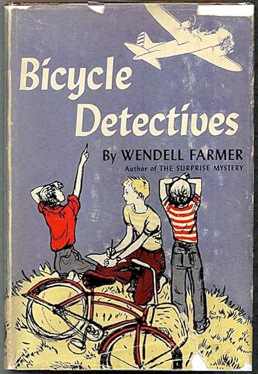
And Then I Read: BICYCLE DETECTIVES by Wendell Farmer
A favorite author when I was in grade school was Lavinia R. Davis, first recommended to me by a classmate, Pru Hobbie. She wrote great books about kids and animals, mainly horses. Davis is largely forgotten today, her best and best known book is “Hobby Horse Hill,” title page below.
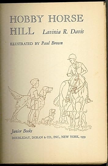
I searched for and found many other Davis books, the best of which were illustrated by Paul Brown, as above. A few years ago I discovered through Wikipedia that she also wrote under the pen name of Wendell Farmer. I already had one book by that author, “Fish Hook Island Mystery,” which I liked a lot, so I’ve been looking for more Davis books written under the Farmer name. “Bicycle Detectives” is one I found recently.
The book was published in 1944, and is very much a wartime story, though of kids in a small town only affected by the war from a distance, but in ways that matter to them. Rig O’Hare’s father, for instance, is away fighting in Europe, and in their own town is a small factory making metal parts for the war. When that factory is bombed, the entire town is turned upside down, and Rig and his friends form a group, the Bicycle Commandos, to try and find the saboteur who did the bombing. There are plenty of clues, but many point to someone the kids feel couldn’t be guilty. Is there a frame-up? Who is the mysterious man Rig and others have seen poking around in the woods and elsewhere? The Commandos are determined to find out.
I enjoyed reading this, though I don’t think it’s on the same level of writing as Davis’ best work. The illustrations by Alice Harvey are fine, if not too exciting. Even as a second tier Davis book I’m glad to have it in my collection.
Recommended, if you can find it, but I can more highly recommend these books by Lavinia R. Davis:
Hobby Horse Hill (1939)
Buttonwood Island (1940)
Pony Jungle (1941)
Plow Penny Mystery (1942)
Melody, Mutton Bone and Sam (1947)
Sandy’s Spurs (1951)
Secret of Donkey Island (1952)
Donkey Detectives (1955)
If you like stories about kids and animals, these are well worth looking for.
February 5, 2014
And Then I Read: SWAMP THING 26
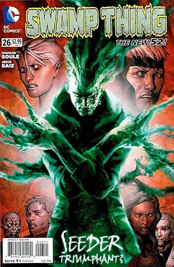
Image © DC Comics, Inc.
So much of comics is about power: craving it, seeking it, achieving it, using it, and eventually losing it. Jason Woodrue, now known as Seeder, has become the new avatar of The Green, usurping Alec Holland and now granted the massive power of all the world’s plants. What does he do with it? That’s what this issue is all about. It’s surprising in some ways, predictable in others, and in general Woodrue seems a bit lost. Perhaps all those years of seeking and achieving left him no time to consider the using part. The writing by Charles Soule and the art by Jesus Saiz continues to be excellent on this book.
Recommended.
February 4, 2014
And Then I Read: AQUAMAN 26
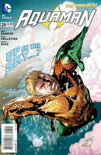
Image © DC Comics, Inc.
Writer Jeff Parker replaces Geoff Johns on this title, so it’s a time of transition for the character, and perhaps for readers as they decide if they’re staying with the title.
Aquaman is King of Atlantis, and Mera is at his side, though not liked by most of the Atlantean people for reasons developed in past storylines. Arthur Curry has his hands full not only with reluctant and obstinate administrators but new threats from deep beneath the ocean. New volcanic rifts are opening, endangering Atlantis, and massive creatures are also coming forth, and causing more destruction. Mera has a few new tricks with her powers that are helping, but the two of them can only do so much. And in the final reveal, things are getting stranger.
The art remains consistent from the past issues, Paul Pelletier’s work is fine. The writing feels a little uncertain. The characters don’t sound or act quite as we’ve come to expect. It’s a shakedown cruise, and we’ll see how it shakes out. For now, I’ll keep reading.
Recommended.
February 3, 2014
Rereading THE VALLEY OF FEAR by A. Conan Doyle
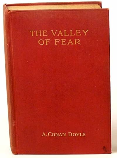
Image found online, I reread this in iBooks, in my continuing revisit to the entire Sherlock Holmes canon. This is the last of the four Holmes novels, and unlike the others I remembered absolutely nothing about it, so it was like reading it for the first time, and great fun.
Like “The Sign of Four,” this novel is told in two parts. It begins in England when Holmes and Watson are called to a country manor to investigate a puzzling murder. The circumstances are made more unusual by the fact that Holmes has already had word of the murder through an informant, and suspects his criminal opponent Moriarty is involved. The murder scene, when they arrive, is essentially untouched, and there are lots of puzzling clues, almost too many. To make matters more complicated, the house is surrounded by a working moat, and the murderer seems to have left through a window and into the moat itself, though no trace of him can be found on the grounds except for a bicycle hidden in the bushes and unclaimed.
As Holmes and Watson investigate, suspicion falls on the murdered man’s new bride and/or a close friend staying at the house. The staff servants are also under some suspicion. As usual, Watson tries to figure things out, and gets wrong ideas, while Holmes develops his own theories, and plans a big reveal of them at the scene of the murder. What happens then is quite surprising!
The second half of the book takes place in America, in a coal mining region that suggests West Virginia or Pennsylvania. There a criminal gang masked as members of the free-masons have grown to great power, intimidating and murdering any mine owners or honest workers who oppose them. The story follows a free-mason from Chicago, on the lam from the police there for a murder, who enters the Valley of Fear, as it’s nicknamed, and soon works himself up to a place of importance in the criminal gang. How this relates to the first half of the story you’ll have to find out by reading it yourself, but both halves are exciting and entertaining.
This novel does follow in the path of “The Sign of Four,” so is not as fresh as that book, but it’s still a fine read and highly recommended.
February 2, 2014
Orchid Extravaganza at Longwood Gardens

Yesterday, after spending the morning at the Brandywine River Museum, Ellen and I drove four miles west on Route 1 to the massive estate and botanical gardens, Longwood Gardens. From spring to fall it deserves a day of its own to walk the garden paths, but in winter the Conservatory (entrance above), a huge enclosed greenhouse, is the thing to see, and from now to March 30 they have hundreds of their orchids on display. After a fine (if expensive) lunch at their restaurant, Ellen and I spent a few hours walking the many paths inside the Conservatory to see the orchids and the many other plants. A great tonic for winter weather.

The main Conservatory building with central pools.

Something new since we were last there, the Fern Wall. The doors are to individual and family-sized restrooms.

The flower beds are beautifully planned and arranged for color and variety.

Another example.

A large Bird of Paradise flower.

Another view in the Conservatory. And now, following without further comment, my photos of the orchids. I don’t know the names of any of them, but they are gorgeous and well worth seeing!


February 1, 2014
New Calendar Art Exhibit at the Brandywine River Museum

This morning Ellen and I visited the Brandywine River Museum in Chadd’s Ford, Pennsylvania, one of my favorite museums. It’s a treasure house of American illustration art and the work of the Wyeth family, as well as a beautiful building with lovely views of the river.

Their new exhibit running from now until May 18th is “A Date with Art: The Business of Illustrated Calendars.” There are several calendar paintings by one of my favorite artists, Maxfield Parrish, this one from an Edison Mazda Calendar. It had glass over it, so there are reflections. Needless to say, my photos don’t do justice to any of the paintings, you have to go see them for yourself!

Detail showing the crackling of the varnish on this shirt. Parrish worked in layers of translucent color with layers of varnish between layers of color to produce an amazingly rich color palette. This area did not hold up so well over time.

Another Parrish for Edison Mazda of Prometheus.

Prometheus detail.

Parrish girls in a garden.

A Parrish landscape, “Sunup.”

“Sunup” detail. Parrish built models of the houses in these landscapes and lit them for accuracy.

Inches away you can barely see the tiny brush strokes on this tree.

The first of three Norman Rockwell Boy Scout calendar paintings, and the one I liked best. Terrific warm lighting.

Detail from above.

Second Rockwell, the overhead spot was too close, picking out shine on the brush strokes.

Third Rockwell, also very good.

The largest number of paintings in the exhibit are by N.C. Wyeth, not a surprise as the museum specializes in his work. Indeed, his studio is part of the museum, though in a different building. This is “The Alchemist.”

Detail from above.

“The Golden Galleon” by N.C. Wyeth.

“Time and Tide” by Wyeth, I think my favorite of his in the exhibit. Fabulous lighting and perspective effects.

Detail from above.

Another detail from “Time and Tide.”

About half the Calendar exhibit is devoted to twelve N.C. Wyeth paintings from one calendar illustrating American History. The paintings are small for Wyeth, but there are some fine ones, and I’ve never seen any of them. The exhibit includes Wyeth’s easel and work table, and many props and photographic slides on glass he used in his work.

Marquette by Wyeth from the calendar.

Pioneers on the prairie by Wyeth.

Washington at Yorktown by Wyeth.

We also enjoyed the remaining galleries featuring the work of Andrew, N.C. and other members of the Wyeth family as well as other illustrators and fine artists. Here are a few N.C. Wyeth favorites. I think I’ve seen them all before, most are on permanent display. This is the painting for the endpapers of “Treasure Island.” Many of the paintings he did for that book are there.

From “The Boy’s King Arthur” by N.C. Wyeth.

An example of his magazine illustration work intended for black and white reproduction, and painted in gray tones.

One of two paintings for a magazine article, “The Snow Highway.”
We thoroughly enjoyed the exhibit and the museum and can’t recommend it highly enough!
January 30, 2014
And Then I Read: ASTRO CITY 6

Image © Juke Box Productions.
The second and concluding part of “Through Open Doors” takes us on a strange journey with yet another behind-the-scenes character in the super-heroic world of Astro City. Thatcher Jerome is an opportunist who saw a good business opportunity in the arrival of the Kirbyesque giant behind an equally Kirbyesque door in the sky above the city’s river. He has the courage and chutzpah to go knock on that door and represent himself as the trade representative of Earth to the alien being who is studying our planet. To his surprise, the gambit works, and he’s soon providing all kinds of goods to the giant, and making a tidy profit. Things get more complicated when Thatcher steals an artifact from the alien’s storeroom, an act leading to the creation of a new super-villain. What happens then might surprise you.
Fine writing by Kurt Busiek, equally fine art by Brent Anderson and Alex Ross (cover). Great lettering by JG Roshell and Jimmy Betancourt of Comicraft and lovely coloring by Alex Sinclair. Is there a creative team that’s been together longer? These guys have it down perfectly. Recommended.
January 29, 2014
And Then I Read: A DARK TRAVELING by Roger Zelazny
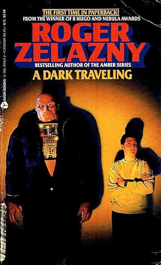
© Estate of Roger Zelazny.
I thought I’d read all of Zelazny’s published fiction, but this one slipped by me somehow. (There are two others I haven’t read, books for younger readers illustrated by Vaughn Bode, now impossible to find or afford. I mean, aside from those.) It’s a slim volume, from a time when fantasy novels were generally much shorter than they are now, before Tolkienitis had bloated them so much. Published in 1987, it may well have been written earlier. Byron Preiss is involved as a packager, and another publisher is also cited.
Despite the relative shortness, 150 pages, Zelazny is in fine form, and he fills the book with great world-building ideas and fine displays of inventive magic and battles between parallel universes that make it seem quite a long story. James Wiley is part of a family full of magic abilities. His sister Becky is a witch, and many of his relatives are magicial, part of an organization keeping watch over our own Earth and many parallel Earths, which are threatened by several dark universes that want to swallow them. It’s a battle going on in secret, and when James’ father disappears suddenly with signs of foul play, it becomes clear that a new attack has begun. James wants to get involved in the search for his father, and his sister agrees to help him. Before long they’re both on another Earth where magic is more common and openly used. The only problem is, it brings out the latent magic in James himself, the ability to take on wolf form. James is a werewolf, only he doesn’t know how to control that part of his nature. He must learn quickly to survive!
Soon the battle is joined, great powers are struggling over a prize that could turn the tide either way. Before long James and Becky are fighting beside other family members and surprising secrets are revealed. The powers against them are vast. The stakes are high. The writing is poetic and full of vivid imagery and fine characters as only Roger Zelazny could craft them!
Recommended.
January 28, 2014
A Stanley Kaye Superman Painting Mystery Part 2
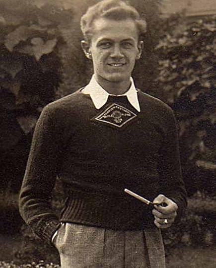
When I received photos of a painting of Superman’s face by Stanley Kaye (above in an uncredited photo) from the owner, Merredith Lowe, I knew nothing about Kaye. A little research revealed he was one of the most prolific inkers of Superman stories in the 1940s and continued to work for DC Comics until 1962.
 Superman in ACTION COMICS #196 (1954) © DC Comics, Inc.
Here’s an example of his inking work over penciller Wayne Boring. In addition to creating and inking comics from about 1941, Kaye inked the Superman newspaper strip for years. A few more facts emerged from Jerry Bails’ “Who’s Who of American Comic Books,” but not many. I put my ace research assistant, Alex Jay, on the case, and Alex came up with more information!
Kaye was born Stanley Rawinis in Brooklyn, NY on Nov. 24, 1916. By the 1920 census his mother Angeline was remarried to Albert Kalinowski, and by a 1925 state census, the boy’s name was listed as Stanley Kalinowski, a name he used through school and at least to 1940. The photo of him above is from John Adams High School, and his sweater features the emblem of the school’s rifle and pistol shooting team, of which he was a prominent member. In the 1940 census he was 23, living with his parents and younger brother Jerome in Queens, New York, and listed his occupation as “artist.” I imagine when he began working in comics in 1941 he adopted the more Americanized version of his name. The earliest comics credit for him is a spot illustration in SUPERMAN #11, July-Aug. 1941, signed “Stanley Kaye,” but he may well have been working as an uncredited inker already.
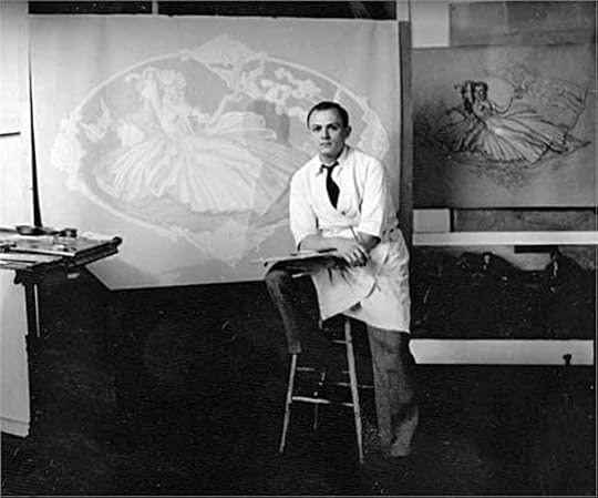
The Bails book lists Kaye’s art training at the Grand Central School of Art, which was located on the top floor of Grand Central Terminal. Bails lists his major influences as Harvey Dunn and Dean Cornwell. Both were prolific painters of magazine covers as well as fine artists. Both taught at the school. The uncredited photo above of Stanley working on a large painting from a smaller layout sketch is probably from his time at the school.
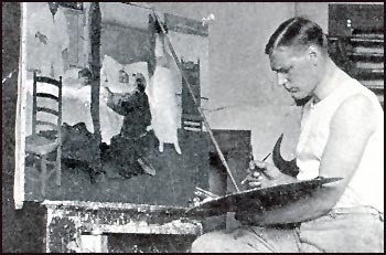
Harvey Dunn at work on a painting. Dunn had studied with N.C. Wyeth, and his style shows the influence.

Here’s an example by Dunn featuring the kind of dramatic pose and impressionistic technique used by Wyeth.
Dean Cornwell, art sample above, was a co-founder of the school, and originally a pupil of Harvey Dunn. He became one of the most celebrated cover artists of the early 20th century. The type of illustration and painting that Stanley Kaye revered all looks back to N.C. Wyeth, himself a student of Howard Pyle.
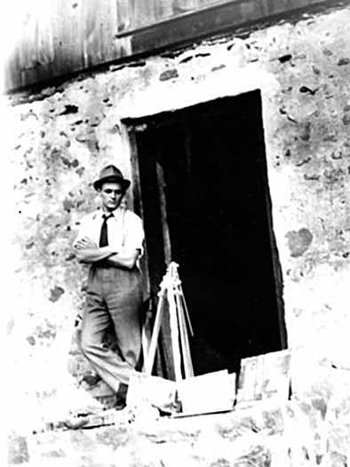
Another uncredited photo of Stanley Kay with paintings and painting gear at what looks like the door way of an old barn, but that’s just a guess. These photos of Kaye were found by Alex Jay on Ancestry.com, but there was no information included with them.
So, Kaye was clearly a painter, but perhaps not able to find paying work as one, and he somehow ended up at the company now known as DC Comics. He did some complete stories, pencils and ink, but mostly he was an inker. The early spot illustrations suggest he began at the company working in the bullpen, a staff production artist. That kind of work was usually done by staffers. I’ve found no evidence that he ever did any painting for the company that was printed, but I imagine co-workers knew of his painting ability.
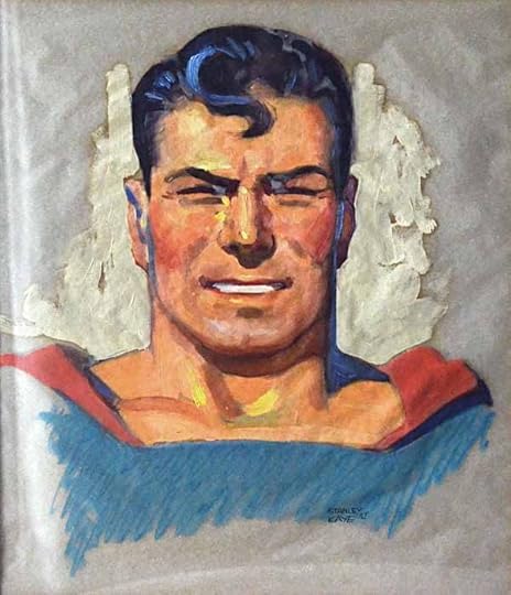
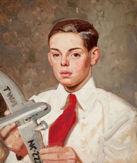
Painting by Stanley Kaye, 1942, courtesy of Merredith Lowe. Superman © DC Comics, Inc.
So we come back to that painting of Superman’s head on paper signed by Stanley Kaye and dated ’42.
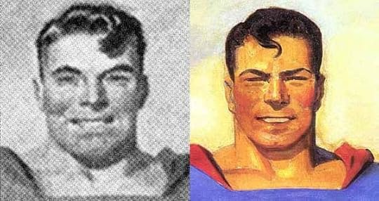
The painting style looks closer to H.J. Ward’s original version to me (and his style in general) than the retouched version by Joe Szokoli, left and right above, though the face and hair details are closer to the Szokoli version. I showed the Kaye painting to artist Mark Wheatley, a fine painter himself, and he suggested perhaps the Kaye study was commissioned to show Szokoli exactly what Harry Donenfeld had in mind for the facial features and hair. This makes a lot of sense to me. Kaye was a regular artist for the company, probably on staff, and perhaps already working on Superman stories as an inker. I can imagine him being very happy to display his painting ability to the company co-owner with this study, no doubt made in Donenfeld’s office where the painting hung. Possibly Kaye hoped to get the chance to make the changes on the painting himself. Donenfeld went with a more experienced cover painter, which is too bad, as I think Kaye’s version looks much better than Szokoli’s. Even though Szokoli was more experienced, he didn’t know the character well, and his technique is smoother and less attractive than the rest of the Ward original. If Kaye’s study was used as his guide, it wasn’t well used. Probably Donenfeld paid Kaye a small fee for the study and sent him back to work in the bullpen, and the painting skills of their staff artist did not go any further at the company that I know of. The study may have been liked and picked up by Donenfeld’s partner Jack Liebowitz who had it framed and hung it in his office, where it later was given to Asa Herzog, and made it’s way to the current owner, Merredith Lowe.
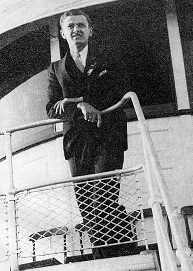
From the volume of his work, I think Stanley Kaye made a good living as an inker for DC Comics, no doubt soon leaving his staff job and freelancing full time, and perhaps pursuing painting on the side, though we have no evidence of that. Here he is on a ship from another undated photo.
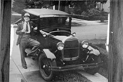
And with a car that he seems very proud of. Family information on Ancestry.com has been kept private, but we do know that Stan Kaye died in Racine, Wisconsin in 1967. His headstone lists him simply as “artist.”
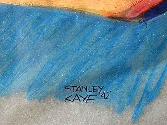
I’ll close with this detail of his signature from the Superman painting. Perhaps other paintings by him will turn up someday, either signed as Kaye or Kalinowski. Let’s keep an eye out for them. Thanks to Merredith Lowe for allowing me see his painting and explore its origins, and to Alex Jay and Mark Wheatley for research help.
Hope you’ve enjoyed this article, others you might like can be found on the COMICS CREATION page of my blog.
Todd Klein's Blog

- Todd Klein's profile
- 28 followers

