
Todd Klein's Blog, page 261
November 30, 2013
Cutting a Christmas Tree

We’re at Ellen’s sister Ann’s house for Thanksgiving weekend. We had a fine turkey dinner Thursday, lots of leftovers yesterday, and today we went out to find a Christmas tree at the farm of Ann’s son Zach’s friend Adam. Adam had visited us last summer, so it was nice to see him again, and we were happy to support his family business. Ellen and Ann are above, it’s cold here in the frozen north of New Jersey!

“What about that one?” “This one over here is nice.” “That one is too tall.” “This one is no good, it has a double trunk.” “I found the perfect tree!” This went on for some time.

We finally settled on the perfect tree, a Concolor, which I’ve never heard of, but it looks and smells good. Zach got the saw, and cut the tree trunk close to the ground while his father Dave and Ann held the tree.
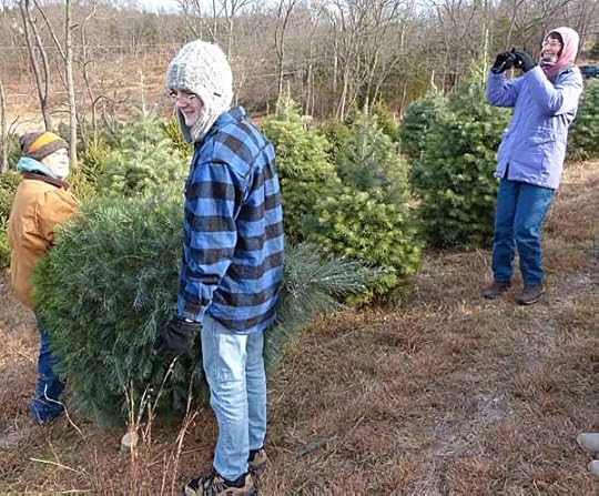
Dave and Zach carried the tree down to their car, while Ellen took a picture. It was a fun thing to do. We used to get a fresh cut tree ourselves, but stopped putting any tree up once we got Tigger and Leo. We knew they’d climb it, and really we rarely have guests at Christmas, so we finally decided it wasn’t worth the work.
At the road they wrapped the tree and put it in the trunk of the car. We had a nice chat with Adam and his family while enjoying free hot cider and cookies, then headed home. If you’re in northwestern New Jersey, we can highly recommend Adam’s Christmas tree farm, any tree for $35. It’s Hidden Springs Christmas Tree Farm, the link is to their Facebook page, open weekends 10-4.
We’ll be heading home soon, but it’s been a fun weekend with Ellen’s family.


November 27, 2013
And Then I Read MASKS
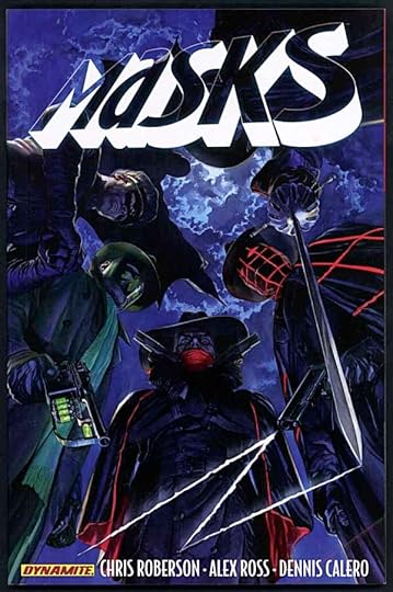
Image © Dynamite Entertainment and the respective copyright holders.
Dynamite has lately been gathering licenses for a number of pulp magazine and radio characters from the 1930s and 1940s, and in this series they’ve teamed quite a few of them up in an exciting adventure. Writer Chris Roberson has done a fine job capturing the feel of the time period, and the characters without making it seem too dated. This is not easy! He also makes the team work by putting them in a New York City where criminals have taken over the government and the police force, making it very hard for any one of them to buck the system. Together they might have a chance, and they coalesce against a very strong common threat, not only to themselves, but to the ordinary people of the city. The art on the first issue is by Alex Ross (also on covers throughout), and it’s terrific. Issues 2-8 have art by Dennis Calero, whose style is looser, somewhat impressionistic. I thought this was a wise choice, and once you get used to it, Calero’s style works just fine. At times it reminded me of Alex Toth, or in other places a little of Gene Colan.
You don’t need to know much about these classic characters like The Shadow and The Green Hornet to enjoy this fine book, but if you do, I think you’ll enjoy it all the more. Great work by everyone involved.
Recommended.
November 26, 2013
Thanksgiving with Relish
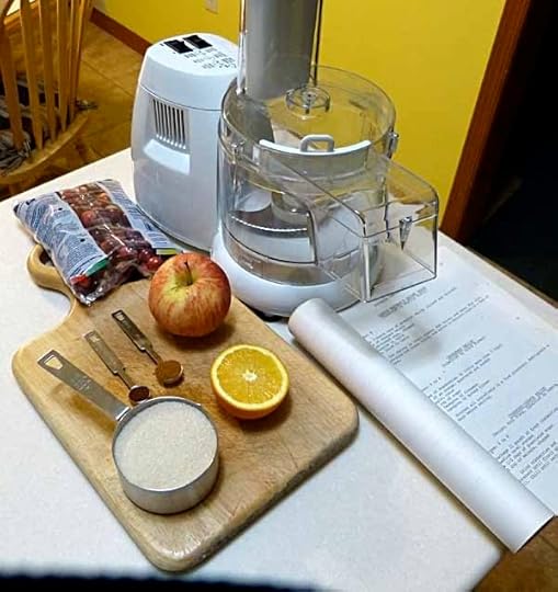
Cranberry Relish, that is. I’ve written about this before, but I just made a batch, and can’t resist spreading the word about this extremely easy and delish side dish that is the perfect complement to turkey, stuffing, mashed potatoes and gravy. There’s no cooking involved. You don’t even peel any of the fruit. Prep time is about 10 minutes. And I find it much tastier than any cooked cranberry sauce I’ve ever had. Above is Everything You Need. Not everyone has a food processor, but a blender will work, you just have to do it in smaller batches.
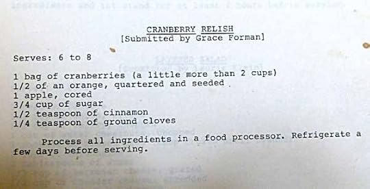
Here’s the recipe from the family cookbook I assembled in the 1980s, submitted by my Aunt Grace Forman, who left us this year. You can’t get much simpler than this! By the way, I use half a navel orange, so no pits to worry about, and today I used a Cameo apple. A tart apple is best, something you’d make pie with. And a good quality cinnamon like those from Vietnam is best.

Half the ingredients about to be chopped. I add the sugar and spices later, though you could add them here.
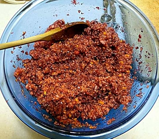
The finished relish, which will be refrigerated until we eat it on Thanksgiving. A day or two in the fridge helps the flavors blend and mellows the slightly harsh tang of the cranberries. You can add more sugar if you like, I did add a little extra, but it’s meant to be tart. Sweet and tart.
We have other dishes to make for the holiday: stuffed mushrooms, sweet potatoes, green beans with slivered garlic, pumpkin pie, and maybe more depending on how ambitious Ellen gets, but those for sure. I’ve got us off on the right foot!
November 25, 2013
And Then I Read: ASTRO CITY 4

Image © Juke Box Productions.
Writer Kurt Busiek continues to find interesting new angles to explore around the edges of the super-heroic experience. This time he looks at Sideliners, a group of people who have powers but choose not to don the costumes and go for the glory. For one reason or another they are just not cut out for that life. Instead they use their abilities in various kinds of support roles, or even completely undercover. It’s a tricky life. They stand the risk of becoming pawns in larger games, as happens to the story’s narrator Martha Sullivan. What happens then may surprise you.
I can only repeat what I’ve said before, this is super-hero comics at its best, in my opinion. Excellent art by Brent Anderson and Alex Ross (on covers), terrific writing by Kurt, top-level lettering and coloring by Comicraft and Wendy Broome. Stories with heart as well as heroics.
Highly recommended.
November 24, 2013
When I Was a Son of the Desert
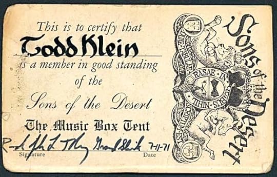
Here’s something I found recently while looking for other things, it’s my membership card to the Sons of the Desert, the Laurel and Hardy appreciation society founded in 1964. Original members/founders included John McCabe, author of a biography of the pair, “Mr. Laurel and Mr. Hardy,” actors Orson Bean and Chuck McCann, and artist/cartoonist Al Kilgore, who designed the handsome crest on the card.
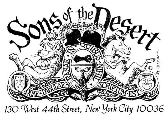
Here’s a better look at the crest, a charming piece with great lettering and the perfect motto in latin, which in translation is “two blank slates on which nothing has been written.” Kilgore was the artist of the Bullwinkle comic strip and several “Rocky and Bullwinkle” comics from Dell and Gold Key, among other things.
The club took its name from a Laurel and Hardy feature film where they join a fraternal organization of the same name, a silly one of course. I had two good friends in high school, Michael McGrath and Randy Tobey, who were fans of old films and particularly old comedy films. Somehow Randy contacted the recently formed club and was able to get permission to start a chapter, I think around 1968. Each chapter was a “Tent,” and each tent took the name of a L&H film. Surprisingly, Randy was granted permission to use the name “The Music Box Tent.” Surprising because, it’s considered one of the best of their short films, probably THE best. The tent consisted of about 10 high school friends, and as I recall only met a handful of times. The main activity of the meetings was to watch rented L&H films on 16mm film, though Randy owned a copy of “The Music Box,” a requirement. I did the lettering on my own name for the card, and might have done it for the other members. It’s an early form of the style I now use for my signature.
When our club went dormant, the name was taken by another group, which I see is located in Arizona. The club was an activity perhaps too ambitious for a group of kids, and we moved on to other things, but of course we all loved the films. I’ve only seen one L&H film recently, a chance encounter with their fine feature “Way Out West” while filpping channels on TV. Randy, the “Grand Shiek” who signed the card in 1971 passed away in 1989. I’ve lost touch with Michael, and hear rarely from one another club member, Paul, but those were fun times and great friends. I miss them.
November 23, 2013
Visiting with Dave Hunt
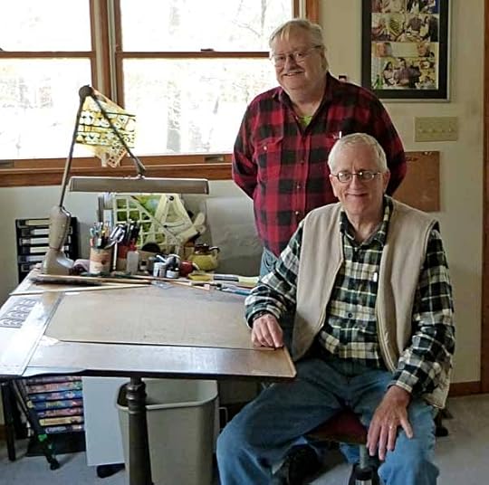
My friend Ron Jordan brought another old friend, Dave Hunt, to visit me today. Dave and I were neighbors when I lived in central New Jersey, and we were both working for DC Comics at the time. I was on staff, Dave was inking lots of comics pages. I saw Dave for the first time in about 20 years at the Asbury Park Comicon this past April, but we didn’t have too much time to talk, so it was good to spend several hours gabbing today.
Dave is no longer doing any comics work, but he had a long career. He was hired by Marvel in (I think) 1973, working in the bullpen with Danny Crespi and Morrie Kuramoto doing art corrections. He soon began lettering (including finishing the last job lettered by Artie Simek, though he doesn’t remember what it was) and doing background inks for Frank Giacoia. He tried coloring for a while, then began doing full inks. Some of his favorites that we talked about were issues of AMAZING SPIDER-MAN over Ross Andru pencils, including an early appearance of The Punisher. Dave had just begun inking X-MEN, first over Dave Cockrum, and a few issues over John Byrne when he was lured to DC by a higher page rate and a contract. Terry Austin replaced him over Byrne. “If I had stayed on X-MEN and had kept the original art, I’d be rich,” he said, with a smile. That was the one that got away.
At DC he did a lot of work on many titles, and remembers favorite pencillers he worked with being Curt Swan and Kurt Schaffenberger. I did a little background inking for Dave on at least one issue of THE ADVENTURES OF SUPERBOY pencilled by Kurt. There were also stories about nightmare jobs. Dave inked a DC movie adaptation of LITTLE SHOP OF HORRORS over Gene Colan pencils. After the book was finished, one of the movie stars decided he didn’t want his likeness in the comic, so Dave had to go in and re-ink all those faces. Then another star did the same thing, more re-inking. Then they changed the end of the movie. Colan and Hunt had to do new pages very quickly. Then they changed the ending of the movie again. And a third time! This is why licensed properties can be really bad to work on…!
We had a great visit. We looked at my small collection of original comics art, shared a pizza, and talked for a few hours. I hope to see Dave again soon. Thanks to Ron for bringing him down.
November 22, 2013
Pulled From My Files #16: MUSINGS
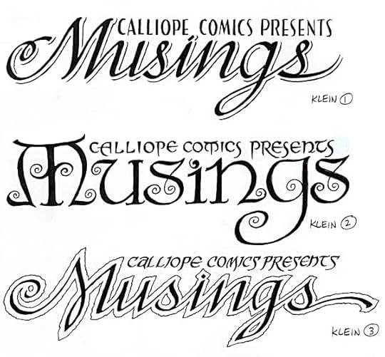 Logo images © Steve Tice and Todd Klein.
In 1993 I was asked to design the logo for a fanzine created by Steve Tice. The content was to lean heavily toward SANDMAN and the work of Neil Gaiman. I loved the name, and came up with these three sketches. The center one was chosen for the final logo. The curlicues were inspired by the art of Frank C. Papé, in his illustrations for “The Cream of the Jest” by James Branch Cabell, a book and author Neil and I both liked. Papé often gave his delightful pen and ink illustrations handsome hand-lettered captions. Here’s an example:
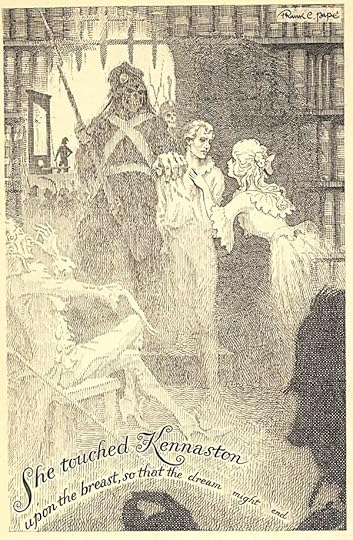
If you don’t know the work of these gentlemen, it’s worth seeking out. I don’t think Papé illustrated a lot of Cabell’s books, but the ones he did are greatly enhanced by his work, which seems largely forgotten now.
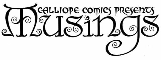
Here’s the final logo, one of my favorites. The magazine only lasted a few issues, but they were good ones.
November 21, 2013
Rereading: THE HOUND OF THE BASKERVILLES by A. Conan Doyle
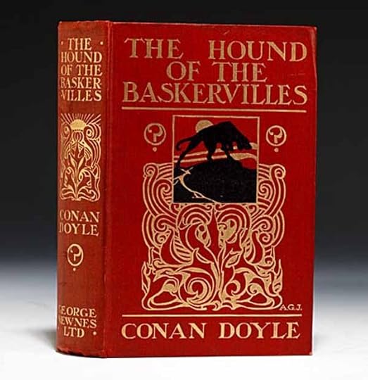
The handsome first edition, not mine. I read it on my iPhone.
This is the most familiar of the Sherlock Holmes novels, and I think of the Holmes stories in all. Doyle combined what he’d already created — a master detective and his assistant — with the elements of a gothic horror thriller: a lonely mansion in an ominous setting, a family legend of a huge, murderous, ghostly hound out to get the head of the house, and a cast of shady characters in the surrounding neighborhood. When the heir to the Baskerville estate comes to Holmes for help and advice, the detective uncharacteristically sends Watson home with him to try his hand at solving the case while protecting Henry Baskerville. It seems Holmes is too busy with other things. So, for a good half the book we follow Watson as he tries to emulate the Holmes method, having some success, but also some failures, as well as scary moments out in the gloomy marshes of Dartmoor. The hound itself does not appear before us for quite a long time, only his howl is heard, but that’s chilling enough! Even more chilling is the cruel plot working against the Baskervilles and the clever mind behind it. Really, this story was perfect for film and TV, and it was adapted many times. Hard to beat the Basil Rathbone version, I say. The book has plenty of thrills, intrigue, and fascinating detail that no film can include, and is great reading.
Highly recommended.
November 20, 2013
And Then I Read: FASHION BEAST
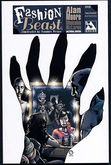
Image © Malcolm McLaren.
Late 1980s Alan Moore. A screenplay commissioned by impresario Malcolm McLaren, the so-called father of “punk,” among other things. Never produced, it sat on a shelf until resurrected in this graphic adaptation from Avatar with a script by Antony Johnston and art by Facundo Percio.
Doll is an attractive young woman in a dystopian, dying London, with nuclear winter on the horizon. She works as a coat-check girl in a club until her mouth puts her out of work. She lands at the premises of top fashion designer Celestine, and is soon making her way into the strange world of fashion, catching the eye of the mysterious designer himself, locked away in a dark room overlooking the shop floor, rumored to be riddled with disease and horrible to see. Then there’s the boy, also working there as a dresser, who helped get her fired from her previous job, and other odd characters like the ancient ladies who run the place under Celestine. Doll’s rise is as dramatic as the fashions she’s clad in, but will her fall be as classic?
I enjoyed this, bleak as much of it is. The feel is closest to V FOR VENDETTA, I found. It drips with social satire, but doesn’t neglect the personal stories of the main characters, with a strong nod to the Cocteau film and original fairy tale of “Beauty and the Beast.” There are no angels in this story, but there are no devils either, at least not on stage. There are merely humans trying to get ahead and get by in an increasingly difficult world.
The art by Percio is quite good. He does not go for classic beauty, his people are more realistic than that, but he does manage to capture the ephemeral glamor of the fashion world anyway, perhaps better than a good girl artist would have. His attention to detail is excellent but not over-wrought. Fine work.
Recommended.
November 19, 2013
And Then I Read: REVERSE-FLASH 1
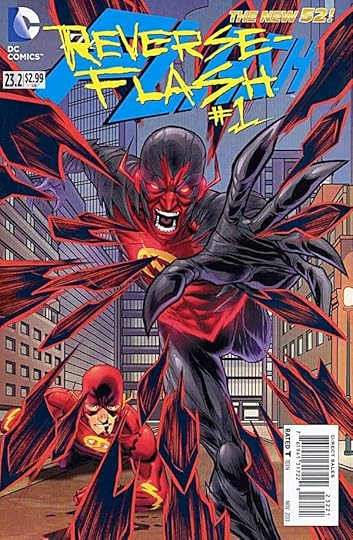
Image © DC Comics, Inc.
This is not a stand-alone story, but deeply embedded in the current FLASH continuity. Since I’m enjoying that, I read this, too. It fills in the missing background on the new Reverse Flash that has been plaguing Barry Allen almost since his return. And the identity of the villain is interesting, he’s Daniel West, the bad-seed brother of Iris West. How he comes to his power is a story full of irony and not a few coincidences, but it reads well, and the art by Scott Hepburn looks pretty good. Daniel has been gathering up “speed force” power for his own ends, and doing in those who have it. He keeps getting stronger, and that power translates into an ability to go farther and farther back in time, where Daniel hopes to change his own story for the better. Nice idea from writers Buccellato and Manapul, and I see some layouts by Manapul in there too, I think.
Recommended.
Todd Klein's Blog

- Todd Klein's profile
- 28 followers

