
Todd Klein's Blog, page 267
September 26, 2013
And Then I Read: GREEN LANTERN CORPS 22
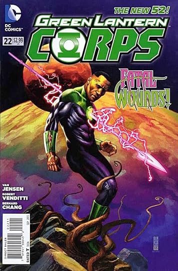
Image © DC Comics, Inc.
“Things fall apart; the centre cannot hold;
Mere anarchy is loosed upon the world,” — William Butler Yeats, “The Second Coming”
That has long been the theme of the Green Lantern universe, and it continues in current issues. The Guardians are off on a junket at the edge of known space. Back on Oa, the center, things are breaking down. The machinery of the Corps: the power rings, are having unpredictable failures that no one can explain, and the same is happening to the other similar groups like the Star Sapphires. Entropy is setting in. There’s a power vacuum at the center, and enemies are beginning to take advantage of it, infiltrating Corps areas and activities. I think I like the way things are being nibbled away at rather than the usual giant battle, more interesting for now. We’ll see where it goes. This issue has some pretty good writing by Van Jensen and Robert Venditti, and excellent art by Bernard Chang.
Recommended.


September 25, 2013
And Then I Read: THE FLASH ANNUAL 2
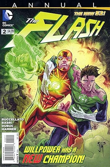
Image © DC Comics, Inc.
This annual steps out of Flash continuity for two standalone stories, a long one and a short one. The long one teams him with Hal Jordan’s Green Lantern in a sort of buddy action movie involving aliens on a distant planet kidnapping Earth kids to use in war games. The banter between Barry and Hal often seems forced, and the plot rather predictable. There are some nice moments here and there, but overall I was not enthused. The backup story is better, a thoughtful piece about how even super-speed can’t solve every problem, with some good character moments for Barry Allen as well as tricky dilemmas. I liked the art on the backup by Cully Hamner the best, too.
Mildly recommended.
September 24, 2013
And Then I Read: JUSTICE LEAGUE OF AMERICA 6
[image error]
Image © DC Comics, Inc.
Okay, I read the second part of Trinity War, and it was pretty good. A large part of the issue was the usual battle between super groups, this time the original Justice League and the spin-off JLA, but it actually did have some consequences that played out in the rest of the issue. There are several mysteries behind the crisis that are intriguing, including one involving the Greek legend of Pandora, and her box of evil. There are interesting character moments for Superman, Wonder Woman and others, and a nice surprise finale.
Despite all that, I don’t feel the need to follow the story into JUSTICE LEAGUE DARK. I’m going to cheat by simply reading the final chapter in the next JUSTICE LEAGUE. Sorry, DC, you’re doing well here, but crossovers just don’t appeal to me that much.
Mildly recommended.
September 23, 2013
And Then I Read: JUSTICE LEAGUE 22
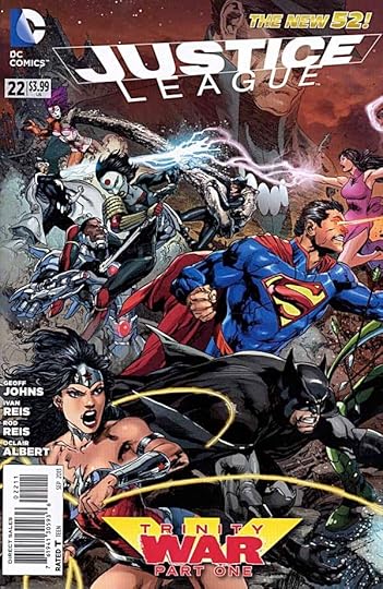
Image © DC Comics, Inc.
Thus begins the latest crossover event, Trinity War. This is a fairly contained one, as it will appear only in the Justice League titles. The first part is full of interesting moments, gathering threads from past JL stories and adding new ones. Madame Xanadu entices with her incomplete visions of a grim future, and mythical Pandora appears to tempt Superman into opening her skull-like box. Meanwhile, Shazam is in deep political trouble overseas, and the League follows to get him out of it, with force if necessary. Then there’s The Question, gathering information of his own about the evil behind the events.
The script by Geoff Johns is well written, the art by Ivan Reis and others is appealing. I’m not sure if I am motivated to read the entire event, I suspect not, but I’ll give the second chapter a look at least.
Recommended.
September 22, 2013
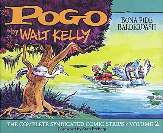
And Then I Read: POGO: BONA FIDE BALDERDASH, THE COMPLETE SYNDICATED COMIC STRIPS VOLUME 2
Images © Okefenokee Glee & Perdue Inc.
The year I was born and the year after: 1951-52 are the years covered in this magnificently excellent volume. I missed it the first time around, not only due to extreme infancy, but the fact that POGO was not carried in the newspapers our family bought. I learned about Pogo years later in the series of paperbacks from Simon & Schuster, but I still wasn’t getting the whole story, wonderful as those books are, because they are edited excerpts of the strip along with some new material. Only now can I know what it would have been like to see this fantastic strip as it came out.
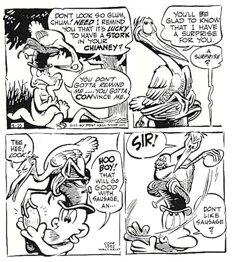
The only complaint I have about reading POGO is that it’s quite tiring! There’s so much to look at, ponder and enjoy, the experience is so dense, I can only absorb about eight pages at a sitting, which amounts to four weeks of dailies or eight Sundays (which are separate here, as they do not run the same continuity). Above is an example taken at random. First, read and enjoy the slapstick humor and the great characters: a self-important stork nesting in the top hat of a voracious alligator. Look at all the expressions, the delightful fluid line work, the storytelling, the language and the superb lettering. And Walt Kelly (with some assistants) did this over and over, producing such excellence to be read every day for many years. It’s redickle-dockle, as the characters would say.
There are many other great strips out there. “Peanuts” is certainly faster to read and equally excellent, but if you enjoy great art and writing you can’t go wrong with these collections.
Highly recommended.
September 21, 2013
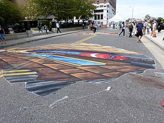
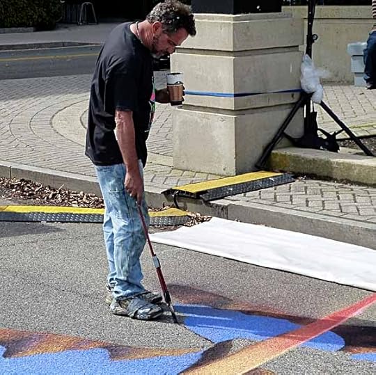
3-D Chalk Art Show, Atlantic City
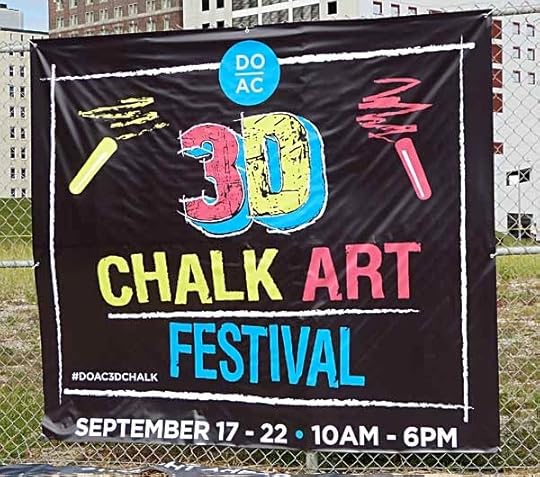
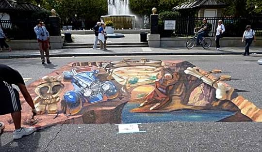
We went to this fascinating show of street art today in Atlantic City. I’ve seen this kind of work in photos, but never in real life, and while I had some idea of how it’s done, I wanted to experience it in person. Ellen and I both found it wonderful. I’ve tried to name the artists, but have missed a few.
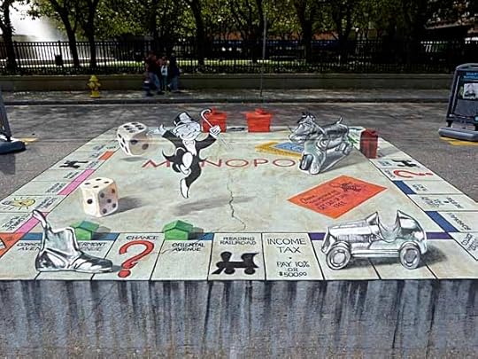
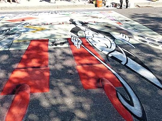
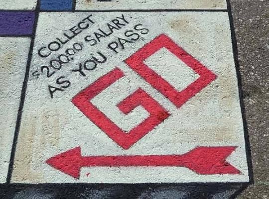
Here’s the one I think we liked best, by Sharyn Namnath. From the designated correct photo spot, it looks as if the dice, place markers, houses and hotels and Mr. Money are rising up from the street.
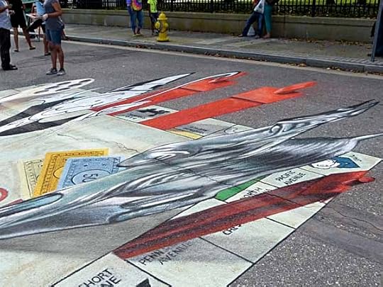
From the side the distortion is obvious and striking. How do they figure this stuff out? I think it’s partly experience and practice, partly working things out beforehand on paper or computer.
 The view from the top, or the completely wrong side, is even more mind bending. The farther the objects extend up from the apparent surface, and the deeper they are in the image, the larger and longer they have to be drawn.
The detail on the art can be quite impressive, too.
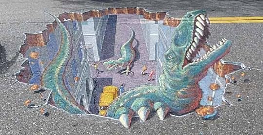
Here are some cool dinos emerging from the road by Tracy Lee Stum. Many of the artists used poster paint as well as chalk to cover the surface better and give brighter colors, this one seems to be mostly chalk.
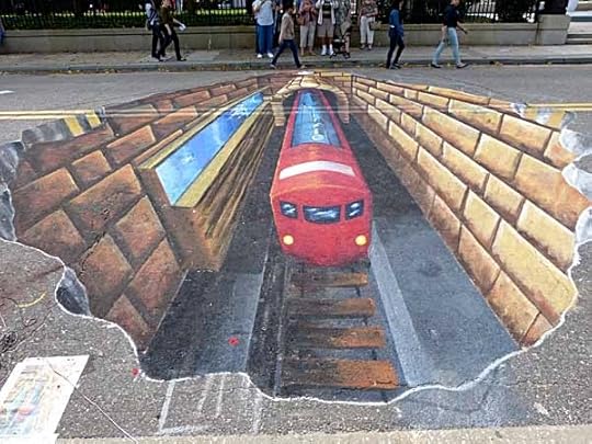
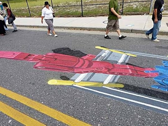
This train was quite impressive…
…and barely made any sense from the side.
Can you guess what this will be?
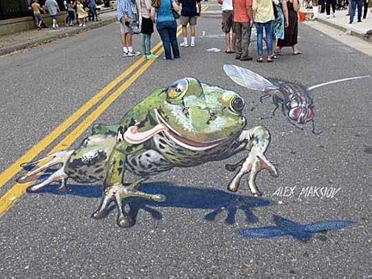
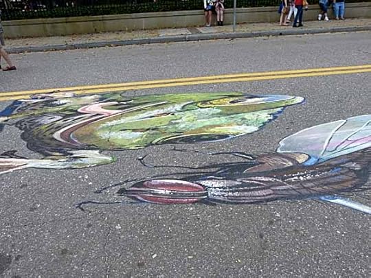
Frog and fly, and even more cool that it rises up off the road surface completely. By Alex Maksiov.
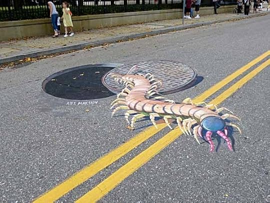
Another creepy one by Alex Maksiov.
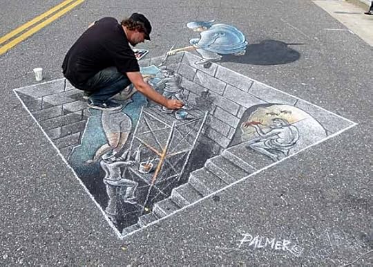
Gary Palmer at work on his art. Most of the artists were there working, though they were supposed to be finished yesterday. The show will run through tomorrow, but it might rain then. They were very lucky to have a dry week!
Art by Julio Jimenez. I wasn’t standing close enough to this one.
Looks like a robot…
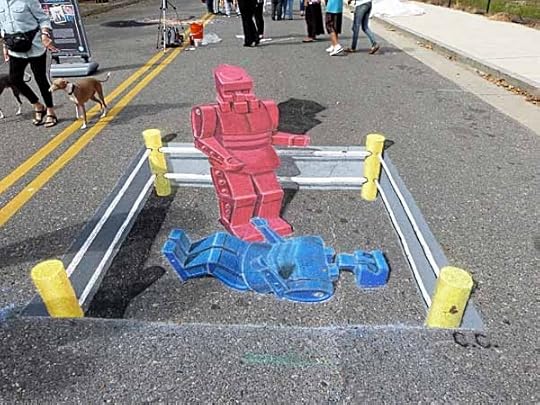
Yup, it’s Rock-’em Sock-em Robots by Chris Carlson. Notice how he’s recessed the boxing ring into the road. Most of the artists had drawn footprints where one was supposed to stand to get the perfect photo, and people lined up at each of these spots.
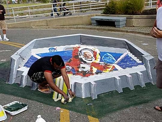
Artist Limnesh Augustine had taken a much different approach. In the center is some art painted on plastic blocks with an unusual design.
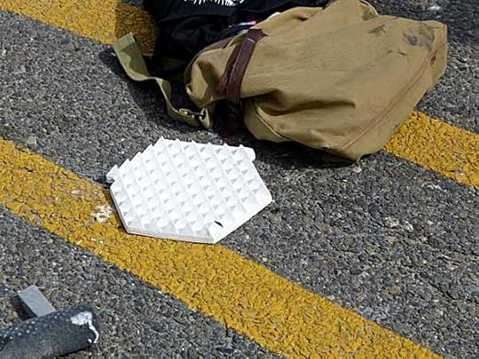
The blocks are covered with small pyramids. The artist painted the image above on the sides of the pyramids all facing one direction, then added more art around that on the street.
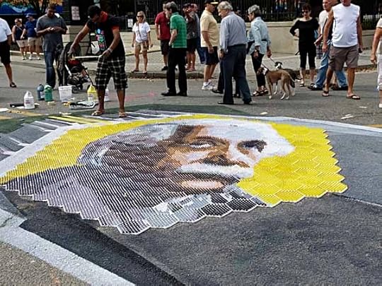
From another side, a different painting on another side of the pyramids revealed Einstein…
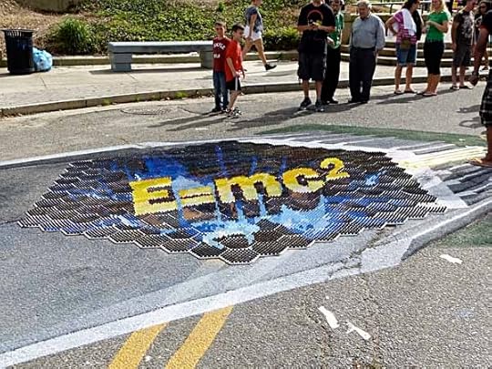
…and from a third angle, his famous equation. Very tricky work, and he could save the central art tiles for display at other shows.
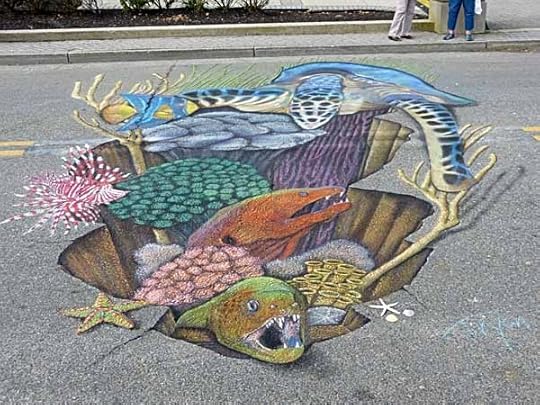
These undersea creatures are by Rod Tryon.
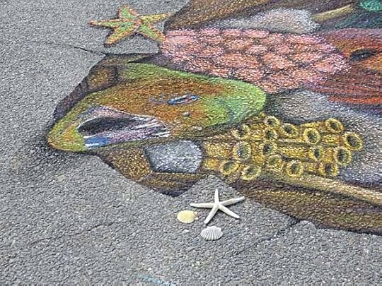
In this side detail you can see that only the three small shells are real.
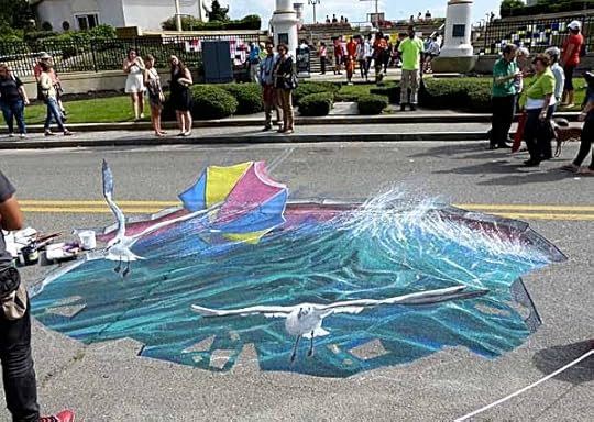
Tony Camarrano made the road into a hole in an icy sea, with gulls.
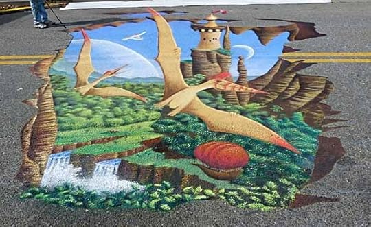
This cool fantasy scene is by Michael Las Casas.
Here he is adding some edge lines with a piece of chalk on a long stick, pretty clever tool. Other tools I noticed were tape and string to mark perspective lines.
Anamorphic Art is what they call this type of 3-D image, and it’s pretty amazing. You can find videos of some of these artists working on YouTube. Really enjoyed seeing it!
September 20, 2013
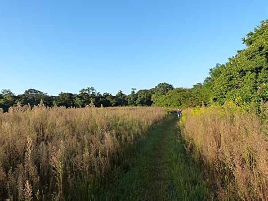
Cuckoo at Higbee
 Photos © Todd Klein, all rights reserved.
This morning I had time to go birding at Higbee Beach Wildlife Management Area in Cape May for the first time in months. The fields were very different since my last visit in early June I think.

The plants were all going to seed, making a perfect food source for seed-eating birds, and this is a good place to see them usually, though there weren’t a lot around today.
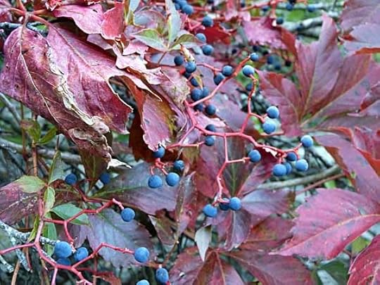
Other birds prefer fruit, and there’s plenty of that, too. Virginia Creeper has berries that look like tiny grapes, though I wouldn’t advise eating them. Robins, thrashers and thrushes will be happy to, though. And there’s lots more, like poison ivy berries. Ever wonder how poison ivy spreads? Birds eat the berries and pass the seeds around.
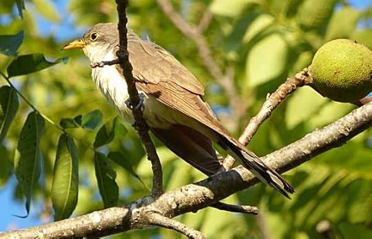
All that natural food draws insects, and some birds prefer to eat those. I was lucky enough this morning to have great views of this yellow-billed cuckoo, which would usually be skulking behind leaves and in the shade, but today was out in the sunshine not far from the path. What was he doing?
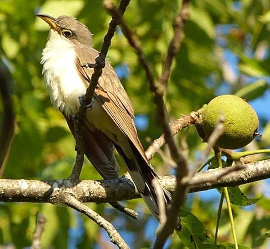
Looking around carefully, and…
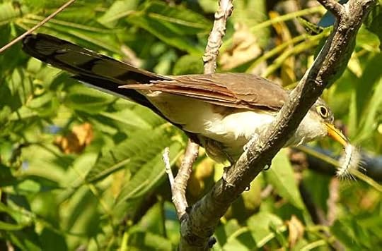
…there’s breakfast, a yummy (to him) caterpillar. Cuckoos love caterpillars. In fact, if you have tent caterpillars in your neighborhood, you probably have cuckoos eating them.
September 19, 2013
And Then I Read: MOUSE GUARD, THE BLACK AXE
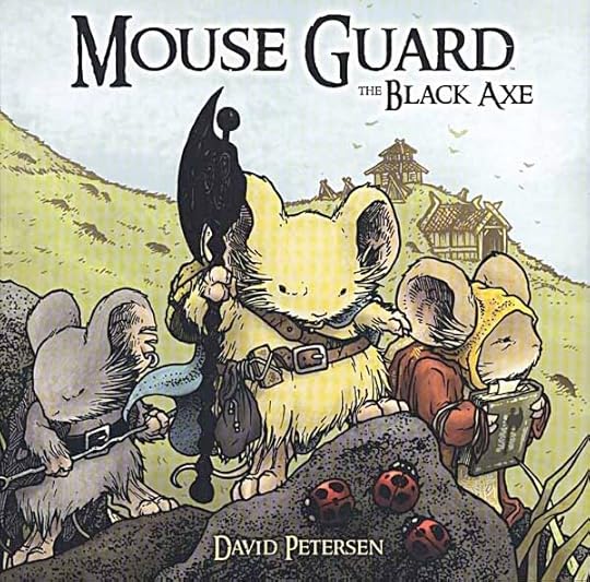
Image © David Petersen
There seems to be an urge in some creators to make the smallest, humblest animals into heroes, and David Petersen’s mice are among them. We can look back to C.S. Lewis’ Reepicheep as an earlier example, and the Brian Jacques books about Redwall are full of heroic mice. Petersen pushes the cute factor all the way in his drawings, as seen above. These are actually considerably cuter than real mice, but his talent allows me to believe they are also brave warriors, a surprising achievement. Of course they are anthropomorphic, little humans in word and deed for the most part, but somehow it works.
In this third hardcover volume we are following heroes of an earlier era in this world’s history, 37 years earlier than the first two volumes, which is many generations in mouse life. Celanwe and Em embark on a quest across a lake that is an ocean to them in search of a fabled weapon, the Black Axe. It was removed to a distant icy land by a mouse who was bent on conquest, and not heard from again, but the Black Axe is important to the well-being of the mice in the civilized land they have created, surrounded by predators and danger.
The writing in this book is excellent. I found it often moving. The art is charming, and except for the overly cute mice extremely realistic, bringing the mediaeval settings, architecture, clothing and lifestyle of the book to life in amazing detail. The lettering and design work on the title pages and maps is impressive. The subtle coloring adds greatly to the story. Some of the fonts used are rather hard to read, but while that slowed me down at times, it did not interfere with my enjoyment of the book. It’s a gem for fantasy fans and fans of great art and storytelling. And an amazing achievement for one creator.
Highly recommended.
September 17, 2013
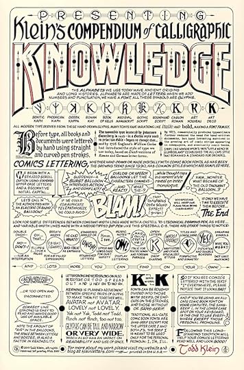
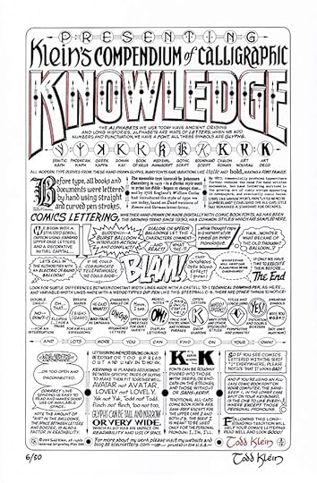
Creating my KNOWLEDGE print
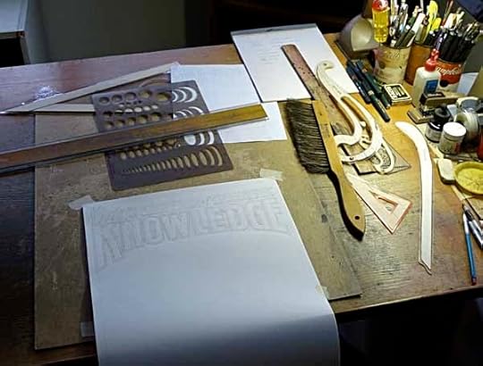
Images © Todd Klein, all rights reserved.
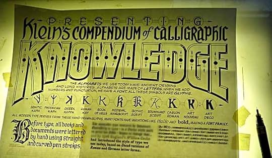
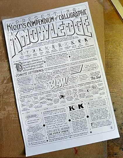
The alphabetical series of prints that I’ve been doing since 2007 had reached the letter K, and it seemed appropriate for me to reserve this one for myself alone, rather than team with another creator, as I had for the previous ten prints in the series (letters A to J). While thinking about that, I also realized this year was the twentieth anniversary of my very first signed print, “A Lettering Sampler,” created in 1993. I decided I would try to come up with a new print about lettering to become a companion piece to that one. I went through lists of words beginning with K, and settled on KNOWLEDGE as the one that would be prominent in the title. I thought Klein should also be in there, and settled on the complete title, “Klein’s Compendium of Calligraphic Knowledge.” Yes, I could have spelled Compendium and Calligraphic with initial letters K, but that was too cute for my taste. Reading it aloud, it has a nice alliteration anyway.
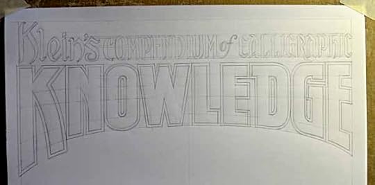
At first I wasn’t sure what would make up the body of the print, though I began making notes for that, but the title was set, so I drew that up on a large sheet of one-ply plate (or smooth) finish Bristol Board drawing paper left over from my staff days at DC Comics. I decided to work larger than printed size again, as I had for the J print, and the paper used is 13.5 by 20.5 inches. Above is the title penciled. I then gradually filled in the rest, working out what I wanted to say as I went along, an unusual way of working for me. “Compendium” means a concise summary of a body of knowledge, but in this case it’s more like “as much as I could get onto one piece of paper,” so take that with a grain of salt!
Here are the final pencils after over a week of working on it last March, when I had time between regular jobs. At the top I added PRESENTING, and in doing that settled on some decorative design elements that I used throughout the piece: circles and thin lines with arrowhead pointers. You’ll see them more clearly below.
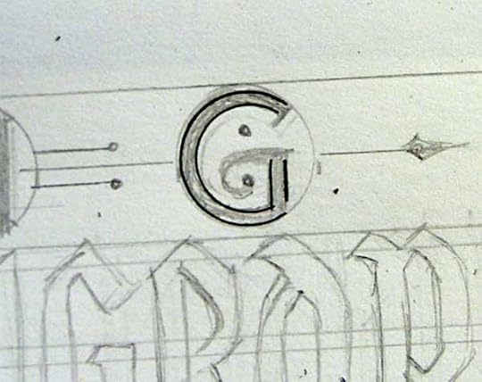
Here are the first ink lines on the G of PRESENTING, made with an 0.20mm Castell Technical drawing pen, circle template and triangle for the vertical lines. That’s a thinner point on the tech pen than I usually use, but I wanted very thin lines here. The style of the letters in PRESENTING is Victorian, inspired by some of my old lettering sample books like THESE. The decorative elements are also Victorian in style. Not sure why, it just seemed like a good way to go this time.
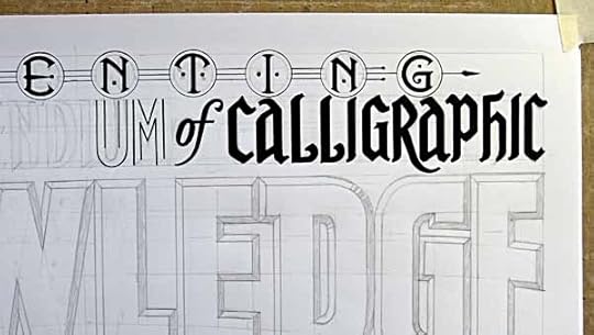
Here’s more ink at the top. I decided to add circles around each letter in PRESENTING, and this was an afterthought, so I had to shorten some of the letters in CALLIGRAPHIC to keep them from touching the circles. This is the sort of adjustment I make as I go along, and I know I can always move things or adjust them further on the final scan before printing. For KNOWLEDGE, as you can see, I added a bevel around the edges of each letter and shaded one side to give it more depth.
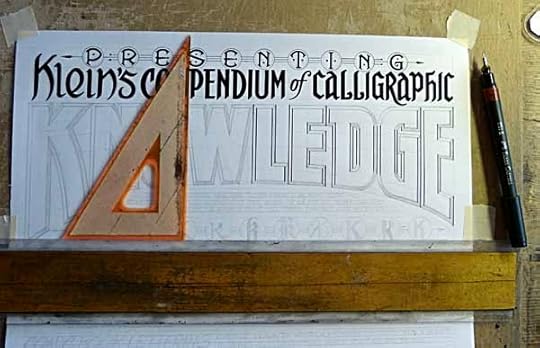
Vertical lines on KNOWLEDGE were inked with the help of my t-square and a small triangle. For the angled lines I just followed the drawing, and for the curved sections I used a large ship’s curve, or on the small curves, a circle template. It was fun working on these large block letters, something I haven’t done much of in recent years.
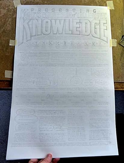
As I worked my way down the page, there were some paragraphs I wanted to do in the style of very old typography. I have fonts for these, and I set the paragraphs in Adobe Illustrator, then printed them at the size I wanted for the print.
Laying that printout on my light box, I positioned the hand-lettered paper over it, and traced the type as best I could see it through the paper using my thin-pointed tech pen.
Here’s the same thing with the lights of the light box turned off, so you can see what I’ve already hand-lettered. I could have just pasted the type onto the image digitally, but this way the type has a looser, more organic feel that fits in well with the rest of the print.
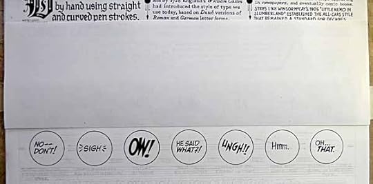
Below that I had planned another row of circles filled with a few of the most common comics lettering styles and punctuation, but as I began inking it, I wasn’t happy with the way it was turning out. First, it seemed the circles were too large for what was in them, second, I thought I could get more items in the space by staggering smaller circles instead.
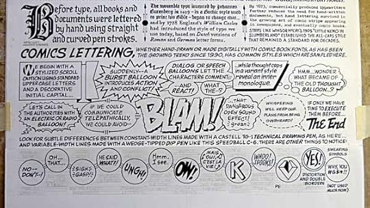
So I cut another strip of the paper and made a patch over that area, redoing the entire section and, I think, making it much better.
It took me about another two weeks to finish inking the lettering. I left a space at lower right for my signature inside the frame of the print this time. Since I was the only one signing, it would give a more balanced look to the final product.
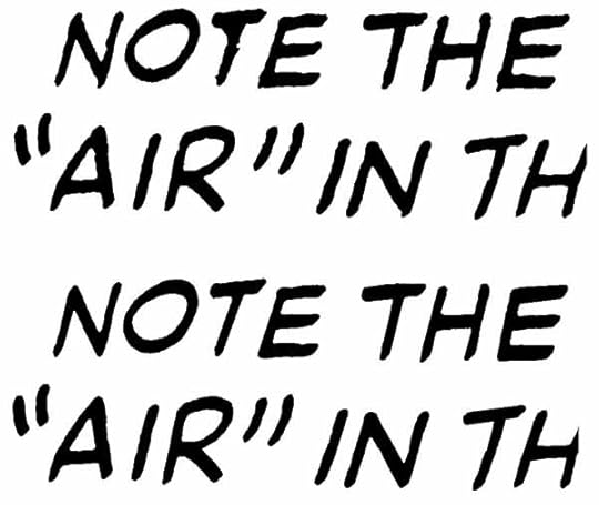
Next I scanned the lettering and began the very lengthy and laborious process of touching up the hand-lettering in Photoshop and getting everything centered and positioned just as I wanted it. Above is a “before and after” of one small section. Many of the tiny imperfections I fix wouldn’t be obvious on the finished print, but I can’t help myself, once I start fixing things I can’t stop! Of course I still want it to look hand-lettered, and it does, but after retouching it looks like hand-lettering where the paper, pen, ink and my own hand were all cooperating perfectly throughout, not the way it actually happened. This process took me through April and into May, which is always a busy month for me. Finally in early June I had my final image and was ready to print it on my Xerox printer, which handles 11 by 17-inch paper.
I decided to print two versions this time. Above is the one printed on white card stock with the art at a smaller size, matching the dimensions and surrounding white space of my first print, “A Lettering Sampler.” I thought some folks might want to hang the two of them side by side, and this way the sizes match. The paper color on the old print may have been white originally, it’s now darkened to off-white, so it’s not a perfect match, but close enough. I only printed 50 of those, and will offer some in a special deal, more on that later. The rest I printed larger, with margins to match my other prints, on cream-colored card stock. I made 300 of those.
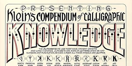
Next I needed to decide on a spot color to be hand-painted on each print. After some thought I decided to add color to the open sides of the letters in KNOWLEDGE, further enhancing the three-dimensional look of the bevels.
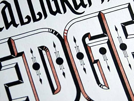
This was straightforward filling except for the curved areas of the O and G, where I would mimic the gradation of the black fills in color. I chose Indian Red from my set of Dr. Ph. Martin’s Hydrus liquid watercolors for three reasons. First, it’s a color I haven’t used. Second, Victorians favored earth tones, so that fit with the design style. Third, I have a wedge-tipped marker I wanted to use to sign my name that is purportedly “red,” but actually closer to this color.
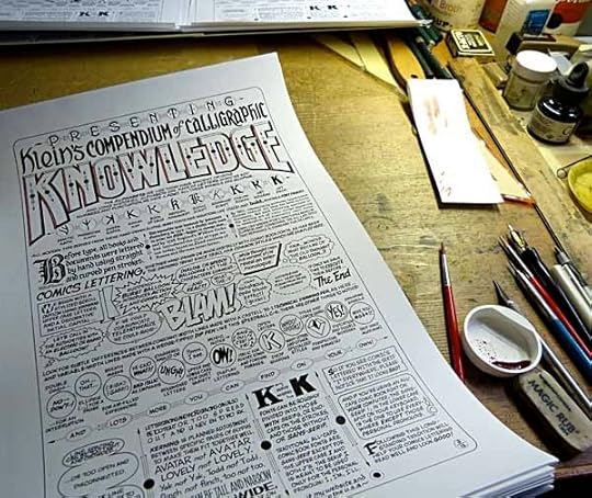
After a few samples to make sure I had the color I wanted, I started work on the white copies first. The painting went slowly because I’d given myself areas with very thin outlines to fill, and that took time. Most of the prints will have one or more small paint spots overlapping the lines, but that just makes it look more hand-made, right? I got the white ones painted in June, but then other things needed my attention and I had to put the painting aside for a while. First, I was writing and researching a lengthy series of blog articles on DC Comics history, second, the San Diego Comicon was looming, and I always seem to have a work crunch before and after that. Finally, in early August I was able to get back to painting prints and finished the rest.
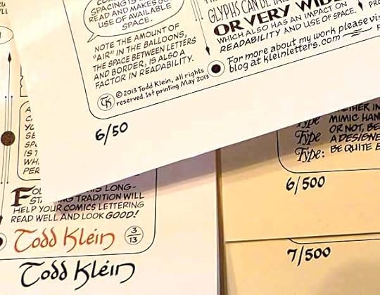
Just one thing remained to work out: signatures and numbering. In the space inside the art that I left, I signed my name in “red” on all the prints. None of my alphabetical prints were numbered, but I did number my first print, “A Lettering Sampler,” and saved the first ten. I decided, for the white copies, I would number them in a similar style (but there are only 50, of course), and sign them again in black below the art border to match the style of the older print.
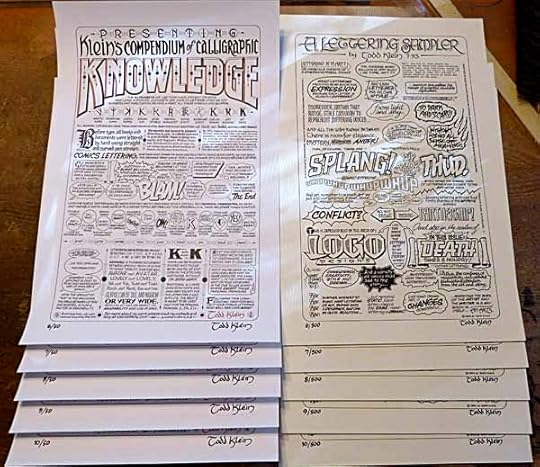
I’m keeping the first five for myself, but I’ll be offering prints numbered 6 through 10 in matching sets, as seen above: the new print on white and the old print from 1993 on off-white paper, matching numbers. The other white prints will be offered individually on a first-come first-served basis, and of course the regular edition on cream paper will also be available. You can order them on my BUY STUFF page, along with all my other prints. Sorry, these sets are now sold out.
This print took a very long time to produce, and I have no one to blame but myself! Hope you find it worth the wait, and I look forward to hearing from you and filling orders. Posts about the creation of my other prints can be found on my SIGNED PRINTS page.
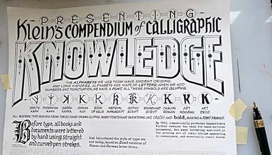
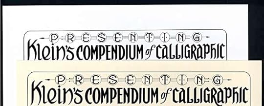
New signed print: KLEIN’S COMPENDIUM OF CALLIGRAPHIC KNOWLEDGE
Images © Todd Klein, all rights reserved.
I’m pleased to announce that my newest signed print, representing the letter K in my alphabetical series, full title: KLEIN’S COMPENDIUM OF CALLIGRAPHIC KNOWLEDGE goes on sale today, Tuesday, September 17th. Commemorating the 20th anniversary of my very first signed print, “A Lettering Sampler,” the new print is also focused on lettering, fonts and font use. As with all my prints, it’s 11 by 17 inches, printed in black on sturdy card stock, and each print has hand-painted Indian Red watercolor on the title. Every print is signed in a similar red color. The edition is 300 copies, and sells for $16 plus shipping.
A second VARIANT edition of only 50 copies has been printed on WHITE card stock, sized to match “A Lettering Sampler,” double signed and numbered. I’m reserving the first 10, leaving 40 of this edition for sale on a first-come, first-served basis. The white variant is intended for those who want to hang it alongside “A Lettering Sampler.” It will also sell for $16 plus shipping.

Plus there is a VERY limited number, FIVE in all, matched sets of KNOWLEDGE and A LETTERING SAMPLER (numbers 6 through 10) available on a first-come, first-served basis for $50 plus shipping. Sorry, these are now sold out.
A description of the creation of this print will follow in my next blog post.
To order these or any of my prints, including past prints created in partnership with Alan Moore, Neil Gaiman, Alex Ross, J.H. Williams III, Mark Buckingham, Bill Willingham, Shawn McManus, Dave Gibbons and Gene Ha, please go to my BUY STUFF page. Thanks, I hope to hear from you soon!
Todd Klein's Blog

- Todd Klein's profile
- 28 followers

