Logo Design: GAMBIT

covers and logos ©Marvel Publishing, Inc.
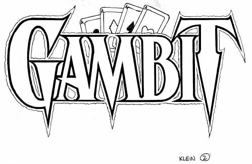
A short one this time, as I don’t have much material for it. Gambit, one of the X-Men, was created by Chris Claremont and first appeared in 1990. The Cajun card-throwing mutant proved popular, and in 1992 I was asked to design a new logo for the character who would star in his own mini-series the following year. I only have two remaining sketches, here’s the first one:
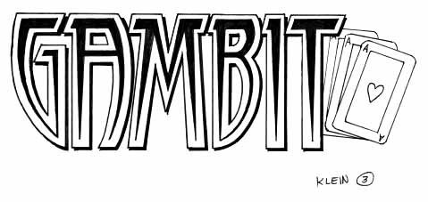
This is the one they went with, minus the ragged outer line and the four aces. The other sketch I still have is here:
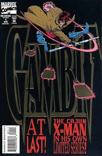
I still like this one, though it doesn’t quite have the pointy impact of sketch 2, which was all the rage at the time. I don’t know what happened to sketch 1 or any other versions. My final, inked by hand on Denril plastic vellum, as was my method in the pre-computer days, ended up very large on the cover of the mini-series, but quite distorted — stretched vertically, and with a drop shadow created digitally, I think. At least, it’s not done the way I probably would have done it. And, on this first cover, printed in gold foil, making it a bit hard to read.
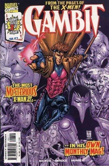
The other three covers of the series hid even more of the logo, but it did turn up again on another series in 1997, and on a continuing series in 1999, the first issue of which is at the top of this article. That version has been digitally traced by someone at Marvel, not me, and given a rounded outline, which I think kind of dilutes the whole pointy thing, but at least it’s fairly close to my original design.
Not much more to say about this one except that I had fun doing it.
Todd Klein's Blog
- Todd Klein's profile
- 28 followers


