
Brian Clegg's Blog, page 103
February 5, 2014
Warped vision
 The typical movie jump to hyperspaceIf there's one thing science fiction movies can agree about, it's that heading towards the speed of light, and or engaging warp drive should make for some interesting special effects. Often stars elongate, sometimes they change colour, sometimes they disappear with a bang.
The reality is not quite so visually exciting, but it is still impressive and decidedly confusing until you think through what is happening.
As a ship accelerates towards the speed of light, two things should happen. One is that there will shifting of colours. The colours of the stars behind the ship will be red-shifted, moving down the spectrum and those in front will be blue-shifted, moving up. This means that some stars will disappear as their colour goes out of the visible range, while others will pop into visibility for the first time.
The second thing is that the stars will move towards the front of the ship, bunching up in the direction of flight (though still as points, not the traditional movie streak). As the ship gets close to light speed, even stars that were almost directly behind it will appear in front. This is the least intuitive aspect, because it seems more natural that the starlight will be 'left behind' than brought to the front. What you have to bear in mind is that while the light was travelling from a particular point, you will have moved with respect to it. Add in the relativistic complication that light continues to travel towards you at the same speed whatever speed you are moving at and you end up with the bunching effect - it just remains very difficult to envisage. This website may help.
Things get more messy when we enter warp drive, whatever than means, as what you see is likely to depend on the mechanism of the warp drive itself, and since they are almost all imaginary, it's really rather up in the air. This website suggests that it would basically be more of the same - that in the warp bubble envisaged for a real warp drive you would see the same effects as when nearing the speed of light (but even more so). However the environment of a warp drive is quite different from a ship travelling at near the speed of light. Technically in a warp drive, the ship isn't moving at all, it's space that is moving around it. And once you get into the more dramatic science fiction concepts like hyperspace it isn't at all clear what the implications would be - quite possibly, there would be no stars visible at all.
There is always a tension in science fiction movies between getting a good representation of the best science tells us and making the film work as a piece of storytelling. Often the reality is ignored due to ignorance or a misapprehension of the audience response. As I mentioned recently, I think the silence of space worked superbly in 2001, and yet practically every movie since has given us sound in a vacuum. In the end, the Star Trek/Star Wars whoosh of stars as warp/hyperdrive is engaged and similar effects probably don't do any harm (though I here and now put a scientific curse on any movie or TV show that portrays a star field that moves visibly past as the ship flies), if only because the technology is fictional. But it doesn't do any harm to ponder it.
Image credit: University of Leicester via space.com


February 4, 2014
The myth of the friendly newsagent
 My corner shopI was listening to a piece on the radio the other day on the way home from the STFC (not a football club - but that's a different story). The piece was bemoaning the rate of closure of local newsagents. 'We are losing a vital local resource,' they said. Are we? Are we really?
Don't get me wrong, I'm all in favour of local enterprise and such, but are the typical local newsagents all that wonderful?
As I've mentioned before, my local corner shop, 5 minutes walk from my front door, is a massive 24 hour Asda superstore, alongside the likes of Marks and Spencer, Next and Starbucks, so I'm not exactly typical in local provision. But I've had plenty of experience of local newsagents in the past, and I really can't see what all the fuss is about.
Those on the programme, bemoaning their loss, had two principle arguments - that the local newsagent gave better customer service than a supermarket, and that mostly they are being replaced by 'metro' or 'express' versions of supermarkets, i.e. diabolical large companies, worming their way into the neighbourhood, rather than friendly locals.
I know there are exceptions - but I think in most cases this is not a viable comparison. Yes, I have known one excellent corner shop/newsagent/post office - to be precise a village shop, where the service was very good. But frankly many of the newsagents I go into are dingy and unpleasant, and have surly staff who haven't a clue about customer service, other than taking your money. Oh, and they are expensive to shop in. By comparison, our nearest supermarket 'local' (which I admit I don't use much because it's further to walk than the hypermarket) is bright, clean and relatively cheap. And in my experience the staff are just as friendly, if not more so.
For that matter, I don't really do small talk. I find it embarrassing and irritating with people I don't really know want to act as if they know me. Of course I like to chat to friends, but these aren't friends. I really don't want to have a conversation, I want efficient, quick service. (Which is why I frequently use the self service tills.) But I'll put that down as my failing. I know a lot of people do like to speak people. But the 'better customer service' argument simply doesn't hold water.
Of course you can't really argue against the 'big evil supermarket' bit. I'm no fan of Tesco, say, as a company. However I'm not sure there is more social benefit to be had by contributing to the coffers of one family rather than the many more people who work in a supermarket 'local'. And in the end it is a financial transaction, not a social service. I would like to be able to make that transaction with whoever does it best, not based on a personal bias against a large company.
So are we really losing a hugely valuable local resource when a local newsagent closes? I'm really not sure we are.
February 3, 2014
Selective tree hugging
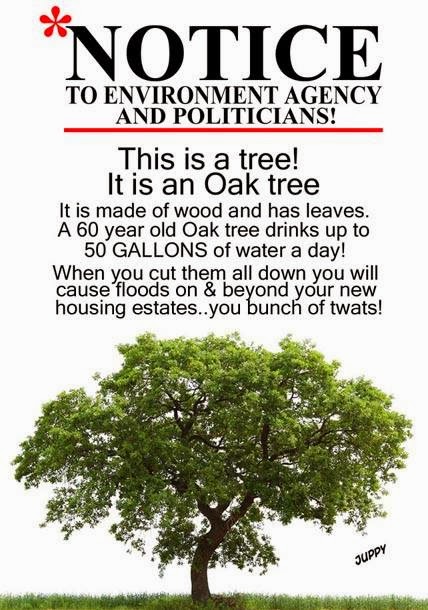 Picture from Mike JuppI was interested to see this graphic on Facebook the other day. I was impressed by the statistic - and it makes a lot of sense. Tear out a load of trees, replace them with housing and tarmac and you are going to get an awful lot less water taken out of the system, inevitably increasing the flood risk.
As always when I see such numbers, though, I feel the urge to check the source, as I am afraid as many as 91% of statistics found on the internet are either wrong or simply made up.*
I have struggled to find anything other than people repeating the 50 gallon figure without sources (though I'll come back to how realistic it is), but I was fascinated to discover this piece of research by the Forestry Commission. Although it doesn't directly confirm the 50 gallon figure, it does (not surprisingly) confirm that trees are about the best thing you can have to reduce water run-off. But the reason I found it fascinating was the detail, looking at different kinds of trees, because it underlines the problem I often have with the green movement.
There is often a tendency to confuse what is 'natural' or sounds more green in a 'hey, let's hug the trees' hippy way with what is better for the environment (this comes through, for instance, in all the myths surrounding organic food). In the UK there is no more natural symbol of a tree than the oak tree, but it's actually not the best tree to reduce flooding. In fact, conifers are significantly better than broad leaf trees like oaks at putting water back into the atmosphere. They also have the advantage of being much quicker to grow. It's all very well for 60-year-old oaks to 'drink' up to 50 gallons, but we haven't got 60 years to wait for new trees to grow. Yes we should preserve existing oaks (which, to be fair, was the point of the graphic), but we should not be planting new ones if this is our aim.
I find this particularly interesting because on the whole the dedicated green types are likely to frown on conifers as being unnatural and not as good as the 'native' species. But if you truly care about the environment, we need a lot more conifers.
I said I couldn't directly confirm the water consumption figure, but I can do a Fermi calculation. Broadleaves achieve between 400 and 640 mm of evaporation from 1 hectare of forest receiving 1000 mm annual rainfall. Let's use the median of 520. The current moving average annual rainfall is about 1175 mm, so that pushes up the consumption to 611 mm/hectare. A typical oak tree is about 13 metres across, so realistically you could get about 40 per hectare (which is 100m x 100m) in a well-covered forest. So the annual volume of water one broadleaf disposes of is 8109942 cc or 81099 litres. That's 222 litres a day, which is 48 gallons. Of course that is all back of the envelope stuff, but it's good enough to see that 50 gallons per day isn't a bad figure.
* If I am honest, this is one of those made up statistics. I picked the number 91 at random. However, because I used the statistical weasel words 'as much as' I am pretty safe, as this basically means anything between 0 and 91. (The same goes for 'up to' which you will see elsewhere above.)
This has been a green heretic production
January 31, 2014
Nerd vision
 Last night saw me at Swindon's Art Centre for a performance by Festival of the Spoken Nerd in their Full Frontal Nerdity tour. I mean, I was told there would be entertaining spreadsheets: how could I resist?
It was great to see an audience of 150 or so really getting into maths and science with an edge - and no doubt the nerds could tell you the edge's exact angle. The trio of Matt Parker, Helen Arney and Steve Mould work well together in a combination of science demos, wryly humorous scientific songs, banter and what was alleged to be maths, although it turned out to be primarily technology, fluid dynamics (physics) and computer science. But there were truly amazing spreadsheets!
Probably most impressive was the physics demos (I would say that) from the amazing electrified pickle to the revelation of the non-existent colour, but the whole was supported by well-scripted chat from all three. Even old chestnuts like breaking a glass with an amplified voice (achieved despite the technology coming over all prima donna) and Conway's Game of Life came alive with the FOTSN touch.
All three proved entertaining performers with a great balance of laughs (often reliant on a little geeky knowledge) and genuine enthusiasm for science. They kept the audience with them all the way and spread the word for nerddom.
I was surprised by the range of the audience - I expected mostly twenty-somethings, and they were certainly well represented and the noisiest, but there were plenty of oldies there too. No children, which is worth emphasising as a recommendation, both because there's what you might primly call 'inappropriate language' and because health and safety is gloriously and explicitly abandoned at the beginning of the gig - and there are couple of things here you definitely don't want kids trying at home.
For the rest of us, though, a great night - and there are plenty of opportunities to see them around the UK through to April. Take a look at the website for venues and bookings, but hurry, as some have sold out already.
January 30, 2014
Dual flushed away
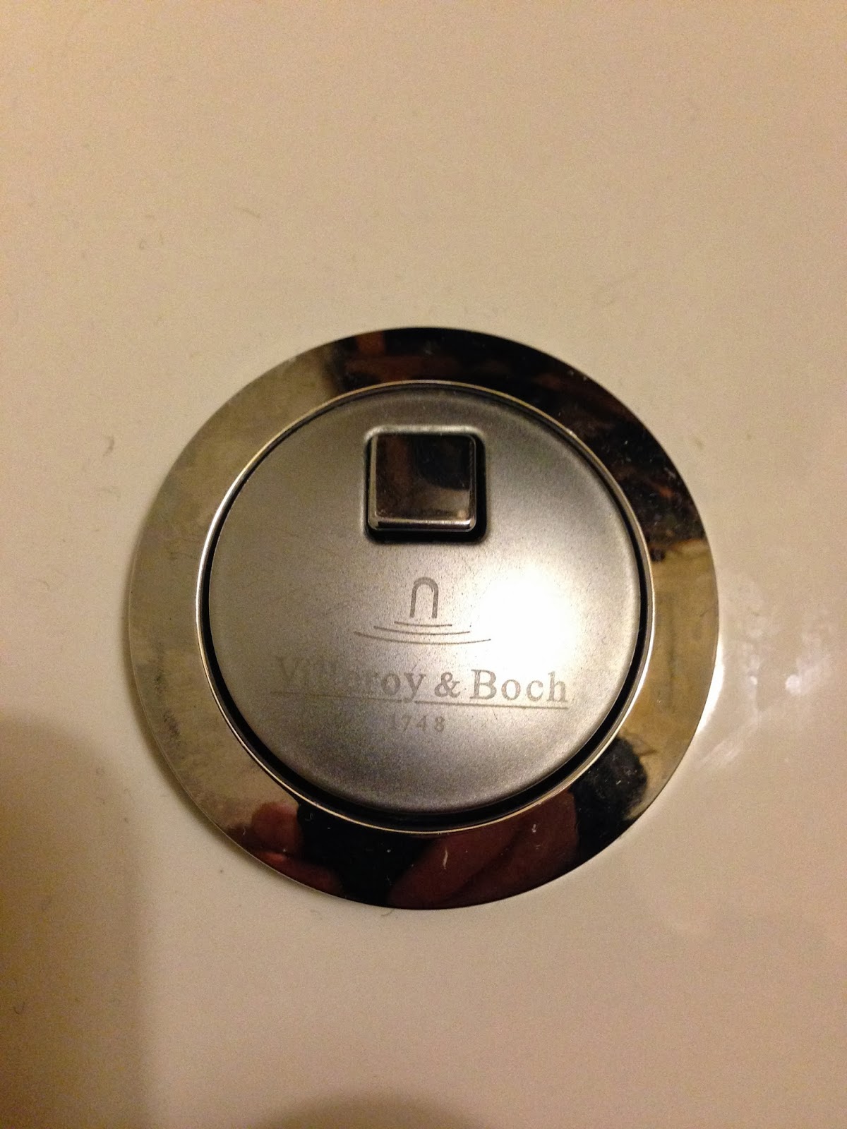 One of our dual flush controls, earlierNow here's the thing. Any modernish toilet in the UK is obliged to be dual flush. The idea is that, should you not want a great deluge of water, then you can opt for a lightweight flush, thereby reducing your water consumption, saving the whale and generally being ecologically friendly and getting a gold star. And I have nothing against that. But as someone who has always taken a great interest in user interface design, the design of most dual flush controls is downright useless.
Take, for example, the dual flush control illustrated, on one of our toilets (yes, we have more than one - aren't we des res?). Clearly there is a big friendly button and a smaller rectangular bit. My guess is that pressing the big button without the rectangular bit is a small flush, but pressing it with the rectangular bit is a large flush. But it is a guess, because there is nothing about the controls that indicates what they do. There's no reason why, for instance, pressing both shouldn't mean 'special economy flush'.
It's also a guess because, frankly, there is no obvious distinction to the amount of water that flows whether you press just the big button or both of them. In fact I sometimes suspect toilet manufacturers don't fit dual flush at all - they just fit dual buttons and hope no one notices that they don't do anything different.
Failing to make controls obvious is a common enough design fault. Think, for instance, of the controls of a four burner cooker hob. Usually the hob is arranged with the burners in a rectangular array, but nine out of ten times, the controls are in a nice straight line. Because the designer thought it looked neat. But this means it is impossible to deduce which control is for which burner - and the manufacturer accordingly has to give us an instruction book, in the form of little graphics we have to check to see which control does what. If they had put the controls in a rectangle too, there would be no need for instructions.
In the case of dual flush, the design is doubly disastrous, because not only is not obvious what to do, there usually isn't even a graphic to instruction you what the controls mean. It's guesswork all the way. It's easy enough to design a triple flush with no instructions. You have a big button split in half unevenly. The small part does a small flush, the big part does a big flush and pressing the whole does a royal flush. It's a little harder to design a dual flush control that is obvious from the shape of the control on its own, though I believe it is possible, but simply engraving a + on the square button (if that's what it means) would at least bring the flush control up to the level of a cooker.
Come on, sanitary ware gurus. Get your fingers out.
January 29, 2014
The Flat Iron experience - anything but flat
 I recently had the pleasure of having a meal up in London with one of my daughters. Until recently the default fare would have been something like T. G. I. Friday's, and being a sucker for US food, however chainified, I wouldn't have complained. But as my offspring are now adult(ish) and sophisticated, it was suggested that we try a trendy London restaurant.
Of itself, this was a bit worrying, as trendy usually means expensive, but I was assured that in the case the main courses come in at a wallet comforting £10 a head. So my only remaining concern was a review I read, which said that the writer was the only person in the place over 30. This turned out to be approximately true for me too, but as it happened it didn't matter and I had a great meal.
The venue is Flat Iron, in Beak Street, just off Regent Street, where you'd expect to pay tourist prices. But this is an ex-popup restaurant with rather original ideas of how to behave. It's no booking, which is actually an advantage if you are prepared to eat at an off-peak time. I've heard of people waiting 2 hours for a table in the evening, but we turned up 5 and were seated straight away (it was getting quite busy by 6).
Said seating is on shared tables, most of six, though there was at least one four. The gimmick, if you want to call it that, is that the menu only has one main plus a special. The main is a flat iron steak, not one of the more expensive cuts, but tasty and a bargain at £10. I went for the special, which is sometimes a different cut of steak (this isn't a place for veggies), but on our day was an excellent burger, with plenty of shallots and a béarnaise sauce.
 The main - flat iron steakThe main comes with a tiny dressed salad, and there are optional sides of chips and a couple of veg - and that's about it. But it really was good, and came in with drinks at around £20 a head. Oh and there's a nice little pot of seasoned popcorn while you are waiting for the food.
The place has a good feel to it too, very friendly staff, and a dinky oddity of providing a small meat cleaver instead of a knife.
I rarely bother to write up restaurants, but this was both different enough, and likely to put me off if I hadn't been forced to go, that I think it's worth a mention - and worth a try.
January 28, 2014
Unplug and unwind
For anyone who has missed my posts since last Thursday - apologies, but I have had a glorious unplugged weekend. We had a short break in our favourite rental holiday cottage, which amongst its best features includes no mobile phone reception and no internet. When we first went to it about 17 years ago it also had no TV aerial. There was a TV, but you could only watch DVDs - but now it's all hi-tech and TV is available.
Does this mean it offers lots of activities instead? Yes and no. If by activities you mean going for a walk or... going for a walk, then, yes it does. Oh, and Saturday and Sunday you can have a cream tea, should you desire it, in the cafe which is handily but not obtrusively attached to the cottage. Anything else you would have to drive to get to, and we didn't use our car all long weekend.
This might sound like hell in our zappy, connected world - but it really isn't. It is glorious. We did watch a bit of TV and read a newspaper (at the cost of a mile walk to the nearest shop), but mostly it really was a case that being detached from the world for a few days was brilliant. Seeing 'No Service' on the phone was not an irritation, it was a joy.
I admit this would only work with the right location - but there's a reason this is our favourite holiday cottage. This is the view from our bedroom window in the morning.

I usually have mixed feelings about liking houses based on the view. We currently have no view, where our last house had superb vistas. And I really don't care. Once you've looked at the view and gone 'Wow!' for the first 30 seconds, the excitement wears off and you hardly ever look at it. But the thing about looking out on the sea is that something is always happening. It's a view with action, whether it's the sea itself, or the boats or the beach activity - mostly dog walkers and mad surfers at this time of year. It's great.
With a view like this, only the words quoted so often by Wellington in that great cartoon strip, the Perishers can suffice: 'What is life, if full of care, we have no time to stand and stare?'
January 23, 2014
Randi devil
 In my book,
Extra Sensory
, I describe how the magician James Randi reproduced a trick that Uri Geller did on the Barbara Walters show in the US.
In my book,
Extra Sensory
, I describe how the magician James Randi reproduced a trick that Uri Geller did on the Barbara Walters show in the US.The source I had, involved Randi carefully not telling us how he did the trick, so in the book I speculate how he might have done it. In the trick, Walters draws a picture and seals it up. Randi concentrates, then appears to draw on a pad, then puts his pen down. Walters opens up her envelope and shows it to the camera. Randi then, almost immediately shows a similar drawing. Here's what I said:
What we see when watching the show is Randi apparently drawing his copy of the picture on a pad using a ball pen, before Walters reveals her picture. It is possible, even using the technique I’m going to suggest, that Randi did do a little drawing at that point in the proceedings – if so, what he produced was probably a basic box, which he could adapt later for whatever was needed. It’s equally possible that he didn’t draw anything, but merely moved the pen to make it look as if he was putting something on paper.
When Walters shows her picture to the camera, and all eyes are on the image, Randi is holding his pad in front of him, with the writing surface facing towards his body. He isn’t holding the pen, so he can’t be drawing anything, right? Except there is an old magician’s trick of fixing a pencil lead under the fingernail, and using that to draw something unseen, concealed behind the pad. The same thing can be done with the end cut off a ball pen refill. What you get, in effect, is a finger end that draws like a pen.
This is, I’m convinced, is how Randi performed the trick, adding in details to the image while Walters was displaying her picture to the camera. He couldn’t look at his own picture much as he did so or it would have given the game away – and this would explain why his stick figure ended up on top of (or as he put it “in”) the house rather than alongside it. The clues that Randi may have given when he described what happened are that he made a big thing at the time of adding the sun to make the picture more like the original – emphasizing, perhaps how he worked by adding drawings after the event – and also he would later stress in a video where he discusses the event, that he used a ball pen where Geller used a big marker pen which would be harder to duplicate with this technique (in fact, Geller drew his image in plain sight, so couldn’t use this technique).Take a look and see what you think.
Yesterday, though, I received an email from an Italian reader. Apparently Randi had admitted on Italian TV how he did this, and it wasn't with a fingertip pen. It seems he used his belt buckle - and certainly, just before the camera pulls away from Randi and onto Walters showing her image, his pad is moving very close to his belt. Even if it wasn't prepared, some metals will leave a coloured marking on paper, and I'm guessing that this is what my Italian correspondent (himself suitably magically mysterious) was suggesting.
January 22, 2014
London blinkers
 Media City, Salford -
 where Londoners can't be bothered to comeWhen I lived in Manchester, the general feeling was that the local news spent far too much time on those scouser scallywags in Liverpool. However, something I think both Manchester and Liverpool could then and can now come together in agreement on is that institutions in general in the UK are far too London-centric.
I hear it time and again - the London-based chattering classes use London as a picture of what the UK is like - and yet, inevitably, the English capital is entirely different from the vast majority of the country. They assume we all have an excellent public transport system and a chi-chi smoothie shop on every corner. They assume what they experience is Britain. But it's not.
Even when an organisation tries to do something about it, there are difficulties in making it work. When I went to Media City in Salford to record University Challenge I thought it was wonderful - and yet I hear that there are difficulties getting people to go there to be interviewed, so it wouldn't be surprising if at least part of the BBC section moves back down to London when the lease is up for renewal.
The thing that set me off on this minor rant was some self-opinionated person on the Today programme this morning. He was talking about how disappointing the lack of black and Asian people in film and broadcasting is. And he was right - his message was spot on. And then he spoiled the whole thing for everyone outside London by comparing the ethnic makeup of people working in the offices in the BBC with the ethnic makeup of London. Assuming, as his type always does, that London is the UK. I'm sorry, it's not the London Broadcasting Corporation. That first word is British, and any comparison should be against British statistics not London ones.
So, please, broadcasters at least, make an effort. When you want to do a vox pop or visit a school, go somewhere other than a London suburb. When you think of what the country is like, don't just think of London. Don't get me wrong - I love London. But it's hard to imagine anywhere less typical of the UK.
January 21, 2014
You say causation, I say correlation... let's call the whole thing off
 Thanks to the excellent Rosy Thornton for pointing out this piece in the Guardian blogs, suggesting that we should 'make sure the next book we read is by a woman.' I find this offensive and I suspect behind the rhetoric is my favourite bugbear, a confusion of correlation and causality.
I would suggest that the vast majority of people do not choose their books based on the gender of the author, even subconsciously. Instead, most of us read books in a genre or genres that we like (and there's nothing wrong with that, though I always encourage people to experiment and take a tiptoe out of their habitual genres).
Here comes the correlation bit. In quite a few genres, one sex of author dominates. I happen to read mostly popular science and science fiction, which have a preponderance of male authors. If instead I happened to enjoy reading fiction the genre that is usually labelled 'chick-lit' (though I think the term is going out of fashion), I suspect I would be reading books where most authors are female - but I don't. In fact a genre I read less frequently, but do read occasionally, is crime, and there female authors do dominate my reading. If you look on my shelves for crime books*, you will find titles by Margery Allingham, P. D. James, Ngaio Marsh, Susan Hill, Ruth Rendell and Elizabeth George hugely dominating those by Colin Dexter and Jonathan Gash, who are the only male crime writers I own books by.
Now I don't think there is anything sinister in the predominance of male writers in science fiction or women writers in crime. It isn't some conspiracy by the publishers - it's quite simply that more men choose to write science fiction and more women choose to write crime. In both cases there are plenty of exceptions, but I'm just talking about the overall picture. So if I, as a man, have chosen to read more books by men (and I think that is true), it is due to an incidental correlation of the sex of the author with the genre they write in, rather than a causal connection between the authors' gender and my decision to read their books.
I think to suggest that we should consciously decide to read a book by a woman is a terrible approach - because we should never be choosing books on the gender of the author (surely the whole point of this business), yet that is exactly what we are being asked to do. I suspect if there was a better understanding of the difference between correlation and causality in the literary world this wouldn't be an issue.
* If anyone thinks this is unrepresentative as a sample of modern crime authors, I only really read the sub-genre of 'traditional English crime'.


