
Brian Clegg's Blog, page 102
February 19, 2014
A silly answer to an interesting question
.jpg/800px-Andromeda_Galaxy_(with_h-alpha).jpg) See this and weep, Mr MayoLast night I heard some of Simon Mayo on Radio 2. (It was an accident, okay?) They asked quite an interesting question: 'How far can you see?' - but then accepted as if it were fact a totally silly answer. Someone had rung in to say that a British Airways pilot told him you could see up to 250 miles, or words to that effect. There are two problems with this.
See this and weep, Mr MayoLast night I heard some of Simon Mayo on Radio 2. (It was an accident, okay?) They asked quite an interesting question: 'How far can you see?' - but then accepted as if it were fact a totally silly answer. Someone had rung in to say that a British Airways pilot told him you could see up to 250 miles, or words to that effect. There are two problems with this.First, I worked at BA for 17 years and met quite a lot of pilots, and many of them were jolly nice people. But almost all were great spinners of yarns. I wouldn't believe a word they said. More to the point, though, as presented, the question bears a considerable resemblance to that hoary old favourite 'How long is a piece of string?', because the proper answer is 'It depends what you are looking at.'*
The furthest anyone can see dwarves the 250 miles answer to a ridiculous extent, but let's work up to it. The human eye is actually very good at detecting photons - it only takes a few to trigger it. This means that on a clear, dark night you can see a candle flame around 10 miles** away, which is pretty impressive in itself.
But a candle isn't exactly hard to beat. Anyone seen the Moon? Yup. So have I. That's around 230,000 miles away. Makes 250 miles seem a little weeny doesn't it? And we haven't started. The Sun is further still, and stars take us out even further. But let's push it to the limit.
The generally agreed 'furthest thing away you can see' (subject to some superbright thing flaring up in the future) is the Andromeda galaxy. Want to find it? One of the most recognizable constellations is Cassiopeia. The five main stars of the constellation form a large letter W, which is hard to miss (though you may see it looking more like an M). But it’s not Cassiopeia itself we are interested in.
If you think of Cassiopeia as a W, treat the second V in the W as an arrow and follow its pointer by a distance that is about the same as the entire span of Cassiopeia. This will have taken you into the much less obvious constellation called Andromeda. And around the point you arrived, a little fuzzy patch of light is just visible with the naked eye.
That fuzzy smear is the Andromeda galaxy, the nearest large galaxy to our own Milky Way. But ‘near’ is a relative thing in intergalactic terms. The Andromeda galaxy is 2.5 million light years away. Let's do a bit of approximate maths to turn that into more familiar units. A light year is the distance light travels in a year. It goes around 186,000 miles a second, so that makes a light year around 186,000 x 3600 x 24 x 365.25 miles. Call it 5,869,713,600,000 miles. So the Andromeda galaxy is around 14,674,284,000,000,000,000 miles away. So the figure given on Simon Mayo's show was around 58,697,136,000,000,000 times too small.
Even by broadcasting standards, that's a pretty magnificent level of inaccuracy.
* This assumes, by the way, that we are talking about seeing with the naked eye, and someone who has good eyesight.
** For easy comparison with the 250 miles, I am abandoning my usual metric units, so those who don't use miles will have to grit their teeth and mentally multiply by 1.609 to get kilometres.
Image from Wikipedia


February 18, 2014
Medieval crackers
 Image showing the 'Centaury' word
Courtesy University of BedfordshireAccording to a press release from the University of Bedfordshire, Stephen Bax, the Professor of Applied Linguistics there has finally managed to begin the process of interpreting the Voynich manuscript, a medieval book on plants and science that is written in a language that is so mysterious that many believed it to be made up, without meaning. To continue with the release:
Up until now the 15th century cryptic work has baffled scholars, cryptographers and code-breakers who have failed to read a single letter of the script or any word of the text.
Over time it has attained an infamous reputation, even featuring in the latest hit computer game Assassin’s Creed, as well as in the Indiana Jones novels, when Indiana decoded the Voynich and used it to find the ‘Philosopher's Stone’.
However in reality no one has come close to revealing the Voynich’s true messages.
Many grand theories have been proposed. Some suggest it was the work of Leonardo da Vinci as a boy, or secret Cathars, or the lost tribe of Israel, or most recently Aztecs … some have even proclaimed it was done by aliens!
Professor Bax however has begun to unlock the mystery meanings of the Voynich using his wide knowledge of mediaeval manuscripts and his familiarity with Semitic languages such as Arabic. Using careful linguistic analysis he is working on the script letter by letter.
“I hit on the idea of identifying proper names in the text, following historic approaches which successfully deciphered Egyptian hieroglyphs and other mystery scripts, and I then used those names to work out part of the script,” explained Professor Bax, who is to give his inaugural lecture as a professor at the University later this month.
“The manuscript has a lot of illustrations of stars and plants. I was able to identify some of these, with their names, by looking at mediaeval herbal manuscripts in Arabic and other languages, and I then made a start on a decoding, with some exciting results.”
Among the words he has identified is the term for Taurus, alongside a picture of seven stars which seem to be the Pleiades, and also the word KANTAIRON alongside a picture of the plant Centaury, a known mediaeval herb, as well as a number of other plants.
Although Professor Bax’s decoding is still only partial, it has generated a lot of excitement in the world of codebreaking and linguistics because it could prove a crucial breakthrough for an eventual full decipherment.Great stuff. The manuscript features in my book Roger Bacon, because it was once thought to be the work of the great thirteenth century proto-scientist. I've reproduced the (long) section on it below for your entertainment.
From Roger Bacon: The First Scientist
 In the early months of 1912, Wilfred Voynich, an American dealer in antique books, bought a strange manuscript that had been found in an Italian villa near Frascati. It was said to contain the secrets of nature, but its author had taken much care to conceal this dangerous knowledge from prying eyes. More than two hundred heavily illustrated pages were filled with a dense, incomprehensible script which no one had yet deciphered, accompanied by enigmatic sketches and diagrams. In its time this remarkable book may been the property of the astrologer John Dee and it certainly found its way into the hands of the Holy Roman Emperor Rudolph II. The author was said to be Roger Bacon.
Nine years after Voynich's purchase, the manuscript was to cause an international sensation. The man responsible was William Newbold, Professor of Intellectual and Moral Philosophy at the university of Pennsylvania. After making a careful study of the Voynich manuscript's complex script he had seen a pattern, not in the characters themselves but in minute markings above the strange lettering. Newbold announced not only that could he confirm that the secret document was the work of Roger Bacon, but that its contents seemed to blow apart the conventional idea of what was known in Bacon's time.
As Newbold's work on the manuscript progressed, he found confirmation of Bacon's authorship. But the revelations that were to amaze the world were that the text accompanying some of the less clear diagrams identified them as depicting distant objects in space and the microscopic features of sperm. These remarkable observations seemed to prove that Bacon had built telescopes and microscopes hundreds of years before they were believed to have been invented.
Newbold needed to confirm that Bacon had written the Voynich manuscript because, despite a long history of its association with Bacon, its author was not explicitly identified. Rudolf II certainly believed that it was Bacon who had written the manuscript when the emperor purchased the book in 1586 for the sizeable fee of 600 gold ducats, but that was simply because he had been told so. It was for the frisson of secrecy that the he paid such a royal fee. The book looked – still looks – as if it contained a wealth of scientific and magical secrets. And Bacon had always stressed that it was vital to keep the secrets of science hidden from the common herd. Here was documentary evidence of how Bacon maintained secrecy.
The emperor had been told that the manuscript must be Bacon's work because it appeared to be cryptically autographed by Bacon. On the last page are three lines of text in a different hand from the rest of the book. They seem to provide an incomplete key to the code used in the main text. Although this key itself is enciphered, it uses a simple form of code already well known in the thirteenth century, so in theory this addition could have been Bacon's work. It seemed, on decoding, that the first few words read 'To me, Roger Bacon' – though to discover this the reader would also have to unscramble an anagram. The man who brought this inscription to the emperor's attention is said to be the same man who had sold it to him, a man who believed Bacon to be much more than the caricature figure of the legend. That man was John Dee.
Dee was the personification of much of what legend had built up Bacon to be. An occultist and alchemist, he was royal astrologer to Queen Elizabeth I. Despite escaping a prosecution for sorcery in 1553, he was constantly held in suspicion by the common people, and eventually much of his extensive library (more than 4,000 books) was destroyed in a fire that was intended to burn Dee alive for his witchcraft. Like Bacon, Dee had wide-ranging interests, arguably sometimes inspired by Bacon. He applied mathematics to geography, improving the navigational techniques that were used at the time. He provided a preface for a translation of Euclid into English, and was active in theatre and the arts. But unlike Bacon, Dee had a very real dark side.
Where Bacon was dismissive of magic and magicians, there is no doubt that Dee revelled in the power that conferred by a claim to manipulate nature by magical means. With his companion Edward Kelley, very much the Bungay to Dee's Friar Bacon, he was said to have conjured up all manner of spirits. Like Bacon in Peter of Trou's stories, Dee was said to possess a magic mirror in which Kelley could see distant events take place. Dee, it was said, single-handedly defeated the Spanish Armada's invasion plan by summoning up bad weather. It's hard to believe that he would ever have denied this feat.
Dee also claimed to be able to communicate with angels by using a special alphabet that he had devised. He has been credited with the founding of the Rosicrucian Order, supposedly a Protestant equivalent to the Jesuits but in fact a secret organization with an inclination towards the occult. It is telling that when Shakespeare wanted a model for Prospero, the powerful but amoral sorcerer in The Tempest, he used Dee. He is also said to have inspired the character of the mad King Lear.
This Elizabethan occultist developed a passion for Roger Bacon (who would have been horrified by much that Dee did). Dee's library contained the largest known collection of Bacon's works, many of which survived the fire. In his preface to Henry Billingsley's translation of Euclid's Elements, Dee says of Bacon that he was 'the flower of whose worthy fame can never dye nor wither'. It is obvious that Dee drew heavily on Bacon's work. The closest Dee came to pure science was in his Propadeumata aphoristica ('Preliminary Aphoristic Teachings'), of which Benjamin Wooley remarks in his 2001 biography of Dee, 'This became the basis of Dee's natural philosophy, and in several ways anticipates Newton's groundbreaking Principia mathematica ...' In Propadeumata, Dee puts forward his theory that everything in the universe gives off rays of a force which then influence other bodies – nothing more than Roger Bacon's species.
It even seems that Dee went so far as to claim to be related to Bacon. In a pamphlet on the reformation of the calendar addressed to Queen Elizabeth in 1582, he took the opportunity both to praise his hero and to try to establish a connection with him:
None has done it more earnestly, neither with better reason and skill, than hath a subject of this British Sceptre Royal done, named as some think David Dee of Radik, but otherwise ... called Roger Bacon.
While it's true that Bacon had argued strongly for calendar reform, Dee's enthusiasm to claim Bacon as an ancestor seems to have overcome his sense of reality – there is no evidence anywhere that Bacon changed his name in this fashion. Any relationship was in Dee's mind alone. It would not have been surprising, then, if Dee himself, to develop the pedigree of the Voynich manuscript, had added the three lines that seemed to link it to Bacon.
This is something that cannot be proved. Little is certain with this manuscript, even the matter of Dee's involvement. A letter attached to the manuscript, written by Prague scientist Johannes Marcus Marci and dated 1665, tells us that the book was sold to Rudolf for 600 ducats. We also know that in 1586, when Dee was in contact with Rudolf, Dee records having 630 ducats, an unusually large sum as he was not well off at the time. Other circumstantial evidence has pointed to Dee's ownership, though some scholars continue to doubt it. But whether or not Dee owned or tampered with the document, the contents remained a total mystery until Professor Newbold's sensational translation.
Newbold basked briefly in the glory of his discovery, but very soon the critics descended upon him. The method Newbold had used to decipher the manuscript was complex and open to misuse. He claimed that the characters in the inscriptions themselves were meaningless, there only to mislead the reader. The message, he thought, lay hidden in almost invisible markings above the strange letters. These markings, he suggested, were similar to a shorthand used by the Greeks. But that wasn't the end of the mystery. To decode the text, Newbold had to use double-character combinations – assuming that two marks in the manuscript made up a single letter of writing – and then apply anagrams, jumbling up groups of characters to make appropriate words. In the hands of his critics, this led to the destruction of Newbold's credibility. They were blistering in their criticism of the Pennsylvania professor's approach, condemning his whole structure as imaginary, and objecting that the use of anagrams meant that almost any meaning could be extracted from a text of this length.
It is certainly true that within Newbold's 'translation' there was much that sat uncomfortably with Bacon's time and seemed to suggest wishful thinking on the professor's part. For example, Bacon appeared to call the members of the Franciscan Order 'monks', a description that would not have been made at a time when the distinction between monks and friars was a recent introduction and very clear. Other, apparent historical references to Bacon's life could simply not be true. Any fit with the historical facts of the period was superficial and collapsed when the detail was examined. It seemed that Professor Newbold had used his imagination to augment the text.
Since Newbold's abortive attempts, the closest there has been to a translation of the Voynich manuscript has come from the acknowledged expert on it, Robert S. Brumbaugh. Brumbaugh managed to establish a sensible structure behind the encoding of the titles of the illustrations, if not of the main text. Unfortunately the technique that seems to have been used to produce the text is numerological, each letter having been converted into a single-digit number before being translated into another character. This process inevitably means that it is hard to decode, as a single number could represent any of several different letters. Brumbaugh's work, together with a closer examination of the style of the manuscript means, has proved that Bacon's connection with it is fictional.
Also, the age of the manuscript itself argues against any link. Although the physical materials used in the manuscript could have been thirteenth-century, little else shows any sign of being contemporary with Bacon. The style of the book – or rather the collection of five different books that it appears to be – is much more like that of the early sixteenth century, particularly in the botanical illustrations. Some of these – confirmed by Brumbaugh's translated captions – include a sunflower and a capsicum pepper, both of which were unknown in Europe until Columbus brought them back to Spain in 1493.
Apart from Brumbaugh's publication, there have been a string of books and papers on the Voynich manuscript, most notably Mary d'Imperio's The Voynich Manuscript: An Elegant Enigma. For the future, perhaps the best hope of cracking the mysterious manuscript may lie in using the statistical techniques developed for the Human Genome Project to search for structures and patterns in the text. Modern Voynich enthusiasts are also producing a high definition computer-based copy of the work to replace the hazy microfilm that Voynich historians have had to work from in the past. However, it seems that what appeared at first to be a new window onto Roger Bacon's work is just as much fantasy as the more obviously grotesque mythological tales that appear in the Historie. It's not that the Voynich manuscript itself is a fraud, but any link with Bacon lies in the imagination, quite possibly the fevered imagination of John Dee.
Take a look at the book, a bargain as an ebook, to find out more about the real Roger Bacon.
February 17, 2014
Colour conundrum
 Have you ever thought about how strange a concept 'shiny black' is? Read on, in a post inspired by a Twitter interchange with Steve Mould of Festival of the Spoken Nerd. (If you haven't seen their show, book now - it's great!)
What colour is the car in the picture?
It's black.
Are you sure?
Of course I'm sure. What's your point?
It's black?
YES! Okay?
Bear with me. How do you know it's black?
Because that's the colour it is.
And how do you know what colour anything is?
This is basic Newtonian stuff, isn't it? White light hits an object. White light is made up of all the colours of the visible spectrum. Some colours are absorbed, the rest re-emitted. And the colours that are re-emitted are the colours we see. Trivial.
So a postbox, for instance?...
Exactly. White light hits a postbox, which absorbs everything except the red photons, which re-emit. And amazingly we see a red postbox. I still don't get your point.
You will. What about a black object?
That's a bit of a special case. We say something is black when it absorbs the whole caboodle. It doesn't re-emit any colours of light. So arguably black isn't a colour at all, it's an absence of colour.
Spot on. So what colour is the car in the picture?
Black.
And yet it is emitting light. It's shiny. And what does shiny mean?
Unless you are a Firefly fan, it means, well, something that shines. The OED says 'Full of light or brightness; luminous...'
So how can that car be black, if it is full of (emitted) light? By your definition, the colour of something is the colour of the light it gives off. What colour light does the shiny car shine with?
Erm, white light?
Exactly. So by your definition of colour, this black car is white. Next we prove that 2+2=16 and rip off the Bank of England.
February 14, 2014
Con-fusion
 It's not surprising when the beam lines have to go through two of these
that a bit of energy is lost.
(Photo courtesy of Lawrence Livermore National Laboratory)I'm a bit embarrassed that the day after moaning about the Today programme's handling of a climate change story, I'm getting at the way the press dealt with a science story today. Some may rightly say something about pots and kettles.
After all, I am a science writer, and I get things wrong too (most recently calling the Harwell facility the National Physical Laboratory rather than it's true name of the Rutherford Appleton - though, to be fair, I think the Harwell lab probably deserves the title more). But the problem I'm describing is more about mainstream media misunderstanding the science, rather than a simple factual error.
The last couple of days, most of the papers have carried excited reporting of a breakthrough at the National Ignition Facility, the vast nuclear fusion site at the Lawrence Livermore lab in America, where they are experimenting with creating fusion for energy by zapping small amounts of material with vast lasers. Typical of the write-ups was the Guardian with 'Sustainable nuclear fusion breakthrough raises hopes for ultimate green energy'. They tell how have the scientists have achieved a world first by getting more energy out of the nuclear fuel than they put in.
What some of the other papers never mention, and the Guardian doesn't put up front, is that this is true, but not as good as it sounds. It's true they did get more energy out of the fuel than they put into it - but they got a lot less out than they put into the system as a whole, as the vast banks of laser amplifiers all lose a bit along the way. To be fair to the Graun, they did eventually explain this - but I think the way the story is structured doesn't put enough emphasis on it up front. And several other papers never even bothered to mention this bit at all.
However, that isn't really what I've got a problem with, so much as the timing. Most of the articles (including the Guardian one) give the impression that this break-through has just happened. But in fact it took place last autumn and was well publicised at the time. All that's happened now is that it has been written up in Nature, who have put out a press release about it and the journalists reacted to the press release, not the actual event.
Now I know many scientists don't particularly like information about experiments to be publicised before they have a peer-reviewed paper, but this was rather different. Either way, the result was, because of the press's obsession that they can only write about things that are immediate and current, rather than just because they are interesting (which this is), that the truth about the timing was carefully pasted over. And that's a bit naughty.
February 13, 2014
Why do they do it?
 Would you buy a used weather system
from this man?I was listening to Lord Lawson on the radio this morning, doing his usual climate change denial thing (though he was being very careful to always refer to it as 'global warming', as the kind of weather we have at the moment is not one many would associate with warming). And in his voice was all the fervour of an old-time religionist. He knows that global warming doesn't exist, and he wants us all to share in his beliefs.
It made me wonder, why he believes something so fervently in the face of the evidence. By evidence, by the way, I don't mean the current flooding in the UK, though of course it may be indeed influenced by climate change. We can't deduce anything from a single data point. I mean the big picture. And when you think about it, his response is very similar to the way that creationists cling onto their beliefs that, say dinosaurs co-existed with humans and were on the ark in a great flood where the waters covered the earth, despite all the evidence the contrary.
It's also why people like Lord Lawson are the last kind of person who should be given a public platform on a subject like this - which wasn't helped by the Today interviewer who several times referred to 'the controversy.' There is no controversy among people who know what they are talking about - and it's interesting again that the interviewer was employing exactly the same term as the creationists: 'teach the controversy.'
As far as I can see, Lawson, who studied PPE, has no training to interpret scientific data, nor to pronounce on science, but away he goes with those typical denialist tropes, some of which I list here to help you spot them in action:
Use language that is misleading, like 'global warming' but never 'climate change'.Cherry pick data to show what you want it to show. So, for instance, point out that global temperatures haven't risen much in the last 15 years, but don't include why this would be expected with the current picture of climate change.Make statements that simply aren't true with such conviction that it sounds as if you know what you are talking about. Say, for instance, when an expert says 'During that time the excess energy is still being absorbed by the climate system,' respond with 'That is pure speculation.' No need to base your comment on any scientific data, even though the argument your are countering is based on measurement, not just theory. Just say 'That's not true,' or 'That's speculation,' loud enough and you will carry the day.Point out that the UK only contributes a small percentage, and say that therefore it doesn't matter what we do. Would he do this about anything else that was wrong, like hanging ex-politicians from lampposts? 'It doesn't really matter, as the UK only has 2 per cent of the world's ex-politicians.' That's okay, then.Say that scientists can't agree, or can't be definitive. This just describes the nature of science. But it doesn't mean we shouldn't go along with the best match science can give us to reality until better results come along. Why go with something that bears no resemblance to reality instead?Find some tiny example that seems to contradict the theory, while ignoring huge swathes of evidence that support it. I know this is cherry picking again, but this time it's extreme cherry picking.All I can say to anyone who is listening to Lord Lawson and thinking 'It must be true, he used to be Chancellor' is to consider whether you would take the same attitude in this situation. You are ill and you go to the doctor. A whole host of medical experts tell you that you need a particular treatment. Then Lord Lawson comes along (who knows as much about medicine as he does climate change) and says 'No, that's rubbish. There is no evidence you need this treatment. You just need to pull yourself together.' Would you really give him the time of day, or would you consider him to be irrelevant to the discussion?
Enough said. I'm off for a ride on Walter, my pet dinosaur.
This has been a green heretic production.
Image from Wikipedia
February 12, 2014
Amazon dilemma
 If there was ever a company it is possible to have a love/hate relationship with, it's Amazon.
The hate side is pretty straightforward, and the one that probably many of my readers could put forward. In fact the very mention of them will have some of you frothing at the mouth. They are a behemoth, flattening all opposition in their path. They fiddle their taxes. They drive bookshops out of business. They don't pay publishers (and hence authors) as much as they should because of their virtual monopoly. They set the rules and everyone else has to follow or get out. And they treat their low level employees like automata.
 I really did write the bookBut actually, they are also pretty damned good at what they do. As someone who wrote the book on customer service, I have to grudgingly admit that most of the time they get it right in a big way.
Like the way that I can buy music from them and in many cases I can not only get the CD, but instantly download the tracks at the same time at no extra charge. Now you may say, 'Grandad! Why do you need the CD if you've got the download?' And I have to reply, 'Experience, young Jedi, experience.' When I first worked on PCs I twice lost a hard drive before I realised backing up was a good thing (I mean the drive failed, as early ones tended to - I wasn't careless enough to actually lose them). If you can get a backup for free, then it's well worth having.
Another example. On Saturday morning I ordered a household product from them. Because I'm one of their 'Prime' customers I get free next day delivery - which itself is a brilliant thing, because it puts online shopping more on a par with the old bricks and mortar version. But of course, we all know that on Saturday, 'next day' means Monday. Nope. It was here, at my house, before 11am next day - Sunday.
And then there's returns. A couple of times I've had to send something back and they make it very easy. They even send out the replacement before you put the original in the post.
So, yes, they may be evil. Yes, they plan to take over the world.. But they are so seductive, like all the best baddies. I don't think I can give them up.
If you want to read more about Amazon (and the secrets of what they get up to), with useful timing, part way through writing this, I got a link to this interesting, if immensely long, article Is Amazon Bad for Books in the New Yorker magazine, from the lovely Lynn Price at Behler Publications.
February 11, 2014
How not to run a phishing scam
There are some evil people out there who prey on computer users by pretending to be their banks etc. Luckily for us, the people who run these phishing scams are often not very bright. The other morning I received this email:

Oh, dear, I thought, what a shame I can't receive that £265.93 as I don't have a NatWest account. Silly old bank. And fancy them not spotting they should take the fee off, rather than add it on. Doubly silly old bank.
But then, the very next email in my inbox was this:

Now, call me suspicious, but finding out that exactly the same amount, with exactly the same transaction ID (and exactly the same negative fee) was also being applied to 'my' Barclaycard account was teensiest bit worrying. Especially as the format of the email was identical. Then I looked at the next email.

Oh, come on now. This is taking idiocy to a new and rather dizzy height. It's surely not phishing at all, but a form of performance art, designed to bring a smile to my face first thing in the morning.
And if that was the intent, it certainly worked.
February 10, 2014
In Apple Blossom Time review
 At first glance I am the last person to be part of the target audience of In Apple Blossom Time by Robert Wack, set in 1944. I hate war films (or rather I have never seen one and never particularly want to). I even avoided War Horse because of the setting. As for written material, the last time I read anything set in the Second World War it was a comic back in the 1960s (usually, as I remember it, involving daring raids to blow up a submarine pen) when there was still a considerable appetite for gung-ho WW2 stories. But this is different.
I'll admit it appealed to my vanity that the author claimed to be inspired my book How to Build a Time Machine to create a novel around the extraordinary war career and death of Dutch-American mathematician Willem van Stockum, one of the first to take on the implications of Einstein's work on general relativity that implied the possibility of using warps in spacetime to create closed time-like loops that should enable travel backwards in time.
I can't deny I found the book gripping. I expected to read bits of it as and when I had a bit of time between research reading for my next book, but in practice once I started, Apple Blossom took over and wouldn't let me put it down. If you are going to be picky, some of the dialogue is a little stilted and there are too many pages given to introspective thought, but the wartime scenes, both van Stockum's experience as a bomber pilot and the scenes on the ground in Normandy in 1944, are well-crafted and place the reader uncomfortably deeply into the action.
The book would have been quite interesting if that were all there were to it, but it is lifted to a new level by the inclusion of mysterious figures, some who appear to be trying to save van Stockum from his 1944 death, and others to prevent this interference. Van Stockum's impact on the physics of time travel would, it seems, have repercussions in the future, if he can continue his work after the war.
Technically there is a flaw in the approach taken to time travel here, as no device reliant on general relativity to travel backwards in time could reach further back than when the machine was first created, but I am always sympathetic to the argument that in science fiction the most important word is 'fiction' and it while every effort should be made to stick to known physics, if necessary the detail has to give way to making the story work. Apart from the violation of what I think of as the 'cardboard box of time effect' (more on that another time) the author does pretty well at keeping the science on track.
It won't appeal to everyone (and if you find the first couple of chapters confusing, bear with it), but in the ebook form you can try before you buy, and I recommend giving In Apple Blossom Time a go. It is available from Amazon.co.uk and Amazon.com. The book will also be available in print later in the year.
February 5, 2014
The compound of regret
_tcm18-116160.GIF) On the whole I find pretty well every compound I cover in the Royal Society of Chemistry podcasts quite interesting, but today's is a bit of a beast. Prepare to meet acetaldehyde, which some blame for your hangover.
On the whole I find pretty well every compound I cover in the Royal Society of Chemistry podcasts quite interesting, but today's is a bit of a beast. Prepare to meet acetaldehyde, which some blame for your hangover.So grab yourself a glass of Irn Bru and hurry over to the RSC compounds site to see more on this painfully fascinating substance (posted 22 Jan). If you'd like to listen straight away, just click here.
Warped vision
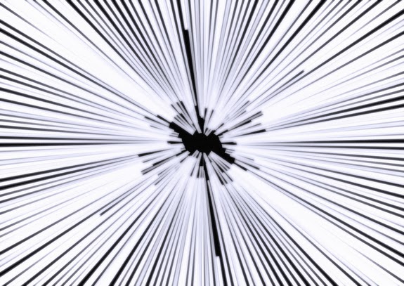 The typical movie jump to hyperspaceIf there's one thing science fiction movies can agree about, it's that heading towards the speed of light, and or engaging warp drive should make for some interesting special effects. Often stars elongate, sometimes they change colour, sometimes they disappear with a bang.
The reality is not quite so visually exciting, but it is still impressive and decidedly confusing until you think through what is happening.
As a ship accelerates towards the speed of light, two things should happen. One is that there will shifting of colours. The colours of the stars behind the ship will be red-shifted, moving down the spectrum and those in front will be blue-shifted, moving up. This means that some stars will disappear as their colour goes out of the visible range, while others will pop into visibility for the first time.
The second thing is that the stars will move towards the front of the ship, bunching up in the direction of flight (though still as points, not the traditional movie streak). As the ship gets close to light speed, even stars that were almost directly behind it will appear in front. This is the least intuitive aspect, because it seems more natural that the starlight will be 'left behind' than brought to the front. What you have to bear in mind is that while the light was travelling from a particular point, you will have moved with respect to it. Add in the relativistic complication that light continues to travel towards you at the same speed whatever speed you are moving at and you end up with the bunching effect - it just remains very difficult to envisage. This website may help.
Things get more messy when we enter warp drive, whatever than means, as what you see is likely to depend on the mechanism of the warp drive itself, and since they are almost all imaginary, it's really rather up in the air. This website suggests that it would basically be more of the same - that in the warp bubble envisaged for a real warp drive you would see the same effects as when nearing the speed of light (but even more so). However the environment of a warp drive is quite different from a ship travelling at near the speed of light. Technically in a warp drive, the ship isn't moving at all, it's space that is moving around it. And once you get into the more dramatic science fiction concepts like hyperspace it isn't at all clear what the implications would be - quite possibly, there would be no stars visible at all.
There is always a tension in science fiction movies between getting a good representation of the best science tells us and making the film work as a piece of storytelling. Often the reality is ignored due to ignorance or a misapprehension of the audience response. As I mentioned recently, I think the silence of space worked superbly in 2001, and yet practically every movie since has given us sound in a vacuum. In the end, the Star Trek/Star Wars whoosh of stars as warp/hyperdrive is engaged and similar effects probably don't do any harm (though I here and now put a scientific curse on any movie or TV show that portrays a star field that moves visibly past as the ship flies), if only because the technology is fictional. But it doesn't do any harm to ponder it.
Image credit: University of Leicester via space.com


.jpg)